Bubble and Point Maps in R with ggplot2 and sf
A point map drops a dot at each location's longitude and latitude. A bubble map goes one step further: it lets each dot's size stand for a value, so a glance shows you both where things are and how big they are. You build the dots with ggplot2 and, when you want real country or county outlines behind them, you add the sf package.
How is a map just a scatterplot of longitude and latitude?
Here is the idea that makes everything else easy: a map is a scatterplot. Every place on Earth has two numbers, a longitude (how far east or west) and a latitude (how far north or south). Put longitude on the x axis and latitude on the y axis, and each place lands exactly where it belongs. You do not need a special map object to start, just a table of coordinates and ggplot2.
Let's build that table. Run this first block to load the tools and see ten of the world's largest cities with their coordinates and populations.
Each row is one city. The lon column is longitude, lat is latitude, and pop is the population in millions. Negative longitudes sit west of the prime meridian (New York, Sao Paulo), and negative latitudes sit south of the equator (Sao Paulo again). Those four numbers per row are all a point map needs.
Now the payoff. We map longitude to x and latitude to y, then draw one dot per city with geom_point().
Run that and a rough world map appears out of nothing. The dot on the far right is Tokyo, the cluster in the middle is Europe, Africa, and the Middle East, and the two dots on the left are New York and Mexico City. It already looks like a map because the coordinates are a map. There is no country outline yet, only the cities, but the shape of the continents is already hinted at by where the cities fall.
There is one problem the plain scatterplot ignores: the aspect ratio. A degree of longitude and a degree of latitude are not the same width on screen, so the world looks squashed. The coord_quickmap() function fixes the ratio for the small-to-medium areas most maps show. Let's add it, plus a splash of color and clearer labels.
Run it and the map relaxes into more natural proportions. The dots have not moved to new coordinates, but the plotting area now gives each degree of latitude and longitude a sensible relative width, so the arrangement reads more like a real map and less like a stretched chart.
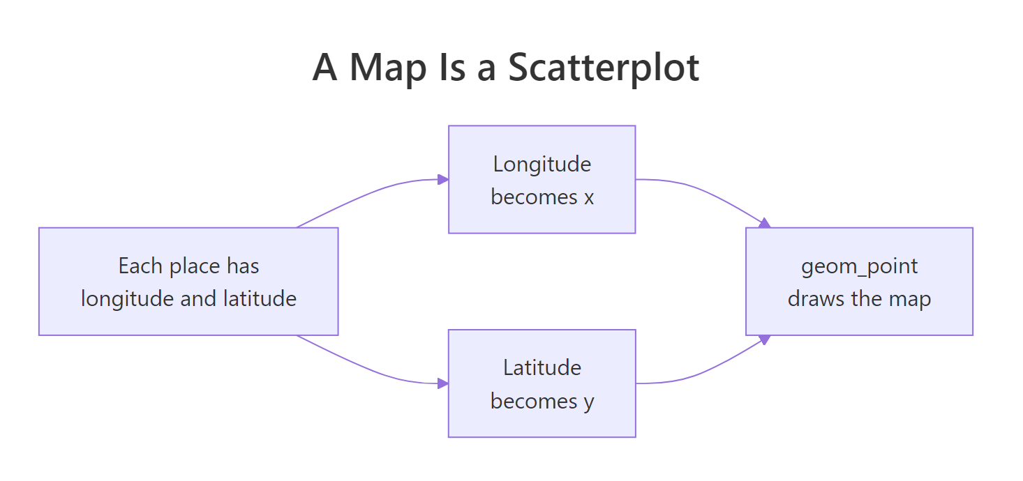
Figure 1: A map is a scatterplot: longitude becomes x, latitude becomes y.
Try it: Draw a point map of only the cities in the northern hemisphere, the ones with a latitude greater than zero. The starter filters the data for you; add the ggplot call.
Click to reveal solution
Explanation: subset() keeps the eight cities with lat > 0, and the ggplot call is the same recipe as before: longitude to x, latitude to y, one point each.
What turns a point map into a bubble map?
A point map answers "where?". A bubble map answers "where, and how much?" at the same time. The trick is one extra line in aes(): you map a value to the size aesthetic, and ggplot2 draws each point as a circle whose size reflects that value. Our cities already carry a pop column, so let's size each dot by population.
Run it and Tokyo, Delhi, and Shanghai swell into the biggest circles while London stays small. The size = pop inside aes() is the whole difference between a point map and a bubble map. The alpha = 0.7 makes each circle slightly see-through so that when two bubbles overlap you can still tell them apart.
Right now ggplot2 picks the size range and the legend title for us. We usually want more control: a wider spread between the smallest and biggest bubble, and a legend title a human wrote. The scale_size() function gives us both.
The range = c(2, 14) tells ggplot2 to draw the smallest population as a 2-unit circle and the largest as a 14-unit circle, with everything else spaced in between. The name = "Population (millions)" renames the legend so a reader knows what the sizes mean. Small choices like these are what separate a rough draft from a chart you would put in a report.
Try it: Color the bubbles by population as well as sizing them, so the biggest cities are both large and brightly colored. The starter sets up the base plot; add a geom_point() that maps colour = pop, then a viridis color scale.
Click to reveal solution
Explanation: Mapping pop to both size and colour doubles the signal, and scale_colour_viridis_c() supplies a color-blind-friendly gradient. When two aesthetics carry the same variable, ggplot2 merges them into one legend automatically.
How do you size bubbles so the areas are honest?
This is the section most tutorials skip, and it is where most bubble maps go wrong. When you look at a circle, your brain judges its area, not its radius. That single fact decides whether your map tells the truth. Let's see the trap with plain arithmetic before we fix it.
Suppose you let the radius grow in step with the value, so value 2 gets radius 2 and value 4 gets radius 4. The area a reader actually sees is proportional to the radius squared. Run this to watch the distortion pile up.
Look at the last row. The value went up 8 times, from 1 to 8, but the area the eye reads went up 64 times. A city that is 8 times bigger looks 64 times bigger. That is not a rounding error, it is a lie baked into the chart, and it happens whenever radius tracks the value directly.
The fix is to make the radius grow with the square root of the value, so that the area, the thing you actually see, grows in direct proportion to the value. The algebra is short:
$$A = \pi r^2 \quad\Longrightarrow\quad r \propto \sqrt{v} \;\text{ gives }\; A \propto v$$
Where:
- $A$ = the bubble's area, which is what the eye reads
- $r$ = the bubble's radius
- $v$ = the data value you are encoding
- $\propto$ means "is proportional to", so $r \propto \sqrt{v}$ reads "the radius grows with the square root of the value"
If the algebra is not your thing, skip it, because the practical rule is one line: use scale_size_area() instead of scale_size(). It maps the value to area for you, so a value twice as large draws a bubble with twice the area.
Run it and compare with the earlier maps. The differences between cities now look proportional to their real population gaps, not exaggerated. A zero value would draw a bubble of zero area, which is exactly what an honest scale should do.
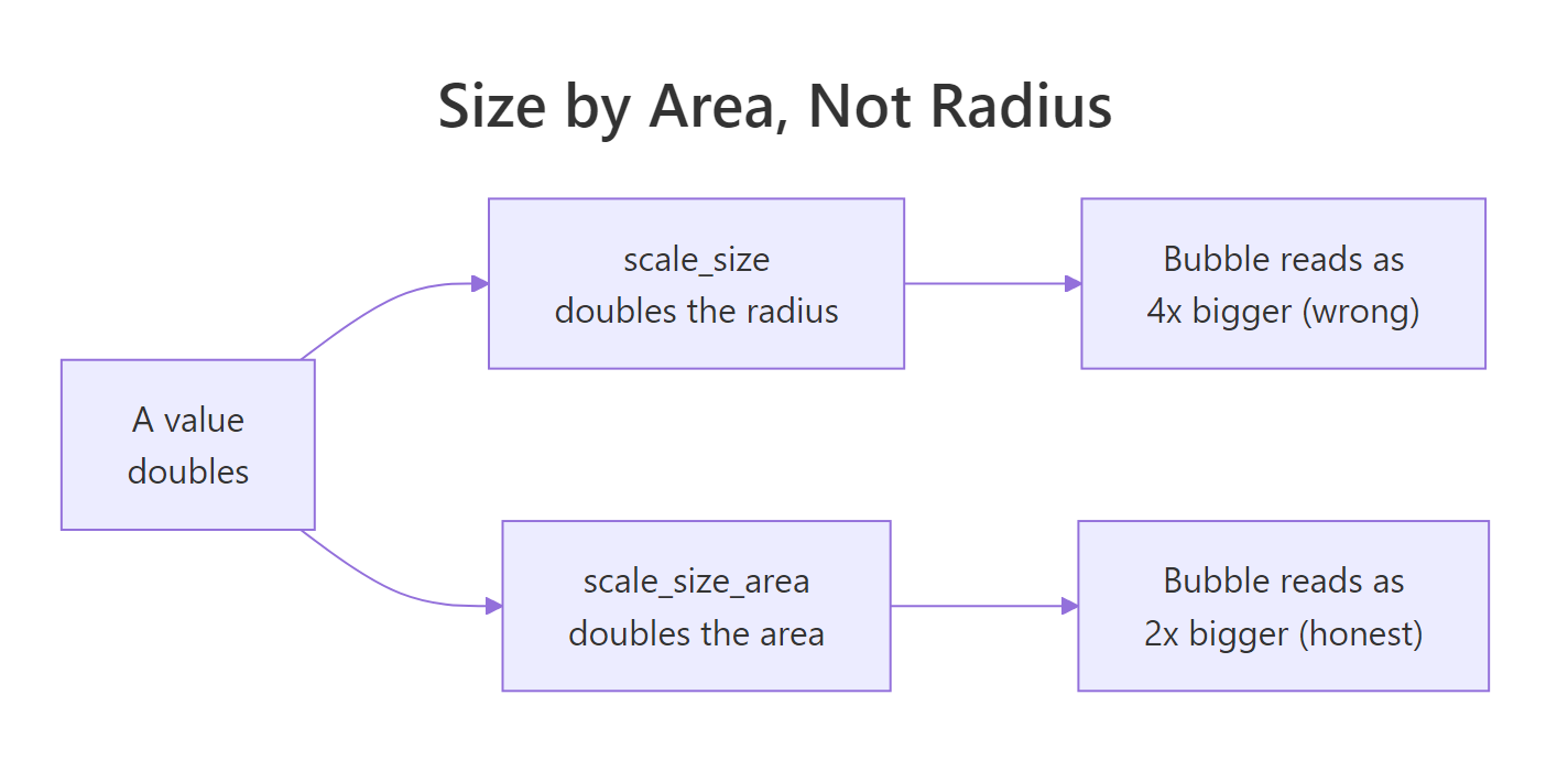
Figure 2: Map the value to bubble area rather than radius, or big values look exaggerated.
Try it: Rebuild the population bubble map with scale_size_area(max_size = 10) so the largest bubble is a bit smaller. The starter gives you the base plot; add the geom and the scale.
Click to reveal solution
Explanation: Lowering max_size from 16 to 10 shrinks the largest bubble while keeping every area proportional, which is handy when big bubbles crowd their neighbours.
How do you build a bubble map from a real dataset (Fiji earthquakes)?
Toy data is fine for learning, but the fun starts with a real dataset. R ships with quakes, a record of 1,000 earthquakes near Fiji, and it is perfect for a bubble map because every row already has a location and a magnitude. Let's look at the first few rows.
Each row is one earthquake. The long and lat columns are its coordinates, mag is the magnitude on the Richter scale, depth is how deep below the surface it struck in kilometres, and stations counts how many seismic stations reported it. That gives us a location, plus a magnitude to size by and a depth to color by, all in one table.
Now we build the bubble map: longitude goes to x and latitude to y, then magnitude to size and depth to color. We use scale_size_area() for honest sizing and a viridis scale for the depth colors.
Run it and a dense cloud of quakes appears. Two bands stand out: a busy zone in the upper area and a scattering to the lower right. The bright and dark colors reveal that shallow and deep quakes cluster in different places, a pattern a plain point map would hide. The alpha = 0.5 matters a lot here, because without it the overlapping points would blur into a solid blob.
With a thousand points, drawing order matters. If a big bubble is drawn last, it sits on top and buries the small ones behind it. Sorting so the largest are drawn first pushes them to the back, keeping the smaller quakes visible. Let's arrange by descending magnitude before plotting.
Run it and the map reads a little cleaner. The arrange(desc(mag)) sorts the strongest quakes to the top of the data frame, so ggplot2 draws them first and they end up at the back. The many small quakes then sit on top where you can still see them, instead of vanishing under the big circles.
alpha = 0.5 so that overlaps stay readable instead of merging into one dark mass.Try it: Color the earthquake bubbles by the number of reporting stations instead of by depth. The starter sets up the base plot with size mapped to magnitude; add the colored geom and a scale.
Click to reveal solution
Explanation: Swapping colour = depth for colour = stations re-colors the same bubbles by how many stations detected each quake, which tends to track magnitude because bigger quakes are felt more widely.
How do you add real map boundaries with sf and geom_sf()?
So far the points have floated on a blank background. To give them context with real boundary shapes like coastlines or county borders, you need polygon geometry, and that is the job of the sf package. An sf object is just a normal data frame with one special column that holds the shape of each region. You draw those shapes with geom_sf(), then layer your bubbles on top. If you want to fill whole regions by value instead of dropping points on them, see choropleth maps.
The sf package ships with a classic teaching dataset: the 100 counties of North Carolina, each with a birth count and a count of sudden infant deaths from 1974. Let's load it and inspect what an sf object looks like.
library(sf)
library(ggplot2)
library(dplyr)

# North Carolina counties ship with the sf package
nc <- st_read(system.file("shape/nc.shp", package = "sf"), quiet = TRUE)

class(nc)
#> [1] "sf"         "data.frame"

nc |> st_drop_geometry() |> select(NAME, BIR74, SID74) |> head(4)
#>        NAME BIR74 SID74
#> 1      Ashe  1091     1
#> 2 Alleghany   487     0
#> 3     Surry  3188     5
#> 4 Currituck   508     1
The class(nc) line confirms the key idea: nc is both an "sf" object and an ordinary "data.frame", so every dplyr verb you know still works on it. We used st_drop_geometry() to hide the bulky shape column and print a clean table of county names alongside births (BIR74) and sudden infant deaths (SID74). The geometry is still there in the full object, holding the outline of each county.
Now the bubble map. We draw the county outlines with one geom_sf(), compute a single representative point per county with st_centroid(), then draw a second geom_sf() of those points sized by the birth count.
# One representative point (centroid) per county
county_centres <- st_centroid(nc)

ggplot(nc) +
  geom_sf(fill = "grey95", colour = "grey70") +
  geom_sf(data = county_centres, aes(size = BIR74),
          colour = "firebrick", alpha = 0.6) +
  scale_size_area(max_size = 10, name = "Births (1974)") +
  theme_void() +
  labs(title = "Births per North Carolina county, 1974")
Run it locally and you get a real map of North Carolina with a red bubble over each county, sized by how many births it recorded. The first geom_sf() draws the grey county polygons as a basemap, and the second draws the centroid points on top. R prints a short note that st_centroid assumes attributes are constant over each county, which is just a reminder, not an error. theme_void() strips the axes and gridlines, which are clutter on a finished map.
You will often have your own longitude and latitude table, like our cities data, and want to place it on an sf basemap. The bridge is st_as_sf(), which turns coordinate columns into proper geometry. Let's convert the cities.
# Turn any longitude/latitude table into an sf object
cities_sf <- st_as_sf(cities, coords = c("lon", "lat"), crs = 4326)

cities_sf
#> Simple feature collection with 10 features and 2 fields
#> Geometry type: POINT
#> Dimension:     XY
#> Bounding box:  xmin: -99.13 ymin: -23.55 xmax: 139.69 ymax: 55.75
#> Geodetic CRS:  WGS 84
#>           city  pop              geometry
#> 1        Tokyo 37.4  POINT (139.69 35.69)
#> 2        Delhi 32.9     POINT (77.1 28.7)
#> 3     Shanghai 29.2  POINT (121.47 31.23)
#> 4    Sao Paulo 22.6 POINT (-46.63 -23.55)
#> 5  Mexico City 22.3  POINT (-99.13 19.43)
#> 6        Cairo 21.9   POINT (31.24 30.04)
#> 7     New York 18.8  POINT (-74.01 40.71)
#> 8        Lagos 15.4     POINT (3.38 6.52)
#> 9       Moscow 12.6   POINT (37.62 55.75)
#> 10      London  9.5   POINT (-0.13 51.51)
The coords = c("lon", "lat") argument tells sf which columns hold the longitude and latitude, and it folds them into a single geometry column of POINT values. Once your data is an sf object, you can draw it with geom_sf() on top of any basemap and let sf handle the alignment for you.
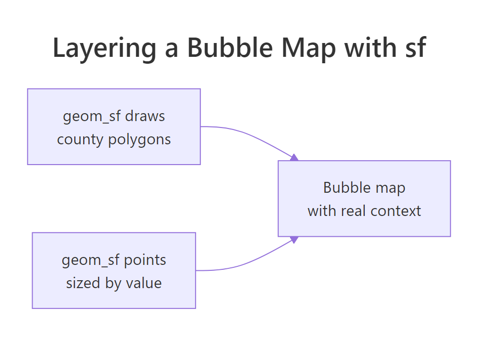
Figure 3: geom_sf draws the boundary basemap, then sized points layer on top.
Try it: Redraw the North Carolina bubble map using SID74 (sudden infant deaths) instead of BIR74. Reuse county_centres and change only the size aesthetic.
# Reuse county_centres; map size to SID74 instead of BIR74
# your code here
Click to reveal solution
ggplot(nc) +
  geom_sf(fill = "grey95", colour = "grey70") +
  geom_sf(data = county_centres, aes(size = SID74),
          colour = "darkblue", alpha = 0.6) +
  scale_size_area(max_size = 10, name = "Deaths (1974)") +
  theme_void()
Explanation: The only change is aes(size = SID74). Because deaths are much rarer than births, the bubbles are far smaller, and scale_size_area() keeps their areas honest so you do not overstate the counts.
Complete Example: a polished earthquake bubble map
Let's pull the pieces together into one finished map you could drop into a report. First a quick numeric summary of the earthquakes so we know what we are drawing.
The summary confirms 1,000 quakes ranging from magnitude 4.0 to 6.4, with an average depth of about 311 km. Now the polished map: we sort so big quakes sit at the back, size by magnitude with an honest area scale, color by depth with a reversed viridis scale so shallow quakes show up in bright yellow, and finish with a clean theme and a subtitle that explains the colors.
Run it and every technique from this tutorial is on screen at once: coordinates as position, magnitude as honest area, depth as color, transparency and draw order taming the overlap, and a coordinate system that keeps the shape true. That is a publication-ready bubble map built entirely from a data frame and ggplot2.
Practice Exercises
These combine several ideas from the tutorial. Each starter block runs as written, and the expected result is described so you can check your work. Use the distinct variable names in each starter so your code does not clash with the tutorial examples.
Exercise 1: Map only the strong quakes
Filter quakes down to the strong events with magnitude 5 or greater, then draw a bubble map with size = mag and colour = depth. You should find 198 quakes that qualify.
Click to reveal solution
Explanation: subset(quakes, mag >= 5) keeps the 198 strongest quakes, and the same bubble-map recipe reveals that the big events cluster tightly rather than spreading evenly.
Exercise 2: Label the three largest cities
Draw a bubble map of all ten cities sized by population, then add non-overlapping text labels for only the three largest. Use the ggrepel package, which nudges labels apart so they do not collide.
Click to reveal solution
Explanation: arrange(desc(pop)) |> head(3) picks Tokyo, Delhi, and Shanghai, and geom_text_repel() draws their names with little connector lines so the text never sits on top of a bubble.
Exercise 3: Map a rate, not a raw count
Raw counts favor big counties, so map a rate instead. For each North Carolina county compute the sudden infant death rate as SID74 / BIR74, then size the centroid bubbles by that rate. This one uses sf, so run it in your local R session.
# Compute the death-per-birth rate for each county
nc_rate <- nc |> mutate(rate = SID74 / BIR74)
rate_centres <- st_centroid(nc_rate)

# your code here: bubble map of rate_centres sized by rate, on the nc basemap
Click to reveal solution
nc_rate <- nc |> mutate(rate = SID74 / BIR74)
rate_centres <- st_centroid(nc_rate)

ggplot(nc_rate) +
  geom_sf(fill = "grey95", colour = "grey70") +
  geom_sf(data = rate_centres, aes(size = rate),
          colour = "firebrick", alpha = 0.6) +
  scale_size_area(max_size = 10, name = "SIDS rate") +
  theme_void() +
  labs(title = "Sudden infant death rate by county, 1974")
Explanation: Dividing deaths by births turns raw counts into a comparable rate, so a small county with a high rate is no longer hidden behind a big county with a high count. This is the same fairness fix that matters for choropleth maps.
Frequently Asked Questions
What is the difference between a point map and a bubble map?
A point map draws every location at the same size, so it answers only "where?". A bubble map maps a value to the size aesthetic, so each point's area also answers "how much?". A bubble map is a point map with one extra job.
Do I need the sf package to make a bubble map?
No. If your data has longitude and latitude columns, ggplot2 alone draws a perfectly good point or bubble map with geom_point(). You only reach for sf when you want real boundary shapes such as coastlines or county borders drawn behind the points with geom_sf().
Why does my map look stretched or squashed?
A plain scatterplot treats one degree of longitude and one degree of latitude as the same width, but they are not equal on the ground. Add coord_quickmap() for a quick fix, or coord_sf() when you are working with sf objects, and the aspect ratio will look right.
Should I use scale_size or scale_size_area?
Use scale_size_area() for bubble maps. It maps your value to the circle's area, which is what the eye actually judges. Plain scale_size() maps the value to the radius, which exaggerates large values because area grows with the square of the radius.
How do I stop bubbles from covering each other?
Three habits help. Sort the data so the largest bubbles are drawn first and sit at the back, add transparency with alpha so overlaps stay readable, and keep the size range modest with max_size so no single bubble dominates.
Which coordinate system should raw GPS points use?
Longitude and latitude straight from a GPS device are in WGS 84, whose EPSG code is 4326. When you convert a table with st_as_sf(), pass crs = 4326 so sf knows how to align your points with a basemap.
Summary
A point map is a scatterplot of longitude and latitude, and a bubble map adds a size aesthetic so each point's area carries a value. Build the points live with ggplot2, size them honestly by area, and add real boundaries with sf only when you need geographic context.
| Task | Function | Key argument |
|---|---|---|
| Plot points at coordinates | geom_point() |
aes(x = lon, y = lat) |
| Turn points into bubbles | aes(size = value) |
inside aes() |
| Size bubbles by area (honest) | scale_size_area() |
max_size |
| Fix the map aspect ratio | coord_quickmap() |
none |
| Draw boundary polygons | geom_sf() |
data = the sf object |
| One point per region | st_centroid() |
the sf object |
| Convert lon/lat to sf | st_as_sf() |
coords, crs = 4326 |
Three takeaways to keep:
- A map is a scatterplot: longitude is x, latitude is y.
- Map values to area with
scale_size_area(), never to radius, or you will exaggerate big values. - Reach for sf and
geom_sf()only when you need real boundaries behind your points.
References
- ggplot2 documentation -
geom_point()reference. Link - ggplot2 documentation -
scale_size()andscale_size_area()reference. Link - ggplot2 documentation -
geom_sf()andcoord_sf()reference. Link - ggplot2 documentation - viridis color scales. Link
- sf package - Simple Features for R. Link
- sf package - Simple Features vignette. Link
- The R Graph Gallery - Bubble map. Link
- R datasets - the
quakesearthquake data. Link
Continue Learning
- Choropleth Maps in R - shade whole regions by value with sf and
geom_sf(), the natural companion to bubble maps. - Interactive Maps in R with leaflet - turn a static map into a pan-and-zoom map your readers can explore.
- Scale Transformations in ggplot2 Beyond Log - go deeper on the scale functions that control size and color.