Scale Transformations in ggplot2 Beyond Log
A scale transformation in ggplot2 re-spaces an axis using a math function (like square root or logit) while keeping the tick labels in your original units. The transform= argument of scale_x_continuous() and scale_y_continuous() understands far more than log: sqrt, reverse, log1p, pseudo-log, logit, reciprocal, Box-Cox and modulus, plus any custom transform you build with new_transform().
Most tutorials stop at the log scale. That leaves you stuck the moment your data has zeros, negative numbers, proportions near 0 and 1, or a skew that log over-corrects. This guide picks up where the log tutorials end. It uses the tidyverse (ggplot2 with a little dplyr, the scales package, and patchwork for side-by-side plots). Every code block runs in your browser, so press Run and change anything you like as you read.
What is a scale transformation, and how is it different from transforming the data?
Real-world numbers are often lopsided. A handful of huge values squash everything else into a thin strip at the bottom of the plot, and all the interesting structure disappears. The diamonds dataset that ships with ggplot2 is a perfect example: most diamonds are cheap, a few are extremely expensive, so a plain price axis wastes most of its height on empty space. Before the fix, load the packages and measure just how wide the prices spread.
Prices run from 326 to 18823, a spread of nearly 58 to 1. On a plain linear axis that forces almost every diamond into a thin band near the bottom. A scale transformation fixes this in one line. Let's see it before we explain it.
Run that and compare the two panels. On the left, the points pile up along the bottom and the cloud is hard to read. On the right, the single line scale_y_continuous(transform = "log10") spreads the prices out so the shape of the relationship becomes clear. Nothing about the data changed. Only the spacing of the axis changed.
Here is the part that trips people up. Look at the y-axis labels on the log panel: they still read in dollars (300, 1000, 3000, and so on), not in log units. That is the whole point of a scale transformation. It moves where each value sits, but it prints the label in your original units.
To see why that matters, let's look at how skewed the raw prices are, then at what the log function actually does to them.
The median price is 2401 but the maximum is 18823, and the mean sits well above the median. That gap is the signature of right skew: a long tail of expensive diamonds pulls the average up. Now watch what happens if you transform the numbers yourself instead of transforming the scale.
If you called mutate(price = log10(price)) and plotted that, your axis would show 2.5, 3.4, 4.3. Those are log units, and almost nobody reads a chart in log units. The scale transformation positions each point using exactly these same log values, but it labels the ticks 326, 2401, 18823 in real dollars. You get the readable spacing of a log axis with the readable labels of the original data.
mutate() changes the numbers and the labels, leaving an axis in log units that readers cannot interpret.transform= argument is new in ggplot2 3.5. Earlier versions named it trans=. If transform = "log10" throws an "unused argument" error, update ggplot2, or use scale_y_continuous(trans = "log10") instead. The transformation names are identical either way.Try it: Start from the plot below and put the x-axis (carat) on a log scale too, so both axes are logarithmic. Add one more scale_x_continuous(transform = "log10") line.
Click to reveal solution
Explanation: Each axis has its own scale, so you transform them independently. With both on "log10", a power-law relationship (price roughly proportional to a power of carat) shows up as a straight-line cloud.
What transformations can you use beyond log?
The transform= argument accepts a name for every transformation the scales package knows about. Log is just one entry in a long list. Here are the built-in names you can drop straight into transform=.
| Name | What it does | Good for |
|---|---|---|
"log10", "log2", "log" |
Compresses large values | Right-skewed positive data, orders of magnitude |
"sqrt" |
Milder compression than log | Counts, areas, gentle skew |
"reverse" |
Flips the axis direction | Ranks, "lower is better" scores |
"log1p" |
Computes log(1 + x) | Counts that include zero |
"pseudo_log" |
Log-like but linear near zero | Data with zeros and negatives |
"logit", "probit" |
Stretches the ends of 0 to 1 | Proportions, probabilities |
"reciprocal" |
Uses 1/x spacing | Rates, "per unit" quantities |
"boxcox", "modulus" |
Tunable strength via a power | Dialing in the right amount of skew fix |
"reverse", "identity" |
Flip, or leave unchanged | Utility transforms |
For the three most common ones, ggplot gives you a shortcut so you do not even need the transform= argument: scale_y_sqrt(), scale_y_reverse(), and scale_y_log10() (each has an x twin). Let's try square root first. It compresses the big values like log does, but more gently, which suits count-like data where log feels too aggressive.
Notice the pattern: 10000 becomes 100, but 1 stays 1. Square root pulls the large numbers down hard while barely touching the small ones, so it evens out a skewed spread. Here it is on the diamonds cloud.
The tail is compressed, though less than the log panel earlier. Square root is the natural first thing to try when your data is skewed but log turns out to be too strong (we return to choosing strength in a later section).
Now reverse. It does not compress anything. It simply flips the axis so larger values sit at the bottom. That is exactly what you want when smaller means better, like a finishing position or a golf score. Under the hood, reverse just negates each value.
By storing 10 as -10 and 30 as -30, the axis order gets inverted while the printed labels stay 10, 20, 30. On a plot, the highest value now appears lowest.
scale_y_log10(), scale_y_sqrt(), and scale_y_reverse() are shorter and clearer than the equivalent transform= string, and they accept the same breaks, labels, and limits arguments as any other continuous scale.Try it: The mpg scatter plot below has a plain x-axis. Put engine displacement (displ) on a square-root x-axis using the shortcut function.
Click to reveal solution
Explanation: scale_x_sqrt() is the shortcut for scale_x_continuous(transform = "sqrt"). The displacement values spread out at the low end and pull in at the high end.
How do you plot data with zeros or negative values?
A log scale has a hard limit: it is only defined for positive numbers. The log of zero is negative infinity, and the log of a negative number does not exist as a real number at all. So the moment your data contains a zero or a negative value, a plain log scale quietly drops those rows and warns you (if you are lucky enough to notice). Let's build a small dataset that breaks a log axis on purpose: a running account balance that dips below zero.
The first three days alone are two negatives and a zero. Watch what the log function returns for values like these.
The negative becomes NaN (not a number) and the zero becomes -Inf (negative infinity). ggplot cannot place those on an axis, so it removes them. Your plot would silently lose every day the account was empty or overdrawn, which are often the days you care about most.
-Inf and NaN, and ggplot discards them with only a console warning. If your bar chart or line suddenly has gaps, check whether a log scale ate the values at or below zero.There are two fixes, depending on your data. If your values are counts that include zero but never go negative, log1p is the clean choice. It computes the log of one plus the value, so zero maps to zero instead of negative infinity.
Zero stays put at 0, and the larger counts still get compressed. For data that also goes negative, like our balance series, you need the pseudo-log transform. It behaves like a straight line near zero and like a logarithm far from zero, so it accepts negatives, zero, and positives all at once. With its default settings, pseudo-log is the inverse hyperbolic sine of half the value.
$$f(x) = \sinh^{-1}\!\left(\frac{x}{2}\right)$$
Where:
- $x$ = your original data value (can be negative, zero, or positive)
- $\sinh^{-1}$ = the inverse hyperbolic sine, which grows like a log for large inputs but passes smoothly through zero
If you are not interested in the formula, skip it. The code below is all you need. Watch how it treats a symmetric spread of values.
The output is perfectly symmetric: -500 and 500 map to equal and opposite values, and zero maps to zero. That is what lets pseudo-log put a negative balance and a positive balance on the same sensible axis. Here it is on the full series.
Every day is visible now, including the zero and the negatives, and the axis reads in real balance amounts. The custom breaks place ticks at nice round numbers on both sides of zero, which pseudo-log needs because its default ticks can land in awkward spots.
Try it: The counts below include a zero. A plain log scale would drop it. Give the y-axis a log1p transform so the zero stays on the chart.
Click to reveal solution
Explanation: log1p maps the zero counts to 0 instead of negative infinity, so the empty categories still appear as flat (zero-height) bars while the large counts get compressed.
How do you spread out proportions and probabilities near 0 and 1?
Proportions and probabilities live between 0 and 1, and they misbehave on a linear axis in a specific way: the interesting action happens at the ends. The difference between a 0.98 and a 0.99 success rate can matter enormously, but on a plain axis those two points sit almost on top of each other. The logit transform fixes this by stretching the ends of the 0-to-1 range so the crowded extremes get more space. The logit of a proportion is the log of its odds.
$$\text{logit}(p) = \ln\!\left(\frac{p}{1-p}\right)$$
Where:
- $p$ = a proportion strictly between 0 and 1
- $\frac{p}{1-p}$ = the odds (chance of success divided by chance of failure)
The odds shoot toward infinity as $p$ nears 1 and toward zero as $p$ nears 0, and the log of the odds turns that into a symmetric axis that pulls the crowded ends apart. Here is what it does to three values climbing toward 1.
The step from 0.5 to 0.9 covers about 2.2 units, and the step from 0.9 to 0.99 covers about another 2.4 units, even though on a plain axis that second step is a tenth the size. Logit gives the near-1 region as much visual space as the middle. Let's plot a set of conversion rates that span from near zero to near one.
On this axis, the gap between variant A at 0.012 and variant B at 0.028 is visible instead of being crushed against the floor, and the same is true for the high performers near the top. The breaks are set as plain proportions, and logit spaces them out for you.
Try it: Plot the rates data on a logit axis but leave out the breaks argument, so you can see the default tick placement logit chooses on its own.
Click to reveal solution
Explanation: Without custom breaks, logit picks its own tick positions. They are functional but often land on uneven proportions, which is why setting readable breaks like 0.05, 0.5, and 0.95 by hand usually reads better.
How do you match transform strength to skew?
Transforms are not all-or-nothing. They come in strengths, and part of the skill is choosing one that corrects your skew without over-correcting it. Statisticians call this idea the ladder of powers: an ordered set of transforms from mild to strong. Watch how each rung treats the number 1000.
Reading left to right, each transform pulls 1000 down harder than the last: square root to 31.6, log to 3, reciprocal all the way to 0.001. If square root leaves your data still skewed, step up to log. If log flattens it too far the other way, step back toward square root. Reciprocal is the strong end of the ladder and usually overshoots.
You can see this trade-off on a real distribution. The plot below shows the same skewed diamond prices under three different transforms at once, so you can judge which one balances the histogram best.
Square root leaves a clear right skew, log10 makes the distribution close to symmetric, and reciprocal overshoots into a messy left-piled shape. For these prices, log is the right rung.
When you want a dial rather than fixed rungs, the Box-Cox transform gives you one. It has a tunable power, usually written as lambda, that slides continuously between the rungs of the ladder. At lambda equal to 0 it becomes exactly the natural log.
$$f(x) = \frac{x^{\lambda} - 1}{\lambda} \quad (\lambda \neq 0), \qquad f(x) = \ln(x) \quad (\lambda = 0)$$
The two outputs are identical, which confirms the claim: Box-Cox at power 0 is the log. Change the power to 0.5 and you get something between square root and log.
Box-Cox only works on positive data. Its sibling, the modulus transform, applies the same tunable power but keeps the sign, so it handles negatives the way pseudo-log does.
The negative inputs come out negative and the positive inputs come out positive, symmetric around zero. Use transform = transform_boxcox(0.4) (or any power you like) inside a scale to dial in the exact strength your distribution needs. The decision guide below sums up the whole choosing process.
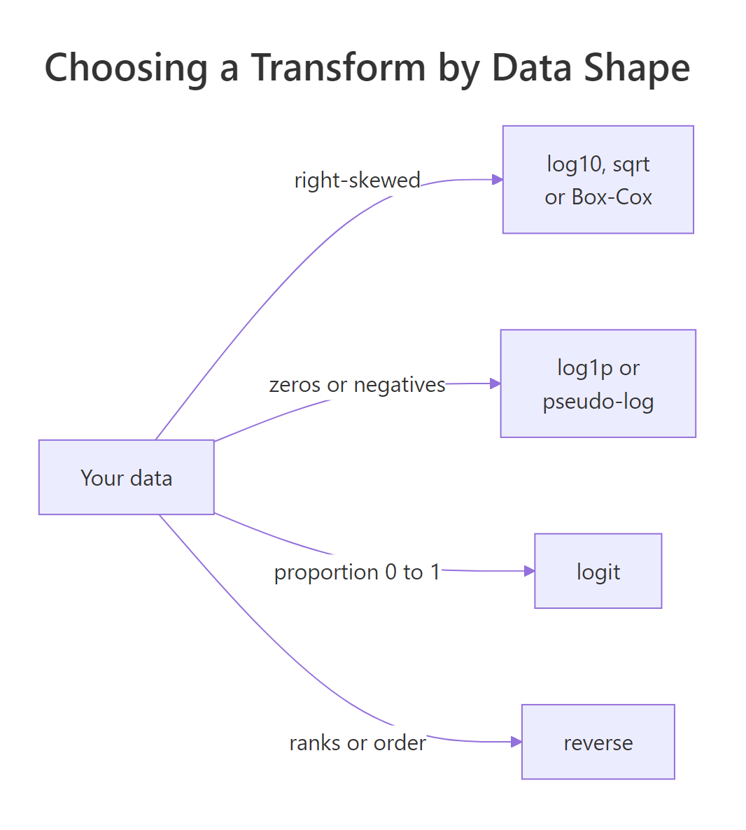
Figure 1: Match the transform to the shape of your data: skew, sign, bounds, or order each point to a different family.
Try it: Plot a histogram of diamond carat (also right-skewed) and compare a log10 x-axis against a sqrt x-axis. Which one looks more symmetric?
Click to reveal solution
Explanation: On carat, log10 splits the distribution into clear clusters around common carat sizes, while sqrt leaves more of the right skew. Log is the stronger rung, and for carat it reveals structure that square root does not.
Why does transform= change your fitted line when coord_transform() does not?
There are two ways to bend an axis in ggplot, and they are not interchangeable. A scale transform (transform=) rescales the data before any statistics are computed. A coordinate transform (coord_transform()) rescales the finished plot after the statistics are computed. When your plot has no statistics, they look identical. The instant you add something like a trend line, they diverge, and choosing the wrong one changes what your model actually fits.
Let's build a dataset that grows exponentially, then fit a straight line to it two different ways.
The users roughly multiply by 1.15 each week, which is exponential growth. Now fit a linear model in raw units and another in log units, then compare the coefficients. In these lm() calls, the formula users ~ week reads as "model users as a function of week".
These describe two completely different growth stories. The raw-units line adds about 494 users every week, a fixed step. The log-units line adds about 0.0595 to the log10 each week, and $10^{0.0595} \approx 1.15$, which is a fixed 15% multiplication per week. One is additive growth, the other is multiplicative growth. A scale transform makes geom_smooth() fit the multiplicative version, because it logs the data first; coord_transform() makes it fit the additive version, then bends the picture. Here are both, with geom_smooth(method = "lm") drawing the straight-line fit and se = FALSE hiding its shaded confidence band.
Because scale_y_log10() transforms the data before geom_smooth() runs, the line is a straight-line fit to the logged users. On a log axis, that appears as a genuinely straight line, and a straight line on a log axis is the correct picture of steady exponential growth.
Here geom_smooth() fits its straight line to the raw users first, and only then does coord_transform() squash the axis. The straight line gets bent into a curve by the squashing. Same data, same smoother, a different fitted relationship, purely because of when the transform happened.
transform= when you want the analysis done in transformed units (the usual case), and reserve coord_transform() for when you specifically want to keep a raw-space computation but squeeze the display.The diagram below shows exactly where each one sits in the plotting pipeline.
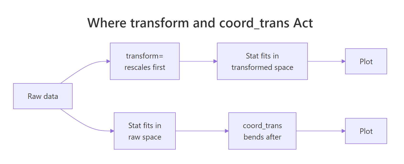
Figure 2: The scale transform rescales data before the statistics run, so fits happen in transformed space. The coordinate transform rescales after, so fits happen in raw space and are then bent.
coord_trans() to coord_transform(). If you are on an older ggplot2, use coord_trans(y = "log10") instead; it behaves the same.Try it: Take the scale-transform plot and swap scale_y_log10() for coord_transform(y = "log10"). Watch the trend line change from straight to curved.
Click to reveal solution
Explanation: The only change is the last line. The smoother now fits a straight line to raw users, and coord_transform() bends that straight line into a curve when it compresses the axis. The fitted relationship is additive, not multiplicative.
How do you build a custom transformation?
When none of the built-in names fit, you can define your own transform with new_transform(). You supply three things: a function that transforms values, a function that inverts the transform (so ggplot can label the axis in original units), and a rule for where to place ticks. As an example, let's build a signed cube-root transform: gentle like square root, but it keeps the sign so it works on negatives, which is handy for data that spans zero.
The transform sends 27 to 3, -27 to -3, and leaves 0 at 0, exactly as a signed cube root should. The inverse function raises values back to the third power so the axis can print original units, and extended_breaks() (from the scales package) picks sensible tick positions. Now use it in a scale exactly like a built-in, on the balance data from earlier.
The negatives and the zero all sit on a single gentle axis, an alternative to pseudo-log with a milder pull. Because you defined the inverse, the ticks still read in real balance units.
Custom transforms often need custom breaks and labels, because the default ticks can look strange in transformed space. This is also where the scales package label helpers earn their keep. Here is a log axis with hand-picked breaks and dollar formatting.
The breaks place ticks at round dollar amounts across the compressed axis, and label_dollar() prints each one with a dollar sign and thousands separators. This combination, a transform plus deliberate breaks and labels, is what turns a technically-correct transformed axis into one that is genuinely easy to read.
new_transform() and transform_*() (like transform_pseudo_log()). Older code used trans_new() and *_trans() (like pseudo_log_trans()). The transform= argument and every example here work either way, but prefer the new names on current installations.Try it: Add dollar labels and a few custom breaks to a square-root price axis, so the ticks read as clean dollar amounts.
Click to reveal solution
Explanation: The shortcut scale_y_sqrt() accepts the same breaks and labels as any continuous scale, so you get a square-root axis with tidy dollar ticks.
Complete Example
Let's pull the ideas together into one polished figure. We have weekly active users that grow exponentially, so the right choice is a log axis (matching the shape of the data), with hand-picked breaks and comma-formatted labels so the numbers read cleanly, and a linear smoother so the growth trend is obvious.
Read the recipe top to bottom. scale_y_log10() chooses the transform that matches exponential data, breaks places ticks at round user counts from 1,000 to 8,000, and label_comma() prints them with thousands separators. Because the transform happens before geom_smooth(), the red line is a straight-line fit in log space, so its straightness is a visual confirmation that growth is steady and multiplicative. That is a scale transformation, breaks, labels, and the transform-before-stat rule all working together in one chart.
Practice Exercises
Time to combine what you have learned. Each exercise uses new variable names so it will not clash with the tutorial code above.
Exercise 1: A readable axis for conversion rates
You have conversion rates for six pages, ranging from a tiny 0.004 up to a near-perfect 0.991. Plot them so the extremes are readable: use a logit axis, set breaks at sensible proportions, and format the labels as percentages.
Click to reveal solution
Explanation: The logit transform stretches the crowded ends of the 0-to-1 range, so the 0.4% page and the 99.1% page both get visible space. The breaks mark familiar proportions and label_percent() prints them as 0.5%, 5%, 25%, and so on.
Exercise 2: A custom transform for profit and loss
Trading results swing from a 2,400 loss to a 3,100 gain and include a zero. A log axis is impossible here. Build your own signed square-root transform (mild, keeps the sign) and use it on the y-axis so wins and losses share one readable scale.
Click to reveal solution
Explanation: The signed square root keeps the sign of each value while compressing its size, so -100 maps to -10 and 100 maps to 10. That lets the big loss and the big gain both fit without hiding the small trades near zero, and the inverse function keeps the tick labels in real currency units.
Exercise 3: Fit in the right space
An intensity signal decays exponentially over 15 hours. You want a straight-line fit that respects the multiplicative decay, so the fit must happen in log space. Plot the points with a linear smoother, and choose the transform tool that fits the line before the axis is bent.
Click to reveal solution
Explanation: scale_y_log10() transforms the data before geom_smooth() runs, so the straight line is fitted to the logged signal, which is the correct model for exponential decay. If you had used coord_transform(y = "log10") instead, the line would be fitted to the raw signal and then bent, describing additive decay rather than the multiplicative decay the data actually follows.
Summary
Scale transformations let you reshape an axis to fit the shape of your data, and the family reaches far beyond log. The table below is your quick reference for choosing one.
| Transform | Use it when | How to call it |
|---|---|---|
sqrt |
Gentle right skew, counts | scale_y_sqrt() |
log10 |
Strong right skew, orders of magnitude | scale_y_log10() |
reverse |
Lower is better, ranks | scale_y_reverse() |
log1p |
Counts that include zero | transform = "log1p" |
pseudo_log |
Data with zeros and negatives | transform = "pseudo_log" |
logit |
Proportions near 0 and 1 | transform = "logit" |
reciprocal |
Rates, strong correction | transform = "reciprocal" |
boxcox / modulus |
Tunable strength (with or without negatives) | transform = transform_boxcox(0.4) |
| custom | None of the above fit | new_transform(...) |
Two habits will save you the most trouble. First, remember that a scale transform relabels the axis in original units, while transforming the column yourself leaves the axis in raw log or root units that readers cannot follow. Second, keep transform= and coord_transform() straight: the scale transform acts before your statistics so fits and summaries happen in transformed space, and the coordinate transform acts after, bending finished geometry. The mind map below gathers the whole toolkit in one view.
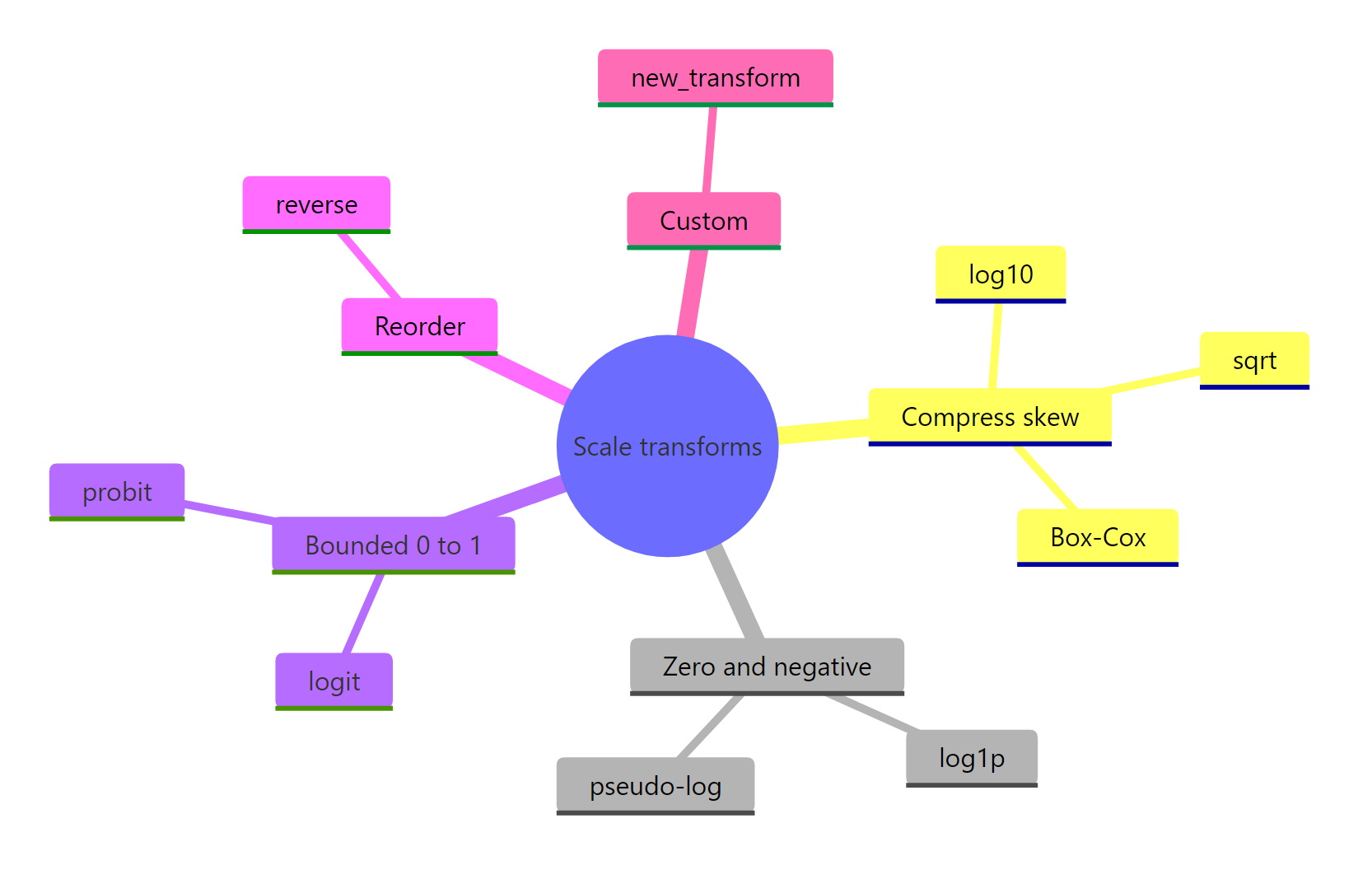
Figure 3: The scale-transform toolkit, grouped by the problem each family solves.
Frequently Asked Questions
Why do my axis labels look strange after I transform the scale?
The transform re-spaces the axis, so the default tick positions can land on values that made sense in transformed space but look odd in original units. The fix is to set breaks yourself at round numbers and, if needed, format them with a scales helper like label_dollar(), label_comma(), or label_percent(). On a log axis, for example, pass breaks = c(100, 1000, 10000) rather than letting ggplot choose.
What is the difference between transform= and coord_transform()?
transform= (inside a scale) rescales the data before ggplot computes any statistics, so a geom_smooth() line, error bars, and boxplot summaries are all calculated in transformed units. coord_transform() rescales the finished plot after the statistics are done, so those computations stay in raw units and only the picture is bent. For almost every analysis you want transform=; reach for coord_transform() only when you deliberately want a raw-space computation squeezed onto a nonlinear display.
My log plot dropped some points and showed a warning. Why?
A log scale is undefined for zero and negative numbers, so ggplot converts them to -Inf and NaN and removes those rows, warning you in the console. If your data legitimately includes zeros or negatives, switch to transform = "log1p" for counts with zeros, or transform = "pseudo_log" for data that also goes negative. Both keep every row on the chart.
Is a scale transform the same as transforming the column with mutate()?
No, and the difference is the axis labels. If you run mutate(y = log10(y)) and plot the result, the axis shows log units like 2, 3, 4 that most readers cannot interpret. A scale transform positions the points using the same log values but prints the ticks in your original units. Use mutate() when you need the transformed numbers for a model or table, and use the scale transform when you only want the chart to read well.
References
- ggplot2 documentation. Position scales for continuous data (scale_continuous), including the
transformargument and built-in names. Link - Wickham, H., Navarro, D., and Pedersen, T. L. ggplot2: Elegant Graphics for Data Analysis, Scale transformation section. Link
- scales package reference. Transformation objects and the full transform index. Link
- scales package.
new_transform()for building custom transformations. Link - scales package.
transform_pseudo_log()and the asinh-based pseudo-log. Link - Wickham, H. and Grolemund, G. R for Data Science, chapter on graphics for communication. Link
- The R Graph Gallery. Custom axis and scale transformations in ggplot2. Link
Continue Learning
- ggplot2 Log Scale: Transform Axes the Right Way The focused deep dive on the single most common transform, with breaks and label patterns for log axes.
- ggplot2 scale_y_continuous() in R: Customize the Y Axis Everything the y scale can do beyond transforms: limits, breaks, expansion, and secondary axes.
- ggplot2 Coordinate Systems How
coord_*()functions work, the family thatcoord_transform()belongs to, and when to bend the whole coordinate space.