Raincloud Plots in R: Distribution Comparisons that Work
A raincloud plot stacks three views of the same numbers: a half-violin that shows the distribution's shape (the cloud), a boxplot that shows the summary, and jittered raw points that show every observation (the rain). It reveals gaps, clusters, and skew that a boxplot alone would hide, which makes it one of the clearest ways to compare groups.
This tutorial builds a raincloud plot from scratch using only core ggplot2, so you understand every layer instead of copying a black-box function. Every code block below runs directly in your browser: press Run and change the numbers. We use base R and the tidyverse staples ggplot2 and dplyr, and near the end we look at packages that automate the whole thing once you know how the pieces fit.
Why do boxplots hide what raincloud plots reveal?
A boxplot squeezes a whole distribution down to five numbers: the minimum, the first quartile, the median, the third quartile, and the maximum. That summary is useful, but it throws away the shape. Two groups can have almost the same five numbers while having completely different distributions, and the boxplot will not tell you.
Let's prove it. We will make two groups on purpose. Group A is a single smooth hump. Group B is two separate clusters (bimodal), which is what you get when two subgroups are mixed together in the same column. We tune Group B so its quartiles land almost exactly on Group A's.
Read the table row by row. Group A and Group B share the same median (about 50) and nearly the same first and third quartiles (about 43 and 57). A boxplot draws its box from Q1 to Q3 with a line at the median, so both boxes will look like near-twins. The takeaway: the five-number summary cannot distinguish these two groups.
Now draw the boxplots and see for yourself.
The two boxes are practically identical, and nothing on the chart hints that the groups differ. If you stopped here, you would report "same distribution" and move on. That would be wrong.
Watch what happens when we swap the boxplot for a violin, which mirrors the distribution's density so its width shows where values pile up.
Now the difference is obvious. Group A is a single bulge in the middle. Group B pinches in the center and bulges twice, once low and once high: two hidden clusters the boxplot completely erased. Same summary numbers, very different stories.
A raincloud plot is the natural next step. It keeps the density shape from the violin, adds the boxplot summary back in, and layers the raw points on top so you can also count and inspect individual observations. You get all three views in one glance.
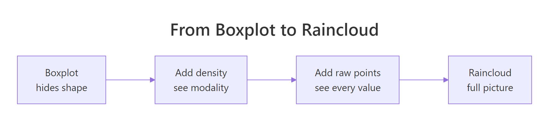
Figure 1: Boxplots hide a distribution's shape; a raincloud adds density and raw points to show the full picture.
Try it: Add the raw points to the boxplot so you can see the two clusters in Group B directly. Use geom_jitter() with a small width on top of the existing boxplot.
Click to reveal solution
Explanation: geom_jitter() scatters each point a little sideways so they do not stack into one line. Even with the box on top, Group B's two clouds of points are now visible. width = 0.15 keeps the scatter narrow, and alpha = 0.3 makes overlapping points readable.
What are the three layers of a raincloud plot?
A raincloud plot is not a special chart type with its own function. It is three ordinary ggplot2 layers stacked in one panel, each showing the same numbers a different way.
- The cloud: a half-violin (a density curve) that shows the distribution's shape.
- The summary: a narrow boxplot that shows the median and quartiles.
- The rain: jittered points that show every individual value.
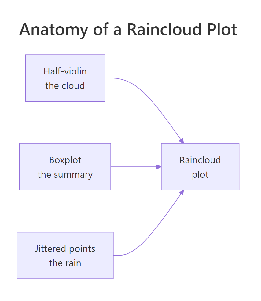
Figure 2: The three layers of a raincloud plot: half-violin cloud, boxplot summary, and jittered rain.
Before we build the polished half-violin version, let's assemble a rough draft using only stock ggplot2 geoms, so the three-layer idea is concrete. We will use the built-in iris dataset and plot sepal length for each of its three species.
Read the layers from the code, bottom of the list to top of the chart. geom_violin() draws the grey density shape. geom_boxplot(width = 0.12) draws a slim box inside it, with outlier.shape = NA so outlier dots are not drawn twice (the jitter layer already shows every point). geom_jitter(width = 0.08) sprinkles the raw points on top. The order matters: later layers draw on top of earlier ones.
This already shows all three views together. So what is wrong with it? Look closely: the violin is a full, mirrored shape, and the points sit right on top of it. The two halves of the violin are redundant (a mirror image adds no information), and the points and box are crammed into the same space as the density. A true raincloud fixes this by using only half of the violin, freeing up the other side for the box and the rain.
Try it: The points above are a little faint and tightly packed. Make them easier to see by widening the jitter slightly and raising the opacity.
Click to reveal solution
Explanation: Raising width to 0.12 spreads the points wider so fewer overlap, and alpha = 0.7 makes each point more solid. There is a trade-off: too much width and the points drift away from their group; too little and they merge into a bar.
How do you draw the half-violin cloud from scratch?
The cloud is the only piece core ggplot2 does not give you directly. There is no built-in "half-violin" geom. But a violin is just a density curve, and a density curve is something we can compute ourselves with base R's density() function. Once we have the curve, we draw one side of it as a filled shape.
Start by looking at what density() returns for a single group.
density() returns two matched vectors of 512 points. d$x is a fine grid of values along the measurement axis (sepal length), and d$y is how dense the data is at each of those values. Where d$y is large, many observations pile up; where it is small, the data thins out. That pair of vectors traces the outline of one side of a violin.
To turn that outline into a filled half-violin, we anchor it against a vertical baseline. The plan for each group is: place the group at an integer position on the x-axis (group 1 at x = 1, group 2 at x = 2, and so on), push the density outward from that baseline to form the curved edge, then close the shape back along the baseline. Here is a small helper that does exactly that for every group in a dataset.
Walk through what the helper builds. For each group i, it computes the density, then rescales d$y so the widest part of the curve sticks out by width (0.4 by default). The x column holds the curve going outward (i + scaled) followed by the flat baseline coming back (rep(i, ...)), and the y column holds the value grid out and then in reverse. Reading head(cloud, 4), you can see setosa's shape starts at x just above the baseline of 1.0 and y near 3.93 cm, which is the low end of setosa's sepal lengths. Chaining outward-curve plus return-baseline gives geom_polygon() a closed outline it can fill.
Now draw the clouds on their own with geom_polygon(). We relabel the integer x positions with the species names so the axis reads normally.
Each species now has a one-sided violin: a filled shape that bulges where its sepal lengths are common and tapers where they are rare. group = grp keeps the three polygons separate so ggplot2 does not try to connect them into one blob, and scale_x_continuous() swaps the numbers 1, 2, 3 for the species names. This is the cloud. Next we hang the box and the rain off the same baseline.
density(vals, adjust = 0.5) for a bumpier curve that follows the data closely, or adjust = 2 for a smoother one. Add an adjust argument to build_cloud() if you want to tune it per plot.Try it: The clouds are a little wide. Rebuild them at half the width so they take up less room, then redraw.
Click to reveal solution
Explanation: The width argument sets how far the widest part of each cloud reaches from its baseline. Dropping it from 0.4 to 0.2 halves the horizontal spread, which is handy when you have many groups packed close together.
How do you assemble and compare groups with a raincloud plot?
Now we combine all three layers. The trick is positioning: the cloud sits to the right of each group's baseline, the box sits just left of it, and the rain sits further left still. We shift the box and points with small offsets from the integer positions, and we jitter the points with a touch of randomness so they do not stack.
Each layer gets its own horizontal slot around the group's integer position. The cloud (geom_polygon) uses the cloud data we built, which already reaches to the right. The box (geom_boxplot) is nudged to position - 0.08 and kept slim with width = 0.06. The rain (geom_point) is nudged furthest left to about position - 0.22, with runif() adding a small random wobble so points do not line up. set.seed(11) makes that wobble reproducible. The result is a full raincloud for all three species, built entirely from parts you now understand.
Reading it, setosa (left) has short sepals in a tight cloud, while virginica (right) has longer sepals and a wider spread. The three species separate cleanly, which is exactly the kind of comparison a raincloud is built for.
Speaking of comparison, the order of the groups matters. When groups sit in a meaningful order, differences pop out. Let's compare fuel economy across engine sizes in the built-in mtcars data and order the cylinder groups by their median miles per gallon.
tapply() computes the median mpg for each cylinder count: 26.0 for four-cylinder cars, 19.7 for six, and 15.2 for eight. We then rebuild the cyl factor with its levels sorted by those medians, so the plot lays the groups out from lowest median to highest instead of in numeric order. Reordering a factor is the single most useful move for making a group comparison readable.
The same build_cloud() helper works on any dataset: here we pass cars, the cyl column, and mpg. Because we ordered the factor by median, the clouds climb steadily from eight cylinders (thirsty, low mpg) on the left to four cylinders (efficient, high mpg) on the right. The eight-cylinder cloud even hints at two sub-groups, which the handful of raw points confirm. That is a story the ordered raincloud tells at a glance.
Try it: Give each cloud a fill color driven by the cylinder group and see how color reinforces the grouping. Map fill = grp is already there; add scale_fill_manual() with three colors of your choice.
Click to reveal solution
Explanation: scale_fill_manual() assigns a specific color to each level of the fill variable, in level order. Here the three hex codes color the three cylinder groups in order. Custom fills let you match a brand palette or use color to signal meaning (for example, red for the worst group).
How do you make horizontal and faceted rainclouds?
Vertical rainclouds work, but horizontal ones are often easier to read, especially when group names are long. Turning the plot on its side is a one-line change: add coord_flip(). We also swap in a cleaner theme.
coord_flip() swaps the axes so the clouds now lie on their backs, growing upward, with the box and rain below each one. Nothing else about the code changes: the positioning logic still works because we only flipped the finished plot. theme_minimal() strips the grey background for a lighter look. Horizontal rainclouds read top to bottom like a list, which suits reports and slides.
To split a raincloud by a second variable (say, comparing the same groups across two conditions), add facet_wrap(~ condition) so ggplot2 draws one panel per condition. Because the package geoms recompute their statistics per panel, faceting works out of the box with ggdist or ggrain. The from-scratch cloud is precomputed for the whole dataset, so to facet it you build the cloud within each condition first, then the same positioning logic works inside every panel.
width above about 0.1) or a broad jitter will overlap the cloud and turn the panel into a smear. Start small and widen only if there is room.Try it: Give the horizontal plot a colorblind-friendly palette using scale_fill_brewer(). The ColorBrewer "Set2" palette is a safe default.
Click to reveal solution
Explanation: scale_fill_brewer(palette = "Set2") applies a ready-made ColorBrewer palette designed to stay distinguishable for colorblind readers. ggplot2 ships many Brewer palettes; "Set2", "Dark2", and "Paired" are good qualitative choices for group fills.
Which R packages make raincloud plots easier?
Now that you understand the layers, you can appreciate the packages that automate them. They do exactly what you just did by hand, wrapped in a single call. Two are worth knowing.
The ggdist package is the most popular. Its stat_halfeye() draws the half-violin cloud, and stat_dots() draws the rain as a neat dot cloud instead of jittered points, so nothing overlaps.
install.packages(c("ggdist", "ggrain")).library(ggdist)
ggplot(iris, aes(x = Species, y = Sepal.Length, fill = Species)) +
stat_halfeye(adjust = 0.5, width = 0.6, justification = -0.2,
.width = 0, point_colour = NA) +
geom_boxplot(width = 0.12, outlier.shape = NA, alpha = 0.5) +
stat_dots(side = "left", justification = 1.1, dotsize = 0.4) +
labs(x = "Species", y = "Sepal length (cm)") +
theme(legend.position = "none")stat_halfeye() builds the cloud and nudges it to the right with justification = -0.2, geom_boxplot() adds the slim box, and stat_dots() piles the raw points to the left with side = "left". Setting .width = 0 and point_colour = NA hides the small interval marker that stat_halfeye() draws by default, leaving a clean half-violin. The output looks like the raincloud you built by hand, with tidier dot stacking.
The newer ggrain package goes further: geom_rain() draws the whole raincloud in one layer.
library(ggrain)

ggplot(iris, aes(x = Species, y = Sepal.Length, fill = Species)) +
  geom_rain() +
  labs(x = "Species", y = "Sepal length (cm)") +
  theme(legend.position = "none")
geom_rain() places the cloud, box, and rain automatically, and it can even connect points across conditions for repeated-measures data. It is the quickest way to a raincloud once the packages are installed. Another option you may see in older tutorials is gghalves, which supplies geom_half_violin() and matching half-geoms; it works the same way by giving you one-sided layers to stack.
For a deeper walkthrough of the ggdist approach and its uncertainty features, see our ggdist package tutorial. The from-scratch method in this post and the package method produce the same picture: use whichever fits your project.
Try it: You do not need a package to restyle your raincloud. Take the from-scratch iris raincloud and give it a soft, publication-ready look with a Brewer palette and a minimal theme.
Click to reveal solution
Explanation: No package is needed to polish a raincloud. scale_fill_brewer() recolors the clouds, theme_minimal() lightens the background, and dropping the legend removes redundancy since the axis already labels each group.
Complete Example
Let's put every step together on a fresh dataset. The built-in chickwts data records the weights of chicks fed six different diets. We want to compare the weight distributions across feeds and see which diet produces the heaviest, most consistent chicks. This is a textbook raincloud job: six groups, and we care about both the typical value and the spread.
The preparation step is the one that makes or breaks the comparison: order the feeds by their median weight so the plot reads as a ranking.
tapply() gives the median weight for each feed, and sorting shows the ranking: horsebean chicks are lightest at a median of 152 grams, while casein-fed chicks are heaviest at 342 grams. We rebuild the feed factor with its levels in that sorted order, so the raincloud will stack from lightest at the bottom to heaviest at the top.
This reuses the exact same build_cloud() helper and positioning pattern from earlier, now on six groups. Reading the finished plot from bottom to top, horsebean produces light chicks with a tight cloud, casein and sunflower produce the heaviest, and sunflower's cloud is noticeably wider, meaning its results are less consistent. A single chart answers both questions we started with: which feed is best on average, and which is most reliable. That is the payoff of a raincloud: it shows the group ranking and the full spread at once, with every raw point still visible.
Practice Exercises
These combine the pieces from the whole tutorial. Each solution runs in the browser, and all reuse the build_cloud() helper you defined earlier on this page.
Exercise 1: A single-group raincloud for skew
The airquality dataset has an Ozone column with missing values. Drop the missing rows, then draw a single raincloud for Ozone. Because there is only one group, place it at x = 1. Look at the finished cloud: is ozone symmetric, or skewed?
Click to reveal solution
Explanation: With one group, everything centers on x = 1. The cloud is clearly right-skewed: it bunches up at low ozone values and stretches a long tail toward high ones. A boxplot would show the same skew only faintly through an off-center median; the cloud makes it unmistakable.
Exercise 2: Compare two transmissions, ordered by median
Using mtcars, compare miles per gallon between automatic and manual cars. The am column is 0 for automatic and 1 for manual. Turn it into a readable factor, order the two groups by median mpg, and draw a raincloud comparing them.
Click to reveal solution
Explanation: Automatic cars have a median of 17.3 mpg and manual cars 22.8, so sorting puts automatic first. The rainclouds show manual cars are not just higher on average but also more spread out, a difference the medians alone would not reveal.
Exercise 3: Add a mean marker to each group
Means and medians can differ, and showing both is a nice touch. Take the from-scratch iris raincloud and add a white diamond at each species' mean sepal length, sitting at the box position. Use aggregate() to compute the means.
Click to reveal solution
Explanation: aggregate() returns one mean per species, and we add an x column to line the diamonds up with the boxes. shape = 23 is a filled diamond, and drawing it last puts it on top of the box. Because iris sepal lengths are fairly symmetric, the white mean diamonds sit close to the median lines; on skewed data they would pull toward the long tail.
Frequently Asked Questions
When should I use a raincloud plot instead of a boxplot?
Use a raincloud whenever the shape of the distribution matters, not just its median and quartiles. A boxplot hides whether a group is bimodal, skewed, or clustered, while a raincloud shows the density curve and every raw point. For a quick five-number comparison a boxplot is still fine; reach for a raincloud when a hidden pattern would change your conclusion.
Do I need a special package to make a raincloud plot in R?
No. A raincloud is three ordinary ggplot2 layers stacked in one panel (a half-violin, a boxplot, and jittered raw points), and this tutorial builds one with core ggplot2 alone. Packages such as ggdist and ggrain automate the assembly and add polish, but they do the same job you can do by hand.
Why is it called a raincloud plot?
The half-violin density sits to one side like a cloud, and the jittered raw points scatter beside it like falling rain. The name is a description of the picture: a cloud of density with the individual observations shown as rain below it.
How much data do I need for a raincloud plot?
The cloud is a kernel density estimate, so it needs enough points to mean something. With fewer than about ten values in a group, the smooth curve can look more confident than the data warrants, so lean on the raw points for very small groups. A few dozen observations per group or more gives a cloud you can trust.
How do I make a raincloud plot horizontal?
Add coord_flip() to the finished plot, as the horizontal section above shows. It swaps the axes so the clouds lie sideways, which reads well when group labels are long or you have many groups. Keep the box narrow and the jitter modest so the flipped layers do not overlap.
Summary
A raincloud plot is three ggplot2 layers on one baseline: a half-violin cloud, a slim boxplot, and jittered raw points. Building it by hand, you learned that the cloud is just a density curve drawn on one side, and that clever x-axis positioning is what keeps the three layers from colliding.
| Layer | What draws it (from scratch) | What it shows |
|---|---|---|
| Cloud | geom_polygon() on a density() outline |
The distribution's shape (peaks, gaps, skew) |
| Summary | geom_boxplot() nudged left, narrow |
Median and quartiles |
| Rain | geom_point() jittered, furthest left |
Every individual observation |
| Order | factor(levels = names(sort(medians))) |
A readable ranking of groups |
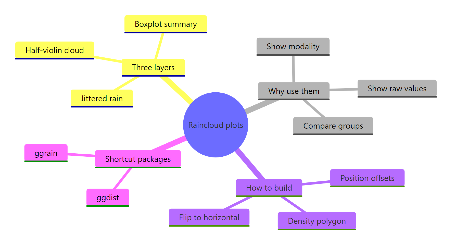
Figure 3: An overview of raincloud plots: their layers, why they help, how to build them, and shortcut packages.
Reach for a raincloud whenever you would have drawn a boxplot but the shape matters: when a group might be skewed or bimodal rather than a single smooth hump. Order the groups by median, flip to horizontal for long labels, and once you are comfortable, let ggdist or ggrain do the assembly for you.
References
- Allen, M., Poggiali, D., Whitaker, K., Marshall, T. R., & Kievit, R. A. (2019). Raincloud plots: a multi-platform tool for robust data visualization. Wellcome Open Research, 4:63. Link - the paper that introduced and named the raincloud plot.
- ggplot2 reference:
geom_violin(). Link - the density layer the cloud is built from, with every argument documented. - ggplot2 reference:
geom_boxplot(). Link - options for the summary layer, includingoutlier.shapeandwidth. - R documentation:
density()kernel density estimation. Link - how the cloud's curve is computed and whatadjustandbwcontrol. - ggdist: Visualizations of Distributions and Uncertainty. Link - the package way to draw the cloud, plus uncertainty and interval geoms.
- ggrain: A Rainclouds Geom for ggplot2. Link - a one-call
geom_rain(), including connected points for repeated measures. - Scherer, C. Raincloud Plots with ggplot2. Link - a widely cited walkthrough with polished styling ideas.
Continue Learning
- Violin Plot in R: the full-density cousin of the cloud, and where the raincloud's shape layer comes from.
- ggdist Package in R: the package way to build rainclouds, plus uncertainty and interval visualizations.
- ggplot2 geom_boxplot in R: master the boxplot layer that forms a raincloud's summary.