Coefficient Plots and Marginal Effects in R with broom
A coefficient plot turns a regression's numbers into a picture: a dot for each predictor's estimated effect and a line for its confidence interval, so you can see at a glance which predictors matter and how sure you are. Marginal effects go one step further, translating those coefficients into the real change they cause in the outcome, which is what you need the moment the model is nonlinear.
This guide builds both from scratch. We use base R and the tidyverse together: the broom package to reshape models and ggplot2 to draw them, plus plain predict() to compute effects by hand so you can see exactly what is happening. The first several sections run right here in your browser, so you can execute every line as you read. The final package section, which uses marginaleffects, you run in your own R session. No prior knowledge of regression interpretation is assumed; every idea is explained before we use it.
How do you turn a regression into a coefficient plot?
A regression summary() dumps a wall of numbers. To compare predictors you squint across rows of estimates and standard errors. A coefficient plot fixes that: it draws each estimate as a dot and its uncertainty as a line, so the whole model reads in one glance. The fastest route there is the broom package, which reshapes any model into a tidy table that pipes straight into ggplot2. Let's build one.
We start with a linear model on the mtcars dataset, which ships with R. We predict fuel economy (mpg) from three things: weight (wt, in thousands of pounds), horsepower (hp), and quarter-mile time (qsec, seconds to cover a quarter mile). The tidy() function from broom takes the fitted model and hands back a neat table, one row per coefficient. Setting conf.int = TRUE adds a 95% confidence interval.
That single table is the payoff. Each row is one term in the model, and the columns give you everything you need to plot it. estimate is the coefficient itself, the model's best guess for that predictor's effect. std.error measures how precise that guess is. conf.low and conf.high are the two ends of the 95% confidence interval, the range of values consistent with the data. p.value is the classic significance number. Everything you need for a plot is now in tidy columns, which is exactly what ggplot2 wants.
Now let's draw it. We drop the intercept (it is just the baseline, not usually interesting to compare), put the coefficient estimate on the x-axis and the term names on the y-axis, and use geom_pointrange() to draw a dot at the estimate with a horizontal line spanning the confidence interval. A dashed vertical line at zero gives the eye a reference.
Run that block and you get three rows, one per predictor. Each has a dot (the estimate) and a whisker (the confidence interval). The wt dot sits well to the left of zero with a whisker that never touches the dashed line, so heavier cars clearly get worse mileage. The hp and qsec whiskers straddle zero, meaning we cannot be sure their effects are anything other than noise. You just read three coefficients and their uncertainty in one look, something the raw table makes you work for.
Try it: Add the rear axle ratio drat as a fourth predictor, re-tidy the model, and look at the new coefficient table. Does drat land clearly on one side of zero?
Click to reveal solution
Explanation: drat has a positive estimate (1.66), but its interval runs from -0.84 to 4.15, straddling zero. On a coefficient plot its whisker would cross the zero line, so the data do not pin down its direction.
How do you read the dots and whiskers?
The plot only helps if you know how to read it, so let's slow down on the three things every coefficient plot shows. Getting these straight turns the picture from decoration into a decision tool.
- The dot is the point estimate. It is the model's single best guess for that coefficient. Further from zero means a larger estimated effect.
- The whisker is the confidence interval. It shows the range of coefficient values consistent with the data. A short whisker means a precise estimate; a long whisker means the data leave a lot of room.
- The zero line is the "no effect" mark. If a predictor had no relationship with the outcome, its coefficient would be zero. So the position of the whisker relative to that line is what matters most.
Here is the rule that ties them together. When a whisker crosses the zero line, the data cannot rule out zero, so you treat that predictor as not statistically significant at the 95% level. When the whole whisker sits to one side, the effect has a clear direction you can trust.
Let's make the plot easier to read. We reorder the terms so the largest effect sits at the top using fct_reorder() from the forcats package, add clear axis labels, and switch to a clean theme.
Run it and the story jumps out. The wt dot is far to the left, near -4.4, with a whisker that stays entirely below zero, so weight has a strong, reliable negative effect on mileage. The hp and qsec dots hug the zero line with whiskers that cross it, so on this evidence we cannot say they matter. Reordering by estimate and dropping the intercept turns a raw model into something a reader grasps in seconds.
Try it: Reorder the terms by the size of the effect regardless of direction, so the biggest mover sits on top. Use abs() inside fct_reorder(), then check the factor order.
Click to reveal solution
Explanation: fct_reorder(term, abs(estimate)) sorts the factor by absolute value, smallest first, so wt (the largest effect) becomes the last level and plots at the top of a ggplot y-axis.
Why can't you compare coefficients on different scales?
Look again at the last plot and a tempting thought appears: wt has a coefficient near -4.4 while hp is near -0.02, so weight must matter roughly two hundred times more than horsepower. That reasoning is wrong, and the reason why is the single most common mistake people make when reading coefficients.
A coefficient answers "how much does the outcome change when this predictor goes up by one of its units?" But the units are wildly different. Let's line up the raw magnitudes to see the trap.
The hp coefficient looks tiny only because one unit of horsepower is a tiny step. Cars in this data range over almost 300 horsepower, so moving "one hp" barely registers. Weight spans only about 3.9 units (thousands of pounds), so "one unit of weight" is a huge fraction of the range. The coefficients are measured in different currencies, and you cannot compare prices across currencies without an exchange rate.
The fix is to standardize the predictors: rescale each one so it is measured in standard deviations rather than its native units. R's scale() function subtracts the mean and divides by the standard deviation. Now a coefficient means "the change in mpg per one standard deviation of this predictor," and every predictor is on the same footing.
The picture changes completely. Weight still leads at -4.26, but horsepower is now -1.22, not a rounding error. Per standard deviation, a typical swing in horsepower moves mileage by more than a full mpg. The raw coefficient of -0.0178 hid that entirely. Standardizing put every predictor in the same units so the coefficient plot finally shows relative importance, not an accident of measurement.
scale() puts them all in standard-deviation units, so the length of each bar reflects real influence rather than the size of its measurement unit.Try it: Standardize a two-predictor model of mpg on hp and drat, then read off which predictor moves mileage more per standard deviation.
Click to reveal solution
Explanation: On the standardized scale, horsepower (-3.55) moves mileage more per standard deviation than the axle ratio (2.51), and the two now sit in comparable units.
What are marginal effects, and why do coefficients mislead?
So far a coefficient plot has been enough, and for a plain linear model that is no accident. In a model like mpg ~ wt, the coefficient of wt already answers the question you care about: "if weight goes up by one unit, how much does mpg change?" That change is called the marginal effect, and for ordinary linear regression the coefficient and the marginal effect are the same number.
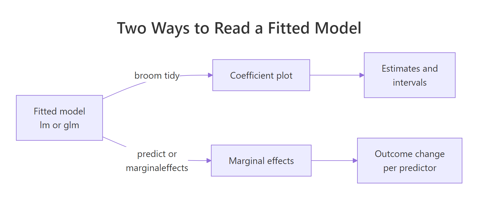
Figure 1: Two ways to read a fitted model. Coefficients summarise the fit; marginal effects translate it into the outcome's own units.
The trouble starts when the model is not a straight line. The most common case is logistic regression, which predicts a yes/no outcome. Let's model whether a car has a manual transmission (am, where 1 means manual) from its horsepower and weight. We fit it with glm() and the binomial family, then tidy it.
Here is the problem. The wt coefficient is -8.08, but -8.08 of what? Not miles per gallon, and not a probability. Logistic regression works on the log-odds scale, so the coefficient says "each extra 1000 pounds lowers the log-odds of a manual transmission by 8.08." Almost nobody thinks in log-odds. The number tells you the direction (negative, so heavier cars are less likely to be manual) and, through its p-value, that the effect is real. It does not tell you the size of the change in plain probability.
A common half-fix is to exponentiate the coefficients into odds ratios. broom does this with exponentiate = TRUE.
Odds ratios are multiplicative: an hp odds ratio of 1.04 means each extra horsepower multiplies the odds of a manual transmission by 1.04. That is better than log-odds, but still awkward. The wt odds ratio of 0.000309 is technically correct and almost impossible to explain to a stakeholder. We need the effect stated the way people actually think: as a change in probability. That is what marginal effects deliver.
If you want the math behind why a logistic coefficient is not a probability change, here it is. The model says the probability is
$$P(y=1) = \frac{1}{1 + e^{-(\beta_0 + \beta_1 x_1 + \beta_2 x_2)}}$$
and the marginal effect of a predictor is the derivative of that probability, which works out to
$$\frac{\partial P}{\partial x_1} = \beta_1 \cdot P (1 - P)$$
Where:
- $\beta_1$ is the log-odds coefficient (the -8.08 for weight)
- $P$ is the predicted probability at the point you are standing on
Because $P$ appears in the formula, the marginal effect depends on where you are along the curve. That single fact is why one coefficient cannot summarise the effect. If the math is not your thing, skip it: the code in the next section shows the same idea by measuring the curve directly.
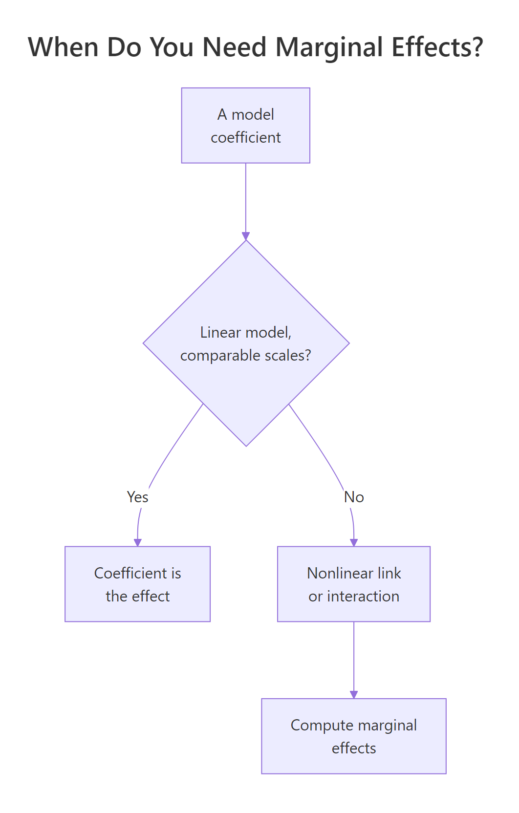
Figure 2: A quick decision guide. Straight-line models hand you the effect directly; nonlinear links and interactions need marginal effects.
Try it: Fit a logistic model for whether a car has a straight engine (vs) from its mileage (mpg), and read the coefficients as odds ratios.
Click to reveal solution
Explanation: The mpg odds ratio of 1.54 means each extra mile per gallon multiplies the odds of a straight engine by about 1.5. Useful, but still an odds ratio, not a probability, which is exactly the gap marginal effects close.
How do you compute marginal effects from scratch?
The cleanest way to understand marginal effects is to build one by hand, and it takes only predict(). The plan has two steps: first get the model's predicted probability across a range of one predictor, then measure how fast that probability changes.
Start with adjusted predictions: the predicted outcome as one predictor varies while the others are held fixed. We build a small grid of weights from the lightest to the heaviest car, hold horsepower at its average, and ask the model for the probability of a manual transmission at each point. One subtlety: to get a confidence band that stays between 0 and 1, we predict on the model's internal log-odds scale (type = "link"), add and subtract the error there, and only then convert back to probability with plogis().
The first rows show that the lightest cars are predicted to be manual with near-certainty. Now plot the whole grid. geom_line() draws the probability curve and geom_ribbon() shades the confidence band around it.
Run it and you get the classic S-shape. The probability sits near 1 for light cars, drops steeply through the middle around 3000 pounds, and flattens near 0 for heavy cars. The marginal effect of weight is simply the steepness of this curve, and you can already see it is not one number: the curve is nearly flat at the ends and plunges in the middle.
type = "link", widening there, and converting with plogis() keeps the band inside its valid range.Let's measure that steepness directly. We nudge weight up by a tiny amount h, see how much the predicted probability moves, and divide. That slope is the marginal effect at a given weight. We compute it at three weights to prove the point.
Read the two right-hand columns together. At wt = 2 the car is almost certainly manual (probability 1.00), so nudging its weight barely changes an already-settled outcome and the slope is a flat -0.003. At wt = 3 the outcome is a genuine coin-flip (probability 0.48), and here weight has its largest effect, a slope of -2.018. At wt = 4 the car is almost certainly automatic (probability 0.00), so again the slope is nearly flat. The marginal effect is strongest exactly where the outcome is most uncertain.
So which single number do you report? The usual choice is the average marginal effect (AME): compute the slope for every car in the data, at its own real values, then average. Let's do exactly that by hand.
Averaged across all 32 cars, adding 1000 pounds lowers the probability of a manual transmission by about 0.36, or 36 percentage points. That is a sentence anyone understands, and we got it with nothing but predict() and mean(). Hold onto the number -0.3596: in the next section a package reproduces it exactly.
Try it: Compute the adjusted prediction (the probability itself, not the slope) for a single car weighing 3.5 with 150 horsepower.
Click to reveal solution
Explanation: type = "response" returns the probability directly. A 3.5-ton car with 150 hp has only about a 1.8% chance of being manual, according to the model.
How do you get marginal effects the easy way with marginaleffects?
Computing marginal effects by hand is the right way to learn them, but for daily work you want a package that handles the grids, the averaging, and the standard errors for you. The marginaleffects package is the modern standard, and its function names map directly onto what we just did by hand.
The marginaleffects examples below run in your own R session. The package is not part of the in-page runner, so copy these blocks into RStudio or an R console. Each block shows the real output it produces, so you can check your results against it.
The headline function is avg_slopes(), which computes the average marginal effect for every predictor, the exact calculation we did by hand for weight.
library(marginaleffects)

avg_slopes(logit_model)
#>  Term Estimate Std. Error     z Pr(>|z|)    S     2.5 %   97.5 %
#>    hp  0.00161   0.000572  2.82  0.00483  7.7  0.000491  0.00273
#>    wt -0.35960   0.057146 -6.29  < 0.001 31.6 -0.471601 -0.24759
#>
#> Type: response
#> Comparison: dY/dX
Look at the wt row: the estimate is -0.3596, the same number we computed by hand, now with a standard error and confidence interval attached for free. The hp row tells you each extra horsepower raises the probability of a manual transmission by about 0.0016 on average. The label Comparison: dY/dX confirms these are slopes, the change in the outcome per unit change in the predictor.
To get adjusted predictions instead of slopes, use predictions() with datagrid() to specify exactly where you want them evaluated. This mirrors the prediction grid we built by hand.
predictions(logit_model,
            newdata = datagrid(wt = c(2, 3, 4), hp = mean(mtcars$hp))) |>
  as.data.frame() |>
  select(wt, estimate, conf.low, conf.high) |>
  mutate(across(estimate:conf.high, \(x) round(x, 3)))
#>   wt estimate conf.low conf.high
#> 1  2    1.000    0.861     1.000
#> 2  3    0.484    0.152     0.831
#> 3  4    0.000    0.000     0.134
Those are the same probabilities we saw at weights 2, 3 and 4, now with confidence intervals. And because everything the package returns is a tidy data frame, plotting is one call. plot_predictions() draws the probability curve we built by hand, and plot_slopes() draws how the slope itself changes across weight.
# The probability curve (same S-shape as before):
plot_predictions(logit_model, condition = "wt")

# How the marginal effect of weight changes across weight:
plot_slopes(logit_model, variables = "wt", condition = "wt")
Both return ordinary ggplot2 objects, so you can restyle them with your own labels and themes just as you would any plot. plot_predictions() reproduces the S-curve, and plot_slopes() shows the marginal effect dipping most sharply through the middle weights, the same story our three-point slope table told.
avg_slopes() and predictions() calls work for linear models, mixed models, and most regressions you will meet. The ggeffects and modelbased packages cover similar ground if you prefer their style.Try it: Use avg_slopes() to get the average marginal effect of horsepower alone, and confirm it matches the 0.0016 we saw by hand.
# Restrict avg_slopes() to just the hp variable:
# your code here
Click to reveal solution
avg_slopes(logit_model, variables = "hp")
#>  Estimate Std. Error    z Pr(>|z|)   S    2.5 %  97.5 %
#>   0.00161   0.000572 2.82  0.00483 7.7 0.000491 0.00273
#>
#> Term: hp
#> Type: response
#> Comparison: dY/dX
Explanation: The variables argument narrows the output to one predictor. The estimate, 0.00161, matches the by-hand average marginal effect exactly.
Complete Example: from model to coefficient plot to marginal effects
Let's tie the whole workflow together on one clean linear model and prove the central lesson: for a straight-line model, the coefficient and the marginal effect are the same number. We predict mileage from weight and horsepower, tidy it, and plot the coefficients.
Both whiskers sit clearly to the left of zero, so weight and horsepower both reliably lower mileage. Now confirm the promise: we compute horsepower's marginal effect by hand, the same nudge-and-average trick from the logistic section, and check it against the coefficient of -0.0318.
The by-hand marginal effect is -0.0318, identical to the coefficient. That is the whole point of this tutorial in one line: for a linear model the coefficient plot already shows the marginal effects, so you are done. The moment you switch to logistic regression, interactions, or any nonlinear term, the coefficient and the marginal effect part ways, and the tools in the last two sections are how you recover the plain-language answer.
Practice Exercises
These combine several ideas from the tutorial. Try each before opening the solution. They use distinct variable names so they will not clash with the objects above.
Exercise 1: Colour a coefficient plot by significance
Take the logistic model logit_model and build a coefficient plot where significant predictors (interval excludes zero) are one colour and non-significant ones another. Build the interval yourself as estimate plus or minus 1.96 standard errors so you avoid the slow profiling step, then map colour to a significance flag.
Click to reveal solution
Explanation: Both predictors are significant here, so both intervals exclude zero and both dots take the "TRUE" colour. Building the Wald interval by hand, estimate plus or minus 1.96 standard errors, keeps the code fast and warning-free.
Exercise 2: Compute an average marginal effect by hand
Without using marginaleffects, compute the average marginal effect of horsepower for logit_model. Nudge hp by a tiny amount for every car, measure the change in predicted probability, and average. Confirm the sign and that it lands near 0.0016.
Click to reveal solution
Explanation: The average marginal effect of horsepower is +0.0016: each extra horsepower raises the average probability of a manual transmission by about 0.16 percentage points. It matches the avg_slopes() value exactly, because that is precisely the calculation the package runs.
Exercise 3: Show a marginal effect that depends on another predictor
Fit a model with an interaction, mpg ~ wt * hp, and use marginaleffects to show that the marginal effect of weight is different at low horsepower (100) versus high horsepower (200). This runs in your local R session.
# Hint: avg_slopes(model, variables = "wt", by = "hp",
#                  newdata = datagrid(hp = c(100, 200)))

# Write your code below:
Click to reveal solution
inter <- lm(mpg ~ wt * hp, data = mtcars)

avg_slopes(inter, variables = "wt", by = "hp",
           newdata = datagrid(hp = c(100, 200)))
#>   hp Estimate Std. Error     z Pr(>|z|)    S 2.5 % 97.5 %
#>  100    -5.43      0.669 -8.12   <0.001 50.9 -6.74  -4.12
#>  200    -2.65      0.619 -4.28   <0.001 15.7 -3.86  -1.43
#>
#> Term: wt
#> Type: response
#> Comparison: dY/dX
Explanation: With the interaction, weight costs 5.43 mpg per 1000 pounds at 100 hp but only 2.65 mpg at 200 hp. A single coefficient could never show that; the marginal effect depends on where you evaluate it, which is exactly when these tools earn their keep.
Summary
Coefficient plots and marginal effects are two views of the same fitted model. The coefficient plot summarises the fit; marginal effects translate it into the outcome's own units. Here is the toolkit at a glance.
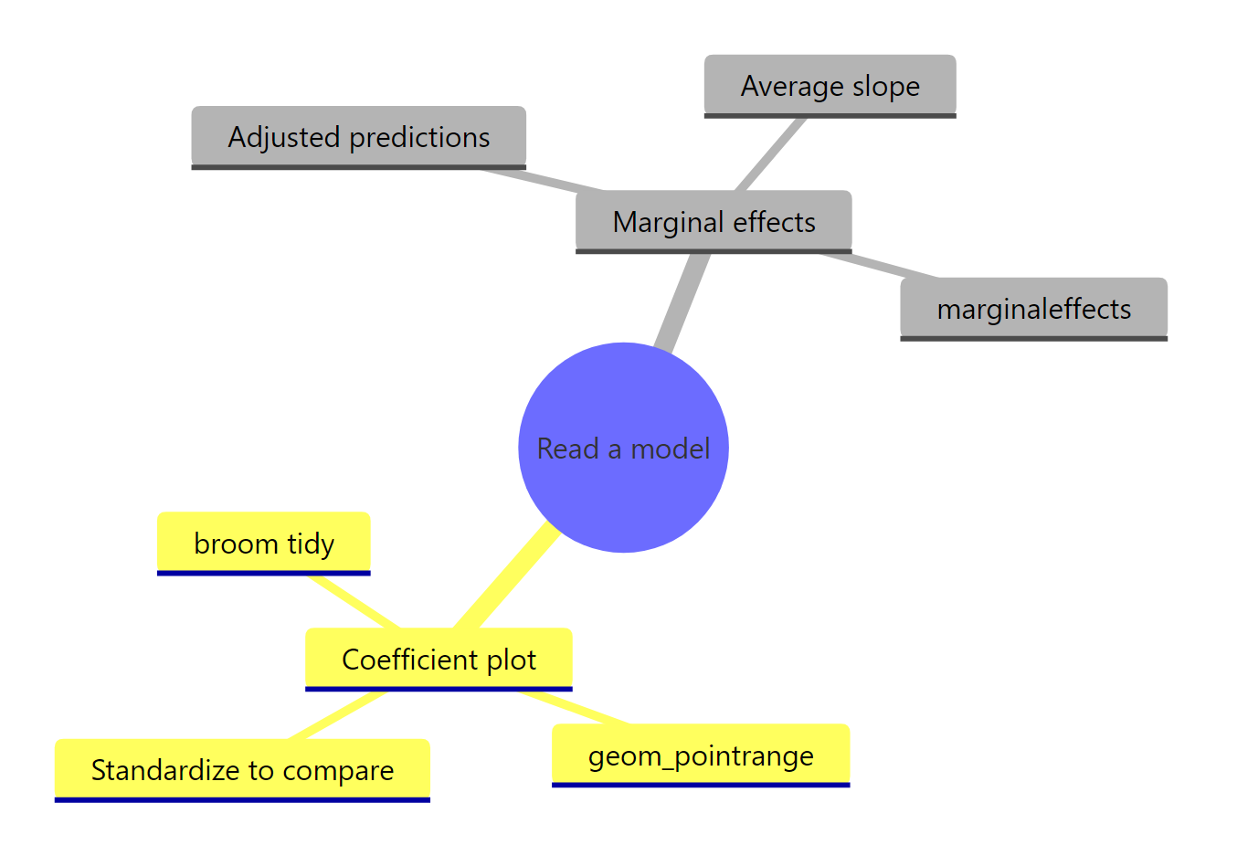
Figure 3: The two halves of reading a model, from tidy coefficients to plain-language marginal effects.
| Task | Tool | Key idea |
|---|---|---|
| Reshape a model into a table | broom::tidy(model, conf.int = TRUE) |
One tidy row per coefficient, ready for ggplot2 |
| Draw a coefficient plot | geom_pointrange() + a zero line |
Dot is the estimate, whisker is the 95% interval |
| Compare predictors fairly | scale() each predictor |
Puts everything in standard-deviation units |
| Read a nonlinear model | Marginal effects, not raw coefficients | Logistic coefficients are log-odds, not probabilities |
| Get the effect by hand | predict() over a grid, then a slope |
Adjusted predictions and finite-difference slopes |
| Get the effect the easy way | marginaleffects::avg_slopes() |
Average marginal effect with standard errors |
The one rule to carry away: a coefficient plot is enough when the model is a straight line, because then the coefficient is the marginal effect. As soon as the model bends, through a logistic link or an interaction, the coefficient and the real-world effect diverge, and marginal effects are how you report what actually happens.
Frequently Asked Questions
What is the difference between a coefficient and a marginal effect?
For an ordinary linear model they are the same number: the change in the outcome per one-unit change in the predictor. They only split apart once the model is nonlinear. In a logistic regression the coefficient lives on the log-odds scale, while the marginal effect is the change in plain probability, and that change depends on where along the curve you measure it. So the rule is short: linear model, read the coefficient; nonlinear model, compute the marginal effect.
Should I include the intercept in a coefficient plot?
Usually not. The intercept is the model's baseline, the predicted outcome when every predictor is zero, so it is not an effect you compare against the predictors. It is also often far larger than the real coefficients, which squashes them into an unreadable cluster. Drop it with filter(term != "(Intercept)") before plotting, as every plot in this guide does.
How do I make a coefficient plot for a logistic regression?
The same way as for a linear model: tidy() the glm, drop the intercept, then draw geom_pointrange() with a zero line. Just remember the dots are log-odds coefficients rather than probabilities, so pass exponentiate = TRUE for odds ratios, or compute marginal effects when you need a probability-scale answer. One practical note: conf.int = TRUE on a glm uses profiled intervals that can be slow, so for a quick plot build a Wald interval by hand with the estimate plus or minus 1.96 standard errors, the trick used in Exercise 1.
Do I have to standardize my predictors before plotting?
Only when you want to compare predictors by importance. On their raw scales a coefficient's size reflects the size of its measurement unit as much as its influence, so a predictor measured in small steps (like horsepower) looks tiny even when it matters. Wrapping each numeric predictor in scale() puts them all in standard-deviation units, so the length of each bar reflects real influence. If you only care about each predictor's effect in its own natural units, leave them as they are.
How do I show a categorical predictor in a coefficient plot?
A factor predictor gives one coefficient per level relative to a reference level, so tidy() returns a separate row for each non-reference level rather than a single row. For example, lm(mpg ~ factor(cyl)) on mtcars produces a factor(cyl)6 row and a factor(cyl)8 row, each the effect of that cylinder count against the 4-cylinder reference. Those rows plot as ordinary dots and whiskers, and standardizing does not apply to them, since a 0/1 indicator is already on a fixed scale.
References
- Robinson, D., Hayes, A., & Couch, S. broom: Convert Statistical Objects into Tidy Tibbles. Link
- broom reference: tidy an lm object. Link
- Arel-Bundock, V. marginaleffects: Predictions, Comparisons, Slopes, Marginal Means, and Hypothesis Tests. Link
- Arel-Bundock, V., Greifer, N., & Heiss, A. How to Interpret Statistical Models Using marginaleffects for R and Python. Journal of Statistical Software (2024). Link
- Solt, F., & Hu, Y. dotwhisker: Dot-and-Whisker Plots of Regression Results. Link
- Lüdecke, D. ggeffects: Create Tidy Data Frames of Marginal Effects for ggplot. Link
- Wickham, H., Çetinkaya-Rundel, M., & Grolemund, G. R for Data Science, 2nd Edition, Chapter on model basics. Link
- Wickham, H. ggplot2: Elegant Graphics for Data Analysis, 3rd Edition. Link
Continue Learning
- Logistic Regression in R: The full mechanics of the yes/no model whose coefficients we translated into probabilities here.
- Visualizing Uncertainty in R: More ways to draw confidence intervals and bands, the same intervals your coefficient plot whiskers show.
- Linear Regression: The foundation model whose coefficients a coefficient plot summarises, explained from the ground up.