Date and Time Axes in ggplot2: Breaks, Labels, Spans
Date and time axes in ggplot2 are handled by three scale functions: scale_x_date() for calendar dates, scale_x_datetime() for timestamps, and scale_x_time() for times of day. Each one lets you set three things independently: where the ticks fall (breaks), how each date reads (labels), and which slice of time is shown (the span).
This tutorial uses the tidyverse (ggplot2 with a little dplyr and scales; lubridate shows up once as an optional helper). Every code block runs in your browser, so you can press Run and change anything you like as you read.
Why does my date axis look like a squished mess?
You plot a time series, and the x-axis comes out wrong. The dates are crammed together, the labels overlap into an unreadable smear, or they are spaced like evenly numbered categories instead of real time. Nine times out of ten the cause is not ggplot at all. It is the type of your date column. Let's reproduce the bug on purpose, fix it in one line, and watch the whole date-axis toolkit fall out of that single fix.
Here is a small table of daily revenue. Notice that the day column is written as plain text.
The class() check confirms the problem: day is a character column, just text, not a date. R has no idea these strings represent points in time. Now watch what ggplot does with it.
Run that and look at the x-axis. Because day is text, ggplot builds a discrete axis: one evenly spaced slot per unique string, in alphabetical order, with no sense of the real gaps between dates. With six values it already looks cramped. With a few hundred it becomes a solid wall of overlapping labels. This is the number one date-axis bug for beginners.
The fix is to tell R that these strings are dates. The as.Date() function converts a character column into a proper Date column.
The class() now reports Date. The values look the same when printed, but under the hood each date is now stored as a number of days, so R understands their order and spacing. Plot it again, this time as a line.
Now the x-axis is a real continuous time axis. ggplot spaces the points by their true distance in time and picks sensible month breaks automatically. The only thing that changed between the broken plot and this one was the column type.
Date and POSIXct columns; a character or factor column always becomes a squished discrete axis, so your first move with any date problem is to check the class.Once your column is a genuine date, formatting the axis splits into three independent jobs, shown below.
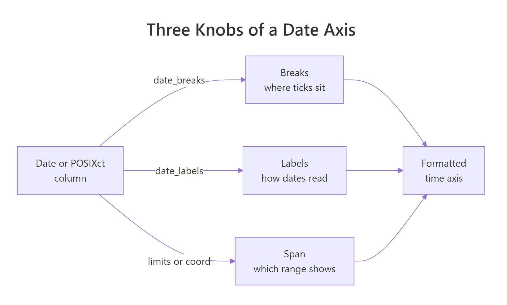
Figure 1: A date axis is three independent knobs. Breaks set where ticks fall, labels set how each date reads, and the span sets which range shows. The rest of this tutorial takes them one at a time.
If your dates come in a non-standard order like 05/23/2024, as.Date() needs a hint about the layout.
as.Date() function assumes the ISO layout %Y-%m-%d, so a string like 05/23/2024 returns NA or a wrong date unless you pass format = "%m/%d/%Y". The lubridate::mdy() and lubridate::dmy() helpers are a friendlier alternative that guess the order for you.Try it: Convert the character vector below into real dates, then confirm the class is Date.
Click to reveal solution
Explanation: as.Date() reads each ISO-formatted string into a Date. Because the strings already use %Y-%m-%d, no format argument is needed.
How do I set where the date ticks appear?
Breaks are the tick marks: the specific dates that get a line and a label on the axis. When you say nothing, ggplot chooses a reasonable set for you. To take control, the easiest tool is date_breaks, which takes a plain-English interval string.
The grammar is a number plus a unit: "1 year", "3 months", "2 weeks", "10 days". The valid units are sec, min, hour, day, week, month, and year, with or without a trailing "s". Let's put a tick every three months on the sales plot.
Now the axis has one tick every three months, no matter how many data points sit between them. You can add fainter, unlabelled gridlines in between with date_minor_breaks, which uses the same interval grammar.
Sometimes you do not want a regular rhythm. You want ticks on a few specific dates, maybe a launch date and two milestones. For that, skip date_breaks and pass an exact vector of dates to breaks instead.
The my_breaks vector holds exactly the three dates we care about, and the axis shows a tick at each one and nowhere else. Notice we also passed date_labels here to format them; that is the next knob.
date_breaks = "3 months" style handles any regular interval in one short string, while a hand-built breaks vector is worth the extra typing only when the tick dates are irregular or hand-picked.Try it: Change the sales plot so the axis shows a tick every two months.
Click to reveal solution
Explanation: The interval string "2 months" tells ggplot to place a tick every second month across the data range.
How do I control how each date label reads?
Breaks decide where the ticks go. Labels decide how each tick is written. Do you want 2024, or Jan 2024, or 01/Jan? You choose the wording with date_labels and a format string built from strftime codes.
A strftime code is a percent sign plus a letter that stands for one piece of a date. %Y means the four-digit year, %b means the short month name, and so on. The cleanest way to understand them is to see each one applied to a single date. Here is March 9, 2024, run through several codes at once.
Each code pulled out one part of the same date. This table lists the codes you will reach for most often, all shown for that same March 9, 2024.
| Code | Means | Example |
|---|---|---|
%Y |
Four-digit year | 2024 |
%y |
Two-digit year | 24 |
%B |
Full month name | March |
%b |
Short month name | Mar |
%m |
Month number | 03 |
%d |
Day of month | 09 |
%A |
Weekday name | Saturday |
%a |
Short weekday | Sat |
%j |
Day of year | 069 |
You combine codes with any punctuation or spaces you like. "%b %Y" produces Jan 2024, and "%d/%m" produces 09/03. Let's label the sales axis as short month plus year.
The ticks now read Jan 2024, Apr 2024, and so on. date_breaks set the tick positions and date_labels set their wording, working together but doing different jobs. One thing to watch: case matters. %m is the month number, %b is the short name, and %B is the full name, while %y is a two-digit year and %Y is four digits. Mixing up the case is a common source of surprise labels.
Try it: Format the single date below so it prints as Mar 2024.
Click to reveal solution
Explanation: %b gives the short month name and %Y the four-digit year, joined by the space you typed between them.
How do I zoom the axis to a date span without dropping data?
The span is the slice of time the axis shows. Often you want to zoom into one window, say two years out of a long history. There are two ways to do this in ggplot, and the difference between them causes real bugs, so it is worth getting right.
To make the difference concrete, let's take the built-in economics data, keep everything from the year 2000 onward, and count the rows.
There are 184 months from 2000 onward, and 36 of them fall inside the 2008 to 2010 window. Keep those two numbers in mind. The safe way to zoom to that window is coord_cartesian(), which crops the view while keeping all 184 rows in the calculation.
The plot shows only 2008 to 2010, but every row is still there behind the scenes. Contrast that with setting limits inside scale_x_date(). That also crops the axis, but it does something extra and dangerous: it throws away every row outside the window before drawing anything.
limits inside a scale drops the 148 out-of-window rows entirely, so any trend line or summary is recomputed on just the 36 rows that remain, quietly changing the result; coord_cartesian(xlim = ...) keeps all the data and only crops the view.You can also leave one edge of the span open by passing NA. And you can trim or pad the gap ggplot leaves at the ends of the axis with expand.
limits = as.Date(c("2008-01-01", NA)) fixes the start and lets the end follow the data, while expand = c(0, 0) removes the small default gap ggplot adds beyond the first and last dates.Try it: Zoom the econ plot to the years 2010 through 2013 without dropping any data.
Click to reveal solution
Explanation: coord_cartesian() crops the visible x-range to the window while keeping every row of econ in the underlying data.
How do I handle timestamps and time-of-day axes?
So far every example used calendar dates. Real data often carries the time of day too: a login at 14:30, a sensor reading every few minutes. A value with both a date and a time is a timestamp, stored in R as the POSIXct class, and it gets its own scale function. The picture below shows which function matches which column type.
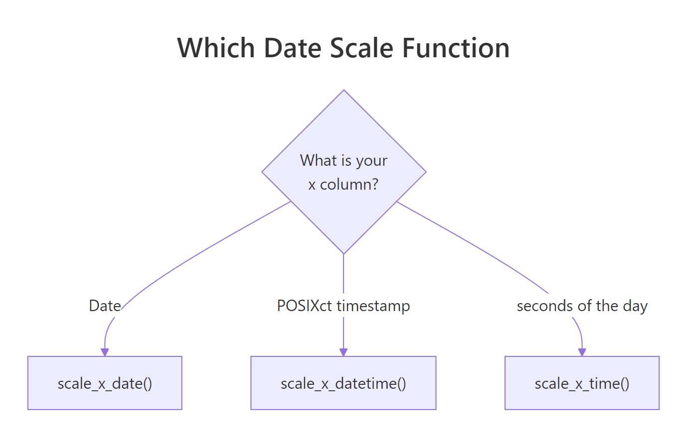
Figure 2: Pick the scale function by the class of your x column. A Date column uses scale_x_date(), a POSIXct timestamp uses scale_x_datetime(), and a plain time of day uses scale_x_time().
A timestamp carries a timezone, and this is where a subtle trap lives. The same instant prints as a different clock time depending on the timezone you display it in. Watch the hour change while the actual moment does not.
The same timestamp reads 14:30 in UTC and 10:30 in New York. This matters for your axis, because ggplot draws the ticks in whatever timezone the data carries unless you tell scale_x_datetime() otherwise through its timezone argument.
POSIXct values carry a timezone, the same data can label ticks at different clock times depending on that zone; when the exact hour matters, build your timestamps with an explicit tz = and pass a matching timezone to the scale.Now let's actually plot timestamps. The break grammar is the same as before, but you now have finer units available, like "3 hours" or "30 min". Here is a day of hourly site visits.
The axis now ticks every three hours and labels each one as hours and minutes. The third case is a plain time of day with no date attached, like a daily opening hour. That uses scale_x_time(), and it measures the axis in seconds since midnight.
We stored each hour as seconds (8 in the morning is 8 * 3600 = 28800 seconds), then used scales::label_time() to print those seconds back as clock times. The axis reads 08:00 through 20:00.
Try it: Change the visits plot so the axis ticks every six hours, still labelled as %H:%M.
Click to reveal solution
Explanation: The interval "6 hours" uses the same grammar as dates, just with a finer unit that scale_x_datetime() understands.
How do I fix crowded or overlapping date labels?
Even with a proper date axis, long labels on a wide date range can collide into an unreadable band. You have three levers to fix it, and they stack: use fewer breaks, write shorter labels, or rotate the text.
Start by seeing how much room the wording itself costs. A full label is far longer than an abbreviated one.
January 01, 2024 is sixteen characters, while Jan 24 is six. Shorter wording alone often clears the crowding. When it does not, rotate the labels so they no longer sit shoulder to shoulder. Rotation lives in theme(), not in the scale.
The angle = 45 tips each label onto a diagonal, and hjust = 1 slides its right edge under the tick so it stays aligned. Now even a monthly label fits comfortably.
date_labels = "%b\n%Y", stacks the month over the year and often reads more cleanly than angled text while keeping the labels horizontal.Try it: Take the monthly sales plot and rotate its labels by 45 degrees.
Click to reveal solution
Explanation: element_text(angle = 45, hjust = 1) inside theme() tilts the labels and re-aligns them under their ticks.
Complete Example
Let's put every knob together on one realistic figure. We will plot United States unemployment from 2000 onward, and shape the axis end to end: a tick every three years, faint yearly gridlines between them, four-digit year labels, a trimmed span with a touch of padding, and a clean look. The economics$date column is already a Date, so no conversion is needed.
Read the recipe top to bottom. date_breaks = "3 years" sets the labelled ticks, date_minor_breaks = "1 year" adds the quiet gridlines, date_labels = "%Y" keeps the wording to a clean year, expand = c(0.01, 0) leaves a sliver of padding at the ends, and coord_cartesian() fixes the visible window without dropping any months. That is breaks, labels, and span working together in a single scale.
Practice Exercises
Time to combine what you have learned. Each exercise uses new variable names so it will not clash with the tutorial code above.
Exercise 1: From text to a formatted quarterly axis
You are handed quarterly sales as text dates. Convert them to real dates, then plot a line with a tick every three months labelled as short month and year (Jan 2023 style).
Click to reveal solution
Explanation: as.Date() fixes the column type first, which is what lets scale_x_date() build a real time axis. Then date_breaks and date_labels set the tick spacing and wording.
Exercise 2: Zoom and declutter a long series
Using the econ data from the tutorial, plot unemployment but zoom to 2008 through 2012 only, with a tick every year and the labels rotated 45 degrees so they do not overlap. Zoom the safe way that keeps all the data.
Click to reveal solution
Explanation: coord_cartesian() zooms without deleting rows, date_breaks = "1 year" with date_labels = "%Y" sets yearly year-only ticks, and the theme() line rotates them clear of each other.
Exercise 3: A timestamp axis for hourly traffic
Build a full day of hourly website traffic as timestamps, then plot it with a tick every two hours labelled as %H:%M. This combines timestamp handling with break and label control.
Click to reveal solution
Explanation: The t column is already POSIXct, so scale_x_datetime() applies, and the "2 hours" interval with "%H:%M" labels gives a clean two-hourly clock axis.
Summary
Formatting a date or time axis in ggplot2 comes down to choosing the right scale function for your column type, then turning three independent knobs. The table below is your quick reference.
| Knob | Where it lives | Example |
|---|---|---|
| Column type | as.Date(), as.POSIXct() |
as.Date("2024-01-05") |
| Breaks (where ticks go) | date_breaks, breaks |
date_breaks = "3 months" |
| Labels (how dates read) | date_labels + strftime |
date_labels = "%b %Y" |
| Span (which range shows) | coord_cartesian(xlim = ) |
xlim = as.Date(c("2008-01-01", "2010-12-31")) |
| Crowding fix | theme(), shorter codes |
angle = 45, hjust = 1 |
| Scale function | class of x column | scale_x_date, scale_x_datetime, scale_x_time |
The mind map below gathers the whole toolkit in one view.
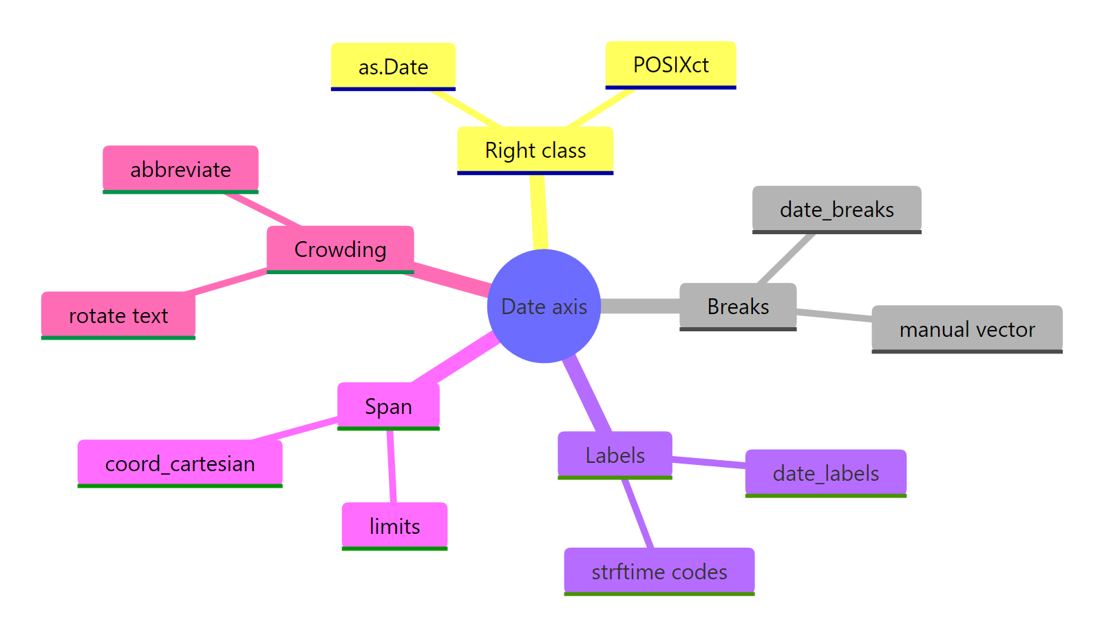
Figure 3: The full date-axis toolkit at a glance, from getting the class right to fixing crowded labels.
The habits that save the most time: always check the column class first, use date_breaks for regular ticks and a manual vector only for irregular ones, and zoom with coord_cartesian() rather than scale limits so you never silently drop data.
Frequently Asked Questions
Why does my date axis show numbers instead of real dates?
If the axis shows large numbers like 19723 rather than dates, the x column is numeric, not a Date. R stores a Date as the number of days since 1970-01-01, and if that class gets lost somewhere upstream (for example after an arithmetic step or an ifelse() that returns numbers), ggplot builds a plain continuous number axis. Check with class(df$x). If it is a day count, convert back with as.Date(x, origin = "1970-01-01"); if it is the original text, use as.Date() on the strings as shown in the first section.
How do I show the month names in English (or another language)?
The %b, %B, and %A codes read your computer's LC_TIME locale, so the month and weekday names come out in the system language. To force English no matter which machine runs the code, call Sys.setlocale("LC_TIME", "C") before you plot; to switch to another language, pass that locale name instead (for example "de_DE" for German). The numeric codes like %m, %d, and %Y are the same in every locale, so use those when you want language-neutral labels.
When should I use scale_x_continuous instead of scale_x_date?
Use scale_x_date() only when the column class is Date, and scale_x_datetime() only for POSIXct. If your x axis is a plain integer year like 2010, 2011, 2012, that column is a number, not a date, so reach for scale_x_continuous() and set breaks = 2010:2012. Convert to a real Date only when you need finer resolution than whole years, such as months or days within a year.
How do I mark a specific date on the plot, like a launch day?
Add a vertical line with geom_vline() and an as.Date() value: geom_vline(xintercept = as.Date("2024-03-15"), linetype = "dashed"). Because the axis is a real date scale, the line lands at exactly the right spot. To label it, add annotate("text", x = as.Date("2024-03-15"), y = 250, label = "Launch"), adjusting the y value to sit where you want the text.
References
- ggplot2 documentation. Position scales for date/time data (scale_date). Link
- Wickham, H., Navarro, D., and Pedersen, T. L. ggplot2: Elegant Graphics for Data Analysis, Date-time section. Link
- scales package reference. Label and break helpers (label_date, label_time, breaks_width). Link
- R Core Team. Date-time conversion and strftime format codes (strptime). Link
- lubridate documentation. Parsing and manipulating dates. Link
- Wickham, H. and Grolemund, G. R for Data Science, Dates and times chapter. Link
- The R Graph Gallery. Time series with ggplot2. Link
Continue Learning
- ggplot2 scale_x_date() in R: Format Date Axis A focused reference on the single most common date-axis function, with five copy-paste patterns.
- ggplot2 Line Charts The geom you will pair a date axis with most often, covered from the basics up.
- ggplot2 Secondary Axis Add a second, differently scaled axis once your primary date axis is dialled in.