Position Adjustments in ggplot2: Stack, Dodge, Jitter, Fill
Position adjustments are the ggplot2 setting that decides what happens when two geoms land on the same spot: whether bars stack up, sit side by side, or turn into proportions, and whether crowded points spread out so you can see them. This tutorial uses the tidyverse (ggplot2 with a little dplyr) and the built-in mpg dataset, so you can run every chart in the box as you read.
What are position adjustments in ggplot2?
Every mark ggplot2 draws needs a coordinate. A bar needs an x position and a height, a point needs an x and a y. Those coordinates come from your aes() mapping. The trouble starts when several marks want the same coordinate: two bars that both belong above "compact", or twenty points that all sit at (20, 30). Something has to give. The position argument is the rule that decides what gives.
Let's start with the raw material. The mpg dataset ships with ggplot2 and records fuel economy for 234 car models. We will group cars by body class and by drivetrain drv (four-wheel, front and rear). Here is the count of cars in each combination, which is exactly what a bar chart will draw.
Read one row: there are 12 compact cars with four-wheel drive and 35 with front-wheel drive. Notice that both compact rows share the same x position on a chart (the "compact" tick). That shared position is the collision position has to resolve.
Now map class to the x-axis and drv to fill, then let geom_bar() count the rows for you. Because two drv values share each class, ggplot2 must decide how to place them. Watch what it does by default.
You get one bar per class, and inside each bar the drivetrains are stacked into colored segments. You never asked for stacking. It happened because geom_bar() carries a default position, and that default is "stack". That single hidden setting is the whole topic of this tutorial.
position. Learning the four main choices lets you reshape a chart without touching your data.Try it: Rebuild the chart with the mapping flipped, so drivetrain sits on the x-axis and each bar is filled by body class. Change the aes() below and run it.
Click to reveal solution
Explanation: Only the aes() mapping changed. The position = "stack" default is still doing the stacking, now with drivetrains on the x-axis and body classes as the colored segments.
How does position = "stack" stack bars?
Stacking is the default for bars, histograms, and areas, so it is the behavior you will see unless you say otherwise. Stack takes the groups that share an x position and piles them on top of one another. The height of the whole bar equals the group total, and each colored segment is one subgroup's count.
Because stack is already the default, writing it out changes nothing. It is worth doing once so you can see the setting clearly.
This looks identical to the plain geom_bar() from the last section, which is the point: the default is stack. The full height of the suv bar reaches 62, because 51 four-wheel-drive SUVs plus 11 rear-wheel-drive SUVs stack to 62.
There is one habit worth forming early. ggplot2 stacks from the top down in the order the legend lists, which often feels upside down: the first legend item ends up at the top of the bar rather than the bottom. You can flip the stacking order with reverse = TRUE inside position_stack().
Writing position_stack(reverse = TRUE) instead of the plain string "stack" is how you reach a position's options. Every position has a string shortcut and a matching function. The string is fine when defaults are fine; the function is how you pass arguments.
position_stack(reverse = TRUE) so the bottom-to-top segment order matches the legend top-to-bottom.Try it: Take the class-by-drivetrain bar and reverse its stack so the segment order matches the legend.
Click to reveal solution
Explanation: position_stack(reverse = TRUE) keeps the totals identical but flips which subgroup sits at the bottom, so the visual order lines up with the legend.
How does position = "fill" show proportions?
Stacking shows totals, but sometimes the total is a distraction. If you want to compare composition, the question is "what share of each class is front-wheel drive?", not "how many cars are there?". That is what position = "fill" answers. Fill stacks the bars exactly like stack, then rescales every bar to the same full height, so each bar reads as 100 percent and the segments read as shares.
It helps to see the numbers fill is drawing. The share of each drivetrain within a class is its count divided by the class total. Here is that calculation done by hand with dplyr.
Compact cars are 26 percent four-wheel drive and 74 percent front-wheel drive, and those two shares add to 1. position = "fill" does this division for you and turns each share into a segment height. You do not need the dplyr step to draw the chart; it is here so you can see that fill is just stack plus a rescale.
Every bar now reaches the top, and the y-axis reads as percentages thanks to scale_y_continuous(labels = scales::percent). This chart makes composition easy to compare across classes, even when the classes have wildly different totals.
Try it: Turn the stacked class-by-drivetrain bar into a proportional bar where every bar fills to 100 percent.
Click to reveal solution
Explanation: position = "fill" rescales each stacked bar to height 1, so the chart shows the share of each drivetrain within a class rather than raw counts.
How does position = "dodge" place bars side by side?
Stacked bars are hard to compare below the bottom segment, because the middle and top segments do not start from a common baseline. When you want a clean magnitude comparison between subgroups, unstack them. position = "dodge" takes the bars that share an x position and sets them next to each other, each starting from zero.
Now each class shows separate bars, one per drivetrain, all rising from the same baseline. Comparing the height of front-wheel drive across classes is now a straight eye-line along the bottom axis.
Dodge has one quirk worth knowing. When a class is missing a drivetrain, the remaining bars widen to fill the gap, so bars in different classes can end up different widths. That uneven look is usually not what you want. The fix is preserve = "single", which keeps every bar the width of a single dodged bar.
With preserve = "single", a class with one drivetrain draws one normal-width bar instead of one fat bar, so widths stay consistent across the whole chart.
There is also a close cousin, position_dodge2(). It works out spacing from the data rather than from a grouping you supply, which makes it the better tool for boxplots and any geom whose elements can have different widths. For plain bars the two look similar; for boxplots, dodge2 is the reliable choice.
The figure below sums up the three bar positions you have now seen. It is the same class and drv mapping every time; only the position changes.
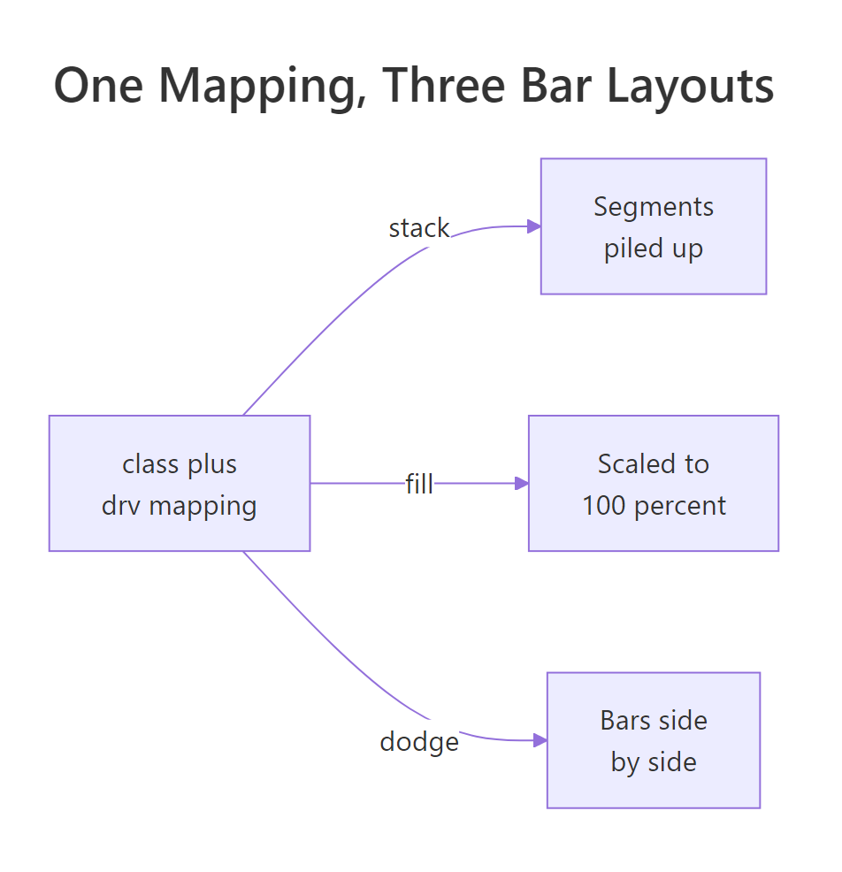
Figure 1: The same class-by-drv mapping under three positions. Stack piles the segments; fill rescales each bar to 100 percent; dodge splits them side by side.
position_dodge() for simple bars where every element is the same width. Use position_dodge2() for boxplots, violins, or any layer whose elements can differ in width, because it computes the side-by-side spacing straight from the data.Try it: Un-stack the class-by-drivetrain bar so the drivetrains sit side by side within each class.
Click to reveal solution
Explanation: position = "dodge" moves the overlapping bars sideways so each drivetrain gets its own bar from a shared baseline, which makes direct height comparisons easy.
How does position = "jitter" fix overplotting?
Bars are not the only marks that collide. Points do too, and the collision is sneakier because it hides how much data is there. When values are rounded or discrete, many points land on the exact same coordinate and pile into a single dot. Two hundred points can look like twenty. This is called overplotting.
The mpg dataset stores city and highway mileage as whole numbers, so a scatter of the two rounds many cars onto the same grid spot. Draw it plainly first.
The plot looks sparse, but it undercounts the data. Several cars share cty = 20, hwy = 28, yet you see one dot. position = "jitter" fixes this by adding a small random nudge to every point, so overlapping points fan out into a visible cluster. The convenience geom geom_jitter() is just geom_point(position = "jitter").
Now the dense spots show as clumps of points instead of a single dot, and the real shape of the data appears. Jitter adds random noise, so the picture shifts a little every time you run it unless you fix the randomness. Set a seed first, and control how far points move with width and height.
Here width = 0.3 and height = 0.3 keep the noise small, so points move just enough to separate without drifting far from their true values. set.seed(3) makes the exact scatter reproducible, so your chart looks the same each time and matches what a colleague sees.
width and height small, always call set.seed() before jittering so the result is reproducible, and never jitter a chart where precise position is the message.Try it: Spread the overplotted city-versus-highway scatter so the crowded spots become visible.
Click to reveal solution
Explanation: geom_jitter() adds small random offsets so stacked points separate. Setting a seed and small width and height keeps the result reproducible and close to the true values.
How do you jitter and dodge points together?
The most useful position is often a combination. A common request is to draw grouped boxplots and then scatter the raw points on top, so readers see the summary and the underlying data at once. That needs two things to happen together: the points must dodge into the right box, and they must jitter so they do not stack into a line. position_jitterdodge() does both.
Here we compare highway mileage across drivetrains, split by model year. The boxplots dodge by year, and the points dodge with them.
Each drivetrain shows two boxes, one per year, and the raw points sit inside their own box with a little horizontal jitter so they do not overlap. Wrapping year in factor() is what creates those two boxes: year is stored as the numbers 1999 and 2008, so factor() turns them into two distinct groups to dodge instead of a continuous scale. jitter.width = 0.15 keeps that spread narrow enough to stay inside the box.
There is one more small position that solves a different problem: nudging labels. When you add text to a chart, the label usually lands right on the mark and covers it. position_nudge() shifts the label by a fixed amount, which is perfect for floating a count just above each bar.
The position_nudge(y = 4) lifts each count label four units up the y-axis, so the numbers float clear above the bars instead of sitting on the top edge.
position_jitterdodge() returns an object, the boxplots and the points can share the same dodging logic, which is why the points line up exactly over their boxes. Positions are not tied to one geom; they are portable rules you attach wherever a layer needs them.Try it: Put raw points onto grouped boxplots of highway mileage by drivetrain, split by year.
Click to reveal solution
Explanation: position_jitterdodge() dodges each point into its year group and jitters it sideways, so the raw values land neatly inside their matching box.
Which position adjustment should you use?
You now have every position in your toolkit. The choice always starts from one question: what is overlapping, and what do you want the reader to see? The table below turns that into a quick lookup.
| Your data | The question | Position |
|---|---|---|
| Bars sharing an x | What is each group's total? | stack (the default) |
| Bars sharing an x | What share does each part hold? | fill |
| Bars sharing an x | How do the subgroups compare? | dodge |
| Points piling up | Where is the data dense? | jitter |
| Points on grouped boxes | Show raw points per group? | jitterdodge |
| Text labels | Shift a label off its anchor? | nudge |
It also helps to know each geom's starting point, because the default is what you get before you type a single position.
| Geom | Default position |
|---|---|
| geom_bar and geom_histogram | stack |
| geom_col and geom_area | stack |
| geom_point | identity |
| geom_boxplot | dodge2 |
| geom_jitter | jitter |
The same logic reads well as a flow: name what overlaps, then pick from the branch that fits.
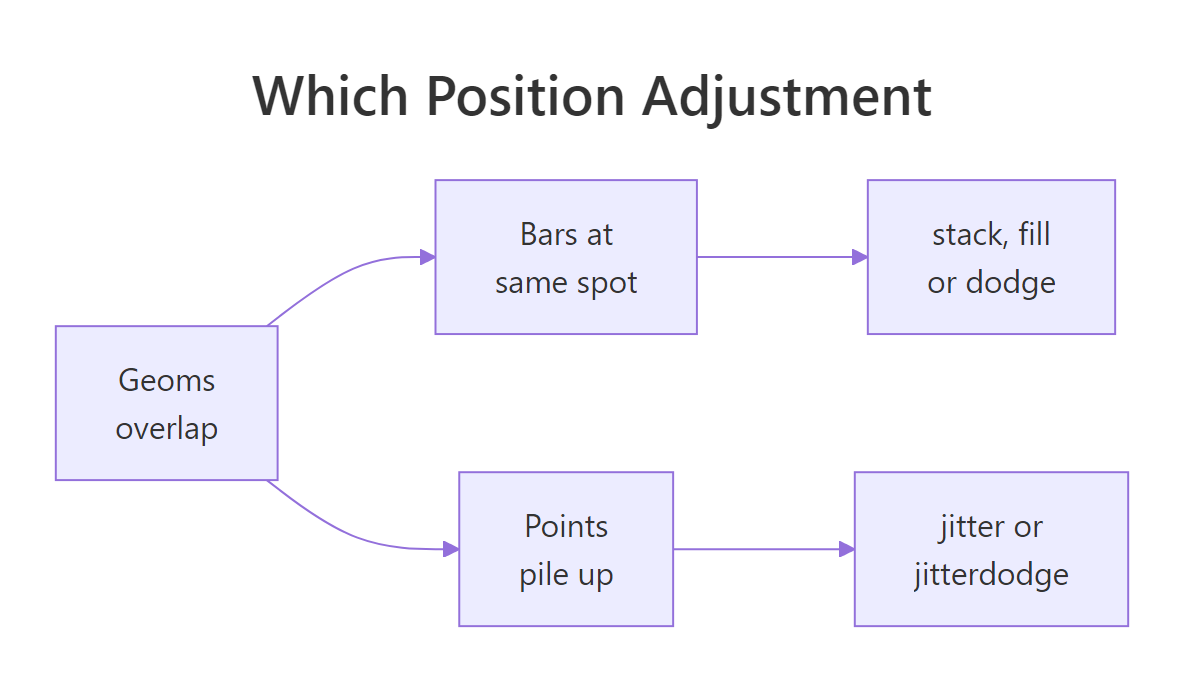
Figure 2: Start from what overlaps. Stacked bars pick stack, fill, or dodge; piled points pick jitter or jitterdodge.
position = "identity" leaves every mark exactly where its data puts it. It is the default for points and the right choice when you deliberately want overlapping bars to sit on top of one another, for example two semi-transparent distributions on one axis.Try it: You want to compare the share of each drivetrain within each class, with every bar a full-height composition. Pick the right position.
Click to reveal solution
Explanation: Share within a group means proportions, and position = "fill" rescales each stacked bar to height 1, so every bar reads as 100 percent.
A complete example: drivetrain mix by class
Let's put the pieces together into a chart you might actually ship: a labelled percentage bar showing the drivetrain mix inside each class. We will prepare the shares with dplyr, draw them with position = "fill", and place a percentage label in the middle of each segment with position_fill(vjust = 0.5).
First, compute the counts and the share of each drivetrain within each class.
The pct column holds each share as a decimal. Now draw the chart with geom_col(), which uses the n we already counted, and let position = "fill" turn those counts into a full-height composition. The trick for centered labels is to give geom_text() the same position_fill(), with vjust = 0.5 so each label lands in the middle of its segment.
The result is a clean composition chart: every class fills to 100 percent, the segments show drivetrain share, and each segment carries its own percentage label centered inside it. The same position_fill() recipe drives both the bars and the labels, which is why the numbers sit exactly where the segments do.
Practice Exercises
These combine several ideas from the tutorial. Try each before opening the solution, and use the distinct variable names given so your code does not clash with the examples above.
Exercise 1: Percent bars with a percentage axis
Build a percent-stacked bar of drivetrain within each class, and format the y-axis as percentages from 0 to 100. Add clear axis and legend labels.
Click to reveal solution
Explanation: position = "fill" makes each bar a full-height composition, and scale_y_continuous(labels = scales::percent) relabels the 0-to-1 axis as percentages.
Exercise 2: Grouped bars of a summary statistic
Sometimes the bar height is a computed number, not a count. First use dplyr to compute the mean highway mileage for each class and drivetrain into my_summary, then draw a dodged bar chart of those means with geom_col().
Click to reveal solution
Explanation: geom_col() uses your precomputed mean_hwy as the bar height, and position = "dodge" places each drivetrain's mean in its own bar for a direct comparison.
Exercise 3: Raw points on grouped boxplots
Combine two layers and a compound position. Draw boxplots of highway mileage by drivetrain, split by model year, then scatter the raw points on top so each point sits inside its own box.
Click to reveal solution
Explanation: position_jitterdodge() dodges each point into its year group and jitters it sideways. Setting outlier.shape = NA hides the boxplot outliers so they are not drawn twice, since the raw points already show them.
Frequently Asked Questions About Position Adjustments
What is the difference between position_dodge and position_dodge2? position_dodge() needs a grouping (usually your fill or colour mapping) and spaces bars evenly based on it. position_dodge2() works out the spacing directly from the data, which lets it handle elements of different widths like boxplots and violins. For plain equal-width bars either works; for anything with variable widths, prefer position_dodge2().
Why did my dodged bars change width between groups? When a group is missing a subgroup, plain dodge widens the remaining bars to fill the space, so widths look uneven across the chart. Add preserve = "single" inside position_dodge() or position_dodge2() to keep every bar the width of a single dodged bar.
Does jitter change my underlying data? Only for drawing. Jitter adds random offsets to where points are plotted, but your data frame is untouched. Because the offset is random, set a seed with set.seed() before the plot so the chart is reproducible, and keep the noise small so points stay near their true values.
When should I use fill instead of stack? Use stack when absolute totals matter and fill when you care about composition. Fill rescales every bar to the same height, so it is ideal for comparing shares across groups of very different sizes, but it deliberately hides the totals.
Can I stack boxplots the way I stack bars? No. Stacking only makes sense for geoms anchored to a baseline, like bars, areas, and histograms, where heights can add up. A boxplot summarizes a spread and has no baseline to stack from, which is why its default position is dodge2, not stack.
Summary
Position adjustments resolve the collisions that happen when marks share a coordinate. Pick one by asking what overlaps and what you want to show.
| Position | Use it when | What it does |
|---|---|---|
| stack | Bars share an x and totals matter | Piles subgroups into one bar (the default) |
| fill | You care about share, not totals | Stacks then rescales each bar to 100 percent |
| dodge | You want to compare subgroups | Sets bars side by side from a shared baseline |
| jitter | Points overplot on discrete values | Adds small random noise so density shows |
| jitterdodge | Raw points over grouped boxplots | Dodges points into groups and jitters them |
| nudge | A label sits on top of its mark | Shifts the label by a fixed offset |
The mind map below shows the whole family at a glance.
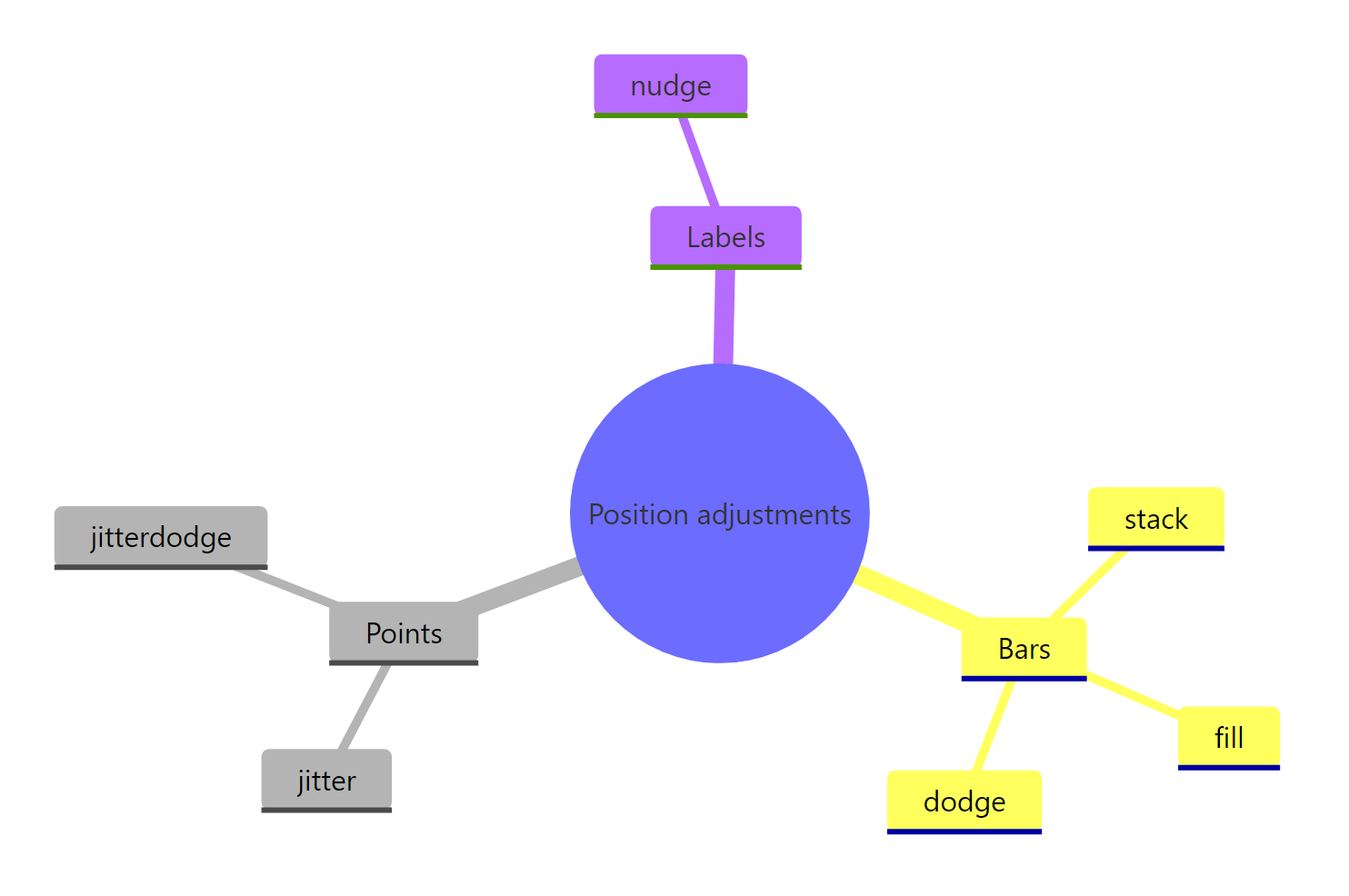
Figure 3: The position-adjustment family at a glance: positions for bars, positions for points and a nudge for labels.
The through-line is simple: the same data and mapping can tell different stories depending on the position, so choose the position that matches the question you are answering.
References
- ggplot2 reference:
position_stack()andposition_fill(). tidyverse.org reference - ggplot2 reference:
position_dodge(). tidyverse.org reference - ggplot2 reference:
position_jitter(). tidyverse.org reference - ggplot2 reference:
position_jitterdodge(). tidyverse.org reference - ggplot2 reference: the
mpgdataset. tidyverse.org reference - R Graph Gallery: grouped, stacked and percent-stacked barplots. r-graph-gallery.com
Continue Learning
- ggplot2 Bar Charts: the geom where stack, fill, and dodge do most of their work, with more on ordering and coloring bars.
- ggplot2 Scatter Plots: where jitter earns its keep, plus other ways to handle overplotting like transparency and binning.
- The Grammar of Graphics: how position fits alongside data, aesthetics, geoms, and scales as one of the seven building blocks of every ggplot2 chart.