The Best ggplot2 Extensions: ggrepel, ggtext, gghighlight
ggplot2 extensions are small add-on packages that plug new layers and text options into the plots you already build. This guide covers the three highest-value ones: ggrepel untangles labels that overlap, ggtext styles text with markdown, and gghighlight spotlights the series that matter.
What are ggplot2 extensions and why do you need them?
You have probably built a ggplot2 chart that was almost right, then hit a wall. The labels piled on top of each other. The title could not show two colours. Fifty lines turned into an unreadable tangle. Base ggplot2 does not fix these problems on its own, and that is exactly the gap extensions fill. An extension is just another package you load, and it adds new pieces that snap into the same ggplot() + layer grammar you already know.
Let's start with a concrete plot so the problem is visible. We will use mtcars, a small dataset that ships with R, and label every car by name. First we copy the car names out of the row names into a real column, because a label has to come from a column.
The table confirms our data is ready: each row is one car, with a model name, a weight (wt), a fuel economy figure (mpg), and horsepower (hp). Now we map model to the label aesthetic and draw the labels with plain geom_text().
Run that and you will see the trouble immediately. Where several cars sit close together, their names print on top of each other and become a smear. geom_text() places each label at its exact data point and never checks whether two labels collide. That single limitation is what the ggrepel extension was built to solve.
Here is the mental model to hold onto. Each of the three extensions in this guide adds one kind of piece to a normal ggplot: ggrepel adds a smarter text layer, ggtext adds styled text elements, and gghighlight adds a focus layer. Nothing about your base plot changes.
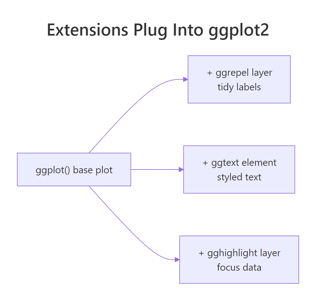
Figure 1: Every extension adds to the same ggplot() base, it does not replace it.
This table sums up what each one is for and the key function you will reach for.
| Extension | Problem it solves | Key function |
|---|---|---|
| ggrepel | Labels overlapping each other | geom_text_repel() |
| ggtext | Plain, single-style text | element_markdown() |
| gghighlight | Too many series to read | gghighlight() |
Try it: Relabel each point with its horsepower (hp) instead of the car name. You only need to change the label aesthetic.
Click to reveal solution
Explanation: The label comes from whatever column you map to label. Swapping model for hp prints the horsepower number at each point.
How do you fix overlapping labels with ggrepel?
The ggrepel package adds two new label layers, geom_text_repel() and geom_label_repel(), that work like geom_text() and geom_label() but with one added behaviour: they push labels apart so none overlap, and they draw a thin line back to the point a label belongs to. You change one word, geom_text() becomes geom_text_repel(), and the smear from the last section is gone.
One detail matters before we run it. ggrepel decides where to move each label starting from a random position, so the exact layout differs from run to run unless you fix the random seed. We call set.seed() first so the plot is reproducible.
Compare this to the earlier chart. Same data, same points, but now every car name has its own clear space and a faint segment ties it to its dot. The only new code is the swap to geom_text_repel() and the max.overlaps = Inf argument, which we will explain in a moment.
set.seed(), the label positions shift a little each time you run the code, so your saved figure will not match a later re-run. Pick any integer and keep it fixed.Labelling all 32 cars is still busy. Often you only want to call out a few points, for example the most fuel-efficient cars, and leave the rest as plain dots. The trick is to build a label column that is blank for the points you want to ignore. An empty string "" tells ggrepel there is nothing to place.
Two things changed here. We used geom_label_repel(), which draws each label inside a white box so it stays readable over the points, and we blanked out every car at or below 25 mpg with ifelse(). The box.padding = 0.6 argument gives each box a little breathing room, and min.segment.length = 0 forces a connector line even for labels that barely moved. The result is a clean chart that highlights the handful of cars you care about while the rest fade into grey context.
That max.overlaps argument from the first ggrepel plot deserves a note, because it silently drops labels if you leave the default in place.
max.overlaps = Inf forces ggrepel to place every label.Try it: Label only the cars above 30 mpg using geom_text_repel(). Change the cutoff in the ifelse() line.
Click to reveal solution
Explanation: The ifelse() keeps a name only when mpg is above 30 and sets everything else to "", so ggrepel labels just the four most efficient cars.
How do you style plot text with ggtext?
The ggtext package lets you write plot text in markdown and HTML. It gives you two kinds of tools: theme elements like element_markdown() that style built-in text such as titles and axis labels, and geoms like geom_richtext() that place styled text at data positions. With either one you can bold a word, recolour it, or break a line, all without leaving ggplot2.
install.packages(c("ggtext", "gghighlight")). Every ggrepel block above runs right here in your browser.The signature ggtext move is to colour the words in your title to match the series, then delete the legend entirely. The title itself becomes the key. Here we colour the points by transmission type, colour the matching words in the title, and turn the legend off with show.legend = FALSE.
library(ggplot2)
library(ggtext)

# Colour the two words in the title, drop the legend, and the title becomes the key.
p_md <- ggplot(mtcars, aes(x = wt, y = mpg, colour = factor(am))) +
  geom_point(size = 2.5, show.legend = FALSE) +
  scale_colour_manual(values = c("0" = "#D55E00", "1" = "#0072B2")) +
  labs(
    title = "Fuel economy for <span style='color:#D55E00'>**automatic**</span> and <span style='color:#0072B2'>**manual**</span> cars",
    x = "Weight (1000 lbs)", y = "Miles per gallon"
  ) +
  theme(plot.title = element_markdown(size = 13))

p_md
Look at what each part does. The title string contains ordinary HTML: a <span style='color:...'> sets a colour and the ... markdown makes the word bold. On its own, ggplot2 would print that as literal angle brackets. The magic is the last line, theme(plot.title = element_markdown()), which tells ggplot2 to render the title as markdown instead of plain text. Because the coloured words already name the two groups, we do not need a legend, so the chart carries less clutter and reads faster.
You are not limited to titles. geom_richtext() places a styled text box anywhere on the panel, using the same markdown and HTML. It is perfect for a one-line annotation that draws attention to a region of the plot.
# geom_richtext() draws markdown or HTML straight onto the panel, like an annotation.
note <- data.frame(
  wt = 4.1, mpg = 32,
  text = "Light **and** thrifty:<br><span style='color:#0072B2'>manual</span> cars sit up here"
)

p_rich <- ggplot(mtcars, aes(wt, mpg)) +
  geom_point(colour = "grey55") +
  geom_richtext(data = note, aes(label = text),
                fill = "white", label.colour = "grey70") +
  labs(x = "Weight (1000 lbs)", y = "Miles per gallon")

p_rich
The note data frame holds a single row: a position on the plot and the styled text to draw there. Inside that text, and is bold, <br> starts a new line, and the <span> colours the word "manual". geom_richtext() draws it in a small white box at (4.1, 32). This is the same idea as geom_label(), with markdown support added on top.
Try it: Make the x-axis title read "Weight in 1000 lbs" with "1000 lbs" in bold. Wrap the words in ... and render the axis title with element_markdown().
# Goal: make the x-axis title read "Weight in 1000 lbs" with "1000 lbs" in bold.
# Wrap the words in **...** and render the axis title with element_markdown().
ex_axis <- ggplot(mtcars, aes(wt, mpg)) +
  geom_point(colour = "grey50") +
  labs(x = "Weight in 1000 lbs")
# Add: + theme(axis.title.x = element_markdown())
ex_axis
Click to reveal solution
ex_axis <- ggplot(mtcars, aes(wt, mpg)) +
  geom_point(colour = "grey50") +
  labs(x = "Weight in **1000 lbs**", y = "Miles per gallon") +
  theme(axis.title.x = element_markdown())
ex_axis
Explanation: The 1000 lbs markdown makes those words bold, and element_markdown() on axis.title.x renders the axis title as markdown rather than plain text.
How do you highlight key data with gghighlight?
When a chart has many series, the hard part is not drawing them, it is showing the reader which ones to look at. The gghighlight package solves this by keeping the series that match a rule in full colour and fading the rest to grey. The grey lines stay on the plot as context, so you see the standouts without losing the sense of the whole. Remember the note above: this section also runs on your own machine.
First, the problem. We simulate twelve products, each with a twelve-month revenue path, and draw them all. This is a classic "spaghetti" chart.
library(ggplot2)
library(gghighlight)

# Twelve made-up products, each a 12-month revenue path (a random walk).
set.seed(2024)
months <- 1:12
series <- expand.grid(month = months, product = paste0("P", sprintf("%02d", 1:12)))
series$revenue <- ave(rnorm(nrow(series)), series$product, FUN = cumsum) + 10

p_spaghetti <- ggplot(series, aes(month, revenue, colour = product)) +
  geom_line(show.legend = FALSE) +
  labs(title = "Twelve products, impossible to tell apart",
       x = "Month", y = "Revenue")

p_spaghetti
Twelve lines in twelve colours tell you almost nothing. To pick the winners we need a rule, and a natural one is "which products reached a high peak". Let's compute each product's highest revenue so we can choose a sensible cutoff.
# gghighlight needs a rule. Base it on each product's peak revenue.
peaks <- tapply(series$revenue, series$product, max)
round(sort(peaks, decreasing = TRUE)[1:6], 1)
#>  P06  P01  P09  P05  P07  P08
#> 14.8 14.1 12.7 12.6 12.4 11.4
The four leaders (P06, P01, P09, P05) all top 12.5, while the next product sits at 12.4. So a cutoff of 12.5 cleanly separates the top four. Now we hand that rule to gghighlight(). Everything with a peak above 12.5 stays coloured, and the rest turn grey.
p_high <- ggplot(series, aes(month, revenue, colour = product)) +
  geom_line() +
  gghighlight(max(revenue) > 12.5, unhighlighted_params = list(colour = "grey85")) +
  labs(title = "Only the standout products keep their colour",
       x = "Month", y = "Revenue")

p_high
One line of new code did all the work. gghighlight(max(revenue) > 12.5) kept the four leaders in colour, greyed the other eight, and even labelled the highlighted lines for you. The unhighlighted_params = list(colour = "grey85") argument controls how faint the background lines are.
max(revenue) > 12.5 is evaluated per product line: it asks "does this line's peak clear 12.5?". That is why you can write a whole-series test like a maximum or a mean and gghighlight applies it line by line.The feature that makes gghighlight worth learning is how it behaves with facets. Split the plot into one panel per product, and gghighlight repeats the grey context in every panel while colouring only that panel's own line. You get a small-multiples chart where each product is shown against the crowd.
p_facets <- ggplot(series, aes(month, revenue, colour = product)) +
  geom_line() +
  gghighlight(max(revenue) > 12.5) +
  facet_wrap(~ product) +
  labs(title = "Each panel highlights one product against the rest",
       x = "Month", y = "Revenue")

p_facets
Each small panel keeps all twelve grey lines as a backdrop and lights up just one product on top. This is the clearest way to answer "how does each product compare to the others" without twelve separate charts or a legend nobody can follow.
list(colour = "grey85", linewidth = 0.3) to make the background lines lighter or thinner. It is the difference between context that supports the story and clutter that fights it.Try it: Highlight the products whose average revenue beats 11, rather than their peak. Swap max() for mean() in the rule.
# Goal: highlight products whose AVERAGE revenue beats 11, not their peak.
# Swap max() for mean() in a gghighlight() line, then run.
ex_plot <- ggplot(series, aes(month, revenue, colour = product)) +
  geom_line()
# Add: + gghighlight(mean(revenue) > 11)
ex_plot
Click to reveal solution
ex_plot <- ggplot(series, aes(month, revenue, colour = product)) +
  geom_line() +
  gghighlight(mean(revenue) > 11, unhighlighted_params = list(colour = "grey85")) +
  labs(x = "Month", y = "Revenue")
ex_plot
Explanation: mean(revenue) > 11 keeps only the products whose twelve-month average clears 11, which turns out to be the two strongest performers.
How do you combine ggrepel, ggtext, and gghighlight in one chart?
Each extension shines on its own, but the real payoff is stacking them. A publication-ready chart usually needs all three jobs at once: it must focus the eye on a few series, label them cleanly, then finish with a styled title. Before we build it, here is a quick way to decide which tool a given problem calls for.
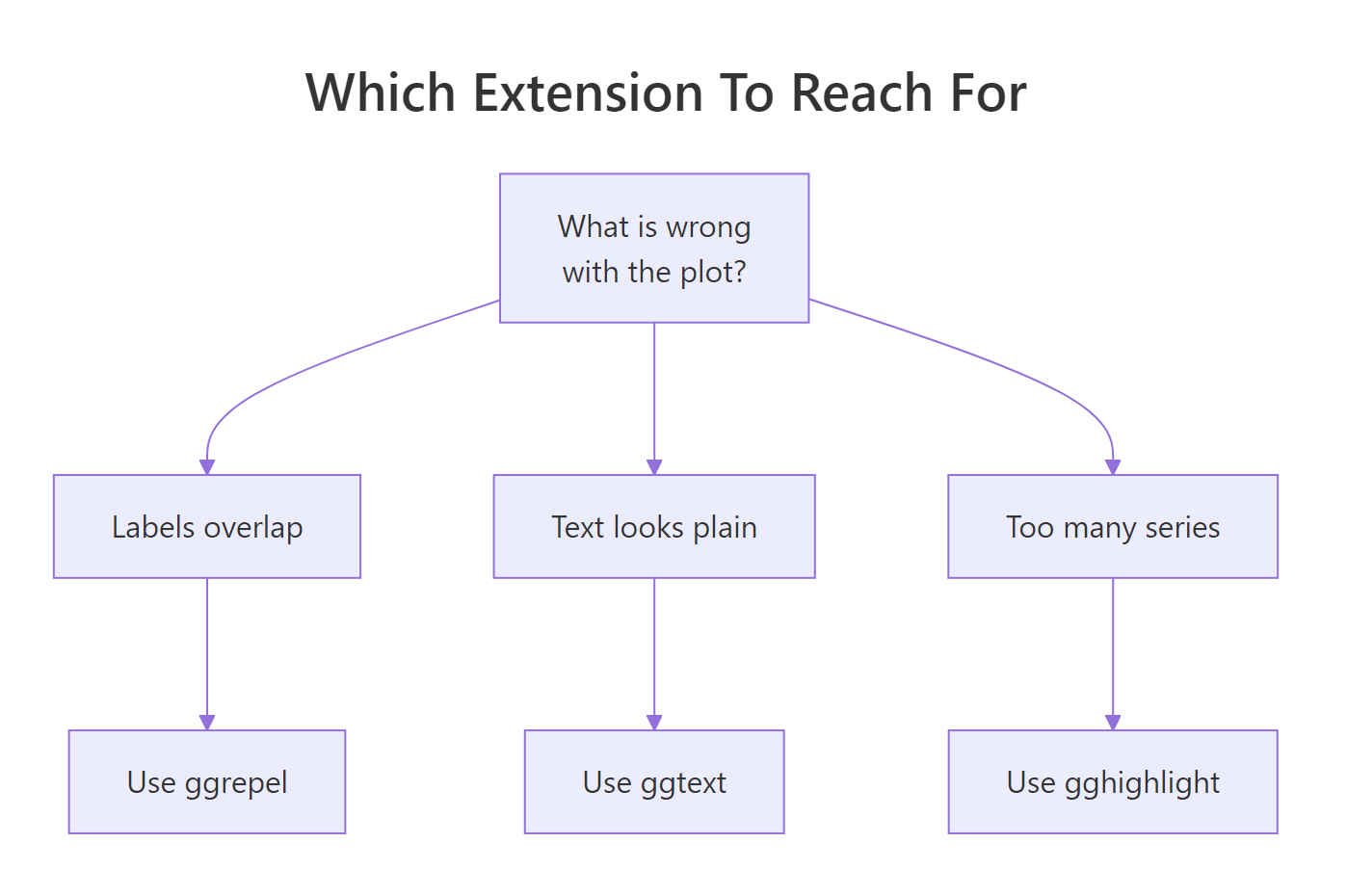
Figure 2: Match the plot problem to the extension that fixes it.
Now the combined chart, reusing the same series data from the last section. We highlight the leaders with gghighlight, label just their end points with ggrepel, and colour the title word with ggtext.
library(ggrepel)
library(ggtext)

# Highlight the leaders, label their end points, and colour the title to match.
# (ggplot2 and gghighlight were loaded in the sections above.)
hi <- names(which(tapply(series$revenue, series$product, max) > 12.5))
ends_hi <- series[series$month == 12 & series$product %in% hi, ]

p_final <- ggplot(series, aes(month, revenue, colour = product)) +
  geom_line(linewidth = 0.9) +
  gghighlight(max(revenue) > 12.5, unhighlighted_params = list(colour = "grey88")) +
  geom_text_repel(data = ends_hi, aes(label = product),
                  nudge_x = 0.5, direction = "y", hjust = 0, size = 3.2,
                  segment.colour = "grey70") +
  labs(
    title = "The <span style='color:#0072B2'>**standout products**</span> pull away late in the year",
    x = "Month", y = "Revenue"
  ) +
  theme_minimal() +
  theme(plot.title = element_markdown(), legend.position = "none")

p_final
Read the recipe layer by layer. gghighlight() fades the also-rans to grey. We then build a small ends_hi table with only the four leaders at month 12 and hand it to geom_text_repel(), so only those end points get a name and the names do not collide. Finally element_markdown() renders the coloured, bold phrase in the title. The chart now tells a single clear story: these four products broke away, and here they are by name.
Try it: Make the chart even more selective. Raise the peak cutoff to 13 so only the top two products stay coloured, and change the title colour to firebrick.
# Goal: highlight only the very top products (peak above 13, not 12.5) and colour
# the bold title word firebrick instead of blue.
# In the p_final recipe above, change two things:
#   1) both 12.5 values to 13
#   2) the title colour #0072B2 to firebrick
new_threshold <- 13
Click to reveal solution
hi <- names(which(tapply(series$revenue, series$product, max) > 13))
ends_hi <- series[series$month == 12 & series$product %in% hi, ]

ggplot(series, aes(month, revenue, colour = product)) +
  geom_line(linewidth = 0.9) +
  gghighlight(max(revenue) > 13, unhighlighted_params = list(colour = "grey88")) +
  geom_text_repel(data = ends_hi, aes(label = product),
                  nudge_x = 0.5, direction = "y", hjust = 0, size = 3.2) +
  labs(title = "Peak above 13: <span style='color:firebrick'>**standout products**</span>",
       x = "Month", y = "Revenue") +
  theme_minimal() +
  theme(plot.title = element_markdown(), legend.position = "none")
Explanation: Raising the cutoff to 13 leaves only P06 and P01 in colour, and color:firebrick in the title span recolours the bold phrase to match a red theme.
Practice Exercises
These combine several ideas from the tutorial. Try each one before opening the solution. The first exercise runs in your browser; the second uses gghighlight and ggtext, so run it locally.
Exercise 1: Label the eight-cylinder cars
Build a labelled scatter of horsepower (hp) versus mpg for the 8-cylinder cars only, and repel the labels so no name overlaps. Subset cars to cyl == 8, map model to the label, and use geom_text_repel().
Click to reveal solution
Explanation: subset(cars, cyl == 8) keeps only the V8 models, then geom_text_repel() spreads their names apart. The max.overlaps = Inf makes sure every car gets a label even in the busy middle of the plot.
Exercise 2: Build a focus chart
Make a "focus" chart from the series data. Highlight the products whose peak revenue tops 12.5, grey out the rest, and add a title where the word "focus" is bold and blue using element_markdown().
# Capstone 2: a "focus" chart. Highlight products whose peak revenue tops 12.5,
# grey out the rest, and add an element_markdown() title where the word "focus"
# is bold and blue.
focus_data <- series
# Write your ggplot() code below, then run.
Click to reveal solution
ggplot(series, aes(month, revenue, colour = product)) +
  geom_line(linewidth = 0.8) +
  gghighlight(max(revenue) > 12.5, unhighlighted_params = list(colour = "grey85")) +
  labs(title = "A chart with <span style='color:#0072B2'>**focus**</span>",
       x = "Month", y = "Revenue") +
  theme_minimal() +
  theme(plot.title = element_markdown(), legend.position = "none")
Explanation: gghighlight(max(revenue) > 12.5) keeps the four leaders in colour, and the <span> plus element_markdown() combination colours the bold word "focus" blue in the title.
Frequently Asked Questions
What is the difference between a ggplot2 extension and a theme?
A theme changes the look of existing plot elements such as fonts and grid lines. An extension adds new capability that base ggplot2 does not have at all, like a label layer that avoids overlaps or a title that renders markdown. You often use both together: an extension for the new feature and a theme like theme_minimal() for the overall style.
Why do ggtext and gghighlight run locally instead of in the browser?
The in-browser runner supports a fixed set of packages, and those two are not in it, while ggrepel is. The code is identical either way, so any ggtext or gghighlight block here will run without changes in RStudio once you install the package. Install both at once with install.packages(c("ggtext", "gghighlight")).
Is ggrepel better than adjusting labels by hand?
For anything past a few points, yes. Hand-nudging labels is slow and breaks the moment your data changes, whereas geom_text_repel() re-solves the layout automatically every time you redraw. Fix the random seed with set.seed() and the automatic layout is also reproducible.
Does gghighlight remove the data it fades out?
No. gghighlight keeps every row and only changes how the non-matching series are drawn, turning them grey rather than deleting them. That is the whole point: the faded lines stay as context so the reader still sees the full picture. If you actually want to drop rows, use dplyr::filter() instead.
How do I install these extension packages?
Each one is on CRAN, so install.packages("ggrepel"), install.packages("ggtext"), and install.packages("gghighlight") all work. You only install once per machine, then load them with library() in each session, exactly like ggplot2 itself.
Summary
The three extensions in this guide each fix a common ggplot2 frustration by adding one new piece to the grammar you already use.
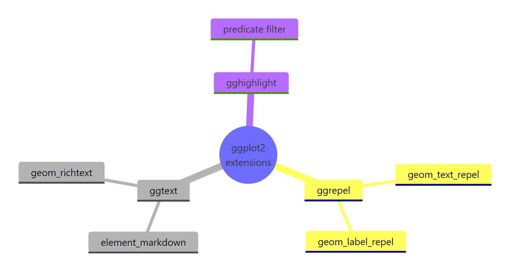
Figure 3: The three extensions and their headline functions.
| Extension | Use it when | Key function | Runs in browser here |
|---|---|---|---|
| ggrepel | Point or text labels overlap | geom_text_repel(), geom_label_repel() |
Yes |
| ggtext | You need bold, colour, or markdown in text | element_markdown(), geom_richtext() |
No, run locally |
| gghighlight | Too many series to read at once | gghighlight() |
No, run locally |
Key takeaways to remember:
- Extensions plug into the same
ggplot() + layergrammar, so nothing about your base plot changes. - Call
set.seed()before any ggrepel plot you want to reproduce exactly. - A coloured ggtext title can stand in for a legend and cut clutter.
- gghighlight tests its rule once per group and keeps the faded series as context, especially inside facets.
- The three combine cleanly: gghighlight to focus, ggrepel to label, ggtext to title.
References
- ggrepel documentation. Getting started with ggrepel (CRAN vignette). Link
- ggrepel package website by Kamil Slowikowski. Link
- ggtext package website by Claus O. Wilke. Link
- gghighlight documentation. Introduction to gghighlight (CRAN vignette). Link
- gghighlight package website by Hiroaki Yutani. Link
- ggplot2 extensions gallery. Link
- Wickham, H. et al. ggplot2: Elegant Graphics for Data Analysis (3rd edition). Link
Continue Learning
- ggplot2 Themes: Customize Fonts, Colors and Layout: style the overall look of any plot, then layer these extensions on top.
- 25 Best ggplot2 Extensions in R: a wider tour of the extension ecosystem beyond the three covered here.
- ggplot2 Colours: Scales, Palettes and Manual Colors: pick the colours you will reuse in ggtext titles and gghighlight highlights.