Plot Templates in R: Functions that Return ggplots
A plot template is an R function that builds and returns a ggplot object, so a single call redraws the same styled chart for any data or columns you hand it. Instead of copy-pasting the same twelve lines for every variable, you write the recipe once and reuse it everywhere.
You already build charts by stacking layers with +. This tutorial shows you how to capture that whole stack inside a function, so the plot becomes a reusable tool. We use ggplot2 throughout, and every code block runs directly in your browser, so you can change a line and re-run it as you read.
Why wrap a ggplot in a function?
Picture this. You have several numeric columns and you want the same clean scatter for each one, so you paste the same block over and over. Then someone asks for a different theme, and now you are hand-editing every copy. A function fixes that: you describe the chart once, and every call reproduces it. Here is the idea in action.
First, let's load ggplot2 and look at the data we will chart. The built-in mpg dataset holds fuel-economy figures for 234 car models.
Each row is one car. We will plot engine size (displ, in litres) against highway mileage (hwy). Now let's wrap that plot in a function. The function takes a data frame, builds a scatter with a fixed style, and returns it.
Read the function top to bottom. It names one argument, data, plus a point_color with a default. Inside, it stacks the usual ggplot layers, and because that stack is the last thing in the function, it becomes the return value. Calling scatter_hwy(mpg_data) draws the chart you would expect: mileage falls as engines grow.
The real payoff shows up when you point the same template at a different slice of the data. No copy-paste, just another call.
Here we filter down to SUVs and hand that subset to the very same function, this time asking for an orange colour. One definition, two charts, identical styling. Change the theme in the function once and every chart that uses it updates together.
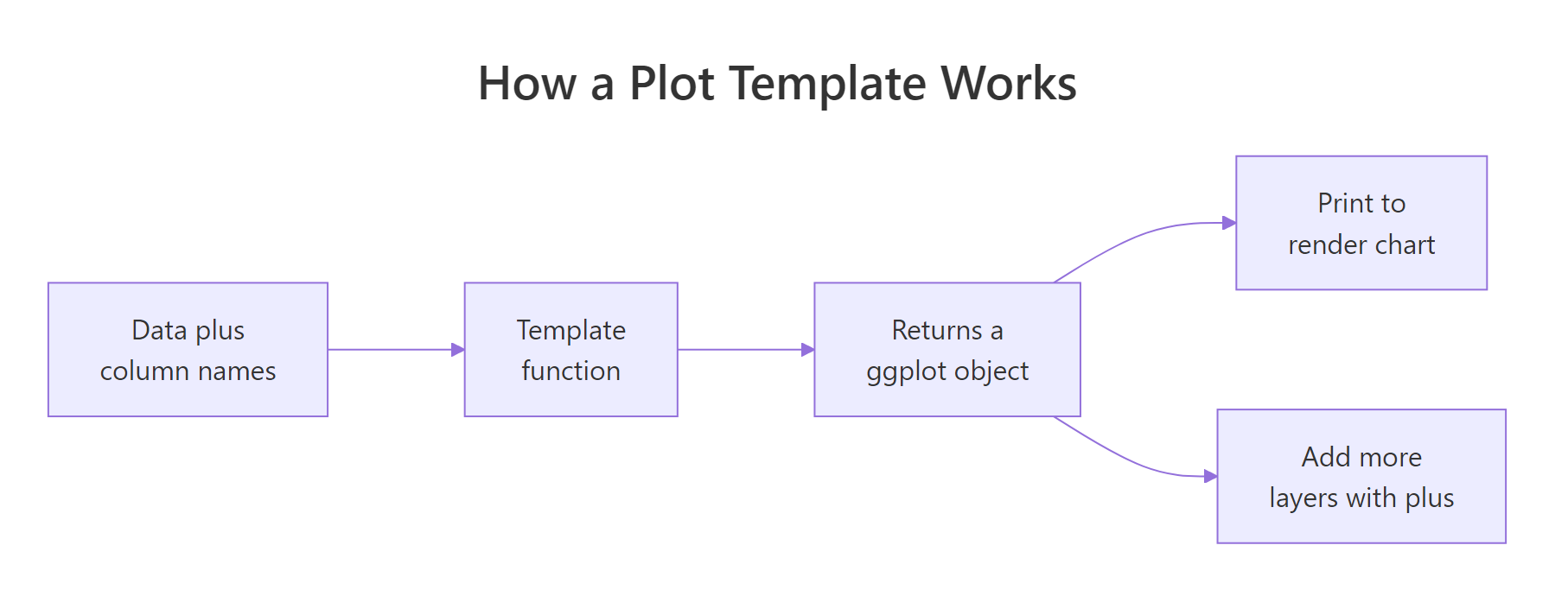
Figure 1: A plot template takes data and column names, returns a ggplot object, then you print it or add more layers.
Try it: The two-seater sports cars are their own class in mpg. Filter them and hand the subset to scatter_hwy() with a red colour.
Click to reveal solution
Explanation: subset() keeps only the rows where class equals "2seater", and the template does the rest. Nothing about the plotting code changed, only the data flowing into it.
Is a ggplot just an object you can store and return?
That reuse works because of something you may not have noticed: a ggplot is an ordinary R object. When you type ggplot(...) + geom_point(), R does not draw anything. It builds a value and hands it back. The chart only appears when that value is printed. That is exactly why a function can return one.
Let's prove it. We will store a plot in a variable and ask R what kind of thing it is.
Assigning to p produced no chart, which confirms that building and drawing are separate steps. The object reports its class as "ggplot2::ggplot" (it also carries the shorter "gg" and "ggplot" tags), and inherits(p, "ggplot") returns TRUE. So p is a value you can pass around, store in a list, or return from a function.
Being an object also means you can inspect it and keep building on it. Every ggplot holds its axis labels and a stack of drawing layers.
The labels are the ones our template set with labs(). The plot starts with one layer (the points), and adding geom_smooth() returns a new plot with two layers. Print p_fit and you will see a straight trend line over the points. This is the whole trick behind templates: a function can return p, and the caller can still add more layers afterward.
Try it: Start from the stored plot p and add a geom_rug() layer, then count the layers.
Click to reveal solution
Explanation: geom_rug() adds tick marks along the axes as a second drawing layer, so the count goes from one to two. Adding a layer never changes the original p; it returns a new plot.
How do you write your first plot template function?
So far the template has been a single expression. Real templates need arguments with sensible defaults and a clear value to return. Let's look at the anatomy by rewriting the function a little more carefully.
Three things changed. We added a title argument that defaults to NULL, so callers can add a headline when they want one and skip it otherwise. We assembled the plot into a variable g and then wrote return(g) to make the return value explicit. And we passed title straight into labs(). Because NULL tells labs() to draw no title, the default behaviour is unchanged.
You do not strictly need return(), since R returns the last expression automatically, but naming the object makes longer templates easier to read. Let's confirm the function really does hand back a plot object.
q holds the returned plot, and inherits() confirms it is a ggplot. Everything you learned in the last section applies: you can store it, inspect it, or add layers to it.
Try it: Add a point_size argument to a template so callers can control the dot size.
Click to reveal solution
Explanation: The argument point_size flows into geom_point(size = point_size), so point_size = 4 draws larger dots. Its default of 2.5 keeps the ordinary call unchanged.
How do you pass column names into a plot template?
Our template still hardcodes displ and hwy. To make it truly reusable, the columns themselves must become arguments. This is the one genuinely tricky part of writing plot templates, so let's go slowly.
The obvious attempt fails. If you write aes(x = xcol) and call the function with xcol = displ, ggplot looks for a column literally named "xcol", which does not exist. The fix is the embracing operator, written as double braces {{ }}. It tells ggplot, "do not take this argument literally; look up whatever column the caller passed." Wrap each column argument in {{ }} inside aes().
Now the template accepts any two columns. We passed cty and hwy as bare names, and {{ }} forwarded them into aes(). Call it again with displ and hwy, or any other pair, and it just works.
There is a pleasant bonus: ggplot labels the axes with the column names automatically. You can ask the plot what titles it will draw with get_labs().
The axis titles came straight from the columns you embraced, with no labs() call needed. That is one less thing for the template to manage.
Sometimes the column name arrives as a string instead of a bare name, for example when it comes from a loop or a user selecting from a menu. For that case, ggplot gives you the .data pronoun: .data[[xcol]] means "the column whose name is the string in xcol."
The columns now come in as quoted strings, and .data[[xcol]] looks them up by name. Because the names are plain text, we can also build a title with paste(). Use {{ }} when the caller types a bare column name, and .data[[...]] when the name is stored as a string.
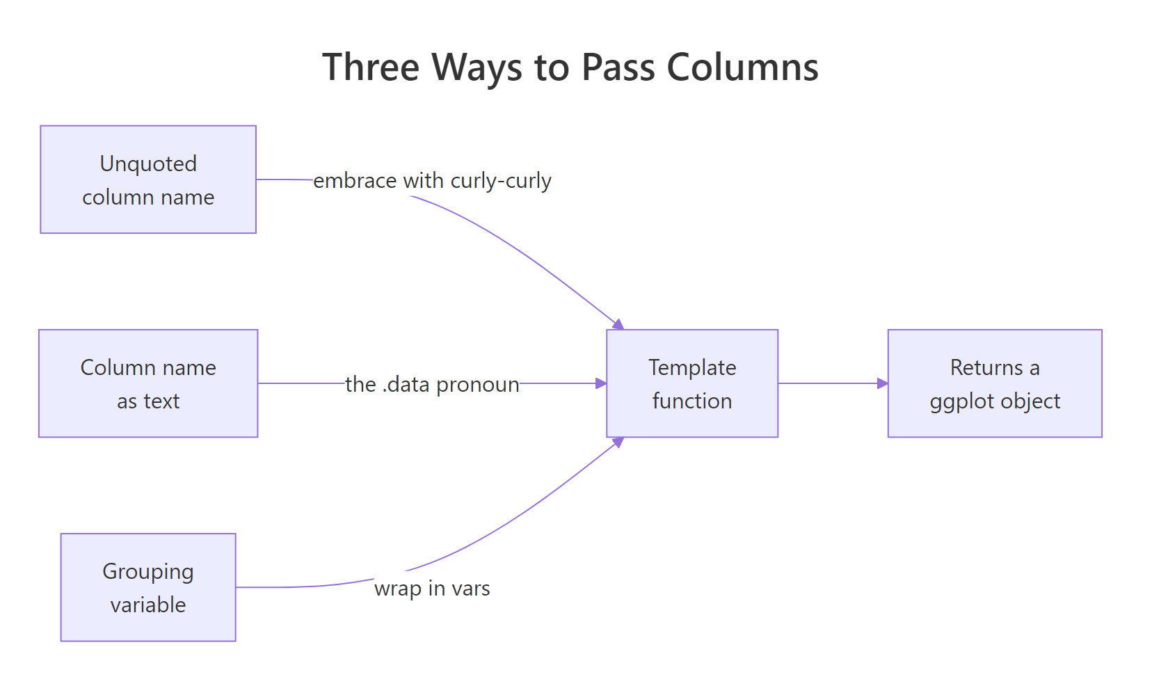
Figure 2: Three ways to feed columns into a template: embrace unquoted names, use the .data pronoun for strings, and wrap grouping variables in vars().
Try it: Finish a template so its y aesthetic maps to whatever column the caller passes.
Click to reveal solution
Explanation: Wrapping ycol in {{ }} forwards the bare column name into aes(), so ex_dot(mpg_data, hwy) plots hwy on the y axis. geom_jitter() spreads the points so overlapping values stay visible.
How do you facet a template programmatically?
Splitting a chart into small panels, one per group, is called faceting. It needs its own trick inside a function. You cannot embrace a column directly inside facet_wrap(); instead you wrap the grouping column in vars(), which is the faceting counterpart of {{ }}. Combine the two and the grouping variable becomes an argument too.
The template maps xcol and ycol with embracing as before, then splits into panels by by. Writing vars({{ by }}) passes the caller's grouping column through to facet_wrap(). The call above produces three panels, one for each drive type, each an identical mini scatter.
Try it: Reuse faceted_scatter() but split the panels by car class instead of drive type.
Click to reveal solution
Explanation: Passing class as the by argument sends it through vars({{ by }}) into facet_wrap(), so you get one panel per car class. The rest of the template is untouched.
How do you generate many plots at once?
Here is where templates pay off at scale. Because each call returns an object, you can loop over a set of columns and collect the results in a list. lapply() runs a function once per element of a vector and gathers the return values, so pointing it at column names gives you one plot per column.
We looped over three column names. Since col is a string on each pass, we look the column up with .data[[col]]. The result, plots, is a list of three ggplot objects, confirmed by its length and the class of its first element. Each histogram is titled with its own column name.
A list of plots is only useful if you can lay them out together. The patchwork package lets you combine ggplots with + or arrange a whole list at once with wrap_plots().
wrap_plots(plots, ncol = 3) arranges the three histograms side by side in a single figure. Add a column to num_cols and rerun, and the grid grows automatically, with no layout code to touch.
Try it: Add the year column to the vector, rebuild the list the same way, and count it.
Click to reveal solution
Explanation: Adding "year" makes the vector four names long, so lapply() builds four plots. The pattern scales to any number of columns without new code.
How do you build reusable style add-ons with list()?
Templates do not have to return a whole plot. A function that returns a list() of layers, scales and theme tweaks becomes a reusable component you graft onto any chart with +. ggplot accepts a list on the right of + and splices each element in as if you had added them one by one.
brand_style() returns three things bundled in a list: a colour scale, a base theme, and a couple of theme overrides. Adding brand_style() to the plot applies all three at once. The beauty is that this bundle is not tied to any particular chart. Point it at a completely different geom and it still works.
Same styling function, a boxplot this time. Your whole team can share one brand_style() and every chart comes out looking consistent, whether it is a scatter, a boxplot, or a bar chart.
Try it: Write a small add-on that moves the legend to the bottom.
Click to reveal solution
Explanation: The add-on returns a list with a theme that sets legend.position = "bottom". Because it is just a list of components, you can add it to any plot with +.
How do you assemble a complete plotting toolkit?
Let's put the pieces together. A good toolkit keeps two jobs separate: one function for house style, and one for the chart structure. Then a single call produces a finished, branded chart. We will build both, use them, and then prove the result is still a plain ggplot by extending it.
report_style() carries the house style, and titled_scatter() handles structure, taking three embraced columns plus a title and subtitle. One call assembles a fully branded chart, and inherits() confirms p_final is a normal ggplot. Because it is, you can keep customising it after the fact.
Adding facet_wrap(vars(drv)) splits the branded chart into one panel per drive type. This is the point worth remembering: templates give you a fast, consistent starting chart, and you never lose the ability to tweak the result with ordinary ggplot code.
Try it: p_final is a normal ggplot. Give it a new title with labs().
Click to reveal solution
Explanation: labs(title = ...) added after the template overwrites the title the template set. The template gives you a strong default, and + lets you adjust anything afterward.
Practice Exercises
These combine several ideas from the tutorial. Try each before opening the solution. The exercises use their own variable names so they will not clash with the tutorial code above.
Exercise 1: A reusable bar-chart template
Write a function bar_template(data, cat_col) that returns a horizontal bar chart of category counts for whatever categorical column you pass. Map the embraced column to the y aesthetic, use geom_bar() (it counts rows for you), and add theme_minimal(). Test it on the class column.
Click to reveal solution
Explanation: Embracing cat_col lets the caller pass any categorical column. Mapping it to y makes the bars horizontal, and geom_bar() counts the rows in each category for you.
Exercise 2: Batch-generate density plots
Write make_densities(data, cols), where cols is a character vector of column names. Return a list with one geom_density() plot per column, looking each column up with .data[[col]]. Then combine the list with patchwork and confirm the pieces.
Click to reveal solution
Explanation: lapply() builds one density plot per name, using .data[[col]] because the names are strings. wrap_plots() arranges the whole list into a single patchwork figure.
Exercise 3: A shareable dark-theme add-on
Build a +-able add-on dark_style() that returns a list() containing scale_color_viridis_d(), theme_dark(), and a legend moved to the bottom. Apply it to two different charts to prove it is reusable.
Click to reveal solution
Explanation: dark_style() bundles a colour scale, a dark theme, and a legend position into a list, so a single + restyles any chart. Adding it to both a scatter and a boxplot shows it does not care what geom you use.
Frequently Asked Questions
What is the difference between {{ }} and .data[[ ]] when passing a column to a plot template? Use the embracing operator {{ }} when the caller types a bare, unquoted column name, as in scatter_any(mpg_data, cty, hwy). Use the .data pronoun .data[[xcol]] when the column name arrives as a string like "cty", which is what you get from a loop or a menu selection. Both map the same column; they only differ in whether the name starts out bare or quoted.
Why does my plot function say "object 'xcol' not found"? You most likely wrote aes(x = xcol) and passed the column as an argument. ggplot took xcol literally and looked for a column named "xcol", which does not exist. Wrap the argument in {{ }} for a bare name, or use .data[[xcol]] for a string, so ggplot looks up the column the caller actually passed.
Do I still need aes_string() to pass column names? No. aes_string() is deprecated in current ggplot2. The embracing operator {{ }} replaces it for bare names, and .data[[var]] replaces it for names held as strings. Both are the supported approach today.
How do I let a template facet by a column the caller chooses? You cannot embrace a column directly inside facet_wrap(). Wrap the grouping argument in vars() instead, written as facet_wrap(vars({{ by }})). That is the faceting counterpart of {{ }}, and it lets the grouping variable become an argument like any other.
Can a plot template return something other than a whole plot? Yes. A function that returns a list() of scales, themes, and layers becomes a reusable add-on you attach to any chart with +. ggplot splices each element of the list in as if you had added them one at a time, so one brand_style() can restyle every chart in a project.
How do I combine several plots made by a template into one figure? Collect them in a list, for example with lapply() over a vector of column names, then pass that list to wrap_plots() from the patchwork package. wrap_plots(plots, ncol = 3) lays them out in a grid, and the grid grows on its own as you add more plots to the list.
Summary
A plot template is just a function that returns a ggplot object. That one idea gives you reuse, batch generation, and shared styling across a whole project.
| Technique | What it does | Key syntax |
|---|---|---|
| Full-plot template | Returns a finished, styled chart | function(data) ggplot(...) + ... |
| Bare column argument | Passes an unquoted column name | aes(x = {{ xcol }}) |
| String column argument | Passes a column name held as text | aes(x = .data[[xcol]]) |
| Faceting argument | Splits panels by a passed column | facet_wrap(vars({{ by }})) |
| Batch generation | One plot per column, then combine | lapply(cols, ...) + wrap_plots() |
| Style add-on | A plus-able bundle of styling | function() list(scale, theme, ...) |
The figure below sums up the four kinds of template you can build from these pieces.
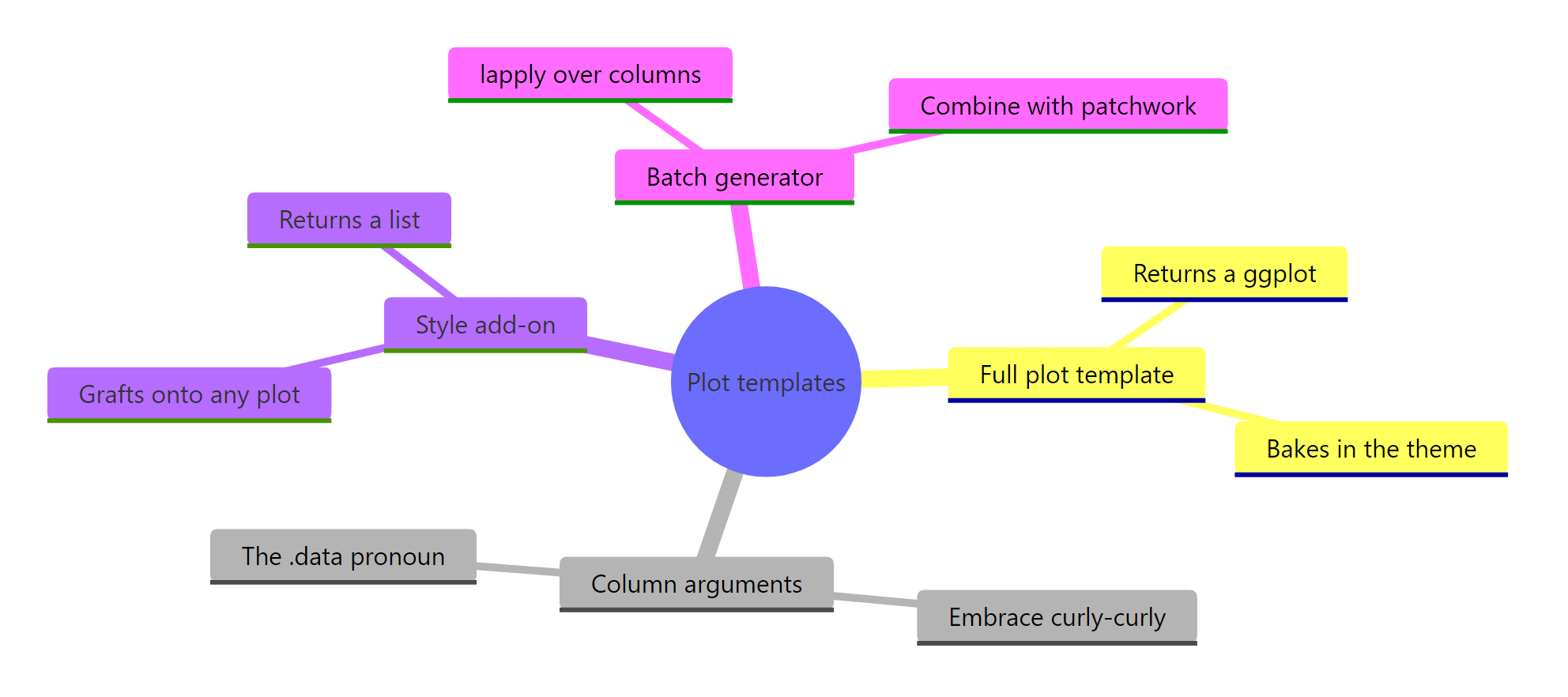
Figure 3: The four kinds of plot template you can build.
Start with a full-plot template for your most common chart, add column arguments when you need flexibility, and pull shared styling into a list() add-on once you notice yourself repeating theme code.
References
- ggplot2 documentation. Construct aesthetic mappings with aes() and the embracing operator. Link
- Tidyverse blog. Tidy evaluation in ggplot2. Link
- dplyr documentation. Programming with dplyr (embracing, the .data pronoun). Link
- Wickham, H. Advanced R, 2nd Edition. Metaprogramming. Link
- patchwork documentation. Combining ggplots into a single figure. Link
- Wickham, H., Cetinkaya-Rundel, M., and Grolemund, G. R for Data Science, 2nd Edition. Functions. Link
Continue Learning
- Build a Complete ggplot2 Theme from Scratch: turn the styling in your templates into a full, named theme you can ship.
- Write Your Own ggplot2 Geom and Stat: go one level deeper and package a custom chart type as a reusable layer.
- How to Read ggplot2 Code: 10 Real Plots Deconstructed: read and adapt any ggplot2 code you find with confidence.