Plotting Big Data in R: Overplotting, Binning, scattermore
When a scatter plot has to draw hundreds of thousands of points, they stack into a solid blob and the plot takes seconds to render. The fix is to stop drawing every dot. Instead, you summarise the points into counts or keep only a sample, and when every point must stay you rasterize them into pixels. This tutorial walks through every option in ggplot2, from a one-line transparency tweak to the scattermore package, using plain ggplot2 the whole way.
Why does a scatter plot fail when you have too many points?
A scatter plot draws one dot per row. That is perfect for a few hundred points, but real datasets are often much larger: sensor logs, transaction records, or simulation output can run to hundreds of thousands or millions of rows. At that scale the dots pile on top of each other, the interesting structure disappears under a wall of ink, and every redraw gets slow. Let's build a dataset big enough to see the problem, then watch it happen.
We will simulate 300,000 points that fall into two overlapping clouds, so there is real structure hiding in the data. The first code block loads ggplot2, generates the data, and confirms its size so you know exactly what you are working with.
The nrow() call confirms 300,000 rows, and head() shows each row is just a pair of numbers, x and y. There are two clouds baked in here: one centered near zero and a second, looser one centered near x = 4. Keep that in mind, because the whole point of the tutorial is that a plain scatter plot will completely hide the second cloud.
Now let's plot all 300,000 points the obvious way, with geom_point(), and see what happens.
The result is a near-solid black mass. Points have stacked so densely that you cannot tell where the data is thick and where it is thin, and you certainly cannot see the two separate clouds. This is called overplotting: so many marks overlap that the plot shows every point yet communicates almost nothing. It is also slow, because ggplot2 still has to draw all 300,000 dots even though most of them land on ink that is already black.
Try it: Prove that overplotting is about volume, not the data itself. Plot just the first 1,000 rows below and the points are clearly separate. Then change 1000 to 50000 and watch the blob start to form again.
Click to reveal solution
Explanation: With 1,000 points you can see gaps between dots. By 50,000 the dense center is filling in again. The data never changed; only the number of overlapping marks did.
Does making points transparent fix overplotting?
The most common first fix is to make each point partly see-through, so that places where many dots overlap show up as darker patches. In ggplot2 you control this with alpha, which sets opacity from 0 (fully transparent) to 1 (fully solid). Let's set a very low alpha so that a single point is almost invisible and only overlaps build up to visible ink.
This is a real improvement. The dense core now reads as a darker cloud, and you can start to sense that the data is not uniform. But there is still a problem: the busiest region saturates to solid black long before the sparse edges become visible, so you lose detail at both ends. A single alpha value has to serve the whole plot, and no single value is right everywhere.
Shrinking the dots helps a little more, because smaller marks overlap less. Let's combine a low alpha with a small point size.
Together, transparency and small points give the clearest picture yet, and you can finally see a hint of the second cloud on the right. This is genuinely useful for tens of thousands of points. The catch is that it does not scale: it still draws every single point, so it stays slow, and past a few hundred thousand points the dense core still saturates.
There is a natural order to the fixes, from the cheapest tweak to the heaviest tool, and the rest of this tutorial climbs that ladder. The figure below is the map.

Figure 1: Fixes for overplotting, from the cheapest change to the heaviest tool.
Try it: Push the settings to the extreme. Lower alpha to 0.005 and size to 0.1, and notice that the sparse edges almost vanish while the core is still dark. That trade-off is exactly why a single alpha never fully wins.
Click to reveal solution
Explanation: At alpha = 0.005 it takes 200 overlapping points to reach solid colour, so the tails fade out while the core stays dark. No single alpha reveals both the dense middle and the thin edges at once.
Can I just plot a random sample of the data?
If you only need a quick look at the shape of the data, the simplest big-data trick is to not use all of it. A random sample of a few thousand points usually shows the same overall pattern as the full dataset, and it plots instantly because there is almost nothing to draw. Let's pull 5,000 random rows out of our 300,000.
The sample(nrow(big), 5000) call picks 5,000 random row numbers, and big[those, ] keeps just those rows. We set a seed first so the sample is reproducible. Now those 5,000 points plot cleanly, with a light alpha to handle what little overlap remains.
This plot renders instantly and, importantly, the two clouds are now visible: one dense group on the left and a looser one on the right. A random sample preserves the shape of dense regions well, because dense regions contribute the most points and so survive the thinning.
Sampling pairs nicely with the position adjustments you may already use, such as a touch of jitter, because both are about making a manageable number of points readable. It is the right tool for fast exploration, and the wrong tool when completeness matters.
Try it: A bigger sample shows more detail at some cost in speed and clarity. Increase the sample from 5,000 to 20,000 rows and re-plot.
Click to reveal solution
Explanation: With 20,000 points the shape is crisper and the two clouds are obvious, but the dense core starts to fill in again. Sampling is a dial between speed and detail, not a permanent fix.
How do I turn points into a density map with binning?
The most reliable fix for overplotting is to stop plotting points at all and instead count them. Binning chops the plotting area into a grid of small cells, counts how many points fall in each cell, and colours each cell by its count. The result is a density map that stays readable no matter how many points you started with, because the number of cells is fixed. Let's start with rectangular bins using geom_bin2d().
Instantly the two clouds appear as two bright regions, and you can read the density directly from the colour of each tile. The bins = 60 argument splits each axis into 60 slices, giving a 60 by 60 grid. This drew in about a second even though it summarised 300,000 points, because ggplot2 only has to paint a few thousand tiles, not 300,000 dots.
The default blue gradient is hard to read precisely, because our eyes do not judge "how much bluer" very well. A perceptual colour scale fixes this. The viridis scales, built into ggplot2, map numbers to colours so that equal steps in count look like equal steps in colour.
Now a cell that is twice as busy genuinely looks about twice as bright, so you can compare regions by eye with confidence. You can read a viridis map from dark purple (few points) through green to bright yellow (many points).
Square bins have one small flaw: the grid lines up horizontally and vertically, which can create distracting stripes. Hexagonal bins avoid this because hexagons tile the plane without aligning into rows and columns. Use geom_hex(), which needs the hexbin package installed.
The hexagonal map is smoother than the square one and, for most density plots, it is the best default. Both clouds are crisp, the transition between them is clean, and the whole thing rendered in well under a second. If you want a deeper tour of binning and smoothing options, the dedicated guide to 2D density and hexbin plots goes further; here we care about them as the workhorse fix for scale.
Try it: Fewer, bigger bins give a coarser but bolder map. Change bins = 60 to bins = 30 and compare.
Click to reveal solution
Explanation: Fewer bins means larger hexagons, each holding more points. The map gets bolder and less noisy but loses fine detail. Bin count is the main dial you tune on a binned plot.
How do I draw smooth density contours?
Binning gives you a blocky map. Sometimes you want a smooth one, like the contour lines on a topographic map, where each line connects places of equal point density. ggplot2 estimates that smooth surface for you with geom_density_2d(), which draws contour lines.
The contour rings show the two clouds as two sets of nested loops, with tightly packed rings marking the densest centers. Contours are excellent for seeing the overall shape and for spotting multiple peaks, and because they summarise the data into a handful of lines they draw without any overplotting at all.
If you prefer a filled heat map to bare lines, stat_density_2d() can shade the whole surface by estimated density. We map the computed density to fill and draw it as a raster, which is a grid of coloured pixels.
This produces a smooth, glowing heat map where brightness is estimated density. It is the smooth cousin of the hexbin plot: hexbins count points in hard-edged cells, while this estimates a continuous surface. The after_stat(density) part tells ggplot2 to colour by the density that the stat computed, rather than by any column in your data.
Try it: Contours are most useful laid over the points they summarise. Start from the sampled scatter and add geom_density_2d() on top so the rings sit over the dots.
Click to reveal solution
Explanation: The faint points give context while the white contour lines trace the density on top. Layering a summary over a light scatter is a clean way to show both the raw data and its shape.
How do I aggregate the data before plotting?
The binning geoms feel like magic, but underneath they do something you could do yourself: group the points into cells and count them. Doing that aggregation by hand is worth seeing once, because it demystifies binning and because a pre-aggregated table is tiny and fast to plot, and you can reuse it later. Let's round each coordinate to one decimal place, which snaps every point to a grid, then count the points at each grid position with dplyr.
The |> symbol is the pipe: it feeds the value on its left into the first argument of the function on its right, so you read the block top to bottom instead of inside out. Here it means "take big, add two rounded columns with mutate(), then count() the rows in each cell". The round(x, 1) and round(y, 1) calls snap each point onto a grid spaced 0.1 apart, mutate() stores those as new xr and yr columns, and count() tallies how many points share each grid cell. We went from 300,000 rows to just 9,063 grid cells: a table 33 times smaller that holds the same density information. Now plotting is trivial, because we just draw one tile per cell and colour it by the count.
This looks almost identical to the geom_bin2d() plot from earlier, which is the whole point: geom_bin2d() is doing exactly this aggregation for you behind the scenes. Once you see binning as "round, group, count, colour", you understand every binned plot in ggplot2.
For very large data, the aggregation step itself can be the slow part, and here the data.table package shines. It groups and counts enormous tables far faster than most alternatives. The syntax is compact: inside the brackets we say what to compute and what to group by.
The expression .N is data.table shorthand for "number of rows in this group", and by = .(...) defines the grid cells. Sorting by -count shows the busiest cells: the densest spot, near the origin, holds 239 points in a single 0.1 by 0.1 cell. We get the same 9,063 cells as dplyr, just computed with an engine built for scale.
Try it: The grid has a long tail of near-empty cells. Count how many cells contain exactly one point, using the grid table.
Click to reveal solution
Explanation: 1,418 of the 9,063 cells hold just one point. Those lonely cells are the sparse outskirts of the clouds, and binning still shows them faithfully, which is exactly why binning beats sampling when rare points matter.
How do I keep every point but plot fast? (scattermore)
Binning and sampling both give something up: binning replaces points with counts, and sampling throws points away. Sometimes you truly need every point on the page, as a real scatter, but you need it to render in about a second instead of grinding for ten. That is what rasterizing does. Instead of asking the graphics engine to draw a million separate dots, a rasterizer paints the points straight onto a pixel grid, which is dramatically faster. The scattermore package brings this to ggplot2 as a drop-in replacement for geom_point().
Because scattermore is a specialised package rather than part of base ggplot2, the next blocks are meant to be run in R on your own machine. Install it once with install.packages("scattermore"), then swap geom_point() for geom_scattermore().
library(scattermore)

# geom_scattermore() is a fast, pixel-based drop-in for geom_point()
ggplot(big, aes(x, y)) +
  geom_scattermore(pointsize = 2)
The output looks like an ordinary scatter of all 300,000 points, but it was rasterized to pixels first, so it renders in a fraction of the time and every point is still there. On a million points the difference is stark, which the benchmark below makes concrete. Point size is fixed for all points with geom_scattermore(), which is the small trade for the speed.
A close relative solves a different problem: colouring each point by how crowded its neighbourhood is, so you get a real scatter that also reads as a density map. The ggpointdensity package adds geom_pointdensity() for this.
library(ggpointdensity)

# Every point is drawn, coloured by how many neighbours are nearby
ggplot(big, aes(x, y)) +
  geom_pointdensity() +
  scale_color_viridis_c()
This gives the best of both worlds for many jobs: you see individual points in the sparse regions, where each dot matters, and a smooth density glow in the crowded core. It is slower than plain scattermore because it computes a neighbour count for every point, but it is a beautiful default for exploratory work.
Here is how the main approaches compare when the dataset grows to 1,000,000 points. These are representative build-and-draw times on one laptop; your exact numbers will differ, but the ratios are what matter.
| Approach | Draw time | Points kept | Shows density? |
|---|---|---|---|
Plain geom_point() |
~10 s | all 1,000,000 | No, solid blob |
Transparency (alpha) |
~10 s | all 1,000,000 | Partly |
| Sample 10,000, then points | ~0.2 s | 10,000 | Approximately |
geom_bin2d() |
~1 s | counted into cells | Yes |
geom_hex() |
~0.8 s | counted into cells | Yes |
geom_scattermore() |
~1 s | all 1,000,000 as pixels | With alpha |
The table shows the shape of the whole problem. Plain points and transparency are the slowest and least readable at scale. Sampling is fastest but incomplete. Binning is fast and readable but replaces points with counts. Rasterizing is the only option that is both fast and keeps every point. If you want a rasterized layer inside an otherwise vector plot, for example a scatter over crisp text and axes in a PDF, the ggrastr package offers geom_point_rast(), which rasterizes just the point layer.
Try it: Think through the trade-off before revealing the answer. If you had 5,000,000 points and needed to see individual outliers in the sparse tails, which single tool from this tutorial fits best, and why?
# Which one keeps every point AND renders fast?
# Options: alpha, sampling, geom_hex, geom_scattermore
Click to reveal solution
Answer: geom_scattermore(). Sampling would risk dropping the very outliers you care about, binning replaces points with cell counts so single outliers blur into their cell, and alpha stays slow at that size. Rasterizing keeps all 5,000,000 points as pixels and still renders in about a second, so the lonely tail points survive and stay visible.
Which technique should I use?
You now have six tools, and the right choice comes down to two questions: what do you need the plot to show, and how big is the data. The diagram below turns that into a quick decision.
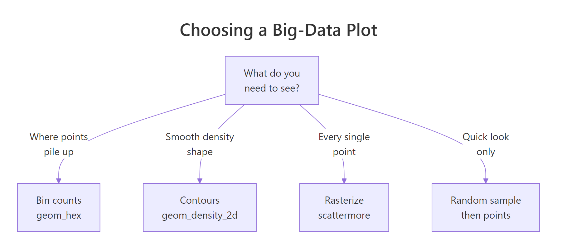
Figure 2: Pick a technique by what you need the plot to show.
Read it as a short set of rules. If you want to see where points pile up, bin them with geom_hex(). If you want the smooth shape of the distribution, draw contours with geom_density_2d(). If you need every individual point on the page, rasterize with geom_scattermore(). And if you just want a fast first look, take a random sample. The table below adds the size dimension.
| Your data size | Just exploring | Publication-quality density | Must keep every point |
|---|---|---|---|
| Up to ~50,000 | geom_point(alpha = ...) |
geom_hex() |
geom_point() |
| ~50,000 to 1,000,000 | random sample | geom_hex() + viridis |
geom_scattermore() |
| Over 1,000,000 | sample or geom_hex() |
aggregate then geom_tile() |
geom_scattermore() |
The honest summary is that binning with geom_hex() is the best default for most big scatter plots, sampling is the fastest way to peek, and scattermore is the specialist you call when every point must stay.
Practice Exercises
These exercises combine the techniques above. Each uses the big, grid, and dt objects created earlier in the tutorial, so run the tutorial code first. Try each one before opening the solution.
Exercise 1: Sample then bin
Real workflows often combine tools. Take a 50,000-row random sample of big, then draw a hexbin plot of that sample with 50 bins and a viridis fill. This is a common pattern: thin first for speed, then bin for readability.
Click to reveal solution
Explanation: Sampling drops the row count to 50,000 for speed, and hexbinning then turns those into a clean density map. Combining a cheap and a mid-tier technique is often the practical answer.
Exercise 2: Measure the sparse tail
A binned map is trustworthy only if you know how much of it is nearly empty. Using the grid table from the aggregation section, compute what percentage of grid cells hold only a single point. Round the answer to one decimal place.
Click to reveal solution
Explanation: grid$n == 1 is TRUE for single-point cells, and mean() of a TRUE/FALSE vector is the fraction that are TRUE. About 15.6% of cells hold just one point, confirming a long, sparse tail that sampling would thin away but binning preserves.
Exercise 3: Find the busiest region
Sometimes the goal is to locate the single densest spot. Using data.table on big, group the points into wider cells, 0.5 units on a side, count them, and return the busiest cell with its count. Use the dt object from earlier.
Click to reveal solution
Explanation: The busiest half-unit cell sits at the origin and holds 5,057 points, the heart of the first cloud. Coarser cells pool more points, so counts are larger than the 0.1-grid counts you saw earlier.
Complete Example
Here is the plot you would actually ship for a 300,000-point dataset: a hexbin density map with a perceptual colour scale, clear labels, and a clean theme. It renders in well under a second and reveals both clouds at a glance.
This single block ties the tutorial together. We took a dataset far too large for a plain scatter plot, summarised it into hexagonal bins, coloured those bins with an honest viridis scale, and labelled the result. The two clouds are obvious, the density is readable, and the plot is fast and export-friendly. That is the big-data plotting workflow in one figure.
Summary
Overplotting is what happens when a scatter plot has more points than it has room for: the dots merge into a blob and the plot slows down. The fix is always to stop drawing every point and instead summarise, thin, or rasterize. The toolkit below covers every case.
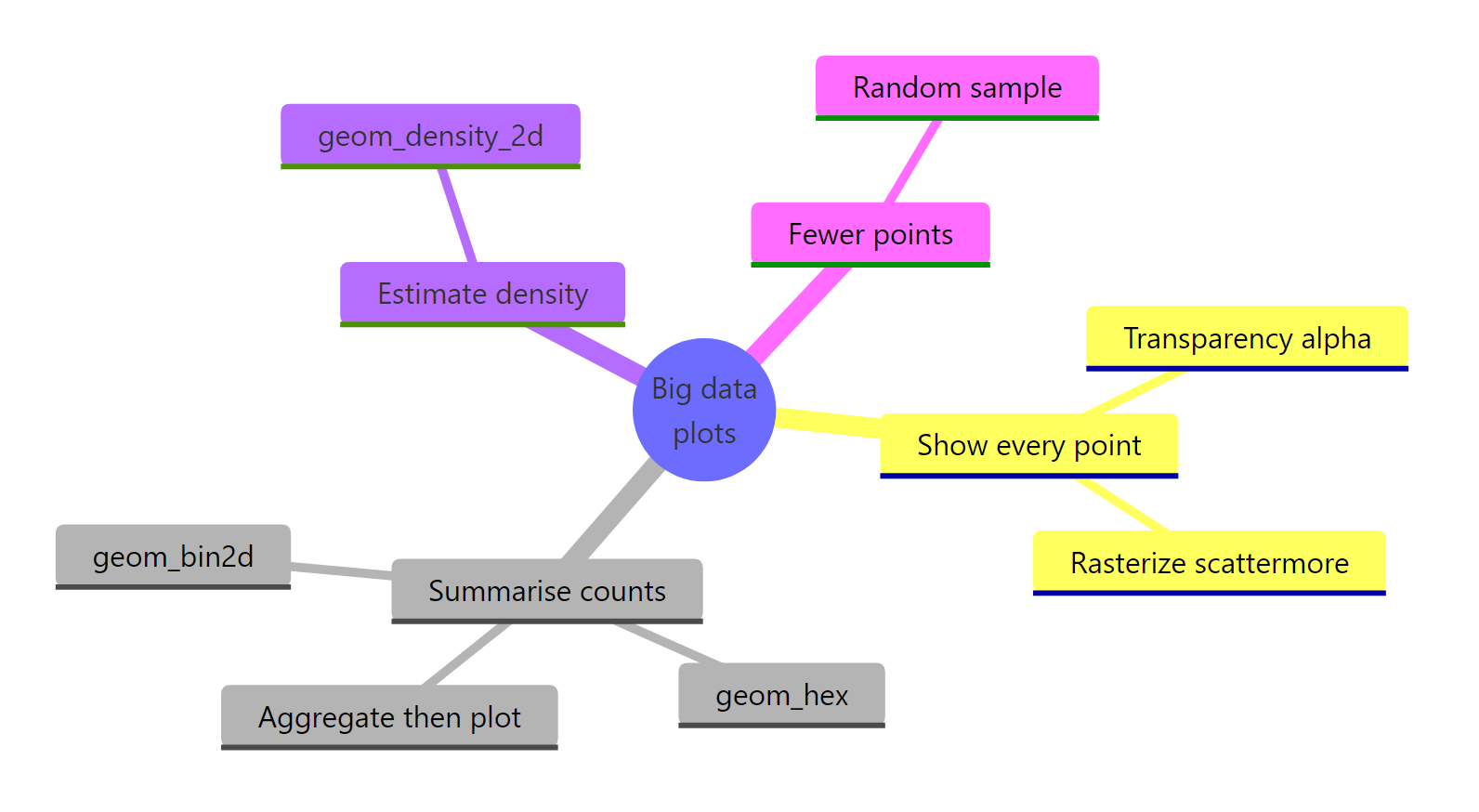
Figure 3: The big-data plotting toolkit at a glance.
| Technique | Function | Best for |
|---|---|---|
| Transparency | geom_point(alpha = ...) |
Tens of thousands of points |
| Sampling | sample() then geom_point() |
Fast exploration |
| Rectangular bins | geom_bin2d() |
Exact counts on a grid |
| Hex bins | geom_hex() |
The best default density map |
| Density contours | geom_density_2d() |
Smooth distribution shape |
| Manual aggregation | dplyr or data.table |
Caching a small summary table |
| Rasterizing | geom_scattermore() |
Keeping every point, fast |
The one rule to remember: past a hundred thousand points, bin by default with geom_hex(), sample for a quick peek, and rasterize with scattermore when every single point has to stay on the page.
FAQ
What counts as "big" for a scatter plot?
Overplotting starts to bite around 10,000 to 50,000 points, where the dense core begins to fill in. By a few hundred thousand points a plain geom_point() is both unreadable and slow to draw. Those are the thresholds where the techniques in this tutorial start to pay off.
Should I use geom_hex() or geom_bin2d()?
Both count points per cell and colour by the count, so they carry the same information. geom_hex() uses hexagons, which tile more evenly and avoid the faint stripes that square bins can show, so it is the better default. Reach for geom_bin2d() when you specifically want axis-aligned cells, for example to line up with a grid already in your data.
Why is my binned plot almost all one colour?
A few very dense cells can stretch the colour scale so that everything else looks flat. Add more bins, or transform the fill with scale_fill_viridis_c(trans = "log") so counts are compared on a log scale and the sparse regions become visible again.
Does scattermore support colour and facets?
Yes. geom_scattermore() accepts the colour and alpha aesthetics and works inside facet_wrap() like any other geom. The one limit is that point size is fixed for every point, so you cannot map a variable to size the way geom_point() allows.
How do I plot big data quickly in base R instead of ggplot2?
Base R has smoothScatter(), which draws a smoothed density image of the points in a single fast call. The ggplot2 tools here give you more control and a consistent grammar, but smoothScatter(big$x, big$y) is a quick base-R equivalent of the filled density heat map.
References
- ggplot2 documentation. geom_hex() reference. Link
- ggplot2 documentation. geom_bin2d() reference. Link
- ggplot2 documentation. geom_density_2d() reference. Link
- Wickham, H. ggplot2: Elegant Graphics for Data Analysis. Chapter on scales and overplotting. Link
- scattermore package on CRAN. Link
- ggpointdensity package on CRAN. Link
- data.table documentation. Introduction and grouping syntax. Link
Continue Learning
- 2D Density and Hexbin Plots in ggplot2: a deeper tour of binning and smoothing, the family of tools this tutorial uses as its workhorse fix.
- ggplot2 Colours and Colour Scales: how the viridis and other fill scales work, so your density maps stay honest and readable.
- Position Adjustments in ggplot2: jitter, dodge, and stack, the lighter-weight overlap fixes for smaller datasets.