2D Density and Hexbin Plots in ggplot2
2D density and hexbin plots summarise where points pile up in a scatter plot by counting or smoothing them, so a dataset with tens of thousands of points reads as a clean map of density instead of an unreadable blob.
Why do scatter plots break down when you have too many points?
A scatter plot draws one dot per row. That works beautifully for a few hundred points. Once you have tens of thousands, the dots start landing on top of each other, and a solid mass of ink hides the very thing you wanted to see: where the data is dense and where it is sparse. This tutorial fixes that with 2D density plots, using ggplot2 throughout and building on the ordinary scatter plot you already know.
Let's start by loading ggplot2 and looking at the data we will use for most of this tutorial. The built-in diamonds dataset records the price and carat weight of nearly 54,000 diamonds.
That nrow() call confirms the scale of the problem: 53,940 diamonds. The head() preview shows each diamond has a carat weight and a price in US dollars. Plotting all 53,940 as individual dots is exactly the situation where a scatter plot struggles.
Now let's see the struggle for ourselves. We will plot carat on the x-axis and price on the y-axis with a plain geom_point().
The lower-left corner is a black wall of ink. Points have stacked so thickly that you cannot tell whether a spot holds ten diamonds or ten thousand. This is called overplotting: so many marks overlap that density becomes invisible. The plot technically shows every diamond, yet it tells you almost nothing about where diamonds concentrate.
A common first instinct is to make each point transparent so overlaps show through as darker patches. Let's try that with alpha, which sets opacity from 0 (invisible) to 1 (solid).
Transparency helps at the edges, but the dense core is still a saturated smear. With this many points, no single opacity works everywhere: light enough to reveal the core leaves the sparse tails invisible, and dark enough to show the tails re-saturates the core. We need a fundamentally different approach: instead of drawing every point, summarise how many points fall in each region.
There are two families of tools for this, and the whole tutorial is organised around them. The first family, binning, chops the plane into small cells and counts the points in each. The second family, smoothing, treats the points as a cloud and estimates a continuous density surface. The figure below shows how the pieces fit together.
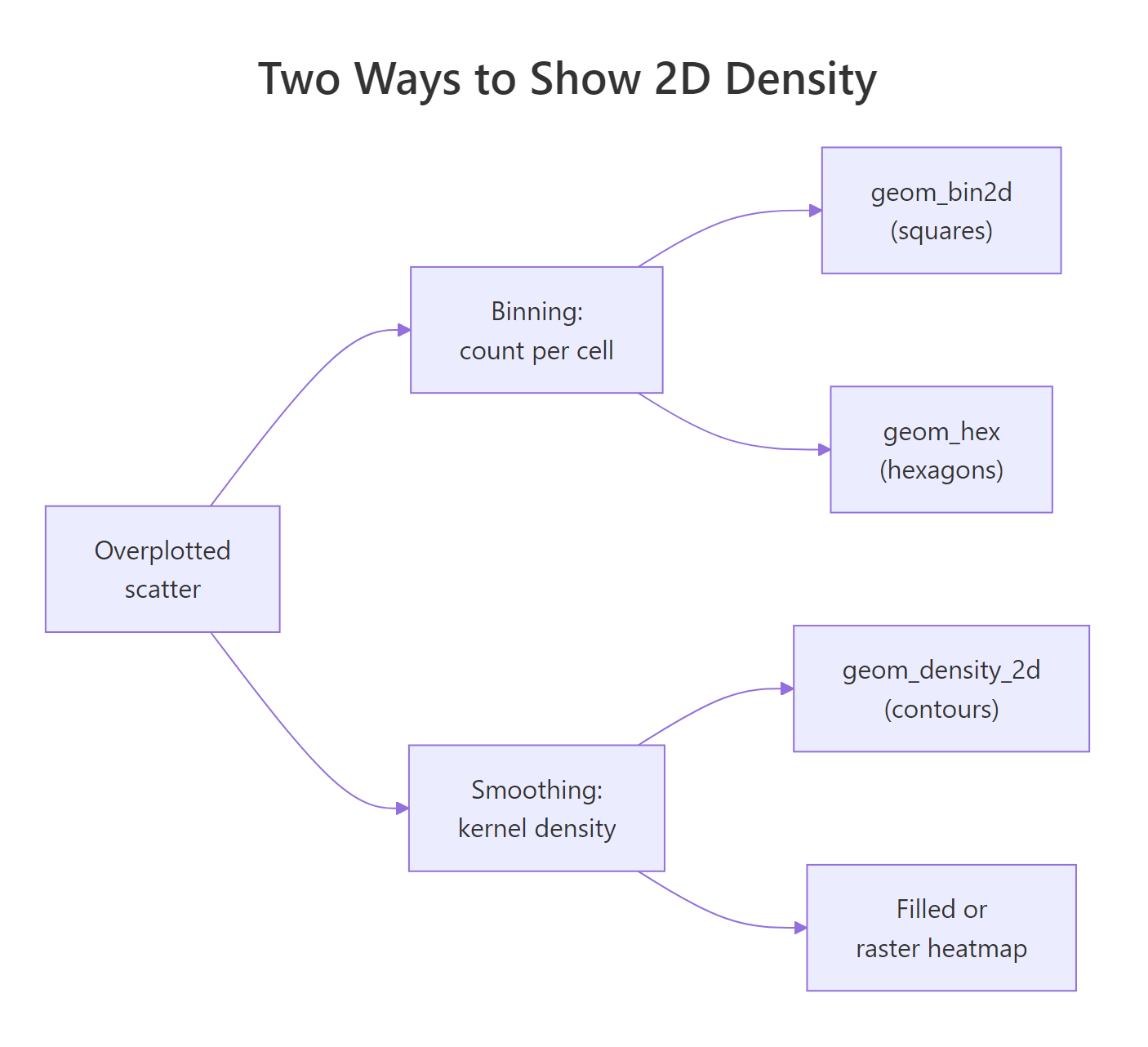
Figure 1: Two families of 2D density plots: binning counts points per cell, smoothing estimates a continuous density surface.
Try it: Push the transparency even lower to confirm that no single opacity rescues an overplotted scatter. Change alpha to 0.02 in the plot below and notice the dense core is still saturated while the tails fade to nothing.
Click to reveal solution
Explanation: At alpha = 0.02 the sparse tails almost disappear while the core is still a solid block. This is the trap of tuning transparency on big data: one value cannot serve both the dense and the sparse parts of the plot, which is why binning and smoothing exist.
How do you bin points into a 2D histogram with geom_bin2d()?
Binning is the simpler of the two families, so we start there. The idea is the same as a regular histogram, just in two dimensions. A 1D histogram slices the x-axis into bars and counts values in each bar. A 2D histogram slices both axes into a grid of rectangular cells and counts the points in each cell. Each cell then gets a colour based on its count.
Before we let ggplot2 do it automatically, let's bin a tiny dataset by hand so the mechanic is completely clear. We will take eight points, cut each axis into three bands with cut(), and count how many points land in each cell with table().
Read that table as a 3-by-3 grid of cells. The three counts on the diagonal (3, 4, and 1) add up to all eight points, and every off-diagonal cell is empty because our points hug the diagonal. That is the entire idea of 2D binning: a count for every cell. geom_bin2d() does exactly this, but with a fine grid and colour standing in for the count.
Let's apply it to the diamonds. The bins argument sets how many cells span each axis.
Now the structure jumps out. The bright cells trace a clear curved band where most diamonds live, and the count scale on the right tells you roughly how many diamonds each colour represents. No ink is wasted on empty regions, and the dense core is a readable colour instead of a black hole.
The default colour ramp (dark blue for low counts, light blue for high) is fine, but a perceptually uniform scale reads densities more honestly. scale_fill_viridis_c() maps the count to the viridis palette, where equal steps in count look like equal steps in colour. Let's add it and bump up the resolution with more bins.
With 40 bins per axis the band is sharper, and viridis makes the busiest cells (bright yellow) pop out from the quiet ones (deep purple). The _c in scale_fill_viridis_c stands for continuous, which matches a continuous count. You now have a plot that shows all 53,940 diamonds and is actually readable.
Try it: The bins argument is the main dial on a binned plot. Render the diamonds with a coarse grid of bins = 15, then imagine bins = 60, and notice how bin size trades detail for smoothness.
Click to reveal solution
Explanation: At bins = 15 the cells are large, so the plot is blocky but robust: each cell holds many diamonds and the overall shape is stable. More bins reveal finer structure but make each cell noisier because it holds fewer diamonds. Choosing bins is a balance between detail and stability.
How does geom_hex() improve on square bins?
Square cells have a subtle problem. In a square grid, a cell's diagonal neighbours are farther away than its side neighbours, so density gradients can look slightly blocky and direction-dependent. Hexagons fix this. A hexagonal grid packs the plane so that every cell sits the same distance from all six of its neighbours, which makes smooth density gradients look smooth. geom_hex() bins into hexagons instead of squares.
There is one setup step. The hexagon math lives in a separate package called hexbin, and ggplot2 uses it behind the scenes, so it must be available before geom_hex() will draw.
hexbin is missing, geom_hex() stops with an error instead of drawing. Install it once with install.packages("hexbin"), then load it alongside ggplot2 as shown below.Let's load hexbin and make our first hexbin plot of the diamonds.
Same story as the square version, but the tiling is hexagonal. Each hexagon is coloured by how many diamonds fall inside it, and the dense curved band is even easier to read because the cells nest together without the blocky seams of a square grid.
As before, more bins and a viridis scale sharpen the picture. The bins argument works the same way it did for geom_bin2d().
This is often the single best chart for a huge scatter: it keeps the exact-count honesty of binning while looking as smooth as a heatmap. The bright yellow ridge shows precisely where diamond prices cluster for each carat weight.
geom_hex() is usually the nicer-looking of the two binned options.Try it: You have a square-binned plot below. Swap geom_bin2d() for geom_hex() so the same data is shown with hexagons, keeping the viridis scale.
Click to reveal solution
Explanation: The only change is the geom. geom_hex() and geom_bin2d() share the same bins argument and the same count-based fill, so switching between them is a one-word edit whenever you want to compare square and hexagonal tiling.
How do you draw smooth density contours with geom_density_2d()?
Binning gives you honest counts, but the result is still a grid of cells. Sometimes you want the smooth shape of the cloud instead: a flowing outline of where the data is dense. That is the second family, smoothing.
Here is the intuition. Imagine placing a small, soft hill over each data point, then adding all those hills together into one continuous landscape. Where points cluster, the hills stack into a tall peak; where points are sparse, the landscape stays flat. This estimated landscape is called a kernel density estimate, and its contour lines are exactly like the elevation lines on a hiking map: each line joins points of equal height, so tight rings mean a steep, dense peak.
We will switch datasets to see this clearly. The base R faithful dataset records 272 eruptions of the Old Faithful geyser: how long each eruption lasted and how long you waited for it. It famously splits into two clusters, which makes it perfect for density contours.
Smoothing in ggplot2 relies on a helper from the MASS package to compute the density surface, so we load MASS here alongside a first look at the data.
The contour lines form two clear sets of rings, one lower-left and one upper-right. That is the two-cluster structure of Old Faithful made visible: short waits tend to go with short eruptions, and long waits with long eruptions. The tighter the rings, the denser that region.
Contours are easier to trust when you can see the points they summarise. Let's draw the raw points first, then lay the contour lines on top so you can check that the rings really do hug the clusters.
Now you can check it directly: the two clumps of dots sit exactly inside the two nests of contour rings. The lines are a smoothed summary of the very points beneath them, which is a good habit to build when you first meet a smoothing method.
..level... Modern ggplot2 replaces that with after_stat(level), which means the same thing (the density level each line represents) but is the current, supported spelling. If you see ..level.. or ..density.. in old code, translate them to after_stat(level) and after_stat(density).Try it: Colour the contour lines by their density level so the tall peaks stand out from the shallow outer rings. Map colour to after_stat(level) inside aes().
Click to reveal solution
Explanation: after_stat(level) exposes the density height that each contour line represents, so mapping it to colour shades the inner (high-density) rings differently from the outer (low-density) ones. This makes the two peaks read at a glance.
How do you fill the density with colour for heatmaps and filled contours?
Contour lines show the shape, but empty space between the lines can feel bare. Filling the density with colour turns the outline into a solid map, which many people find easier to read. ggplot2 gives you two filled styles.
The first is filled contour bands. geom_density_2d_filled() colours the space between contour lines, like a topographic map with shaded elevation bands.
Each band is one slice of density, from the dark low-density outskirts to the bright high-density cores. The two peaks now stand out clearly, each shown as its own set of bands. Notice the legend labels ranges of the density level, because the fill encodes which band you are in.
The second style is a smooth heatmap with no bands at all. We build it with stat_density_2d(), ask it to fill by the raw density value with after_stat(density), and draw it as a continuous raster (a grid of coloured pixels) by setting geom = "raster" and turning contouring off.
This is the smoothest possible view: colour flows continuously from low density to high with no banding. Two things are worth pulling apart here. after_stat(density) fills by the raw height of the density surface, giving a true heatmap, whereas after_stat(level) (used by the filled contours above) fills by discrete probability bands. And geom = "raster" paints continuous pixels, while the default polygon geom would paint stepped bands. Pick raster plus density when you want a smooth heatmap, and filled contours when you want labelled bands.
stat_density_2d(..., geom = "raster", contour = FALSE) gives a smooth gradient with no steps, which is ideal for a clean density backdrop. geom_density_2d_filled() gives discrete bands with a legend, which is better when readers need to name density levels.Try it: Overlay the raw points on the smooth heatmap so readers can see the data behind the colour. Add a faint geom_point() after the stat_density_2d() layer.
Click to reveal solution
Explanation: Layers stack in the order you add them, so the white, semi-transparent points land on top of the heatmap. This lets readers verify that the bright regions really do sit where the points cluster, without the dots overwhelming the colour.
How much detail should you show when tuning bins and bandwidth?
Every 2D density plot has one main dial that controls how much detail you see. Turn it one way and the plot is coarse and stable; turn it the other and the plot is fine but noisy. The dial has a different name in each family, so let's meet both.
For binned plots, the dial is bins. Fewer bins mean bigger cells: the plot is blocky but each cell rests on many points, so it is stable. Here is the diamonds hexbin turned down to a coarse grid.
At bins = 10 you see only the broad shape. Compare that to the bins = 40 version from earlier: more bins reveal finer structure but each cell holds fewer diamonds, so the colour gets noisier. Push bins high enough and every point sits in its own cell, which just recreates the overplotted scatter you started with.
For smoothed plots, the dial is the bandwidth, which sets how wide each little hill is before they are added up. ggplot2 exposes it through adjust, a simple multiplier on the automatic bandwidth: adjust = 0.5 halves the width (spikier), and adjust = 2 doubles it (blurrier). This matters a lot on faithful, where the wrong setting can hide the two clusters.
With adjust = 0.5 the contours break into jagged little islands that form around individual points. Some of those bumps are noise, not real structure.
With adjust = 2 the surface is so smooth that the two clusters start to blur into one broad blob, hiding the very split that makes Old Faithful interesting. The default (adjust = 1) sits between these extremes and shows the two clean peaks.
adjust up and down and check that the structure you see is stable, not an artefact of one setting.Try it: See how aggressive a small bandwidth gets. Set adjust = 0.3 and watch the contours fracture into many tiny islands.
Click to reveal solution
Explanation: At adjust = 0.3 the hills are so narrow that the estimate tracks almost every point, producing a rash of tiny rings. This is overfitting the density: it describes these 272 points but would not generalise to a fresh sample. It is the smoothing-world version of using too many bins.
Which 2D density geom should you use?
You now have four main tools. The decision comes down to two questions: do you need honest counts or a smooth shape, and do you want lines or filled colour? The flowchart below walks through it.
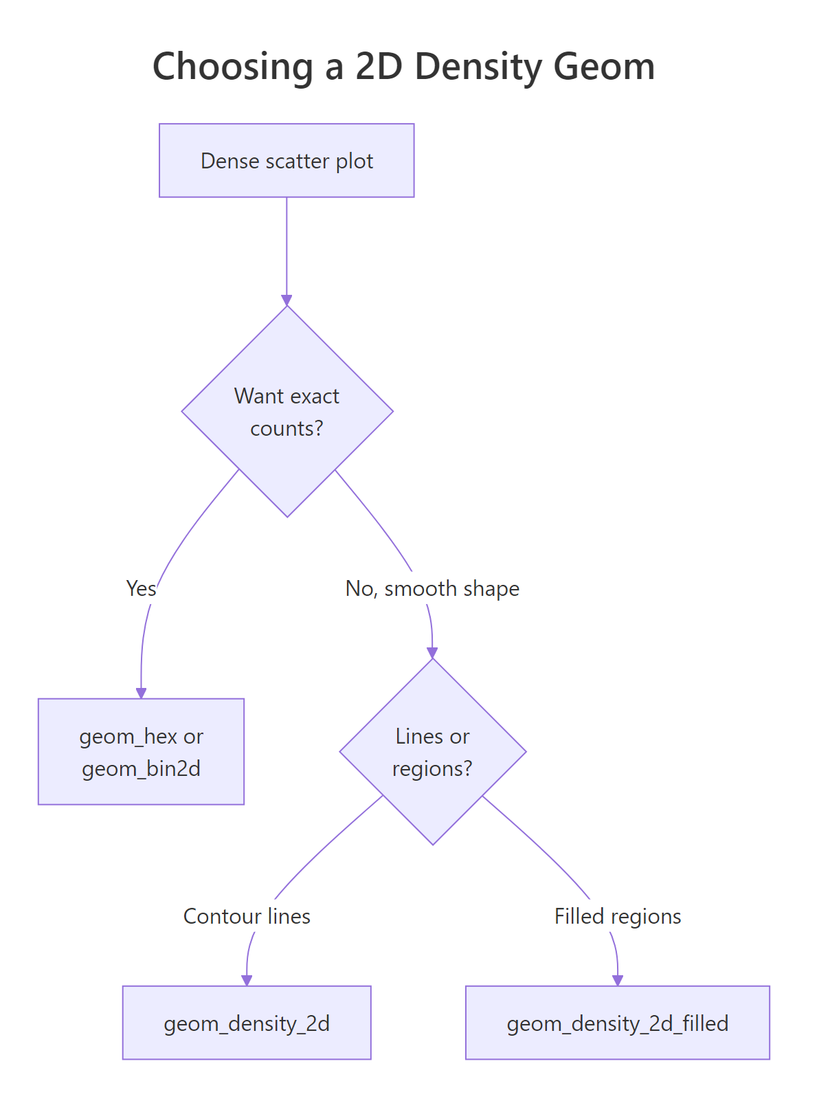
Figure 2: A quick decision guide for picking a 2D density geom.
Here is the same guidance as a table you can scan.
| Geom | Family | Fill encodes | Best for |
|---|---|---|---|
geom_bin2d() |
Binning | Count per square | Fast, exact counts; a true 2D histogram |
geom_hex() |
Binning | Count per hexagon | Large scatters that should look smooth |
geom_density_2d() |
Smoothing | Nothing (lines) | Showing the shape of the cloud as outlines |
geom_density_2d_filled() |
Smoothing | Density band | A filled, topographic view with a legend |
Seeing all four on the same data makes the differences click. The patchwork package lets you place plots side by side with + and /, so we can build a 2-by-2 panel. We reuse faithful because its two clusters show up in every style.
The top row (binning) shows blocky counts you can trust cell by cell. The bottom row (smoothing) shows a flowing shape that reads the two clusters more elegantly but hides the exact numbers. Neither is "correct"; they answer different questions.
geom_bin2d() or geom_hex() when a reader might ask "how many points are in this region?", and use geom_density_2d() or its filled cousin when the question is "what does the cloud look like?" Many good figures show the smooth density with the points or counts layered underneath.Try it: Build your own side-by-side comparison. Make a hexbin and a filled-density plot of faithful, then place them next to each other with patchwork's +.
Click to reveal solution
Explanation: Assigning each plot to a variable lets you combine them with patchwork's + operator, which lays them out in a row. Swap + for / to stack them vertically instead.
Complete Example
Let's put the whole workflow together on the diamonds. We begin where every real analysis begins, with the overplotted scatter that fails, then produce a polished hexbin as the finished figure: 40 bins, a viridis fill with a named legend, and clean labelled axes under a minimal theme.
The first plot is the black blob we opened with. The second tells the actual story: a bright ridge of many small, inexpensive diamonds in the lower left, thinning out to a sparse scatter of large, expensive ones toward the upper right. Same data, same two columns, but the hexbin turns 53,940 overlapping dots into a clear map of where diamonds concentrate. That is the payoff of 2D density plots.
Practice Exercises
These exercises combine what you have learned. Each has a runnable starter and a full solution. Use fresh variable names so your practice code does not clash with the tutorial.
Exercise 1: A labelled hexbin of Old Faithful
Make a hexbin of faithful with waiting on the x-axis and eruptions on the y-axis. Use 25 bins and a viridis fill, then add axis labels and a title. This practises the binned family plus labelling.
Click to reveal solution
Explanation: geom_hex(bins = 25) bins the 272 eruptions into hexagons, scale_fill_viridis_c() colours them by count, and labs() supplies the title and axis labels. Even with only a few hundred points, the two clusters are unmistakable.
Exercise 2: A layered density map
Build a single figure that layers three things on faithful: a smooth density heatmap as the background, white contour lines on top, and faint white points on top of that. This combines stat_density_2d(), geom_density_2d(), and geom_point() in one plot.
Click to reveal solution
Explanation: The layers draw bottom to top: the raster heatmap paints the density surface, the white contour lines trace equal-density rings, and the faint white points show the raw data behind it all. Because each layer is semi-transparent or thin, none hides the others.
Exercise 3: A bandwidth investigation
Smoothing can mislead if the bandwidth is wrong. Draw two contour plots of faithful side by side with patchwork, one at adjust = 0.4 and one at adjust = 1.6, and decide which one tells the honest two-cluster story.
Click to reveal solution
Explanation: At adjust = 0.4 the contours fracture into noisy islands, and at adjust = 1.6 the two clusters blur toward a single blob. Neither extreme is honest: the default near adjust = 1 shows the two clean peaks best. The lesson is to always check that a smooth density is stable across a range of bandwidths.
Summary
2D density plots replace an overplotted scatter with a readable map of where points concentrate. They fall into two families, and knowing which one you need is most of the battle.
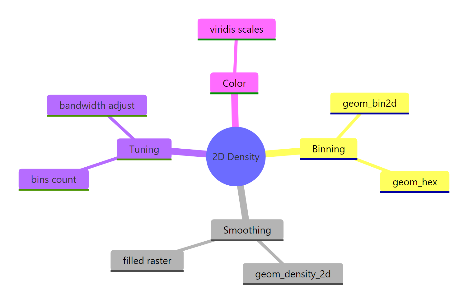
Figure 3: The 2D density toolkit in ggplot2 at a glance.
The key takeaways:
- Overplotting is the problem. Once tens of thousands of points overlap, transparency cannot save the plot; you must count or smooth.
- Binning counts points per cell.
geom_bin2d()uses squares andgeom_hex()uses hexagons; both colour each cell by its count, and hexagons tile more evenly. - Smoothing estimates a continuous surface.
geom_density_2d()draws contour lines,geom_density_2d_filled()fills the bands, andstat_density_2d(geom = "raster")makes a smooth heatmap. - Use after_stat() for computed values.
after_stat(level)gives probability bands andafter_stat(density)gives raw height; the old..level..notation is deprecated. - Tune one dial carefully.
binscontrols binned resolution andadjustcontrols smoothing bandwidth; check that structure is stable rather than an artefact of one setting. - Colour by viridis. A perceptually uniform scale makes density comparisons honest and colour-blind friendly.
Frequently Asked Questions
Do I need the hexbin package for geom_bin2d() too?
No. Only geom_hex() needs the hexbin package, because hexagonal tiling uses its math. geom_bin2d() bins into squares and works with base ggplot2 alone, so it is a handy fallback if you cannot install hexbin.
What is the difference between geom_density_2d() and geom_density2d()?
They are the same function. geom_density2d() is an older alias kept for backward compatibility, and geom_density_2d() is the current, preferred spelling. Use the underscore version in new code.
Why do my density contours fail or look wrong?
geom_density_2d() estimates the surface with MASS::kde2d(), so MASS must be available. The estimate can also misbehave when your data has very few points or almost no spread on one axis. Make sure MASS is installed and that both variables genuinely vary.
How many bins should I use for geom_hex() or geom_bin2d()?
Start around 30 to 50 for a large dataset, then adjust by eye. Too few bins hide structure, and too many turn the plot back into a noisy scatter. There is no single correct number; the goal is a setting where the pattern stays stable as you nudge bins.
Are these plots worth it for small datasets?
They shine most on large data. For a few dozen points a plain scatter is clearer and honest. Reach for binning or smoothing once overlap starts hiding density, which usually happens somewhere in the thousands of points.
References
- ggplot2 reference: Contours of a 2D density estimate (geom_density_2d). Link
- ggplot2 reference: Heatmap of 2D bin counts (geom_bin_2d). Link
- ggplot2 reference: Hexagonal heatmap of 2D bin counts (geom_hex). Link
- Wickham, H. et al. - ggplot2: Elegant Graphics for Data Analysis, chapter on statistical summaries. Link
- hexbin package on CRAN (Dan Carr et al.). Link
- Venables, W. N. & Ripley, B. D. - MASS::kde2d, two-dimensional kernel density estimation. Link
- The R Graph Gallery - 2d density plot with ggplot2. Link
- Healy, K. - Data Visualization: A Practical Introduction, on overplotting. Link
Continue Learning
- ggplot2 Scatter Plots - the starting point these plots improve on, covering colour, point size and trend lines.
- Heatmap in R - the close cousin of a binned density plot, for showing values on a grid.
- ggplot2 Colours - the full set of colour scales, including the viridis family used throughout this tutorial.