Bump Charts in R: Rank Over Time with ggplot2
A bump chart is a ggplot2 chart that shows how the ranking of several groups changes over time. Each group becomes a line running left to right across the time points, and because the y-axis is flipped so rank 1 sits at the top, a line that rises means a group climbed the ranking and two lines that cross mean one group overtook another.
This tutorial builds a bump chart from scratch with the tidyverse: ggplot2 for the graphics, dplyr for computing the ranks, and tidyr for one reshape step. You will not need any special "bump" add-on package. A bump chart is really just a line chart with a flipped axis, and building it by hand teaches you exactly how it works so you can restyle it any way you like.
What is a bump chart and when should you use one?
Line and bar charts answer the question "how big?" A bump chart answers a different question: "who is winning, and is the order changing?" It deliberately throws away the exact values and keeps only the ranking, so a shift in position jumps out even when the underlying numbers barely move. That makes it perfect for a handful of groups tracked over a few time points, like teams across a season or products across a few quarters.
We will follow one story throughout. An online store tracks five product categories and their revenue each month, and we want to see how their popularity ranking reshuffles from January to May. Let's build that data and look at it.
We built the table with tibble(), the tidyverse's version of a data.frame (it prints with the tidy # A tibble header you see above and otherwise behaves the same). These revenue figures are made-up sample numbers, in thousands of dollars, chosen so the ranking shuffles in an interesting way. Each row is one category, and each of the five month columns holds that category's revenue for the month. This "wide" shape, one row per group with a column per time point, is a common way real data arrives from a spreadsheet.
Look down any single column and you can eyeball a winner. In January, Electronics leads at 80 and Toys trails at 42. But scanning five separate columns to track who moved where is exactly the mental work a bump chart does for you.
Try it: Before we go further, warm up on the wide table. Use sum() to total the January revenue across all five categories. The answer should be 288.
Click to reveal solution
Explanation: The $ pulls out a single column as a plain numeric vector, and sum() adds up its five values. That is 48 + 80 + 55 + 42 + 63 = 288.
How do you turn values into ranks for each period?
A bump chart plots rank, not revenue, so the real work happens before any plotting: we need a rank for every category in every month. Getting there is a clean three-step pipeline. First reshape the wide table into a long one, then group the rows by month, then rank the categories inside each month.

Figure 1: Three steps turn a table of values into rank-per-period data.
Let's start with the reshape. Right now each month is a separate column, but to rank "within a month" and later to draw a line through a category's points, we want one row per category per month. The pivot_longer() function folds several columns down into two: one holding the old column names, one holding their values.
The |> symbol is R's pipe: it takes the value on its left and feeds it as the first argument to the function on its right, so sales_wide |> pivot_longer(...) just reads as "take the wide table, then pivot it." The cols = Jan:May argument names the five columns to fold, names_to = "month" sends their names into a new month column, and values_to = "revenue" sends the numbers into a new revenue column. We started with 5 rows and now have 25, five months for each of the five categories (the printout shows the first 10 and notes 15 more).
There is one catch with the new month column: R stored it as plain text, and text sorts alphabetically. On a chart axis that would put "Apr" first and scramble the timeline. We fix it by turning month into a factor with the levels listed in calendar order.
A factor is R's type for a category that has a fixed set of allowed values in a set order. By passing levels = month_order we tell R that January comes first and May comes last, no matter how the rows happen to be sorted. The levels() function reads that order back so we can confirm it stuck.
Now the key step: ranking. We want, inside each month, a rank of 1 for the highest revenue down to 5 for the lowest. The group_by(month) call tells dplyr to treat each month as its own little table, and min_rank(desc(revenue)) assigns the ranks within that group. We call ungroup() afterward to return to a normal, ungrouped table.
The desc() wrapper flips the sort so that the largest revenue earns rank 1, and min_rank() returns clean whole-number ranks (shown as <int>). Because we grouped by month first, the ranking restarts inside each month rather than running across the whole table. We then filtered to just January and May and sorted by month and rank so the two ends of the story sit side by side.
Read the two blocks and the reshuffle is obvious. Electronics starts at rank 1 in January but falls to rank 4 by May, while Sports climbs from 2 up to 1. That swap, the market leader getting overtaken, is precisely the kind of movement a bump chart is built to show.
rank(-x) also works but returns decimals and averages ties, so min_rank() is the cleaner choice here.Try it: Show the ranking for February only. Filter sales to the rows where month is "Feb" and sort them by rank. Electronics should sit at rank 1 and Sports at rank 5.
Click to reveal solution
Explanation: filter() keeps only the February rows and arrange(rank) sorts them best to worst. Notice Sports sank to last in February after sitting second in January, a dip it later recovers from.
How do you build a basic bump chart in ggplot2?
With a rank for every category in every month, the chart itself is short. A bump chart is built from three ordinary ingredients: one geom_line() to connect each category's ranks across the months, one geom_point() to mark the rank at each month, and scale_y_reverse() to flip the y-axis so that rank 1 sits at the top like the winner of a race.
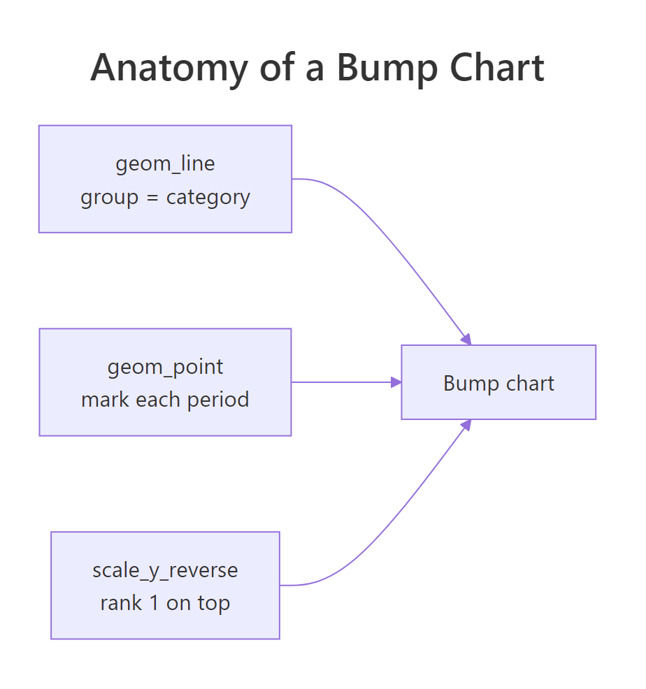
Figure 2: A bump chart is lines plus points on a reversed y-axis.
Let's map the pieces to ggplot2. We put month on the x-axis and rank on the y-axis, and we set group = category so ggplot2 knows which points belong to the same line. Coloring by category gives each line its own hue.
The group = category mapping is the piece that makes the chart work. Without it, ggplot2 would try to connect every point into one tangled path; with it, each category gets its own line threading through its five ranks. The geom_point() layer drops a dot at each month so the reader can see exactly where a line sits at each step.
The key line in this block is scale_y_reverse(). Rank data is upside down compared to how ggplot2 draws numbers: normally a bigger y-value sits higher, but here the best rank is the smallest number (1). Reversing the axis puts rank 1 at the top and rank 5 at the bottom, so the chart reads like a leaderboard. Try deleting that line and you will see the whole thing flip into a confusing "lower is better" picture.
Try it: Copy the basic chart but make it bolder. Set the lines to linewidth = 1.5 and the points to size = 5 so the ranking reads from across a room.
Click to reveal solution
Explanation: linewidth controls line thickness and size controls point radius. Thicker lines and bigger dots make the ranking easier to follow at a glance, which is handy for slides.
How do you make a bump chart clear and readable?
The basic chart is correct but rough. It leans on a color legend, its y-axis shows fractional ticks like 2.5 that make no sense for ranks, and you have to hop back and forth to a key to tell the lines apart. Three small moves fix all of that: force whole-number ticks, label each line at its right end, and drop the legend.
Let's build the polished version and then unpack it. We add a geom_text() layer that draws only the "May" rows, so each category name appears once at the finish line of its own line.
Four things changed from the basic chart. The breaks = 1:5 inside scale_y_reverse() forces the axis to show only whole ranks, 1 through 5, with no odd half-steps. The geom_text() layer pulls out just the May rows with subset(sales, month == "May") and prints each category name to the right of its last point, nudged over with nudge_x = 0.1. Because the labels now identify the lines, guides(color = "none") hides the redundant legend. Finally scale_x_discrete(expand = ...) adds a 35 percent margin on the right so the names have room instead of running off the panel, and theme_minimal() strips the grey background down to the data.
The payoff is a chart that explains itself. A reader can trace Sports climbing to the top and Electronics sliding down without ever consulting a legend, because the answer is written at the end of each line.
Try it: One end label is good, two are better for a busy chart. Add a second geom_text() that labels the "Jan" rows on the left as well, using hjust = 1 and a small negative nudge so the names sit just outside the first points.
Click to reveal solution
Explanation: The second geom_text() reads only the January rows and places names to the left with hjust = 1. We widened the left margin to 30 percent so those names fit. Labeling both ends lets the reader anchor each line at its start and its finish.
How do you highlight one line to tell a story?
When every line is a bright color, it is hard to know which one to follow, and the single movement you care about blends in with the rest. The fix is to grey out every line except the one group you want to feature. You do it by mapping color to a true-or-false test rather than to the category itself.
Say the story is "Sports came from behind to take the lead." We map color = category == "Sports", which is TRUE for the Sports rows and FALSE for every other row, then paint those two groups by hand.
The expression category == "Sports" runs once per row and returns TRUE or FALSE, so mapping it to color splits all the lines into just two groups: the featured one and everyone else. The scale_color_manual() call then assigns the actual colors, a soft grey80 to the FALSE group and a strong red to the TRUE group. Against the grey background, the red Sports line stands out, and its late climb from the bottom of the chart to the top is easy to follow.
geom_bump() swaps the straight segments for gentle S-curves, which some designers prefer for a polished look. It is an optional tidyverse-style add-on, and everything in this tutorial works without it, so reach for it only when you specifically want the curved style.Try it: Feature a different category. Rebuild the highlight chart but spotlight "Toys" instead of "Sports", and give it a green color like #1b7837 so it reads as a different story.
Click to reveal solution
Explanation: Only the test and the TRUE color changed. Now Toys stands out in green, revealing its spike to rank 1 in March before it slid back to last, a very different arc from the Sports climb.
Complete Example
Let's pull the best moves into one polished bump chart you could drop straight into a report. It draws colored lines, labels each category by name on the left, prints its final rank as a "#1"-style tag on the right, uses whole-number ticks, and carries a clear title. Every piece here appeared earlier in the tutorial.
The two geom_text() layers do the direct labeling: the first prints each category's name to the left of its January point, and the second prints its final standing as a tag like #1 to the right of its May point, built with paste0("#", rank). The fontface = "bold" makes both sets of labels stand out, and the asymmetric expand gives more room on the left (for long names) than the right (for short tags). The result is a single figure that names every line, shows where each category finished, and needs no legend or caption to be understood.
Practice Exercises
These combine several ideas from the tutorial. Each uses distinct variable names so it will not overwrite the objects we built above. Try each one before opening the solution.
Exercise 1: Find the most consistent top performer
A category can win one month and vanish the next. To find the steadiest strong performer, compute each category's average rank across all five months, then sort so the lowest average (the most consistently high) is on top. Save the result to ex1_ranks. The winner should be Home with an average rank of 2.2.
Click to reveal solution
Explanation: group_by(category) then summarise(mean_rank = mean(rank)) collapses each category to a single average-rank number, and arrange() sorts them. Home never won a month, but it sat second or third every time, giving it the best average and the title of steadiest performer.
Exercise 2: A bump chart of only the big movers
A crowded bump chart can bury the interesting lines. Build a focused chart of just three categories, Sports, Electronics, and Toys, which have the most dramatic swings. First filter sales to those three and save it to three, print it to confirm you have 15 rows, then draw a basic bump chart from that smaller table.
Click to reveal solution
Explanation: %in% keeps rows whose category is any of the three names, leaving 15 rows (three categories times five months). Feeding that smaller table into the same recipe draws a less crowded chart where the three tangled arcs are easy to trace.
Exercise 3: Which category's ranking swung the most?
Average rank (Exercise 1) hides how bumpy a category's ride was: a steady third-place finisher and a wild category that bounced between first and last can share the same average. Measure the swing instead. For each category find its best (lowest) rank, its worst (highest) rank, and the gap between them, then sort so the biggest swing is on top. Save the result to ex3_swings. Sports and Toys should tie at the top, each swinging a full four places.
Click to reveal solution
Explanation: min(rank) finds a category's best month and max(rank) its worst, so worst - best is how many places it moved between the two. Sports and Toys each swung a full four ranks, while Home stayed within a single place all season, which is why Exercise 1 found Home the steadiest performer.
Frequently Asked Questions
Do I need the ggbump package to make a bump chart? No. Core ggplot2 draws a real bump chart from geom_line(), geom_point(), and scale_y_reverse(), as this whole tutorial does. The ggbump package only adds smooth, curved lines in place of the straight segments, so it is a style choice, not a requirement.
Why do I have to reverse the y-axis? Because the best rank is the smallest number. Rank 1 beats rank 5, but by default ggplot2 draws 5 higher up the page than 1. scale_y_reverse() flips the axis so rank 1 sits at the top, matching how people read a leaderboard from the top down.
How many groups and time points work well? Bump charts shine with a handful of groups (roughly three to eight) over a few time points. With many lines they tangle into spaghetti, and with many time points the crossings get hard to follow. If your chart looks like a knot, highlight one or two lines or split it into small multiples.
What happens if two groups tie in the same period? min_rank() gives tied values the same rank and then skips the next number, so two second-place ties become rank 2, rank 2, then rank 4. If you need every position to be unique, add a tiebreaker column to sort on, or use dplyr::row_number() on an ordered table.
My metric is best when it is lowest, like a finishing position. Does that break the chart? No, you just rank the other way. Drop the desc() and rank the raw value ascending with min_rank(revenue), so the smallest value earns rank 1. The rest of the chart, including the reversed axis, stays exactly the same.
Summary
A bump chart turns a table of values into a picture of ranking over time. The trick is that the drawing is easy once the data is right: reshape to long, rank within each period, then draw lines and points on a reversed axis so the leader sits on top.
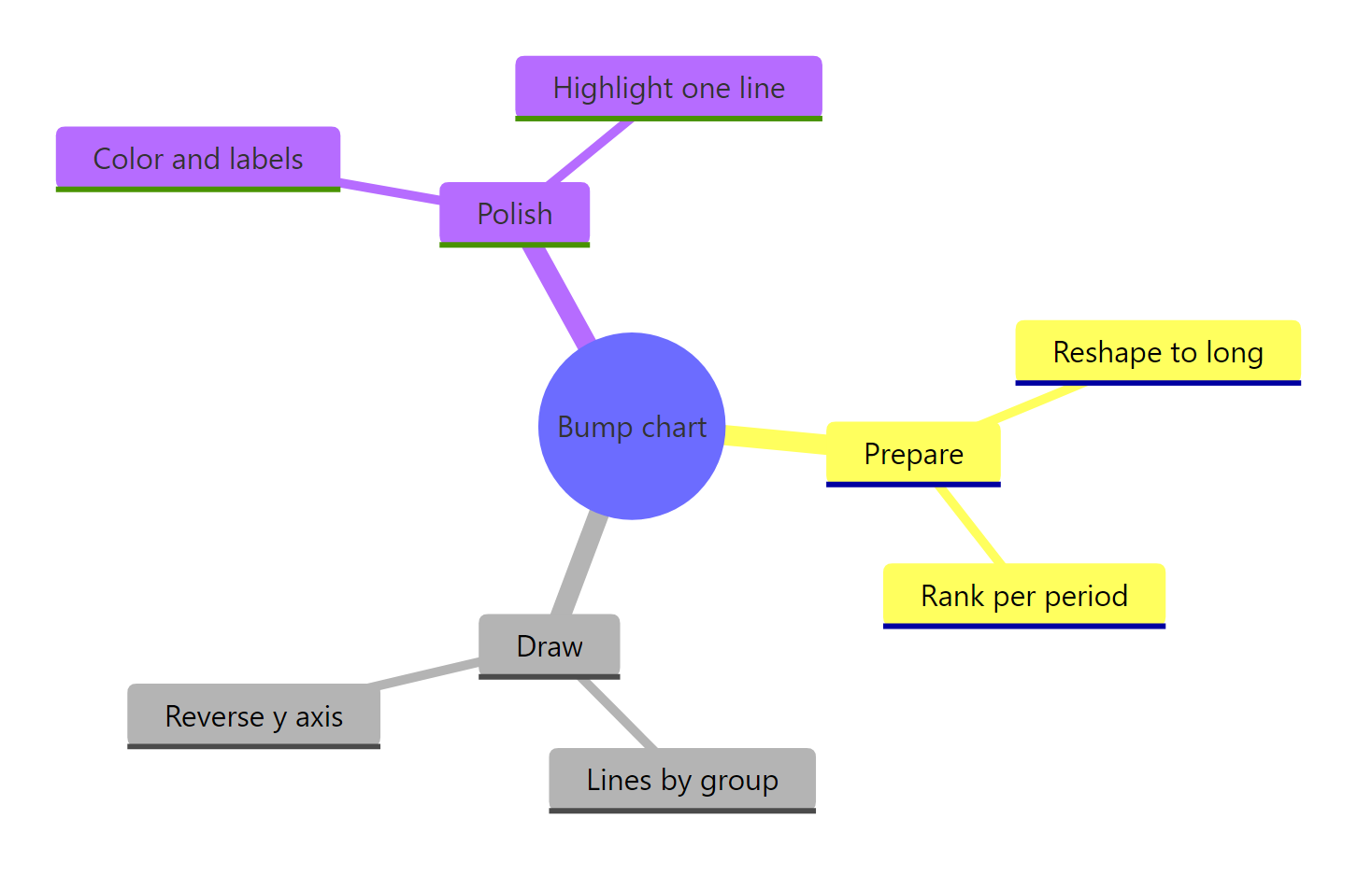
Figure 3: The full bump-chart workflow at a glance.
The workflow in one place:
| Step | What to do |
|---|---|
| Reshape | pivot_longer() to one row per group per period |
| Order time | Make the time column a factor with explicit levels |
| Rank | group_by(period) then min_rank(desc(value)) |
| Draw | geom_line(group = ...) plus geom_point() |
| Flip axis | scale_y_reverse(breaks = 1:5) so rank 1 is on top |
| Polish | Direct end labels, hidden legend, theme_minimal(), optional highlight |
Reach for a bump chart when the order of a small set of groups is your message and you want shifts and overtakes to jump off the page. Build it from core ggplot2 and you can restyle every layer, then add ggbump only if you want the curves.
References
- ggplot2 documentation. geom_line() reference. Link
- ggplot2 documentation. scale_y_reverse() and continuous scales. Link
- dplyr documentation. Ranking functions including min_rank(). Link
- tidyr documentation. pivot_longer() reference. Link
- Wickham, H., Cetinkaya-Rundel, M., Grolemund, G. R for Data Science, 2nd Edition, Data Visualization. Link
- Sjoberg, D. ggbump: A geom for creating bump charts in ggplot2. CRAN. Link
- The R Graph Gallery. Line charts for several groups in ggplot2, the base a bump chart is built on. Link
Continue Learning
- ggplot2 Line Charts: the foundation a bump chart is built on, covering
geom_line(), grouping, and styling in depth. - Dumbbell and Slope Charts in R: two more before-and-after chart types, including the slope chart, a two-point cousin of the bump chart.
- Reshape Data with pivot_longer and pivot_wider: the wide-to-long reshape every bump chart depends on, explained from scratch.