Write Your Own ggplot2 Geom and Stat
A ggplot2 extension is a reusable layer you call just like geom_point(), built from two parts: a stat that transforms your data and a geom that draws it. Both are defined with ggplot2's object system, ggproto. This guide builds one from nothing, step by step, so you can package your own custom charts and reuse them everywhere.
You have added geom_point() and geom_smooth() to plots a hundred times. This tutorial shows you the other side: how to write your own layers. We use ggplot2 throughout, because its ggproto system is the tool for the job, and every code block here runs directly in your browser.
What does it mean to extend ggplot2?
Every layer you have ever added to a plot, geom_point(), geom_bar(), stat_smooth(), is a thin wrapper around a single function called layer(). That function bundles three jobs: a stat transforms your raw data into something plottable, then a geom draws the result. A position step in between nudges overlapping shapes apart. When no built-in layer does what you want, you write your own and call it forever after.
Let's start at the finish line. The code below defines a small extension that wraps each group of points in its tightest surrounding boundary, its convex hull. Do not worry about the details yet. Run it, see the payoff, and we will rebuild every line from scratch through the rest of this tutorial.
When you run this you get two things: a small table of the boundary points the new layer computed, and a plot showing the usual scatter plus three shaded blobs, one per species, each hugging the outermost points of its cluster. That shaded boundary is not a built-in geom. You just built it. chull() is a base R function that returns the points forming the outer boundary, and your new StatChull hands those boundary points to a polygon.
Here is the mental model to carry through the whole tutorial. A ggplot layer is always three swappable pieces.
| Layer part | Its job | What you supply |
|---|---|---|
| Stat | Transform the data | A compute_group() method |
| Position | Nudge overlapping shapes | Usually "identity" (no change) |
| Geom | Draw the shapes | A draw_panel() method returning graphics |
Try it: You have StatChull defined above. Draw the hull as an open outline instead of a filled shape by swapping the geom from "polygon" to "path".
Click to reveal solution
Explanation: "polygon" closes the shape and fills it, while "path" connects the same boundary points with a line but leaves them unfilled. Same stat, different geom, different look. That is the power of keeping the two jobs separate.
How does a ggplot layer turn data into a plot?
Before you write a stat, it helps to see the assembly line a stat sits on. When you print a plot, ggplot2 runs a build pipeline: it takes your raw data frame, lets the stat compute new columns, lets the position nudge things, then hands the result to the geom, which produces the actual graphics.

Figure 1: How ggplot2 turns raw data into a plot: the stat computes new columns, then the geom draws them.
Most of this pipeline is invisible, but you can peek inside it. The function layer_data() returns the exact data frame a layer produced after its stat ran. Let's use it to catch a built-in stat in the act. A bar chart looks like it just draws your data, but geom_bar() secretly runs a stat that counts rows.
Look at that. You never gave geom_bar() a count column, yet here it is. The stat behind the bar chart, StatCount, looked at your class column, counted the rows in each category, and invented the count, prop, and width columns that the bars are actually drawn from. A stat's whole job is to manufacture the numbers a geom needs.
Stats also run once per group, not once per plot. To see that, colour a smoother by drive type so ggplot2 fits a separate line to each group.
The group column is the giveaway. ggplot2 split the data by drive type, fit a line to each group separately, and stacked the fitted x and y points back together with a group label. Rows shown here all read group 1, the first drive type. When you write your own stat, you write the function that runs on one group at a time, and ggplot2 handles the splitting for you.
Try it: A box plot draws five summary numbers per box (the whiskers, the box edges, plus a median line). Use layer_data() to reveal them for geom_boxplot() grouped by drive type.
Click to reveal solution
Explanation: StatBoxplot turned each group's raw hwy values into five numbers: the whisker ends (ymin, ymax), the box edges (lower, upper), and the middle median. The box geom draws those five numbers. Again, the stat does the math and the geom does the drawing.
What is ggproto, and how does its inheritance work?
You have now written ggproto("StatChull", Stat, ...) twice without me explaining it. Let's fix that, because ggproto is the object system every ggplot2 extension is built on.
A ggproto object is a bundle of fields (values) and methods (functions). You create one with ggproto(name, parent, ...). The second argument is the object it inherits from, so a new stat inherits from Stat and picks up all of ggplot2's built-in behaviour for free. Inside a method, the first argument is always self, which lets a method read the object's own fields. That is the whole idea. Here is a tiny example that has nothing to do with plotting, so you can see the mechanics clearly.
Read that slowly. Animal has a name field and a speak() method that reads self$name. Dog is created with Animal as its parent, so it starts as a copy of Animal, then overrides both name and speak(). Calling Dog$speak() runs the dog's version. This is exactly how your stats and geoms work: you inherit from Stat or Geom, then override just the methods you care about.
Inheritance leaves a visible trail. Ask R for the class of Dog and you see the chain it belongs to.
The chain reads child to parent: a Dog is also an Animal, which is a ggproto object, which is a gg object. When ggplot2 builds a plot and asks your stat to compute, it walks this same chain to find the right method.
Try it: Create a Cat that inherits from Animal but says "cat says meow".
Click to reveal solution
Explanation: Cat inherits from Animal, then overrides name and speak(). Because speak() reads self$name, it automatically uses "cat". Same pattern you will use to override compute_group() in a stat.
How do you write your own stat?
Now you have every piece to understand a stat properly. A stat is a ggproto object that inherits from Stat and overrides one method: compute_group(). That method receives one group's data as a data frame, does some math, and returns a new data frame for the geom to draw. It also declares required_aes, the aesthetics that must be present for it to work.
Recall from earlier that ggplot2 splits your data before your code ever runs. This diagram shows the three-level split. You only ever write the bottom box.
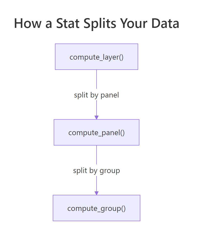
Figure 2: A stat splits your data by panel and group, then calls compute_group on each piece.
Here is StatChull from the opening, now with every line explained. It is genuinely this short.
The compute_group() function receives data, a data frame holding one group's rows with columns named x and y (ggplot2 renames your aesthetics to these standard names). chull() returns the row indices of the points on the convex hull, in order. Using those indices to subset data keeps only the boundary rows, which is exactly what a polygon needs. The scales argument is passed in case you need the panel's scale information; here you do not use it.
A raw stat object is awkward to call. Users expect a friendly function like stat_chull(), so you write a thin constructor that passes your stat to layer(). This wrapper is boilerplate you will copy for every stat.
Every argument here is standard layer() plumbing. The one you choose is geom = "polygon", the default shape your stat pairs with. Users can override it, just as you did in the first exercise. Now stat_chull() behaves like any built-in layer.
Let's prove the stat actually ran by counting how many boundary points it kept for each species. Here hull_plot has two layers, so we inspect layer 2, your stat_chull(); layer 1 is the plain geom_point().
Each species started with 50 points, but the convex hull kept only the handful on the outer edge: 8, 7, and 6 points for the three species. Your compute_group() ran three times, once per species, and ggplot2 stitched the results together with the right group labels. You wrote seven lines of logic and got a reusable layer.
Try it: Write a stat whose compute_group() returns only the single highest point (largest y) of each group. Use which.max() to find it.
Click to reveal solution
Explanation: which.max(data$y) returns the index of the largest y in the group, and subsetting data by it keeps that one row. The stat runs per group, so you get one top point per species. The y values (4.4, 3.4, 3.8) are the maximum sepal widths in each species.
How do you write your own geom?
A stat makes numbers; a geom makes shapes. Writing a geom feels a little more involved because the end result is actual graphics rather than a data frame, but the pattern mirrors a stat closely. A geom is a ggproto object inheriting from Geom that overrides draw_panel(), the method that returns the drawing. It also lists required_aes, sets default_aes (fallback values for colour, size, and so on), and points draw_key at a legend-drawing helper.
The one new idea is the coordinate transform. Your data lives in data units, like sepal length 5.1, but graphics are drawn in panel units from 0 to 1, where (0, 0) is the bottom-left corner and (1, 1) is the top-right. The call coord$transform(data, panel_params) converts your data columns into those 0-to-1 positions. After that, you use functions from R's built-in grid graphics system to draw. Here is the simplest possible geom, one that draws a point at each row.
Run it and you get a plain scatter plot, drawn entirely by your own code. coord$transform() placed every car at its 0-to-1 position, and grid::pointsGrob() (a "grob" is a graphical object, grid's word for a drawable shape) stamped a point at each one. The default_aes line means a user who does not set a colour gets black. This is the skeleton every geom shares.
A single point is not very exciting. The real power shows up when you compose existing geoms. A lollipop chart is a stem rising from zero with a dot on top, which is just a segment plus a point. Rather than draw both from scratch, you call the built-in geoms' own draw_panel() methods and glue their outputs together with grid::gList().
Notice draw_panel() here never touches grid directly. It builds a stems data frame (each row gets an endpoint at y = 0), then asks GeomSegment to draw the stems and GeomPoint to draw the dots, wrapping both grobs in a gList. You reused two built-in geoms and wrote almost no drawing code. Let's plot the average miles-per-gallon for each cylinder count.
You get three clean lollipops: a steel-blue stem from zero to each average, capped with a dot. Four-cylinder cars average 26.7 mpg, eight-cylinder cars only 15.1. The chart type did not exist in ggplot2 until you defined it, and now geom_lollipop() works on any data.
Try it: Give GeomSimplePoint a new look. Redefine it so unset points default to steel-blue triangles (shape = 17), then replot.
Click to reveal solution
Explanation: default_aes supplies the fallback aesthetics. Setting shape = 17 (a filled triangle) and colour = "steelblue" there changes the default look for anyone who does not override them in aes().
How do you turn a stat and geom into a polished, reusable layer?
You have now written a stat constructor and a geom constructor, and both looked almost identical. That constructor is the public face of your extension, so it pays to understand its arguments. Every one of them is a standard layer() control.
| Argument | What it controls |
|---|---|
mapping |
Aesthetics specific to this layer, from aes() |
data |
An optional data frame just for this layer |
stat / geom |
The partner piece; a geom_* sets a default stat, a stat_* sets a default geom |
position |
Overlap handling, usually "identity" |
na.rm |
Whether to silently drop missing values |
show.legend |
Force a legend on or off |
inherit.aes |
Whether to reuse the plot-level aes() mapping |
There is one gotcha worth knowing. If you want your geom to accept an extra setting, say a baseline for the lollipop stems, you cannot just add it to draw_panel(). Recent ggplot2 versions validate parameters and will drop an unrecognised one with a warning. You register the extra name in a field called extra_params.
This plots the same lollipops, but the stems now start at 10 instead of 0. The baseline value flowed from your constructor, through layer()'s params, into draw_panel(), all because you listed it in extra_params. Without that one line you would see an "unknown parameters" warning and the setting would be ignored.
When should you write a stat, a geom, or both? Use this quick guide.
- Write a stat when you need new numbers from the data (a running average, a boundary, a summary point).
- Write a geom when you need a new shape drawn from numbers you already have (a lollipop, a crosshair, a labelled marker).
- Write both when a chart needs a custom calculation and a custom drawing.
- Always start by overriding only
compute_group()ordraw_panel(), and reach for the deeper methods (setup_data,setup_params) only if you must.
Try it: Draw the lollipops with a baseline of 20 instead of 10, so only the four-cylinder stem points up.
Click to reveal solution
Explanation: With baseline = 20, each stem runs between 20 and its value. Because six- and eight-cylinder averages (19.7 and 15.1) sit below 20, their stems point downward, while the four-cylinder stem (26.7) still points up. The parameter reaches draw_panel() only because baseline is in extra_params.
Complete Example
Let's tie the whole tutorial together by building a custom stat and a custom geom that work as a team. The goal: mark the centre of each group with a crosshair. The stat computes each group's centre (a new calculation), and the geom draws a crosshair spanning the panel (a new shape). Neither exists in ggplot2, and together they show every idea from this guide in one plot.
First the stat. StatMeanPoint collapses each group down to a single row: the average x and average y.
Now the geom. GeomCrosshair draws two dashed lines through each incoming point, one vertical and one horizontal, each spanning the full panel. Because the transformed coordinates run 0 to 1, a full-height vertical line goes from y = 0 to y = 1 at the point's x, and the horizontal line mirrors that.
The one new token in that geom is .pt. ggplot2 measures linewidth in millimetres, but grid wants line widths in points, so multiplying by .pt (a conversion constant ggplot2 provides for exactly this) restates the width in the units grid draws with. You reach for it any time you pass a ggplot2 linewidth straight into a grid call.
Finally, snap the two together. You do not need a geom_crosshair() call here; instead you tell stat_mean_point() to draw with your custom geom by passing geom = GeomCrosshair. That is the flexibility of the stat-and-geom split: any stat can feed any geom.
The printed table confirms the stat collapsed each species to its centre point, for example (5.006, 3.428) for the first species. The final plot shows the faded scatter with a coloured dashed crosshair marking each group's centre. Your custom stat did the arithmetic, your custom geom did the drawing, and ggplot2 handled everything in between. That is a complete, reusable ggplot2 extension.
Practice Exercises
These combine several ideas from the tutorial. Try each before opening the solution. The exercise code uses fresh names so it will not clash with the objects defined above.
Exercise 1: A median-centre stat
Write StatMedianPoint, a stat that returns the median x and median y of each group (medians resist outliers better than means). Wrap it in a stat_median_point() constructor and mark each iris species median with a large star (shape = 8).
Click to reveal solution
Explanation: The only change from StatMeanPoint is median() in place of mean(). The constructor is identical boilerplate. The stars land on each species median, for example (5.0, 3.4) for the first species.
Exercise 2: A stem geom from scratch
Build GeomStem, a geom that draws a bare vertical stem from y = 0 up to each point, using grid directly (no borrowing GeomSegment). You will need to transform both the points and a y = 0 baseline, then draw with grid::segmentsGrob().
Click to reveal solution
Explanation: Transforming a y = 0 copy of the data gives the baseline's panel position, so segmentsGrob() can draw from the baseline up to each point. Multiplying linewidth by .pt (a ggplot2 constant) converts to the units grid expects.
Exercise 3: Feed your stat into a styled marker
Reuse StatMedianPoint from Exercise 1, but this time mark the medians as thin crosses (shape = 3) sized to stand out. Then explain in a sentence why the crosses come out coloured by species even though stat_median_point() never mentions colour.
Click to reveal solution
Explanation: The crosses inherit colour = Species because inherit.aes = TRUE (the constructor default) passes the plot-level aes() mapping down to your layer. Your stat splits the data by that same grouping, computes a median per species, and the geom draws each median in its group colour. You never wrote colour handling; the grammar carried it for you.
Summary
You can now build ggplot2 layers instead of only using them. Here are the pieces and the one function that anchors each.
| Concept | What it is | Key function or field |
|---|---|---|
| Layer | A stat + geom + position bundle | layer() |
| Stat | Transforms data, once per group | compute_group() |
| Geom | Draws shapes from data | draw_panel() |
| ggproto | The object system for both | ggproto() |
| Inheritance | Reuse ggplot2's machinery | ggproto("New", Stat, ...) |
| Constructor | The user-facing stat_* / geom_* |
wraps layer() |
| Coordinate transform | Data units to 0-to-1 panel units | coord$transform() |
| Custom parameters | Extra draw settings | extra_params |
| Inspection | See what a stat computed | layer_data() |
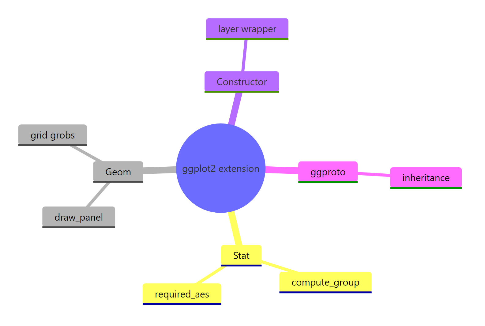
Figure 3: The parts of a ggplot2 extension at a glance.
The habit to keep: a stat makes numbers, a geom makes shapes, and you only build the piece you need. Start by overriding a single method, inspect the result with layer_data(), and compose existing geoms whenever you can. From here, the natural next step is to move these definitions into an R package so geom_lollipop() and friends install alongside ggplot2 and travel between every project you work on.
Frequently Asked Questions
When should I write a stat versus a geom?
Write a stat when you need new numbers computed from your data, such as a boundary, a running average, or a group summary. Write a geom when you already have the numbers and need a new shape drawn from them, such as a lollipop or a crosshair. If you need both a new calculation and a new drawing, write both and let the stat feed the geom.
Do I have to build an R package to reuse my extension?
No. Everything in this tutorial runs in a plain script, and you can keep your ggproto definitions and constructors in a sourced .R file. A package is simply the tidy way to share them: once geom_lollipop() lives in a package, it installs and loads alongside ggplot2 and travels between projects. Start in a script, move to a package when you want to reuse or publish.
What is the difference between draw_panel and draw_group?
Both return the graphics for your geom, but they run at different granularities. draw_panel() receives all the rows in a panel at once, which is efficient and right for most geoms. draw_group() runs once per group and is what you want when a shape depends on a whole group together, like a single polygon that connects a group's points.
Why does my custom parameter get ignored?
Recent ggplot2 versions validate layer parameters and quietly drop any they do not recognise, with an "unknown parameters" warning. If you add an argument to draw_panel(), you must also list its name in the geom's extra_params field. That is what tells ggplot2 to pass the value through instead of discarding it.
How do I get a legend for my custom geom?
Point the geom's draw_key field at one of ggplot2's key-drawing helpers, such as draw_key_point for dot-like geoms or draw_key_path for line-like ones. The helper draws the small swatch shown in the legend. If you omit it, your geom either shows no key or borrows an unhelpful default.
References
- Wickham, H. et al. Extending ggplot2 (official vignette). Link
- Wickham, H. ggplot2: Elegant Graphics for Data Analysis (3e), Chapter 20: Extending ggplot2. Link
- ggplot2 reference, Stats (the Stat ggproto class). Link
- ggplot2 reference, base ggproto classes (Geom, Stat, Coord). Link
- ggplot2 reference, layer() (the function every constructor wraps). Link
- Murrell, P. R Graphics and the grid package documentation (grobs and units). Link
- R Core Team, chull() documentation (convex hulls in base R). Link
Continue Learning
- The stat System in ggplot2 - a closer look at how built-in stats compute the numbers behind every chart.
- ggplot2 Extensions - the wider ecosystem of extension packages built on the mechanics you just learned.
- Build a ggplot2 Theme - extend the other half of the grammar, the appearance, by writing a reusable theme.