Dumbbell and Slope Charts in R for Before-After Stories
A dumbbell chart and a slope chart are two ggplot2 chart types for showing how a value moved between two points, like before and after. A dumbbell draws each group as two dots joined by a bar, so you see the size of every gap at a glance. A slope chart draws each group as a line linking its two values, so a rise or fall becomes the tilt of a line and a change in rank becomes a crossing.
This tutorial builds both charts from scratch with the tidyverse: ggplot2 for the graphics, dplyr for shaping the numbers, and tidyr for one reshape step. You will not need any special "dumbbell" or "slopegraph" add-on package. Both charts are just a few core layers stacked together, and building them by hand teaches you exactly how they work so you can restyle them any way you like.
What story do dumbbell and slope charts tell?
Before-and-after numbers show up everywhere: satisfaction before and after a redesign, revenue in two quarters, a metric in 2019 versus 2024. The trouble is that a grouped bar chart hides the one thing you care about. The reader has to mentally subtract one bar from its neighbor for every category. A dumbbell chart and a slope chart put that difference in the foreground instead of making the reader compute it.
We will tell one story throughout: a product team measured customer satisfaction (0 to 100) for six features before and after a redesign. Let's create that data and look at it.
We built the table with tibble(), the tidyverse's version of a data.frame (it prints with the compact # A tibble header you see above and otherwise behaves the same). Each row is one feature with two measurements. before is the score from before the redesign, after is the score from after. This "wide" shape, one row per group with a column per time point, is the natural starting point for a dumbbell chart.
The number that carries the whole story is the change, so let's compute it directly and keep it in the table.
The |> symbol is R's pipe: it takes the value on its left and passes it as the first argument to the function on its right, so scores |> mutate(...) is just a readable way to write mutate(scores, ...). It lets you read a chain of steps from top to bottom. The mutate() function adds a new column without dropping the old ones. Here change = after - before gives a positive number when a feature improved and a negative number when it slipped. Four features went up (Checkout, Mobile App, Dashboard, Onboarding) and two went down (Search and Billing). That mix of winners and losers is exactly what these charts are built to show.
Try it: Use the scores table to count how many features improved (where change is greater than 0). The answer should be 4.
Click to reveal solution
Explanation: filter() keeps only the rows where the condition is true, and nrow() counts the rows that survive. Four features had a positive change.
How do you build a dumbbell chart in ggplot2?
A dumbbell chart looks like a hand weight: two round dots joined by a short bar. In ggplot2 you build it from three ordinary layers. One geom_segment() draws the connecting bar from the before value to the after value, and two geom_point() layers drop a dot at each end. That is the whole trick.

Figure 1: A dumbbell chart is one geom_segment bar with two geom_point dots stacked on top.
Let's map the pieces. We put feature on the y-axis so each feature gets its own row. The bar runs horizontally from before (its x) to after (its xend). Then one dot marks where the feature started and another marks where it ended.
Read the layers from the bottom up. The geom_segment() call needs four positions: x and y for where the bar starts, xend and yend for where it ends. Because both dots sit on the same feature row, yend is just feature again. The first geom_point() draws the grey "before" dot at the before value, and the second draws the blue "after" dot at the after value.
When you run this, each feature becomes a horizontal dumbbell. The gap between the grey and blue dots is the change, and long bars jump out immediately. Checkout and Onboarding show wide gaps, while Search and Billing barely move.
ggalt::geom_dumbbell(), but that add-on is not always available and it hides what is really happening. Building the chart from geom_segment() and geom_point() always works and shows you every moving part, so you can restyle it freely.Try it: Copy the basic chart, but make the "after" dots bigger (try size = 6) and change their color to "darkorange". Only the second geom_point() needs to change.
Click to reveal solution
Explanation: The dots are independent layers, so styling one never touches the other. Bigger, brighter "after" dots pull the eye toward where each feature ended up.
How do you make a dumbbell chart easy to read?
The basic chart works, but three small moves turn it from readable into clear. We sort the rows, color by direction, then label the values, adding them one at a time.
First, sorting. Right now the features sit in the order we typed them, which means nothing. If we sort by the after value, the chart becomes a ranked list and the eye can scan it top to bottom. The reorder() function reorders a category by a number, so reorder(feature, after) arranges features from lowest to highest ending score.
We wrapped feature in reorder(feature, after) in both the aes(y = ...) and the segment's yend, so the bar and its row stay lined up. We also thickened the bar with linewidth = 1.5 and lightened it to grey80 so the dots read as the main event. The labs() call gives the x-axis a real name and drops the redundant y-axis title with y = NULL. Now the highest-scoring features sit at the top.
Next, color. Right now every bar looks the same, so a feature that dropped looks just like one that rose. Let's tag each feature as "Improved" or "Declined" and color by that tag. We build the label with if_else(), which returns the first value when the test is true and the second when it is false.
Now every row knows whether it went up or down. We can map that new direction column to color and let ggplot2 pick a color per group. We also add geom_text() to print the ending value just above each blue dot, so the reader gets exact numbers without hunting along the axis.
Two things changed. We moved color = direction inside aes() for the segment and the after dot, which tells ggplot2 to split those layers by the direction group. Then scale_color_manual() sets the exact colors: a calm blue for improvements and a warm orange for declines. The geom_text() layer places each after value slightly above its dot, nudged up by vjust = -1.2. The grey "before" dot stays a fixed grey so it always reads as the starting point. Now a glance separates the two declining features from the four that improved.
Try it: Sort the dumbbells by the size of the change instead of the ending score. The hint is to reorder by change rather than after.
Click to reveal solution
Explanation: Sorting by change puts the biggest drop at the bottom and the biggest gain at the top, so the chart ranks features by how much they moved rather than where they landed.
How do you build a slope chart in ggplot2?
A slope chart tells the same before-after story with lines instead of bars. Each feature is a single line running from its before value on the left to its after value on the right. A line that tilts up means the feature improved, a line that tilts down means it declined, and lines that cross show a change in ranking.
There is one setup step. A dumbbell reads straight from the wide table, but a slope chart draws a line through points, so it needs one row per point. We reshape the two columns before and after into two rows using pivot_longer().
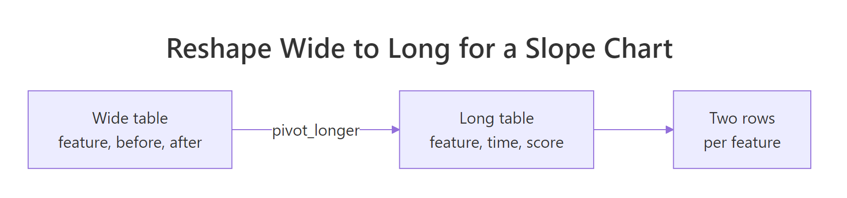
Figure 2: pivot_longer() turns one wide row into two long rows, one per time point.
Let's reshape the data and look at the result.
We started with 6 rows and now have 12, two per feature. The cols = c(before, after) argument tells pivot_longer() which columns to fold down. The old column names ("before", "after") land in a new time column, and the numbers land in a new score column. This long shape is what geom_line() needs to connect the two points of each feature.
There is one catch. R stores the time values as plain text, and text sorts alphabetically, which would put "after" before "before" on the axis. We fix that by turning time into a factor with the levels in the order we want.
A factor is R's type for a category with a fixed set of possible values, and those values have an order. By listing levels = c("before", "after") we tell R that before comes first. The levels() function confirms the order stuck.
Now the data is ready. We draw one line per feature with geom_line(), using group = feature so ggplot2 knows which points belong to the same line, and add dots at each end with geom_point().
The group = feature mapping is the piece that makes a slope chart work. Without it, ggplot2 would try to connect all the points into one tangled line. With it, each feature gets its own line from its before point to its after point. Running this shows a fan of grey lines, most tilting up, a couple tilting down.
The plain version has no labels, so you cannot tell which line is which. Let's color each line by feature and print the feature name at the right end, where the reader's eye finishes.
The geom_text() layer only draws labels for the "after" rows, which we pick with subset(scores_long, time == "after"), so each name appears once at the right end of its line. The nudge_x = 0.05 pushes the text just past the last dot, and expand = expansion(mult = c(0.1, 0.35)) adds room on the right so long names do not run off the panel. Because the color already identifies each line, guides(color = "none") hides the now-redundant legend.
Try it: The long table has more rows than the original. Use nrow() to confirm how many rows scores_long has, and think about why the reshape doubled them.
Click to reveal solution
Explanation: Six features times two time points gives 12 rows. pivot_longer() traded width (two value columns) for length (two rows per feature), which is the shape a line chart needs.
When should you use a dumbbell vs a slope chart?
Both charts show before-after change, so which one should you reach for? The short answer: use a dumbbell when the size of each gap is the point, and a slope chart when direction and ranking are the point.
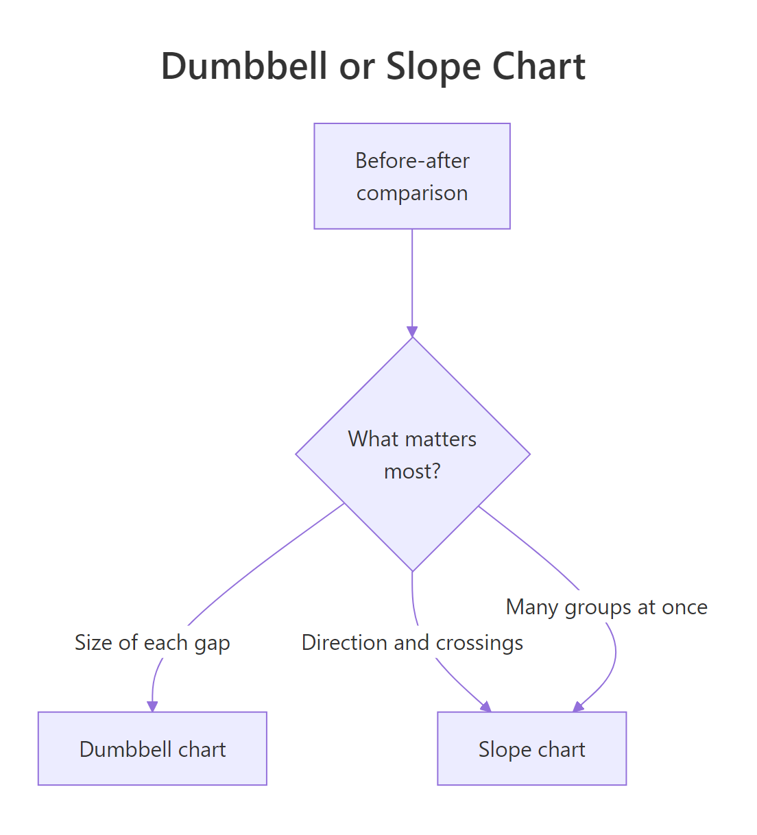
Figure 3: Pick a dumbbell for gap size, a slope chart for direction and rank changes.
Here is a side-by-side comparison to guide the choice.
| Question | Dumbbell chart | Slope chart |
|---|---|---|
| What does it emphasize? | The size of each gap | The direction and steepness of each change |
| Easy to sort and rank? | Yes, sort rows by value or change | Harder, lines are fixed by their values |
| Shows rank changes (crossings)? | No | Yes, crossing lines reveal them |
| Best group count | Works well with many groups | Best with a handful before lines tangle |
| Reads best when | You want a ranked "gap list" | You want to see who overtook whom |
A slope chart has one extra power a dumbbell cannot match: when two lines cross, you instantly see that one group overtook another. Let's color the slope lines by direction so the two declines stand out. First we attach the direction label to the long table with a join.
The left_join() matches rows by feature and copies the direction column from scores onto every row of the long table. We only pulled in the columns we need with select(scores, feature, direction). Now each of the 12 long rows carries its direction, so we can color by it.
Mapping color = direction splits the lines into two colored groups, and scale_color_manual() reuses the same blue-for-up, orange-for-down scheme from the dumbbell chart. Keeping colors consistent across both charts helps a reader who sees them together. The two orange lines tilt down while the four blue lines tilt up.
Try it: Rebuild the colored slope chart yourself using the slope_dir data, mapping color = direction on both the line and point layers.
Click to reveal solution
Explanation: Any two contrasting colors work. The point is that mapping color = direction turns the chart into a two-group story: one color for the risers, one for the fallers.
Complete Example
Let's pull the best moves into one polished dumbbell chart you could drop into a report. It sorts by ending score, colors by direction, labels both the before and after values, and adds a clear title. Every piece here appeared earlier in the tutorial.
We sorted once up front by setting feature = reorder(feature, after), so every layer inherits the ranked order. The two geom_text() layers print the starting value to the left of the grey dot and the ending value to the right of the colored dot, using hjust to push each label clear of its point. We fixed the x-axis to a sensible window with scale_x_continuous(limits = c(50, 88)) so the labels have breathing room, and theme_minimal() strips the chart down to the data. The result is a single figure that ranks the features, shows each starting and ending score, and separates the winners from the losers by color.
Practice Exercises
These combine several ideas from the tutorial. Each uses distinct variable names so it will not overwrite the objects we built above. Try each one before opening the solution.
Exercise 1: Find the biggest mover
Using the scores table, find the single feature that moved the most in either direction (the largest absolute change). Save it to biggest and print it. The expected answer is Onboarding, with a change of 19.
Click to reveal solution
Explanation: abs(change) ignores the sign so a big drop competes with a big gain, arrange(desc(...)) puts the largest on top, and slice(1) keeps that one row. Onboarding rose 19 points, the biggest move on the board.
Exercise 2: A dumbbell of only the declines
Build a dumbbell chart showing only the features that declined. First filter scores to the declining rows and print them, then draw the dumbbell for just those features. There should be two: Search and Billing.
Click to reveal solution
Explanation: Filtering first shrinks the data to the two declining features, and the same three-layer recipe draws a focused chart. Zooming in on just the problem cases is a common reporting move.
Exercise 3: A titled slope chart by direction
Recreate the direction-colored slope chart from the slope_dir data, but add a title and subtitle so it stands on its own in a report. Save it to p_cap3.
Click to reveal solution
Explanation: The chart body is the same as before; the labs() title and subtitle plus theme_minimal() turn a working plot into a finished figure a reader can understand without extra context.
Frequently Asked Questions
Do I need the ggalt or CGPfunctions package for these charts? No. Those packages offer shortcuts like geom_dumbbell() and newggslopegraph(), but you can build both charts with core ggplot2 geoms, as this tutorial does. Building them by hand keeps your code portable and lets you restyle every layer.
When should I use a bar chart instead? Use a bar chart when you care about the absolute levels and there is no natural "before and after" pairing. The moment your story is about how a paired value changed, a dumbbell or slope chart shows the change far more directly than two bars side by side.
What if I have more than two time points? A dumbbell chart is built for exactly two points, so it does not extend cleanly. A slope chart can add more columns on the x-axis and becomes a small multi-point line chart, though with many points a standard line chart is usually clearer.
My metric is better when it is lower, like wait time. Does that break the charts? No, the charts still work, but flip your color logic. Define the direction so that a decrease counts as an improvement, then map your colors to that. The geometry does not change; only the label of what "good" means does.
How do I label the size of each change on a dumbbell? Add a geom_text() layer positioned at the midpoint of each bar with the change value as its label, for example label = change. Placing the number on the bar itself saves the reader from subtracting the two dot positions.
Summary
Dumbbell and slope charts both turn a before-after table into a clear picture of change. A dumbbell draws each gap as a bar with two dots and is easy to sort and rank. A slope chart draws each change as a tilting line and is the better choice when direction and crossings matter.
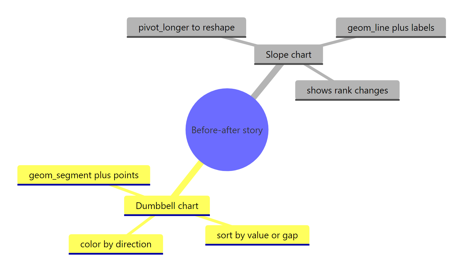
Figure 4: The full before-after charting workflow at a glance.
The workflow in one place:
| Step | Dumbbell chart | Slope chart |
|---|---|---|
| Data shape | Wide: one row per group | Long: one row per point (pivot_longer()) |
| Core geoms | geom_segment() plus two geom_point() |
geom_line() plus geom_point() |
| Ordering | Sort with reorder() |
Set time order with a factor |
| Direction | Color by an Improved/Declined label | Color lines by the same label |
| Labels | Value labels at each dot | Feature names at the right end |
Reach for a dumbbell when the size of each gap is the message. Reach for a slope chart when the reader needs to see which groups rose or fell and whether any ranks crossed.
References
- ggplot2 documentation. geom_segment() reference. Link
- ggplot2 documentation. geom_point() reference. Link
- tidyr documentation. pivot_longer() reference. Link
- forcats documentation. fct_reorder() and factor ordering. Link
- Wickham, H., Cetinkaya-Rundel, M., Grolemund, G. R for Data Science, 2nd Edition, Data Visualization. Link
- The R Graph Gallery. Dumbbell chart with a gap column. Link
- R CHARTS. Slopegraph in ggplot2. Link
Continue Learning
- ggplot2 Line Charts: the foundation for slope charts, covering
geom_line(), grouping, and styling in depth. - Text Labels in ggplot2: everything about
geom_text()and direct labeling, including how to keep labels from overlapping. - Reshape Data with pivot_longer and pivot_wider: the wide-to-long reshape that every slope chart depends on, explained from scratch.