Advanced Faceting in R: ggh4x, Nested and Per-Panel Axes
Advanced faceting is the set of ggplot2 techniques for controlling a multi-panel plot beyond a plain facet_wrap(): free per-panel scales, panel sizing, strip placement and styling, panel order, and, with the ggh4x package, truly nested strips and a different axis on every panel.
Faceting splits one plot into a grid of small panels, one per group, so you can compare groups side by side. If you have met facet_wrap() and facet_grid() before, you already know the basic move. This tutorial picks up right after that and gives you fine control over how those panels look and behave.
Everything here builds on ggplot2 and the built-in mpg dataset (fuel economy for 234 cars). The main sections run in your browser, so you can edit and re-run every example as you read. The final section uses an add-on package called ggh4x, which you run in your own R session; its output is shown as rendered images so you can still see exactly what it produces.
How do you control panel layout and free scales in facet_wrap?
A plain facet_wrap(~ class) already splits mpg into one panel per vehicle class. The catch is that every panel is forced to share a single x and y scale at one fixed size. Advanced faceting begins the moment you want each panel to size itself to its own data rather than share one cramped scale, or to sit in an order you choose. Let us start from the payoff and add one control at a time.
Here is the baseline. We build a scatter of highway mileage (hwy) against engine size (displ), store it as an object called p, then split it by class.
The table() count confirms the seven groups we are about to split on, from just five 2-seaters up to sixty-two SUVs. We then saved the base plot once as p, so from now on we can bolt a facet layer onto it with a single +, where vars(class) names the column to split on (writing ~ class does the same thing). The result is seven panels sharing identical axes, which makes cross-panel comparison honest: a point in the same spot means the same thing in every panel.
That shared axis is sometimes the problem. The 2-seater panel has only a few cars clustered in one corner, so most of its panel is empty. When each group lives in a different range, let each panel set its own limits with scales.
scales = "free" frees both axes so every panel zooms to its own data. Use "free_x" or "free_y" to free just one axis. Notice how each panel now fills its space, but the axes no longer line up, so you can no longer eyeball differences between panels at a glance.
You also control the grid shape. ncol and nrow set how many columns or rows of panels you get, and dir decides whether panels fill by row ("h", the default) or by column ("v").
Setting ncol = 4 forces four panels per row, and dir = "v" fills them top to bottom before moving right. Layout control matters for reports: a wide 4-column grid fits a landscape page, while a tall 2-column grid suits a phone screen.
Try it: Put each drivetrain (drv) in its own panel, all on a single row. Start from the scaffold and change the faceting variable and the layout.
Click to reveal solution
Explanation: vars(drv) splits on drivetrain (four-wheel, front, rear) and nrow = 1 lines the three panels up in one row for an easy left-to-right read.
When should you use facet_grid with free scales and space = "free"?
facet_wrap() lays panels out in a flowing grid. facet_grid() is different: it crosses one variable against another, so rows mean one thing and columns mean another. Use it when both splitting variables matter and you want a true matrix of panels.
The formula reads rows ~ columns. Here we cross drivetrain (rows) against cylinder count (columns).
Every cell is one drivetrain-and-cylinder combination. Empty cells (like a rear-wheel 4-cylinder, which does not exist in the data) stay blank on purpose, which itself shows which drivetrain-and-cylinder combinations occur.
facet_grid() adds a second lever that facet_wrap() lacks: space. While scales frees each panel's axis range, space frees each panel's physical size so a panel with more categories gets more room. This pairing is especially useful for categorical summaries like boxplots.
We put class on the y axis, ordered by its average hwy with reorder() so the boxes run low to high, and split into drivetrain rows with drv ~ . (the dot means "no column split"). scales = "free_y" lets each row show only the classes it actually contains, and space = "free_y" sizes each row to match how many classes it holds, so no box gets squashed. Without space, every row would be the same height and rows with few classes would waste space.
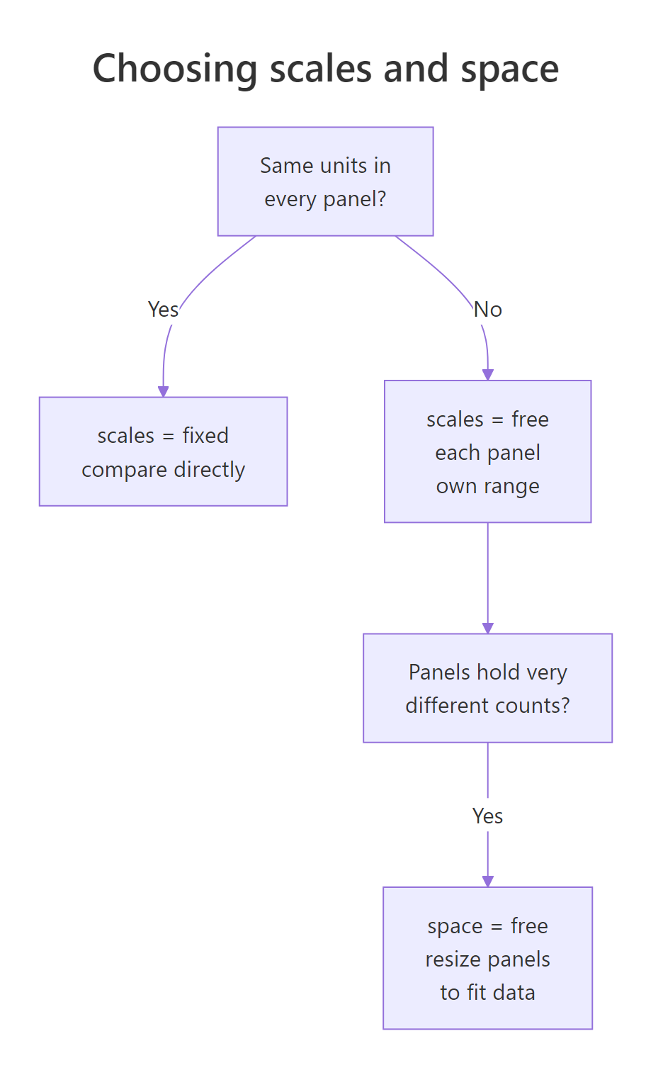
Figure 1: How the scales and space decisions differ in facet_grid.
scales = "free_y" changes what numbers each panel's axis spans; setting space = "free_y" changes how tall the panel is drawn. They are independent, and for ragged categorical data you usually want both.Try it: Take a boxplot of hwy by class split into drivetrain columns, and free the x axis range and width per column.
Click to reveal solution
Explanation: . ~ drv splits into one column per drivetrain, and the two free_x settings let each column set its own x range and width instead of being stretched to a shared one.
How do you build nested-looking strip labels in base ggplot2?
The strip is the little labelled bar on top of each panel. When two variables define your panels, you often want both names to show. Base ggplot2 can stack them, giving a nested look, without any extra package.
Pass two variables to vars() and use a labeller. label_both prints the variable name alongside its value, and by default it puts each variable on its own line.
Each strip now reads like drv: 4 on one line and cyl: 6 on the next. That two-line strip is what people mean by a "nested look": the outer grouping (drivetrain) sits above the inner grouping (cylinders). The panels themselves are still a flat wrap; only the labels are layered.
Long strip labels are a common headache because they get clipped. label_wrap_gen() wraps them onto multiple lines at a width you choose.
We made a deliberately long label by pasting a prefix onto each class name. label_wrap_gen(width = 16) then breaks any label longer than 16 characters across lines so nothing is cut off. This is the cleanest fix for descriptive labels that would otherwise overflow their strip.
Sometimes you want the two variables merged into a single strip rather than stacked. interaction() glues them into one factor you can facet on.
interaction(drv, cyl, sep = " / ") creates labels like 4 / 6 in one line per panel. This keeps strips compact when a two-line label would be too tall.
label_both strips look grouped, yet there is no line or bracket tying the panels of one drivetrain together. Drawing that true hierarchy is exactly what the ggh4x package adds later in this tutorial.Try it: Facet by both year and drv, and label each strip with its variable name using label_both.
Click to reveal solution
Explanation: label_both turns each strip into a two-line label such as year: 1999 over drv: f, making the two grouping variables unmistakable.
How do you move and restyle facet strips?
By default strips sit on the top and right of the grid. You can move them and restyle them so the plot reads the way you want. Moving comes first.
In facet_grid(), the switch argument flips strips to the opposite side. switch = "both" moves the row strips to the left and the column strips to the bottom.
Now the cylinder labels run along the bottom and the drivetrain labels down the left, which some readers find more natural because the labels sit next to the axes they relate to.
In facet_wrap(), the equivalent control is strip.position, and you pair it with theme(strip.placement = "outside") so the strip sits beyond the axis rather than crowding the panel.
strip.position = "bottom" drops the strips under each panel, and strip.placement = "outside" pushes them past the axis text so they act like a second, per-panel axis title.
Styling is pure theme work. strip.background controls the strip's fill and border, and strip.text controls the label font.
We filled the strips with a dark slate colour and set the text to white and bold. The strips now read as clear section headers, which helps a busy grid feel organised.
strip.background fill with a contrasting strip.text colour turns the strip from a faint label into a strong visual divider, which is worth doing whenever a grid has many panels.Try it: Move the class strips to the left of each panel and place them outside the axis.
Click to reveal solution
Explanation: strip.position = "left" rotates the strips to the left edge, and strip.placement = "outside" moves them beyond the y axis so they never overlap the panel.
How do you reorder panels and add total panels?
Panels appear in the order of the faceting variable's factor levels. For a plain character column like class, that means alphabetical order, which is rarely the most useful. Let us confirm the default, then change it.
The classes come out alphabetically, so pickup sits in the middle even though it has the worst mileage. To order panels by a meaningful number, use reorder(), which sets the factor levels by a summary statistic.
reorder(mpg$class, mpg$hwy, FUN = median) builds a factor whose levels run from the lowest median hwy to the highest. The printed levels confirm it: pickups and SUVs (thirsty) now come first and compacts and midsize cars (efficient) come last. Faceting on this new column arranges the panels as a ranking.
The panels now run from worst to best mileage, left to right, top to bottom. Reordering is one of the highest-value faceting tweaks because it lets the layout itself carry the message.
reorder() sorts the panels so the reader sees the ordering you care about without reading a single number.A different need is a totals panel that shows every group combined next to the split panels. facet_grid() does this with margins = TRUE.
margins = TRUE adds one extra panel labelled (all) that pools every drivetrain, so readers can compare each group against the overall pattern in the same view. This is handy for dashboards where the total matters as much as the parts.
Try it: Split by drv across columns and add a combined column that shows all drivetrains together.
Click to reveal solution
Explanation: margins = TRUE appends an (all) column pooling every drivetrain, so the combined view sits right beside the per-drivetrain panels.
How do you highlight one panel against the full dataset?
A faceted plot answers "what does each group look like on its own", but it hides "how does each group compare to everyone else". The fix is a classic trick: draw the entire dataset in grey behind every panel, then draw each panel's own subset in colour on top.
The key move is a background layer whose data has the faceting variable removed. Because that layer has no class column, it cannot be split, so ggplot2 repeats it in every panel.
transform(mpg, class = NULL) copies the data and drops the class column, giving us mpg_all. The first geom_point() draws that full backdrop in light grey; the second draws the faceted subset in orange. Every panel now shows its own cars in context, so you can see instantly that 2-seaters sit in the high-power, low-mileage corner while compacts cluster the other way.
Try it: Build the same highlight effect for drv instead of class.
Click to reveal solution
Explanation: Dropping drv from bg makes the grey layer facet-free, so all cars appear behind each drivetrain panel while the coloured points mark the current group.
When do you need ggh4x, and what does it add?
Base ggplot2 took us a long way: free scales, panel sizing, strip control, panel ordering and the highlight trick. Three things it genuinely cannot do are draw a true nesting line above grouped strips, put a different scale on individual panels, or free scales fully independently in a grid. The ggh4x package fills exactly those gaps.
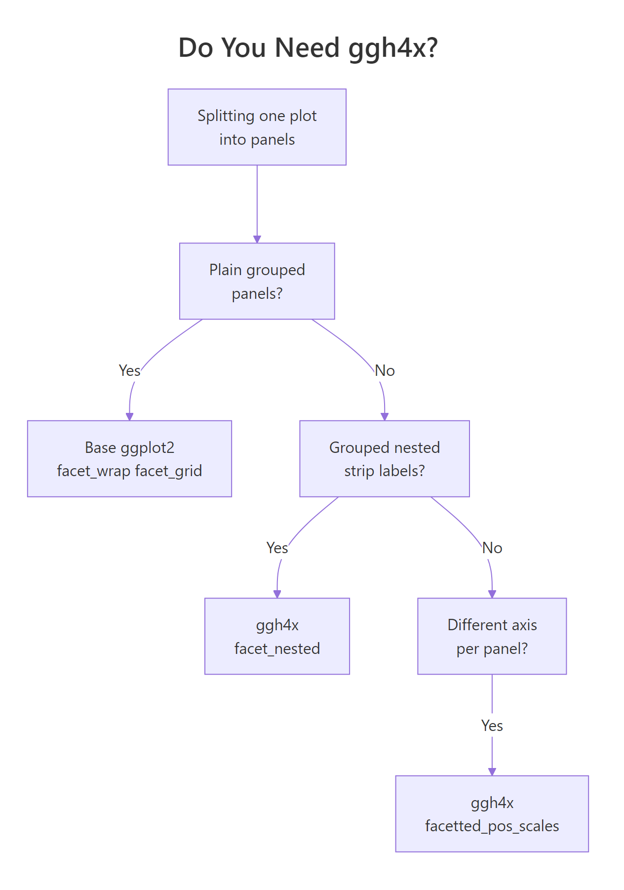
Figure 2: Base ggplot2 first, ggh4x only when you need it.
The examples below use ggh4x, which is not one of the packages available in the interactive runner on this page. Install it once with install.packages("ggh4x") and run these snippets in your own R session such as RStudio or the R console. Each block is followed by its real rendered output so you can see the effect without running anything.
The first gap is real nesting. facet_nested() reads a formula like outer + inner and draws a spanning strip for the outer group above the inner strips, with a connecting line. Here manufacturers are nested inside a region.
library(ggh4x)

mpg_eu <- subset(mpg, manufacturer %in%
                   c("audi", "volkswagen", "toyota", "honda"))
mpg_eu$origin <- ifelse(mpg_eu$manufacturer %in% c("audi", "volkswagen"),
                        "Europe", "Asia")

ggplot(mpg_eu, aes(displ, hwy)) +
  geom_point(colour = "#2c7fb8") +
  facet_nested(~ origin + manufacturer)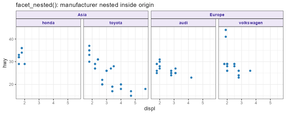
Figure 3: facet_nested() draws hierarchy lines above grouped strips.
The origin strip now spans its manufacturers with a clear bar, so the two-level grouping is unmistakable. Base ggplot2 could stack these labels but never draw that spanning header.
The second gap is per-panel axes. facetted_pos_scales() lets you hand it a list of scales, one per panel, so each panel can use a different transformation or label format.
ggplot(mpg, aes(displ, hwy)) +
  geom_point(colour = "#2c7fb8") +
  facet_wrap(vars(drv), scales = "free_x") +
  facetted_pos_scales(x = list(
    scale_x_continuous(limits = c(1, 7)),
    scale_x_reverse(),
    scale_x_continuous(labels = scales::label_number(suffix = "L"))
  ))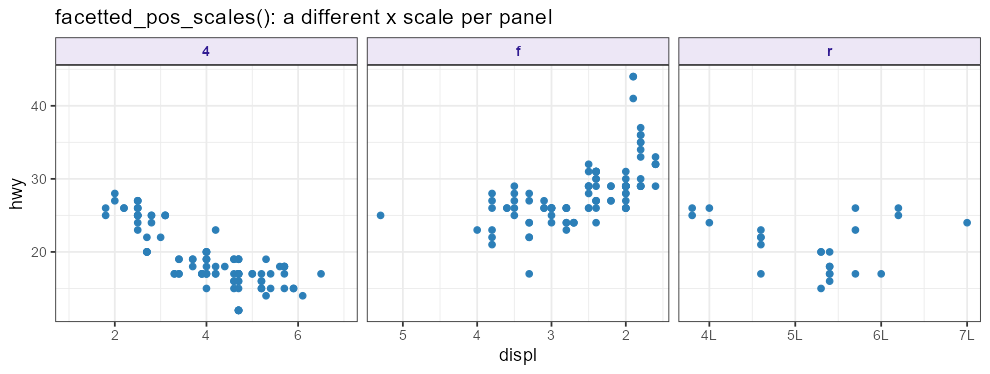
Figure 4: facetted_pos_scales() gives each panel its own x scale.
The three panels now use three different x scales: a fixed 1-to-7 range, a reversed axis, and an axis whose labels carry an "L" suffix for litres. You must set scales = "free_x" first so ggplot2 allows per-panel scales, then facetted_pos_scales() assigns them in order.
The third gap is fully independent grid scales. Base facet_grid() shares scales along each row and column even when free; facet_grid2() with independent = "all" frees every panel completely.
ggplot(mpg, aes(displ, hwy)) +
  geom_point(colour = "#2c7fb8") +
  facet_grid2(vars(drv), vars(year),
              scales = "free", independent = "all")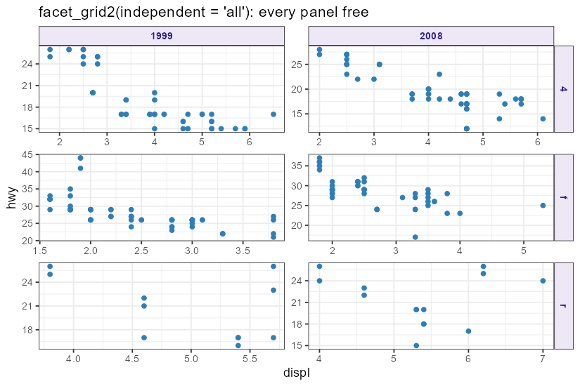
Figure 5: facet_grid2(independent = "all") frees every panel's axes.
Every panel now has its own x and y range, even panels in the same row or column. That is impossible in base facet_grid(), where free scales are still shared down each column and across each row.
ggplot(), aes(), and geom_point() lines are identical to the base examples. You only replace facet_wrap() or facet_grid() with the ggh4x version, which makes ggh4x cheap to adopt when a plot truly needs it.Try it locally: In your own R session, take the nested example and add nest_line = element_line(colour = "grey40") inside facet_nested() to draw a visible connector between the region strip and its manufacturers. Compare it to the default and decide which reads better for your data.
Practice Exercises
These capstone exercises combine several techniques from the tutorial. They all use base ggplot2, so you can run and check them in your browser. Each starter block runs as-is; edit it toward the goal, then reveal the solution.
Exercise 1: Rank panels and brand them
Reorder the class panels by their median hwy, free the y scale per panel, and give the strips a dark background with white bold text.
Click to reveal solution
Explanation: reorder() orders the panels worst-to-best mileage, scales = "free_y" lets each panel size its own y range, and the two theme lines turn the strips into dark headers. Three independent techniques combine cleanly on one plot.
Exercise 2: Highlight with relocated strips
Draw every class against a grey backdrop of all cars (the highlight trick), and move the strips to the bottom, outside the axis.
Click to reveal solution
Explanation: Removing class from cap_bg makes the grey layer repeat in every panel, the orange layer marks the current class, and the two strip settings drop the labels below each panel outside the axis.
Exercise 3: A ragged categorical grid
Build a boxplot of hwy by class, split into drivetrain rows, and use free scales, free space, and a totals row so each row is sized to its classes and an (all) row pools everything.
Click to reveal solution
Explanation: scales = "free_y" shows only the classes present in each drivetrain, space = "free_y" sizes each row to its class count, and margins = TRUE adds an (all) row pooling every drivetrain for reference.
Frequently Asked Questions
When should I use free scales instead of fixed scales? Use fixed scales (the default) when comparing groups against each other is the point, because shared axes make positions directly comparable. Switch to free scales when the shape or trend within each group matters more and the groups live in very different ranges. Free scales make each panel readable but remove the ability to compare across panels at a glance.
What is the difference between scales and space in facet_grid? scales controls the axis range shown in each panel, while space controls how much physical room each panel gets. Freeing scales lets a panel zoom to its data; freeing space lets a panel with more categories be drawn larger. For ragged categorical data such as boxplots with different numbers of categories per panel, you usually free both together.
Can I get nested strip labels without ggh4x? Yes, up to a point. Passing two variables to vars() with labeller = label_both stacks both labels, giving a nested look. What base ggplot2 cannot do is draw the spanning bar and connecting line that visually group the inner panels under one outer label. For that true hierarchy you need facet_nested() from ggh4x.
Does ggh4x replace ggplot2? No. ggh4x is a small extension that adds new facet_* functions and a few scale helpers on top of ggplot2. Your ggplot(), aes(), and geom_* code stays exactly the same; you only swap the faceting layer. You still load and use ggplot2 as usual.
How do I show axis labels on inner panels of a grid? Base ggplot2 draws axes only on the outer edges of a facet grid. The facet_grid2() and facet_wrap2() functions in ggh4x accept an axes = "all" argument that draws ticks and labels on inner panels too, with a remove_labels option to keep the ticks but drop repeated labels. This helps when a large grid makes readers scan far to find the nearest axis.
My plot has too many panels to read. What should I do? First cut the number of groups, for example by collapsing rare categories into an "Other" bucket before faceting. If every group must stay, use ncol and nrow to shape the grid to your page, free scales so small panels stay legible, and consider the grey-backdrop highlight so each panel still carries context. A grid of 30 tiny panels rarely communicates better than a well-chosen six.
Summary
Advanced faceting is mostly about control: which panels appear, in what order, at what size, carrying which labels. Base ggplot2 handles the large majority of that, and ggh4x covers the few things it cannot.
| Technique | Function or argument |
|---|---|
| Panel layout | facet_wrap(ncol=, nrow=, dir=) |
| Free per-panel scales | scales = "free", "free_x", "free_y" |
| Free per-panel size | facet_grid(space = "free_y") |
| Stacked nested-look labels | facet_wrap(vars(a, b), labeller = label_both) |
| Wrap long labels | label_wrap_gen(width = ) |
| Move strips | switch= (grid), strip.position= (wrap) |
| Style strips | theme(strip.background, strip.text) |
| Reorder panels | reorder() or forcats::fct_reorder() |
| Totals panel | facet_grid(margins = TRUE) |
| Highlight against all data | grey layer with the facet variable removed |
| True nested strips | ggh4x::facet_nested() |
| Per-panel axes | ggh4x::facetted_pos_scales() |
| Fully independent grid scales | ggh4x::facet_grid2(independent = "all") |
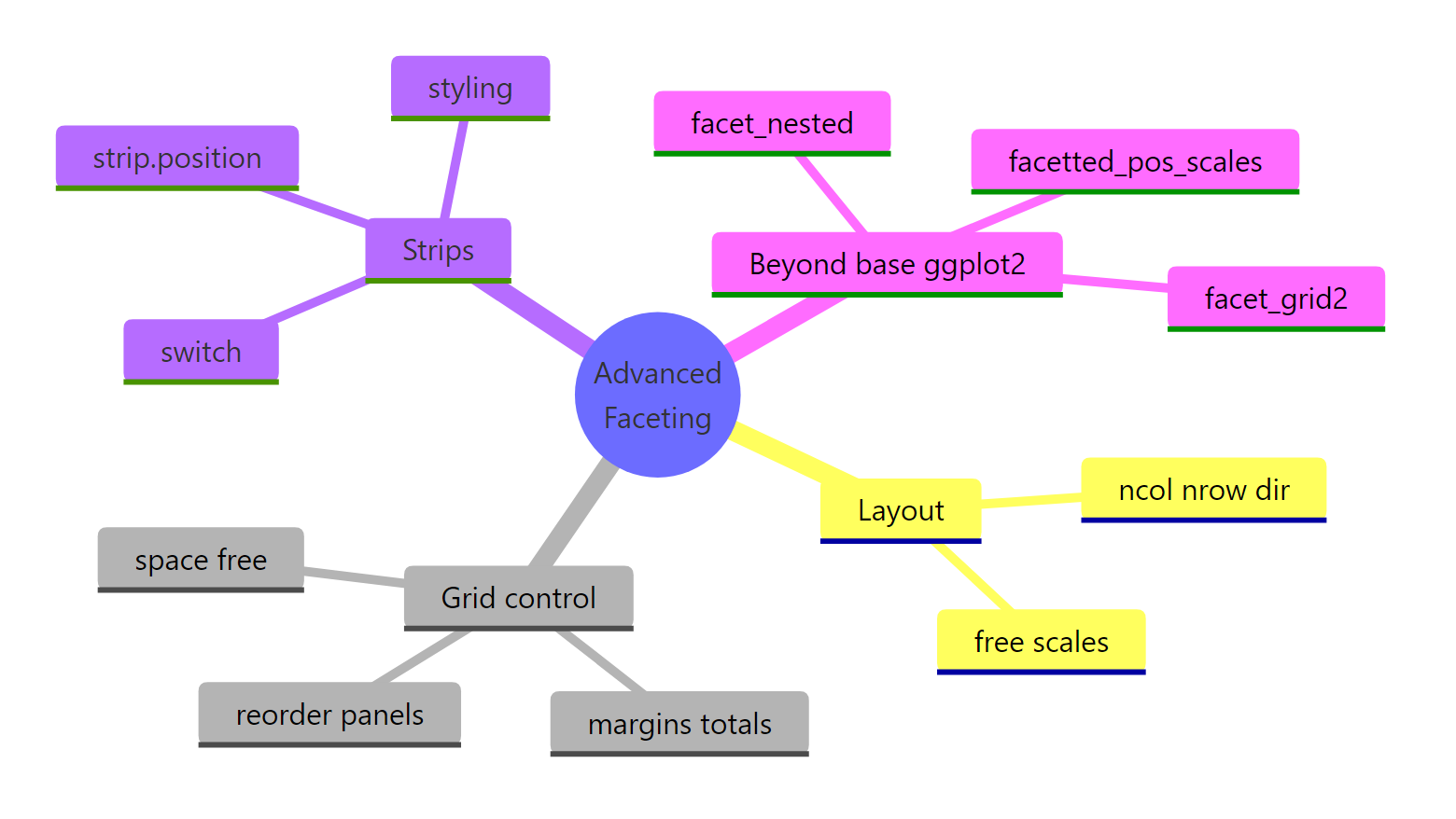
Figure 6: The advanced-faceting toolkit at a glance.
The workflow is reliable: reach for base ggplot2 first, and add ggh4x only when you hit true nesting, per-panel axes, or fully independent scales. Because ggh4x changes only the facet layer, you can start in base ggplot2 and upgrade a single line when the plot demands it.
References
- ggplot2 documentation. Wrap a 1d ribbon of panels into 2d: facet_wrap(). Link
- ggplot2 documentation. Lay out panels in a grid: facet_grid(). Link
- ggplot2 documentation. Labeller functions, including label_both and label_wrap_gen. Link
- Wickham, H., Navarro, D., Pedersen, T. L. ggplot2: Elegant Graphics for Data Analysis, Faceting chapter. Link
- Brand, T. van den. ggh4x: Facets vignette. Link
- Brand, T. van den. ggh4x reference: facet_nested(). Link
- Brand, T. van den. ggh4x reference: facetted_pos_scales(). Link
- Brand, T. van den. ggh4x reference: facet_grid2(). Link
Continue Learning
- ggplot2 Facets: the foundations of
facet_wrap()andfacet_grid()that this tutorial builds on. - Small Multiples in R: design principles for reading a grid of related panels well.
- Multi-Panel Figures in R: combine several different plots into one figure with patchwork.
- ggplot2 Themes: go deeper on theming, including the strip elements you styled here.