Multi-Panel Figures in R: a One-Page Brief in ggplot2
A multi-panel figure places several separate plots inside one figure. A one-page brief is a multi-panel figure designed so a reader gets the whole story from a single page. This tutorial builds one end to end in ggplot2, using the patchwork companion package to compose the panels.
What is a multi-panel figure, and how is it different from faceting?
A single chart answers one question well. A brief has to answer several at once: what is the trend, which groups lead, how does the split look. A multi-panel figure lays those answers side by side on one page so a reader takes them in together. Before we design one, we settle the fork that every multi-panel job starts with.
We will build everything on one dataset so the ideas stack instead of resetting. The mpg dataset ships with ggplot2 and records fuel economy for 234 car models. Let's load our two packages and peek at the four columns we care about.
Each row is one car. displ is the engine size in litres, hwy is highway miles per gallon, class is the body type, and drv is the drivetrain (f for front-wheel, r for rear-wheel, 4 for four-wheel). Those are the ingredients for a small brief about fuel economy.
Now the payoff. Let's build two different views of this data, then join them into one figure with a single plus sign. The first plot relates engine size to mileage, and the second ranks body types by mileage.
The + operator comes from patchwork, and it places the two plots side by side in one figure. Inside p_box, reorder(class, hwy, median) sorts the body types by their median mileage so the boxes climb in order, and coord_flip() turns the chart on its side so the long class names sit on the readable vertical axis. You now have two distinct views living in a single figure.
That combined figure holds two different plots. Faceting does something that looks similar but is fundamentally different: it takes one plot and repeats it once per subset of the data. Here is the same scatter, split into one panel per drivetrain.
Three panels appear, but they share the same axes and the same geom, and only the data subset changes from panel to panel. That is faceting: one plot, many slices. Composition is the opposite: many different plots, one figure. The diagram below draws the fork.
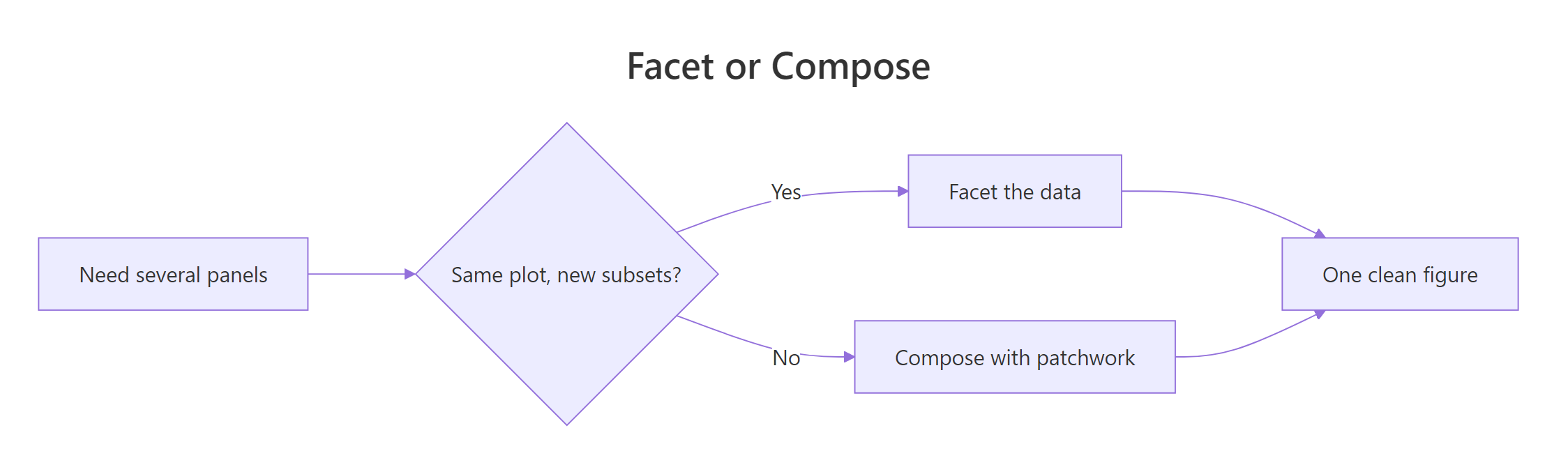
Figure 1: Two routes to multiple panels: facet one plot, or compose several.
This tutorial is about the second route. Faceting has its own dedicated guide, so here we focus on composing several distinct plots into a single designed page, the kind you would hand to a manager or drop into a report.
Try it: The plus sign packs plots into a grid. The slash operator stacks them vertically instead. Stack p_scatter on top of p_box.
Click to reveal solution
Explanation: The / operator places the second plot beneath the first, giving a tall two-row figure instead of a wide two-column one.
How do you combine plots into panels with patchwork?
patchwork gives you three small operators, and they are all you need for most layouts. The + operator packs plots into a grid that fills automatically, | places plots side by side in a row, and / stacks them in a column. With two plots, + and | produce the same side-by-side result, which is what you saw above; the difference shows once you have three or more, where + wraps them into a grid while | keeps them all in one row. Wrapping a group in parentheses lets you nest these, so you can build a row inside a column.
A good brief has a third view that quantifies what the first two suggest. The scatter hints that drivetrain matters, so let's check the actual average mileage for each drivetrain before we draw it.
The gap is large. Front-wheel-drive cars average 28.2 highway mpg, well above four-wheel drive at 19.2. A number that clear deserves its own panel, so let's turn it into a bar chart and then nest all three plots together.
The parentheses group p_scatter | p_box into one row, and the / p_bar places the bar chart in a second row that spans the full width beneath them. Inside p_bar, stat_summary(fun = mean, geom = "col") computes the mean of hwy for each drivetrain and draws it as a column, and guides(fill = "none") hides the colour key we do not need here. Three panels, one figure, arranged exactly how we asked.
Try it: Place the boxplot and the bar panel side by side in a single row using the beside operator.
Click to reveal solution
Explanation: The | operator lays the two panels out in one row instead of a column, so they share the figure's height and split its width.
How do you give one panel top billing in the layout?
A grid of equal panels has no focal point, so the reader does not know where to look first. A brief fixes this by giving one panel top billing: the single most important view gets the most space, and the supporting panels shrink around it. patchwork controls size two ways.
The simple way is plot_layout() with relative widths or heights. Passing widths = c(2, 1) makes the first column twice as wide as the second, so the scatter dominates and the boxplot rides alongside it.
The two numbers are ratios, not inches, so c(2, 1) just means "twice as wide". The scatter now clearly leads, and the boxplot reads as support. That is enough for a two-panel figure, but a real brief usually has a hero panel next to two smaller ones.
For that, a design string draws the grid as text. Each letter is a panel, letters are assigned to plots in the order you add them, and repeating a letter makes that panel span more cells. Here A is the scatter and fills a two-by-two block, while B and C stack down the right-hand column.
Read the string like a grid: the top row is AAB and the bottom row is AAC. A occupies four cells, so the scatter becomes a large square hero, while B (the boxplot) and C (the bar) each take a single cell on the right. The figure now has an obvious reading order, which is exactly how a reader moves through a brief.

Figure 2: A reader scans a brief from the headline, to the hero panel, to the supporting panels and legend.
Try it: Rewrite the design string so the boxplot becomes the hero panel. Remember that B is the boxplot, because it was the second plot added.
Click to reveal solution
Explanation: Making B fill the two-by-two block gives the boxplot the hero slot, while A (scatter) and C (bar) shrink into the right-hand column.
How do you make separate panels look like one figure?
Compose three plots that were built separately and you can end up with a subtle collage: slightly different grey levels, different text sizes, three visual styles sharing one page. A brief should read as one designed thing, which means every panel speaks the same visual language. The fastest way to enforce that is a house theme, set once for the whole session.
theme_set() makes a theme the default for every plot you draw afterwards, so you set the look once instead of adding it to each panel by hand.
Every panel now wears theme_minimal, the same clean white background and light grid, because ggplot applies the current default theme each time a plot is drawn. Even though we built the plots earlier, redrawing them picks up the new default, so the figure reads as one coherent page.
Setting a default covers the whole session. To adjust just the panels of one composition, use the & operator. It sends a theme change to every panel in that figure at once, which is ideal for a one-off tweak.
The & applies the theme() to each of the three panels, so all their axis titles turn bold in a single line. Without it you would have to add the same theme() call to p_scatter, p_box, and p_bar separately. One operator, one consistent change across the whole figure.
Try it: Use the & operator to remove the faint minor gridlines from every panel at once.
Click to reveal solution
Explanation: The & operator passes theme(panel.grid.minor = element_blank()) to each panel, so one line strips the minor gridlines from the whole figure.
How do you add one title, one legend, and panel tags?
A finished brief follows a simple discipline: one headline, one legend, one caption. Two of those need patchwork's help. Start with the legend. When several panels use the same colour scale, patchwork can merge their legends into a single shared one with guides = "collect" inside plot_layout().
In our brief only the scatter carries a colour legend, so collect lifts that one legend out to the margin of the whole figure instead of cramping it inside the scatter panel. The real payoff comes when two panels share the same colour mapping: collect is what stops the legend from being drawn twice.
Now the headline and the panel tags. plot_annotation() adds a figure-level title, subtitle, and caption, and tag_levels = "A" labels the panels A, B, C so the text can refer to them. Let's assemble the full brief and save it to brief.
The title and subtitle sit above the panels as a headline, the caption credits the source underneath, and each panel now carries an A, B, or C tag in its corner. The tag_levels = "A" argument does the labelling automatically, counting through the panels in the order they were added.
Try it: By default the collected legend sits on the right. Move it to the bottom of the figure with the & operator and a legend.position theme setting.
Click to reveal solution
Explanation: The & sends the legend.position setting to every panel, and because the legend is collected, the one shared legend moves to the bottom of the whole figure.
How do you export a brief, and what about other packages?
A brief usually leaves R as a file for a slide or a report. ggsave() writes a plot to disk at a size you choose, measured in inches, at a resolution you set with dpi. The width-to-height ratio matters as much as the size, because a hero layout needs a landscape shape so the big panel has room to breathe.
ggsave() takes a filename, the plot object, and the dimensions. Here 10 by 6.5 inches at 300 dots per inch produces a crisp landscape image sized for a report page, and file.exists() confirms the file was written. Because the whole composition is a single plot object, saving it is no different from saving one chart.
patchwork is not the only way to compose plots. Three other packages solve the same job with a single function, and you will meet them in other people's code. The table shows how they line up.
| Package | Function | Panel labels | Shared legend |
|---|---|---|---|
| patchwork | + and / operators |
tag_levels |
guides = "collect" |
| gridExtra | grid.arrange() |
manual | manual |
| cowplot | plot_grid() |
labels = |
get_legend() |
| ggpubr | ggarrange() |
labels = |
common.legend = TRUE |
library(gridExtra)
library(cowplot)
library(ggpubr)

# gridExtra: arrange on a grid
grid.arrange(p_scatter, p_box, ncol = 2)

# cowplot: grid with panel labels
plot_grid(p_scatter, p_box, labels = c("A", "B"))

# ggpubr: one shared legend at the bottom
ggarrange(p_scatter, p_box, common.legend = TRUE, legend = "bottom")
Each one-liner arranges the two plots in its own style. Pick whichever tool your team already uses, because the ideas here, hierarchy, a shared look, and one legend, transfer directly to all of them.
Try it: Re-save the brief in a tall portrait shape, 7 inches wide by 9 tall, for a document that reads top to bottom.
Click to reveal solution
Explanation: Swapping to a taller-than-wide shape suits a portrait page, and the panels reflow to fill the new dimensions.
Complete Example
Let's put every idea into one self-contained block you could drop into a report. It builds three panels of the mpg data, gives them a shared theme, arranges them with a hero layout, collects the legend, and adds a headline with panel tags, all at once.
This figure tells the whole story at a glance. The reader lands on the headline, reads the hero scatter to see that bigger engines mean fewer miles, then confirms the pattern with the ranked boxplot and the drivetrain bar, all sharing one clean theme and one legend. Note the trailing & theme_minimal(base_size = 11), which applies the house theme to every panel so the block stands on its own. To ship it, a single ggsave() line writes it to disk.
Practice Exercises
These exercises combine the ideas above. Each uses fresh variable names beginning with my_ so your work never overwrites the tutorial plots.
Exercise 1: A two-panel diamond price brief
Build a side-by-side brief from the diamonds dataset: a scatter of price against carat next to a boxplot of price by cut. Sample 2,000 rows first so the scatter stays light, then add one shared title with plot_annotation().
Click to reveal solution
Explanation: The | operator sets the two panels side by side, and plot_annotation(title = ...) adds a single headline above the whole figure rather than one per panel.
Exercise 2: An iris brief with a hero panel
Compose three views of the iris data into a brief with a hero panel: a Petal.Length against Petal.Width scatter coloured by Species as the hero, a Sepal.Length boxplot by Species, and a Sepal.Width histogram. Use a design string for the hero layout, collect the legend, and add A, B, C tags.
Click to reveal solution
Explanation: The scatter (A) fills the hero block, the boxplot (B) and histogram (C) stack beside it, guides = "collect" pulls the single Species legend out to the margin, and tag_levels = "A" labels the panels.
Exercise 3: Turn a faceted plot into composed panels
A faceted plot forces every panel to share one title and one set of axes. Rebuild facet_wrap(~ drv) on mpg as three composed panels instead, so each drivetrain panel can carry its own title. Filter the data three times and give each plot its own labs(title = ...).
Click to reveal solution
Explanation: Composing three separate plots lets each panel carry its own title, something facet_wrap() cannot do because it draws one title for the whole strip. That freedom is the reason to choose composition when panels need to differ.
Frequently Asked Questions
When should I use patchwork instead of facet_wrap()?
Use facet_wrap() when every panel is the same plot drawn on a different slice of one dataset, because it shares axes and legends automatically. Reach for patchwork when the panels are genuinely different plots, or when you want different sizes, titles, or scales for each panel.
How do I stop the legend appearing on every panel?
Add plot_layout(guides = "collect") to merge identical legends into a single shared one. If one panel's legend is redundant, suppress it on that panel with guides(color = "none") or guides(fill = "none") before you compose.
Why are my panels not lining up along their axes?
patchwork aligns panels by default, but a long axis label or a legend on one panel can push its plotting area out of step. Give the panels matching axis titles, collect the legends into one, or use patchwork's free() function to release a panel from strict alignment.
Can a panel hold a table or plain text instead of a plot?
Yes. patchwork can add text or a table as a panel alongside your charts, and many briefs pair a chart with a small text or number panel this way. The composition operators treat that panel like any other.
Does the composed figure save with ggsave() like a normal plot?
It does. A patchwork composition is still a single plot object, so ggsave() writes it out normally. Just give it a width and height that match the layout so the panels stay legible at the final size.
Summary
A one-page brief is a designed page, not a pile of plots. The table sums up which tool does each job, and the diagram recaps the workflow from blank page to finished file.
| Job | Tool |
|---|---|
| Put plots in a grid or a stack | + and / operators |
| Give one panel top billing | plot_layout(design = ...) |
| Make every panel share a look | theme_set() and the & operator |
| Merge repeated legends into one | plot_layout(guides = "collect") |
| Add a headline and A, B, C tags | plot_annotation() |
| Export at a page size | ggsave() |

Figure 3: The five steps to a finished one-page brief.
The mental model is simple: decide facet or compose, build your panels in a shared theme, give one of them top billing, then unify the figure with a single title, legend, and set of tags. Get those habits right and your multi-panel figures will read as one clear page every time.
References
- patchwork documentation. Plot layout (plot_layout). Link
- patchwork documentation. Annotate the final patchwork (plot_annotation). Link
- Wickham, H., Navarro, D., Pedersen, T. L. ggplot2: Elegant Graphics for Data Analysis, Chapter: Arranging plots. Link
- ggplot2 documentation. Wrap a 1d ribbon of panels into 2d (facet_wrap). Link
- ggplot2 documentation. Save a ggplot (ggsave). Link
- cowplot documentation. Arrange plots in a grid (plot_grid). Link
- Chang, W. R Graphics Cookbook, 2nd Edition. Link
Continue Learning
- patchwork in R: Combine ggplot2 Plots Cleanly - the full composition toolkit this brief workflow draws on, including nesting and spacers.
- ggplot2 Facets - the other route to multiple panels, for when every panel is the same plot on a different subset.
- Small Multiples in R - scaling faceting up to dozens of tiny panels in one figure.
- Publication-Quality Figures in R - polish, sizing, and export for figures headed to print.