Significance Brackets on ggplot2 Charts: ggsignif, ggpubr
A significance bracket is a small line drawn over two groups on a chart, carrying a p-value or a row of stars that tells you whether the gap between those groups is a real difference or just random noise. This tutorial adds them to ggplot2 charts with the ggsignif and ggpubr packages, and explains every statistic behind the bracket from scratch.
What does a significance bracket actually show?
Picture two boxplots sitting next to each other. One group looks a bit higher than the other. Your eye says "these look different", but a chart cannot tell you whether that gap would survive if you collected the data again. A significance bracket answers exactly that question, right on the plot, so a reader never has to trust your gut.
Let's ground this in real data. The built-in ToothGrowth dataset records the tooth length of 60 guinea pigs, each given vitamin C either as orange juice (OJ) or as plain ascorbic acid (VC). We will start with the plain group averages, then build up to a labelled bracket. The block below loads ggplot2 and dplyr and compares the two supplement groups.
The orange-juice group averages 20.7 units of tooth length against 17.0 for the ascorbic-acid group. So there is a gap of about 3.7 units. The |> symbol is R's pipe: it feeds the result on its left into the first argument of the function on its right, so you read the chain left to right. Here it passed tg into group_by(), and then summarise() split the 60 rows into the two supplement groups and computed the mean, the spread, and the count for each. The obvious next question: is a 3.7-unit gap big enough to believe?
A picture makes the gap visible but not decidable. Let's draw the two boxes so you can see the overlap for yourself.
Run that block. The OJ box sits higher, but the two boxes overlap a lot, so eyeballing is not enough. To get a yes-or-no answer, you run a statistical test. The classic test for comparing two group means is the two-sample t-test, which asks: if the two groups really had the same average, how surprising would a 3.7-unit gap be?
The line that matters is p-value = 0.06063. A p-value is the probability of seeing a gap this large (or larger) purely by chance if the two groups truly had the same mean. Here that probability is about 6 percent. The usual cutoff for calling a result "statistically significant" is 5 percent (written as 0.05). Because 0.06 is just above 0.05, this difference is not quite significant: it is suggestive, but you cannot rule out luck. A significance bracket is simply this p-value drawn onto the chart.
Try it: The t-test assumes the data is roughly bell-shaped. A test that makes no such assumption is the Wilcoxon test. Swap t.test for wilcox.test on the same formula and see if the verdict changes.
Click to reveal solution
Explanation: The Wilcoxon test gives p-value = 0.06366, almost the same verdict as the t-test. Both land just above 0.05, so both call the difference borderline rather than clearly real.
How do you draw a bracket with ggsignif?
You have three tools for putting p-values on a ggplot, and they trade speed for control. The ggsignif package is the quickest: one extra layer draws the bracket and runs the test for you. The ggpubr package adds automatic global tests. The rstatix package gives you full control over adjusted p-values. This section starts at the quick end.
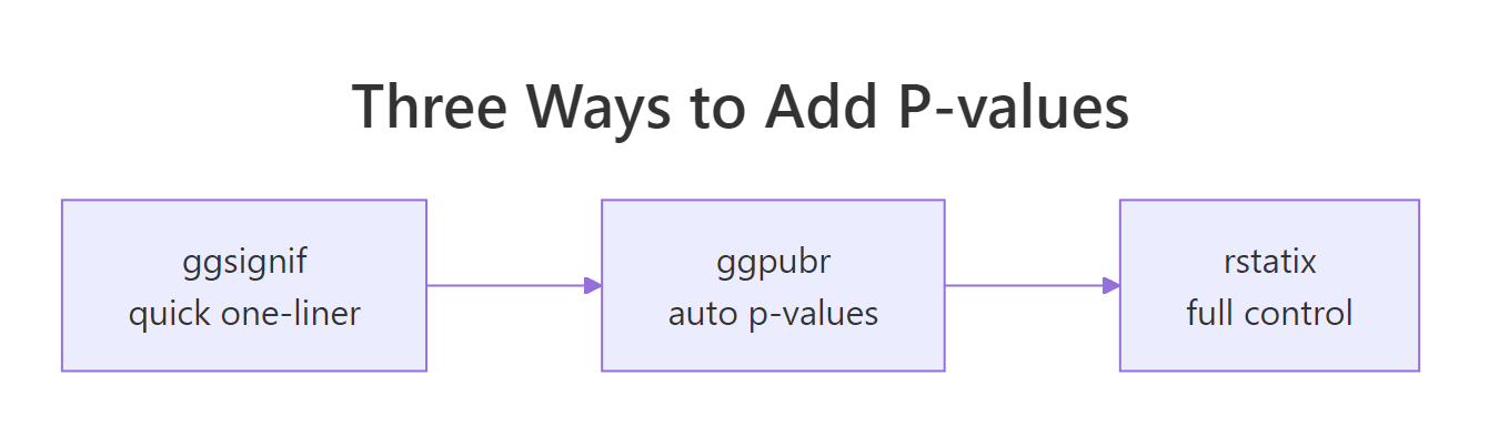
Figure 1: Three tools for the same job, from quickest to most controlled.
geom_signif and the ggpubr helpers need packages the browser sandbox does not carry, so copy those blocks into a local R session such as RStudio to see the plots. Each plot is shown here as a rendered figure so you can follow along either way.The ggsignif package adds one new layer, geom_signif(). You hand it the pair of groups you want to compare, and it runs a test (Wilcoxon by default), then draws the bracket with the p-value on top. Here it is on the two supplements.
library(ggsignif)

ggplot(tg, aes(x = supp, y = len)) +
  geom_boxplot(fill = "#9ECAE1") +
  geom_signif(comparisons = list(c("OJ", "VC"))) +
  labs(x = "Supplement", y = "Tooth length") +
  theme_minimal(base_size = 13)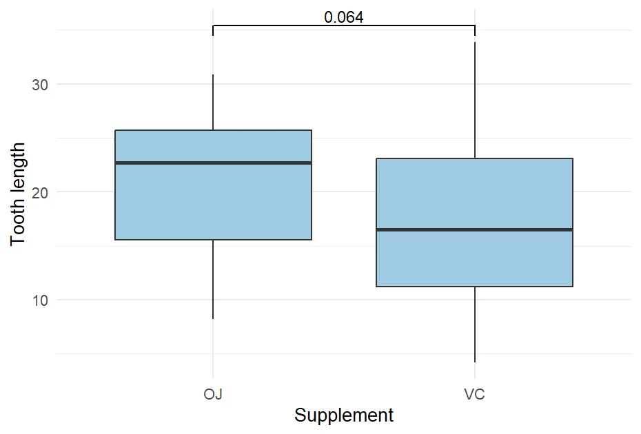
Figure 2: One ggsignif bracket labelled with the Wilcoxon p-value.
The bracket now spans OJ and VC, labelled 0.064. That is the Wilcoxon p-value you computed in the exercise above, rounded to two significant figures. The comparisons argument takes a list of pairs, where each pair names the two x-axis groups to bridge. One pair means one bracket.
Often you do not want the raw number, you want the shorthand stars that journals use. Setting map_signif_level = TRUE turns the p-value into a star code instead. The mapping is fixed and worth memorising.
| Label | Meaning | p-value range |
|---|---|---|
*** |
very strong evidence | p < 0.001 |
** |
strong evidence | p < 0.01 |
* |
some evidence | p < 0.05 |
ns |
not significant | p greater than 0.05 |
ggplot(tg, aes(x = supp, y = len, fill = supp)), ggsignif cannot work out which rows to test and the bracket calculation fails. Set fill inside geom_boxplot() instead, as the examples here do.Try it: Force geom_signif() to use a t-test instead of its default Wilcoxon test by adding test = "t.test". The label should shift to about 0.061.
# Add test = "t.test" to geom_signif, then run locally.
ggplot(tg, aes(x = supp, y = len)) +
  geom_boxplot(fill = "#9ECAE1") +
  geom_signif(comparisons = list(c("OJ", "VC"))) +
  labs(x = "Supplement", y = "Tooth length") +
  theme_minimal(base_size = 13)
Click to reveal solution
ggplot(tg, aes(x = supp, y = len)) +
  geom_boxplot(fill = "#9ECAE1") +
  geom_signif(comparisons = list(c("OJ", "VC")), test = "t.test") +
  labs(x = "Supplement", y = "Tooth length") +
  theme_minimal(base_size = 13)
Explanation: The test argument accepts any two-sample test name as a string. With "t.test" the bracket now shows the t-test p-value (0.06063), which matches the t.test() call from the first section.
How do you compare more than two groups at once?
Two groups is the easy case. Real questions usually have three or more. In ToothGrowth, each animal also received one of three doses: 0.5, 1, or 2 milligrams per day. Dose is stored as a number, so first turn it into a factor, which tells R to treat each dose as a distinct category rather than a continuous quantity.
Now there are three named groups. Let's see the mean tooth length in each.
Tooth length climbs steadily with dose, from 10.6 up to 26.1. With three groups you can draw a bracket for each pair you care about. Pass geom_signif() a list with three pairs, and add map_signif_level = TRUE for stars. The step_increase argument stacks the brackets so they do not sit on top of each other.
ggplot(tg, aes(x = dose, y = len)) +
  geom_boxplot(fill = "#A1D99B") +
  geom_signif(comparisons = list(c("0.5", "1"), c("1", "2"), c("0.5", "2")),
              map_signif_level = TRUE, step_increase = 0.12) +
  labs(x = "Dose (mg/day)", y = "Tooth length") +
  theme_minimal(base_size = 13)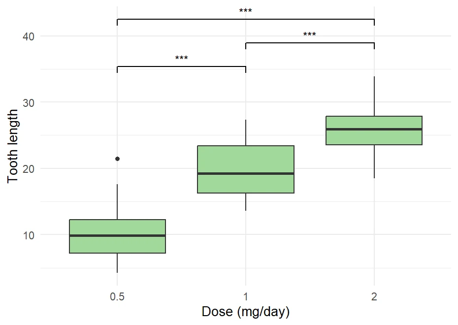
Figure 3: Three brackets with significance stars across doses.
Every pair earns three stars, meaning each p-value is below 0.001. Each bracket is its own separate Wilcoxon test, run only on the two groups it connects. You can confirm the numbers behind the stars with base R's pairwise.wilcox.test(), which runs the same comparisons and prints them as a grid.
Read the grid like a mileage chart: the cell for row 1, column 0.5 holds the p-value comparing dose 1 with dose 0.5, which is 7.7e-07 (0.00000077). Every cell is far below 0.001, which is why every bracket showed three stars. The dose effect is real and strong.
Try it: Rerun the three pairwise comparisons using a t-test instead of the Wilcoxon test, and apply the Bonferroni correction. Change the function to pairwise.t.test and set p.adjust.method = "bonferroni".
Click to reveal solution
Explanation: Even after the Bonferroni correction (which multiplies each p-value to guard against false alarms), all three comparisons stay far below 0.05. The dose effect is strong enough to survive the penalty.
How does ggpubr add p-values automatically?
The ggpubr package builds on ggsignif and adds two conveniences: it can annotate a plot with almost no configuration, and it can add a single global test that asks "is there any difference anywhere across all the groups?". Its workhorse function is stat_compare_means().
Before plotting, it helps to see the comparison as a plain table. The compare_means() function returns one row per pair with the p-value and the star label already worked out.
library(ggpubr)

compare_means(len ~ dose, data = tg)
#> # A tibble: 3 × 8
#>   .y.   group1 group2        p         p.adj p.format p.signif method
#>   <chr> <chr>  <chr>     <dbl>         <dbl> <chr>    <chr>    <chr>
#> 1 len   0.5    1      7.74e- 7 0.0000015     7.7e-07  ****     Wilcoxon
#> 2 len   0.5    2      4.35e-11 0.00000000013 4.4e-11  ****     Wilcoxon
#> 3 len   1      2      7.57e- 5 0.000076      7.6e-05  ****     Wilcoxon
The p column is the raw p-value, p.adj is the adjusted version, and p.signif is the star label. Notice ggpubr uses four stars for the tiniest p-values, one step finer than base ggsignif. The method column confirms it defaulted to the Wilcoxon test. Now feed the same comparisons to the plot, and add a second stat_compare_means() with no comparisons to print the global test at the top.
my_comparisons <- list(c("0.5", "1"), c("1", "2"), c("0.5", "2"))

ggplot(tg, aes(x = dose, y = len)) +
  geom_boxplot(fill = "#74C476") +
  stat_compare_means(comparisons = my_comparisons) +
  stat_compare_means(label.y = 48) +
  labs(x = "Dose (mg/day)", y = "Tooth length") +
  theme_minimal(base_size = 13)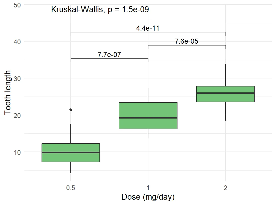
Figure 4: ggpubr pairwise brackets plus a global Kruskal-Wallis p-value.
You get the three pairwise brackets, plus a global Kruskal-Wallis p-value printed near the top. The global test answers the broad question "do the doses differ at all?" before you look at which specific pairs differ. The first stat_compare_means() drew the brackets from your list of pairs, and the second one, with no comparisons, added the overall test.
method argument, for example method = "t.test" or method = "anova".Try it: Use compare_means() to compare the two supplements (len ~ supp) instead of the doses. You should get a single row with a ns label.
# Change len ~ dose to len ~ supp, then run.
compare_means(len ~ dose, data = tg)
Click to reveal solution
compare_means(len ~ supp, data = tg)
#> # A tibble: 1 × 8
#>   .y.   group1 group2      p p.adj p.format p.signif method
#>   <chr> <chr>  <chr>   <dbl> <dbl> <chr>    <chr>    <chr>
#> 1 len   OJ     VC     0.0637 0.064 0.064    ns       Wilcoxon
Explanation: The single comparison gives p = 0.0637 with the ns (not significant) label, matching the borderline Wilcoxon result from the very first section.
How do you show adjusted p-values for publication?
Remember the warning about running many tests. When you draw several brackets, each carries its own risk of a false positive, so the honest move for any published figure is to adjust the p-values upward to compensate. The simplest adjustment is the Bonferroni correction, which multiplies each raw p-value by the number of comparisons.
$$p_{adj} = p \times m$$
Where:
- $p$ = the raw p-value from a single test
- $m$ = the total number of comparisons you ran
The idea is intuitive: if you gave yourself three chances to find a "significant" result, each individual result has to clear a higher bar. The rstatix package makes this a tidy pipeline. Its examples use %>%, the pipe from the magrittr package, which works just like the |> you saw earlier. You compute the tests, adjust them, add star labels, and the result is a clean table you control completely.
library(rstatix)

stat.test <- tg %>%
  t_test(len ~ dose) %>%
  adjust_pvalue(method = "bonferroni") %>%
  add_significance()
stat.test
#> # A tibble: 3 × 10
#>   .y.   group1 group2    n1    n2 statistic    df        p    p.adj p.adj.signif
#>   <chr> <chr>  <chr>  <int> <int>     <dbl> <dbl>    <dbl>    <dbl> <chr>
#> 1 len   0.5    1         20    20     -6.48  38.0 1.27e- 7 3.81e- 7 ****
#> 2 len   0.5    2         20    20    -11.8   36.9 4.40e-14 1.32e-13 ****
#> 3 len   1      2         20    20     -4.90  37.1 1.91e- 5 5.73e- 5 ****
Follow the pipeline top to bottom: t_test() ran all three pairwise t-tests, adjust_pvalue() created the p.adj column by multiplying each p by 3, and add_significance() added the p.adj.signif stars. Compare the p and p.adj columns for the first row: 1.27e-7 became 3.81e-7, exactly three times larger. Because the raw values were so tiny, they stay significant even after the penalty.
Now draw the table you just built. The add_xy_position() function works out where each bracket should sit, and stat_pvalue_manual() draws precisely the p-values you computed, not a fresh test.
stat.test <- stat.test %>% add_xy_position(x = "dose")

ggplot(tg, aes(x = dose, y = len)) +
  geom_boxplot(fill = "#FDBB84") +
  stat_pvalue_manual(stat.test, label = "p.adj.signif", tip.length = 0.01) +
  labs(x = "Dose (mg/day)", y = "Tooth length") +
  theme_minimal(base_size = 13)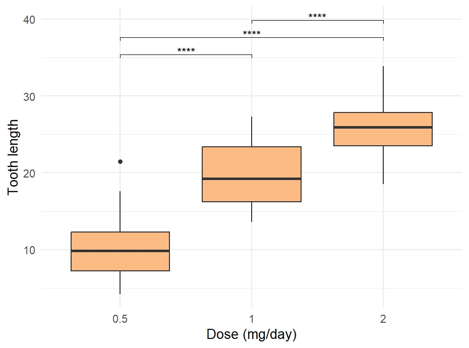
Figure 5: Bonferroni-adjusted significance stars via stat_pvalue_manual.
Try it: The Bonferroni method is strict. A gentler, more common choice is Benjamini-Hochberg, written "BH". Swap the adjustment method and compare the p.adj column.
# Change method = "bonferroni" to method = "BH", then run.
tg %>%
  t_test(len ~ dose) %>%
  adjust_pvalue(method = "bonferroni") %>%
  add_significance()
Click to reveal solution
tg %>%
  t_test(len ~ dose) %>%
  adjust_pvalue(method = "BH") %>%
  add_significance()
#> # A tibble: 3 × 10
#>   .y.   group1 group2    n1    n2 statistic    df        p    p.adj p.adj.signif
#>   <chr> <chr>  <chr>  <int> <int>     <dbl> <dbl>    <dbl>    <dbl> <chr>
#> 1 len   0.5    1         20    20     -6.48  38.0 1.27e- 7 1.90e- 7 ****
#> 2 len   0.5    2         20    20    -11.8   36.9 4.40e-14 1.32e-13 ****
#> 3 len   1      2         20    20     -4.90  37.1 1.91e- 5 1.91e- 5 ****
Explanation: The Benjamini-Hochberg adjusted values are slightly smaller than the Bonferroni ones (1.90e-7 versus 3.81e-7 for the first row), because it controls false discoveries less aggressively. Every comparison still clears significance.
Which statistical test should each bracket use?
A bracket is only as trustworthy as the test underneath it. Pick the wrong test and the p-value can be misleading. Two questions decide the choice: how many groups are you comparing, and is the data roughly bell-shaped (what statisticians call normally distributed)?
| Situation | Two groups | Three or more groups |
|---|---|---|
| Data roughly normal | t-test | ANOVA, then Tukey for pairs |
| Data skewed or small | Wilcoxon test | Kruskal-Wallis, then Dunn for pairs |
| Same subjects measured twice | paired t-test | repeated-measures ANOVA |
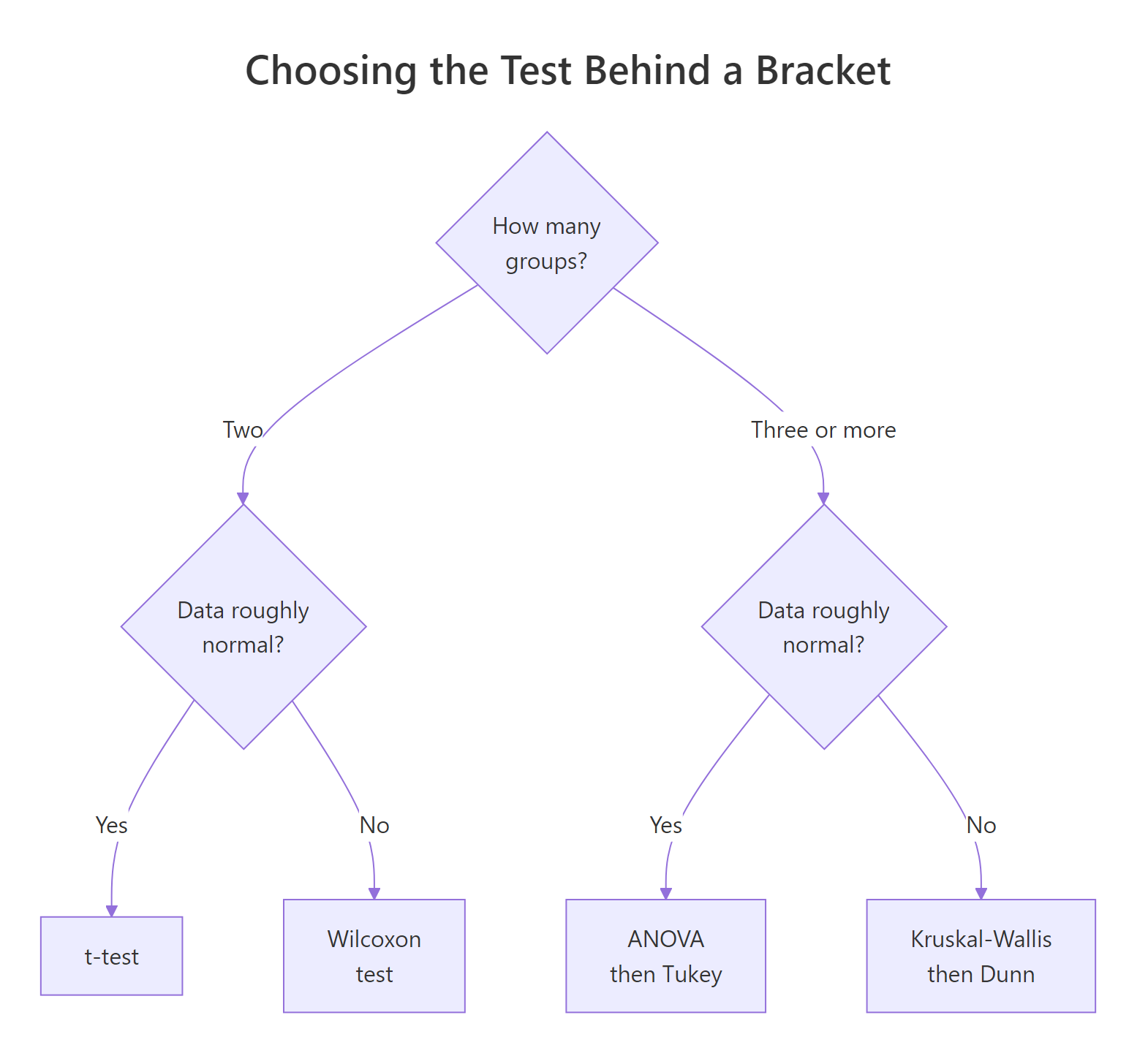
Figure 6: How to choose the test behind each bracket.
The "roughly normal" question has a quick check: the Shapiro-Wilk test. A high p-value there means the data does not deviate meaningfully from a bell curve, so a t-test is safe. Let's check the tooth-length values.
The p-value is 0.1091, comfortably above 0.05, so the tooth-length data is close enough to normal that a t-test is defensible. Read this test backwards from the others: here a large p-value is the reassuring outcome, because the null idea being tested is "the data is normal".
ggsignif and ggpubr functions accept paired = TRUE for exactly this case.Try it: Run the Shapiro-Wilk test on just the OJ group, using tg$len[tg$supp == "OJ"]. Does that subset look as normal as the whole column?
Click to reveal solution
Explanation: For the OJ subset the p-value is 0.02359, below 0.05, which flags a departure from normality. In a strict analysis you would lean toward the Wilcoxon test for this group, a good reminder that the right test can depend on the subset.
Complete Example: A Publication-Ready Significance Plot
Let's assemble everything into one figure you could drop straight into a report. It shows the raw tooth-length points, the boxplots by dose, and Bonferroni-adjusted p-values printed as exact numbers on stacked brackets. The statistics come from the rstatix pipeline, so every number on the chart is one you can defend.
set.seed(2026)

stat.comp <- tg %>%
  t_test(len ~ dose) %>%
  adjust_pvalue(method = "bonferroni") %>%
  add_significance() %>%
  add_xy_position(x = "dose")

ggplot(tg, aes(x = dose, y = len)) +
  geom_boxplot(aes(fill = dose), width = 0.6, alpha = 0.85) +
  geom_jitter(width = 0.12, alpha = 0.4, size = 1) +
  stat_pvalue_manual(stat.comp, label = "p.adj = {p.adj}",
                     tip.length = 0.01, step.increase = 0.06) +
  scale_fill_brewer(palette = "Set2") +
  labs(title = "Tooth length increases with vitamin C dose",
       subtitle = "Brackets show Bonferroni-adjusted t-test p-values",
       x = "Dose (mg/day)", y = "Odontoblast length") +
  theme_minimal(base_size = 13) +
  theme(legend.position = "none")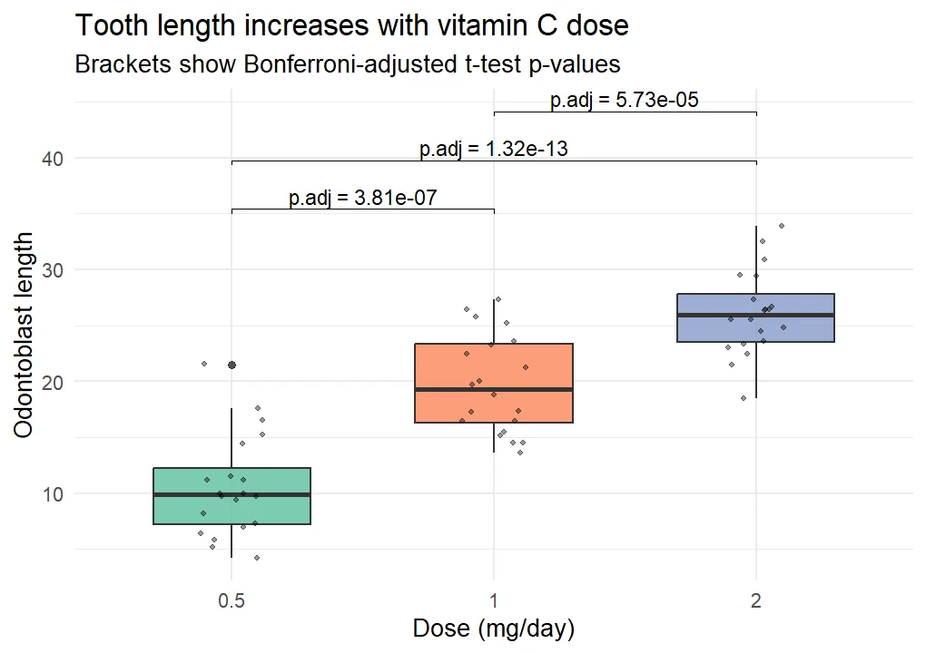
Figure 7: A publication-ready plot with adjusted p-values.
This single plot carries the raw data (the jittered points), the summary (the boxes), and the evidence (the adjusted p-values), all from the same data frame. The label = "p.adj = {p.adj}" template prints the exact adjusted value on each bracket rather than a star, which is the more transparent choice for a small number of comparisons.
Practice Exercises
These combine several ideas from the tutorial. Each starter block runs as-is so you can build from it, and the expected output is in the solution.
Exercise 1: Adjust p-values for a new dataset
The PlantGrowth dataset records dried plant weight under a control and two treatments (ctrl, trt1, trt2). Run pairwise t-tests of weight by group, adjust them with the Holm method, add significance stars, and save the table to pg_stats.
# Use t_test(weight ~ group), then adjust_pvalue(method = "holm"), then add_significance().
# Write your code below:
Click to reveal solution
pg_stats <- PlantGrowth %>%
  t_test(weight ~ group) %>%
  adjust_pvalue(method = "holm") %>%
  add_significance()
pg_stats
#> # A tibble: 3 × 10
#>   .y.    group1 group2    n1    n2 statistic    df     p p.adj p.adj.signif
#>   <chr>  <chr>  <chr>  <int> <int>     <dbl> <dbl> <dbl> <dbl> <chr>
#> 1 weight ctrl   trt1      10    10      1.19  16.5 0.25  0.25  ns
#> 2 weight ctrl   trt2      10    10     -2.13  16.8 0.048 0.096 ns
#> 3 weight trt1   trt2      10    10     -3.01  14.1 0.009 0.027 *
Explanation: After the Holm adjustment only the trt1 versus trt2 comparison stays significant. Notice ctrl versus trt2 was significant raw (0.048) but slips to ns once adjusted (0.096), a textbook example of why adjustment matters.
Exercise 2: Compare every group against a reference
Sometimes you only care how each group compares to one baseline. Using compare_means() on the iris dataset, compare the Sepal.Width of each species against setosa by passing ref.group = "setosa".
# Use compare_means with ref.group = "setosa" on Sepal.Width ~ Species.
# Write your code below:
Click to reveal solution
compare_means(Sepal.Width ~ Species, data = iris, ref.group = "setosa")
#> # A tibble: 2 × 8
#>   .y.         group1 group2            p    p.adj p.format p.signif method
#>   <chr>       <chr>  <chr>         <dbl>    <dbl> <chr>    <chr>    <chr>
#> 1 Sepal.Width setosa versicolor 2.14e-13 4.30e-13 2.1e-13  ****     Wilcoxon
#> 2 Sepal.Width setosa virginica  7.10e- 9 7.10e- 9 7.1e-09  ****     Wilcoxon
Explanation: With ref.group set, you get two rows instead of three, each comparing a species to setosa. Both are wildly significant, confirming setosa's sepal width stands apart from the others.
Exercise 3: Build the full significance plot
Put it together for PlantGrowth: draw a boxplot of weight by group and layer the Holm-adjusted stars on top using stat_pvalue_manual(). Remember to call add_xy_position() so the brackets know where to sit.
# Compute the stats with add_xy_position(x = "group"), then plot with stat_pvalue_manual.
# Write your code below:
Click to reveal solution
pg_xy <- PlantGrowth %>%
  t_test(weight ~ group) %>%
  adjust_pvalue(method = "holm") %>%
  add_significance() %>%
  add_xy_position(x = "group")

ggplot(PlantGrowth, aes(x = group, y = weight)) +
  geom_boxplot(fill = "#BCBDDC") +
  stat_pvalue_manual(pg_xy, label = "p.adj.signif") +
  labs(x = "Treatment group", y = "Dried weight") +
  theme_minimal(base_size = 13)
Explanation: The same four-step rstatix pipeline feeds stat_pvalue_manual(), so the plot shows exactly the Holm-adjusted stars from Exercise 1: only the trt1 versus trt2 bracket carries a star.
Frequently Asked Questions
What is a significance bracket?
It is an annotation on a plot: a horizontal line spanning two groups, topped by a p-value or a set of stars from a statistical test. It gives a reader an at-a-glance answer to "is the difference between these two groups real?" without a separate table.
What do the stars mean on the brackets?
The stars compress a p-value into a code. One star is p below 0.05, two stars is below 0.01, and three stars is below 0.001. The label ns means not significant (p above 0.05). Some packages like ggpubr add a fourth star for p below 0.0001.
Should I use ggsignif or ggpubr?
Use ggsignif when you want one or two quick brackets and nothing else. Use ggpubr when you also want an automatic global test or a very short syntax. For any figure going into a paper, compute adjusted p-values with rstatix first, then draw them with stat_pvalue_manual().
Why does my p-value differ from another tool's?
Two common reasons. First, the default test differs: geom_signif uses Wilcoxon while a t-test gives a different number. Second, adjustment: a raw p-value and a Bonferroni-adjusted one are not the same. Always state which test and which correction you used.
How do I change the test that ggsignif runs?
Pass the test argument to geom_signif(), for example test = "t.test" or test = "wilcox.test". For ggpubr's stat_compare_means(), use the method argument instead, such as method = "anova".
My brackets overlap or run off the top of the plot. How do I fix it?
Add vertical space with step_increase in geom_signif() (try 0.1 to 0.15 per bracket), or set explicit heights with add_xy_position() when using rstatix. You can also raise the plot ceiling with ylim() or expand_limits(y = ...).
Do I always need to adjust p-values?
Adjust whenever you draw more than one bracket, because each extra test raises the odds of a false positive. For a single comparison there is nothing to adjust. Bonferroni is the strictest option and Benjamini-Hochberg ("BH") is a gentler, widely accepted alternative.
Summary
Significance brackets turn a statistical test into a mark on your chart. The table below is your quick reference for the three tools.
| Goal | Call |
|---|---|
| One quick bracket | geom_signif(comparisons = list(c("A", "B"))) |
| Stars instead of a number | add map_signif_level = TRUE |
| Several stacked brackets | list of pairs plus step_increase |
| A global test on the plot | stat_compare_means(label.y = ...) |
| Comparisons as a table | compare_means(y ~ group, data) |
| Adjusted p-values, drawn exactly | rstatix pipeline plus stat_pvalue_manual() |
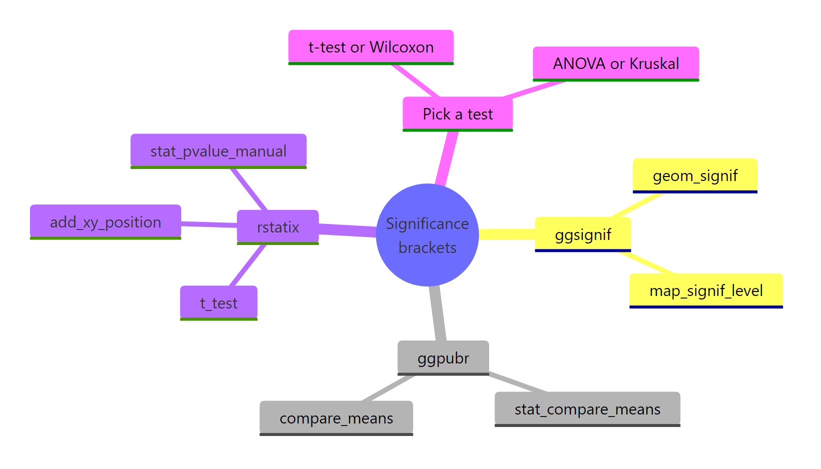
Figure 8: The significance-bracket toolkit at a glance.
The one habit that keeps you honest is to think about the test before the picture. Decide how many groups you have and whether the data is roughly normal, pick the matching test, adjust the p-values when you draw more than one bracket, and only then annotate the plot. Do that and your brackets will say something a reader can trust.
References
- Ahlmann-Eltze, C. ggsignif: Significance Brackets for ggplot2. Package documentation. Link - the full argument list for
geom_signif(), includingcomparisons,test, andstep_increase. - ggsignif on CRAN. Link - the install page and version history for the package.
- Kassambara, A. ggpubr: ggplot2 Based Publication Ready Plots. CRAN. Link - the source for
stat_compare_means()andcompare_means(). - Kassambara, A. rstatix: Pipe-Friendly Framework for Basic Statistical Tests. CRAN. Link - the pipe-friendly
t_test(),adjust_pvalue(), andadd_xy_position()used in the publication workflow. - ggplot2 documentation. geom_boxplot() reference. Link - the boxplot layer every bracket sits on top of.
- R Core Team. pairwise.t.test() reference. Link - base R's pairwise group comparisons behind the brackets.
- R Core Team. p.adjust() and adjustment methods. Link - how Bonferroni, Holm, and Benjamini-Hochberg corrections are computed.
Continue Learning
- ggplot2 geom_boxplot() in R - build the boxplots these brackets sit on, from the ground up.
- One-Way ANOVA in R - the global test behind brackets when you have three or more normal groups.
- Summary Statistics on Plots in R - add means and confidence intervals to the same charts.