stat_summary in ggplot2: Means and CIs on the Plot
stat_summary() computes a statistic like the mean for each group and draws it straight onto your plot, so you can add group means, standard errors, and confidence intervals as a layer without a separate summarising step. This tutorial uses the tidyverse (mostly ggplot2), and every example runs in your browser.
Why plot summary statistics instead of every raw point?
Imagine you measured the sepal length of 150 iris flowers across three species and you want to answer a simple question: which species has the longest sepals, and how sure are you? A scatter of 150 dots will not answer that. Your eye cannot average a cloud of points. What you actually want is one number per group (the mean) and a sense of how trustworthy that number is (an error bar).
Let's start with the numbers themselves, then put them on a plot. The block below loads ggplot2 and computes the average sepal length in each species with base R's aggregate().
That table already answers the question: virginica has the longest sepals on average (6.588 cm) and setosa the shortest (5.006 cm). The walk-through is short here. aggregate() split the 150 rows by Species and applied mean to each group, returning one row per species.
The problem is that a bare table is not a plot, and hand-computing a summary and then plotting it is two steps that can drift out of sync. stat_summary() collapses both steps into one plot layer. Here is the payoff: the raw points, the group means as dots, and a small error bar on each mean, all from the raw data.
Run that block. The grey dots are the raw flowers, jittered sideways so they do not overlap. The blue dots are the group means, sitting exactly where the table said they would (5.006, 5.936, 6.588). The blue bars show a small margin around each mean. The whole figure came from the raw data frame, with no separate summary table to build or maintain. The rest of this tutorial unpacks how each piece works.
Try it: Change the payoff plot to show mean petal length instead of sepal length. Swap the y aesthetic, then run.
Click to reveal solution
Explanation: Only the y aesthetic changed. stat_summary() recomputes the mean and error bar for whatever column you map to y.
How does stat_summary() actually work?
stat_summary() does three things in order: it splits your data into groups (one per unique x value), it applies a summary function to the y values in each group, and it draws the result with a geom you choose. The one decision that trips people up is which argument to hand your function to: fun or fun.data. The rule is about how many numbers your function returns.
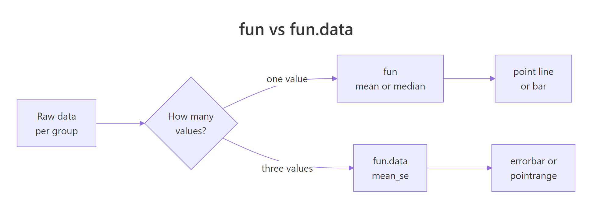
Figure 1: fun returns one value; fun.data returns three (ymin, y, ymax).
Use fun when your summary is a single number, like a mean or a median. That single value becomes the y position of a point, a line, or a bar. The block below plots just the mean of each species with no error bar.
Here fun = mean returns one number per species, and geom = "point" drops a dot at that height. There is nothing else on the plot because a single value cannot draw a range.
Error bars need a range, which is three numbers: a middle (y), a bottom (ymin), and a top (ymax). That is what fun.data is for. A function passed to fun.data receives the whole vector of y values for a group and returns a small data frame with those three columns. ggplot2 ships one such function, mean_se, which returns the mean plus or minus one standard error. Let's look at exactly what it hands back for a single group.
The output is a one-row data frame. y is the mean (5.006), ymin and ymax are the mean minus and plus one standard error. Any geom that draws a range, like errorbar or pointrange, knows how to read those three columns. That is the whole mechanism.
fun.data argument expects a data frame with ymin, y, and ymax, and that is precisely what a range geom needs to draw.Try it: Plot the median sepal length per species instead of the mean. Change fun = mean to fun = median.
Click to reveal solution
Explanation: median returns one number, so it goes to fun, just like mean. Any function that takes a vector and returns a single value works here.
How do you add error bars for the standard error?
A mean on its own can mislead. Two groups might have the same mean, yet one is measured from 5 noisy values and the other from 500 clean ones. The error bar shows how precise the mean is. The most common error bar is the standard error of the mean, which is the standard deviation of the data divided by the square root of the sample size.
$$SE = \frac{s}{\sqrt{n}}$$
Where:
- $s$ = the sample standard deviation (how spread out the raw values are)
- $n$ = the number of observations in the group
The formula says something intuitive: more data (a larger $n$) makes the mean more precise, so the standard error shrinks. mean_se computes this for you. Instead of drawing the point and the bar as two layers, you can draw both at once with geom = "pointrange".
One layer gives you the mean as a dot and the standard-error range as a thin line through it. The pointrange geom reads all three columns (y, ymin, ymax) from mean_se and draws them together.
y, ymin, and ymax that a separate point plus errorbar would, with half the code.A classic use is the bar chart with error bars, common in biology and psychology. You stack two stat_summary() layers: one draws the mean as a bar, the other draws the standard error as a whisker on top. The ToothGrowth dataset (tooth length in guinea pigs given vitamin C) is a natural fit.
The bars show mean tooth length climbing with dose, and the whiskers show the standard error at each dose. Notice factor(dose) in the aesthetic: dose is stored as a number (0.5, 1, 2), and wrapping it in factor() treats each dose as a distinct category so you get three separate bars. We will come back to why that matters near the end.
Try it: Make the standard-error whiskers narrower. Change width = 0.2 to width = 0.1.
Click to reveal solution
Explanation: width controls the horizontal length of the whisker caps only. It does not change the statistic, just the look of the bar.
What is the difference between SE, SD, and a confidence interval?
People mix up three quantities that all look like "a spread around the mean". Getting them straight changes what your error bar actually claims.
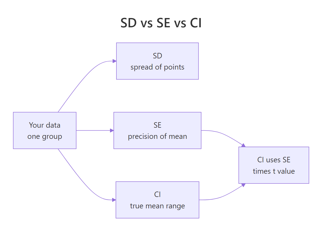
Figure 2: SD describes the data; SE and the CI describe the mean.
The standard deviation (SD) describes the raw data: how far individual points scatter around the mean. It does not shrink as you collect more data, because the data is just as spread out. The standard error (SE) describes the mean itself: how much the mean would wobble if you repeated the study. It shrinks as the sample grows. A confidence interval (CI) is a range built from the SE that, for a 95% CI, is wide enough to catch the true mean about 95% of the time.
Here is a compact comparison.
| Quantity | What it measures | Shrinks with more data? | Show it when |
|---|---|---|---|
| SD | Spread of the raw values | No | You care about variability between individuals |
| SE | Precision of the mean | Yes | You want a quick sense of the mean's wobble |
| CI | Plausible range for the true mean | Yes | You want to compare group means honestly |
A 95% confidence interval takes the mean and reaches out by a multiplier times the standard error. For a mean, that multiplier comes from the t-distribution, which corrects for small samples.
$$\bar{x} \pm t^{*} \times SE$$
Where:
- $\bar{x}$ = the sample mean
- $t^{*}$ = the t multiplier for your confidence level, from
qt() - $SE$ = the standard error from the formula above
You do not need any extra package to draw this. You can write a tiny function that returns the y, ymin, and ymax that fun.data expects, using only base R. This is the most useful trick in this tutorial, because it runs anywhere and you control the math.
The function takes a vector, computes the mean, the standard error, and the t multiplier qt(0.975, df = n - 1) for a two-sided 95% interval, then returns the three columns. For versicolor the mean is 5.936 with a 95% CI from 5.79 to 6.08. Now hand that function to fun.data, exactly like mean_se.
Each species now shows its mean with a 95% confidence interval. Because the intervals barely overlap, you can be fairly confident the species really do differ in sepal length.
You will also see two ready-made helpers in other tutorials: mean_cl_normal (the same normal-theory CI) and mean_cl_boot (a bootstrap CI that makes no normal assumption). They give the same style of result, but they depend on the Hmisc package, which is not always installed.
mean_ci function above has no such dependency.Run the block below in a local R session (RStudio, say) after installing Hmisc once. It shows the two helpers, and confirms mean_cl_normal returns the identical interval to our hand-written function.
# Run locally after: install.packages("Hmisc")
versicolor <- iris$Sepal.Length[iris$Species == "versicolor"]

# Normal-theory 95% CI (identical math to our mean_ci)
mean_cl_normal(versicolor)
#>       y     ymin     ymax
#> 1 5.936 5.789306 6.082694

# Bootstrap 95% CI (resamples the data, makes no normal assumption)
set.seed(2026)
mean_cl_boot(versicolor)
#>       y   ymin    ymax
#> 1 5.936 5.7939 6.07605
mean_cl_normal reproduces our interval to the decimal (5.789 to 6.083). mean_cl_boot lands very close but not identical, because it estimates the interval by resampling rather than by formula. For most work, either the custom function or these helpers is fine. The custom one just needs no extra package.
Try it: Change mean_ci into a 90% confidence interval. For 90%, the two-sided t cutoff is qt(0.95, ...), not qt(0.975, ...).
Click to reveal solution
Explanation: A 90% interval is narrower than a 95% one because you demand less confidence, so the t multiplier is smaller and the range tightens.
How do you compare grouped data with dodged means?
Real comparisons often have two grouping variables at once. In ToothGrowth, each dose was delivered by two supplements: orange juice (OJ) and ascorbic acid (VC). If you map supp to colour, both groups pile up on the same x position and overlap. The fix is position_dodge(), which nudges each group sideways so their points and error bars sit next to each other.
Two lines now trace the mean tooth length for each supplement across doses, with standard-error bars beside each other rather than on top of each other. The group = supp mapping tells ggplot2 which points to connect into a line. At the two lower doses OJ has the higher mean, and at the top dose the two supplements are about equal.
The same idea works for grouped bars. Set fill = supp and dodge both layers with the same width so the whiskers land on their bars.
Try it: Add the group means as points on top of the two lines. Add a third stat_summary() layer with geom = "point".
Click to reveal solution
Explanation: A third layer with geom = "point" reuses fun = mean and the same dodge, so the dots sit exactly on the line vertices.
How do you order groups and handle a continuous x-axis?
Two practical snags come up constantly with stat_summary(). The first is ordering. By default ggplot2 sorts categories alphabetically, which is rarely the order you want. reorder() sorts a factor by another variable, so you can arrange groups by their mean. Here the cylinder counts in mtcars are ordered by mean miles per gallon.
reorder(factor(cyl), mpg) sorts the cylinder groups so the lowest mean mpg sits on the left. Now the plot reads as a ranking, not an arbitrary alphabetical list. It reuses the mean_ci function from earlier, so each group also carries a 95% interval.
The second snag is a continuous x-axis. If x is a number rather than a factor, stat_summary() computes a separate summary at every unique x value, which is usually not what you want when x is something like engine size. The cleaner move for continuous x is to bin it first with stat_summary_bin(), which groups nearby x values into a fixed number of bins and summarises each bin.
The faint grey points are the raw cars. The orange points are the mean highway mpg within each of 10 displacement bins, tracing the downward trend cleanly. For a smooth trend line with a confidence band instead, see geom_smooth().
factor() for distinct categories, or use stat_summary_bin() to group it.Try it: Order the cylinders from highest to lowest mean mpg instead of lowest to highest. Negate the ordering variable with a minus sign.
Click to reveal solution
Explanation: Negating the sort variable with -mpg flips the order, so the group with the highest mean mpg lands on the left.
Complete Example: A Publication-Ready Group Means Figure
Let's put the pieces together into one figure you could drop into a report. It shows the raw tooth-length points, the group mean for each dose and supplement, and a 95% confidence interval on each mean, all dodged so the two supplements sit side by side. The raw points use position_jitterdodge() so they scatter within their own group.
This single plot shows the raw data, the summary, and its uncertainty at once. The faint dots give the reader the actual spread, the solid dots give the group means, and the confidence intervals let them judge whether OJ and VC really differ at each dose. Every layer read from the same raw data frame, and the custom mean_ci function kept the whole thing dependency-free.
Practice Exercises
These combine several ideas from the tutorial. Each starter block runs as-is so you can iterate, and the expected output is in the solution.
Exercise 1: Petal length bar chart with error bars
Build a bar chart of mean petal length per iris species, with standard-error whiskers on top. Save the plot to my_p1.
Click to reveal solution
Explanation: The bar layer uses fun = mean (one value), the error bar layer uses fun.data = mean_se (three values). Both read from the same raw data.
Exercise 2: A custom median-and-IQR summary
Write a summary function that returns the median as y, the 25th percentile as ymin, and the 75th percentile as ymax, then plot it as a pointrange for mpg by cylinder in mtcars. Wrap each quantile in as.numeric() so the columns are unnamed.
Click to reveal solution
Explanation: Any function returning y, ymin, and ymax works with fun.data. Here the range is the interquartile range instead of a confidence interval, which is a robust choice for skewed data.
Exercise 3: Dodged means with 95% confidence intervals
Recreate the grouped ToothGrowth comparison, but show each group's mean with a 95% confidence interval (use the mean_ci function from the tutorial) as a dodged pointrange, coloured by supplement. Save it to my_p3.
Click to reveal solution
Explanation: Colour by supp splits each dose into two groups, and matching position_dodge(width = 0.4) on both layers keeps each mean lined up with its interval.
Frequently Asked Questions
What is the difference between fun and fun.y?
They do the same job, but fun.y is the old name and is deprecated. Modern ggplot2 uses fun for a function that returns a single value. If you see fun.y in an old tutorial, replace it with fun.
Do I need the Hmisc package to plot confidence intervals?
No. The helpers mean_cl_normal and mean_cl_boot need Hmisc, but you can write a small mean_ci function with base R's qt() and sd(), as shown above. It returns the same normal-theory interval and has no dependencies.
Should I show a standard error or a confidence interval?
A confidence interval is usually the more honest choice when you want readers to compare group means, because it directly answers "where is the true mean likely to be". A standard error is fine as a quick precision cue, but it is a narrower bar and easy to misread as more certainty than you have.
Can I use stat_summary() with data I already summarised?
You can, but there is no point. If your data already has one row per group with a mean and bounds, use geom_point() plus geom_errorbar() directly. stat_summary() earns its keep when you hand it raw, unsummarised data.
Why does my chart show far too many bars or points?
Your x-axis is probably a continuous number, so stat_summary() draws one summary per unique value. Wrap the x variable in factor() to get distinct categories, or switch to stat_summary_bin() to group the values into bins.
How do I change the confidence level, say to 99%?
With the custom function, change the qt() cutoff: use qt(0.995, ...) for a 99% interval. With the Hmisc helpers, pass fun.args = list(conf.int = 0.99) to stat_summary().
Summary
stat_summary() turns raw data into a summarised plot layer, so group means and their uncertainty appear without a separate aggregation step. The table below is your quick reference.
| Goal | Call |
|---|---|
| Mean point per group | stat_summary(fun = mean, geom = "point") |
| Mean with standard error | stat_summary(fun.data = mean_se, geom = "pointrange") |
| Bar chart with error bars | stat_summary(fun = mean, geom = "bar") plus an errorbar layer |
| 95% confidence interval (no packages) | stat_summary(fun.data = mean_ci, geom = "pointrange") |
| Compare two groups | add position_dodge() to every layer |
| Continuous x-axis | stat_summary_bin(fun = mean, bins = 10) |
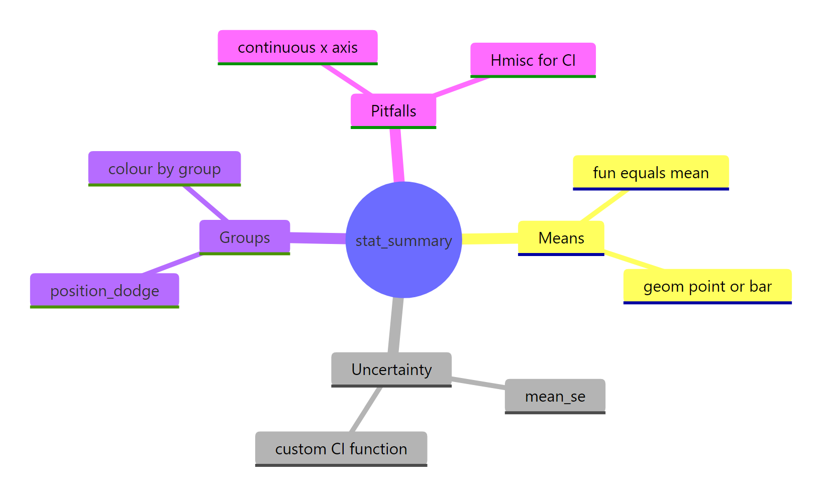
Figure 3: The main jobs stat_summary() does on a plot.
The single decision that drives everything is fun versus fun.data: one value goes to fun, three values (ymin, y, ymax) go to fun.data. Once you can write a function that returns those three columns, you can draw any summary and any error bar you like, with no extra packages.
References
- ggplot2 documentation. stat_summary() reference. Link
- ggplot2 documentation. mean_se() reference. Link
- Harrell, F. Hmisc package (source of mean_cl_normal and mean_cl_boot). CRAN. Link
- Wickham, H., Cetinkaya-Rundel, M., Grolemund, G. R for Data Science, 2nd Edition. Chapter on layers. Link
- R Core Team. The t-distribution and qt(). R stats documentation. Link
- Cumming, G., Fidler, F., Vaux, D. Error bars in experimental biology. Journal of Cell Biology (2007). Link
- Nordmann, E. et al. Data visualisation using R: representing summary statistics. Link
Continue Learning
- Error Bars in R: SD, SE or CI, Done Right - a deeper look at which error bar to choose and how to read it.
- ggplot2 Error Bars in R - drawing error bars from pre-summarised data with geom_errorbar().
- geom_smooth() in R - fit and plot a trend line with a confidence band across a continuous x-axis.