Visualizing Uncertainty in R: Intervals, Bands and ggdist
Visualizing uncertainty means showing not just a number but how sure you are of it. Instead of a lone average, you draw error bars, intervals, bands or a distribution shape so the reader can see the full range of plausible values at a glance. This guide teaches the whole toolkit from scratch: base ggplot2 error bars and confidence bands first, then the ggdist package for richer point-intervals, half-eye plots and model bands.
We build up slowly, and we use base R and the tidyverse together. The first four sections run right here in your browser, so you can execute every line as you read. Later sections use the ggdist package, which you run in your own R session. No prior knowledge of confidence intervals is assumed; we explain each idea before we use it.
Why plot uncertainty instead of just the average?
A bar chart of group averages looks clean and confident. That is exactly the problem. It shows one number per group and quietly hides how noisy that number is. Two groups can have the same average while one is rock-solid and the other is barely more than a guess, and a plain bar chart draws them identically.
The fix is to always pair an estimate with a measure of how much it could wobble. Let's start with the mtcars dataset, which ships with R, and summarise fuel economy (mpg) for cars grouped by their number of cylinders (cyl). Alongside the mean we compute the standard deviation, the group size, and the standard error, which we will unpack properly in the next section. The |> symbol in the code is R's pipe: it feeds the value on its left into the function on its right, so you read the steps top to bottom as take mtcars, group it by cyl, then summarise each group.
Read the last two columns. The 4-cylinder cars average 26.7 mpg with a standard error of 1.36, while the 6-cylinder cars average 19.7 with a much smaller standard error of 0.549. That single extra column is the whole point: we now know not just the averages but how precisely we know each one.
Numbers in a table are hard to compare, so let's turn them into a picture. geom_pointrange() draws a dot for the estimate and a vertical line for the range around it. Here we draw the mean plus or minus one standard error.
Run that block and you get three dots with short vertical whiskers. The dot is the average; the whisker is the uncertainty. The 6-cylinder whisker is tiny, telling you that estimate is precise, while the 4-cylinder whisker is longer, telling you to trust it a little less. That contrast is invisible on a bar chart.
Try it: Build a summary of horsepower (hp) by cylinder. Start from the scaffold, then add the sd_hp, n and se_hp columns the same way we did for mpg.
Click to reveal solution
Explanation: The pattern is identical to the mpg summary. se_hp = sd_hp / sqrt(n) shrinks the spread of the raw values into a measure of how precisely we know the mean.
What do SD, standard error, and confidence intervals actually measure?
Those three terms trip up almost everyone, because they sound similar but answer different questions. Getting them straight is the foundation for every plot in this guide, so let's slow down and define each one in plain language before touching the formulas.
- Standard deviation (SD) measures the spread of the raw data. If individual cars vary a lot in mpg, the SD is large. It describes the data points themselves.
- Standard error (SE) measures the precision of the average. It answers "if I recomputed this mean from a fresh sample, how much would it jump around?" More data means a more stable mean, so SE shrinks as the sample grows.
- Confidence interval (CI) turns the SE into a plain-language range, such as "we are 95% confident the true average lies between 24 and 29".
The three are linked by a short chain. You start with the spread of the data, divide by the square root of the sample size to get the precision of the mean, then widen that by a critical value to get an interval.
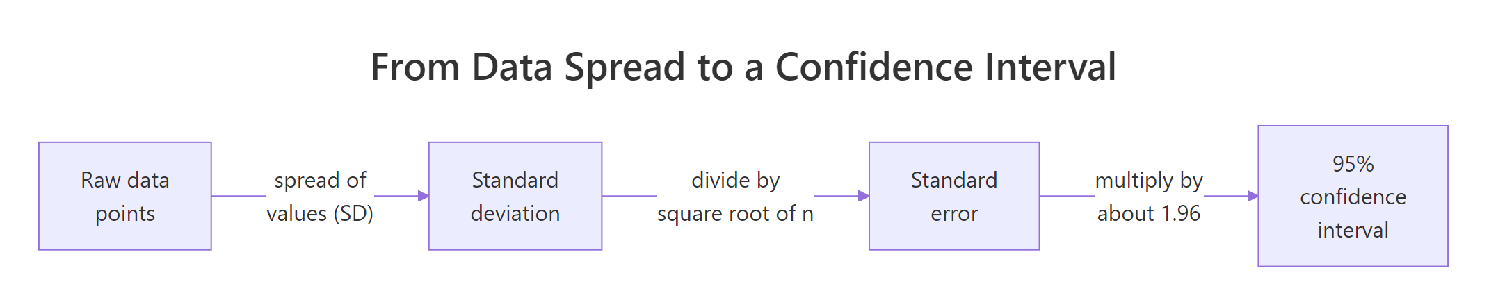
Figure 1: From raw spread to a confidence interval in two steps.
Here is the same chain in R, computed by hand for the 4-cylinder cars so you can see every step. We pull out the raw mpg values, then walk from SD to SE to a 95% interval.
Walk through the numbers. The raw mpg values have an SD of 4.51, a fairly wide spread. Dividing by the square root of 11 shrinks that to an SE of 1.36. Multiplying the SE by 1.96 and stepping out on both sides of the mean gives an interval from 24.0 to 29.3. That interval is our best guess for where the true 4-cylinder average lives.
Two formulas capture that chain. The standard error rescales the spread by sample size:
$$SE = \frac{SD}{\sqrt{n}}$$
And the 95% confidence interval steps out from the mean by about two standard errors:
$$CI_{95\%} = \bar{x} \pm 1.96 \times SE$$
Where:
- $\bar{x}$ = the sample mean (our estimate)
- $SD$ = the standard deviation of the raw values
- $n$ = the number of observations
- $1.96$ = the critical value that captures the middle 95% of a normal distribution
The value 1.96 is the large-sample shortcut. With only 11 cars, the honest critical value is a little larger, and R's built-in t.test() uses the exact one for you. Let's compare.
The exact interval runs from 23.6 to 29.7, slightly wider than our hand-rolled 24.0 to 29.3, because the t-distribution accounts for the small sample. For quick plots the difference is small, but for a real report you should let t.test() or a model compute the interval.
Try it: Compute the exact 95% confidence interval for the mean mpg of the 6-cylinder cars using t.test().
Click to reveal solution
Explanation: t.test() returns a list, and $conf.int grabs the interval directly. The 6-cylinder average is known more precisely than the 4-cylinder one, so this interval is narrower.
How do you draw error bars and point-intervals in ggplot2?
Now that you know what an interval means, let's draw it properly for several groups at once. The recipe is always the same: compute a lower and upper bound per group, then hand those bounds to a ggplot2 geom. We'll build the bounds with qt(), which gives the exact t critical value for each group's sample size.
The tcrit column shows the critical value shrinking as the group grows, from 2.45 for the 7-car group down to 2.16 for the 14-car group. The lower and upper columns are the 95% bounds, and notice they match the t.test() interval we computed earlier for the 4-cylinder group. Now we can plot them.
geom_errorbar() draws the classic capped bar. We pair it with geom_point() for the estimate.
The width argument controls the little horizontal caps; smaller values give narrower caps. If you prefer a cleaner look with no caps, swap geom_errorbar() for geom_linerange(), or use geom_pointrange() from the first section to draw the point and the line in one geom.
Computing the summary yourself is the transparent way, but ggplot2 can also do it on the fly. stat_summary() takes the raw data and computes a summary function per group. Passing fun.data = mean_se gives the mean plus or minus one standard error, drawn as a point-interval, all without a separate summary table.
This plot layers the raw data (grey jittered dots) under the summary (red point-intervals), which is a genuinely honest chart: the reader sees both the individual cars and the summarised uncertainty. The jitter spreads points sideways so they do not overlap.
Try it: Recreate the raw-plus-summary plot, but for car weight (wt) instead of mpg, and colour the point-intervals dark green.
Click to reveal solution
Explanation: Only the y aesthetic and the colour change. stat_summary() recomputes mean_se for the new variable automatically, which is why it is so convenient.
How do you add a confidence band around a trend line?
Error bars work when the x-axis is a handful of categories. When x is continuous, like car weight, you want a smooth confidence band: a shaded ribbon that hugs a trend line and shows how uncertain the line is at every x value. The band is narrow where you have lots of data and flares out where data is sparse.
The quickest way is geom_smooth(). Ask it for a linear model with method = "lm" and it fits the line and draws the 95% band in one step.
Run it and you get the downward trend line with a grey band around it. The band is the confidence interval for the fitted line at each weight. It is thinnest near the middle of the data and widens toward the edges, exactly where predictions get shakier.
geom_smooth() is convenient but a bit of a black box, so let's open it up. The band comes from fitting a model and asking predict() for a confidence interval at a grid of x values. We build that grid, get predictions with bounds, and glue them together.
The fit column is the predicted mpg, and lwr and upr are the confidence bounds at each weight. Now geom_ribbon() draws the shaded area between lwr and upr, and geom_line() draws the fit on top.
This reproduces what geom_smooth() did, but now you control every piece: the model, the confidence level, the fill colour, and the transparency set by alpha. Building it by hand also makes the next distinction concrete.
interval = "confidence" for the mean and interval = "prediction" for one new observation.Try it: Rebuild the band data frame using a prediction interval instead of a confidence interval, and print the first few rows. Notice how much wider the bounds get.
Click to reveal solution
Explanation: The fit column is unchanged, but the bounds widen sharply. At a weight of 1.51 the confidence band spanned 27.0 to 31.4, while the prediction band spans 22.6 to 35.8, because it must account for a single car's scatter, not just the uncertainty of the average.
What is ggdist and how do its point-intervals work?
Base ggplot2 gets you error bars and bands. The ggdist package goes further: it treats uncertainty visualization as distribution visualization, and gives you a family of stats that draw point estimates, one or more nested intervals, and the shape of the distribution, all from a single line of code. It is the tool the title of this guide promises.
ggdist's core idea is the point-interval: a dot for a central estimate, plus one or more bars of increasing thinness for wider intervals. Adding a density curve on top turns it into a half-eye plot. The diagram below shows the anatomy.
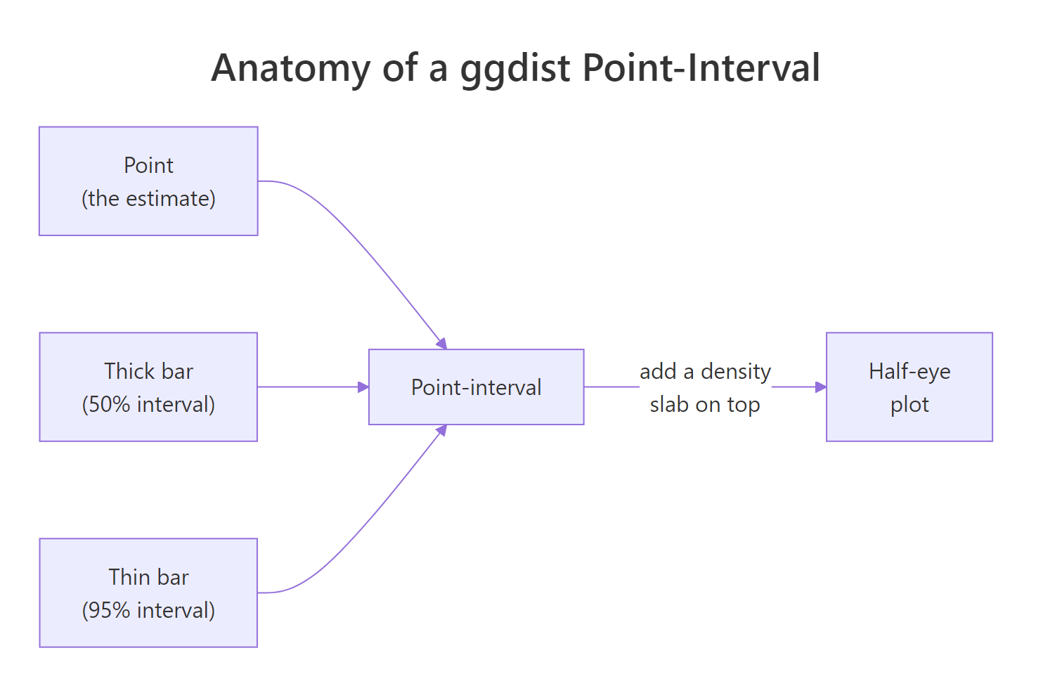
Figure 2: A point-interval is a point plus nested interval bars; a slab of density makes it a half-eye.
Before plotting, it helps to see the numbers ggdist works with. The point_interval() function summarises a column into a point estimate and its intervals. The .width argument asks for several interval widths at once, here the 50%, 80% and 95% intervals.
library(ggdist)

mtcars |>
  group_by(cyl) |>
  point_interval(mpg, .width = c(0.5, 0.8, 0.95))
#> # A tibble: 9 × 7
#>     cyl   mpg .lower .upper .width .point .interval
#>   <dbl> <dbl>  <dbl>  <dbl>  <dbl> <chr>  <chr>
#> 1     4  26     22.8   30.4   0.5  median qi
#> 2     6  19.7   18.6   21     0.5  median qi
#> 3     8  15.2   14.4   16.2   0.5  median qi
#> 4     4  26     21.5   32.4   0.8  median qi
#> 5     6  19.7   18.0   21.2   0.8  median qi
#> 6     8  15.2   11.3   18.3   0.8  median qi
#> 7     4  26     21.4   33.5   0.95 median qi
#> 8     6  19.7   17.8   21.3   0.95 median qi
#> 9     8  15.2   10.4   19.0   0.95 median qi
Each cylinder group gets three rows, one per width. The .point column tells you the estimate is the median, and .interval says the bounds are quantile intervals (qi). Notice the intervals nest: the 95% interval for the 4-cylinder group (21.4 to 33.5) contains the 80% interval (21.5 to 32.4), which contains the 50% interval (22.8 to 30.4). This is the data behind a ggdist plot.
Now the plot. stat_pointinterval() takes the raw data and draws exactly those nested intervals, thick bars for narrow intervals and thin bars for wide ones.
ggplot(mtcars, aes(x = mpg, y = factor(cyl))) +
  stat_pointinterval(.width = c(0.5, 0.95)) +
  labs(x = "MPG", y = "Cylinders") +
  theme_ggdist()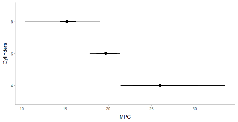
Figure 3: stat_pointinterval() draws a point plus nested interval bars per group, no summary table needed.
The dot is the median mpg, the thick bar is the 50% interval, and the thin bar is the 95% interval. The whole plot came from one stat, with no manual summarising. To make the widths pop with colour instead of thickness, stat_interval() draws each interval as a coloured band.
ggplot(mtcars, aes(x = mpg, y = factor(cyl))) +
  stat_interval(.width = c(0.5, 0.8, 0.95), linewidth = 6) +
  scale_color_brewer(palette = "Blues") +
  labs(x = "MPG", y = "Cylinders", color = "Interval") +
  theme_ggdist()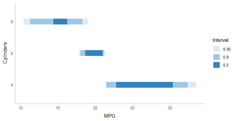
Figure 4: stat_interval() encodes interval width with colour, darkest for the narrowest interval.
Now the 50%, 80% and 95% intervals stack as darker-to-lighter bands. This is a compact way to show that most of the plausible values sit in the dark core, with the light edges being less likely.
Try it: Use point_interval() to summarise horsepower (hp) by cylinder at a single 90% interval width.
mtcars |>
  group_by(cyl) |>
  # call point_interval() on hp with .width = 0.9

#> Expected: a median hp per cylinder with 90% lower and upper bounds
Click to reveal solution
mtcars |>
  group_by(cyl) |>
  point_interval(hp, .width = 0.9)
#> # A tibble: 3 × 7
#>     cyl    hp .lower .upper .width .point .interval
#>   <dbl> <dbl>  <dbl>  <dbl>  <dbl> <chr>  <chr>
#> 1     4   91     57    111     0.9 median qi
#> 2     6  110    106.   159.    0.9 median qi
#> 3     8  192.   150    289.    0.9 median qi
Explanation: Swapping mpg for hp and using a single .width gives one row per group. The 8-cylinder cars have both the highest median horsepower and the widest interval, meaning their power varies the most.
How do you show a whole distribution with half-eye and gradient plots?
A point-interval summarises a distribution into a point and some bars. Sometimes you want to show the full shape: is it symmetric, skewed, or bimodal? ggdist's slabinterval family answers this by drawing a slab (the distribution's shape) attached to an interval. The most popular is the half-eye plot.
stat_halfeye() draws a density curve (the "eye") above a point-interval. You see the estimate, the intervals, and the entire distribution in one compact glyph.
ggplot(mtcars, aes(x = mpg, y = factor(cyl))) +
  stat_halfeye(.width = c(0.5, 0.95)) +
  labs(x = "MPG", y = "Cylinders") +
  theme_ggdist()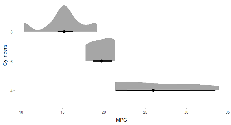
Figure 5: stat_halfeye() stacks a density slab on top of a point-interval, showing shape and summary together.
Look at the 8-cylinder group at the bottom. Its density slab has a clear peak, telling you most 8-cylinder cars cluster tightly, while the 4-cylinder slab at the top is wider and flatter, meaning those cars vary more in mpg. The point-interval underneath each slab gives the same summary you saw before. This is the plot that made ggdist famous.
A gradient plot carries the same information but fades the fill by density instead of drawing a curve. Denser regions are darker, so the eye is drawn to the most probable values.
ggplot(mtcars, aes(x = mpg, y = factor(cyl))) +
  stat_gradientinterval(.width = c(0.5, 0.95)) +
  labs(x = "MPG", y = "Cylinders") +
  theme_ggdist()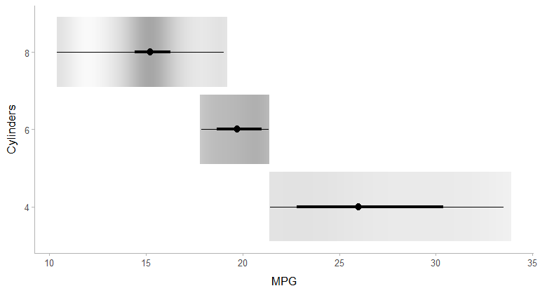
Figure 6: stat_gradientinterval() encodes probability as opacity, darkest where values are most likely.
Gradient plots are handy when you have many groups and stacked density curves would overlap. The fading fill communicates "most likely here, less likely there" without adding vertical height.
Try it: Swap stat_halfeye() for stat_eye() to draw a full eye, which mirrors the density above and below the interval.
ggplot(mtcars, aes(x = mpg, y = factor(cyl))) +
  # replace this comment with a stat_eye() layer using .width = c(0.5, 0.95)
  labs(x = "MPG", y = "Cylinders") +
  theme_ggdist()
#> Expected: a symmetric (mirrored) density with an interval, one per cylinder
Click to reveal solution
ggplot(mtcars, aes(x = mpg, y = factor(cyl))) +
  stat_eye(.width = c(0.5, 0.95)) +
  labs(x = "MPG", y = "Cylinders") +
  theme_ggdist()
Explanation: stat_eye() is the two-sided cousin of stat_halfeye(). It mirrors the density into a violin-like shape with the point-interval running through the middle.
How do you visualize model uncertainty with stat_lineribbon()?
The final piece ties intervals and bands together. When you fit a model and want a trend line with nested uncertainty bands, ggdist's stat_lineribbon() is purpose-built. It draws the fit plus several bands at once, giving the continuous cousin of the nested point-intervals from earlier.
First we need fitted values with their standard errors along a grid of weights. The broom package does this cleanly: augment() with se_fit = TRUE returns the fitted value and its standard error for each new x. This step uses only broom, so it runs in your browser.
The .fitted column is the predicted mpg and .se.fit is its standard error at each weight. To turn a fitted value and its standard error into a full distribution, ggdist uses the distributional package: dist_student_t() builds a t-distribution for every row from the degrees of freedom, the fitted mean, and the standard error. stat_lineribbon() then draws nested bands from those distributions.
library(ggdist)
library(distributional)

ggplot(aug, aes(x = wt)) +
  stat_lineribbon(
    aes(ydist = dist_student_t(df = df.residual(lm_fit), mu = .fitted, sigma = .se.fit)),
    .width = c(0.5, 0.8, 0.95)
  ) +
  geom_point(data = mtcars, aes(y = mpg), colour = "grey40") +
  scale_fill_brewer(palette = "Blues") +
  labs(x = "Weight (1000 lbs)", y = "MPG", fill = "Interval") +
  theme_ggdist()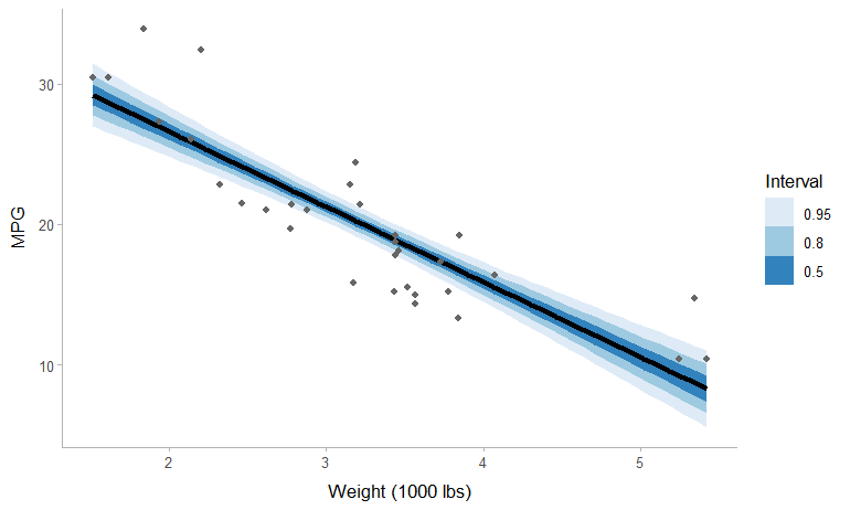
Figure 7: stat_lineribbon() draws the fit with nested confidence bands, darkest at the center.
The result is the plot the whole guide has been building toward: a fit line wrapped in three nested bands, dark in the middle where the model is most confident and fading outward. It is the band from section four, upgraded to show several confidence levels at once, with the same nested logic as the point-intervals from section five.
Try it: Redraw the lineribbon with a single 95% band in a solid fill colour instead of three nested bands.
ggplot(aug, aes(x = wt)) +
  stat_lineribbon(
    aes(ydist = dist_student_t(df = df.residual(lm_fit), mu = .fitted, sigma = .se.fit))
    # then add: , .width = 0.95, fill = "steelblue", alpha = 0.4
  ) +
  geom_point(data = mtcars, aes(y = mpg), colour = "grey40") +
  theme_ggdist()
#> Expected: one shaded 95% band around the fit line
Click to reveal solution
ggplot(aug, aes(x = wt)) +
  stat_lineribbon(
    aes(ydist = dist_student_t(df = df.residual(lm_fit), mu = .fitted, sigma = .se.fit)),
    .width = 0.95, fill = "steelblue", alpha = 0.4
  ) +
  geom_point(data = mtcars, aes(y = mpg), colour = "grey40") +
  theme_ggdist()
Explanation: Setting a single .width gives one band, and moving fill and alpha outside aes() makes them fixed styling rather than data-driven. This is the ggdist equivalent of the geom_ribbon() band from section four.
Complete Example
Let's tie the whole workflow together with a chart you could drop into a report. We compare fuel economy across cylinder counts, split by transmission type, and show a 95% confidence interval for every group. This uses only browser-runnable code, so you can run the entire thing here.
First, summarise mpg by cylinder and transmission, building the confidence bounds with qt() exactly as before.
Look at the last row: only two 8-cylinder manual cars exist, so its critical value rises to 12.7 and its interval is very wide. That very wide interval is exactly the point: with only two cars we barely know that group's average, and a plain bar chart would have hidden how little data it rests on.
Now plot it. We colour by transmission and use position_dodge() so the two transmissions sit side by side within each cylinder group instead of overlapping.
The finished chart reads cleanly: manual cars average better mpg among 4-cylinder models, the gap shrinks for 6 cylinders, and the huge whisker on the 8-cylinder manual group warns you not to over-read its two-car average. Every claim a reader might make is now tempered by a visible interval.
Practice Exercises
These combine several ideas from the guide. Try each before opening the solution.
Exercise 1: Confidence intervals for gear groups
Summarise the rear axle ratio (drat) by the number of forward gears (gear), compute a 95% confidence interval per group with qt(), and print the result. Save it to drat_ci.
Click to reveal solution
Explanation: This is the section-three recipe applied to a new grouping variable. The 5-gear group has the fewest cars and the widest interval, a pattern you should now expect.
Exercise 2: A confidence band for mpg versus horsepower
Fit a linear model of mpg on hp, build a 95% confidence band over a grid of horsepower values with predict(), and store the first few rows in cap_band. You do not have to plot it, just produce the banded data frame.
Click to reveal solution
Explanation: The workflow matches section four exactly, only the predictor changed from wt to hp. Feed cap_band into geom_ribbon() plus geom_line() and you have the finished band.
Exercise 3: Compare distributions with a half-eye plot
Using ggdist, draw a half-eye plot of mpg split by transmission (am, where 0 is automatic and 1 is manual), showing 66% and 95% intervals. This one runs in your local R session.
# Hint: aes(x = mpg, y = factor(am)) then stat_halfeye(.width = c(0.66, 0.95))

ggplot(mtcars, aes(x = mpg, y = factor(am))) +
  # add the stat_halfeye() layer here
  labs(x = "MPG", y = "Transmission (0 = auto, 1 = manual)") +
  theme_ggdist()
Click to reveal solution
library(ggdist)

ggplot(mtcars, aes(x = mpg, y = factor(am))) +
  stat_halfeye(.width = c(0.66, 0.95)) +
  labs(x = "MPG", y = "Transmission (0 = auto, 1 = manual)") +
  theme_ggdist()
Explanation: Mapping factor(am) to y gives one half-eye per transmission. The manual group's density sits clearly to the right, showing manual cars tend to get better mileage, and the slab shape reveals how spread out each group is.
Summary
Visualizing uncertainty is a single skill with a few interchangeable tools. Choose the tool by the shape of your data, then let the geom show the reader how much to trust each number.
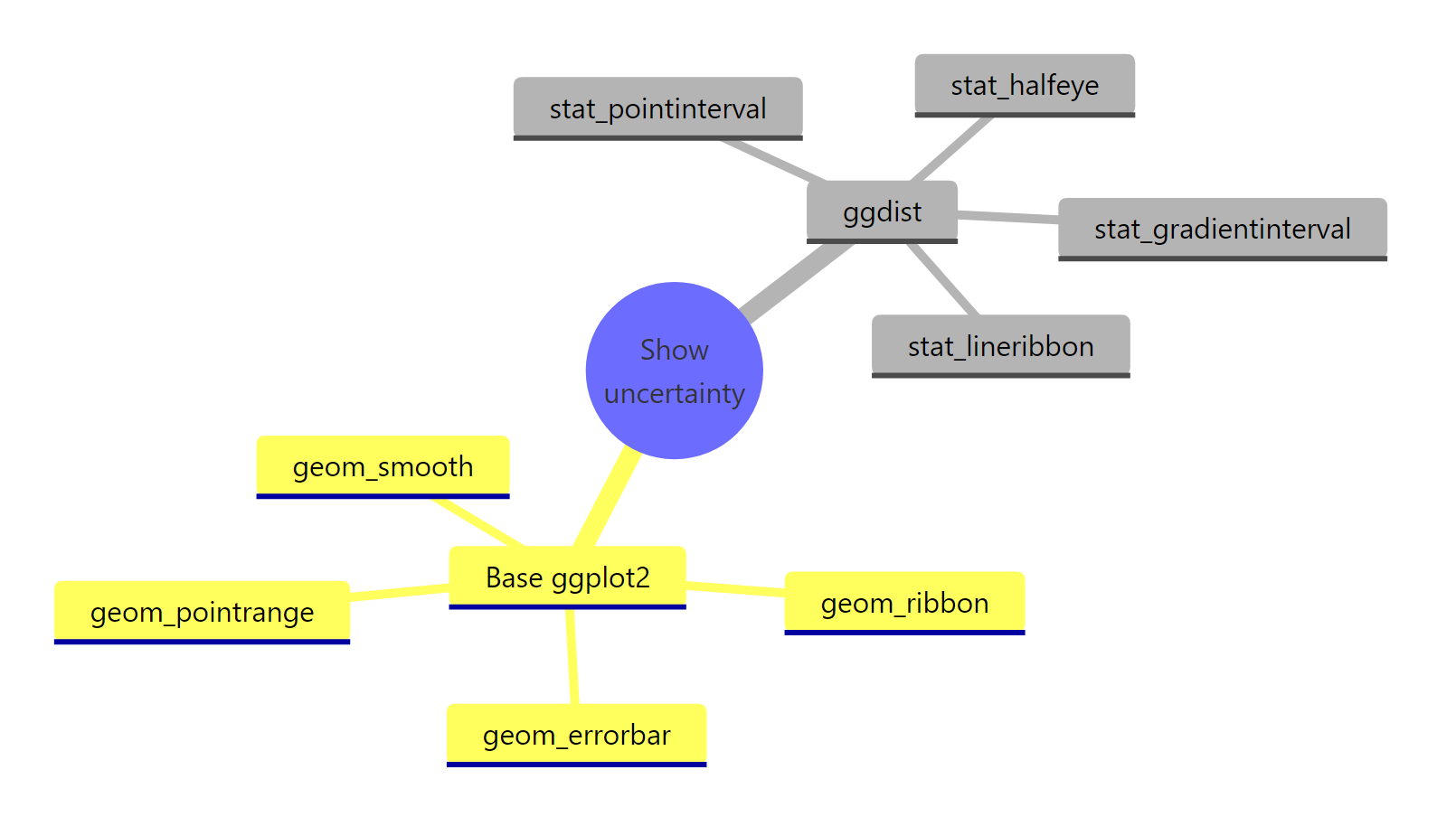
Figure 8: The full toolkit, from base ggplot2 error bars to ggdist slabintervals.
| Your data | Best tool | What it shows |
|---|---|---|
| A few group means | geom_pointrange() or geom_errorbar() |
Estimate plus one interval |
| Groups, computed on the fly | stat_summary(fun.data = mean_se) |
Mean and SE without a summary table |
| A trend over continuous x | geom_smooth() or geom_ribbon() |
A confidence band around the line |
| Groups, nested intervals | ggdist stat_pointinterval() / stat_interval() |
Point plus 50/80/95 intervals |
| The full distribution shape | ggdist stat_halfeye() / stat_gradientinterval() |
Density slab plus interval |
| Model trend, nested bands | ggdist stat_lineribbon() |
Fit line with 50/80/95 bands |
Key takeaways to carry forward:
- Always pair an estimate with an interval. A number alone hides how precise it is.
- Know your three quantities. SD is the spread of data, SE is the precision of the mean, and a CI turns SE into a plain-language range.
- A confidence band tracks the average; a prediction band tracks a single new point. They differ a lot in width.
- ggdist unifies it all as distribution visualization, from point-intervals to half-eyes to lineribbons.
FAQ
Do I need the ggdist package, or can I do everything in base ggplot2?
Base ggplot2 already covers a lot: geom_errorbar() and geom_pointrange() for group intervals, and geom_smooth() or geom_ribbon() for a single confidence band, all of which run anywhere. Reach for ggdist when you want nested intervals, the full distribution shape (half-eye or gradient plots), or model bands at several confidence levels from one line. The two are complementary, not an either-or choice.
My error bars are much longer than someone else's on the same data. Why?
Almost always because you are drawing different quantities. A standard deviation bar shows the spread of the raw values, while a standard error bar shows the precision of the mean and is therefore smaller. A confidence interval takes that standard error and widens it by a critical value. Label which one you plotted so readers can compare like with like.
How do I put error bars on a bar chart instead of on points?
Draw the bars with geom_col() and add geom_errorbar() on top, mapping ymin and ymax to your bounds. If the bars are grouped, give geom_col() and geom_errorbar() the same position_dodge() width so each error bar sits on its own bar. Many people prefer geom_pointrange() instead, because solid bars can hide the data behind them.
Can I draw these uncertainty bands for a model other than lm(), such as a logistic regression?
Yes. predict() and broom's augment() work for glm() and many other model types, so the recipes from sections four and seven carry over. For a glm() you usually predict on the link scale with standard errors, then transform the fitted value and its bounds back to the response scale before plotting.
My ggdist plot code returns nothing or an error. What went wrong?
The ggdist blocks run in your own R session, not in the page. Install the package once with install.packages("ggdist") (plus "distributional" for the lineribbon example), then load it with library(ggdist) before the plotting code. If a plot still does not appear, make sure the ggplot() call is the value printed at the console rather than assigned to a variable.
References
- Kay, M. - ggdist: Visualizations of Distributions and Uncertainty. Package documentation and reference. Link
- Kay, M. - Frequentist uncertainty visualization (ggdist vignette). Link
- Kay, M. - Slab + interval stats and geoms (ggdist vignette). Link
- Kay, M. - Lineribbon stats and geoms (ggdist vignette). Link
- ggplot2 documentation -
geom_ribbon()andgeom_smooth()reference. Link - Robinson, D., Hayes, A., & Couch, S. - broom: Convert Statistical Objects into Tidy Tibbles. Link
- O'Hara-Wild, M., et al. - distributional: Vectorised Probability Distributions. Link
- Wilke, C. O. - Fundamentals of Data Visualization, Chapter 16: Visualizing uncertainty. O'Reilly (2019). Link
- Wickham, H., & Grolemund, G. - R for Data Science, 2nd Edition. Link
Continue Learning
- Error Bars in ggplot2: SD, SE or CI, Done Right - a closer look at which error bar to draw and how to compute each one correctly.
- ggdist Package in R: Visualize Distributions and Uncertainty - a focused tour of ggdist's slabinterval and dotsinterval families, including raincloud plots.
- Communicating Uncertainty in R - how to present intervals honestly so your charts inform rather than mislead.