The Normal Distribution in R: Where It Comes From
The normal distribution is a symmetric, bell-shaped curve where most values sit close to the average and become rarer the further you move away from it. It turns up everywhere from human heights to test scores because it is what you get when many small random effects add up. In R, four short functions do everything you need with it: dnorm, pnorm, qnorm and rnorm. All four ship with base R, so there is nothing to install.
Where does the normal distribution come from?
Before you touch a single function, it helps to watch the bell curve appear on its own. Roll one die and every face is equally likely, so the outcomes are flat. But add up ten dice and something surprising happens: the totals pile up in the middle and thin out at the edges. That pile is the normal distribution, and seeing it form explains why it turns up so often.
Let's start with the flat case so the contrast lands. We roll a single fair die ten thousand times and count how often each face appears.
Here sample(1:6, 10000, replace = TRUE) draws ten thousand rolls, table() counts each face, and prop.table() turns those counts into proportions. Every face lands near 0.167, which is one in six. There is no peak and no tail: a single die is flat, not bell-shaped.
Now for the surprising part. Instead of one die, we roll ten dice, add them into a single total, and repeat that whole experiment ten thousand times. The replicate() function runs the same line over and over and collects the answers.
The average total is about 35, which makes sense because each die averages 3.5 and ten of them average 35. The histogram is the payoff: the totals bunch up around 35 and fade away toward 10 and 60. Nobody designed that shape. It emerged just from adding.
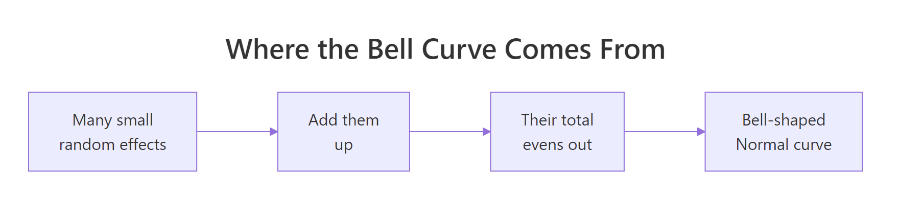
Figure 1: Many small random effects add up into a single bell-shaped curve.
Why does adding do this? Extreme totals need many dice to agree. To reach 60 you need every die to roll close to a six, which is rare, but there are dozens of ways to land near 35, so middle totals are common. This same logic drives real measurements. An adult's height is a sum of many genetic and nutritional nudges, and a lab measurement is a true value plus a pile of tiny errors, so both come out bell-shaped.
Try it: Roll only two dice ten thousand times, sum each roll, then look at the resulting shape. With just two dice the curve is a simple triangle, a first hint of the bell.
Click to reveal solution
Explanation: A total of 7 is the most common because it has the most combinations that produce it, while 2 and 12 each need both dice to agree. Two dice already lean toward the middle, and stacking more dice smooths that triangle into the bell you saw above.
What is a normal distribution, and what do the mean and standard deviation control?
A normal distribution is fully described by just two numbers. The mean sets where the peak sits, and the standard deviation sets how wide the curve spreads. Change those two knobs and you can describe any bell, from sharp test scores to broad income ranges.
The height of the curve at any value is given by dnorm(), short for "density of the normal". The word density here means how tall the curve is at that point, which reflects how concentrated the values are nearby. The tallest point is always at the mean. Let's measure it for the default curve, the one centered at 0 with a spread of 1.
dnorm(0) returns about 0.399, the height of the peak. On its own that number is not very meaningful, but its shape becomes clear when we draw the whole curve. The curve() function sweeps a value across a range and plots the function at each point.
That is the classic bell: tall in the middle at 0.399 and sinking toward zero past 3 in either direction. Notice how symmetric it is. The height two steps to the left of center equals the height two steps to the right, which we can confirm by reading several points at once.
The values mirror around the middle: the height at -2 matches the height at 2, and the height at -1 matches the height at 1. The peak of 0.399 sits at 0. This symmetry is a defining feature of every normal curve.
Now watch what the two knobs do. We draw the standard curve, then a second curve shifted to a mean of 2 and stretched to a standard deviation of 2, so you can see position and spread change independently.
The orange curve slid to the right because its mean moved to 2, and it flattened because a larger standard deviation spreads the same total area over a wider base. Both curves still enclose an area of exactly 1, since every value has to land somewhere. A wider curve must therefore be shorter.
dnorm(0) and dnorm(0, mean = 0, sd = 1) give the same answer. Supply your own mean and sd whenever your data is not centered at 0.If you like a formula, the height of the curve comes from one equation. If formulas are not your thing, skip this box, because the code above already does the work for you.
$$f(x) = \frac{1}{\sigma\sqrt{2\pi}}\; e^{-\frac{1}{2}\left(\frac{x-\mu}{\sigma}\right)^2}$$
Where \\( x \\) is the value on the horizontal axis, \\( \mu \\) (mu) is the mean, \\( \sigma \\) (sigma) is the standard deviation, and \\( e \\) is Euler's number, about 2.718. Plug in the standard normal at its peak and the exponent becomes 0, leaving \\( 1/\sqrt{2\pi} \\), which is the 0.399 you already measured with dnorm(0).
Try it: A curve with a standard deviation of 2 is wider and flatter, so its peak is lower than the standard curve's 0.399. Measure the peak height of a curve centered at 10 with a standard deviation of 2.
Click to reveal solution
Explanation: The peak is at the mean of 10, and doubling the standard deviation to 2 halves the peak height to about 0.199. A wider curve spreads its area thinner, so it cannot be as tall.
How do you find probabilities with pnorm()?
Most real questions are about probability, not height. You rarely ask "how tall is the curve at 185 cm" but you often ask "what fraction of people are shorter than 185 cm". That fraction is the area under the curve up to a point, and pnorm() gives it directly. The p stands for probability.
Because the whole area under the curve is 1, an area is the same as a proportion. Let's start with a landmark value. About 97.5 percent of a standard normal sits below 1.96, a number you will meet again in confidence intervals.
pnorm(1.96) returns 0.975, meaning 97.5 percent of the standard normal falls below 1.96. Now let's make it concrete with real units. Suppose adult male heights follow a normal distribution with a mean of 175 cm and a standard deviation of 7 cm. What share of men are shorter than 185 cm?
About 92 percent of men are shorter than 185 cm. We passed the value 185 along with the mean and standard deviation, and pnorm() returned the area to the left, which is the proportion below. To flip the question to "what fraction are taller than 185 cm", we want the area to the right instead.
Only about 7.7 percent of men are taller than 185 cm, and notice that 0.923 and 0.077 add up to 1, because everyone is either below or above the line. The lower.tail = FALSE argument tells R to measure the upper tail rather than the lower one.
Try it: Basketball recruiters care about the far right tail. Find the fraction of men taller than 190 cm using the same height model.
Click to reveal solution
Explanation: Only about 1.6 percent of men clear 190 cm. Moving the cutoff from 185 to 190 cm shrinks the tail sharply, which shows how quickly the curve thins out as you move away from the mean.
What is the 68-95-99.7 rule (and what is a z-score)?
There is a quick mental shortcut for any normal distribution called the 68-95-99.7 rule, also known as the empirical rule. It says that about 68 percent of values fall within one standard deviation of the mean. About 95 percent fall within two standard deviations, and about 99.7 percent within three. Rather than take that on faith, we can prove it with pnorm().
The area within one standard deviation is the area below +1 minus the area below -1, and the same pattern gives the other two bands.
The numbers come out to 0.6827, 0.9545 and 0.9973, which is exactly the 68, 95 and 99.7 percent the rule promises. The rule is not a rough guess, it is these three areas rounded.
This works for any normal distribution because you can always rescale it to the standard one. Counting how many standard deviations a value sits from its mean gives a z-score, and that turns any bell into the standard bell. Our earlier 185 cm height is a good test: it should be about 1.43 standard deviations above the mean.
$$z = \frac{x - \mu}{\sigma}$$
Where \\( x \\) is your value, \\( \mu \\) is the mean, and \\( \sigma \\) is the standard deviation. Let's compute the z-score for 185 cm and feed it to pnorm() with no mean or sd, so R uses the standard normal.
The z-score is 1.43, and pnorm(z) returns 0.923, the very same answer we got earlier from pnorm(185, 175, 7). Standardizing first or passing the raw value with its mean and sd are two roads to the same number.
Seeing the bands on the curve makes the rule stick. The plot below marks one, two and three standard deviations from the center.
The red lines at plus and minus one standard deviation bracket the tall middle that holds 68 percent of the area. The green lines at three standard deviations sit far out where almost nothing remains, just 0.3 percent in both tails combined.
Try it: The rule covers whole standard deviations, but you can ask about any distance. Find the proportion of values within 1.5 standard deviations of the mean.
Click to reveal solution
Explanation: About 86.6 percent of values fall within 1.5 standard deviations, comfortably between the 68 percent at one and the 95 percent at two. The same subtraction trick works for any distance you choose.
How do you find cut-off values with qnorm()?
So far we started with a value and asked for a probability. Often you need the reverse: start with a probability and ask which value marks that cut-off. That is what qnorm() does, and the q stands for quantile, which is just a fancy word for a cut-off point like a percentile. It is the exact inverse of pnorm().
We saw that 97.5 percent of the standard normal sits below 1.96. If instead you are handed the 0.975 and asked which value it corresponds to, qnorm() hands back the 1.96.
qnorm(0.975) returns 1.96, undoing the earlier pnorm(1.96) exactly. Now put it to work on the height model. What height marks the 90th percentile, the point where 90 percent of men are shorter?
The 90th percentile is about 184 cm, so a man that tall is taller than 90 percent of men. We can also ask for the exact middle, the 50th percentile, which should land right on the mean.
qnorm(0.5) returns 175, the mean itself. Because the normal distribution is perfectly symmetric, its median and mean are the same value.
Try it: Tailors making tall sizes want the height that only the top 5 percent of men exceed, which is the 95th percentile. Find it.
Click to reveal solution
Explanation: About 186.5 cm marks the 95th percentile, so only 1 man in 20 is taller. This is the mirror image of the earlier pnorm(186.514, 175, 7) question, which is exactly why the two functions invert each other.
How do you generate random normal data with rnorm()?
The last of the four functions creates data rather than describing it. rnorm() draws random values from a normal distribution, where the r stands for random. This is how you simulate a dataset when you do not have real numbers yet, which is useful for testing methods and building intuition.
Let's draw one thousand simulated heights from our model and check that they behave. Because the draw is random, we call set.seed() first so the results are reproducible for you and me both.
The first six draws are ordinary-looking heights near 175 cm. More importantly, the sample mean of 174.82 and sample standard deviation of 7.02 land very close to the 175 and 7 we asked for, and the histogram shows the familiar bell. The values are random, but they obey the distribution's rules.
Try it: IQ scores are often modeled as normal with a mean of 100 and a standard deviation of 15. Simulate 500 IQ scores and check that their average is near 100.
Click to reveal solution
Explanation: The sample mean is 100.68, close to the true 100 but not exactly on it, because 500 draws still carry a little randomness. Draw more values and the average would sit even closer to 100.
How do you check whether your data is normal?
Real data is never perfectly normal, so the practical question is whether it is close enough. Three tools answer that, and using them together is far safer than trusting any one alone. We already have sample_heights, which we know is normal, so it makes a good honest test case.
The first check is a histogram with the ideal curve drawn on top. If the bars roughly follow the curve, the data looks normal.
Setting freq = FALSE puts the histogram on a density scale so it lines up with dnorm(). The bars track the purple curve closely, which is our first sign of normality. A histogram can be blunt for small samples though, so we bring in a sharper tool.
The second check is a normal Q-Q plot. It sorts your data and plots it against the values a perfect normal would produce. When the points stay close to the straight line, the data is normal.
The points fall almost exactly on the red line, with only tiny wobbles at the ends. That straight-line pattern is the clearest visual evidence of normality, and departures show up as curves or S-shapes.
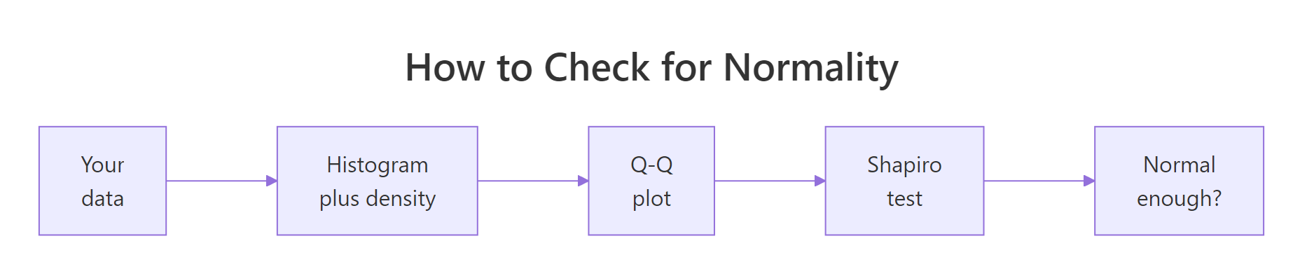
Figure 2: A three-step routine for checking whether data is normal.
The third check is a formal test. The Shapiro-Wilk test computes a single p-value, where a small p-value (below 0.05) is evidence the data is not normal.
The p-value of 0.767 is far above 0.05, so the test finds no reason to doubt normality, which matches what the plots told us. To see the opposite verdict, we run the same test on an exponential sample, which is heavily skewed and clearly not normal.
Here the p-value is smaller than 0.0000000000000002, printed as less than 2.2e-16, which is overwhelming evidence the data is not normal. The three tools agree with each other, and that agreement is what you are looking for.
Try it: A uniform distribution is flat, not bell-shaped, so it should fail the test. Draw 500 uniform values and print only the Shapiro-Wilk p-value.
Click to reveal solution
Explanation: The p-value of about 0.000000000016 is far below 0.05, so the test correctly rejects normality. A flat distribution has no peak and hard edges, which is nothing like a bell.
A complete example: exam scores from start to finish
Let's tie all four functions together on one realistic problem. Suppose a class of students takes an exam whose scores follow a normal distribution with a mean of 72 and a standard deviation of 12. We will answer four questions a teacher would actually ask, using one function each.
First, the single most likely score sits at the mean, and dnorm() gives the curve height there.
We stored the mean and standard deviation in named objects so the rest of the code reads cleanly. The peak density of 0.033 sits at 72, confirming the average score is also the most common one.
Next, pnorm() answers two grading questions at once: the share who fail below 50, and the share who earn an A at 85 or above.
About 3.3 percent of students fall below 50 and fail, while about 13.9 percent score 85 or higher and earn an A. The upper-tail flag handled the A question in one line.
Now the teacher wants to award prizes to the top 10 percent. That is a cut-off question, so qnorm() is the tool.
Any student scoring above about 87.4 lands in the top 10 percent. Finally, rnorm() simulates a realistic class of 30 students so the teacher can preview a plausible spread of scores.
The simulated scores range from about 41 to 95, cluster in the 60s and 70s, and include one failing score near 41 and two A grades above 88. That single normal model, driven by just a mean and a standard deviation, answered every question the teacher had.
Frequently asked questions
What is the difference between dnorm, pnorm, qnorm and rnorm?
Each function answers a different question about the same curve. dnorm() gives the height of the curve at a value, pnorm() gives the probability below a value, qnorm() gives the value at a probability, and rnorm() draws random values. A quick rule of thumb: d is for density and p is for probability, while q is for quantile and r is for random.
Why is the normal distribution so common in real data?
Because most measurements are sums of many small independent influences, and adding many such influences always tends toward a bell curve. Height, measurement error and exam totals all form this way. This tendency is the Central Limit Theorem, and it is why the normal distribution appears far more often than any other.
What is the standard normal distribution?
It is the specific normal distribution with a mean of 0 and a standard deviation of 1, and it is the default in R's normal functions. Any normal distribution can be converted to it by computing z-scores, which express each value as its distance from the mean in standard deviations. Working in standard units lets one curve describe every normal problem.
How do I know if my data is actually normal?
Combine a picture with a test. Draw a histogram with the ideal curve on top and a normal Q-Q plot, then run shapiro.test() for a formal p-value. If the plots look straight and bell-shaped and the p-value is not tiny, the data is normal enough to work with.
Does a large p-value from shapiro.test prove my data is normal?
No. A large p-value only means the test found no strong evidence against normality, which is not the same as proof. On big samples the test also becomes oversensitive and can flag trivial departures, so treat it as one clue alongside the plots, never as the final word.
Practice exercises
These problems combine the functions you just learned. Try each one before opening the solution, and use the distinct variable names shown so your code does not clash with the examples above.
Exercise 1: IQ scores at the extremes
IQ scores are modeled as normal with a mean of 100 and a standard deviation of 15. What proportion of people score above 130, the common "gifted" threshold, and what score marks the 99th percentile? Use one function for each part.
Click to reveal solution
Explanation: About 2.3 percent of people score above 130, and the 99th-percentile cutoff is about 135. The first is a probability question so it uses pnorm() with the upper tail, and the second is a cut-off question so it uses qnorm().
Exercise 2: watch the Central Limit Theorem happen
Prove the origin story yourself. Take 10000 samples, each of size 30, from an exponential population (which is very skewed, not normal), compute the mean of each sample, and describe the collection of means. Show that the average of the means is near the population mean of 1, and that their spread is close to 1 divided by the square root of 30.
Click to reveal solution
Explanation: The means average 0.997, right on the population mean of 1, and their spread of 0.182 matches the predicted 0.183 almost exactly. The exponential population is deeply skewed, yet its sample means form a tidy bell, which is the Central Limit Theorem at work.
Exercise 3: a quality-control spec limit
A bottling machine fills bottles with a volume that is normal with a mean of 500 ml and a standard deviation of 5 ml. What fraction of bottles are underfilled below 490 ml? Then set a lower spec limit so that only 1 percent of bottles fall below it. Finally, simulate 10000 fills and confirm the underfill rate.
Click to reveal solution
Explanation: About 2.3 percent of bottles come in under 490 ml, and a spec limit of 488.4 ml would flag only the bottom 1 percent. The simulation gives an underfill rate of 0.025, matching the theoretical 0.023 up to ordinary sampling noise.
Summary
You now know where the normal distribution comes from and how to work with it in R. The bell curve is not arbitrary: it emerges whenever many small random effects add up, which is why it describes so much of the world. Two numbers, the mean and the standard deviation, pin down any normal curve completely, and the 68-95-99.7 rule turns those two numbers into fast estimates.
The four functions each answer one kind of question, summarized below.
| Function | The question it answers | Example |
|---|---|---|
dnorm() |
How tall is the curve at this value? | dnorm(0) is 0.399 |
pnorm() |
What fraction is below this value? | pnorm(185, 175, 7) is 0.92 |
qnorm() |
What value sits at this percentile? | qnorm(0.90, 175, 7) is 184 |
rnorm() |
Give me random values from the curve | rnorm(1000, 175, 7) |
The diagram below turns that table into a quick decision guide.
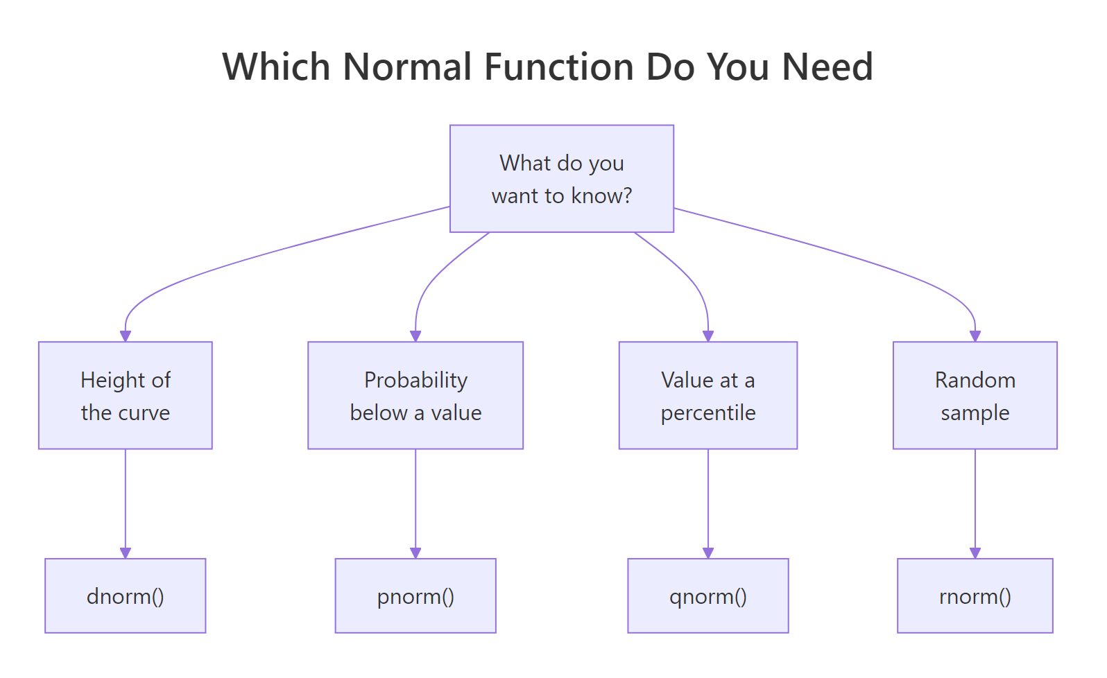
Figure 3: Pick the right function by what you want to know.
To decide if real data is normal, read a histogram with the ideal curve on top, a Q-Q plot, and a Shapiro-Wilk p-value together, and trust their agreement over any single check.
References
- R Core Team. The Normal Distribution, R stats package documentation. Link
- R Core Team. An Introduction to R, CRAN manuals. Link
- Wickham, H., Cetinkaya-Rundel, M., and Grolemund, G. R for Data Science, 2nd Edition. Link
- Cetinkaya-Rundel, M. and Hardin, J. Introduction to Modern Statistics (OpenIntro), the normal model chapter. Link
- NIST/SEMATECH e-Handbook of Statistical Methods. Normal Distribution. Link
- Wikipedia. Normal distribution. Link
- Wikipedia. Central limit theorem. Link
Continue learning
- Central Limit Theorem in R: the deeper story behind why summing random effects gives a bell curve, with simulations you can run.
- Random Variables in R: the building block underneath every distribution, explained from scratch.
- Normality and Variance Tests in R: a fuller toolkit for checking whether your data meets the normal assumption before you model it.