Mean vs Median, SD vs IQR: Choosing Center and Spread
The mean and standard deviation summarize typical, symmetric data. The median and the IQR (interquartile range) summarize skewed data or data with outliers. In R you compute all four with mean(), sd(), median(), and IQR(), and this guide shows you how to pick the pair that describes your data honestly.
Every number below runs right here in the page, using base R for almost everything and the dplyr package once at the very end. You can change any value and re-run to see what happens. Nothing to install, no files to download.
What do center and spread actually measure?
Every dataset raises two plain questions. Where is the middle of the values, and how spread out are they around that middle? Statisticians call these two ideas center and spread, and R gives you two common answers for each. Let's compute all four on a dataset you have probably met before, then spend the rest of the guide learning which answer to trust and when.
The mtcars dataset ships with R and holds the miles-per-gallon figures for 32 cars in its mpg column. The code pulls that column into a variable, then packs the four summary numbers into a single named vector so you can read them side by side. We round to two decimals just to keep the display tidy.
Here is what each line did. mtcars$mpg grabbed the mileage column, mean() and median() reported two versions of the center, and sd() and IQR() reported two versions of the spread. Wrapping them in c(name = value, ...) built one labeled vector so all four print together.
Read the numbers as two pairs, not four separate facts. The mean (20.09) and the median (19.20) both answer "what is a typical car's mileage," and they nearly agree here. The standard deviation, or SD (6.03), and the IQR (7.38) both answer "how much do cars differ from that typical value." The rest of this guide is about which member of each pair to report.
Try it: The airquality dataset has a Temp column of daily temperatures. Compute its mean and its median and see how close they are.
Click to reveal solution
Explanation: The mean (77.88) and median (79) sit very close together, which is a hint that the temperature values are roughly symmetric with no wild outliers.
How do the mean and median differ?
The mean is the balance point of your data. You add up every value and divide by how many there are, so every single number tugs on the result. The median is the middle value once you line the data up from smallest to largest, so it only cares about position, not size. When the data is symmetric, these two land in almost the same place.
Let's prove that with a tiny, perfectly balanced set of five numbers. Watch both measures return the same answer.
Both give 6. The mean got there by averaging (2 + 4 + 6 + 8 + 10 = 30, divided by 5), and the median got there by picking the middle of the sorted list. With balanced data they agree.
Now change just one number. We replace the 10 with a 100 that sits far off to the right, then run the same two functions.
Look at what happened. The median stayed at 6, exactly where it was, because 6 is still the middle value of the sorted list. The mean jumped to 24, a number larger than four of the five data points. That single large value dragged the balance point far to the right.
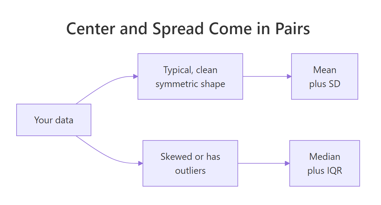
Figure 1: The mean pairs with the SD, the median pairs with the IQR. Your data's shape picks the pair.
median(), so you never compute it by hand.Try it: Start from the vector c(10, 12, 14, 16, 18), then make a copy where the last value is 180 instead of 18. Compare how the mean and median move.
Click to reveal solution
Explanation: One inflated value pushed the mean from 14 up to 46.4, while the median did not move at all. The median only tracks the middle position, so a change to an extreme value leaves it untouched.
Why does an outlier wreck the mean but not the median?
That difference is not a quirk of small toy vectors. It is the single most important reason to prefer one measure over the other, so it is worth seeing on data that looks like the real world. An outlier is a value that sits far away from the bulk of the data, and even one of them is enough to pull the mean well away from the bulk.
Imagine a small company with five employees. Here are their yearly salaries, and we compute the typical salary two ways.
With no extreme values, the mean (45,200) and median (45,000) tell the same honest story: a typical employee earns around 45,000. Either number would do.
Now the founder adds their own salary of 500,000 to the payroll. We append it and recompute.
The mean shot up to 121,000. Not a single employee earns anywhere near that, so the mean now describes nobody in the room. The median moved gently from 45,000 to 47,000 and still points at a real, typical salary. This is exactly why news reports use "median household income," not mean: one billionaire on the street should not redefine what typical means.
Statisticians measure this resistance with a breakdown point, the fraction of your data that can be corrupted before the summary becomes meaningless. The mean has a breakdown point of 0 percent, because one bad value is enough to send it anywhere. The median has a breakdown point of 50 percent, because you would need to corrupt half the data before the middle value moves off the good values.
Try it: A researcher records six reaction times in seconds: five are around 0.3, but one trial was a distracted 1.90. Compute the mean and median and see which one a reader should quote.
Click to reveal solution
Explanation: The mean (0.59) is nearly double a typical trial because the one slow response inflates it. The median (0.335) sits right among the normal trials, so it is the honest summary of a typical reaction time here.
What do the standard deviation and IQR measure?
Center is only half the story. Two datasets can share the same mean while one is tightly bunched and the other is wildly scattered, and spread is what tells them apart. Just as center came in two flavors, spread does too, and each flavor partners with one of the center measures.
The standard deviation answers a simple question: on average, how far is a value from the mean? Let's build the intuition by hand before trusting the function. We take a small vector, subtract the mean from each value to get its distance from center, then compare our by-hand feel to what sd() reports.
The deviations are how far each point falls from the mean of 5.5, some negative (below) and some positive (above). The standard deviation, 1.87, is essentially the typical size of those distances. A car's mileage or a person's height that is one SD from the mean is a fairly ordinary case; three SDs away is genuinely unusual.
If you like the formula, here it is. The standard deviation squares each distance so positives and negatives do not cancel, averages them, then takes a square root to return to the original units.
$$s = \sqrt{\frac{1}{n-1}\sum_{i=1}^{n}(x_i - \bar{x})^2}$$
Where:
- $s$ = the sample standard deviation
- $n$ = the number of values
- $x_i$ = the i-th value
- $\bar{x}$ = the mean of all the values
If the math is not your thing, skip it: the code above already showed that the SD is just the typical distance from the mean, and that intuition is all you need.
The IQR takes a completely different route. Instead of measuring distance from a center, it measures the width of the middle 50 percent of your data. It finds the value one quarter of the way up the sorted list (the 25th percentile, called Q1) and the value three quarters up (the 75th percentile, Q3), then reports the gap between them.
The quantile() call shows Q1 is 4.25 and Q3 is 6.75, so the middle half of the values lies inside that band. IQR() simply returns the width of that band, 6.75 minus 4.25, which is 2.5. Because it throws away the smallest and largest quarter of the data, extreme values in the tails cannot touch it.
var() gives you the average squared distance, in squared units, which is why we take its square root to get the SD back in the data's own units. Report the SD, not the variance, when you want a number a reader can interpret directly.Try it: Seven exam scores came in as c(55, 62, 68, 71, 74, 80, 88). Report both the standard deviation and the IQR of these scores.
Click to reveal solution
Explanation: The SD (10.99) is the typical distance of a score from the mean, and the IQR (12) is the width of the middle half of the scores. Both describe spread; they just measure it in different ways.
How do outliers and skew change SD vs IQR?
You already saw the mean crumble under an outlier while the median held firm. The exact same contest plays out between the SD and the IQR, and the result is just as lopsided. This is the reason the two pairs stay together: the fragile members (mean and SD) go together, and the sturdy members (median and IQR) go together.
Let's start with a clean sample of 30 values drawn around 50 with no outliers, then measure its spread both ways. The set.seed() line just makes the random draw identical every time you run it.
On clean data the two measures are in the same ballpark: an SD of 4.41 and an IQR of 5.75. Both are sensible descriptions of how tightly the values cluster.
Now we drop one absurd value, 200, into the same sample and measure again. Nothing else changes.
The SD shot up from 4.41 to 27.42, more than six times larger, because it squares the large distance of that one outlier from the mean. The IQR barely moved, edging from 5.75 to 6.00, because the middle 50 percent of the data is almost unchanged by a single value out in the tail. You can see the lonely outlier and the compact middle box if you draw a boxplot.
Run that block and the box you see is exactly the IQR, the middle half of the data, while the single dot far to the right is the outlier that wrecked the SD. The plot makes the whole story visible at a glance.
Try it: Take the clean vector c(20, 22, 24, 26, 28), then add a wild 300 to it. Compare how the SD and the IQR each respond.
Click to reveal solution
Explanation: The SD leapt from 3.16 to 112.71 under a single outlier, while the IQR moved only from 4 to 5. Whenever the SD dwarfs the IQR like this, you are looking at data with heavy tails or outliers.
Which pair should you use for your data?
You now know the trade-off. The mean and SD use every value, which makes them precise on clean, symmetric data but fragile when outliers or skew appear. The median and IQR ignore the extremes, which makes them steady on messy or lopsided data. So how do you decide? Start by checking the shape of your data, and the fastest shape check is already in your hands.
Compare the mean and the median. When they are close, the data is roughly symmetric and either pair works. When the mean is noticeably larger than the median, a long right tail is pulling the mean up, and you should lean on the median and IQR. The airquality dataset has an Ozone column that is famously right-skewed, so let's test it. It contains some missing values, so we add na.rm = TRUE to tell R to skip them. The |> at the end of the block is R's pipe operator: it takes the result on its left and passes it as the first argument to the function on its right, so x |> round(2) means exactly round(x, 2).
The mean (42.13) sits well above the median (31.50). That gap is the signature of right skew: a handful of very high ozone days stretch the mean upward while the median stays anchored in the bulk of ordinary days. For data shaped like this, the median and IQR are the honest summary. You can see the skew directly by plotting it.
Run that block and you will see the long tail of high-ozone days on the right, with the red mean line pulled toward that tail and the blue median line sitting closer to the peak where most days actually fall. The picture is the whole argument in one glance.
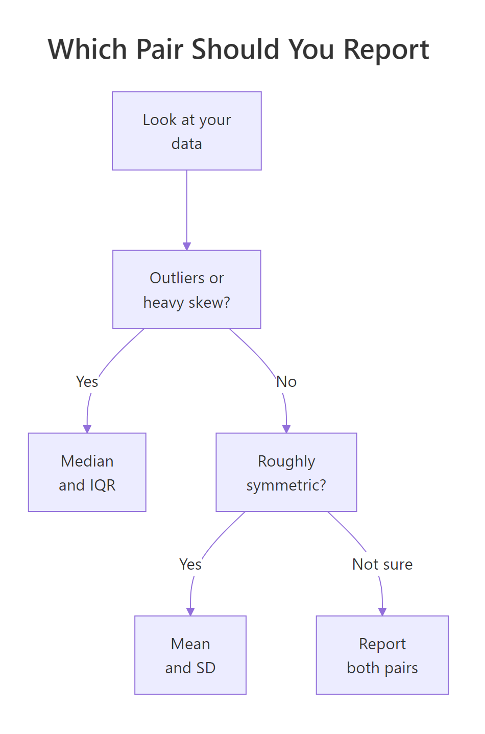
Figure 2: A quick rule for choosing which center and spread to report.
Here is the decision boiled down to a few rules you can apply to any column:
- Symmetric and clean? Use the mean and SD. They use all the information and feed directly into common tests and confidence intervals.
- Skewed, or has outliers? Use the median and IQR. They describe the typical case without being dragged around by extremes.
- Not sure? Report both pairs. If they agree, either is fine; if they disagree, the gap itself is telling you the data is skewed.
- Ranked or ordinal data (like satisfaction from 1 to 5)? The median is the sensible center, since the gaps between ranks are not true distances.
summary() on a numeric vector prints the minimum, Q1, median, mean, Q3, and maximum together, so you can eyeball the mean-versus-median gap and the quartiles at a glance before deciding which pair to report.Try it: The airquality dataset also has a Wind column. Compare its mean and median to judge whether wind speed is roughly symmetric.
Click to reveal solution
Explanation: The mean (9.96) and median (9.70) are very close, so wind speed is roughly symmetric. For a variable like this, the mean and SD are a perfectly good summary.
Complete Example: Summarizing a Real Dataset
Let's put the whole workflow together on the airquality dataset, treating two of its columns the way you would in a real analysis: check the shape first, then report the pair that fits. We already know Ozone is right-skewed, so let's contrast it with Temp.
Step one is the shape check. We compare each variable's mean and median. A small gap means symmetric; a large gap means skewed.
For Temp the mean (77.88) and median (79) are almost identical, so temperature is roughly symmetric. Combined with what we saw earlier, Ozone is skewed and Temp is not, so they call for different pairs.
Step two is to report the pair that suits each variable: mean and SD for the symmetric Temp, median and IQR for the skewed Ozone. We stack them into one small table with rbind() so they read cleanly.
Each row now carries the summary that describes its variable honestly. Temp is reported as a mean of 77.88 with an SD of 9.47, and Ozone as a median of 31.50 with an IQR of 45.25. Notice we would never mix them up: quoting a mean for the skewed ozone data would overstate a typical day.
Real analyses usually want these summaries broken out by group. The airquality data spans five months, so let's report the median and IQR of ozone for each month. This is the one place we use dplyr, whose group_by() and summarise() make grouped summaries readable.
The grouped table tells a clear story. Ozone runs highest in July and August (medians of 60 and 52) and those months are also the most variable (IQRs of 43.5 and 53.8). Because ozone is skewed, reporting the median and IQR per month is far more trustworthy than reporting a mean and SD that a few smoggy days could distort.
Practice Exercises
These combine several ideas from the tutorial. Try each one before opening the solution. The exercise code uses its own variable names so it will not clash with anything above.
Exercise 1: Report both pairs and pick the honest one
A sensor logs six pH readings that should all sit near 4.2, but one reading came back as a faulty 22.0. Given readings <- c(4.1, 4.3, 4.0, 4.2, 4.4, 22.0), compute the mean, SD, median, and IQR, then decide which pair honestly describes a typical reading.
Click to reveal solution
Explanation: The mean (7.17) and SD (7.27) are both wrecked by the faulty 22.0, suggesting a typical reading near 7 that never happened. The median (4.25) and IQR (0.25) correctly report that readings cluster tightly around 4.2. Here the median and IQR are the honest pair.
Exercise 2: Write a function that picks the pair for you
Write a function choose_summary() that decides automatically. Use Pearson's second skewness coefficient, 3 * (mean - median) / sd: if its absolute value is above 0.5, the data is skewed and the function should return the median and IQR; otherwise it should return the mean and SD. Test it on airquality$Ozone and airquality$Temp.
Click to reveal solution
Explanation: The function drops missing values, measures skew from the mean-median gap, and branches. Ozone's skew is about 0.97, above the threshold, so it returns the median and IQR; Temp's skew is about -0.35, so it returns the mean and SD. That matches the choices we made by hand.
Exercise 3: Robust spread by group
Using mtcars, report the median and IQR of mpg for each cylinder group (cyl), then sort so the most variable group is on top. Which cylinder count has the widest spread of mileage?
Click to reveal solution
Explanation: Four-cylinder cars have the widest spread of mileage (IQR of 7.6), while six- and eight-cylinder cars are far more consistent. The median mileage also falls as cylinders rise, from 26 down to 15.2, which matches the intuition that bigger engines drink more fuel.
Frequently Asked Questions
When should I use the mean instead of the median? Use the mean when your data is roughly symmetric and free of outliers, because it uses every value and feeds directly into common statistical tests. Switch to the median when the data is skewed or contains extreme values, since the mean gets dragged toward the tail and stops describing a typical case.
Why do the median and IQR go together? Both ignore the extreme values in the tails. The median is the middle of the sorted data, and the IQR is the width of the middle 50 percent, so neither is disturbed by an outlier. Pairing them gives you a center and a spread that tell a consistent, outlier-resistant story.
How can I tell if my data is skewed before choosing? Compare the mean and the median. If they are close, the data is roughly symmetric and the mean and SD are fine. If the mean is much larger than the median, a long right tail is pulling it up, so prefer the median and IQR. A quick histogram confirms the shape.
Is the standard deviation or the variance the right thing to report? Report the standard deviation. Variance is the SD squared, so it lives in squared units (squared dollars, squared degrees) that no reader can interpret. The SD is back in the data's own units, which makes it the readable choice.
What about the mode? The mode is the most frequent value, and it is the natural center for categorical data like favorite color or blood type. For continuous numeric data it is rarely used as the main summary, so this guide focuses on the mean and median.
Summary
Center and spread are two questions about every dataset, and each has a fragile answer and a robust answer. The table below is the whole guide in one view.
| Measure | What it answers | R function | Best when |
|---|---|---|---|
| Mean | Typical value (balance point) | mean() |
Symmetric, clean data |
| Median | Typical value (middle rank) | median() |
Skewed data or outliers |
| Standard deviation | Typical distance from the mean | sd() |
Symmetric, clean data |
| IQR | Width of the middle 50 percent | IQR() |
Skewed data or outliers |
The mean and SD travel together, and the median and IQR travel together. Pick the pair by the shape of your data: symmetric and clean calls for the mean and SD, while skew or outliers call for the median and IQR. When in doubt, report both and let the gap between them tell you how skewed your data really is.
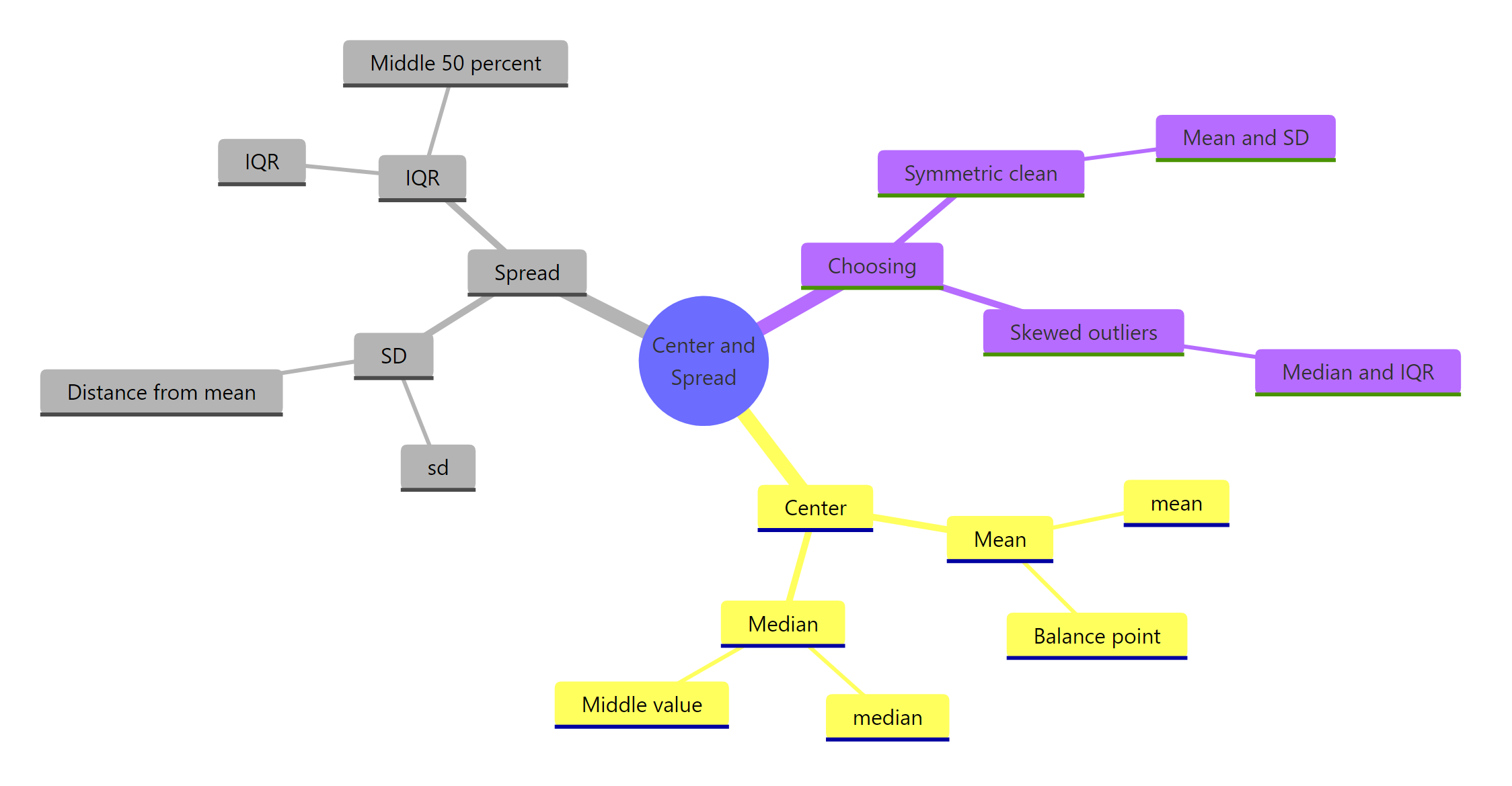
Figure 3: The four measures with their R functions and the situation each one fits.
References
- R Core Team. An Introduction to R, Section on summaries and simple statistics. Link
- R Documentation.
sd(),IQR(), andquantile()reference pages, stats package. Link - Wickham, H. and Grolemund, G. R for Data Science, Chapter on Exploratory Data Analysis. Link
- Tukey, J. W. Exploratory Data Analysis. Addison-Wesley (1977). The origin of the boxplot and the five-number summary.
- NIST/SEMATECH. e-Handbook of Statistical Methods, Measures of location and scale. Link
- dplyr documentation.
summarise()reference. Link
Continue Learning
- Descriptive Statistics in R - a broader tour of summary functions that build on the mean, median, SD, and IQR you just learned.
- Outlier Detection in R - how to find the extreme values that push you toward the median and IQR in the first place.
- Populations, Samples and Sampling Bias in R - why the sample you summarize has to represent the population you care about.