Types of Data in Statistics: Categorical to Continuous
The types of data in statistics fall into two families: categorical data (labels like colors or blood groups) and numerical data (counts and measurements). Knowing which type a variable is tells you which summaries and charts are valid, and which ones would be nonsense.
Every dataset you will ever analyze is a grid of variables, and each variable is one of a handful of types. Get the type right and the correct average and chart almost pick themselves. Get it wrong and you can compute a number that looks fine but means nothing, like the "average" of a column of city names. This lesson teaches every data type from scratch with tiny examples you can run as you read. We use plain base R throughout, so there is nothing to install.
Why does the type of data matter?
The type of a variable is the first thing a statistician checks, before any analysis. It decides what you are allowed to do with the numbers. A quick way to feel this is to build a small dataset with a mix of columns and look at what each one holds.
Let's create a five-person survey. Each row is a person, and the columns record a name and gender, a satisfaction rating, plus an age and a weight in kilograms. Run the block to see the table.
That printed the whole data frame, five rows by five columns. The columns clearly are not all the same kind of thing. name and gender are labels, age and weight_kg are amounts, and satisfaction is a ranking. R assigned a storage type to each column automatically, and you can ask it what those types are with str(), which prints the structure of an object.
Reading that output top to bottom, chr means character, R's word for text labels, and num means numeric, R's word for measured amounts. So name, gender, and satisfaction are stored as text, while age and weight_kg are stored as numbers. This split between "labels" and "amounts" is the whole idea behind data types.
Now watch why the split matters in practice. Asking for the average age is sensible. Asking for the average gender is not, because you cannot add and divide labels. The right summary for a label column is a count of how often each label appears, which table() gives you.
The first line averaged the five ages and returned 36.4, a real number you can act on. The second line counted the labels and told you there are 3 people recorded as F and 2 as M. If you instead tried mean(survey$gender), R would return NA and warn you that the argument is not numeric, because averaging text is meaningless. The column's type decided which summary was allowed.
Try it: The satisfaction column is another set of labels. Summarize it the right way by counting how many people gave each rating.
Click to reveal solution
Explanation: table() counts each distinct label. Two people said High and two said Medium, while one said Low. That count is the correct summary for a label column, where a mean would be undefined.
What are the two big families: categorical and numerical data?
Every variable belongs to one of two families, and telling them apart is the single most useful skill in this whole lesson. Categorical data records which group something belongs to, using labels. Numerical data records how much or how many, using numbers you can do arithmetic on.
A good test is to ask: "Does it make sense to average two values?" If yes, the variable is numerical. If no, it is categorical. Eye color cannot be averaged, so it is categorical. Height can, so it is numerical.
Let's summarize one variable of each family. First a categorical one, a vector of favorite colors. The natural summary is a count of each label with table().
The output lists every distinct color and how many times it appeared: blue twice, green once, red three times. There is no "average color", and R would not let you compute one. Counts are the whole story for a categorical variable.
Now a numerical one, a vector of heights in centimeters. Here arithmetic is meaningful, so we can ask for a full numeric summary with summary() and the average with mean().
The summary() output gives you the smallest value (158), the largest (182), the middle value or median (171.5), and the average or mean (170.2), plus the two quartiles in between. Every one of those is a real quantity because heights are amounts you can order and average. That is exactly what "numerical" buys you.
Each family then splits once more, giving four everyday subtypes in total. The diagram below is the map for the rest of the lesson.
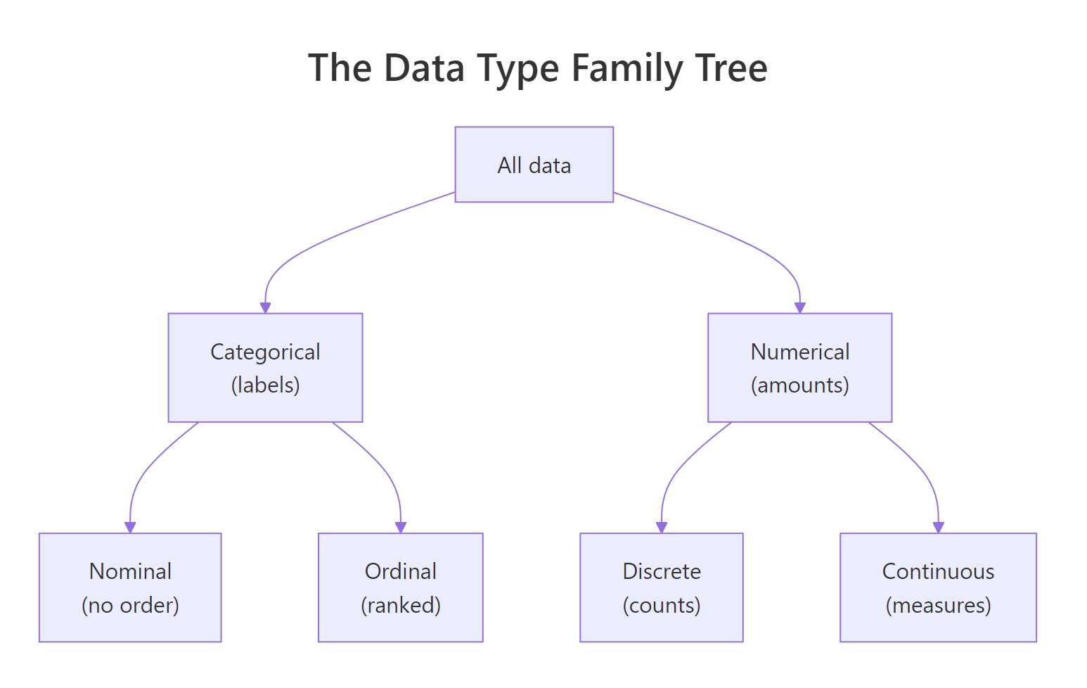
Figure 1: The two families of data split into four everyday subtypes.
Try it: You have recorded the pet each household owns. Decide which family this variable belongs to, then summarize it correctly.
Click to reveal solution
Explanation: Pets are labels, so the variable is categorical and counts are the right summary. Three households have a cat and two a dog, while one keeps a fish.
What are nominal and ordinal data?
Categorical data comes in two flavors, and the difference is simply whether the labels have a natural order. Nominal data has no order at all: red is not "more" than blue, and blood type A is not "higher" than B. Ordinal data does have an order: Low, Medium, and High clearly climb a ladder even though you cannot say by how much.
R has a dedicated type for categorical data called a factor. A factor stores the labels plus the official list of allowed values, called its levels. Let's turn a vector of blood types into a factor. Blood type has no order, so this is nominal.
Printing blood shows the six values, and the second line reports the levels: A, AB, B, O. Notice R sorted the levels alphabetically. That order is just for display; it carries no meaning, because blood type is nominal. levels() returns that list of allowed categories on its own.
Ordinal data is a factor too, but you tell R the correct order with levels = and mark it as ordered. Once you do, R knows that Low comes before Medium, which comes before High, and it will let you make comparisons.
Look at the Levels line: Low < Medium < High. The < signs show R now understands the ranking. Because of that, satis > "Low" works and returns TRUE for every rating above Low, which is everything except the single Low value. A plain nominal factor would refuse that comparison.
Ordering also makes one more summary possible: the median, the middle category. You cannot average ordinal labels, but you can rank them. Under the hood each level has an integer code (Low is 1, Medium is 2, High is 3), and median() of those codes points at the middle rank.
as.integer() revealed the hidden codes: the five ratings map to 3, 1, 2, 3, 2. Their median is 2, which is the code for Medium. So the typical satisfaction rating is Medium. That is the strongest summary ordinal data supports.
Try it: T-shirt sizes have a clear order: Small, Medium, Large. Build an ordered factor from c("M", "S", "L", "M", "S") with the levels in the correct order, then reveal its integer codes.
Click to reveal solution
Explanation: Setting levels = c("S", "M", "L") fixes the ranking, so S is coded 1, M is 2, then L is 3. The printed S < M < L confirms R stored the order you meant.
What are discrete and continuous data?
Numerical data also splits in two, and the question this time is whether the values are counted or measured. Discrete data is counted, so it lands on whole numbers with nothing in between: you can have 2 children but never 2.5. Continuous data is measured, so it can take any value in a range, limited only by how finely your instrument reads: a weight might be 61.0 kg, or 61.03 kg, or finer still.
R even stores these differently. Whole-number counts can be held as the integer type, and measured amounts as the double type (short for double-precision decimal). Let's start with a discrete count: the number of children in five households. Adding an L after a number tells R to store it as an integer.
typeof() confirms the values are stored as integer, and is.integer() agrees with TRUE. Summing them gives 8 children across the five homes. A count like this can only ever be a whole number, which is the signature of discrete data.
Now a continuous measurement: the weights we saw earlier. These are stored as double because they carry decimals, and any value in between two readings is possible.
typeof() reports double, R's decimal number type, and range() returns the smallest and largest weights, 55.9 and 82.5. Between those two numbers lies an unbroken scale: 60.1, 60.15, 60.152, and so on are all legal weights. That unbroken scale is what makes the variable continuous.
Try it: The number of emails you receive in a day is a count. Store c(3L, 0L, 5L, 2L, 4L), confirm R holds it as an integer, then total the emails.
Click to reveal solution
Explanation: The L suffix stores each value as an integer, so typeof() reports integer. The five days add up to 14 emails, a whole-number total that fits discrete data.
How do the four levels of measurement (NOIR) fit together?
You will often meet a second naming system called the levels of measurement, or scales of measurement. It splits data into four levels, remembered by the initials NOIR: nominal, ordinal, interval, ratio. It is not a competing idea; it is a finer view of the same families you already know.
Nominal and ordinal are exactly the categorical subtypes from before. The new part is that numerical data splits into interval and ratio, and the difference is one subtle property: whether zero means "none". Each level adds one property to the level below it, as the ladder shows.

Figure 2: Each rung of the NOIR ladder adds one property to the one below it.
Interval data has equal, meaningful gaps but no true zero. Temperature in Celsius is the classic case. The gap from 10 to 20 degrees is the same size as the gap from 30 to 40, so differences are trustworthy. But 0 degrees Celsius does not mean "no temperature", it is just the freezing point of water, so ratios break down. Watch what goes wrong.
diff() reports the gaps between consecutive readings (10 then 20 degrees) and those gaps are perfectly meaningful. But the last line divides 40 by 10 to get 4, which tempts you to say "40 degrees is four times as hot as 10 degrees". That claim is false, because the zero point is arbitrary. The ratio is a number R will compute, yet it means nothing.
Ratio data fixes this by having a true zero, where zero genuinely means "none of the quantity". Weight, height, age, as well as counts, are all ratio data. Temperature in Kelvin is ratio too, because 0 Kelvin is absolute zero, the point of no heat at all. Convert the same temperatures to Kelvin and the ratio suddenly becomes honest.
Now dividing the hottest reading by the coolest gives about 1.11, and because Kelvin has a real zero, that ratio is legitimate: the object truly has about 11 percent more thermal energy. The only thing that changed was the zero point, and that is the entire distinction between interval and ratio.
Try it: Calendar years, like 1990 and 2000, are interval data: gaps between years are meaningful, but year zero is a convention, not "no time". Using c(1990, 2000, 2010), show that the gaps are sensible while the ratio of two years is not.
Click to reveal solution
Explanation: The gaps are a clean 10 years each, which is valid interval information. The ratio 2010 divided by 1990 is about 1.01, but it is meaningless because year zero is arbitrary, so no one is "1 percent older than the year 1990".
How does data type decide your summaries, charts, and tests?
This is where all the theory pays off. Once you name a variable's type, the right summary, the right chart, and often the right test follow almost automatically. The table below is a cheat sheet you can return to.
| Data type | Typical summary | Typical chart | A common test |
|---|---|---|---|
| Nominal | Counts, proportions, mode | Bar chart | Chi-squared test |
| Ordinal | Median, counts by rank | Bar chart | Rank-based test |
| Discrete | Counts, mean | Bar chart or histogram | Poisson-style models |
| Continuous | Mean, standard deviation | Histogram | t-test |
Let's put the first row to work. For a categorical variable you count the labels and draw a bar chart, where each bar's height is a count. We already have the blood factor, so we can summarize and chart it in one go.
table() produced the counts (two A, one AB, one B, two O), and barplot() drew one bar per blood type with heights matching those counts. A bar chart is the honest picture for categorical data because it shows separate, unrelated groups rather than a continuous flow.
Continuous data calls for different tools: the mean with a measure of spread, and a histogram rather than a bar chart. Let's generate 200 body-mass-index values and look at them. The set.seed() line just makes the random draw reproducible so you get the same numbers shown here.
summary() shows the values center near 24 (both the median and mean sit just under it) and spread from about 17.6 to 30.4. hist() then slices that range into bins and draws how many values land in each, revealing the familiar bell shape. A histogram works here precisely because the data is continuous and neighboring values belong together.
The decision path below folds this whole section into one glance.
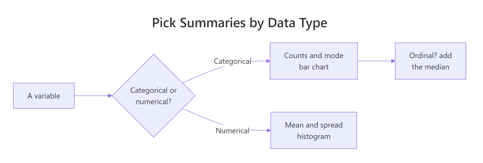
Figure 3: A quick decision path from a variable's type to its summary and chart.
Try it: You recorded exam grades as c("A", "B", "A", "C", "B", "A"). Grades are categorical, so count them and draw the matching chart.
Click to reveal solution
Explanation: The counts are three A grades, two B, and one C, and barplot() gives the correct chart for categorical data. A histogram would be wrong here because grades are separate groups, not points on a measured scale.
What are the most common data-type mistakes?
Most data-type bugs come from one trap: a column that is stored as numbers but is really categorical. R cannot tell the difference on its own, so it will average any numeric column, even when the average is gibberish. Learning to spot this is what separates a careful analyst from a careless one.
The classic example is a postal code. A zip code like 60614 is a label for a place, not an amount, even though it is written with digits. Averaging zip codes produces a number that points nowhere.
The "average zip code" is 56333, a code that may not even exist and certainly is not a meaningful middle of these four places. The fix is to treat the column as categorical by wrapping it in factor(), after which table() gives the sensible summary: zip 60614 appears twice, the others once each. The digits look numeric, but the data is nominal.
The same trap hits survey scales stored as numbers. A Likert scale is often coded 1 to 5 for storage, but those codes stand for ordered labels like "Strongly disagree" up to "Strongly agree". Turning the codes back into a labeled, ordered factor makes the meaning explicit and blocks accidental averaging.
The labels = argument mapped each code to its meaning, so 1 became "Strongly disagree" and 5 became "Strongly agree", and ordered = TRUE kept the ranking. Now the values read as what they actually are, and anyone reading your code sees ordered opinions rather than bare numbers to be averaged.
Try it: Customer ID numbers c(101, 102, 101, 103, 102, 101) look numeric but identify people, so they are categorical. Summarize them the right way instead of averaging.
Click to reveal solution
Explanation: Treated as categories, the IDs tell a clear story: customer 101 appears three times, 102 twice, then 103 once. Averaging them would have produced a fake "typical ID" that identifies no one.
Complete Example
Let's tie every idea together on a real dataset. R ships with mtcars, a table of 32 cars. We will pick four columns, work out the type of each, and then summarize each one correctly. First, look at how R stored them.
R stored all four as num, but their real types differ. mpg (miles per gallon) is genuinely continuous ratio data. cyl (cylinders) is a discrete count with only three possible values, so we treat it as categorical. am is nominal: 0 means automatic and 1 means manual, so those numbers are just codes. gear is an ordered count, effectively ordinal. Knowing this, we summarize each by its true type.
For mpg, continuous data, the mean of 20.1 miles per gallon is a fair summary. For am, nominal data, we counted the two labeled groups: 19 automatics and 13 manuals. For gear, an ordered count, the table shows most cars have 3 or 4 gears and only 5 cars have 5. Each summary respects the column's real type rather than the num label R happened to give it.
am and gear as numbers, but they are categorical. You, not R, decide the statistical type based on what the values mean.Practice Exercises
These combine several ideas from the lesson. Try each before opening the solution. The variables use my_ and ratings names so they will not clash with the tutorial's objects.
Exercise 1: Build and summarize an ordered rating
Customer reviews come in as c("Good", "Poor", "Excellent", "Good", "Poor", "Excellent", "Good") on the scale Poor, Fair, Good, Excellent. Build an ordered factor with all four levels (even though no one chose Fair), count the reviews, and find the median rating's code.
Click to reveal solution
Explanation: Declaring all four levels keeps Fair in the summary with a count of 0, which is honest reporting. The median code is 3, which maps to Good, so the typical review is Good.
Exercise 2: Treat stored numbers as the categories they are
In mtcars, both cyl (cylinders) and gear are stored as numbers but are really categories. Produce a count table for each, treating them as ordered categories, and read off which value is most common.
Click to reveal solution
Explanation: As categories, the columns tell a clear story: 8-cylinder cars are the most common (14 of 32), and 3-gear cars are the most common (15 of 32). A mean of these codes would have been far less informative than the counts.
Exercise 3: Catch a numeric-looking category
A colleague hands you zip codes stored as numbers: c(90210, 10001, 90210, 60614, 10001, 90210). Show why averaging them is wrong by computing the mean, then produce the correct summary by treating them as categories.
Click to reveal solution
Explanation: The mean of 58541 is a zip code that identifies nowhere useful, which flags the mistake. The count table is the right summary: 90210 shows up three times, 10001 twice, then 60614 once.
Frequently Asked Questions
Is a variable's type a property of the data or a choice I make? Both. R assigns a storage type (character, integer, double) automatically, but the statistical type depends on what the values mean. You decide that a column of 0s and 1s is nominal, or that codes 1 to 5 are ordinal, because R cannot know your intent.
What is the difference between discrete and continuous data again? Discrete data is counted and lands on separate whole numbers, like the number of children. Continuous data is measured and can take any value in a range, like weight or height. If halves and quarters of a unit make sense, the variable is continuous.
Are interval and ratio data just numerical data? Yes. Interval and ratio are the two levels of numerical data in the NOIR system. The only difference between them is the true zero: ratio data has one (so "twice as much" is meaningful) and interval data does not.
Can I always take the mean of numbers? No. You can take the mean only when the numbers are genuine amounts. Zip codes, phone numbers, and ID numbers are labels stored as digits, so their average is meaningless even though R will compute it.
Why turn a column into a factor? A factor tells R that a column is categorical, records its allowed levels, and (when ordered) its ranking. That protects you from accidental arithmetic and makes summaries like counts and medians behave correctly. See the deeper guide on factors in R.
Summary
Here is the whole lesson on one screen. The mindmap recaps the types and how R stores each.
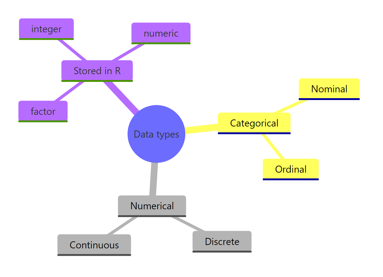
Figure 4: The full map of data types and how R stores each one.
The key takeaways:
- Two families. Categorical data is labels you count; numerical data is amounts you can average.
- Categorical splits into nominal and ordinal. Nominal has no order (blood type); ordinal has a ranking (Low, Medium, High). Store both as a
factor, usingordered = TRUEfor ordinal. - Numerical splits into discrete and continuous. Discrete is counted whole numbers (
integer); continuous is measured on an unbroken scale (double). - NOIR is the same map, refined. Nominal and ordinal are the categorical subtypes; interval and ratio split numerical data by whether zero means "none".
- Type drives the summary. Counts and bar charts for categorical, the mean and histograms for continuous, the median for ordinal.
- Watch for numbers that are really labels. Zip codes and ID numbers are categorical, so wrap them in
factor()before summarizing.
Get the type right first, and every later choice about summaries, charts, and tests becomes almost automatic.
References
- R Core Team. An Introduction to R, section on factors. Link
- R Documentation.
factor()function reference. Link - R Documentation.
typeof()function reference. Link - Wickham, H., Cetinkaya-Rundel, M., and Grolemund, G. R for Data Science, 2nd Edition, Factors chapter. Link
- Wikipedia. Level of measurement (nominal, ordinal, interval, ratio). Link
- forcats package (tidyverse). Tools for working with categorical variables (factors). Link
Continue Learning
- What Statistics Is For: Questions, Evidence, Decisions - the big picture of why we analyze data at all, and the perfect companion to knowing your data types.
- Descriptive Statistics in R - now that you can name a variable's type, learn the summaries that suit each one.
- Factors in R - a deeper look at the factor, R's dedicated tool for categorical and ordinal data.