GLM Diagnostics in R Beyond Gaussian Models
GLM diagnostics are the checks that confirm a generalized linear model, like Poisson or logistic regression, actually fits your data. They work differently from linear-regression diagnostics because the ordinary residual plots you trust for lm() will mislead you for a GLM. This tutorial shows you which residuals to use, how to catch overdispersion, and how to build the one residual that behaves the same way for every model family. Everything uses base R plus MASS, and every code block runs right here in your browser.
Why do the residual plots from linear regression mislead you for a GLM?
When you fit a linear model, you learned a reflex: plot the residuals against the fitted values and panic if you see a pattern. That reflex backfires for a GLM. Below we simulate a count process where we know the true model exactly. Then we fit that exact model and look at its residuals. If patterns meant trouble, this plot should be clean. Watch what happens.
The estimated intercept and slope come back as 0.5 and 0.7, the exact numbers we simulated from. This model is not just good, it is perfect. And still the residual plot shows curved diagonal bands sweeping across the picture.
Two things cause those bands, and neither is a real problem. First, the response is a whole number (0, 1, 2, 3, ...), so for any given fitted mean the residuals can only take a few discrete values, which line up into stripes. Second, in a GLM the spread of the response changes with the mean on purpose. A Poisson count with a mean of 2 varies less than a count with a mean of 40. So the residuals naturally get bigger as the fitted value grows, producing that fanning shape.
That is what "beyond Gaussian" means in practice. The rest of this tutorial gives you the right tools: the residual types a GLM actually offers, a number that tells you when a count model is misbehaving, the one residual that looks Normal for any family, and how to spot a single row bending your fit.
Try it: A count model is behaving well when its dispersion statistic sits near 1.0. The dispersion statistic is the sum of squared Pearson residuals divided by the residual degrees of freedom (both explained in the next two sections). Compute it for m_pois and confirm it is close to 1.
Click to reveal solution
Explanation: The value 0.971 is essentially 1, which is exactly what a correct Poisson model should produce. You now have your first honest GLM diagnostic, and it confirms what the coefficient recovery already told us: this model fits.
Which residual types does a GLM give you, and which should you use?
A residual is the gap between what you observed and what the model predicted. Linear regression has one obvious way to measure that gap. A GLM gives you several, because the raw gap is not on a stable scale. Let us line up the three that residuals() produces and see how they differ.
The type argument picks the flavor. The "response" type is the plain gap, observed minus fitted mean. The "pearson" type divides that gap by the model's own standard deviation for each point, putting every residual on a comparable scale. The "deviance" type instead measures how much each point adds to the model's total lack of fit, and it is the default you get from residuals().
Look at row 5. The response residual is a large 4.214, which looks alarming until you realize that point simply has a big fitted mean, so a gap of 4 is ordinary there. The Pearson and deviance residuals rescale it to about 2.5 and 2.1, numbers you can actually compare against the other rows. That rescaling is the whole point of Pearson and deviance residuals.
The Pearson residual has a clean formula. It is the gap divided by the square root of the model's variance function:
$$r^{P}_i = \frac{y_i - \hat{\mu}_i}{\sqrt{V(\hat{\mu}_i)}}$$
Where:
- $y_i$ = the observed value for row $i$
- $\hat{\mu}_i$ = the fitted mean the model predicts for row $i$
- $V(\hat{\mu}_i)$ = the model's variance function (for Poisson this is just $\hat{\mu}_i$, since a Poisson's variance equals its mean)
To see why the raw response residual is untrustworthy, measure its spread in the bottom half versus the top half of the fitted values. If the raw residuals were on a stable scale, the two numbers would match.
The raw residuals are 50% more spread out in the high-fitted half than in the low half. That growing spread is the mean-variance link again, and it is why a raw-residual plot looks like a funnel even for a perfect model. Pearson and deviance residuals divide that growth back out.

Figure 1: Each residual type standardizes the one before it, ending in the quantile residual, the only one that is Normal for any GLM family.
plot(model) on a GLM, R draws standardized deviance residuals, which are deviance residuals further divided by their leverage-adjusted standard error. You can get them directly with rstandard(model). They are a small refinement on the deviance residuals shown above, not a different animal.Try it: Pearson residuals should have roughly constant spread across the fitted range, unlike the raw ones. Reuse the grp grouping and confirm the two spreads are both close to 1.
Click to reveal solution
Explanation: Both halves now sit near 1.0, so the funnel is gone. Pearson residuals have a stable spread because dividing by the model's standard deviation cancels out the mean-variance link. That is why you compare Pearson (or deviance) residuals, never raw ones, when you eyeball a GLM.
How do you check a count model for overdispersion?
Here is the single most common thing that goes wrong with a count model. A Poisson distribution has one strict rule: its variance equals its mean. Real count data usually varies more than that. Extra variation between observations, clustering, or a missing predictor all inflate the spread beyond what Poisson allows. That excess spread is called overdispersion, and if you ignore it your standard errors come out too small and ordinary predictors look wildly significant when they are not.
You measure it with the dispersion statistic, the average squared Pearson residual:
$$\hat{\phi} = \frac{1}{n - p}\sum_{i=1}^{n} \frac{(y_i - \hat{\mu}_i)^2}{V(\hat{\mu}_i)}$$
Where $n - p$ is the residual degrees of freedom (sample size minus the number of estimated coefficients). For a well-behaved Poisson model $\hat{\phi}$ sits near 1. A value well above 1 signals overdispersion. Let us fit a real count model, warpbreaks, which records the number of warp breaks on looms under different wool types and tensions.
A dispersion of 4.26 is a red flag. The data varies more than four times as much as a Poisson model assumes. The coefficients themselves are still roughly right, but every standard error, z-value, and p-value from this model is untrustworthy because they all assume the spread is four times smaller than it actually is.
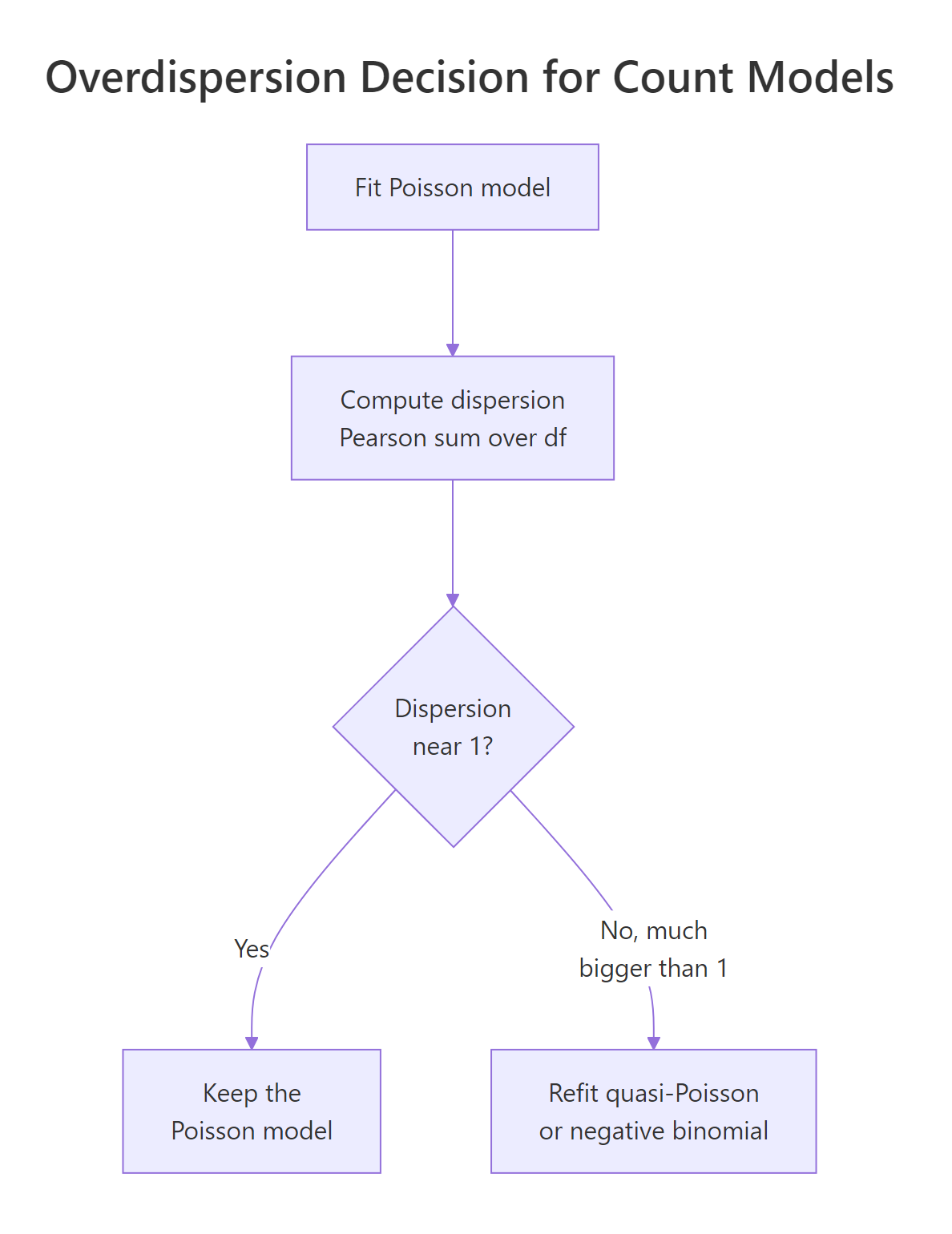
Figure 2: The overdispersion decision: measure dispersion, keep Poisson if it is near 1, otherwise switch model.
The clean fix is a model that lets the variance grow faster than the mean. The negative binomial does exactly that: it adds a spare parameter that soaks up the extra spread. Refit with glm.nb() from the MASS package and compare the standard errors side by side.
The negative binomial standard errors are roughly twice as large. That is the overdispersion the Poisson model understated. Under Poisson, tensionH looks extremely precise with a standard error of 0.064; the honest number is 0.124. Same estimate, very different confidence.
Try it: A quicker fix than the negative binomial is the quasi-Poisson family, which keeps the Poisson estimates but multiplies the standard errors by the estimated dispersion. Fit it and read the dispersion straight from the summary.
Click to reveal solution
Explanation: The quasi-Poisson dispersion, 4.262, is exactly the statistic we computed by hand earlier. Quasi-Poisson is the fastest way to correct standard errors for overdispersion. The negative binomial goes further by giving you a full probability model you can predict and simulate from, which is why it is usually the better choice.
What are randomized quantile residuals, and why do they fix GLM diagnostics?
The residuals we have seen still carry the discreteness stripes from the very first plot. There is one residual that erases them completely, and once you meet it you will reach for it every time. It is the randomized quantile residual, from Dunn and Smyth (1996), and it is the engine behind modern diagnostic packages.
The idea is a two-step transform. First, feed each observation through the model's own fitted cumulative distribution. If the model is correct, those probabilities are spread evenly between 0 and 1, no matter whether the response was a count, a 0/1 outcome, or anything else. For a discrete response we spread each point randomly across the little probability step it lands on, which is the "randomized" part. Second, push those uniform values through the Normal quantile function so a correct model produces textbook Normal residuals.
$$u_i \sim \text{Uniform}\big(F(y_i - 1),\; F(y_i)\big), \qquad r^{Q}_i = \Phi^{-1}(u_i)$$
Where $F$ is the fitted CDF of the response (for a Poisson, ppois at the fitted mean), and $\Phi^{-1}$ is the Normal quantile function (qnorm). Let us build it by hand for our known-correct Poisson model from the first section and check it with a Normal quantile plot.
The points fall along the reference line and the Shapiro-Wilk p-value of 0.675 gives no reason to doubt normality. Compare that with the ugly striped plot we started with, from the exact same model. The quantile residuals remove the discreteness and show that the fit is correct. This is why they are the gold standard for anything beyond Gaussian.
statmod package computes them with qresiduals(), and the popular DHARMa package builds simulation-based versions plus formal tests for overdispersion and zero-inflation. Building them by hand once, as we just did, is the fastest way to understand what those packages are doing under the hood.Try it: For a correct model, quantile residuals behave like standard Normal draws, so about 5% should fall outside the plus-or-minus 1.96 band. Check that on q_res.
Click to reveal solution
Explanation: About 3.5% of the residuals land outside the band, close to the 5% you expect from a standard Normal. If this fraction were much larger, say 20% or 30%, it would be strong evidence that the model is wrong. We use exactly that idea to expose a bad model in the practice exercises.
How do you diagnose a logistic regression with only 0/1 outcomes?
Logistic regression pushes the discreteness problem to its extreme. The response is only ever 0 or 1, so for any fitted probability the residual can take just two values. Plot them and you get two useless curves, one for the zeros and one for the ones. Let us see it on birthwt, a study of low-birthweight births, where we model the chance of a low-weight baby from the mother's age and pre-pregnancy weight, plus whether she smoked or had hypertension.
Every point sits on one of two smooth curves. Nothing about an individual residual tells you whether the model fits, because a single 0/1 outcome carries almost no information on its own. The fix is to stop looking at individual points and look at groups. Sort the observations by their fitted probability, cut them into bins, and average the raw residual inside each bin. If the model is calibrated, those bin averages hover around zero.
Now you can read the fit. Every bin average is small, within about 0.07 of zero, and no run of consecutive bins shares the same sign. That is what a calibrated logistic model looks like: in each slice of predicted risk, the model is neither systematically too high nor too low.
binnedplot() function in the arm package draws this automatically with confidence bounds, but the hand-built version above shows exactly what it computes: predicted risk versus observed rate, slice by slice.Try it: A binned residual near zero means predicted risk matches observed rate in that bin. Confirm it directly by averaging the fitted probability and the actual low outcome within each bin.
Click to reveal solution
Explanation: The predicted and observed rows track each other closely across all five bins, which is the same information the binned residuals gave you: the model is well calibrated. The bin average residual is simply observed rate minus predicted rate, which is why the two views agree.
How do you find influential and high-leverage points in a GLM?
A model can pass every residual check and still be quietly steered by one or two rows. Two quantities catch that. Leverage measures how unusual a point's predictor values are, and Cook's distance measures how much the whole fit would move if you deleted that point. Both work for GLMs just as they do for linear models, through hatvalues() and cooks.distance(). Let us rank the warpbreaks negative binomial rows by influence.
Row 5 has the largest Cook's distance at about 0.11. There is no magic threshold, but a common rule of thumb flags any point above 4 divided by the sample size. The values here are modest and no single row dominates, which is reassuring. If one point were an order of magnitude larger than the rest, you would refit without it and see whether your conclusions held.
Leverage has its own rule of thumb: watch points above two times the number of coefficients divided by the sample size. Compare that threshold with the largest leverage in the data.
The highest leverage, 0.076, sits comfortably below the 0.148 threshold, so no point has an unusual combination of predictor values. That makes sense here because the predictors are just wool type and tension, a small tidy grid with no extreme rows.
Try it: Count how many warpbreaks rows exceed the common Cook's distance rule of thumb, 4 divided by the sample size.
Click to reveal solution
Explanation: Four rows clear the rule of thumb. That is normal for a threshold this loose, and none of them was extreme in the ranking above. You would glance at those four rows, confirm they are genuine looms and not data-entry errors, and move on.
Complete Example: A Full GLM Diagnostic Workflow
Let us put every step together on a fresh dataset. quine records days of school absence for Australian schoolchildren, broken down by ethnicity and sex, plus age group and learning speed. Absence counts are exactly the kind of data that overdisperses, so it is a realistic test. We follow one fixed order: fit, check the shape with quantile residuals, check the spread with dispersion, check individual points with Cook's distance, then refit if needed.

Figure 3: The order to run GLM checks: shape first, then spread, then individual points.
Start with a Poisson fit and its dispersion statistic.
A dispersion of 13 is severe overdispersion, far worse than the warpbreaks case. This Poisson model's standard errors are hopelessly optimistic. Refit as a negative binomial and let the AIC, a fit score where lower is better, confirm the upgrade.
The AIC drops from 2299 to 1109, an enormous improvement. The negative binomial is unambiguously the right model here. Now check its shape with quantile residuals, using pnbinom as the fitted CDF and the estimated theta as the size parameter.
The points track the reference line, so the negative binomial captures the spread that Poisson missed. Finish by checking whether any single school is steering the fit.
Row 72 stands out a little but nothing is extreme, so we keep the full data. That is the whole workflow: we caught the overdispersion, fixed it with a negative binomial, confirmed the shape with quantile residuals, and cleared the influence check. A one-line summary of the model is now safe to report.
Practice Exercises
These combine several ideas from the tutorial. Each starter block runs as-is so you can iterate; the solutions include the output to check against. Use the distinct variable names shown so your exercise code does not overwrite the models above.
Exercise 1: Decide whether a Poisson model is adequate
Not every count is overdispersed. Using mtcars, fit a Poisson model for carb (the number of carburetors) on hp and wt, then compute the dispersion statistic and decide whether Poisson is a reasonable choice.
Click to reveal solution
Explanation: The dispersion is 0.46, which is below 1. This is underdispersion, the opposite problem: the counts vary less than Poisson expects. Underdispersion makes Poisson standard errors slightly conservative (too wide), which is far less dangerous than overdispersion. For a quick analysis, plain Poisson is perfectly acceptable here. The lesson: always check dispersion, but the direction and severity decide whether you must act.
Exercise 2: Use quantile residuals to expose a bad model
Earlier, quantile residuals confirmed a good model. Now use them to catch a bad one. Build randomized quantile residuals for the overdispersed warpbreaks Poisson model m_wb, then compute the fraction that fall outside the plus-or-minus 1.96 band. For a correct model this is about 0.05; a much larger fraction is a smoking gun.
Click to reveal solution
Explanation: A full 37% of the residuals fall outside the band, seven times the 5% a correct model would produce. Because the Poisson model badly understates the true spread, the fitted CDF is too narrow, pushing the probability values toward 0 and 1 and the quantile residuals into extreme tails. This is exactly the overdispersion the dispersion statistic flagged, now visible in the residuals themselves.
Exercise 3: Measure how much one point moves the fit
Cook's distance told you which point is most influential in the quine negative binomial model, but not how much it matters. Find the single row with the largest Cook's distance, refit the model without it, and compare the coefficients with and without that row.
Click to reveal solution
Explanation: Dropping one child leaves the big effects stable (ethnicity stays near -0.6) but noticeably moves the smaller age and sex terms, for example SexM from 0.082 down to 0.005. Because no coefficient flips sign or changes conclusion, the model is robust to this single point and you would keep the full data. Refitting without an influential point, and checking whether your story survives, is the honest way to use Cook's distance.
Summary
GLM diagnostics rest on one idea: because a GLM's spread changes with its mean and the response is often discrete, the residual tools from linear regression mislead you, so you need residuals and checks built for non-Gaussian data.
| Question | Tool | Rule of thumb |
|---|---|---|
| Which residual to eyeball? | Pearson or deviance, never raw | Stable spread across fitted values |
| Is a count model overdispersed? | Dispersion statistic (Pearson sum / df) | Near 1 is fine; well above 1 needs a fix |
| How to fix overdispersion? | Quasi-Poisson or negative binomial | Negative binomial gives a full model |
| One residual for any family? | Randomized quantile residual | Straight Normal quantile plot means good fit |
| A logistic model with 0/1 stripes? | Binned residuals | Bin averages should hover near zero |
| Is one row steering the fit? | Cook's distance and leverage | Inspect points above 4/n or 2p/n, do not auto-delete |
Run the checks in a fixed order: shape (quantile residuals), then spread (dispersion), then individual points (Cook's distance). Fix distribution and dispersion problems before you trust any residual or influence measure, because a misspecified model corrupts all of them.
Frequently Asked Questions
Are GLM assumptions the same as linear regression assumptions?
No. A GLM does not assume Normal errors or constant variance, so the Normal quantile plot and the "residuals vs fitted" scatter you use for lm() do not transfer directly. Instead you check the mean-variance relationship through the dispersion statistic and judge the distribution with randomized quantile residuals.
How high does dispersion have to be before I worry?
For a Poisson model the dispersion statistic should sit near 1. A value a little above 1 is usually harmless, but anything from roughly 1.5 upward is worth addressing, and a value of 2 or more almost always calls for a quasi-Poisson or negative binomial refit. Confirm the fix by comparing the standard errors before and after.
Should I plot deviance or Pearson residuals?
Use deviance residuals, the residuals() default, for general plots, and use Pearson residuals to compute the dispersion statistic. For any serious distribution check, reach for randomized quantile residuals instead, because they are the only residuals that look Normal for every family.
Can I just call plot() on a glm object?
Yes, and it draws standardized deviance residuals with a Normal quantile plot. It is a fine first look, but it inherits the discreteness stripes we saw at the start, so do not over-read patterns in it. A quantile-residual plot gives a much clearer verdict.
Does logistic regression suffer from overdispersion?
Ungrouped 0/1 data cannot be overdispersed, so a dispersion statistic from a Bernoulli logistic model is not meaningful. Grouped binomial data (successes out of trials) can be overdispersed, and there you check dispersion exactly as you do for counts.
References
- R Core Team. glm and residuals.glm reference (stats package). Link
- Venables, W. N. & Ripley, B. D. Modern Applied Statistics with S (MASS), 4th Edition. Springer (2002). Source of
glm.nb(). Link - Dunn, P. K. & Smyth, G. K. Randomized Quantile Residuals. Journal of Computational and Graphical Statistics, 5(3), 236-244 (1996). Link
- Hartig, F. DHARMa: Residual Diagnostics for Hierarchical Regression Models (package vignette). Link
- Dunn, P. K. & Smyth, G. K. Generalized Linear Models With Examples in R. Springer (2018). Link
- Faraway, J. J. Extending the Linear Model with R, 2nd Edition. CRC Press (2016). Link
- Fox, J. & Weisberg, S. An R Companion to Applied Regression, 3rd Edition (car package). SAGE (2019). Link
Continue Learning
- How to Read Logistic Regression Output in R - Interpret coefficients, odds ratios, and fit statistics line by line before you diagnose the model.
- Offsets and Exposure in Poisson Models in R - Model rates instead of counts, a common cause of apparent overdispersion.
- Zero-Inflated and Hurdle Models in R - When too many zeros break a count model, and how to model the extra zeros directly.