Which Distribution When: A Field Guide in R
Choosing a probability distribution in R comes down to a few plain questions about your data: do you count it or measure it, does it have a floor or a ceiling, and is it symmetric or lopsided. This field guide answers those questions, then matches each answer to the right distribution and the exact R functions that go with it.
How do you choose a probability distribution in R?
You open a statistics problem and face a wall of names: normal, binomial, Poisson, gamma, beta, Weibull. Which one models your data? The good news is that you rarely need the whole list. A short chain of questions about the data in front of you narrows it to one or two families. Let us start with the single most useful question and read the answer straight from the data.
The question is this: do you count your data, or do you measure it? Counted data lands on whole numbers (0, 1, 2 cars, emails, defects). Measured data can take any value on a scale (7.4 mph, 36.7 degrees, 1.82 metres). To see how different that makes things, let us simulate three everyday quantities and print a small fingerprint of each.
The fingerprint() helper records three things about each quantity: whether every value is a whole number, plus the range and the average. The two count quantities (coin heads and complaints) are all whole numbers, and they live inside natural limits. Heights are not whole numbers at all, and they spread smoothly around their average. That single whole_numbers column already splits the world of distributions in two.
Once you know whether the data is counted or measured, two follow-up questions finish the job:
- Is the range bounded? Some quantities cannot go below zero (waiting times, incomes), and some are trapped between 0 and 1 (proportions, rates). Bounds rule distributions in or out.
- Is the shape symmetric or skewed? A symmetric bell points to the normal. A long right tail points to the skewed families such as the gamma or log-normal.
Those three questions, count-or-measure, bounded-or-not, symmetric-or-skewed, are the whole field guide. The picture below turns them into a map you can follow top to bottom.
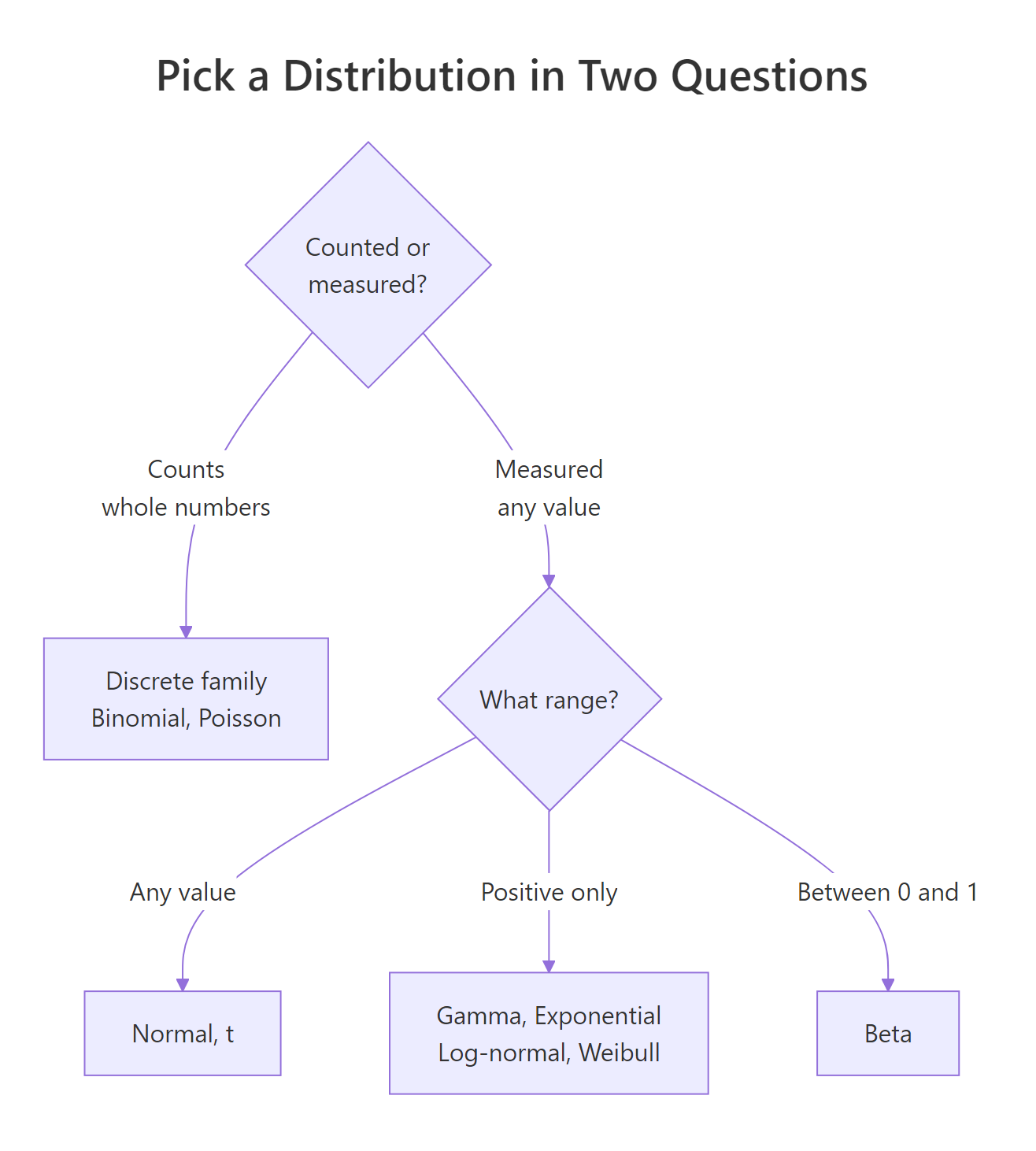
Figure 1: The whole guide in one picture: count or measure, then the range.
Try it: Decide whether each quantity below is discrete (counted) or continuous (measured). Replace each "?" with your answer.
Click to reveal solution
Explanation: Emails and defective bulbs are things you tally in whole units, so they are discrete. Body temperature sits on a continuous scale where any in-between value is possible.
What do R's d, p, q, and r functions do?
Before we tour the distributions, you need one piece of shared vocabulary, because every distribution in R follows the same naming pattern. Each family has a short root name (norm for normal, pois for Poisson, binom for binomial) and four prefixes you attach to it. Learn the four prefixes once and you can work with any distribution.
Here is what each prefix means, shown on the normal with our height model (mean 170 cm, standard deviation 8 cm).
Read those three numbers as a sentence about heights. The density at 180 cm is 0.023, a relative height of the curve at that point. The probability of being below 180 cm is 0.894, so about 89% of adults are shorter than 180 cm. And 97.5% of adults are shorter than 185.7 cm, which is what qnorm(0.975, ...) returns: the quantile that leaves 97.5% below it. The p and q prefixes are inverses of each other.
The fourth prefix, r, draws random values from the distribution. This is how you simulate data.
Every one of those five heights is a plausible draw from a population averaging 170 cm. Setting the seed with set.seed() first makes the draw reproducible, so you and I get the same five numbers.
There is one wrinkle worth stating clearly. For a continuous distribution, d gives a density, not a probability, because the chance of landing on any exact value is zero. For a discrete distribution, d gives an honest probability of an exact outcome. Watch the difference on the Poisson, where counts are whole numbers.
Here dpois(2, lambda = 4) is a real probability: there is a 14.7% chance of exactly 2 calls when the average is 4 per hour. And ppois(2, ...) adds up the chances of 0, 1, and 2 calls to give 23.8%.
norm, pois, binom, unif, exp, gamma, beta, and lnorm for the log-normal. Attach d, p, q, or r to any of them and the function exists. Type ?Distributions in the console for the full list.Try it: Using the same height model (mean 170, sd 8), what fraction of adults are shorter than 160 cm? The pnorm() function gives the probability below a value.
Click to reveal solution
Explanation: pnorm(160, ...) accumulates all the probability below 160 cm. About 10.6% of adults in this model are shorter than 160 cm.
Which distributions fit count data?
Count data is the discrete branch: whole numbers with a natural floor of zero. Two distributions cover the vast majority of count problems, and telling them apart comes down to one question: is there a fixed number of trials?
The binomial models a fixed number of independent yes/no trials, each with the same success probability. Think 20 quiz questions, 50 manufactured parts, 100 email sends. You count how many succeed. Suppose a student guesses on a 20-question quiz with 4 options each, so the chance of a correct guess is 0.25.
Guessing gives a 6.1% chance of exactly 8 correct and a 10.2% chance of 8 or more. The expected score is n * p = 5 correct, and the variance is n * p * (1 - p) = 3.75. For the binomial, the mean and variance follow a fixed rule.
$$\mu = np, \qquad \sigma^2 = np(1-p)$$
Where $\mu$ is the mean number of successes, $\sigma^2$ is the variance, $n$ is the number of trials, and $p$ is the success probability. If formulas are not your thing, skip them, the numbers in the output already tell the story.
The Poisson models counts of events over an interval of time or space when there is no fixed number of trials: sign-ups per hour, typos per page, potholes per mile. Its one parameter, lambda, is the average count per interval.
With an average of 4 sign-ups per hour, there is a 10.4% chance of exactly 6 and a 23.8% chance of 2 or fewer. The Poisson has a famous signature: its mean equals its variance. That property is also its weak spot, and the diagram below shows where it fails.
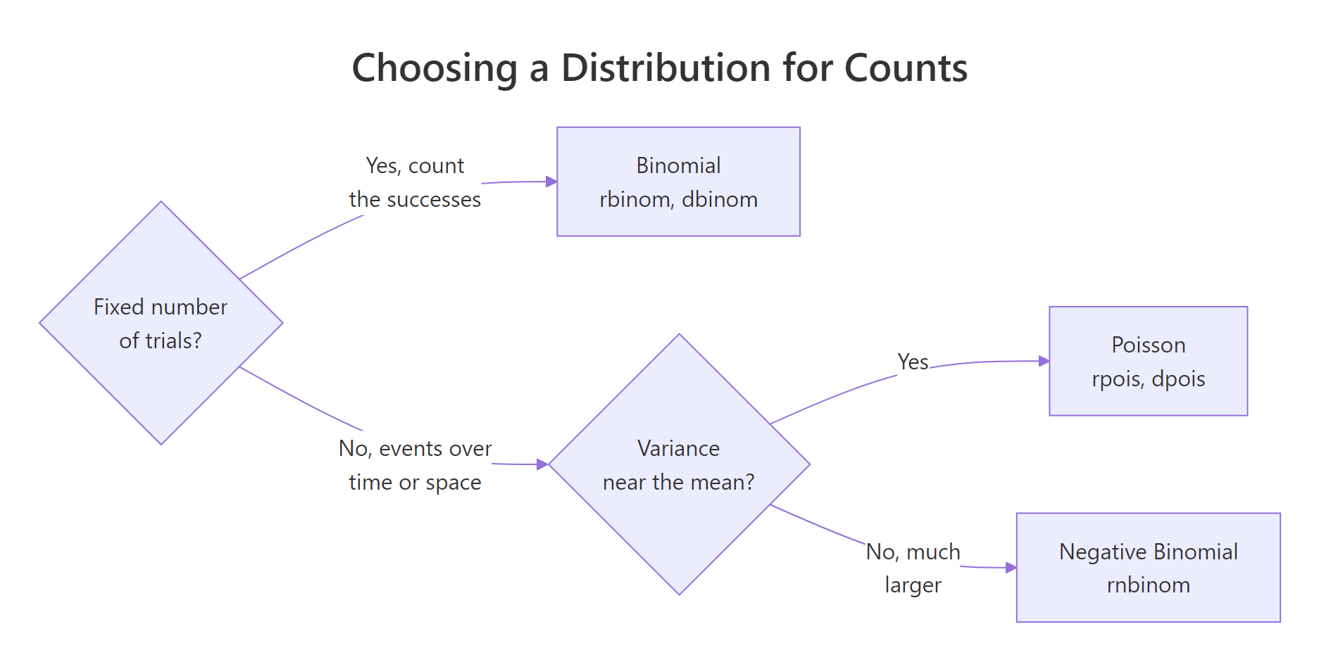
Figure 2: Choosing among the count distributions.
Real count data is often more spread out than a Poisson allows, a situation called overdispersion. When the variance runs well above the mean, reach for the negative binomial instead. Let us simulate overdispersed counts and check.
The mean is about 4.2 but the variance is 11.8, nearly three times larger. A Poisson would insist the variance equals the mean, so it would badly understate the spread. The negative binomial adds a second parameter precisely to let the variance grow.
Try it: A factory line makes items with a 3% defect rate. In a box of 50, what is the probability of exactly 2 defects? This is a binomial with 50 trials and a success probability of 0.03.
Click to reveal solution
Explanation: A fixed batch of 50 parts with the same defect probability is a textbook binomial. There is a 25.6% chance of finding exactly 2 defects.
Which distribution fits symmetric, bell-shaped data?
Now cross into measured data. The first continuous family to check is the one you already know: the normal, the symmetric bell curve. It shows up whenever many small effects add together, which is why measurements like heights, along with the averages of large samples, tend to look normal. A quick tell for normal-shaped data is that its mean and median sit close together, because a symmetric shape has no long tail to drag the mean away.
Let us check daily temperatures from the built-in airquality dataset.
The mean (77.9) and median (79.0) are almost on top of each other, exactly what you expect from a roughly symmetric shape. A histogram with a matching normal curve makes the fit visible.
The bars follow the blue normal curve reasonably well, with a slight lean but no dramatic tail. This is the continuous map you will be working through in the next few sections.
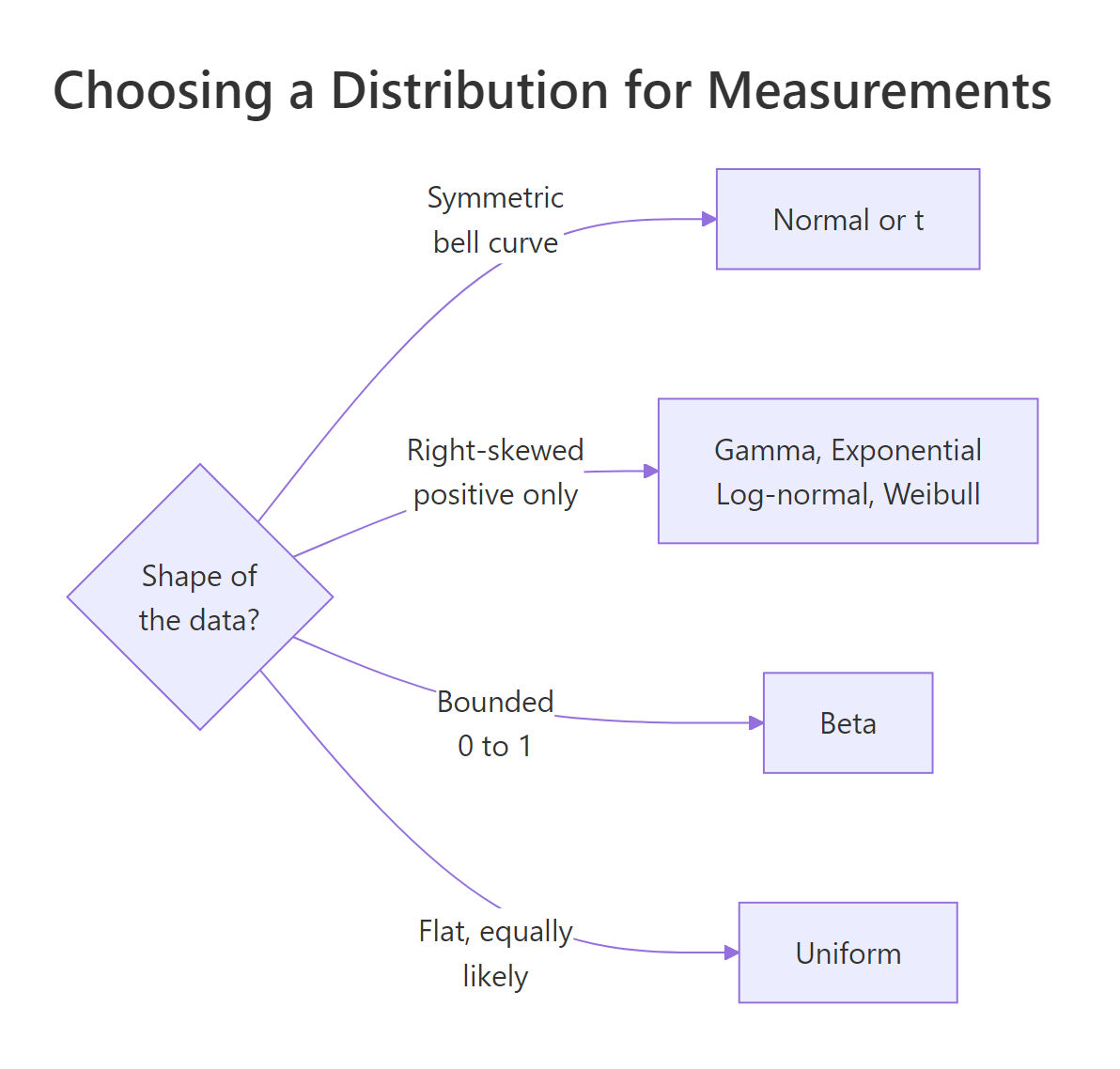
Figure 3: Choosing among the continuous distributions by shape.
Sometimes data is bell-shaped but produces more extreme values than a normal expects. That is the job of Student's t, which looks like the normal but with heavier tails. Its one parameter, the degrees of freedom, controls how heavy those tails are: fewer degrees of freedom means heavier tails and more frequent extreme values. It is the safer choice for small samples and for data prone to occasional outliers. Compare how often each distribution produces a value more than 3 standard deviations from centre.
The normal puts only 0.27% of its probability beyond 3 standard deviations, while a t with 3 degrees of freedom puts 5.77% out there, more than 20 times as much. That is why the t is the more realistic model when your data produces the occasional extreme value.
Try it: Is the fuel economy in mtcars$mpg roughly symmetric? Compare its mean and median.
Click to reveal solution
Explanation: The mean (20.1) sits a little above the median (19.2), a mild right skew. It is close enough that a normal is a reasonable first approximation, though a skewed family might fit slightly better.
Which distributions fit positive, skewed data?
A huge amount of real-world data is positive and right-skewed: waiting times, incomes, rainfall, insurance claims, file sizes. These values cannot go below zero, and they trail off in a long right tail. Several distributions live here, and the right one depends on how the data is generated.
Start with the exponential, which models the waiting time between random events that happen at a steady rate. Its defining trait is memorylessness: how long you have already waited tells you nothing about how much longer you will wait. If buses arrive on average every 10 minutes, the rate is 1/10 per minute.
There is a 39.3% chance the next bus arrives within 5 minutes, the median wait is 6.9 minutes, and the average wait is 10 minutes. Notice the median is smaller than the mean, the fingerprint of a right skew.
$$E[X] = \frac{1}{\lambda}$$
Where $E[X]$ is the mean waiting time and $\lambda$ is the event rate. A faster rate means a shorter average wait.
Next is the log-normal, the distribution for quantities built by multiplying many small effects rather than adding them. Incomes and city populations often look log-normal, as do stock prices. Its definition is simple: a quantity is log-normal when its logarithm is normal. Let us simulate incomes and confirm.
On the raw scale the mean sits 12% above the median, a clear right skew. Take logarithms and the ratio drops to 1.00, meaning the logged data is symmetric. That collapse of the skew after a log transform is the signature of log-normal data, and it is also why analysts model incomes on a log scale.
The gamma is the flexible workhorse for positive, right-skewed quantities such as rainfall totals and insurance claim sizes. Its two parameters (shape and rate) let it stretch from a steep exponential-like curve to a gentle bell, and its mean is shape divided by rate.
This gamma has a mean of 4 and a variance of 8, and 80% of its values fall at or below 6. When the exponential is too rigid but the data is still positive and skewed, the gamma is usually the answer.
Try it: Calls arrive on average every 4 minutes, so the rate is 1/4 per minute. What is the probability the next call comes within 2 minutes? Use pexp().
Click to reveal solution
Explanation: With a rate of 1/4 per minute, the chance of waiting less than 2 minutes is 39.3%. Because the exponential is memoryless, this holds no matter how long you have already been waiting.
Which distributions fit proportions and bounded ranges?
Some data lives inside hard walls. Proportions and rates are trapped between 0 and 1, and some quantities are equally likely across a fixed range. Two distributions handle these bounded cases.
The beta is the distribution for anything constrained to the interval from 0 to 1: conversion rates, click-through rates, the probability of an event, the fraction of a task completed. Its two shape parameters, a and b, bend it toward 0 or toward 1, or shape it into a hump in the middle. The mean is a divided by (a + b).
This beta has a mean proportion of 0.8, there is a 77.5% chance the rate falls below 0.9, and the five simulated rates all land between 0.82 and 0.93. Every draw respects the 0-to-1 boundary automatically, which a normal never would.
The uniform is the flat distribution: every value in a range is equally likely, with no peak. It models a genuinely random pick within known limits, and it is the default when you have no reason to prefer one value over another. Say a bus is equally likely to arrive at any minute within a 10-minute window.
Because every minute is equally likely, the chance of arrival in the first 3 of 10 minutes is exactly 0.3, and the average arrival time is the midpoint, 5 minutes. The uniform has no skew and no peak, just a flat slab of equal probability.
Try it: A beta with a = 2 and b = 5 models a low conversion rate. What is its mean proportion? The mean is a divided by (a + b).
Click to reveal solution
Explanation: With more weight on b than a, the beta leans toward 0, giving a mean proportion of 0.286, a plausible low conversion rate.
How do you fit a distribution to your own data?
So far you have matched distributions to data by eye and by rule of thumb. To go further, you estimate the distribution's parameters from the data and then check how well it fits. The workflow has four steps: describe the data, guess a family from its shape, estimate the parameters by maximum likelihood, then confirm the fit. R's fitdistr() from the MASS package handles the estimation using maximum likelihood, which is a principled way of finding the parameter values that make your observed data most probable.
Let us make this concrete by simulating 300 waiting times and pretending we do not know where they came from. Step one is to describe them.
The values are positive (the minimum is 0.12) and right-skewed (the mean of 4.89 sits above the median of 4.10). Step two is to guess a family: that positive skew points to the gamma. Step three is to estimate the gamma's parameters with fitdistr().
The fit recovers a shape of about 2.08 and a rate of about 0.43, close to the true values of 2 and 0.4 that generated the data. The numbers in parentheses are standard errors, a measure of how precise each estimate is. But how do we know gamma beats a simpler guess like the normal? Step four compares the candidates using log-likelihood, where a higher value means a better fit.
The gamma scores -737.8 against the normal's -780.2. Higher is better, so the gamma is the clear winner, which makes sense because the normal cannot capture the positive skew or the hard floor at zero.
Try it: Fit a normal distribution to mtcars$mpg with fitdistr(). It returns the estimated mean and standard deviation.
Click to reveal solution
Explanation: fitdistr() estimates a mean of 20.09 and a standard deviation of 5.93 for the fuel economy, matching the summary statistics you computed earlier.
Putting It All Together
Let us run the full field guide on a real dataset from start to finish. The airquality$Wind column holds daily wind speeds at a New York monitoring station, and we want the distribution that best describes them.
Step one, walk the three questions. Wind speed is measured, not counted, so it is continuous. It cannot go below zero, so it is positive. And we need to see its shape. Let us describe it.
There are no missing values, the minimum is 1.7 mph, and the mean (10.0) and median (9.7) are close, so the data is roughly symmetric. That gives us two reasonable candidates: the normal, because the shape is near-symmetric, and the Weibull, a flexible positive distribution often used for wind speeds. Let us fit both and compare them with AIC, where a lower value means a better fit after accounting for model complexity.
The two AIC values are 822.5 and 821.0, a difference of just 1.5. A gap that small counts as a tie: the models fit about equally well. When two candidates are this close, the sensible move is to pick the simpler, more interpretable model and report its parameters.
The normal fit gives a mean wind speed of about 9.96 mph and a standard deviation of about 3.51 mph. A final Q-Q plot confirms the choice: if the points hug the diagonal, the normal model fits.
The points fall close to the red line through the middle of the data, with only mild deviation at the extremes, so the normal is a defensible, and simple, model for daily wind speed.
Practice Exercises
These exercises combine several ideas from the guide. Try each one before opening the solution, and note that they use their own variable names so they will not disturb the earlier examples.
Exercise 1: Model a defect count and confirm by simulation
A machine produces parts with a 5% defect rate. In batches of 40, model the number of defects. Identify the distribution, compute the probability of a batch with no defects, and then confirm that probability by simulating 100000 batches.
Click to reveal solution
Explanation: A fixed batch of 40 with a constant defect rate is a binomial. The exact probability of zero defects is 0.129, and simulating 100000 batches gives 0.128, confirming the formula.
Exercise 2: Spot and fit a skewed distribution
The vector below holds 500 house prices (in thousands of dollars). Show that the data is right-skewed by comparing its mean and median, then fit both a log-normal and a normal distribution and compare them by AIC. The lower AIC wins.
Click to reveal solution
Explanation: The mean (364) sits above the median (344), the hallmark of a right skew. The log-normal AIC (6317.1) is more than 100 points below the normal AIC (6424.6), so the log-normal is the far better model, as expected for a multiplicative quantity like prices.
Exercise 3: Diagnose overdispersion in counts
A support desk logs the daily ticket counts below. Compute the mean and variance, then decide whether a Poisson (which requires the mean to equal the variance) or a negative binomial is the better model.
Click to reveal solution
Explanation: The variance (28.77) is nearly six times the mean (4.85), so the dispersion ratio is 5.9. A Poisson would demand a ratio of 1, so it badly understates the spread here. The negative binomial, which allows extra variance, is the correct model.
Frequently Asked Questions
What is the difference between a PMF and a PDF?
A probability mass function (PMF) applies to discrete distributions and gives the exact probability of each whole-number outcome, so dpois(2, 4) is a genuine probability. A probability density function (PDF) applies to continuous distributions and gives a density, not a probability, because the chance of any single exact value is zero. For continuous data you get probabilities by integrating the density over a range, which is what pnorm() and pexp() do for you.
Can I always just use the normal distribution?
Not safely. The normal assumes symmetric, unbounded data, so it misbehaves on counts (which are discrete), on waiting times and incomes (which are positive and skewed), and on proportions (which are bounded between 0 and 1). It is a fine default for symmetric measurements and for averages of large samples, thanks to the Central Limit Theorem, but forcing it onto skewed or bounded data produces impossible predictions like negative wait times.
How much data do I need to choose a distribution?
Enough to see the shape, which usually means at least 30 to 50 points, and more for the tails. With very few observations, several distributions will fit about equally well and the choice should lean on how the data is generated (for example, waiting times are exponential by mechanism) rather than on the sample shape alone.
What if two distributions fit equally well?
That is common and fine. When candidates are within about 2 AIC points, as the wind speed example showed, treat it as a tie and pick the simpler, more interpretable model. You lose almost nothing in fit and gain a lot in clarity.
Do I need to know the distribution before running a t-test?
For a t-test you mainly care whether the data (or the average of it) is roughly normal, which the Central Limit Theorem often delivers for larger samples even when individual values are not normal. Choosing a full distribution matters more when you are modelling the data itself or computing probabilities from its tails.
Summary
The whole field guide reduces to three questions and a lookup table. Ask whether the data is counted or measured, whether its range is bounded, and whether its shape is symmetric or skewed. Then read off the family.
| Data situation | Distribution | R root | Mean / spread signal | Everyday example |
|---|---|---|---|---|
| Counts, fixed number of trials | Binomial | binom |
mean n*p |
correct answers on a quiz |
| Counts, events per interval | Poisson | pois |
mean equals variance | sign-ups per hour |
| Counts, variance far above mean | Negative binomial | nbinom |
variance greater than mean | daily support tickets |
| Measured, symmetric bell | Normal | norm |
mean near median | heights, temperatures |
| Measured, symmetric, heavy tails | Student's t | t |
more outliers than normal | small-sample estimates |
| Measured, positive, waiting time | Exponential | exp |
mean 1/rate |
time between arrivals |
| Measured, positive, multiplicative | Log-normal | lnorm |
log is symmetric | incomes, prices |
| Measured, positive, general skew | Gamma | gamma |
mean shape/rate |
rainfall, claim sizes |
| Measured, bounded 0 to 1 | Beta | beta |
mean a/(a+b) |
conversion rates |
| Measured, flat over a range | Uniform | unif |
midpoint is the mean | a random pick in a window |
To go from a guess to a fitted model: describe the data, pick a family from its shape and mechanism, estimate parameters with fitdistr() from MASS, then confirm the choice with AIC and a Q-Q plot. When two families tie, prefer the simpler one.
References
- R Core Team, Distributions in the stats package. Link
- Venables, W. N. & Ripley, B. D., fitdistr() in the MASS package. Link
- Delignette-Muller, M. L. & Dutang, C., Overview of the fitdistrplus package. Link
- NIST/SEMATECH, e-Handbook of Statistical Methods: Gallery of Distributions. Link
- Penn State Eberly College of Science, STAT 414: Introduction to Probability Theory. Link
- Wikipedia, List of probability distributions. Link
- Prabhakaran, S., Fitting Distributions to Data in R. Link
Continue Learning
- Fitting Distributions to Data in R, once you know which family to try, this tutorial goes deep on estimating parameters and running formal goodness-of-fit checks with fitdistrplus.
- Normal, t, F and Chi-Squared Distributions in R, a focused look at the four distributions that power most hypothesis tests, including how they relate to each other.
- Binomial and Poisson Distributions in R, the two count distributions from this guide, worked through in full with more examples and the link between them.