Covariance and Correlation in R from First Principles
Covariance measures whether two variables move together and in which direction. Correlation rescales that same idea onto a fixed ruler from -1 to +1, so the strength of the link is finally readable. This tutorial builds both by hand in base R, matches them exactly to the built-in cov() and cor() functions, then shows you where each one can quietly mislead. Every code block is live, so you can run it and change the numbers as you read.
What does it mean for two variables to move together?
Think about hours spent studying and the exam score that follows. You expect that as one goes up, the other tends to go up too. That everyday idea, two things rising and falling together, is exactly what covariance and correlation put a number on. Before any formula, let's look at a tiny, honest dataset we will carry through the whole tutorial: six students, their study hours, and their exam scores.
We only need base R for the statistics. We will bring in ggplot2 for the pictures, and load it once here so it is ready for every plot later.
Here is what just happened. We created a small data frame called study with one row per student, a hours column, and a score column. Printing study shows the six pairs of numbers we will analyze.
Reading down the two columns, a pattern jumps out: the student with 1 hour scored 52, and the student with 6 hours scored 84. As hours climb, score climbs too. Numbers in a table are easy to misread, though, so let's see the same six pairs as points.
The plot shows six points marching from the bottom-left to the top-right. That upward slope is the visual signature of two variables that move together. If the points sloped downward, one would rise as the other fell. If they scattered with no slope, the two would be unrelated.
To turn that picture into a number, we need one more idea: the deviation. A deviation is how far a single value sits from its own column's average. A student above the average study time has a positive hours-deviation; a student below it has a negative one. Covariance, which we build next, is really just a clever combination of these deviations.
Try it: Here are four daily temperatures. Compute each day's deviation from the mean, which is the value minus the average. A positive result means that day was warmer than average.
Click to reveal solution
Explanation: The mean of the four temperatures is 25. Subtracting 25 from each value gives its deviation, so 20 becomes -5 (five below average) and 30 becomes +5 (five above average).
What is covariance, and how do you compute it by hand?
Covariance takes the deviation idea and does three things: it finds each point's deviation in both columns, multiplies those two deviations together, and averages the results. The multiplication is the heart of it. When both deviations are positive (above average on both) or both negative (below average on both), their product is positive. When one is above and the other below, the product is negative. Add the products up and a positive total means "they move together."
Let's build that table for the six students, one column at a time, so nothing is hidden.
Walk through one row to see the recipe. The first student studied 1 hour, which is 2.5 below the average of 3.5, so dev_hours is -2.5. That student scored 52, which is 15.17 below the average score, so dev_score is -15.17. Both deviations are negative (below average on both), and multiplying two negatives gives a positive product of 37.92. Notice that every single product in the table is positive, because in this dataset a below-average student on hours is also below-average on score, and an above-average student is above-average on both.
Now we collapse that whole products column into one number. Covariance is the sum of the products divided by the number of points minus one.
The products column adds up to 111.5. We have 6 students, so we divide by n - 1, which is 5, giving 22.3. That single positive number is the covariance: positive because the products agreed, and larger the more strongly the two columns move together.
The real test is whether R's built-in function agrees with our hand calculation. It does, to the decimal.
cov() returns 22.3, exactly matching cov_manual. That is the whole point of doing it by hand first: the built-in function is not a black box, it is just the deviation-product-average recipe you traced through above.
In formula form, the sample covariance of two variables $x$ and $y$ is:
$$\operatorname{cov}(x, y) = \frac{1}{n-1} \sum_{i=1}^{n} (x_i - \bar{x})(y_i - \bar{y})$$
Where:
- $x_i$ and $y_i$ = the $i$-th pair of values (one student's hours and score)
- $\bar{x}$ and $\bar{y}$ = the means of the two columns
- $n$ = the number of pairs
n - 1 for a sample rather than n corrects a small underestimate that creeps in because you estimated the means from the same data you are measuring. R's cov() and var() both use n - 1 by default, which is why the hand calculation and the function match.Try it: Compute the covariance of two short vectors with cov(). A positive answer means they tend to rise together.
Click to reveal solution
Explanation: The covariance is positive, so ex_x and ex_y broadly move together, even though the second pair (3 with 5) and third pair (5 with 4) dip against the trend.
Why is covariance hard to read, and how does correlation fix it?
Covariance has a serious flaw: its size depends on the units you happen to use. The number 22.3 sounds concrete, but it is measured in "hours times score points," a unit nobody has intuition for. Worse, if you switch hours to minutes, the covariance balloons even though the underlying relationship has not changed at all. Let's prove it.
The first line is our familiar 22.3. In the second line we multiplied hours by 60 to express the same study time in minutes, and the covariance jumped to 1338, which is exactly 60 times larger. The students did not study any differently. We only relabeled the axis, yet the covariance changed by a factor of 60.
This is why you can never look at a lone covariance and say whether a relationship is strong. Is 1338 a strong link? You cannot know without also knowing the scale of both variables. A covariance between two dollar amounts and a covariance between two temperatures live in different units and cannot be compared.
Try it: Multiply the score column by 10 and compare the covariance before and after. Watch what happens to the number.
Click to reveal solution
Explanation: Multiplying one variable by 10 multiplies the covariance by 10, from 22.3 to 223.0. The relationship is identical; only the units changed. That instability is exactly why we need a scale-free version.
Correlation: dividing the units out
Correlation fixes the units problem with one simple move: it divides the covariance by the two standard deviations. A standard deviation is the typical spread of a single column, measured in that column's own units. When you divide the covariance (in hours-times-points) by the standard deviation of hours and the standard deviation of score, all the units cancel out. What is left is a pure, unit-free number that always lands between -1 and +1.

Figure 1: Correlation is covariance divided by the two standard deviations, which strips out the units.
Let's compute correlation by hand using the covariance we already have.
Here is the arithmetic. We took cov_manual, which is 22.3, and divided by the product of the two standard deviations. R computes those two spreads (about 1.87 for hours and about 11.97 for score), multiplies them to get roughly 22.40, and 22.3 divided by 22.40 gives 0.9955. Because it sits so close to 1, this tells us hours and score move together almost perfectly in this small dataset.
As before, the built-in function agrees exactly.
cor() returns the same 0.9955126. And now for the payoff that covariance could not deliver: correlation does not care about units. Let's redo it with hours in minutes.
Switching hours to minutes left the correlation completely unchanged at 0.9955126, even though the covariance for the same switch leapt from 22.3 to 1338. That stability is what makes correlation readable: a correlation of 0.9955 means the same thing whether you measure time in minutes or hours.
In formula form, the Pearson correlation coefficient $r$ is the covariance divided by the product of the two sample standard deviations:
$$r = \frac{\operatorname{cov}(x, y)}{s_x \, s_y}$$
Where:
- $\operatorname{cov}(x, y)$ = the covariance you already computed
- $s_x$ = the sample standard deviation of $x$
- $s_y$ = the sample standard deviation of $y$
Try it: Reuse the ex_x and ex_y vectors from earlier and turn their covariance into a correlation.
Click to reveal solution
Explanation: The correlation of about 0.88 is a strong positive link. Unlike the covariance of 6.67 from before, this number is instantly interpretable: close to 1 means a strong upward relationship.
How do you read a correlation coefficient?
A correlation carries two pieces of information at once: the sign and the size. The sign is direction. A positive correlation means the variables rise together; a negative one means as a rule when one rises the other falls. The size, ignoring the sign, is strength. A value near 1 or -1 means the points hug a straight line closely; a value near 0 means they scatter.
Here is a rough guide for reading the strength. Treat these bands as conventions, not laws, because what counts as "strong" depends heavily on the field you work in.
| Absolute value of r | How to describe it |
|---|---|
| 0.0 to 0.1 | negligible |
| 0.1 to 0.3 | weak |
| 0.3 to 0.5 | moderate |
| 0.5 to 0.7 | strong |
| 0.7 to 1.0 | very strong |
Numbers on a table are abstract, so let's generate three datasets with known correlations and see what each strength actually looks like. We set a seed first so the random draw is the same every time you run it.
We built one base variable gx, then created three partners. The first adds only a little noise, giving a strong positive correlation of 0.96. The second adds a lot of noise, lowering the correlation to a weak 0.43. The third flips the sign by negating gx, producing a strong negative correlation of -0.91. Now let's plot all three side by side.
The pictures make the numbers concrete. The strong-positive panel shows points packed tightly along an upward line. The weak-positive panel shows a cloud that still tilts up but with plenty of scatter. The negative panel shows a tight downward line. Once you have seen these shapes, a bare correlation number will call the matching picture to mind.
Try it: The mtcars dataset ships with R. Correlate a car's miles-per-gallon with its weight and read off the sign and strength.
Click to reveal solution
Explanation: The correlation of -0.87 is strong and negative, which matches intuition: heavier cars burn more fuel, so as weight goes up, miles per gallon goes down.
How do you build and read a correlation matrix?
Real analysis rarely involves just two columns. Usually you want to see how every variable relates to every other variable at once. Hand cor() a data frame of several numeric columns and it returns a correlation matrix: a grid where the cell in row A, column B holds the correlation between variable A and variable B. Let's do it for five columns of mtcars.
Read the matrix like a mileage chart. The diagonal is all 1.00 because every variable is perfectly correlated with itself. The grid is symmetric, so the value above the diagonal mirrors the one below it. Scanning the mpg row, you can see mileage is strongly negatively correlated with weight (-0.87), horsepower (-0.78), and engine displacement (-0.85), and positively correlated with the rear axle ratio drat (0.68). The matrix is the fastest way to spot which pairs deserve a closer look.
A grid of numbers is hard to scan once it grows, so a colored heatmap helps. First we reshape the matrix into a long, three-column form that ggplot2 can plot.
The as.table() then as.data.frame() trick unrolls the grid into one row per cell, with Var1 and Var2 naming the pair and Freq holding the correlation. That long shape is exactly what a tile plot needs.
The heatmap paints strong positive correlations blue, strong negative ones red, and near-zero ones white, with the exact number printed in each cell. Now the weight-and-displacement pair (0.89) and the weight-and-mpg pair (-0.87) leap out by color alone, no squinting at a number grid required.
round(cor(vars), 2) trims the noise so patterns stand out, and the ones down the diagonal are just each variable correlated with itself, so you can ignore them when hunting for interesting pairs.Try it: The first four columns of the iris dataset are numeric flower measurements. Build their correlation matrix and find the most tightly linked pair.
Click to reveal solution
Explanation: Petal length and petal width have the strongest link at 0.96, so flowers with longer petals almost always have wider petals. Sepal width stands apart, correlating only weakly and even negatively with the others.
How do you test whether a correlation is statistically significant?
A correlation computed from a handful of points can be a fluke. With only six students, even unrelated variables can line up by luck. The question significance testing answers is: if hours and score were truly unrelated in the wider world, how surprising would a correlation this strong be in a sample this size? The cor.test() function answers it, and it returns far more than a single number.
There is a lot in that output, so let's read it line by line. The cor at the bottom is our familiar estimate, 0.9955. The p-value is 3.016e-05, which is 0.00003, far below the usual 0.05 threshold. A p-value that small means a correlation this strong would almost never appear by chance if the two variables were truly unrelated, so we treat the link as real. The 95 percent confidence interval runs from 0.958 to 0.9995, which is the plausible range for the true correlation: even at its most pessimistic, the relationship stays very strong.
The takeaway is a two-part verdict. The correlation is both large (0.9955) and unlikely to be an accident (tiny p-value), so we can report it with confidence. Had the p-value been above 0.05, we would say the data are too thin to rule out coincidence.
Try it: Run cor.test() on mtcars mileage and weight, then pull out just the p-value from the result.
Click to reveal solution
Explanation: The result of cor.test() is a list, and $p.value reaches into it for that one element. The value 1.3e-10 is vanishingly small, so the strong negative link between weight and mileage is not a coincidence.
When should you use Spearman or Kendall instead of Pearson?
Everything so far used Pearson correlation, which measures how close the points come to a straight line. That is the right tool most of the time, but it has a blind spot: a relationship can be perfectly predictable yet not straight. Pearson underrates those curved relationships. Two alternatives, Spearman and Kendall, fix this by looking at ranks (the order of the values) instead of the raw numbers. The right choice depends on the shape of your data.
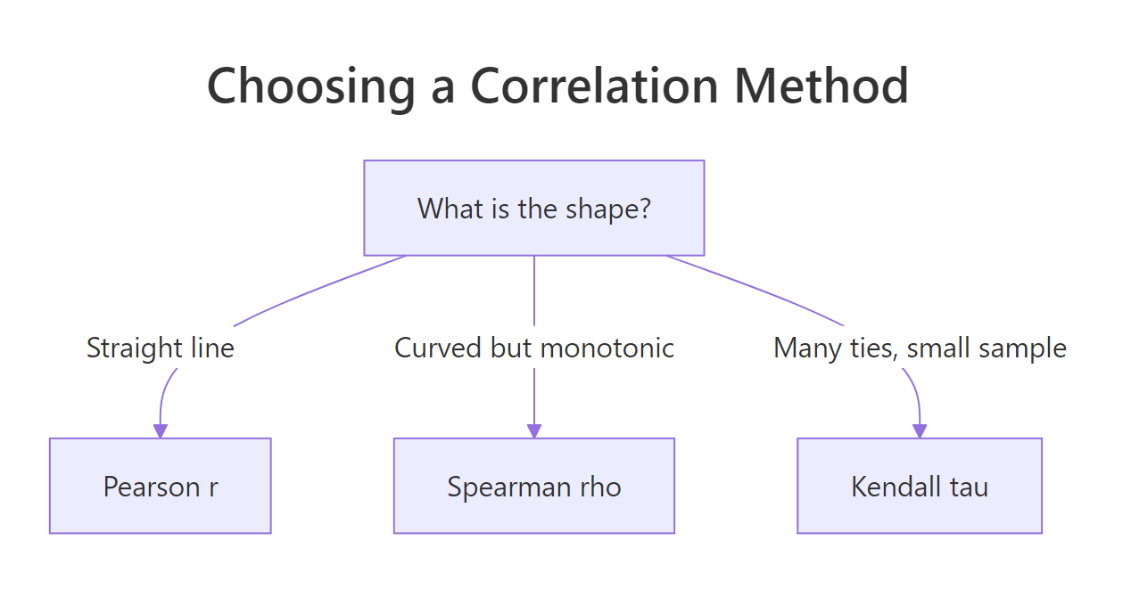
Figure 2: Pick the correlation method from the shape of the relationship.
Here is a relationship that is perfectly ordered but strongly curved: each value is the cube of the one before it. Watch how the two methods disagree.
Pearson reports 0.928, strong but not perfect, because the cubic curve bends away from a straight line. Spearman reports exactly 1.000, and it is right in its own terms: every time g increases, h increases too, without a single exception. Spearman measures whether the ranks move together perfectly, and here they do. When you care about "does y always go up when x goes up" rather than "do they follow a straight line," Spearman is the honest answer.
Here is how to pick among the three methods.
| Method | Use it when | What it measures |
|---|---|---|
| Pearson | the relationship is roughly a straight line | strength of the linear link |
| Spearman | the relationship is curved but always one direction, or has outliers | strength of the ranked, monotonic link |
| Kendall | the sample is small or has many tied values | agreement between ordered pairs |
Try it: These two vectors rise together, but the first has one huge outlier. Compute both Pearson and Spearman and see which one the outlier fools.
Click to reveal solution
Explanation: The ranks of ex_a still climb 1 through 6 in step with ex_b, so Spearman sees a perfect 1.000. Pearson, distorted by the value 100, drops to a misleading 0.681. When an outlier is present, the rank-based method tells the truer story.
What traps should you watch for with correlation?
Correlation is powerful, but it is easy to misread in three specific ways. The first trap is that a correlation only sees straight-line relationships. The most famous demonstration is Anscombe's quartet, four datasets built by the statistician Francis Anscombe that share almost the same correlation while looking completely different. R ships them in a built-in data frame called anscombe.
All four datasets report a correlation of about 0.816. If correlation told the whole story, the four would be interchangeable. They are not, as the plot reveals.
Only the first dataset is a genuine straight-line cloud. The second is a smooth curve that a straight line badly misfits. The third is a perfect line ruined by one outlier. The fourth is a vertical stack of points plus one far-off point that on its own produces the correlation. Same number, four completely different realities. The lesson is permanent: always plot your data, never trust a correlation you have not looked at.
The second trap follows directly: a correlation of zero does not mean the variables are unrelated. It only means there is no straight-line trend. A perfect, obvious pattern can hide behind a zero.
Here sy is exactly the square of sx, a perfect U-shaped parabola with no randomness at all. Yet the correlation is precisely 0, because for every upward stretch on the right there is a matching downward stretch on the left, and they cancel. The variables are completely determined by each other, and correlation still reports nothing. Zero correlation rules out a linear trend, not a relationship.
The third trap is the most famous: correlation is not causation. Ice cream sales and drowning deaths rise together across the year, giving a strong positive correlation, but ice cream does not cause drowning. A third variable, summer heat, drives both. A correlation tells you two things move together; it never tells you that one makes the other happen.
Try it: Build a V-shaped relationship where y is the distance of x from zero, then check the correlation. The points clearly follow a rule, so predict the number before you run it.
Click to reveal solution
Explanation: The V shape is symmetric around zero, so the rising right arm and the falling left arm cancel out to a correlation of 0. The relationship is real and perfectly predictable, but it is not linear, so Pearson correlation cannot see it.
Complete Example: A correlation analysis of mtcars
Let's tie every piece together in a small, realistic workflow: figure out what makes a car fuel-efficient. We start by screening how mileage relates to five candidate predictors, all at once.
The single row of correlations ranks the candidates instantly. Weight has the strongest link to mileage at -0.87, followed closely by displacement (-0.85) and horsepower (-0.78), all negative, meaning bigger, heavier, more powerful cars use more fuel. Weight is the front-runner, so we confirm it with a significance test.
The test pins the correlation at -0.868 with a p-value of 1.29e-10, so the weight-mileage link is both strong and highly significant. Now we finish the way every correlation analysis should, by plotting the pair to check the relationship really is a straight line and not an Anscombe-style illusion.
The scatter shows a clean downward band of points that the trend line tracks well, with no lurking curve or lone outlier steering the result. That final visual check is what lets us report the finding honestly: in this dataset, a heavier car reliably means lower mileage. Whether weight is the true cause, or a stand-in for engine size and everything else that scales with a big car, is a question correlation alone cannot settle.
Practice Exercises
These combine several ideas from the tutorial. Each starter block runs as written, so you can fill in your own attempt and compare it to the reveal.
Exercise 1: Show that correlation is scale-invariant but covariance is not
Take two short vectors, my_x and my_y. Multiply my_x by 100 to change its units, then compare both the covariance and the correlation before and after the change. Confirm that the covariance moves but the correlation stays put.
Click to reveal solution
Explanation: Scaling my_x by 100 multiplies the covariance by 100, from 37.5 to 3750, but the correlation holds steady at 0.9163. This is the units problem and its fix, side by side in one table.
Exercise 2: Find the most correlated pair in a matrix
From the columns mpg, wt, hp, and qsec of mtcars, build the correlation matrix and find the single strongest relationship. Blank out the diagonal and the lower half first so each pair appears only once and no variable can match itself.
Click to reveal solution
Explanation: With the diagonal and lower triangle set to NA, only the six unique pairs remain. The largest magnitude is -0.87, the mpg-and-weight pair, confirming weight as mileage's strongest partner among these four.
Exercise 3: Curved data with an outlier, tested properly
A dose-response study returns values that rise steeply and include one extreme dose. Compute both the Pearson and Spearman correlations, then run a Spearman significance test. Decide which correlation you would report.
Click to reveal solution
Explanation: The response is perfectly monotonic, so Spearman gives a clean 1.000, while Pearson lands at 0.975 because the curve and the extreme dose bend it off a straight line. The Spearman p-value of 0.0000496 confirms the ranked link is real, so Spearman is the honest number to report here.
Frequently Asked Questions
Why does cor() return NA when my data looks fine?
The usual cause is missing values. If either vector contains an NA, cor() returns NA rather than guess what you meant by the gap. Tell it how to handle the missing entries with the use argument: cor(x, y, use = "complete.obs") drops any row where either value is missing, and for a whole matrix use = "pairwise.complete.obs" builds each pair from the rows those two columns share. Look at where the NAs sit before you choose, because dropping rows changes which data each correlation rests on.
Can I compute a correlation for categorical variables?
Not with Pearson, which needs numbers so it can measure distance from a mean. If the categories have a natural order (small to large), convert them to ranks and use Spearman instead. For unordered categories like colour or city, correlation does not apply at all, and you would reach for an association measure built for counts, such as Cramer's V from a contingency table. The guiding idea is to match the method to the type of variable you have.
How many data points do I need to trust a correlation?
There is no hard cutoff, but very small samples give unstable numbers. With only six students, a high correlation still came with a wide confidence interval from cor.test(), which is its own warning that the estimate is shaky. As a rough habit, treat a correlation from fewer than about 30 points with caution and read the confidence interval, not only the coefficient. More points narrow that interval and make the number you report more dependable.
What is the quickest way to remember covariance versus correlation?
Both measure whether two variables move together, but covariance is stated in mixed units you cannot compare across different variable pairs, while correlation divides those units out to land on a fixed -1 to +1 scale. Use the sign of a covariance to read direction, and use correlation whenever you need to judge or compare strength.
Summary
Covariance and correlation both answer "do these two variables move together," but only correlation gives you a number you can actually read and compare. The mindmap below gathers the whole journey in one view.
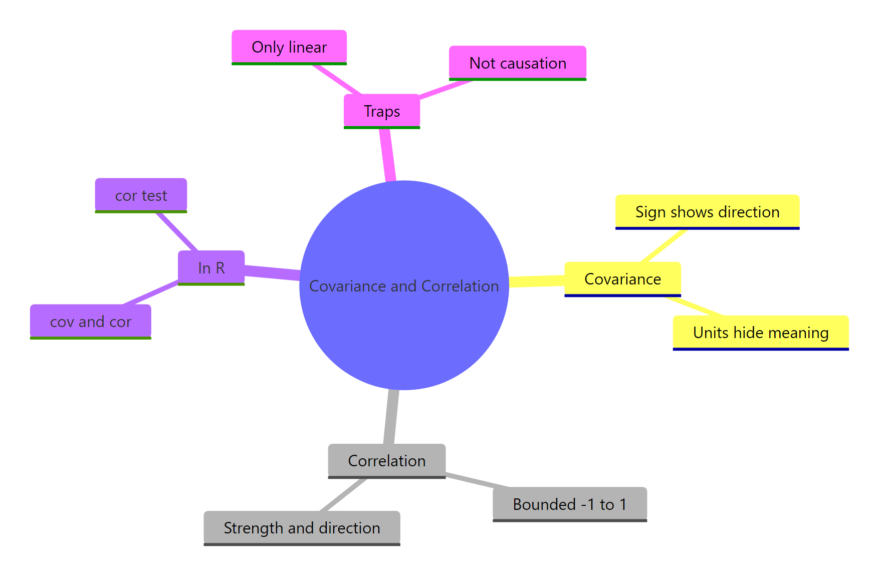
Figure 3: A one-page map of covariance, correlation, their R functions and the traps.
Here are the key takeaways to carry forward.
| Idea | What it tells you | R function |
|---|---|---|
| Covariance | the direction of co-movement, but in unreadable units | cov() |
| Correlation | direction and standardized strength, always -1 to +1 | cor() |
| Significance | whether the correlation is more than sampling luck | cor.test() |
| Method choice | match Pearson, Spearman, or Kendall to the shape | cor(..., method =) |
- Covariance sign is meaningful, its size is not. Positive means together, negative means opposite, but the magnitude changes with units.
- Correlation standardizes covariance by dividing by the two standard deviations, producing a unit-free value from -1 to +1.
- Always plot before you trust a number. Anscombe's quartet proves that identical correlations can hide wildly different shapes.
- Zero correlation is not independence, and correlation is never proof of causation.
References
- R Core Team, stats package. cor, cov and cor.test reference. Link
- R Core Team. An Introduction to R, section on statistical models and summaries. Link
- Wickham, H. and Grolemund, G. R for Data Science, chapter on exploratory data analysis and covariation. Link
- Anscombe, F. J. (1973). Graphs in Statistical Analysis. The American Statistician, 27(1), 17-21. Link
- Frost, J. Covariance vs Correlation: Understanding the Differences. Statistics By Jim. Link
- Pearson correlation coefficient. Wikipedia (formula reference). Link
Continue Learning
- Z-Scores and Percentiles in R: correlation standardizes a pair of variables the same way a z-score standardizes one, so this is the natural companion.
- Mean, Median, SD and IQR in R: the standard deviation you divided by to get correlation is explained from scratch here.
- Linear Regression: squaring the correlation gives R-squared, the bridge from measuring a relationship to modeling it.