Small Multiples in R: the 40-Tiny-Plots Workflow
Small multiples are a grid of small, identical charts, one per group, drawn on shared axes so your eye compares them like frames of a film. In R, ggplot2 faceting turns one long table into dozens of these tiny panels with a single line, and a few deliberate choices make forty of them read cleanly.
What exactly is a small multiple?
When you have one measurement tracked across many groups, say a price series for dozens of cities, cramming every group onto one chart gives you a tangle of overlapping lines. A small multiple does the opposite. It gives every group its own little panel, keeps the axes identical everywhere, and lays the panels out in a grid. Once you learn to read one panel, you can read all forty, because only the data changes from panel to panel, never the design.
Let's see the payoff before we discuss the theory. We will use txhousing, a built-in ggplot2 dataset of monthly housing figures for 46 Texas cities from 2000 to 2015. One faceting call turns that long table into 46 tiny price charts.
That printed 46, and the plot below it is 46 separate line charts, one per city, all sharing the same x and y axes. If the |> is new to you, it is R's pipe: it passes the value on its left into the function on its right, so txhousing |> filter(!is.na(median)) just hands txhousing to filter() and keeps the rows that have a median price. The single new ingredient is facet_wrap(~ city): it reads the city column, makes one panel per distinct value, and draws the same geom_line() inside each. This mechanism is called faceting, and small multiples are what you build with it.
Read the grid as a whole and patterns jump out. Most cities drift gently upward, a few spike hard around 2014 to 2015, and the general shape (a dip near 2008 to 2011, then recovery) repeats almost everywhere. You could never see that in a 46-line spaghetti chart.
Try it: Draw the same 46-panel grid, but map the number of sales per month instead of the median price. Which cities sell the most homes?
Click to reveal solution
Explanation: Only the y aesthetic changes. facet_wrap(~ city) still builds one panel per city, so you get the same grid showing monthly sales counts instead of prices.
Why must every panel share the same scale?
The shared scale is the whole point, so it is worth seeing what happens when you keep it and when you break it. Forty-six panels are a lot to eyeball, so let's shrink the problem to six well-known cities where the effect is easy to read.
We now have a smaller table, tx6, holding only those six cities. Here they are with the default fixed scales, meaning every panel uses the exact same y-axis range.
Because the y axis is identical across all six panels, the heights are directly comparable. Austin's line sits high, El Paso's stays low, and you can read that difference straight off the grid. That is the small-multiples promise working.
Now watch what a single argument does to that promise. Setting scales = "free_y" lets each panel pick its own y-axis range to fit its own data.
Every panel now looks busy and important, because each line fills its own box top to bottom. It looks nicer at a glance, and it is a trap. El Paso and Austin appear to reach similar heights even though Austin's prices are far higher, because each panel is zoomed to its own range. The comparison you came for is gone.
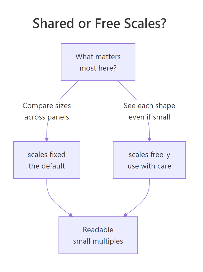
Figure 1: Choosing shared or free scales for your panels.
scales = "free_y" a short bar and a tall bar can look identical, so readers draw wrong conclusions. Reach for free scales only when the shape of each series matters more than comparing their magnitudes.Try it: Set scales = "free" (both axes free) on the six-city plot and look at the x axes. What makes cross-panel reading even harder than free_y alone?
Click to reveal solution
Explanation: Now the x axis also varies per panel, so even the time ranges no longer line up. Two panels can cover different years at different widths, which makes any left-to-right comparison unreliable.
How do I make forty tiny panels readable?
Shared scales give you an honest grid, but the default styling was built for one big chart, not forty small ones. At full size the strip labels and grid lines do no harm. Shrink each panel to a thumbnail and that same ink turns into clutter that hides the data. The fix is subtraction: strip out everything that is not the line itself.
We collect those subtractions into one reusable theme so we do not repeat them. Each setting removes or shrinks one piece of chart furniture.
Look at the 46-panel grid now against the very first one. The lines are thinner, the y-axis numbers are gone (you rarely need exact values in a thumbnail, only the shape), the panel titles are small and bold, and the panels sit closer together. The data survived the shrink because everything competing with it was removed. The ncol = 6 argument also pins the grid to six columns, so the layout is predictable instead of whatever ggplot guesses.
ncol (or nrow) stops the panels from reflowing when the window resizes and gives you a shape you can plan a page around. Pick a column count that keeps panels roughly square.Try it: Render the same clean grid with 8 columns instead of 6. Does a wider, shorter grid read better or worse for these cities?
Click to reveal solution
Explanation: ncol = 8 makes each panel narrower and the whole grid shorter. Wider grids fit more per row but give each line less horizontal room, so the trend is harder to trace. Six columns is often the better balance here.
How do I order the panels so the grid tells a story?
By default facet_wrap() lays out panels in alphabetical order, which carries no meaning. Abilene comes first only because of its name. You can do far better by ordering panels by a number that matters, so the grid reads like a ranked list and the eye lands on the extremes first.
Say we want the priciest cities in the top-left and the cheapest in the bottom-right. First we compute each city's peak median price.
That table is the ranking we want the panels to follow: Collin County at the top, then Fort Bend, working down. To make the facets obey it, we turn city into a factor whose level order is set by peak price. The fct_reorder() function from the forcats package does exactly this: reorder city by the max of median, largest first.
The factor levels now match the ranked table, and facet_wrap() always follows factor level order. Redraw the clean grid and the panels arrange themselves by price with no other change.
Now the top row holds the most expensive markets and prices fall as you scan down. The grid tells a story it did not tell when it was alphabetical, and you did not touch the plotting code, only the factor.
Try it: Order the panels by average monthly sales instead of peak price, so the busiest markets come first. Use mean as the summarising function.
Click to reveal solution
Explanation: We reorder city by mean sales rather than peak price. The na.rm = TRUE handles missing sales values inside mean(), and .na_rm = TRUE keeps fct_reorder() from warning about them. The busiest markets now lead the grid.
How do I highlight one panel and keep the rest as context?
A powerful small-multiples move is to show every group's data faintly in the background of every panel, then draw the panel's own group boldly on top. Each little chart then answers "how does this city compare to all the others?" at a glance. This is often called the gray-context or "you are here" trick.
The mechanism is a small trick with data. A faceted layer only appears in its matching panel, because the panel is defined by the facet column. If you build a second copy of the data with the facet column renamed to something else, that copy has no city to match, so it is drawn in full inside every panel. We color it grey and put it underneath, then draw the real city line in orange on top.
Every panel now shows all six cities in pale grey, with the panel's own city highlighted in orange. Austin's panel makes it obvious the city runs near the top of the pack, while El Paso's panel shows it tracking along the bottom. The grey lines give each highlighted line something to be measured against, which is exactly Tufte's "compared to what?" made visible.
The key line is geom_line(data = bg, aes(group = city_bg), ...). Because bg has no city column, ggplot cannot assign its rows to a single panel, so it repeats them everywhere. The group = city_bg keeps each background city as its own separate line instead of one zig-zag joining all cities.
Try it: Build the same highlight effect for just three cities, Austin, Dallas, and Houston, with a blue highlight line instead of orange.
Click to reveal solution
Explanation: The recipe is identical, just with three cities and a blue foreground. The renamed city_bg copy still appears in every panel as grey context, and the blue line marks the panel's own city.
How do I show dozens of panels without overflow?
Forty-six panels at a readable size do not all fit on one screen or one page. Rather than shrinking them until they are useless, split the grid into pages and show a manageable batch on each. This is the honest answer to "too many panels": paginate, do not cram.
The plan is simple arithmetic. Decide how many panels per page, then work out how many pages you need and which cities land on page one. Because we already ordered city by price, page one naturally holds the most expensive markets.
So 46 cities at 12 per page need 4 pages, and page1 names the first twelve. To draw just that page, filter the data to those cities before faceting. Everything else, the theme, the ordering, stays the same.
Page one shows the twelve priciest markets at a comfortable size, each panel big enough to trace. Swap page1 for the next slice and you get page two, and so on until every city has had its turn at full size.
facet_wrap_paginate(), which takes a page argument and does this slicing internally. The manual filter shown here needs nothing extra and makes the logic visible, which helps when you want a custom split.Try it: Draw page two by taking cities 13 through 24 from city_levels. Give it the title "Page 2 of 4".
Click to reveal solution
Explanation: city_levels[13:24] grabs the next twelve cities in ranked order. The plotting code is unchanged apart from the filter and title, which is the whole appeal of pagination: one recipe, many pages.
Complete Example: a reusable small-multiples function
You have now assembled every piece of the workflow: facet the data, share the scale, declutter the theme, order the panels, then page through them when there are too many. The last step is to stop retyping it. Wrapping the recipe in a function means a good small multiple is one call away for any dataset.
The function below takes the data and the three things that change (the x column, the y column, and the panel column) and returns a finished plot. The doubled braces, {{ }}, let you pass bare column names just like ggplot does.
That single call rebuilds the ranked, decluttered grid from earlier, because the function bundles the theme, the line style and the layout. Point it at a different table with a different panel column and you get a consistent small multiple with no extra thought. The figure below traces the same pipeline the function encodes.

Figure 2: The small-multiples workflow, start to finish.
Practice Exercises
These combine several ideas from the tutorial. Each solution uses only functions shown above. Use the fresh variable names given so you do not overwrite the objects from earlier sections.
Exercise 1: Rank a sales grid
Build a small multiple of monthly sales for the six cities in big, with the panels ordered by each city's mean sales (busiest first) and the compact sm_theme applied. Save the reordered data as my_sales.
Click to reveal solution
Explanation: The same ordering trick, applied to sales. fct_reorder() sets the panel order by mean sales so Houston leads and El Paso trails, and sm_theme keeps the small panels clean.
Exercise 2: Highlight four markets against each other
Pick the four cities Midland, Odessa, Austin and Houston. Draw a highlight grid where each panel shows its own median price in orange over all four in grey, laid out in two columns. Save the subset as my_sub.
Click to reveal solution
Explanation: The renamed my_bg copy repeats in every panel as grey context, and the orange line marks each panel's own city. The two oil-town panels (Midland, Odessa) reveal a very different late spike from the big metros.
Exercise 3: Find the record price
Not every question needs a plot. Using tx, find the single city, year, and month with the highest median price ever recorded, and print those columns. This is the number the ranked grid pointed you toward.
Click to reveal solution
Explanation: filter(median == max(median)) keeps only the record-setting row, and select() trims to the columns you asked about. Collin County in May 2015 set the peak, which is why it sat top-left in the ranked grid.
Frequently Asked Questions
Are small multiples the same as faceting? They are two sides of one coin. Faceting is the ggplot2 tool (facet_wrap() and facet_grid()) that splits a plot into panels. A small multiple is the design idea: use that tool with shared scales and a clean, repeated layout so the panels compare cleanly. Every small multiple is faceted, but a careless facet with free scales is not really a small multiple.
How many panels are too many? There is no hard cap, only a readability limit. If every panel is still big enough to trace the shape, you are fine, and 40 to 50 tiny line panels usually work. Once panels shrink below roughly a thumbnail, switch to pagination and show a dozen per page rather than cramming.
Can I use bars, points, or histograms instead of lines? Yes. Faceting works with any geom. Swap geom_line() for geom_col(), geom_point(), or geom_histogram() and the same facet, scale, order and theme advice applies. Lines simply happen to suit the time series in txhousing.
Are free scales ever the right choice? Sometimes. When you care about the shape of each series rather than comparing their sizes, for example each group having wildly different ranges, scales = "free_y" lets every panel show its own detail. Just label it clearly so readers know the heights are not comparable.
How do I save a big grid to a file? Use ggsave() with an explicit size, for example ggsave("grid.png", width = 12, height = 8, units = "in", dpi = 300). A 46-panel grid needs a large canvas, so set generous width and height rather than accepting the default, which is sized for a single chart.
Summary
Small multiples turn a crowded multi-group chart into a grid of tiny, comparable panels. The design rule is simple (share the scale), and the craft is in making forty panels read at thumbnail size. Here is the workflow in one place.
| Step | What you do | Key function |
|---|---|---|
| Facet | One panel per group | facet_wrap(~ group) |
| Share the scale | Keep axes identical so heights compare | scales = "fixed" (default) |
| Declutter | Strip axis text and heavy grid lines | theme_minimal() plus theme() |
| Order | Rank panels by a summary number | forcats::fct_reorder() |
| Highlight | Fade the rest, bold the one | background layer with the facet column renamed |
| Paginate | Show a dozen per page, not all at once | filter to a page, then facet |
The mental model to keep: a small multiple is many charts that agree on everything except the data. Get the shared scale right, remove the clutter, order the panels with intent, and even forty tiny plots become one clear comparison.
References
- Wickham, H. et al. ggplot2: Elegant Graphics for Data Analysis, Faceting chapter. Link. The authoritative treatment of
facet_wrap(),facet_grid(), scales, and the background-context technique. - ggplot2 reference:
facet_wrap(). Link. Every argument for wrapping panels into a grid, includingncol,nrow, andscales. - ggplot2 reference:
facet_grid(). Link. For two-variable panel grids defined by rows and columns. - ggplot2 reference: the
txhousingdataset. Link. Column definitions for the Texas housing data used throughout. - forcats reference:
fct_reorder(). Link. How to set factor level order by a summary of another variable, which drives panel order. - Small multiple, Wikipedia. Link. Background on Tufte's term and the design principle behind the technique.
Continue Learning
- ggplot2 Facets: the faceting fundamentals that small multiples build on, including
facet_wrap()versusfacet_grid(). - ggplot2 facet_wrap() in R: a focused deep dive on the single function at the heart of this workflow.
- ggplot2 facet_grid() in R: when your panels are defined by two variables at once, in rows and columns.