Accessible Data Visualization in R: Color Vision and Contrast
Accessible data visualization means every reader can decode your chart, including the roughly 1 in 12 men and 1 in 200 women who see color differently. Two levers do most of the work: choosing colors that survive color blindness and grayscale, and keeping enough brightness contrast between your marks and the background. This tutorial builds both from scratch in R and ggplot2, and you can run every example as you read.
Why do readers see the same chart differently?
A chart that looks perfectly clear to you can be unreadable to the person sitting next to you. The reason is that human color vision varies, and a surprisingly large slice of your audience does not see the red-versus-green distinction you might be relying on. If your chart's meaning lives entirely in color, part of your audience loses that meaning.
We will work in the tidyverse dialect throughout: ggplot2 for the charts and a little dplyr for data. Let's start with an ordinary scatter plot and let ggplot2 pick the colors, the way most people write their first plot.
Those are the three groups we color by: 103 four-wheel, 106 front, and 25 rear-drive cars. Run the plot and you get three colored point clouds, one per drive type. It looks fine. But which three colors did ggplot2 actually choose? We can ask directly. scales::hue_pal() is the function that builds ggplot2's default colors, and calling its result with (3) returns three of them, spaced evenly around a color wheel.
The three hex codes are a salmon red (#F8766D), a green (#00BA38), and a blue (#619CFF). That first pair, a red and a green at similar brightness, is exactly the combination that the most common form of color blindness cannot tell apart. The default palette produces exactly that risky pairing.
To understand why, you need a quick model of how color vision works. Your eye has three kinds of color-sensing cells called cones, tuned to long (reddish), medium (greenish), and short (bluish) wavelengths. Color vision deficiency, often shortened to CVD, happens when one cone type is missing or shifted. That produces four broad types, shown below in order of how common they are.
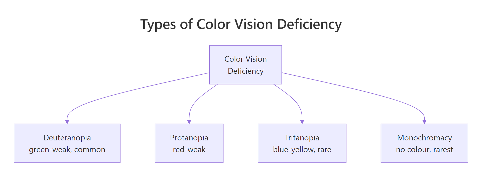
Figure 1: The four types of color vision deficiency, by how common they are.
The two red-green types, deuteranopia (green-weak) and protanopia (red-weak), are by far the most frequent and together affect about 8% of men of Northern European descent. Tritanopia (blue-yellow) is rare, and complete monochromacy (no color at all) is rarer still. The practical takeaway is blunt: red versus green is the single riskiest color contrast you can build a chart around.
Try it: Print the five colors ggplot2 would use for a five-group chart, then pick out the pair most likely to be confused as red and green.
Click to reveal solution
Explanation: The red #F8766D and the green #00BF7D sit at similar lightness, so a red-green colorblind reader sees them as nearly the same color. The more groups you add with the default scale, the more likely two of them land in a confusable pair.
What makes a color palette colorblind-safe?
A colorblind-safe palette is one whose colors stay distinct even after a cone type drops out. Two design ideas make that happen. The first is spreading colors apart in more than just hue, so they also differ in brightness. The second is perceptual uniformity, meaning equal steps in your data map to equal-looking steps in color across the whole range. Two families give you this for free in ggplot2.
The first is viridis, a set of continuous scales that ship with ggplot2. Viridis was engineered to stay readable under all common CVD types and even in grayscale. Use it for continuous quantities with scale_colour_viridis_c() (or scale_fill_viridis_c()).
The second is Okabe-Ito, a qualitative palette of eight colors designed by Masataka Okabe and Kei Ito specifically so that no two are confusable under color blindness. It is the go-to choice for categorical groups. ggplot2 does not carry it as a named scale, so we define it as a plain vector of hex codes.
That printed vector is just the eight hex codes: orange, sky blue, bluish green, yellow, blue, vermillion, reddish purple, and black. To use them, hand a named subset to scale_colour_manual(), matching each data value to a color. Here is the same scatter from before, now on a safe palette.
The three groups now use blue, orange, and green from Okabe-Ito. These were chosen so they differ in both hue and brightness, which is what keeps them apart when a cone type is missing. For a continuous variable, reach for viridis instead. Below we color the same points by city mileage, a continuous number.
The points run from dark purple (low city MPG) through green to bright yellow (high). Because viridis brightness increases steadily with the value, a reader can rank the points even if they cannot see the hues at all. That is the property a rainbow scale lacks.
Try it: Color the scatter by class (a 7-level category) using the discrete viridis scale instead of a manual palette.
Click to reveal solution
Explanation: scale_colour_viridis_d() picks seven evenly spaced viridis colors, one per class. The _d suffix means discrete (one color per category); _c means continuous. Even with seven groups the brightness ordering keeps them legible.
How can you simulate color blindness to test a chart?
Choosing a safe palette is step one. Step two is checking your specific chart, because a palette that is safe in theory can still fail once you subset it, tweak it, or add a risky custom color. The most reliable check is to transform your colors through a model of each deficiency and look at the result. The colorspace package does this with deutan(), protan(), and tritan(), one function per CVD type.
That package is not one of the ones that runs in your browser here, so run the next block in your own R session (for example in RStudio) after install.packages("colorspace"). It takes your palette and returns how those colors appear to someone with each deficiency.
library(colorspace)

# How the Okabe-Ito colours appear under two CVD types
deutan(okabe_ito)   # deuteranopia (green-weak): the most common type
#> [1] "#CAB411" "#87A4E8" "#8A8676" "#FCE34E" "#3B67B1" "#9E8C00" "#9498A5"
#> [8] "#000000"
tritan(okabe_ito)   # tritanopia (blue-yellow): rare
#> [1] "#FB8C87" "#00C2C6" "#009E92" "#FFD4C5" "#008289" "#EB4050" "#D6788A"
#> [8] "#000000"
Each call returns a new set of eight hex codes, the simulated appearance of the palette. The important test is whether the eight simulated colors are still distinct from one another. For Okabe-Ito they are, which is the whole point of the palette.
Reading hex codes is hard, so let's see them as swatches. The helper below draws any vector of colors as labeled tiles, and it even picks black or white text depending on how dark each tile is (a tiny preview of the contrast idea in the next section). We feed it the deuteranopia-simulated colors we just computed, pasted in as a vector so this block runs anywhere.
You get eight tiles, and crucially they are still eight visibly different tiles. The orange has shifted toward gold and the greens have muted, but a reader with deuteranopia can still tell every group apart. That is what "safe" looks like when you test it rather than assume it.
deutan() on your palette tells you whether groups survive color blindness; it does not change your chart. If two simulated swatches look alike, that is your signal to pick different colors or add a second encoding, which we cover below.Try it: You already defined show_swatches(). Render the tritanopia-simulated Okabe-Ito palette (its hex codes are printed above) to see how blue-yellow color blindness reshapes it.
Click to reveal solution
Explanation: Under tritanopia the yellow drifts toward pink and the blues shift toward teal, yet the eight swatches stay distinct. A palette that survives all three simulations, as Okabe-Ito does, is what we mean by colorblind-safe.
What is color contrast and why does it matter?
Color choice handles who can tell your groups apart. Contrast handles whether anyone can read your text and see your marks at all. Contrast is the brightness gap between two colors, most often between text and its background, or between a data mark and the panel behind it. Low contrast makes labels vanish for readers with low vision, on dim screens, and in bright sunlight.
The web accessibility standard, WCAG, turns this into a number you can compute. First it converts a color to a single brightness value called relative luminance, then it compares two luminances as a ratio. Both are short formulas, and both are just arithmetic you can run in base R.
The luminance step starts by undoing the gamma curve baked into screen colors, then takes a weighted average that reflects how sensitive the eye is to each channel (green counts most, blue least). If the math is not your thing, skip to the code below; the function does exactly what the formulas say.
For each channel value $c$ (red, green, or blue, scaled to the 0-to-1 range), linearize it:
$$ c_{lin} = \begin{cases} \dfrac{c}{12.92} & c \le 0.03928 \\[2mm] \left(\dfrac{c + 0.055}{1.055}\right)^{2.4} & c > 0.03928 \end{cases} $$
Then combine the three linearized channels into one luminance $L$:
$$ L = 0.2126\,R_{lin} + 0.7152\,G_{lin} + 0.0722\,B_{lin} $$
Here is that formula as an R function. It takes any hex color (or several) and returns luminance on a 0 (black) to 1 (white) scale.
The output confirms the scale: white is 1, black is 0, the Okabe-Ito blue is a dark 0.15, and the Okabe-Ito yellow is a bright 0.74. Now the contrast ratio. WCAG defines it as the lighter luminance plus a small constant, divided by the darker luminance plus the same constant:
$$ \text{contrast} = \frac{L_{light} + 0.05}{L_{dark} + 0.05} $$
The ratio runs from 1:1 (two identical colors) up to 21:1 (black on white). WCAG asks for at least 4.5:1 for normal body text and 3:1 for large text or graphical objects like lines and points. Here is the function and three quick tests.
Read those three numbers against the 4.5:1 bar for text. The mid grey scores 4.54, so it just passes; in fact #767676 is the lightest grey that clears 4.5:1 on white. The orange scores only 2.25 and fails badly, so orange text on white is too faint to read. The blue scores 5.19 and passes comfortably. Same palette, very different results depending on the background.
Try it: Check whether the Okabe-Ito sky blue (#56B4E9) passes the 4.5:1 threshold for normal text on a white background.
Click to reveal solution
Explanation: 2.31 is well below 4.5:1, so sky blue makes poor body text on white. It is fine for large marks like points and bars (which only need 3:1, and even that is borderline here), but not for small labels.
How do you make any ggplot chart accessible?
You now have the pieces: a safe palette, a way to test it, and a way to measure contrast. Putting them together into a routine turns "accessible" from a vague goal into four concrete steps you can apply to any chart.

Figure 2: Four steps that make almost any chart accessible.
The step that does the most work is the second one: redundant encoding, meaning you map the same variable to a second aesthetic so color is never the only clue. For points, add shape. For lines, add linetype. Here is the scatter from the very start of the tutorial, now encoded twice: color and shape both track drive type.
Because we gave colour and shape the same labels, ggplot2 merges them into one legend. Now a reader can separate the groups by circle, triangle, and square even if the colors are useless to them. The same trick works for line charts, where linetype (solid, dashed, dotted) plays the role of shape. Let's build a small trend dataset to show it.
Three colored lines, but color alone is doing the work. The inline exercise below fixes that. First, the fourth step in the workflow: the grayscale test. Printing and photocopying strip color entirely, so a truly robust chart still reads in pure brightness. We can preview that by converting our palette to its luminance-equivalent grays.
Look at the first two numbers: orange is 0.416 and sky blue is 0.405, almost identical brightness. In the gray swatches they collapse into the same shade. Okabe-Ito is colorblind-safe, but it is not fully grayscale-safe, because several of its colors share a luminance. This is the reason redundant encoding matters even with a good palette: shape and linetype survive the grayscale test that color cannot.
Try it: Take the line chart and add linetype = group so the three lines stay separable in black and white.
Click to reveal solution
Explanation: Mapping the same variable to linetype adds a second channel. Even printed in grayscale, solid versus dashed versus dotted tells the three lines apart when their colors would merge.
Complete Example
Let's tie the palette, contrast, and grayscale ideas together in one polished chart: average city fuel economy for each vehicle class, split by drive type. We pick three Okabe-Ito fills that sit far apart in brightness, and we audit that spacing with relative_luminance() before drawing, so we are not just trusting the palette's reputation.
The audit prints three luminances, 0.152, 0.416, and 0.257, which are comfortably spread out. Because the fills differ in brightness as well as hue, the bars stay distinguishable under color blindness and in grayscale, and because they come from Okabe-Ito, no two collapse under a deficiency. That is a chart that works for every reader, built from the same three checks you learned above.
Practice Exercises
These combine several ideas from the tutorial. Try each before opening the solution. They use fresh variable names so they will not clobber the objects from earlier examples.
Exercise 1: Rescue a red-green line chart
The chart below encodes two teams with red and green only, the worst case for a colorblind reader. Rewrite it to be accessible: swap in Okabe-Ito colors that differ in brightness, add linetype as a second channel, and then use contrast_ratio() to confirm the two line colors differ in luminance.
Click to reveal solution
Explanation: Blue and orange are far apart in hue for color vision, and linetype keeps them apart in grayscale. The contrast ratio of 2.31 confirms they also differ in brightness (blue is darker), so the two lines never look identical, whatever the reader's vision.
Exercise 2: Write a palette auditor
Not every color pair in a "safe" palette is safe in grayscale, as we saw with orange and sky blue. Write a function flag_pairs() that takes a palette and returns every pair of colors whose contrast ratio is below a threshold (default 1.15, meaning nearly identical brightness). Reuse relative_luminance() and contrast_ratio(), and utils::combn() to generate the pairs.
Click to reveal solution
Explanation: combn() builds all 28 pairs; we keep the three whose brightness is within about 15%. These are the pairs (orange and sky blue, green and vermillion, green and pink) that merge in grayscale, which is exactly why you add shape or linetype when any of them share a chart.
Exercise 3: An accessible heatmap with legible labels
Build a tile heatmap of how many cars fall in each class-and-drive combination, filled with continuous viridis. Then add the count as a text label on each tile, choosing black text on the bright (high-count) tiles and white text on the dark ones, so every label stays readable.
Click to reveal solution
Explanation: Viridis makes the counts readable as a continuous scale for every reader. The n > max(n) / 2 test flips the label color: bright yellow tiles get black text, dark purple tiles get white text, so no label ever sits on a same-brightness background. That is the contrast rule applied automatically.
Summary
Accessible visualization comes down to two questions asked of every chart: can everyone tell the groups apart, and can everyone read the marks and text? The table below maps each situation to the tool that answers it.
| Situation | Tool in R | What it does |
|---|---|---|
| Continuous quantity, any reader | scale_colour_viridis_c() / scale_fill_viridis_c() |
Brightness rises with value; safe for CVD and grayscale |
| Categorical groups, any reader | Okabe-Ito via scale_colour_manual() |
Eight colors no CVD type confuses |
| Test a chart for color blindness | colorspace::deutan() / protan() / tritan() |
Simulates how colors appear under each deficiency |
| Check text or mark legibility | contrast_ratio() vs WCAG 4.5:1 / 3:1 |
Measures brightness gap to the background |
| Survive grayscale and printing | shape, linetype, direct labels |
Redundant channels that need no color |
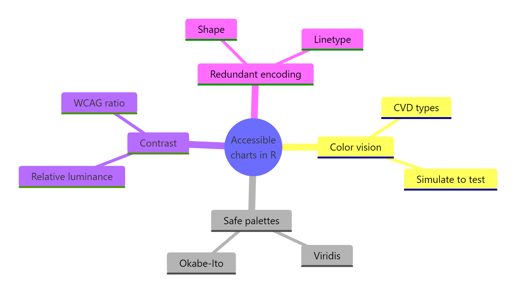
Figure 3: The pieces of accessible visualization covered in this tutorial.
The habits that make it automatic:
- Start from a safe palette: viridis for continuous data, Okabe-Ito for categories.
- Never let color be the only channel. Add shape to points and linetype to lines.
- Measure contrast instead of guessing. Aim for 4.5:1 on text, 3:1 on marks.
- Test, do not assume. Simulate CVD and preview in grayscale before you ship.
FAQ
Should I use viridis or Okabe-Ito?
Match the palette to the data. Viridis is a continuous scale, so use it for numbers you want readers to rank (counts, prices, temperatures). Okabe-Ito is a discrete, qualitative palette, so use it for unordered categories (species, region, team). Reaching for the wrong one, like a qualitative palette on a continuous variable, makes smooth data look stepwise.
Are ggplot2's default colors colorblind-safe?
No. The default scale_colour_hue() spaces colors evenly around a color wheel at similar brightness, which regularly produces confusable red-green pairs, as scales::hue_pal()(3) showed. For anything you share, replace the default with viridis or Okabe-Ito.
What contrast ratio do I actually need?
WCAG asks for at least 4.5:1 between normal text and its background, and 3:1 for large text (roughly 18pt or 14pt bold) and for graphical objects like lines, points, and icons. Chart titles and axis labels are text, so hold them to 4.5:1.
How many distinct colors can a palette carry?
Fewer than you think. Okabe-Ito tops out at eight, and beyond about seven categories any color scheme gets hard to distinguish, especially under color blindness. If you need more groups, rethink the chart: facet into small multiples, use direct labels, or aggregate the long tail into an "other" category.
Does an accessible chart still need alt text?
Yes. Color and contrast serve readers who see the chart; a text description serves screen-reader users who do not. When you save a plot for the web with ggsave(), add a concise alt attribute in the HTML <img> tag that states the chart type, the variables, and the main takeaway.
References
- Wickham, H. (2016). ggplot2: Elegant Graphics for Data Analysis, Chapter 11: Colour scales and legends. Springer. Link
- Okabe, M. & Ito, K. (2008). Color Universal Design (CUD): How to make figures and presentations that are friendly to colorblind people. Link
- Smith, N. J. & van der Walt, S. (2015). A Better Default Colormap for Matplotlib (the viridis design talk). SciPy 2015. Link
- W3C (2018). Web Content Accessibility Guidelines (WCAG) 2.1, Success Criterion 1.4.3 Contrast (Minimum) and the contrast-ratio definition. Link
- Zeileis, A., Fisher, J. C., Hornik, K., et al. (2020). colorspace: A Toolbox for Manipulating and Assessing Colors and Palettes. Journal of Statistical Software, 96(1). Link
- Wilke, C. O. (2019). Fundamentals of Data Visualization, Chapter 19: Common pitfalls of color use. Link
- ggplot2 reference. The viridis scales,
scale_colour_viridis_c(). Link
Continue Learning
- ggplot2 Colours, the foundations of mapping color aesthetics in ggplot2, the parent topic this tutorial builds on.
- R Color Theory: Palettes and ColorBrewer, a deeper tour of sequential, diverging, and qualitative palette families and when each applies.
- ggplot2 Themes, control panel background, gridlines, and text so your contrast choices survive into the final styled figure.