How to Read ggplot2 Code: 10 Real Plots Deconstructed
Reading ggplot2 code means walking a chain of + layers from left to right and naming what each one adds. Once you can read a function's prefix, any plot becomes a plain sentence you can follow. We use the built-in ggplot2 datasets throughout, and every block runs in your browser, so you can read the code and watch the plot appear side by side.
Why does ggplot2 code look like a chain of plus signs?
The first time you meet ggplot2 code, it looks like a pile of functions glued together with + signs, and it is hard to tell where one idea ends and the next begins. The good news: that chain is not random. It is a recipe you read from left to right, one step at a time. Let's start by looking at a finished plot together with the data it draws from.
The mpg dataset ships with ggplot2 and holds one row per car model, with columns for engine size (displ), highway mileage (hwy), and body type (class). The plot code has just two parts joined by a +. The first part, ggplot(mpg, aes(x = displ, y = hwy)), says which data to use and which columns feed the x and y axes. The second part, geom_point(), says draw each row as a point.
Here is the trick that makes ggplot2 readable: read the chain out loud as a sentence. This plot reads as: "Take the mpg data, put engine size on the x axis and highway mileage on the y axis, then draw each car as a point." That is the whole plot. Every ggplot2 command, no matter how long, can be read the same way.

Figure 1: A ggplot2 command reads left to right: start with data, then add each layer with +.
The + sign is the punctuation of that sentence. It means "and then add another layer on top." A plot object is literally a stack of layers, and you can ask R how many layers a plot has.
Our scatter plot has exactly one layer, the geom_point() we added. Later, when we stack a trend line on top, this same count will read 2. Counting layers is a quick way to confirm you have spotted every + that draws something.
Try it: The plot p1 has no title. Add one more layer with a + so the plot gains the title "Engine size vs mileage". You only need to add a labs() layer.
Click to reveal solution
Explanation: labs() is one more layer, so you attach it with a + just like any other. Reading the new chain out loud: "...and then label the plot with this title." The prefix labs is your clue that this layer adds text, not data.
What are the building blocks every ggplot2 plot is made of?
Now that you can read a two-part chain, here is the map for reading any chain. Every ggplot2 layer belongs to one of a handful of jobs, and the beautiful part is that the function's prefix tells you which job it does. You do not need to memorize hundreds of functions. You need to recognize six or seven prefixes.
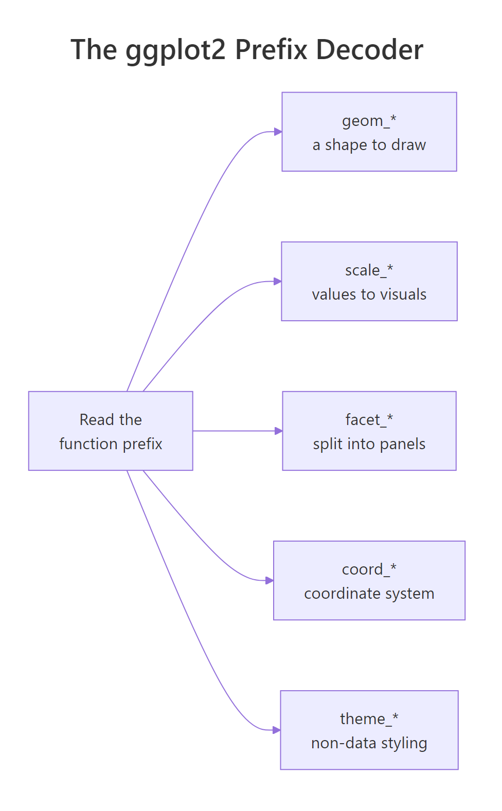
Figure 2: The function prefix tells you which slot a layer fills.
Here is the decoder. When you hit an unfamiliar + something() in a plot, find its prefix in this table and you instantly know its job.
| You see | Prefix | Its job (the question it answers) |
|---|---|---|
ggplot(data, ...) |
ggplot |
What dataset does this plot read? |
aes(...) |
aes |
Which columns map to x, y, colour, size? |
geom_point, geom_bar |
geom_ |
What shape draws the data? |
scale_x_log10, scale_fill_brewer |
scale_ |
How do data values become positions and colours? |
facet_wrap, facet_grid |
facet_ |
Should the plot split into small panels? |
coord_flip, coord_polar |
coord_ |
What coordinate system draws the shapes? |
labs, theme_minimal, theme |
labs / theme |
What text and styling wrap the plot? |
Let's re-read our scatter plot through this lens. Watch how each line of the command below announces its own job. We write the same plot again, but with every slot on its own line and a comment naming it.
Read top to bottom, the command is a checklist you filled in: data and mapping first, then a shape, then text, then style. Nothing here is memorized syntax, it is the same five questions from the table, answered in order. When you read code someone else wrote, run the same checklist and every line falls into a slot.
geom_ draws, scale_ maps, facet_ splits, coord_ reshapes, theme_ styles. Naming the category first stops the code from feeling like a wall.Try it: You spot the line + coord_flip() in someone's plot. Without running anything, which slot does it fill and what does it do? Write your one-sentence answer, then run the snippet below to check.
Click to reveal solution
The prefix is coord_, so it sets the coordinate system. coord_flip() swaps the x and y axes, turning vertical bars into horizontal ones. Reading it out loud: "...and then flip the coordinates so the bars lie sideways." Horizontal bars are easier to read when category names are long.
How do you read the geom layer, and the numbers it makes up?
Most geom_ layers just draw the numbers you gave them. A few of them do arithmetic first, and that trips up new readers who go looking for a y value that is not in the data. The classic example is geom_bar(). Notice that the plot below maps only x, with no y anywhere, yet the bars still have heights.
The table() call shows the counts by hand: 5 two-seaters and 47 compacts, on up to 62 SUVs. The plot has no y in its aes(), yet each bar rises to one of those numbers. That is because geom_bar() runs a hidden counting step, called a stat, before it draws. When you read a bar chart, the correct question is not "where is the y column?" but "what did the geom compute for me?"
Histograms work the same way. A histogram maps only a single continuous column, then the geom slices it into bins and counts how many values fall in each bin.
Read out loud: "Take the mpg data, put highway mileage on the x axis, then slice it into 20 bins and draw a bar for how many cars land in each." The bins = 20 inside the geom is a setting that controls the counting, not a column from the data.
geom_bar(), geom_histogram(), geom_count(), or geom_density() with only an x mapping, read it as "this geom makes up the height from the data," rather than hunting for a missing column.Try it: You read a bar chart that maps only x = drv on the mpg data, with no y anywhere. Predict what the y axis will show before running it.
Click to reveal solution
The y axis shows a count: how many cars have each drive type (4 for four-wheel, f for front, r for rear). There is no y in the mapping, so geom_bar() counts the rows in each drv group and uses that count as the height.
How do you read aes(), and why is colour sometimes outside it?
This is the single most confusing thing for new readers, so it is worth slowing down. Colour, size, and shape can appear in two places, and the place changes their meaning completely. When colour sits inside aes(), it maps a data column, so the plot gets one colour per value plus a legend.
Read out loud: "...and colour each point by its class." Because colour = class lives inside aes(), ggplot2 assigns a different colour to each car class and draws a legend so you can tell them apart. The legend is the giveaway that a column was mapped.
Now watch what happens when colour sits outside aes(), inside the geom itself. It becomes a fixed setting applied to every point, with no legend at all.
Read out loud: "...and make every point steelblue." Here colour is not tied to any column, it is a paint choice, so there is no legend. The rule for reading is short: inside aes() means "colour by a column," outside aes() means "set one fixed colour."
aes(). If every mark is the same colour with no legend, the colour was set outside aes() as a plain value. Mixing these two up is the most common ggplot2 reading mistake.Try it: Two snippets are below. Read them and decide which one produces a legend, then run to confirm.
Click to reveal solution
Explanation: The second snippet maps colour = drv inside aes(), so it colours points by drive type and draws a legend. The first sets colour = "darkgreen" outside aes(), so all points are green with no legend.
How do you read a plot with several geom layers stacked?
Real plots often stack more than one geom. Reading them is still just walking the chain, but now you say "and on top of that, also draw..." for each extra geom. The order you read them in is the order they are drawn, so later layers sit on top of earlier ones. Here we draw the points, then add a straight trend line on top.
Read out loud: "Take the mpg data, map engine size and mileage, draw the points, then on top draw a straight best-fit line." The geom_smooth(method = "lm") layer fits a line through the cloud and draws it. The layer count now reads 2, matching the two geoms we can see in the code.
Both geoms share the same aes() from the ggplot() call, which is why the line follows the same x and y as the points. That is the default: a mapping set in ggplot() flows down to every geom below it. When you read stacked geoms, assume they share the top mapping unless a geom carries its own aes().
Try it: Swap the order of the two geoms below so the points are drawn on top of the smooth line. Predict what changes visually, then run it.
Click to reveal solution
With geom_smooth() written first and geom_point() second, the points are drawn last and therefore sit on top of the line. The line is now partly hidden behind the point cloud. Reading order equals drawing order: whatever comes later in the chain lands on top.
How do you read scales, coordinate flips, and log axes?
Once data and geoms are in place, the next family of layers adjusts how values become positions and colours. These carry the scale_ and coord_ prefixes. A scale_fill_* layer, for example, controls the palette used to fill shapes. Read the boxplot below: it fills boxes by drive type, then picks a specific colour palette.
Read out loud: "...fill each box by drive type, and use the Set2 palette for those fills." The scale_fill_brewer() line does not add data, it only changes which colours the mapped fill uses. Its scale_fill_ prefix tells you that before you read the argument.
Scales also handle axis transformations. The diamonds dataset has prices and carat weights that span a huge range, which squashes a normal scatter into one corner. Reading the price and carat ranges shows why.
Prices run from 326 to 18823 dollars, and carats from 0.2 to 5, both heavily bunched at the low end. Read out loud: "...draw faint points, then put both the x and y axes on a log scale." The alpha = 0.3 inside geom_point() is what makes the points faint: it sets their transparency, so where many points overlap the colour builds up darker. The two scale_*_log10() layers stretch the crowded low values apart so the pattern becomes a clean line. We loaded forcats here because the next plot needs it.
A coord_ layer reshapes the whole coordinate system after the geoms are placed. Reading a coord_flip() plot, you can also spot a data transform hiding inside aes(). Here fct_reorder() sorts the classes by their median mileage before plotting.
Read out loud: "Order the classes by their median highway mileage, draw a boxplot for each, then flip the coordinates so they run left to right." The levels() output confirms the order the plot uses: pickups have the lowest median mileage, midsize cars the highest. Reading the transform inside aes() explains why the boxes are sorted rather than alphabetical.
scale_x_log10 means "the x aesthetic, on a log10 scale"; scale_fill_brewer means "the fill aesthetic, using a Brewer palette." Splitting the name at the underscore gives you the meaning before you read the arguments.Try it: You read the line + scale_y_log10() at the end of a plot. In one sentence, what does it change about the plot? Write your answer, then run the check.
Click to reveal solution
scale_y_log10() puts the y axis on a base-10 log scale. Only the y aesthetic changes: prices that were bunched near the bottom get spread out, so the relationship with carat looks straighter. The data itself is untouched, just the axis mapping.
How do you read faceted and publication-ready plots?
The last two families split the plot into panels and add polish. A facet_ layer takes one plot and repeats it once per group, a technique called small multiples. Read the facet formula as "one panel per...".
Read out loud: "...then split this scatter into one panel per class." The ~ class part is a formula that names the grouping column. Every panel shares the same axes, which makes it easy to compare the same relationship across groups. The facet_ prefix is your signal that the plot is about to multiply into panels.
The final family, labs and theme_, never touches the data at all. It only renames things and restyles the look. Reading a polished plot, you can safely skim these layers last, because they change nothing about the numbers.
Read out loud: "Take the economics data, put date on x and unemployment on y, draw a line, then label it and apply the minimal theme." The economics data has one row per month. The labs() and theme_minimal() layers add the title, axis names, and a clean white look, but the line itself is decided entirely by geom_line() and the mapping above it.
labs() and theme_*() line as styling you can skim.Try it: You read + facet_wrap(~ drv) on the mpg data. How many panels will the plot have? (Hint: drv has three values.) Write your answer, then run to confirm.
Click to reveal solution
Three panels, one for each drive type (4, f, r). facet_wrap(~ drv) creates one panel per distinct value of drv, and drv has three values, so you get three side-by-side scatter plots sharing the same axes.
Complete Example: Reading a Six-Layer Plot Line by Line
Now let's read a plot with every family at once, the kind you might meet in a real analysis script. Do not try to absorb it as a whole. Read it one + at a time, naming each slot from its prefix, and it stays simple.
The first two lines are data preparation, not part of the plot. set.seed(1) just fixes the random draw so you get the same 2000 rows every time. The |> is R's pipe: it passes diamonds into filter(carat < 3) (keep only diamonds under 3 carats), then passes that result into slice_sample(n = 2000) (take 2000 random rows). Everything from ggplot( onward is the plot chain, and that is what we read below.
Read the chain slot by slot, exactly as the comments number it:
- Data and mapping: take a 2000-row sample of diamonds under 3 carats, put carat on x and price on y, then colour by cut.
- First geom: draw faint points, using the same
alpha = 0.3transparency as before. - Second geom: add a straight trend line, one per cut colour, with no shaded error band.
- Scale: put the y axis on a log scale and format the price labels with commas.
- Facet: split everything into one panel per clarity grade.
- Labs and theme: add the title and axis names, then apply the minimal theme for styling.
That is six ideas, read in order, each announced by its prefix. The nrow(d) check confirms we are drawing the 2000 sampled rows. Once you can narrate a plot like this line by line, no ggplot2 code can intimidate you, because every long chain is just this same short list of questions answered one layer at a time.
Practice Exercises
These exercises train the reading skill directly. Try to answer each one in plain English before you run any code.
Exercise 1: Narrate every layer
Read the plot below and write a one-sentence description of what each layer does, naming its slot (data, mapping, geom, scale, facet, or theme). Then run it to check your reading against the picture.
Click to reveal solution
Line by line: ggplot(mpg, ...) sets the data and maps class to the x axis, mileage to the y axis, then fill colour to class as well (mapping). geom_boxplot() draws a box-and-whisker shape per class (geom). scale_fill_brewer(palette = "Set3") chooses the palette for the fill (scale). labs(title = ...) adds the title (labs). theme_minimal() styles the look (theme). Reading out loud: "Show the spread of highway mileage for each class as boxplots, coloured with the Set3 palette, titled and styled minimally."
Exercise 2: Find the layer with the bug
Someone wanted a scatter plot where each drive type gets its own colour and a legend. Their code below produces green points with no legend instead. Read the layers, find the one line that causes the problem, and fix it so the colour maps to drv.
Click to reveal solution
Explanation: The bug is colour = "green" set outside aes(), inside the geom. That paints every point one fixed colour and never draws a legend. Moving colour = drv inside aes() maps the colour to the drive-type column, so ggplot2 assigns one colour per value and adds a legend automatically.
Exercise 3: Read a messy chain without running it
Read the chain below and describe the final plot in words: what shape, what is on each axis, how it is coloured, whether it splits into panels, plus whether any axis is transformed. Only after you have written your description, run it to check.
Click to reveal solution
The plot is a scatter (geom_point) of price against carat, with faint semi-transparent points. Points are coloured by cut, so there is a legend. The y axis is on a log10 scale with comma-formatted labels. The whole scatter is split into one panel per diamond color grade by facet_wrap(~ color), and theme_minimal() gives it a clean style. Reading out loud: "Faint carat-versus-price points, coloured by cut, on a log price axis, one panel per colour grade, minimally styled."
Frequently Asked Questions
What does the plus sign actually do in ggplot2 code?
It adds one more component to the plot on its left. Each + attaches a new piece, whether a geom layer or a styling tweak, to the growing plot object. That is why plots are built up in stages rather than in a single call, and why you read the code as "and then add."
Why do some plots have a y axis when the code never sets one?
Because certain geoms compute the y value themselves. geom_bar() and geom_histogram() count rows behind the scenes, so they turn a single x mapping into bar heights. When you meet a bar chart with only x mapped, read it as "the geom is counting for me."
How do I know whether a colour will get a legend?
Look at where the colour sits. If colour or fill appears inside aes(), it maps a data column and ggplot2 draws a legend automatically. If it appears outside aes() inside the geom, it is a fixed setting and no legend appears.
In what order should I read a long ggplot2 command?
Read left to right, or top to bottom when it spans several lines. Begin with the data and mapping, then move through the geoms one at a time. Read any scale_ and coord_ and facet_ layers next, and treat labs() and theme_*() as final polish you can skim.
Is reading ggplot2 code different from writing it?
They use the same grammar, so the skills reinforce each other. Reading is often the faster win, because you meet far more ggplot2 code in other people's scripts and answers than you write yourself. Once you can name each layer's slot from its prefix, writing your own plots becomes filling in the same slots.
Summary
You now have a repeatable method for reading any ggplot2 command: walk the + chain left to right and name each layer's job from its prefix. The prefix is the key, it tells you the slot before you read a single argument.
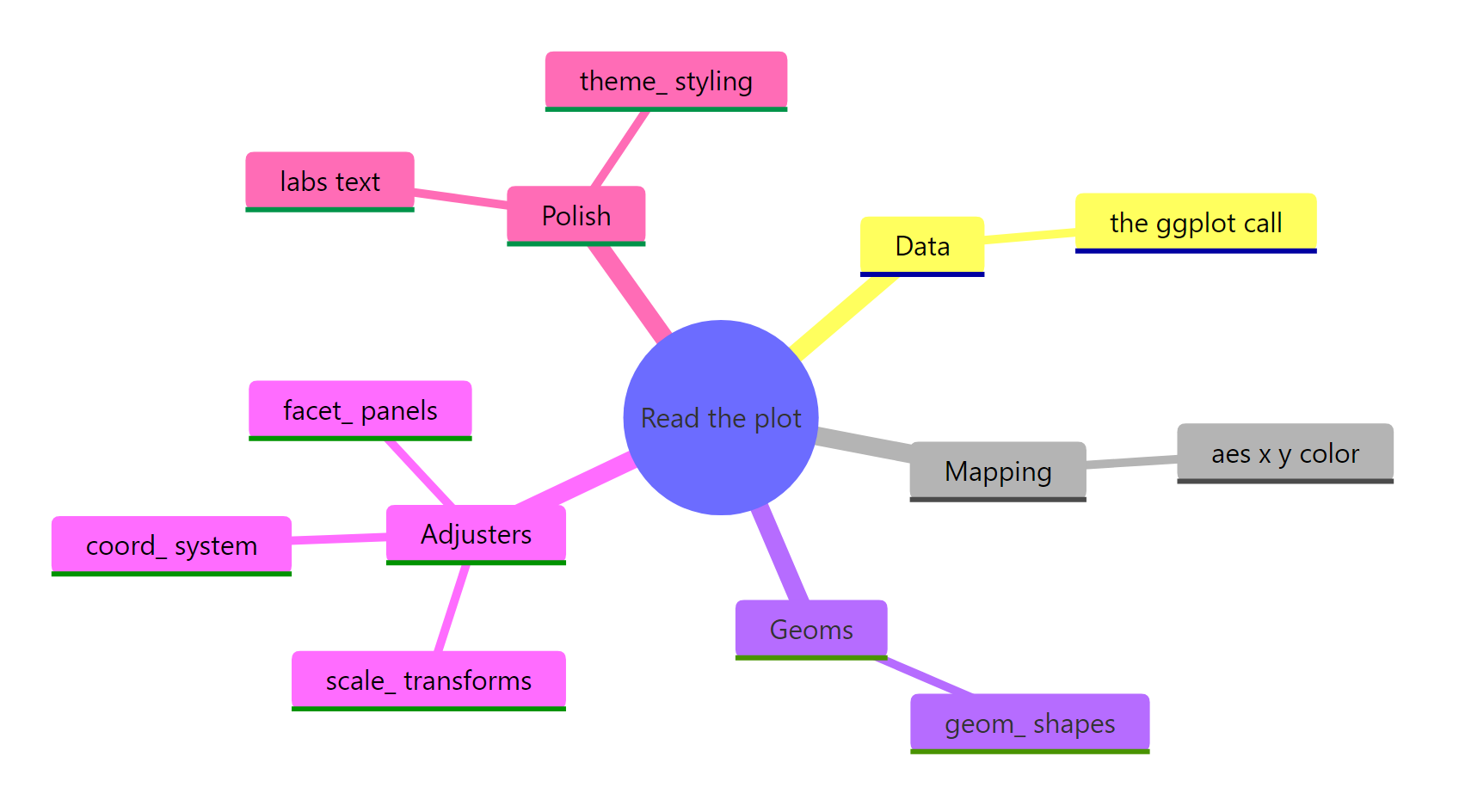
Figure 3: A reading checklist you can run on any ggplot2 plot.
| Prefix | Slot | The question it answers |
|---|---|---|
ggplot |
Data | Which dataset does the plot read? |
aes |
Mapping | Which columns map to x, y, colour, fill? |
geom_ |
Geom | What shape draws the data (and does it compute values)? |
scale_ |
Scale | How do values become positions and colours? |
coord_ |
Coordinates | What coordinate system draws the shapes? |
facet_ |
Facets | Is the plot split into panels? |
labs / theme_ |
Polish | What text and styling wrap the plot? |
Key takeaways to carry forward:
- Read the chain as a sentence. Each
+means "and then add a layer," so a plot is just a recipe read top to bottom. - Read the prefix first.
geom_draws,scale_maps,facet_splits,coord_reshapes,theme_styles. - Watch where colour sits. Inside
aes()maps a column and adds a legend; outsideaes()sets one fixed value. - Some geoms make up numbers. A bar or histogram with only an x mapping is counting for you behind the scenes.
- labs and theme are decoration. Skim them last when you want to understand the data quickly.
References
- Wickham, H., Navarro, D., Pedersen, T. L. ggplot2: Elegant Graphics for Data Analysis (3e), "Build a plot layer by layer". Link - the canonical walk-through of adding one layer at a time, straight from the package authors.
- Wickham, H. A Layered Grammar of Graphics. Journal of Computational and Graphical Statistics (2010). Link - the paper that defines the grammar the
+chain is built on. - ggplot2 function reference, tidyverse. Link - look up any
geom_,scale_,facet_, orcoord_function by its prefix. ggplot()reference, tidyverse. Link - the argument-by-argument spec for the openingggplot()call.aes()reference, tidyverse. Link - every aesthetic you can map insideaes(), in one place.- Wickham, H., Çetinkaya-Rundel, M., Grolemund, G. R for Data Science (2e), Data visualization. Link - a gentle first course if you want to start writing the plots you can now read.
Continue Learning
- The Grammar of Graphics in ggplot2 - the theory behind the layers you just learned to read.
- ggplot2 Aesthetics: Mapping Data with aes() - go deeper on the mapping slot and everything
aes()can do. - Scatter and Line Charts in ggplot2 - start building the plots you can now read fluently.