A Publication Figure System in R: an End-to-End Case Study
A publication figure system is a small set of reusable pieces, one theme, one colour palette and one set of shared scales, that makes every figure in a study look like one designed object instead of a pile of one-off plots. In this case study you build that system once for a real analysis, then use it to produce a coherent set of six journal-ready figures. Everything runs as interactive code in your browser, so you can change a value and rebuild any figure on the spot.
What is the study, and why does it need a figure system?
Imagine you are the data person on a small paper about mammal sleep. The lead author hands you a question: does an animal's body size and its diet explain how much it sleeps? You have one dataset and, by the end, you will owe the journal a figure set: a main result, a group comparison, a distribution, a model summary and a supplementary check. If each of those figures uses a different font, a different grey, and a different colour for "carnivore", the reader spends energy re-learning the chart instead of reading the science.
That is the whole reason a figure system exists. Before we design anything, let's meet the data and confirm there is a story worth telling. We will use msleep, a built-in dataset of sleep records for 83 mammals that comes with ggplot2, and keep the species whose diet is recorded. The first block loads the tools, trims the columns we need, and prints a one-line headline so we know the payoff before we plot anything.
We kept 76 species with a recorded diet. The average mammal sleeps about 10.5 hours a day, and the correlation between sleep and body mass (on a log scale) is -0.6, a moderate negative link. In plain terms, heavier animals tend to sleep less. That single number is enough to build a main-result figure around, so there is a real result worth showing.
The second question is whether diet adds anything. vore labels each species as a carnivore, herbivore, insectivore or omnivore. Let's compute the mean sleep for each diet group, sorted from sleepiest to least, so we can see whether the groups even differ.
Insectivores look like the sleepiest group at 14.9 hours, well above the herbivores at 9.5. That is a real gap worth a comparison figure. But look at the mammals column: there are only 5 insectivores, against 32 herbivores. Hold that thought, because the size of a group decides how much we can trust its average, and that tension will drive one of our most important design decisions later.
Try it: Each species belongs to a taxonomic order (Rodentia, Primates, and so on). Count how many species fall in each order and show the three largest groups.
Click to reveal solution
Explanation: count(order, sort = TRUE) tallies rows per order and sorts by the count, and head(3) keeps the three biggest. Rodents dominate the sample, which is worth remembering when you generalise any result.
What do the default plots get wrong?
Before we build anything polished, let's be honest about where a first draft lands. A reviewer sees the default plot before they see your analysis, so it pays to know what they will flag. We will make the two most obvious figures with plain ggplot2 defaults: a scatter of sleep against body mass, and a bar of mean sleep per diet.
Run both, then compare them to the rendered versions below.
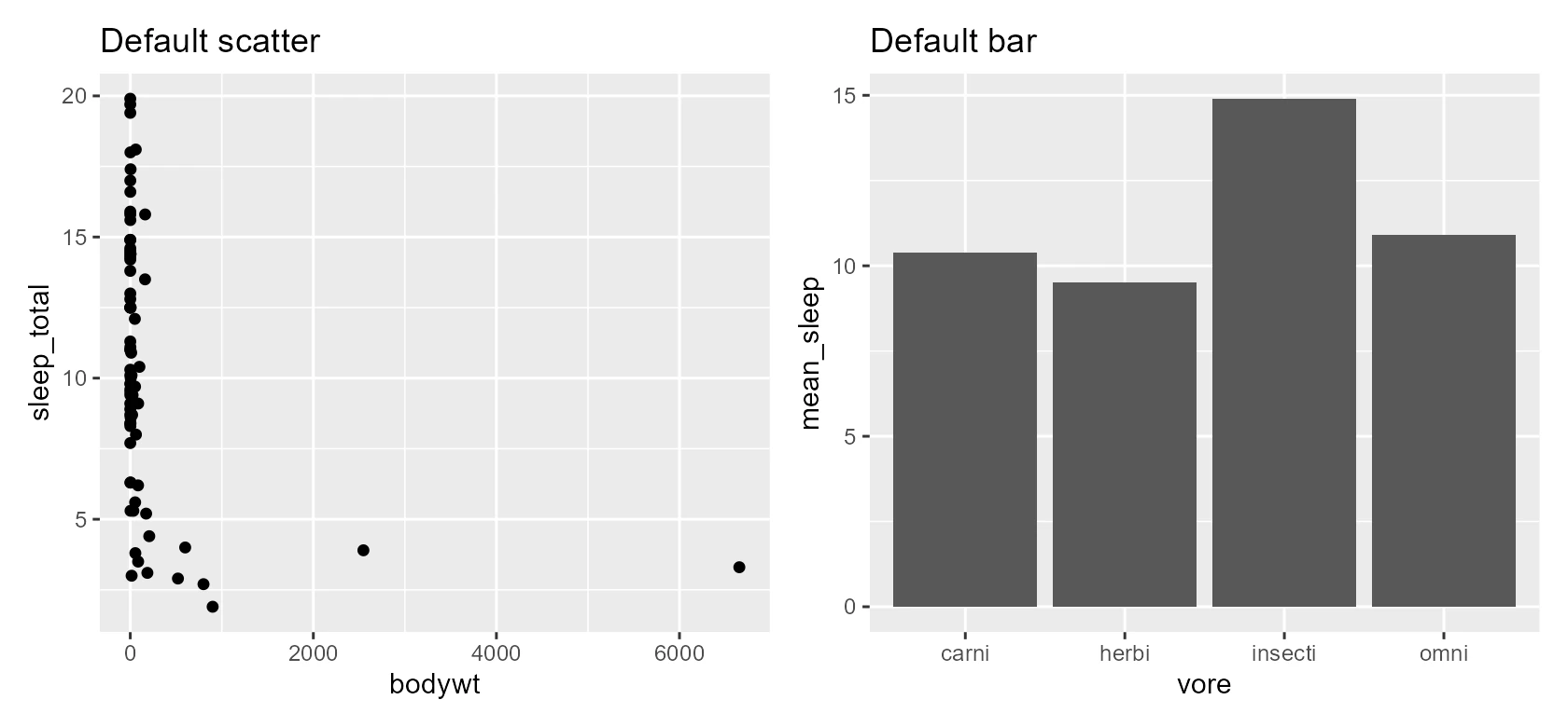
Figure 1: The defaults. A reviewer would reject both on sight.
Here is what a reviewer would circle in red. In the scatter, body mass runs from a 5-gram shrew to a 6,600-kilogram whale, so on a linear axis every small mammal is smashed into a vertical stripe at the left and the relationship is invisible. The grey panel background is chartjunk that print does not want, the axis titles are raw column names like bodywt, and nothing tells the reader which point is a carnivore.
The bar chart is worse than it looks. The bars are ordered alphabetically rather than by value, so the eye has to hunt. The axis labels are again raw names. Most importantly, the tall insectivore bar looks like a confident, solid fact, yet it rests on just five animals. A bar draws a heavy block from zero up to the mean and shows nothing about how uncertain that mean is.
Try it: The scatter's real problem is the linear x-axis. Put body mass on a log scale so the small mammals stop bunching up, and see the trend appear.
Click to reveal solution
Explanation: scale_x_log10() spreads the body-mass values across the axis by their order of magnitude, so a shrew and a whale sit at opposite ends instead of stacking up. The downward trend that was hidden is now easy to see. Logging a heavily skewed axis is the single most useful fix in this whole tutorial.
How do you build one theme, one palette and shared scales?
Now we design the system. It has three parts: a colour palette that names each diet, a theme function that sets every non-data detail, and a scale helper that applies the palette the same way every time. We build each once, then reuse it for the rest of the paper.
Start with colour, because colour carries meaning here. We assign one fixed colour to each diet and reuse it in every figure, so "green" always means herbivore. The four hex codes below come from the Okabe-Ito palette, a set chosen to stay distinct for readers with colour-vision deficiency and to survive greyscale printing.
The vector is named, so ggplot2 can match each colour to its diet by name rather than by position. That naming is what keeps carnivores the same rust-orange whether they appear first or last in a plot. We also fix a display order and a set of human-readable labels, so every axis and legend reads "Herbivore" instead of "herbi" and lists the groups from least to most sleep.
Next comes the theme, the part that controls every non-data mark: fonts, grid lines, the background, the legend. We wrap our choices in a function called theme_paper() so any figure can adopt them in one line. Read the comments as a rationale, because in a real style guide each of these lines is a decision you can defend to a co-author.
A few of those choices deserve a sentence each. We start from theme_minimal() because it already removes the grey panel that journals dislike. We keep only a faint horizontal grid, since most of our plots ask the reader to compare values up the y-axis, and a full grid would box the data in. We put the legend on top and left-aligned so the panel keeps its full width, and we use the plain "sans" font family because it is guaranteed to exist everywhere the code runs.
The last piece is a scale helper, so applying the palette is one short call rather than a long scale_colour_manual() repeated in every figure. We register the theme as the session default with theme_set(), and from here on every plot picks it up automatically.
That is the same scatter from the audit, now wearing the system. The result below shows the payoff of a few lines of setup.
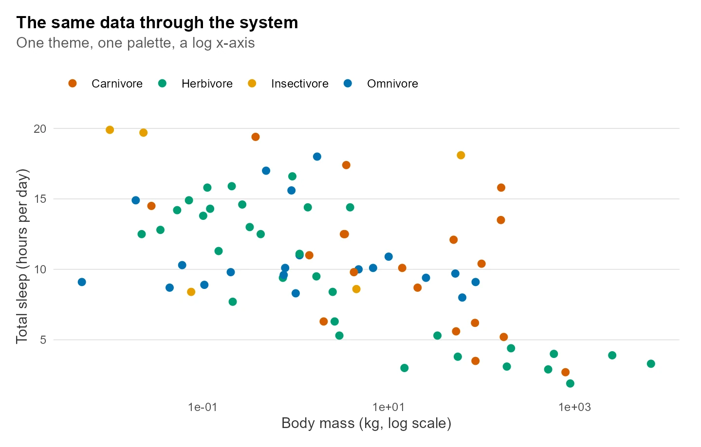
Figure 2: The same data through the system: clean theme, log axis, meaningful colour.
The three pieces fit together like this: the theme, the palette and the shared scale all feed into every figure, so one edit to any of them restyles the whole set.
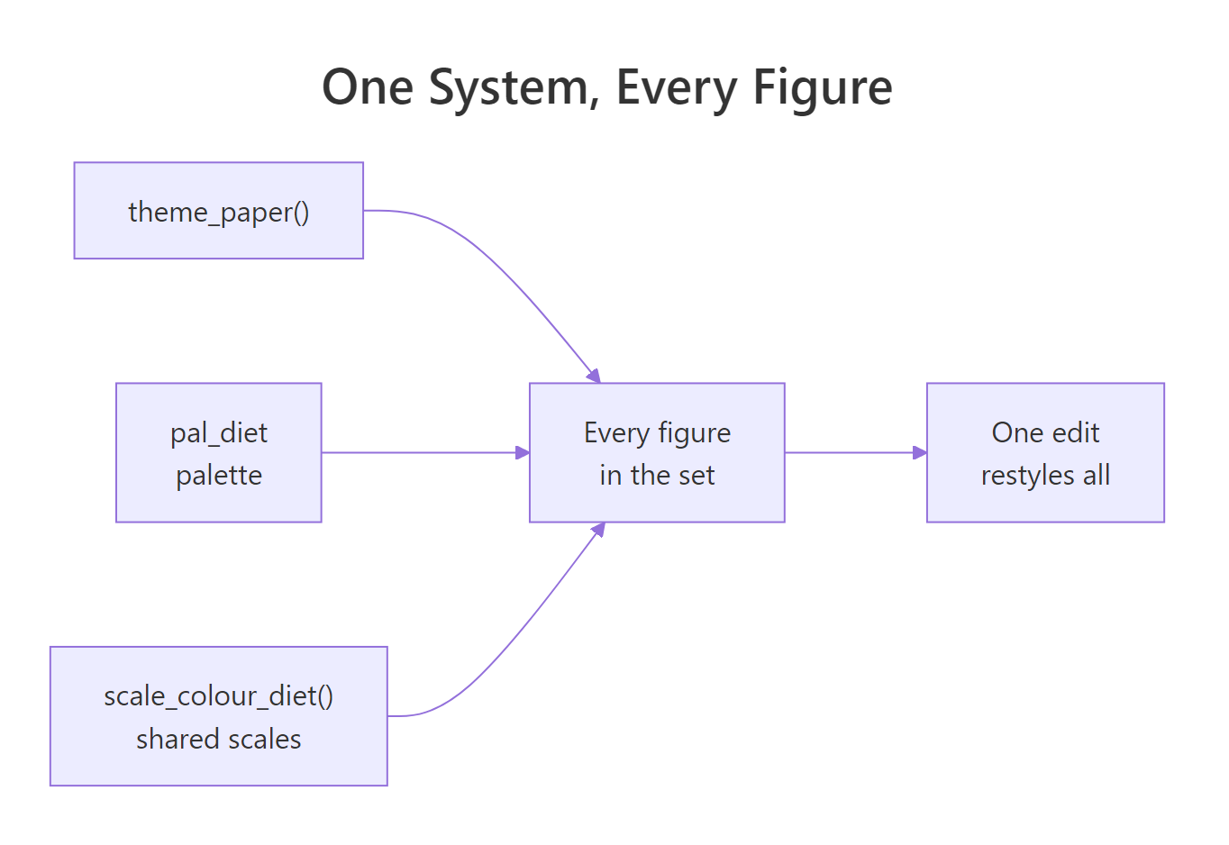
Figure 3: One system feeds every figure in the paper.
theme_paper() with a base_size argument lets you bump the text size for a poster or a slide without redefining anything. A plain saved theme object is fixed; a function is a reusable recipe you can tune per output.Try it: Our theme puts the legend on top. On one plot, override that and move the legend to the right, without touching theme_paper() itself.
Click to reveal solution
Explanation: A later theme() layer overrides the matching setting from theme_paper(), so the legend moves to the right for this one plot while every other figure keeps the top legend. That is the point of a system: sensible defaults you can override locally when a figure needs it.
How do you build the main-result figure?
The main result answers the paper's headline question in one picture: bigger mammals sleep less. We plot total sleep against body mass on the log axis, colour each species by diet, and lay a linear fit with a shaded 95% confidence band over the top. The band is our first honest signal of uncertainty, because it shows how tightly the data pin the trend.
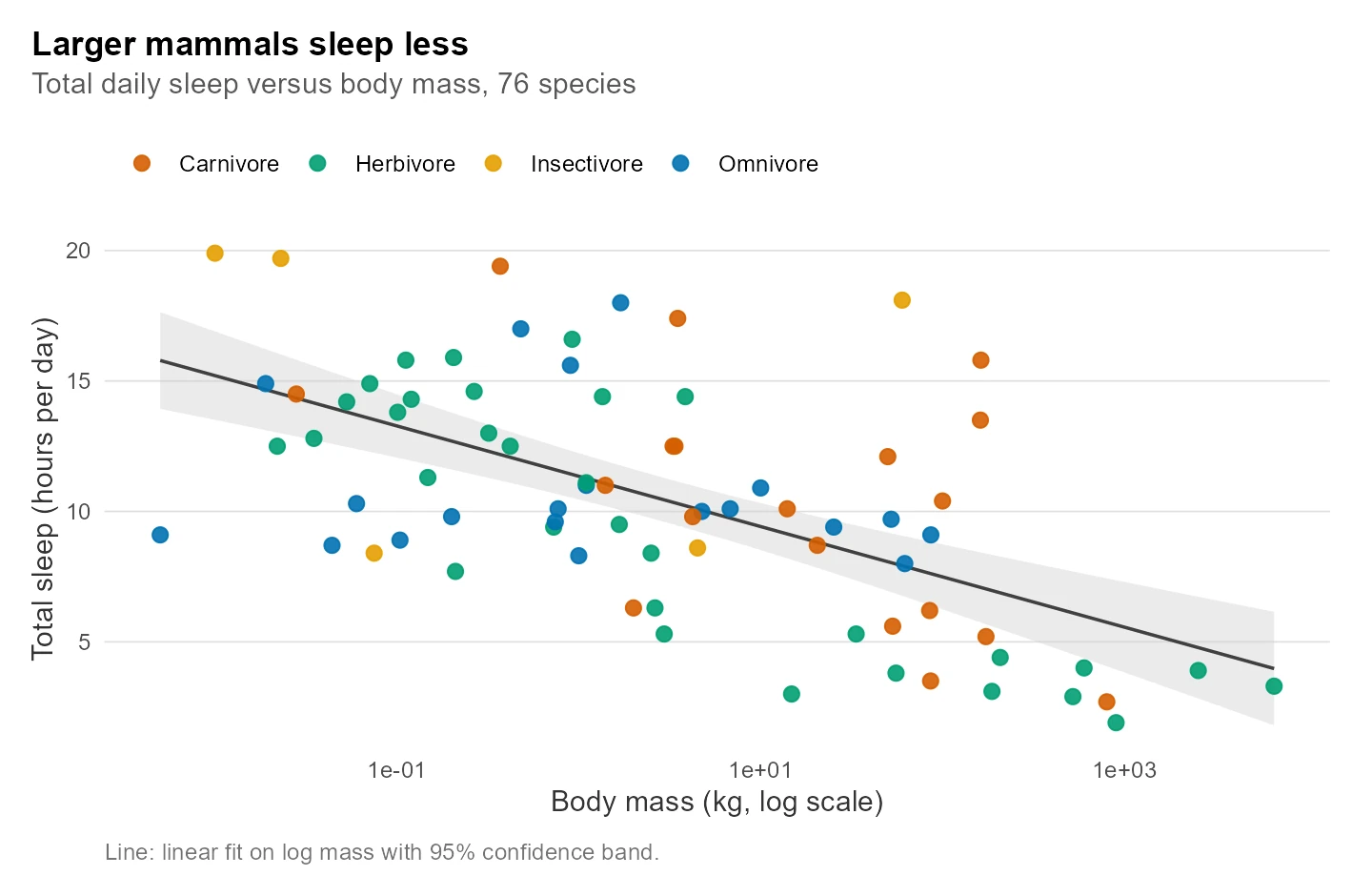
Figure 4: Total daily sleep falls as body mass rises, across 76 mammal species.
Read the figure from the line outward. The fitted line slopes down, and the narrow grey band around it tells us the slope is well determined, not a fluke of a few points. Because we drew the confidence band instead of just the line, a reader can see at a glance that the trend would survive a modest change in the sample. The diet colours add a second layer of information without extra clutter: insectivores (orange) sit high and light, big herbivores (green) trail off to the lower right.
Notice how much the earlier setup is paying off now. Building this figure took only the geoms and the labels, because the theme, palette and log scale all came from the system. The caption is written the way it would appear under the figure in the paper, a habit worth keeping so captions never become an afterthought.
Try it: In a dense cloud, smaller and more transparent points let the fitted line show through. Shrink the points and lower their opacity.
Click to reveal solution
Explanation: Smaller, semi-transparent points reduce overplotting where species pile up, so the shape of the cloud and any fitted line read more clearly. Point size and opacity are two of the cheapest levers you have for a crowded scatter.
How do you compare groups and show their spread?
The audit showed why a bar of group means is a trap: it hides the sample size and pretends every mean is equally solid. The fix is to plot the mean as a point, draw a 95% confidence interval around it, and scatter the individual species behind it so the reader sees the raw spread. First we compute the interval for each diet.
The interval is the mean plus or minus the standard error times a t-value from qt(), which is the standard 95% confidence interval for a group mean. Look at the two extremes. The omnivore mean of 10.9 comes with a tight interval of 9.5 to 12.3, because 20 species pin it down. The insectivore mean of 14.9 carries a huge interval of 7.6 to 22.3, because only 5 species stand behind it. The bar chart drew those two as equally tall, solid blocks; the interval shows that one of the two means is far less precise than the other.
Now we draw the comparison. We put the mean as a fat point, the interval as an error bar, and the individual species as faint jittered dots behind each group. We order the groups by their mean, so the eye reads them in a natural sequence.
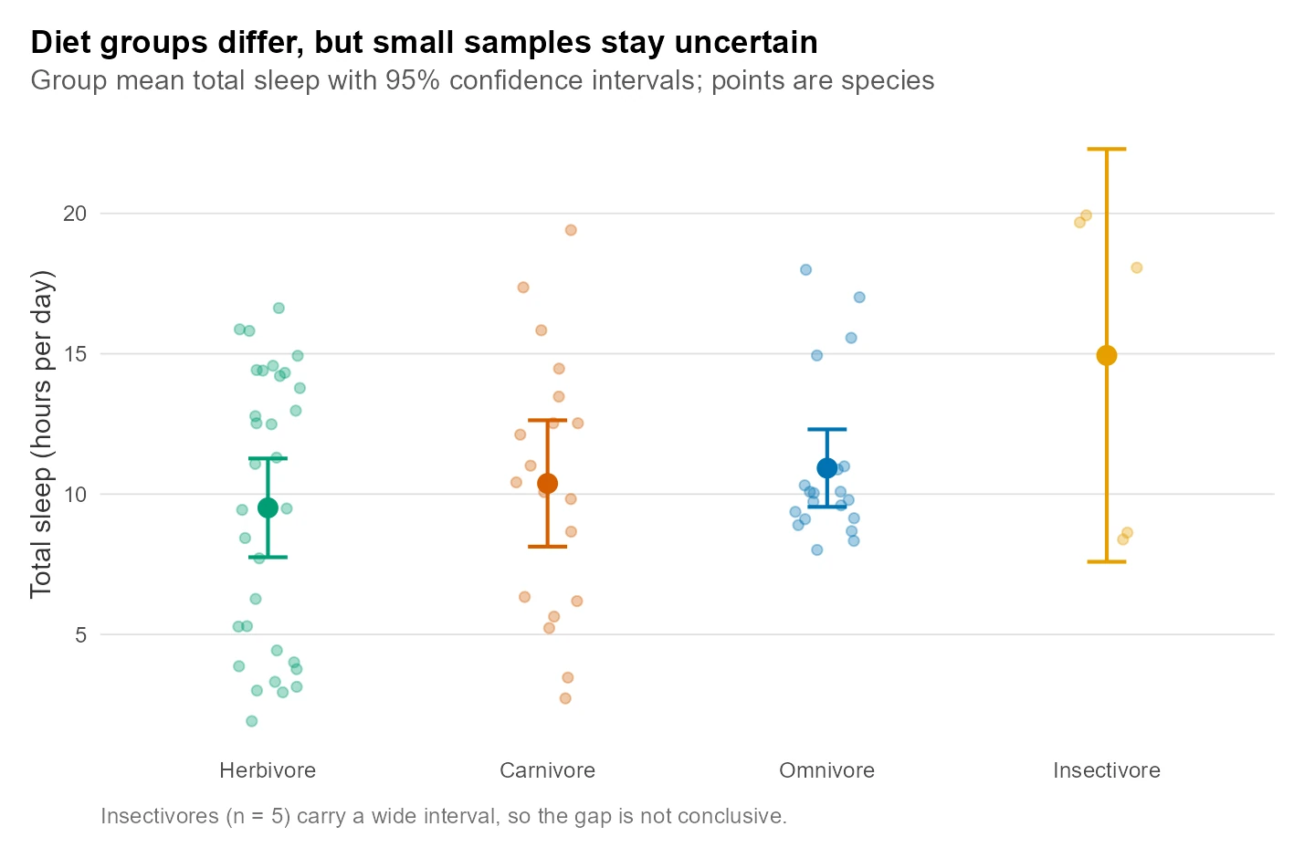
Figure 5: Diet-group means with 95% intervals. The insectivore interval is wide because n = 5.
This figure makes an honest claim. Yes, insectivores have the highest mean, but their interval is so wide that it overlaps every other group, so we cannot call the difference real from this sample alone. The jittered points add a second layer of information: you can see that omnivores cluster tightly around their mean while carnivores spread from short to long sleepers. We hid this figure's colour legend because the x-axis already names each group, avoiding a redundant key.
A distribution figure completes the picture by characterising the outcome itself. Reviewers often ask "what does the response variable look like?", and a histogram answers it directly. We add a dashed line at the median so the centre is unmistakable.
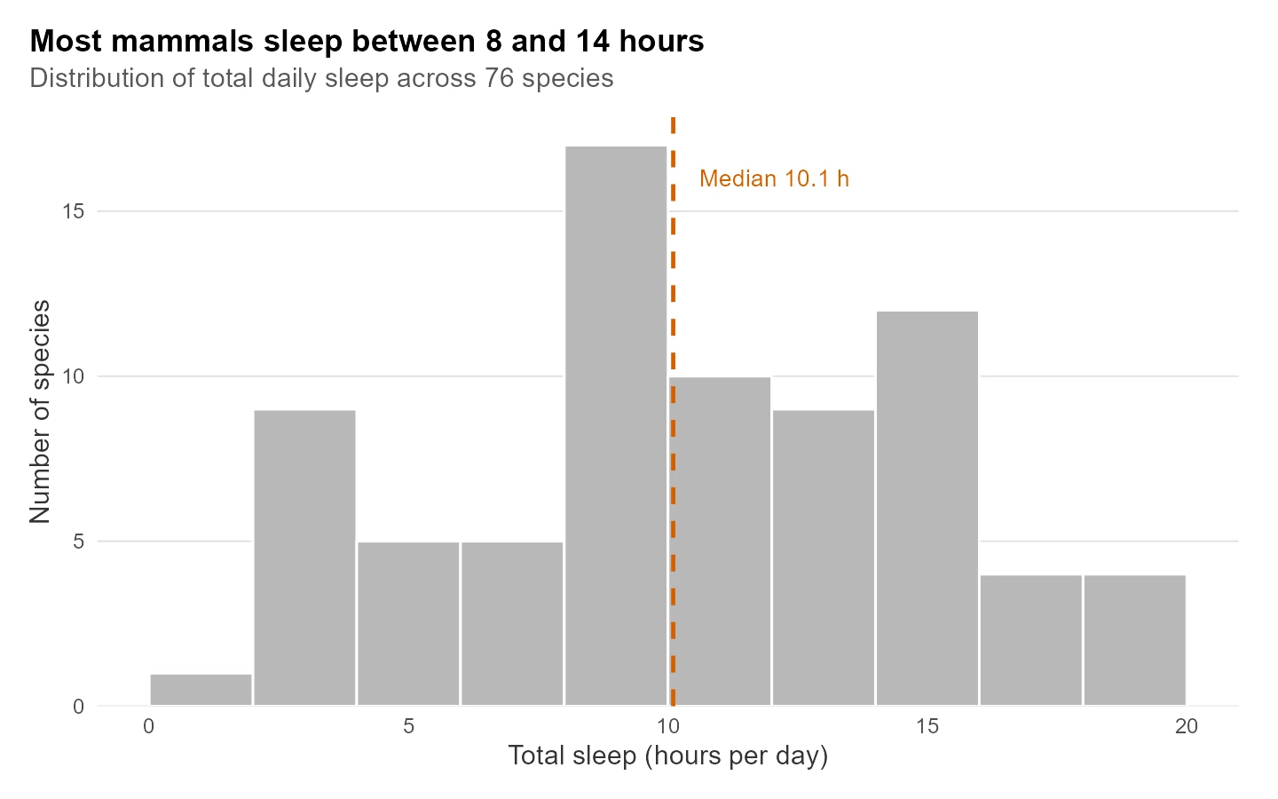
Figure 6: Total sleep is roughly centred, with a median near ten hours.
The distribution is single-peaked and fairly symmetric, centred near the 10.1-hour median, with a thin tail of long sleepers past 18 hours. That tells the reader the mean is a fair summary here, since there is no wild skew pulling it around. The expand argument pins the bars to the baseline so there is no floating gap under the histogram, a small polish that print editors notice.
Try it: A 90% interval is narrower than a 95% one. Compute the half-width of a 90% interval for each diet group and see how much it shrinks.
Click to reveal solution
Explanation: The half-width still balloons for insectivores (5.6 hours on 5 species) and stays small for the big groups. Lowering the confidence level narrows every interval a little, but it cannot rescue a tiny sample; only more data can.
How do you present the model and a supplementary check?
The comparison figure looked at diet on its own, but diet and body mass travel together, so we need a model that weighs them at the same time. We fit a linear model of sleep on log mass plus diet, with herbivores as the reference group, and read the coefficients with broom::tidy(). The conf.int = TRUE argument gives us a confidence interval for each effect.
Read the estimates in the model's own units. The log_mass coefficient of -1.98 means each tenfold increase in body mass costs about two hours of daily sleep, and its interval (-2.6 to -1.37) sits safely below zero, so the effect is solid. Compared with herbivores, carnivores sleep about 2.25 hours more and insectivores about 3.59 hours more, both with intervals that just clear zero. Omnivores are indistinguishable from herbivores once mass is accounted for, since their interval (-1.47 to 2.62) straddles zero.
A table of coefficients is correct but slow to read. A coefficient plot, sometimes called a dot-and-whisker plot, shows the same numbers as points with their intervals, so the reader sees at once which effects clear zero. We drop the intercept, rename the terms into plain language, and put a dashed line at zero as the reference.
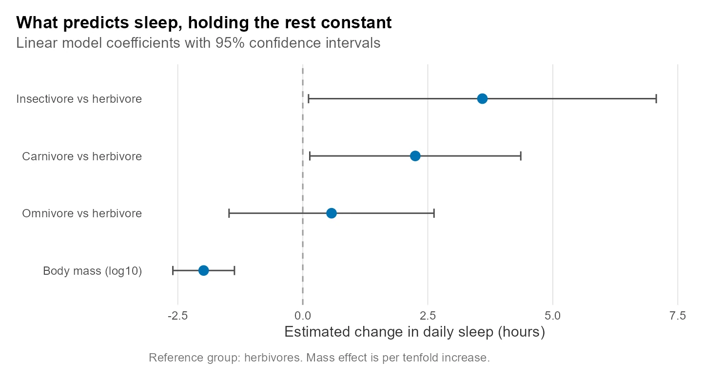
Figure 7: Model coefficients. An interval that crosses the dashed zero line is not distinguishable from no effect.
This is uncertainty shown a third way. The body-mass effect sits far to the left of zero with a short interval, so it is the firmest finding. The insectivore effect has the widest whisker of all, which follows directly from its tiny sample, and it only just clears zero. Notice we overrode the theme's grid here: for a coefficient plot the reader compares against the vertical zero line, so we swapped the horizontal grid for a vertical one. The system gives you defaults, and a good figure bends them when the message calls for it.
One supplementary figure rounds out the set. Papers often include a secondary check, and here we ask whether REM sleep tracks total sleep, using the 56 species that have a REM measurement.
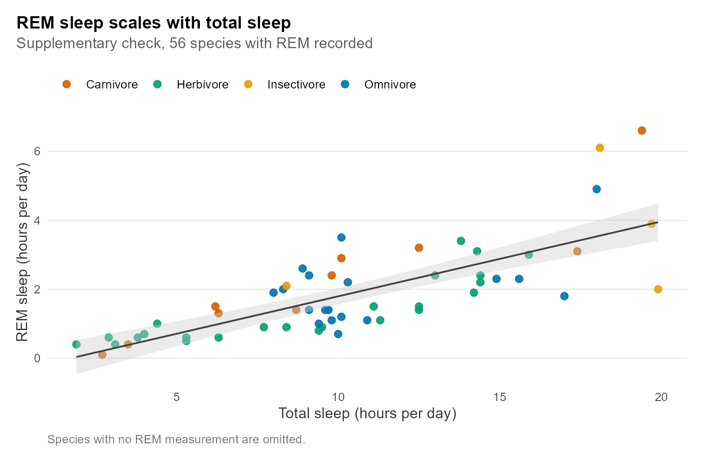
Figure 8: Species that sleep more also spend more time in REM.
The relationship is clean and positive: animals that sleep longer also log more REM. Because this figure uses the same theme, palette and confidence band as the main result, it reads as a sibling of Figure 4 rather than a stranger, which is exactly the consistency the system buys.
Finally, papers usually combine the strongest panels into one multi-panel figure. The patchwork package lets you place plots side by side with a shared title and panel tags. We strip the individual titles from the two panels, since one caption now covers both, and add tags "a" and "b".
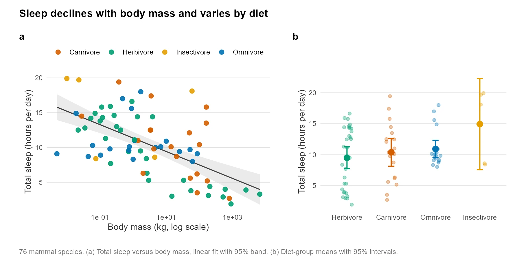
Figure 9: The paper's main figure. Panel (a) is the relationship, panel (b) the group comparison.
labs(title = NULL) before combining.Try it: The model's overall fit tells you how much of the variation it explains. Pull the R-squared out of the fitted model.
Click to reveal solution
Explanation: The model explains 42% of the variation in sleep (r_squared = 0.42), a respectable share for a two-predictor model of animal behaviour. The adjusted value of 0.39 penalises the extra diet terms slightly, and n = 76 confirms every species was used.
How do you export figures to journal specification?
A figure that looks right on screen still has to leave R at the exact size and resolution the journal demands. ggsave() handles this: you give it a size in millimetres (the unit publishers quote), a resolution in DPI, and it picks the file format from the extension. We save the main figure as a single-column raster PNG and as a vector PDF, both 90 mm square, then confirm both files exist.
Two files, two purposes. The PNG is a grid of pixels at 300 DPI, the usual floor for print, and is the safe choice for a Word document or a preview. The PDF is a vector file that stores the plot as shapes, so it stays razor sharp at any zoom, which is what most journals prefer for line art like ours. We wrote both into a temporary folder so nothing clutters your project, but in practice you would point them at a figures/ directory with clear names like fig1_sleep_mass.pdf.
For the sharpest text and a true 600-DPI TIFF, many labs reach for the ragg package, which renders fonts more crisply than the base devices and is the modern default for camera-ready output. It is a local add-on rather than part of the in-browser toolset, so the block below is written to run in your own RStudio session.
# Run this in RStudio: ragg gives crisp text and a true 600-DPI TIFF
library(ragg)

agg_tiff(file.path(tempdir(), "fig1_sleep_mass.tiff"),
         width = 90, height = 90, units = "mm", res = 600, compression = "lzw")
print(fig1)
invisible(dev.off())
file.exists(file.path(tempdir(), "fig1_sleep_mass.tiff"))
#> [1] TRUEsans family so it renders anywhere, but for a specific typeface locally, pair ragg or svglite with the systemfonts package and set base_family in theme_paper(). Always save at the journal's stated width in millimetres so text keeps its intended size when the figure is placed on the page.Try it: A two-column journal figure is often 180 mm wide. Save the main figure at that width.
Click to reveal solution
Explanation: Passing width = 180, units = "mm" matches a common double-column width, and ggsave() writes the file at 300 DPI. Because the size is fixed in millimetres, the figure will drop onto the page at the intended dimensions with no rescaling.
How do you reuse the whole system in your next project?
The real payoff of a figure system is that you never build it twice. The block below is the complete, self-contained system: the palette, the labels, the theme, the colour scale and a small save_journal() helper, followed by one figure that uses all of them. Lift this into any new analysis, swap the palette and the data, and every figure you draw will already share a house style.
That single block is your handoff. It carries no analysis-specific logic beyond the palette and the demo plot, so it drops cleanly into a fresh project. Keep it in a file like R/figure-system.R and source() it at the top of every analysis script, and your figures will match from the first plot.
Practice Exercises
These combine several ideas from the case study. Try each before opening the solution. They use their own variable names so they will not disturb the objects from the tutorial.
Exercise 1: Compare mass across two diets
Using the full msleep data, keep only carnivores and herbivores, then report the count of species and the mean body weight for each group. Store the working data in my_top.
Click to reveal solution
Explanation: filter(vore %in% c(...)) keeps the two groups, and summarise() reports the count and mean mass for each. Herbivores average far heavier because the group includes large grazers, which is exactly why the model needed body mass as well as diet.
Exercise 2: Rebuild the mass-sleep slope from scratch
Fit a simple linear model of total sleep on log-10 body mass across all of msleep, then read the slope with broom::tidy(). Store the model in my_fit and confirm the slope is negative.
Click to reveal solution
Explanation: The slope of -1.79 says each tenfold jump in body mass costs about 1.8 hours of sleep, close to the -1.98 from the fuller model. The two agree because body mass is the dominant driver, and diet only nudges the estimate once mass is in the model.
Frequently Asked Questions
Why build a theme function instead of just using theme_minimal() each time? A function bundles every decision (grid, legend, margins, text colour) into one name you reuse. When a co-author asks for a bigger font or a lighter grid, you change one function and every figure updates, rather than editing the same theme() block in five scripts and risking a mismatch.
Is the Okabe-Ito palette really necessary, or can I pick any colours? You can pick any colours, but a colourblind-safe palette protects roughly one in twelve male readers who would otherwise confuse red and green. The Okabe-Ito set was designed to stay distinct for those readers and to survive greyscale printing, so it is a safe default that costs you nothing.
When should I use a bar chart at all? Bars are honest for counts and for parts of a whole, where the length from zero is the actual quantity. They mislead for a mean, because the solid block implies a precision the data may not have. For group means, show a point with a confidence interval instead, as we did in Figure 5.
Why log the body-mass axis rather than the sleep axis? Body mass spans five orders of magnitude, from grams to tonnes, so a linear axis crushes almost every species into a corner. Sleep spans a narrow 2 to 20 hours, which a linear axis handles fine. Log the axis whose values multiply, and leave alone the one whose values add.
How do I get a specific font like Arial or Helvetica into the figure? The theme uses the generic sans family so it renders anywhere. For an exact typeface, install the systemfonts package, register the font, set base_family in theme_paper(), and export with ragg or svglite, which embed fonts reliably. That combination is the current recommended path for camera-ready fonts.
Can I reuse this system for a completely different dataset? Yes, that is the point. Swap the palette and labels for your own categories, keep theme_paper() and scale_colour_diet() as they are, and the look carries over. The handoff block in the last section is written to be copied into a new project with only the palette and the data changed.
Summary
A publication figure system turns a scattered set of plots into one coherent argument. You audit the defaults, build the reusable pieces once, then spend your effort on the data instead of the styling. The workflow below is the path this case study followed.

Figure 10: The end-to-end figure-system workflow.
| Step | What you do | Why it matters |
|---|---|---|
| Audit | Render the naive defaults and critique them | Names the exact problems a reviewer would flag |
| System | Build one theme, one palette and one scale helper | A single edit restyles every figure at once |
| Figures | Construct each figure from the shared pieces | The set reads as one designed object |
| Uncertainty | Draw bands, intervals and coefficient whiskers | Shows how firm each finding really is |
| Export | Save at journal size in mm at 300 to 600 DPI | The file meets the spec with no manual fixes |
| Handoff | Keep the system in one file and source it | You never rebuild the house style again |
The habits that carry the most weight are three: log a heavily skewed axis, replace bars of a mean with a point and an interval, and define your look once so every figure inherits it. Master those and your figures will look like they belong together, because they will.
References
- Wickham, H., Navarro, D., and Pedersen, T. L. ggplot2: Elegant Graphics for Data Analysis (3e), Themes. Link
- ggplot2 documentation. theme(): modify components of a theme. Link
- scales package. Scale functions for visualization. Link
- patchwork package. The composer of plots. Link
- broom package. Convert statistical objects into tidy tibbles. Link
- R Core Team. grDevices palette(): the built-in Okabe-Ito colourblind-safe palette. Link
- Wilke, C. O. Fundamentals of Data Visualization. Link
Continue Learning
- Publication-Ready ggplot2 Figures: The Checklist - the per-figure checklist of fonts, sizes and DPI that this system automates.
- ggplot2 Themes: From theme_classic to Your Own House Style - a deeper look at every theme element you can control.
- Export Plots in R: ggsave, Devices, DPI and Journal Specs - a focused guide to saving figures at exactly the size and format you need.