Point Pattern Analysis
Centrography is a very basic form of point pattern analysis which refers to a set of descriptive statistics such as the mean center, standard distance and standard deviational ellipse.
Density based analysis characterize the pattern in terms of its distribution. Density measurements can be broken down into two categories: global and local.
An alternative to the density based methods explored thus far are the distance based methods for pattern analysis whereby the interest lies in how the points are distributed relative to one another (a second-order property of the point pattern) as opposed to how the points are distributed relative to the study extent (source: https://mgimond.github.io/Spatial/point-pattern-analysis.html)
In this excercise we will explore the crime rate at City at Buffalo for the year 2018. The crime data was downloaded from here. The shape file of Buffalo city area and crime data for the year 2018 could be found here.
In this lesson will cover:
Load R packages
library(sp)           ## Data management
library(spdep)        ## Spatial autocorrelation
library(RColorBrewer) ## Visualization
library(classInt)     ## Class intervals
library(raster)       ## spatial data
library(grid)         # plot
library(gridExtra)    # Multiple plot
library(ggplot2)      # Multiple plot
library(gtable)
library(ggrepel)      # for better lebelling
library(tidyverse)    # data manupulation
library(ggplot2)
library(ggmap)        #use to read map
library(maps)         #map tools kits
library(spatstat)
library(maptools)
Load data
# Define data folder
dataFolder<-"D:\\Dropbox\\WebSite_Data\\R_Data\\Data_Crime\\"
df<-read.csv(paste0(dataFolder,"crime_data_2018.csv"), header = TRUE)
city<-shapefile(paste0(dataFolder,"buffalo_city.shp"))
crime_loc<-shapefile(paste0(dataFolder,"Crime_location_2018.shp"))
Exploratory Data Analysis
df$incident_type<-as.factor(df$incident_type)
levels(df$incident_type)
## [1] "Assault" "Breaking & Entering" "Homicide"
## [4] "Other Sexual Offense" "Robbery" "Sexual Assault"
## [7] "Theft" "Theft of Vehicle"df_incident <- as.data.frame(sort(table(df$incident_type),decreasing = TRUE))
colnames(df_incident) <- c("Incident_Type", "Total")
df_incident## Incident_Type Total
## 1 Theft 6652
## 2 Assault 2770
## 3 Breaking & Entering 2377
## 4 Theft of Vehicle 1014
## 5 Robbery 834
## 6 Other Sexual Offense 158
## 7 Sexual Assault 132
## 8 Homicide 64df_incident$Percentage <- df_incident$Total / sum(df_incident$Total)
df_incident## Incident_Type Total Percentage
## 1 Theft 6652 0.475108921
## 2 Assault 2770 0.197843011
## 3 Breaking & Entering 2377 0.169773588
## 4 Theft of Vehicle 1014 0.072423398
## 5 Robbery 834 0.059567174
## 6 Other Sexual Offense 158 0.011284908
## 7 Sexual Assault 132 0.009427898
## 8 Homicide 64 0.004571102Bar plot
df_incident %>%
  ggplot(aes(reorder(`Incident_Type`, Total), y = Total)) +
  geom_col(fill = "orange") +
  geom_label_repel(aes(label = Total), size = 2.5) +
  coord_flip() +
  labs(title = "Crime Committed in 2018 at City of Buffalo",
       x = "",
       y = "Total")+
  theme(plot.title = element_text(hjust = 0.5))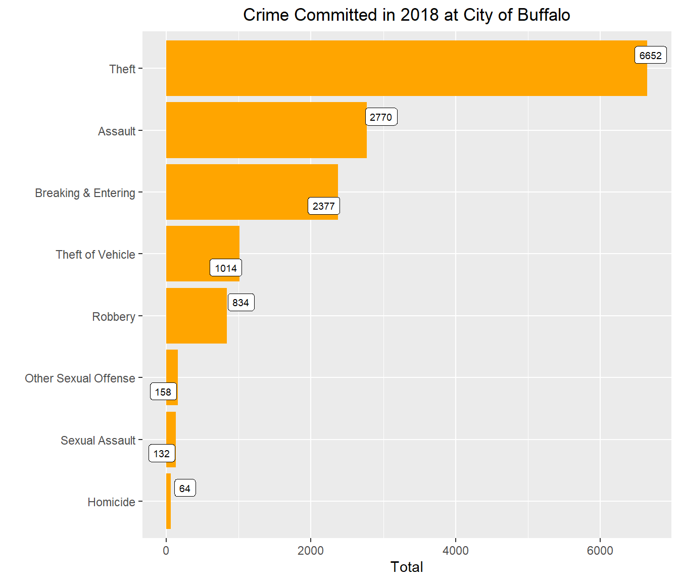
Plot data
city_gcs <- spTransform(city, CRS("+proj=longlat +datum=WGS84"))
city_gcs <- fortify(city_gcs)
## Regions defined for each Polygonscols=c("Theft" ="Green", "Assault"= "blue", "Breaking & Entering" = "sky blue", "Theft of Vehicle"= "orange", "Robbery" = "yellow4",
"Other Sexual Offense" = "yellow", "Sexual Assault" = "black" , "Homicide" = "red") qmplot(long, lat, data = city_gcs, maptype = "toner-lite", color = I("grey"))+
geom_polygon(aes(x=long, y=lat, group=group),
fill='grey', size=.2,color='black', data=city_gcs, alpha=0)+
geom_point(aes(x = long,
y = lat,
size = I(1),
colour = incident_type
), data =df) +
coord_equal() +
scale_colour_manual(values = cols) +
ggtitle("Types of Crime Commited in 2018")+
theme(plot.title = element_text(hjust = 0.5))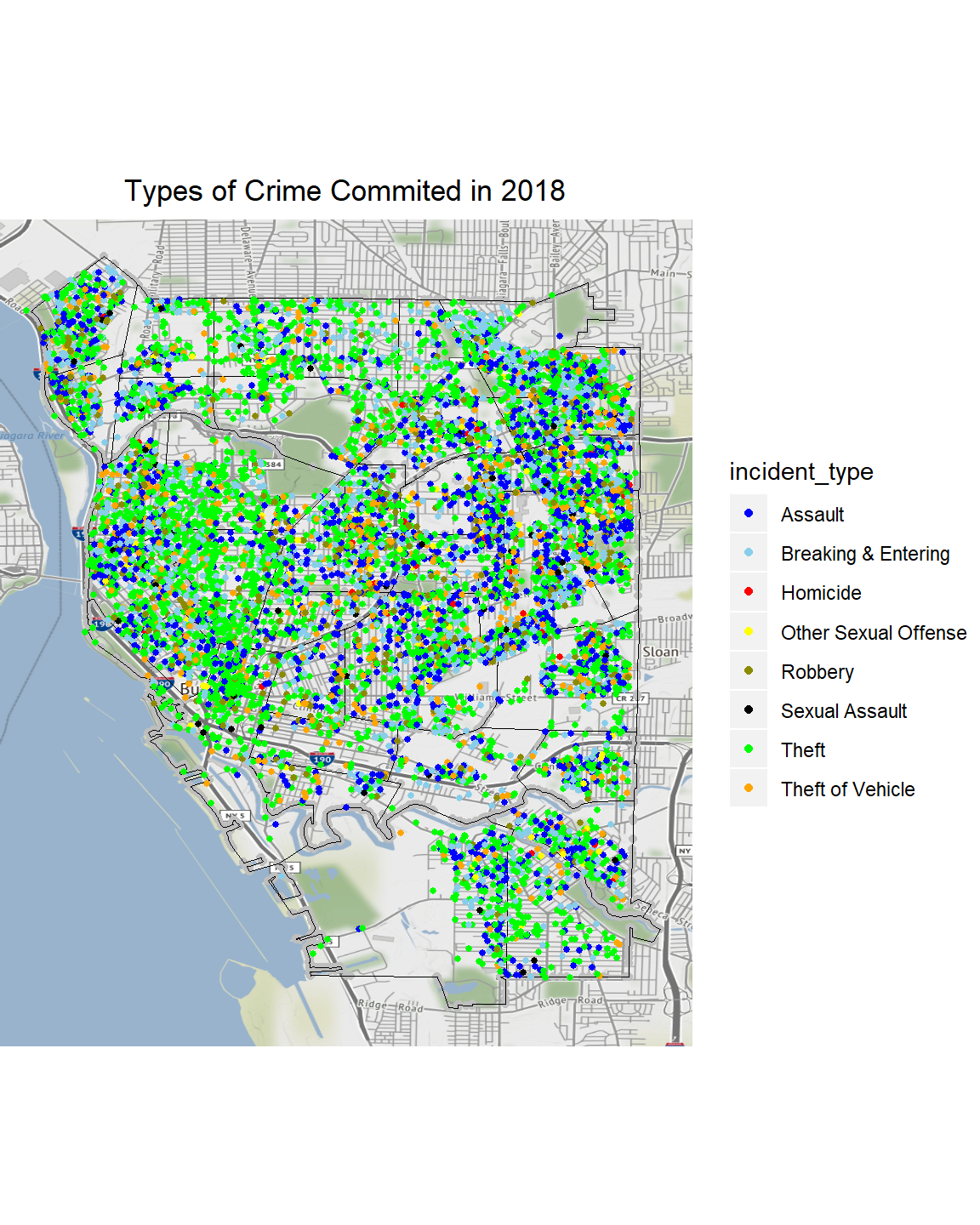
Point Pattern Analysis with spatstat
Create a data farme
crime_data=merge(crime_loc, df, by="ID")Coerce from SpatialPolygons to an object of class “owin” (observation window)
cityOwin <- as.owin(city)
class(cityOwin)
## [1] "owin"Extract coordinates from SpatialPointsDataFrame:
pts <- coordinates(crime_data)
head(pts)
## coords.x1 coords.x2
## [1,] 3608603 5517029
## [2,] 3615749 5514641
## [3,] 3617332 5516222
## [4,] 3613187 5513889
## [5,] 3612422 5513328
## [6,] 3614154 5513055Now we can create a point pattern object
p <- ppp(pts[,1], pts[,2], window=cityOwin)## Warning: 9 points were rejected as lying outside the specified window## Warning: data contain duplicated pointsplot(p)## Warning in plot.ppp(p): 9 illegal points also plotted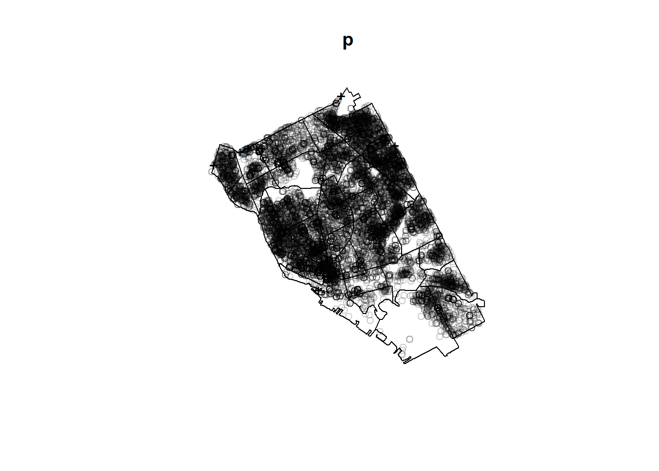
Compute Kernel Density
Kernel density is the standard deviation of a Gaussian (i.e., normal) kernel function, it is actually only around 1/2 of the radius across which events will be ‘spread’ by the kernel function. Remember that the spatial units we are using here are meters.
The commands density fun and density both perform kernel estimation of the intensity of a point pattern. The difference is that density returns a pixel image, containing the estimated intensity values at a grid of locations, while densityfun returns a function(x,y) which can be used to compute the intensity estimate at any spatial location. For purposes such as model-fitting it is more accurate to use densityfun.
ds <- density(p,
              sigma = 500) # Smoothing bandwidth, or bandwidth selection function
plot(ds,  main='Crime density')
contour(ds, add=TRUE)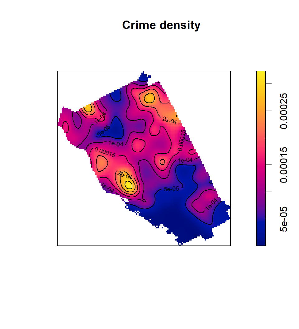
Density–optimal bandwidth
R provides a function that will suggest an optimal bandwidth to use:
opt_bw <-bw.diggle(p)
opt_ds <-density(p, sigma=opt_bw) # Using optimal bandwidths
plot(opt_ds, Add=TRUE, main='Crime density')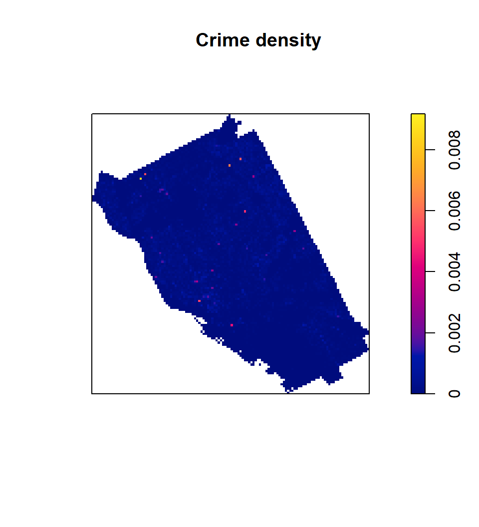
Perspective plots
persp(ds, main="Density")
Mean Nearest Neighbor Distance Analysis for the Crime Patterns
[Although nearest neighbor distance analysis on a point pattern is rarely used now (as discussed in the readings), the outputs generated can still be useful for assessing the distance between events.
The spatstat nearest neighbor function is nndist.ppp(), returns a list of all the nearest neighbor distances in the pattern.
For a quick statistical assessment, you can also compare the mean value to that expected for an IRP/CSR pattern of the same intensity:
Give this a try for one or more of the crime patterns. Are they clustered? Or evenly-spaced?](https://www.e-education.psu.edu/geog586/node/831)
#Nearest Neighbour Analysis
nnd <-nndist.ppp(p)
hist(nnd)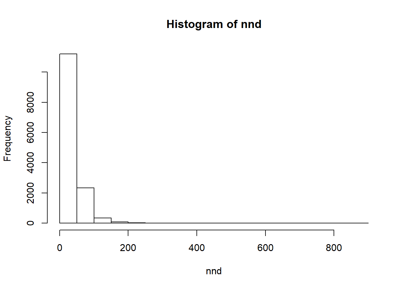
summary(nnd)## Min. 1st Qu. Median Mean 3rd Qu. Max.
## 0.00 0.00 0.00 24.33 43.25 894.35mnnd <-mean(nnd)
exp_nnd <-0.5/ sqrt(p$n / area.owin(cityOwin))
mnnd / exp_nnd## [1] 0.4990722Map all Crime locations
crime_data$fcat <- as.factor(crime_data$incident_type)
w <- as.owin(city)
xy <- coordinates(crime_data)
mpp <- ppp(xy[,1], xy[,2], window = w, marks=crime_data$fcat)
## Warning: 9 points were rejected as lying outside the specified window## Warning: data contain duplicated pointsspp <- split(mpp)
plot(spp, main='')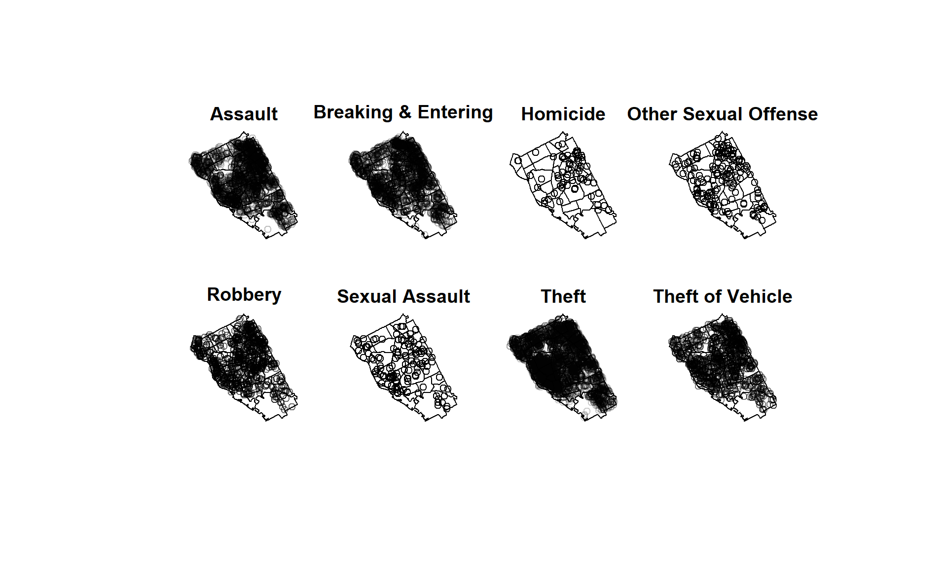
Density maps of all crimes
plot(density(spp, sigma=500), main='')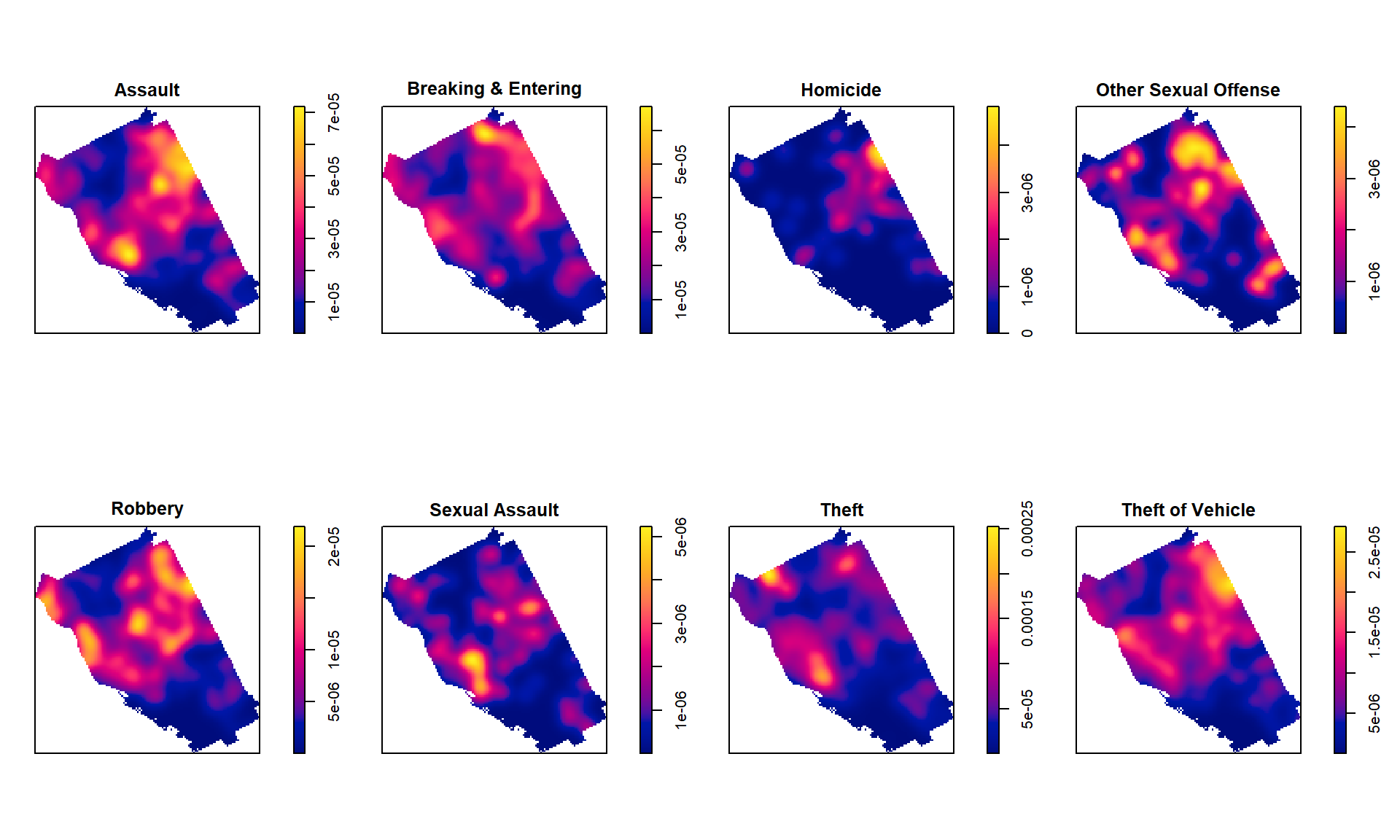
K-function
In spatstat the function Kest computes several estimates of the K-function which estimates Ripley’s reduced second moment function K(r) from a point pattern in a window of arbitrary shape.
spatstat.options(checksegments = FALSE)
kHom <- Kest(spp$"Homicide")
Simulation Envelopes of Summary Function for 3D Point Pattern
In spatstat the function envelope computes the pointwise envelopes. he envelope command performs simulations and computes envelopes of a summary statistic based on the simulations. The result is an object that can be plotted to display the envelopes. The envelopes can be used to assess the goodness-of-fit of a point process model to point pattern data.
keHom <- envelope(spp$"Homicide", Kest)## Generating 99 simulations of CSR ...
## 1, 2, 3, 4, 5, 6, 7, 8, 9, 10, 11, 12, 13, 14, 15, 16, 17, 18, 19, 20, 21, 22, 23, 24, 25, 26, 27, 28, 29, 30, 31, 32, 33, 34, 35, 36, 37, 38,
## 39, 40, 41, 42, 43, 44, 45, 46, 47, 48, 49, 50, 51, 52, 53, 54, 55, 56, 57, 58, 59, 60, 61, 62, 63, 64, 65, 66, 67, 68, 69, 70, 71, 72, 73, 74, 75, 76,
## 77, 78, 79, 80, 81, 82, 83, 84, 85, 86, 87, 88, 89, 90, 91, 92, 93, 94, 95, 96, 97, 98, 99.
##
## Done.Plot K-function anf Envelop
par(mfrow=c(1,2))
plot(kHom)
plot(keHom)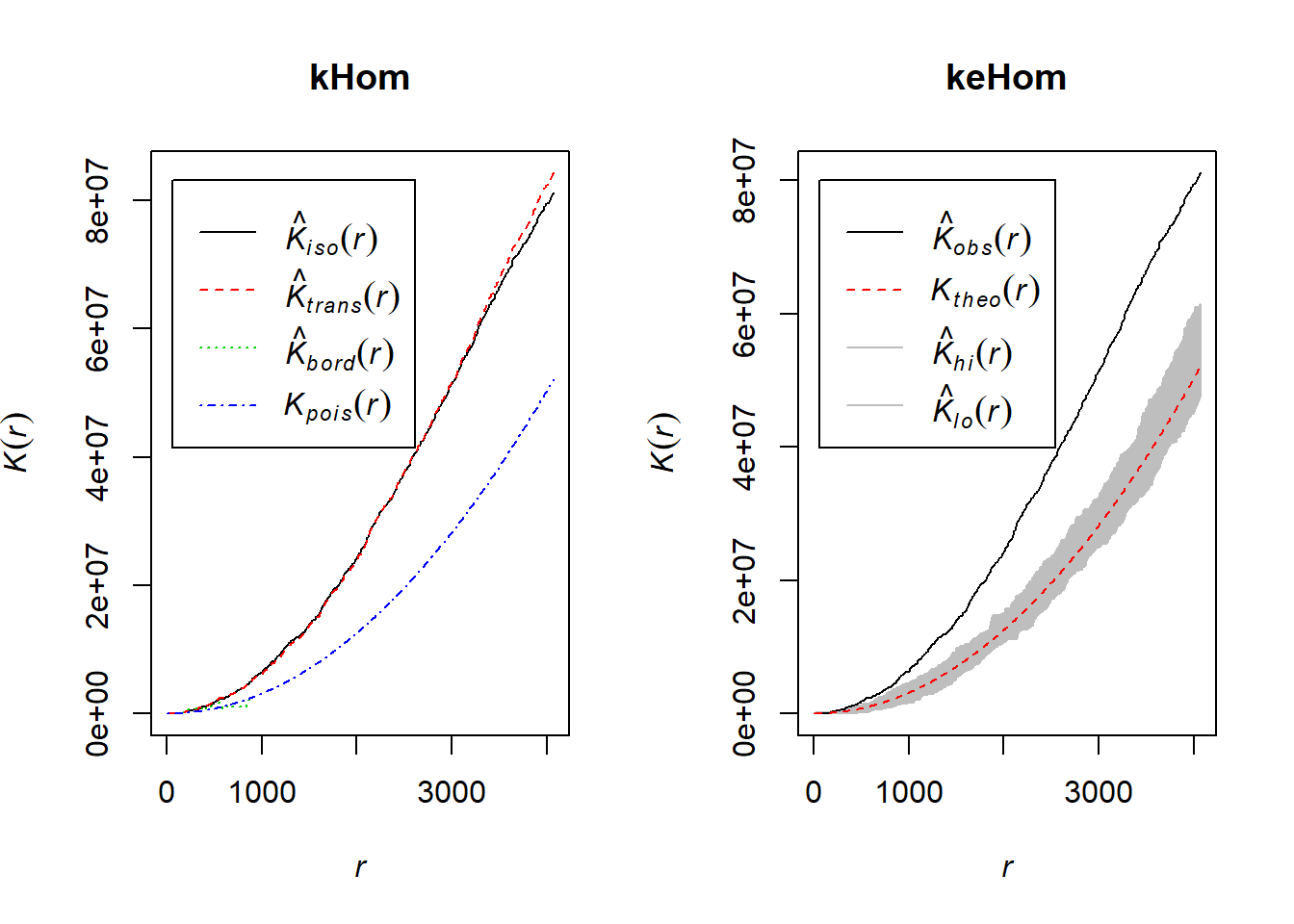
Advanced Mapping
# Define data folder
dataFolder<-"D:\\Dropbox\\WebSite_Data\\R_Data\\Data_Crime\\"
df<-read.csv(paste0(dataFolder,"crime_data_2018.csv"), header = TRUE)
city<-shapefile(paste0(dataFolder,"buffalo_city.shp"))
crime_loc<-shapefile(paste0(dataFolder,"Crime_location_2018.shp"))
Density Map of Crime Incident
qmplot(long, lat, data = city_gcs, maptype = "toner-lite", color = I("grey"))+
  geom_polygon(aes(x=long, y=lat, group=group),
             fill='grey', size=.2,color='black', data=city_gcs, alpha=0)+
  geom_density_2d(aes(x = long, y = lat), data = df) +
    stat_density2d(data = df,
    aes(x = long, y = lat, fill = ..level.., alpha = ..level..), size = 0.01,
    bins = 16, geom = "polygon") + scale_fill_gradient(low = "green", high = "red",
    guide = FALSE) + scale_alpha(range = c(0, 0.3), guide = FALSE)+
    ggtitle("Density Map of All Crimes Commited in \n 2018 at City of Buffalo")+
    theme(plot.title = element_text(hjust = 0.5))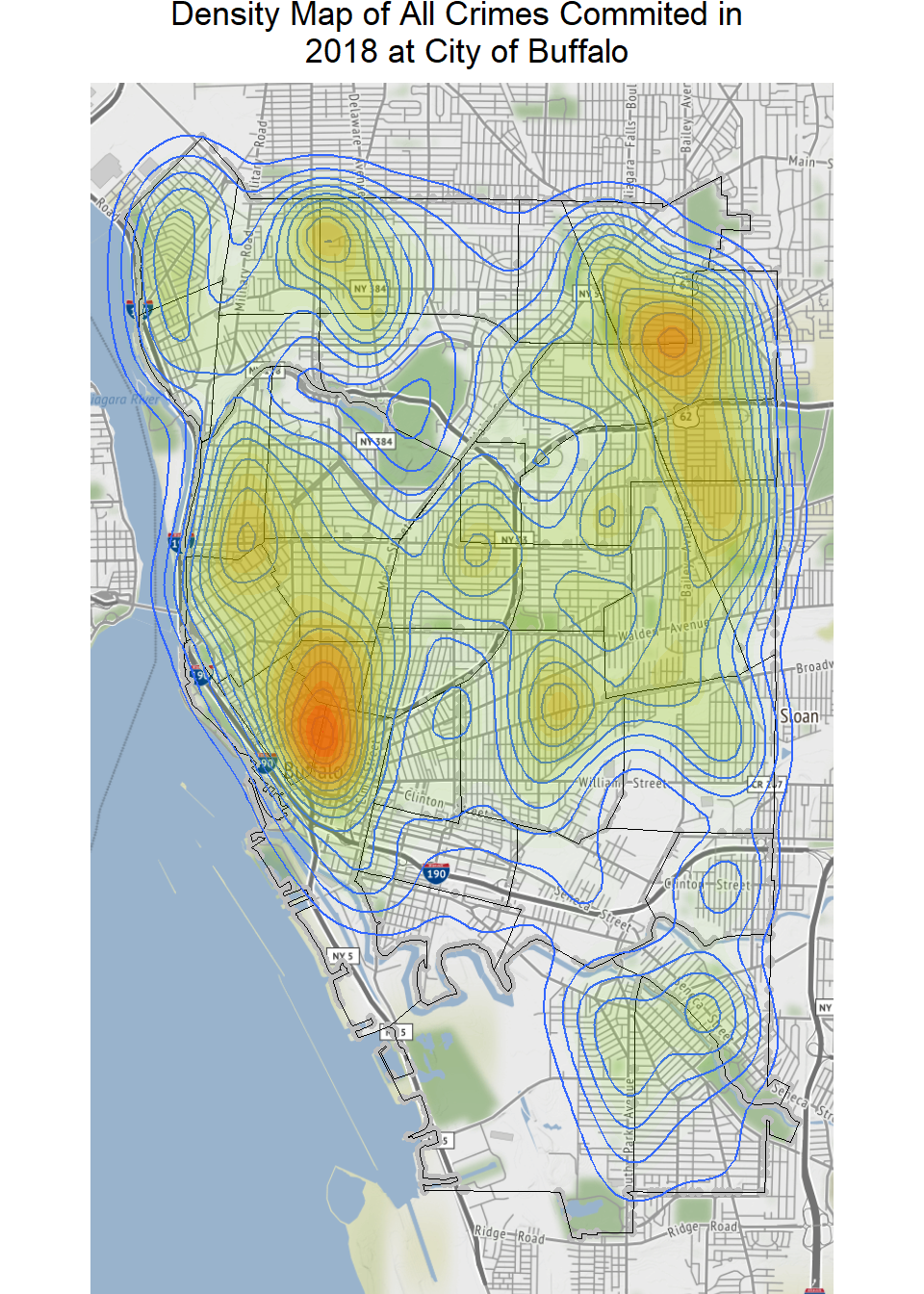
Next we are going to map the crime density. For the illustrate purpose, we are going to map Theft commited in 2018.
theft_df<- df %>%
  select(incident_type, long, lat) %>%
  filter(incident_type =="Theft")
Density Map of Theft Commited in 2018
qmplot(long, lat, data = city_gcs, maptype = "toner-lite", color = I("grey"))+
  geom_polygon(aes(x=long, y=lat, group=group),
             fill='grey', size=.2,color='black', data=city_gcs, alpha=0)+
  geom_density_2d(aes(x = long, y = lat), data = theft_df) +
    stat_density2d(data = theft_df,
    aes(x = long, y = lat, fill = ..level.., alpha = ..level..), size = 0.01,
    bins = 16, geom = "polygon") + scale_fill_gradient(low = "green", high = "red",
    guide = FALSE) + scale_alpha(range = c(0, 0.3), guide = FALSE)+
    ggtitle("Density Map of Theft Commited in \n 2018 at City of Buffalo")+
    theme(plot.title = element_text(hjust = 0.5))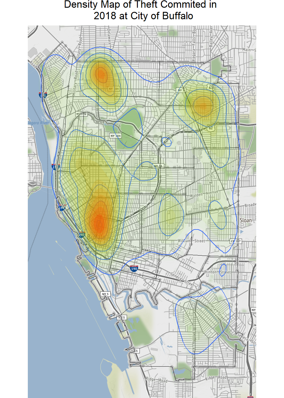
Now, we will plot density of the four most crimes committed in 2018. We will create data-frame with 4 crimes.
# Create a data frame
crime_df<- df %>%
  select(incident_type, long, lat) %>%
  filter(incident_type %in% c("Theft", "Assault","Breaking & Entering", "Theft of Vehicle"))
Density Map of the four most crimes committed in 2018
qmplot(long, lat, data = city_gcs, maptype = "toner-lite", color = I("grey"))+
geom_density_2d(aes(x = long, y = lat), data =crime_df) +
  facet_wrap(~ incident_type)+
  stat_density2d(data = crime_df,
    aes(x = long, y = lat, fill = ..level.., alpha = ..level..), size = 0.01,
    bins = 16, geom = "polygon") + scale_fill_gradient(low = "green", high = "red",
    guide = FALSE) + scale_alpha(range = c(0, 0.3), guide = FALSE)+
    ggtitle( "Density Maps of the four most crimes committed in \n 2018 at  City of Buffalo")+
    theme(plot.title = element_text(hjust = 0.5))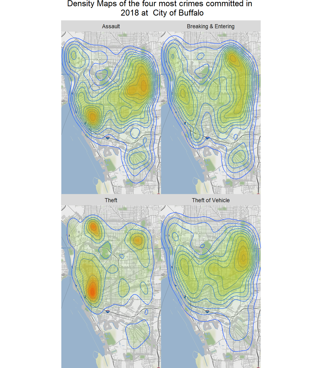
Crime over time
theft_df_time<- df %>%
  select(incident_type, day_of_week, hour_of_day ) %>%
  filter(incident_type =="Theft")
theft_df_time <- theft_df_time%>%
group_by(day_of_week, hour_of_day) %>%
summarize(count = n())
head(theft_df_time)## # A tibble: 6 x 3
## # Groups: day_of_week [1]
## day_of_week hour_of_day count
## <fct> <int> <int>
## 1 Friday 1 74
## 2 Friday 2 73
## 3 Friday 3 77
## 4 Friday 4 64
## 5 Friday 5 67
## 6 Friday 6 76plot <- ggplot(theft_df_time, aes(x = hour_of_day, y = day_of_week, fill = count)) +
geom_tile() +
theme(axis.text.x = element_text(angle = 90, vjust = 0.6), legend.title = element_blank(), legend.position="top", legend.direction="horizontal", legend.key.width=unit(2, "cm"), legend.key.height=unit(0.25, "cm"), legend.margin=unit(-0.5,"cm"), panel.margin=element_blank()) +
labs(x = "Hour at Theft Committed", y = "Day of the Week", title = "Number of Theft Committed at City of Buffalo, 2018") +
scale_fill_gradient(low = "white", high = "#27AE60")
plot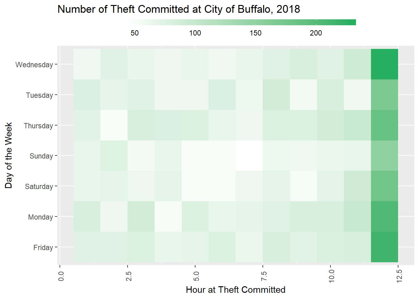
Plot all crimes
df_arrest_time_crime <- df %>%
  group_by(incident_type, day_of_week, hour_of_day) %>%
  summarize(count = n())
plot <- ggplot(df_arrest_time_crime, aes(x = hour_of_day, y = day_of_week, fill = count)) +
geom_tile() +
facet_wrap(~ incident_type, nrow=2)+
# fte_theme() +
theme(axis.text.x = element_text(angle = 90, vjust = 0.6, size = 4))+
labs(x = "Hour at Crime Committed", y = "Day of the Week", title = "Number of Cimes Committed at City of Buffalo, 2018") +
scale_fill_gradient(low = "white", high = "#27AE60")
plot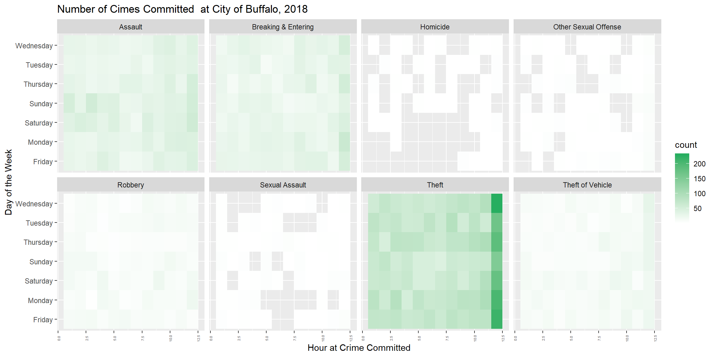
Interactive Mapping - Crime locations
data <- df %>%
 select(ID, long, lat, address, incident_type, date_incid, day_of_week, hour_of_day)
library(leaflet)
data$popup <- paste("<b>Incident #: </b>", data$ID, "<br>", "<b>incident_type: </b>", data$incident_type,
"<br>", "<b>Date: </b>", data$date_incid,
"<br>", "<b>Day of week: </b>", data$day_of_week,
"<br>", "<b>Time: </b>", data$date_incid,
"<br>", "<b>Address: </b>", data$address,
"<br>", "<b>Longitude: </b>", data$long,
"<br>", "<b>Latitude: </b>", data$lat)
leaflet(data, width ="100%") %>% addTiles() %>%
addTiles(group = "OSM (default)") %>%
addProviderTiles(provider = "Esri.WorldStreetMap",group = "World StreetMap") %>%
addProviderTiles(provider = "Esri.WorldImagery",group = "World Imagery") %>%
# addProviderTiles(provider = "NASAGIBS.ViirsEarthAtNight2012",group = "Nighttime Imagery") %>%
addMarkers(lng = ~long, lat = ~lat, popup = data$popup, clusterOptions = markerClusterOptions()) %>%
addLayersControl(
baseGroups = c("OSM (default)","World StreetMap", "World Imagery"),
options = layersControlOptions(collapsed = FALSE)
)Interactive Map - Crime Density
ds <- density(p, sigma = 500,edge=T) # Smoothing bandwidth, or bandwidth selection function
ds.raster <- raster(ds)
projection(ds.raster)=projection(city)
r<-projectRaster(ds.raster, crs="+proj=longlat +ellps=WGS84 +datum=WGS84 +no_defs")
pal = colorNumeric(c("green", "yellow", "orange", "red"), values(r),
na.color = "transparent")
leaflet() %>%
addTiles(group = "Map") %>%
addProviderTiles("Esri.WorldImagery", group = "Satellite") %>%
addRasterImage(r, group = "Raster",
colors = pal,
opacity = 0.6) %>%
addLegend(pal = pal,
values = values(r*100),
title = "Crime Densit x 100",
opacity = 1,
) %>%
addLayersControl(
baseGroups = c("Map", "Satellite"),
overlayGroups = c("Raster"),
options = layersControlOptions(collapsed = FALSE)
)