My Blog: projects, sketches, works in progress, thoughts, and inspiration.

Tagged: design

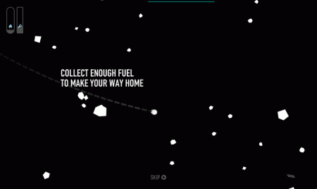
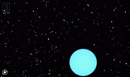
Title screen for Orbit, a flash, arcade style, adventure game in space. Click to play!

Orbit is an arcade style adventure game. Explore an abandoned field of space junk and collect enough fuel to find your way home. The game is currently a small segment of the final adventure. In it I focused on developing the basic gameplay and the tone through motion, scale, graphics, and sound. Put on some headphones and give it a try.

Screenshots of the game. Click to enlarge.

In many ways, Orbit is quite similar to my first game, Pulsus. It’s just more circles and particles. But, while I’m certainly still show’s the same style and interests, I’ve added a few things to my game design vocabulary here. The biggest thing I tried to add was narrative and character. Although the story and goals are vague, I wanted to bring people into the game more with a bit of setting. I also tried to develop a sense of scale to the world.

Any feedback on the game is very much appreciated. This prototype is likely going to be expanded into an iOS game, with help from the rest of the Friends of The Web.

Post Page »

Space Junk

06-15-11

Tagged: , ,

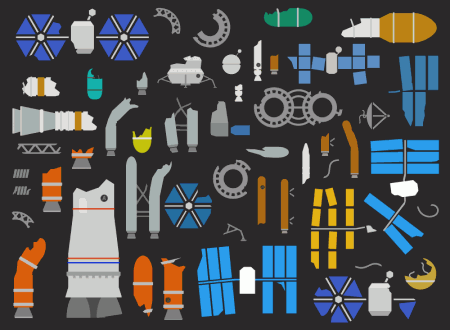
Space Junk Illustrations for a New GameVarious illustrations of space junk for a new game. Click the image to enlarge.

I’m working on a flash prototype for my next game, which will probably end up on iOS. Moving on from Pulsus, I’m designing something with a little more narrative, scenery, and character, although it’s still pretty much just particles…

Here’s a jumble of various pieces of space junk I’m working on for the game. It’s a fun process of designing little vector rockets and spaceships and then tearing them apart. I’m aiming to release a first prototype this weekend.

Post Page »

Last summer I had a great opportunity to work at the Baltimore Interaction Design Firm, ID5. During my time there I designed and built a virtual tour for the State University of New York at Potsdam.

The tour needed to be able to capture the experience of the school for prospective students who are not able to visit. The school also wanted to avoid the typical cliches and create an engaging interactive experience.

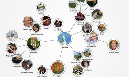
SUNY Potsdam Virtual Tour, Designed by Anthony MattoxScreenshot of the SUNY Potsdam Virtual Tour. Click to Enlarge.

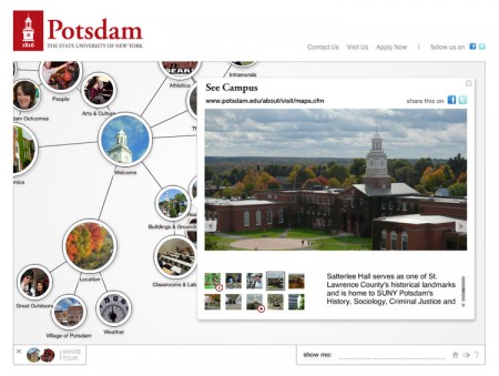
The application was designed to be fit into the Potsdam website. It showcases the broad range of resources and opportunities and also the cohesiveness between different areas of the school. The basis of the application is a collection of interconnected concepts and components of the school. These elements exist as objects in a simulated physical system. Clicking one element reveals related topics. Each object contains images, video and other detailed information.

As you move through the tour, the system organizes itself based on the connections between elements. Users can also save particular elements by dragging them to the dock in the bottom left. Saved elements can be quickly re-opened or shared as a group to a friend.

SUNY Potsdam Virtual Tour, Designed by Anthony MattoxScreenshot fo the SUNY Potsdam virtual tour showing images and video within a node. Click to enlarge.

Technical Jazz

The tour is built in Flash (using Flash Pro CS3 and CS5 (thanks ADAA!)). A CMS, which I built with PHP and MySQL with the CodeIgniter framework, allows SUNY Potsdam to edit the tour, creating and linking nodes and adding images, video, and maps within them. Adobe Illustrator was used to design the application and create graphic elements.

Post Page »

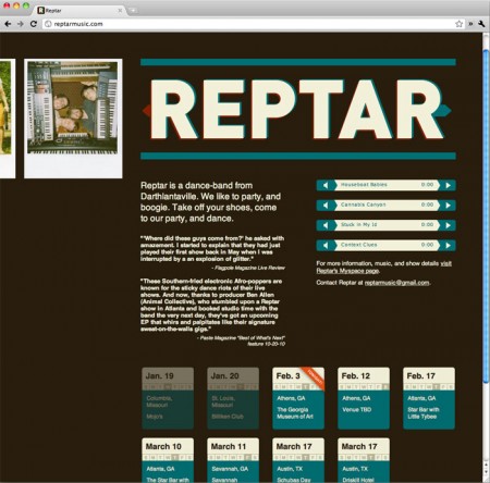
Some old friends of mine are in a fantastic band, Reptar. I’m working on a larger scale website for them, but in the meantime I built a quick one pager with basic information and a couple tracks. Check out the site and their music at ReptarMusic.com.

Reptar Music Website, Designed by Anthony Mattox

For more information on Reptar, check out their myspace page. They’re currently touring around the southeast, but I hear they’re heading up north soon.

Post Page »

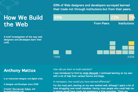
HowWeBuildTheWeb is an informal research piece which explores how web designers and developers learn their craft. I had hypothesized that most learned primarily outside of institutions from their peers, either in person or through the web. So far this is overwhelmingly the case.

Visit HowWeBuildTheWeb.netVisit the site.

The site asks designers and developers how and when they first learned their skills and graphs the data over time, showing time horizontally and educational source by the color. Each participant is shown as a block on the timeline. Clicking on each will show more detailed information including answers to a number of qualitative questions about their experience and the web in general.

Check out the site to see peoples responses and how the education of web designers has changed over time. If you make websites, contribute and share your experience.

On a technical side, the site consists of two main components, a form and a set of data visualizations. Form design is a complex art. I used a few common techniques to make it easier to use. The form is organized by the type of information, large fields are shrunk while they are empty, and lists are extended as necessary. There’s also a sneaky login system that I did my best to hide. After submitting, users can edit their information and resubmit. If they return to the page much later, clicking the edit link will let them enter their email and password.

The data visualizations are primarily handled with PHP, HTML, and CSS. The timeline is a table (the first html table I’ve ever made ever). Cells that represent individuals have classes and other attributes so they are colored and clickable. The table handles all of the scaling. The area graph is just a couple of divs with style attributes dropped in for the width. Nothing too fancy.

The site is built on my favorite frameworks: Codeigniter, a php library, and jQuery, for a few javascript touches.

Post Page »

Another poster for the Ligetisplit Ensemble.

The poster is a little atypical, but I tried to establish the relevant hierarchy of information in new ways to create an interesting poster. The title is near the bottom of the poster, but is large enough be the focal point. The background graphics also bring attention to it.

Other key information, for someone who wants to attend, is closest to the top-left, in a position of attention. Little icons also help to make their purpose clear at a glance.

The graphics were created in illustrator using transform tools, something I’ve been playing with in my make something cool everyday project.

New Music Exhibition - Poster for the Ligetisplit Ensemble

Post Page »

In the shadow of Mark Weaver, my friends Andy Mangold and Jonnie Hallman, and many other more talented humans than myself, I’ve decided to make something cool. Every day.

Anthony Mattox: Make Something Cool Every Day

Every day I plan to spend around 15 to 30 minutes making some quick piece of artwork, either an image, flash applet, processing sketch, sound, or any other medium. The project is meant to keep me productive and be engaged in at least a little something creative every day. It’s also a place where I can exercise and develop skills which I don’t normally have many opportunities to use. Generally I like to work on larger scale projects, and, while this is a very large project, it’ll get me doing something a little different every day. I’m also hoping some of these sketches will set off other, more complete works. Hopefully I can stick to my time constraints so it doesn’t become a burden that I give up.

I began the project about a month ago to build up some content before I publicize it (also while I fixed things in the website). So I’ve got a good batch of things there already. Check out the project at http://makesomethingcooleveryday.anthonymattox.com and subscribe to the feed at http://feeds.feedburner.com/anthonymattox/msced.

The nerd stuff: The site is built with codeigniter and jQuery. This is the second project I’ve used codeigniter for and I’m pretty happy with it. The site still has some kinks in it. Aside from those two frameworks, I built everything else from there up for my own edification and for more control. Bugs and more features will slowly be fixed and added.

Post Page »

I’ve just finished a website for this cute girl I know, Rachel Verhaaren. She is a photographer, and a student here at MICA. Her work has really fantastic colors and textures (two of my favorite things), especially her large format photographs and often focus on optics and perception.

Most photographers seem to want the most minimal of sites, a white or dark grey page with their work in the middle. I felt it was more appropriate to give it just a little bit more color and give visitors a good impression of Rachel’s work as soon as they open the page, something few photographer’s sites do. WIth that in mind, her portfolio is on the front page with large images linking to sets of images.

www.rachelverhaaren.com

website of Rachel Verhaaren - home page

Some nice javascript touches are built with jQuery and the site is powered by WordPress.

website of Rachel Verhaaren - portfolio page

Post Page »

Here is a poster I designed for an event held by the Ligetisplit Ensemble, a musical group in Baltimore. The event, a History of Electronic Music Instruments, should be a good night.

I used an old Processing sketch which visualized an audio stream. The typography isn’t quite what I usually do, but it seemed appropriate for the event. It probably isn’t that unusual anyway.

history-of-electronc-music

Post Page »