My Blog: projects, sketches, works in progress, thoughts, and inspiration.

Tagged: web design

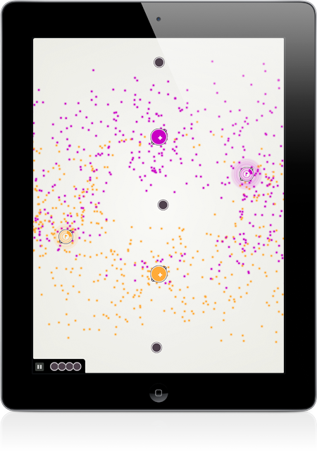
Pulsus iPad Game Screenshot

After a few long months of development, Pulsus is finally available for the iPad. From my original flash prototype, Pulsus has grown in every way possible. It’s found a new home on a wonderful device, has fully redrawn graphics, a new soundtrack, improved physics, a much improved interface, and a suite of new objects and levels on the way. The game has been completely rebuilt from the ground up in native Objective C and C++.

Visit the new Pulsus page for more information and pretty screenshots. View Pulsus in the app store. And play the old flash game.

The app is initially only available for the iPad but will be coming to the rest of the iOS family later this summer.
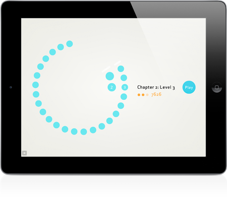
Pulsus iPad Game Screenshot

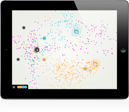
Pulsus iPad Game Screenshot

Of course, there is always more to improve, but Pulsus for the iPad has come very close to my original expectations for the game, creating a simple, but complex world and an enveloping series of meditative puzzles

Some Technical Notes

Pulsus is built using Objective C, C++, and C, it get’s a little hazy to be honest. All audio was created using Ableton Live and Adobe Soundbooth, graphics in Adobe Illustrator. Photoshop was always there to help out too. Original prototype created in Flash and AS3.

All type set in Apex Sans by Thirstype.

Special thanks for invaluable feedback and beta testing to Jason Corace, Jason Sloan, Andy Mangold, Dai Foldes, Dave Fong, and Josh Hepworth.

Moving Forward

Planned updates to Pulsus include an iPhone/iPod version, new objects and levels, and a good list of little improvements here and there.

If you enjoy Pulsus, any rating, reviewing, blogging, and retweeting is appreciated. The better Pulsus does, the better position I’ll be in to make more, and better games in the future. I may even be able to convince the rest of the Friends of The Web to work together on some awesome games.

Post Page »
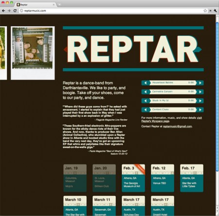
Some old friends of mine are in a fantastic band, Reptar. I’m working on a larger scale website for them, but in the meantime I built a quick one pager with basic information and a couple tracks. Check out the site and their music at ReptarMusic.com.

Reptar Music Website, Designed by Anthony Mattox

For more information on Reptar, check out their myspace page. They’re currently touring around the southeast, but I hear they’re heading up north soon.

Post Page »

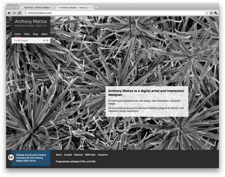
Website of Anthony Mattox version 10

Oh wow. Look at this cool new website. Yes, for sure, it is both of those things.

I’ve been working on this new website for quite a while. It’s still, of course, a bit of a work in progress, but with a little luck everything is working. I’m still building my portfolio here. The system I have set up, again using WordPress, is fairly flexible so I can do some nice things in the future. You’ll also find a much better homepage which does a better job, I think, of showing off my work. You’ll also find some nice little changes such as a fancy new favicon, which now makes some sense, and keyboard navigation in the portfolio.

If you catch any bugs or if you have any suggestions let me know.

Post Page »

The List List - a net art piece by Anthony Mattox

The List List is net art* piece I’ve been working on for the past few months. It is a collaborative list of lists, an open platform for everyones favorite superlatives.*the deacons of new media art might not agree as it isn’t ugly as sin and the concept isn’t unbelievable convoluted and yet meaningless.

On the site, you can create lists and vote lists and items within them up and down. The goal is just to build a collection of fun and humorous lists.

The site has been an enormous technical exercise in precisely executing a complex web page. Despite the apparent simplicity, it is one of the more involved sites I’ve built. Including a number of interactions with the database and an extensive collection of ajax scripts so that all the site’s functions can be used without reloading the page and with a flourish of sleek animations.

It’s very easy to get burned out on a piece with just a few details left to go. I did my best to polish every detail of the The List List, making every transition smooth and considering every graphic, semantic, and functional minutia.

I built the site using CodeIgniter, a php framework, and jQuery. CodeIgniter was probably not necessary, but it made laying out the foundation super fast. jQuery is of course great for animations and simplifying Ajax scripts.

The List List - a net art piece by Anthony Mattox

Go have some fun with it.

Post Page »

In the shadow of Mark Weaver, my friends Andy Mangold and Jonnie Hallman, and many other more talented humans than myself, I’ve decided to make something cool. Every day.

Anthony Mattox: Make Something Cool Every Day

Every day I plan to spend around 15 to 30 minutes making some quick piece of artwork, either an image, flash applet, processing sketch, sound, or any other medium. The project is meant to keep me productive and be engaged in at least a little something creative every day. It’s also a place where I can exercise and develop skills which I don’t normally have many opportunities to use. Generally I like to work on larger scale projects, and, while this is a very large project, it’ll get me doing something a little different every day. I’m also hoping some of these sketches will set off other, more complete works. Hopefully I can stick to my time constraints so it doesn’t become a burden that I give up.

I began the project about a month ago to build up some content before I publicize it (also while I fixed things in the website). So I’ve got a good batch of things there already. Check out the project at http://makesomethingcooleveryday.anthonymattox.com and subscribe to the feed at http://feeds.feedburner.com/anthonymattox/msced.

The nerd stuff: The site is built with codeigniter and jQuery. This is the second project I’ve used codeigniter for and I’m pretty happy with it. The site still has some kinks in it. Aside from those two frameworks, I built everything else from there up for my own edification and for more control. Bugs and more features will slowly be fixed and added.

Post Page »

For the past few months I’ve been hard at work building a flash game. As my first game (but hopefully not last) it was a bit of an adventure, but worthwhile in the end. There are certainly still details to be worked out and some extra features to finish off, but overall it’s come out pretty well.

First go play it! Then come back here if you’d like to know a little more about how the game was created.

I’m not one to preface my work, but I would like to mention that I am not a gamer in any respect. This being said, I may not be aware of all the game conventions I should be following, despite a good amount of ‘research’. If you have any tips for this or future games, feedback is always appreciated. You can leave public comments here or send me feedback through the Pulsus contact form.

Recently, thanks to a class with Jason Corace, I’ve become interested in games as interactive systems. In the same class I developed a card game and created Pulsus for my final project.

The Game

pulsus-game-screenshot-medium

The game, Pulsus, is a puzzle game about particle systems. Players have to place objects to direct particles from emitters into goals. While it is a puzzle game, it is also about exploring a dynamic system.

In the game, players solve puzzles by placing objects onto the stage which effect the way the particles move. In each level the particles must be moved from particle emitters into goal points. Different colored goals accept only particles of that color. Particles must hit the goal quickly enough to fill it up, but once it is complete is will remain filled. The colored force objects will attract their own color while repelling others. Grey objects interact with all particles in the same way.

Read On »

Read On (Post Continues) »

Once again, It was time for a complete re-design of my website.

After a few frustrating iterations, my previous design was just something created to be as simple as possible so I didn’t screw anything up. White background, black text, lots of pictures. It worked out pretty well, but it didn’t exactly sell me as a web designer (to be fair this one isn’t very web-designer-ish either). It was also a little cold and unfriendly. It also had some formal issues, such as wide text columns.

This new site fixes these issues, and is also generally more visually interesting.

p9_screenshot

The Blog layout stayed more or less the same. The post meta-data is in the left column followed by the main column for the post content. A third column, on the right hand side, can be used to annotate images and other elements within a post. I’ve also added a fancy tag cloud and page numbers thanks to a nifty plugin. I’ve been struggling between having a wide column with nice big images, and a thinner, easier to read, column, with smaller images. To try and get the best of both, I added Thickbox (sorry Lokesh, I was already using jQuery).

I feel my work is much more effective when it is larger and I had to sacrifice larger images in my blog for the sake of the layout. Thickbox helped this some, but just to make sure, I added the option to add a custom background to every blog post and page. Someone with a larger screen looking at on of my projects will see an elegant column of images, but will also have it filling in the background around the page. To enhance this I also have custom highlight colors to match the background image. Any page that shows multiple posts pulls these custom options from the top post.

The Home Page has grown substantially. A work from my portfolio is still featured at the top and it’s background pulled. I’ve also added more links to other parts of my site and around the web, and a silly picture of me, just for fun.

My Portfolio now has three viewing modes (large images, excerpts, and thumbnails) and benefited from other site wide additions.

As of right now I still have some little tweaks to make, but everything seems to be pretty much in place. I hope to get some feedback from everyone on the new page look. Comment below, or try my fancy new contact form.

Post Page »

In my blog I frequently share code for little projects in Processing & Arduino. It’s always bothered me to look at the black and white text which, in comparison to the beautifully colored code in various editors, is quite a strain to read. I considered a few ways to do this, primarily client side with JavaScript, server side with PHP, or something pre-formatted in any language.

I decided to write a script to add in the necessary HTML to color the code, which I could then paste into my site. Although this does add a fair amount more to the size of the HTML files on the site I decided it was the best way to go. A server side script, probably built into a WordPress Plugin, would be nice and easy to use, but it would be run every time the page was loaded and would be a load on the server. A JavaScript highlighter would also work well, but it would still be a large script anyway and it would add the hassle of browser inconsistencies and run time on slower browsers.

Since I was building this script I wanted to make it available to others. The Processing and Arduino communities, which the script is built for, are both great about sharing code, and this will make sharing just a little bit easier.

Processing & Arduino Code Formatter Screenshot

The script is built into a simple site at www.anthonymattox.com/code_formatter. You can paste your code into the page, adjust the settings, and format it. The script returns the HTML and a chunk of CSS based on the styles you selected on the first page. Paste the HTML into your site and either add the given CSS or use it as a model to write your own.

In my blog its styled to look something like this. Unfortunately it’s still black in rss readers.

processing code
code formatter
Sample Processing Code

/* sample processing code */
/* analog clock */
PVector mid;
float sc, mn, hr, s, m, h;

void setup() {
  background(20);
  size(400,400);
  noFill();
  stroke(200);
  smooth();
  frameRate(1);
  mid=new PVector(width/2,height/2,0);
}

void draw() {
  background(0);
  s=float(second());
  m=float(minute());
  h=float(hour());
  sc=(s-15)/60*TWO_PI;
  mn=(m-15)/60*TWO_PI;
  hr=(h-3)/12*TWO_PI+mn/12;
  
  strokeWeight(2);
  stroke(200,0,0);
  line(mid.x,mid.y,mid.x+100*cos(sc),mid.y+100*sin(sc));
  stroke(200);
  line(mid.x,mid.y,mid.x+110*cos(mn),mid.y+110*sin(mn));
  strokeWeight(4);
  line(mid.x,mid.y,mid.x+60*cos(hr),mid.y+60*sin(hr));
  
  stroke(50);
  ellipse(mid.x,mid.y,240,240);
}
Post Page »

Take Eight

01-04-09

Tagged: ,

new_site

In my quest to master the web I’ve redesigned my site a few times. Unfortunately I keep coming across new things to learn and after finishing each re-design i find something wrong with it. So here it is for the eighth (give or take) time. My goal was to make the site a little more professional and show off my work a little better. The results not so bad, so maybe I’ll give it a rest for a few months.

Post Page »