Chapter 1 Preface
This book is designed primarily for use in a second semester statistics course although it can also be useful for researchers needing a quick review or ideas for using R for the methods discussed in the text. As a text primarily designed for a second statistics course, it presumes that you have had an introductory statistics course. There are now many different varieties of introductory statistics from traditional, formula-based courses (called “consensus” curriculum courses) to more modern, computational-intensive courses that use randomization ideas to try to enhance learning of basic statistical methods. We are not going to presume that you have had a particular “flavor” of introductory statistics or that you had your introductory statistics out of a particular text, just that you have had a course that tried to introduce you to the basic terminology and ideas underpinning statistical reasoning. We would expect that you are familiar with the logic (or sometimes illogic) of hypothesis testing including null and alternative hypothesis and confidence interval construction and interpretation and that you have seen all of this in a couple of basic situations. We start with a review of these ideas in one and two group situations with a quantitative response, something that you should have seen before.
This text covers a wide array of statistical tools that are connected through situation, methods used, or both. As we explore various techniques, look for the identifying characteristics of each method – what type of research questions are being addressed (relationships or group differences, for example) and what type of variables are being analyzed (quantitative or categorical). Quantitative variables are made up of numerical measurements that have meaningful units attached to them. Categorical variables take on values that are categories or labels. Additionally, you will need to carefully identify the response and explanatory variables, where the study and variable characteristics should suggest which variables should be used as the explanatory variables that may explain variation in the response variable. Because this is an intermediate statistics course, we will start to handle more complex situations (many explanatory variables) and will provide some tools for graphical explorations to complement the more sophisticated statistical models required to handle these situations.
1.1 Overview of methods
After you are introduced to basic statistical ideas, a wide array of statistical methods become available. The methods explored here focus on assessing (estimating and testing for) relationships between variables, sometimes when controlling for or modifying relationships based on levels of another variable – which is where statistics gets interesting and really useful. Early statistical analyses (approximately 100 years ago) were focused on describing a single variable. Your introductory statistics course should have heavily explored methods for summarizing and doing inference in situations with one group or where you were comparing results for two groups of observations. Now, we get to consider more complicated situations – culminating in a set of tools for working with multiple explanatory variables, some of which might be categorical and related to having different groups of subjects that are being compared. Throughout the methods we will cover, it will be important to retain a focus on how the appropriate statistical analysis depends on the research question and data collection process as well as the types of variables measured.
Figure 1.1 frames the topics we will discuss. Taking a broad view of the methods we will consider, there are basically two scenarios – one when the response is quantitative and one when the response is categorical. Examples of quantitative responses we will see later involve passing distance of cars for a bicycle rider (in centimeters (cm)) and body fat (percentage). Examples of categorical variables include improvement (none, some, or marked) in a clinical trial related to arthritis symptoms or whether a student has turned in copied work (never, done this on an exam or paper, or both). There are going to be some more nuanced aspects to all these analyses as the complexity of both sides of Figure 1.1 suggest, but note that near the bottom, each tree converges on a single procedure, using a linear model for a quantitative response variable or using a Chi-square test for a categorical response. After selecting the appropriate procedure and completing the necessary technical steps to get results for a given data set, the final step involves assessing the scope of inference and types of conclusions that are appropriate based on the design of the study.
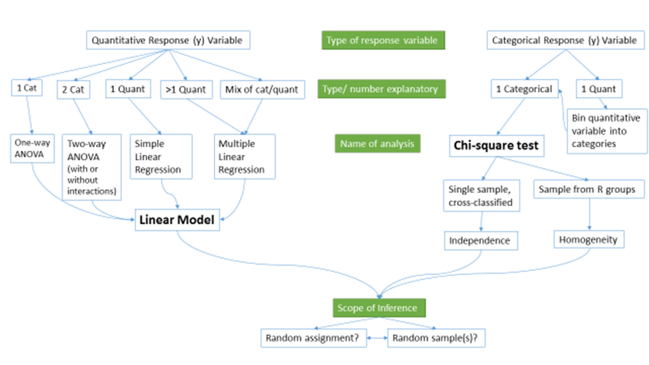
Figure 1.1: Flow chart of methods.
We will be spending most of the semester working on methods for quantitative response variables (the left side of Figure 1.1 is covered in Chapters 2, 3, 4, 6, 7, and 8), stepping over to handle the situation with a categorical response variable in Chapter 5 (right side of Figure 1.1). Chapter 9 contains case studies illustrating all the methods discussed previously, providing a final opportunity to explore additional examples that illustrate how finding a path through Figure 1.1 can lead to the appropriate analysis.
The first topics (Chapters 1, and 2) will be more familiar as we start with single and two group situations with a quantitative response. In your previous statistics course, you should have seen methods for estimating and quantifying uncertainty for the mean of a single group and for differences in the means of two groups. Once we have briefly reviewed these methods and introduced the statistical software that we will use throughout the course, we will consider the first new statistical material in Chapter 3. It involves the situation with a quantitative response variable where there are more than 2 groups to compare – this is what we call the One-Way ANOVA situation. It generalizes the 2-independent sample hypothesis test to handle situations where more than 2 groups are being studied. When we learn this method, we will begin discussing model assumptions and methods for assessing those assumptions that will be present in every analysis involving a quantitative response. The Two-Way ANOVA (Chapter 3) considers situations with two categorical explanatory variables and a quantitative response. To make this somewhat concrete, suppose we are interested in assessing differences in, say, the yield of wheat from a field based on the amount of fertilizer applied (none, low, or high) and variety of wheat (two types). Here, yield is a quantitative response variable that might be measured in bushels per acre and there are two categorical explanatory variables, fertilizer, with three levels, and variety, with two levels. In this material, we introduce the idea of an interaction between the two explanatory variables: the relationship between one categorical variable and the mean of the response changes depending on the levels of the other categorical variable. For example, extra fertilizer might enhance the growth of one variety and hinder the growth of another so we would say that fertilizer has different impacts based on the level of variety. Given this interaction may or may not actually be present, we will consider two versions of the model in Two-Way ANOVAs, what are called the additive (no interaction) and the interaction models.
Following the methods for two categorical variables and a quantitative response, we explore a method for analyzing data where the response is categorical, called the Chi-square test in Chapter 5. This most closely matches the One-Way ANOVA situation with a single categorical explanatory variable, except now the response variable is categorical. For example, we will assess whether taking a drug (vs taking a placebo1) has an effect2 on the type of improvement the subjects demonstrate. There are two different scenarios for study design that impact the analysis technique and hypotheses tested in Chapter 5. If the explanatory variable reflects the group that subjects were obtained from, either through randomization of the treatment level to the subjects or by taking samples from separate populations, this is called a Chi-square Homogeneity Test. It is also possible to obtain a single sample from a population and then obtain information on the levels of the explanatory variable for each subject. We will analyze these results using what is called a Chi-square Independence Test. They both use the same test statistic but we use slightly different graphics and are testing different hypotheses in these two related situations. Figure 1.1 also shows that if we had a quantitative explanatory variable and a categorical response that we would need to “bin” or create categories of responses from the quantitative variable to use the Chi-square testing methods.
If the predictor and response variables are both quantitative, we start with scatterplots, correlation, and simple linear regression models (Chapters 6 and 7) – things you should have seen, at least to some degree, previously. The biggest differences here will be the depth of exploration of diagnostics and inferences for this model and discussions of transformations of variables. If there is more than one explanatory variable, then we say that we are doing multiple linear regression (Chapter 8) – the “multiple” part of the name reflects that there will be more than one explanatory variable. We use the same name if we have a mix of categorical and quantitative predictor variables but there are some new issues in setting up the models and interpreting the coefficients that we need to consider. In the situation with one categorical predictor and one quantitative predictor, we revisit the idea of an interaction. It allows us to consider situations where the estimated relationship between a quantitative predictor and the mean response varies among different levels of the categorical variable. In Chapter 9, connections among all the methods used for quantitative responses are discussed, showing that they are all just linear models . We also show how the methods discussed can be applied to a suite of new problems with a set of case studies and how that relates to further extensions of the methods.
By the end of Chapter 9 you should be able to identify, perform using the statistical software R (R Core Team 2019), and interpret the results from each of these methods. There is a lot to learn, but many of the tools for using R and interpreting results of the analyses accumulate and repeat throughout the textbook. If you work hard to understand the initial methods, it will help you when the methods get more complicated. You will likely feel like you are just starting to learn how to use R at the end of the semester and for learning a new language that is actually an accomplishment. We will just be taking you on the first steps of a potentially long journey and it is up to you to decide how much further you want to go with learning the software.
All the methods you will learn require you to carefully consider how the data were collected, how that pertains to the population of interest, and how that impacts the inferences that can be made. The scope of inference from the bottom of Figure 1.1 is our shorthand term for remembering to think about two aspects of the study – random assignment and random sampling. In a given situation, you need to use the description of the study to decide if the explanatory variable was randomly assigned to study units (this allows for causal inferences if differences are detected) or not (so no causal statements are possible). As an example, think about two studies, one where students are randomly assigned to either get tutoring with their statistics course or not and another where the students are asked at the end of the semester whether they sought out tutoring or not. Suppose we compare the final grades in the course for the two groups (tutoring/not) and find a big difference. In the first study with random assignment, we can say the tutoring caused the differences we observed. In the second, we could only say that the tutoring was associated with differences but because students self-selected the group they ended up in, we can’t say that the tutoring caused the differences. The other aspect of scope of inference concerns random sampling: If the data were obtained using a random sampling mechanism, then our inferences can be safely extended to the population that the sample was taken from. However, if we have a non-random sample, our inference can only apply to the sample collected. In the previous example, the difference would be studying a random sample of students from the population of, say, Introductory Statistics students at a university versus studying a sample of students that volunteered for the research project, maybe for extra credit in the class. We could still randomly assign them to tutoring/not but the non-random sample would only lead to conclusions about those students that volunteered. The most powerful scope of inference is when there are randomly assigned levels of explanatory variables with a random sample from a population – conclusions would be about causal impacts that would happen in the population.
By the end of this material, you should have some basic R skills and abilities to create basic ANOVA and regression models, as well as to handle Chi-square testing situations. Together, this should prepare you for future statistics courses or for other situations where you are expected to be able to identify an appropriate analysis, do the calculations and required graphics using the data set, and then effectively communicate interpretations for the methods discussed here.
1.2 Getting started in R
You will need to download the statistical software package called R and an enhanced interface to R called RStudio (RStudio Team 2018). They are open source and free to download and use (and will always be that way). This means that the skills you learn now can follow you the rest of your life. R is becoming the primary language of statistics and is being adopted across academia, government, and businesses to help manage and learn from the growing volume of data being obtained. Hopefully you will get a sense of some of the power of R in this book.
The next pages will walk you through the process of getting the software downloaded and provide you with an initial experience using RStudio to do things that should look familiar even though the interface will be a new experience. Do not expect to master R quickly – it takes years (sorry!) even if you know the statistical methods being used. We will try to keep all your interactions with R code in a similar code format and that should help you in learning how to use R as we move through various methods. We will also often provide you with example code. Everyone that learns R starts with copying other people’s code and then making changes for specific applications – so expect to go back to examples from the text and focus on learning how to modify that code to work for your particular data set. Only really experienced R users “know” functions without having to check other resources. After we complete this basic introduction, Chapter 2 begins doing more sophisticated things with R, allowing us to compare quantitative responses from two groups, make some graphical displays, do hypothesis testing and create confidence intervals in a couple of different ways.
You will have two3 downloading activities to complete before you can do anything more than read this book4. First, you need to download R. It is the engine that will do all the computing for us, but you will only interact with it once. Go to http://cran.rstudio.com and click on the “Download R for…” button that corresponds to your operating system. On the next page, click on “base” and then it will take you to a screen to download the most current version of R that is compiled for your operating system, something like “Download R 3.6.1 for Windows”. Click on that link and then open the file you downloaded. You will need to select your preferred language (choose English so your instructor can help you), then hit “Next” until it starts to unpack and install the program (all the base settings will be fine). After you hit “Finish” you will not do anything further with R directly.
Second, you need to download RStudio. It is an enhanced interface that will make interacting with R less frustrating and allow you to directly create reports that include the code and output. To download RStudio, go near the bottom of https://www.rstudio.com/products/rstudio/download/ and select the correct version under “Installers for Supported Platforms” for your operating system. Download and then install RStudio using the installer. From this point forward, you should only open RStudio; it provides your interface with R. Note that both R and RStudio are updated frequently (up to four times a year) and if you downloaded either more than a few months previously, you should download the up-to-date versions, especially if something you are trying to do is not working. Sometimes code will not work in older versions of R and sometimes old code won’t work in new versions of R.5
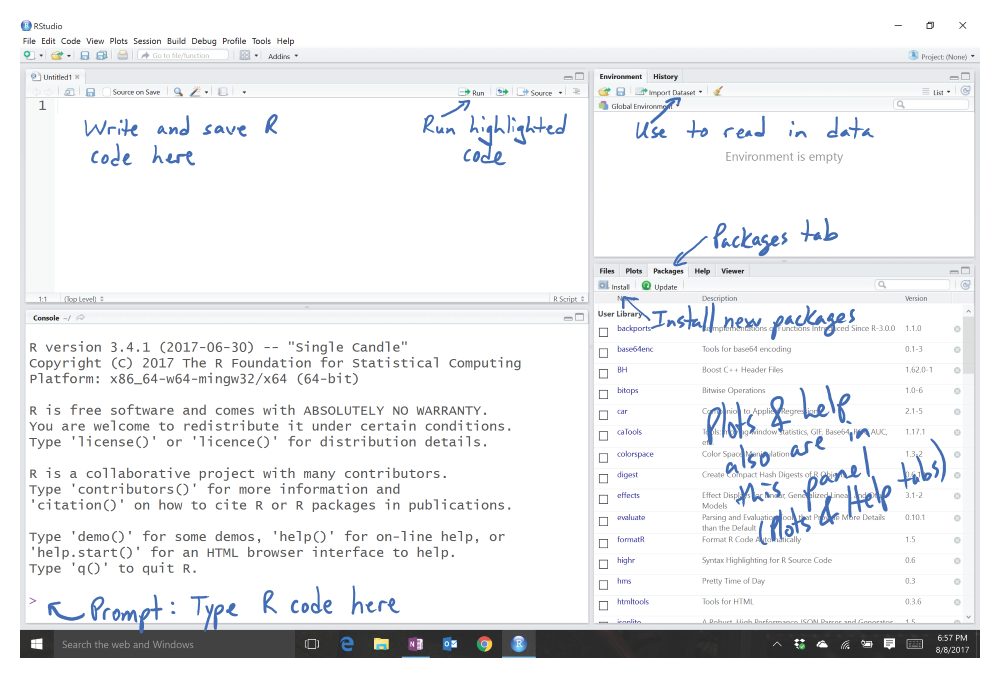
Figure 1.2: Initial RStudio layout.
To get started, we can complete some basic tasks in R using the RStudio interface. When you open RStudio, you will see a screen like Figure 1.2. The added annotation in this and the following screen-grabs is there to help you get initially oriented to the software interface. R is command-line software – meaning that in some way or another you have to create code and get it evaluated, either by entering and execute it at a command prompt or by using the Rstudio interface to run the code that is stored in a file. RStudio makes the management and execution of that code more efficient than the basic version of R. In RStudio, the lower left panel is called the “console” window and is where you can type R code directly into R or where you will see the code you run and (most importantly!) where the results of your executed commands will show up. The most basic interaction with R is available once you get the cursor active at the command prompt “>” by clicking in that panel (look for a blinking vertical line). The upper left panel is for writing, saving, and running your R code either in .R script files or .Rmd (markdown) files, discussed below. Once you have code available in this window, the “Run” button will execute the code for the line that your cursor is on or for any text that you have highlighted with your mouse. The “data management” or environment panel is in the upper right, providing information on what data sets have been loaded. It also contains the “Import Dataset” button that provides the easiest way for you to read a data set into R so you can analyze it. The lower right panel contains information on the “Packages” (additional code we will download and install to add functionality to R) that are available and is where you will see plots that you make and requests for “Help” on specific functions.
As a first interaction with R we can use it as a calculator. To do this, click near the command prompt
(>) in the lower left “console” panel, type 3+4, and then hit enter. It
should look like this:
You can do more interesting calculations, like finding the mean of the numbers -3, 5, 7, and 8 by adding them up and dividing by 4:
Note that the parentheses help R to figure out your desired order of operations. If you drop that grouping, you get a very different (and wrong!) result:
We could estimate the standard deviation similarly using the formula you might remember from introductory
statistics, but that will only work in very limited situations. To use the real
power of R this semester, we need to work with data sets that store the
observations for our subjects in variables.
Basically, we need to store observations in named vectors (one dimensional
arrays) that contain a list of the observations. To create a vector containing
the four numbers and assign it to a variable named variable1, we need to
create a vector using the concatenate function
c which means “combine the items” that follow, if they are inside
parentheses and have commas separating the values,
as follows:
To get this vector stored in a variable called variable1 we need to
use the assignment operator, <- (read as “is defined to contain”) that assigns
the information on the right into the variable that you are creating on
the left.
In R, the assignment operator, <-, is created by typing a
“less than” symbol < followed by a “minus” sign (-)
without a space between them. If you
ever want to see what numbers are residing in an object in R, just type
its name and hit enter. You can see how that variable contains the same
information that was initially generated by
c(-3, 5, 7, 8) but is easier to access since we just need the text
for the variable name representing that vector.
With the data stored in a variable, we can use functions such as
mean and
sd to find the mean and standard deviation of the observations contained in
variable1:
When dealing with real data, we will often have information about more than one variable. We could enter all observations by hand for each variable but this is prone to error and onerous for all but the smallest data sets. If you are to ever utilize the power of statistics in the evolving data-centered world, data management has to be accomplished in a more sophisticated way. While you can manage data sets quite effectively in R, it is often easiest to start with your data set in something like Microsoft Excel or OpenOffice’s Calc. You want to make sure that observations are in the rows and the names of variables are in first row of the columns and that there is no “extra stuff” in the spreadsheet. If you have missing observations, they should be represented with blank cells. The file should be saved as a “.csv” file (stands for comma-separated values although Excel calls it “CSV (Comma Delimited)”), which basically strips off some of the junk that Excel adds to the necessary information in the file. Excel will tell you that this is a bad idea, but it actually creates a more stable archival format and one that R can use directly.6
The following code to read in the data set relies on an R package called
readr (Wickham, Hester, and Francois 2018). Packages in R provide additional functions and data sets that
are not available in the initial download of R or RStudio. To get access to the packages,
first “install” (basically
download) and then “load” the package. To install an R package, go to the Packages
tab in the lower right panel of
RStudio. Click on the Install button and then type in the name of the package in
the box (here type in readr).
RStudio will try to auto-complete the package name
you are typing which should help you make sure you got it typed correctly. If you are working in a .Rmd file, a highlighted message may show up on the top of the file to suggest packages to install that are not present – look for this to help make sure you have the needed packages installed. This will
be the first of many times that we will mention that R is case sensitive – in
other words, Readr is different from readr in R syntax and this sort of
thing applies to everything you do in R. You should only need to install each R
package once on a given computer. If you ever see a message that R can’t find a
package, make sure it appears in the list in the Packages tab. If it
doesn’t, repeat the previous steps to install it.
Important: R is case sensitive! Readr is not the same as readr! |
After installing the package, we need to load it to make it active in a given work
session. Go to the command prompt and type (or copy and paste) library(readr) or require(readr):
> library(readr)With a data set converted to a CSV file and readr installed and loaded, we need to read the data set into the active workspace.
There are two ways to do this, either using the point-and-click GUI in RStudio (click
the “Import Dataset” button in the upper right “Environment” panel as
indicated in Figure 1.2) or modifying the read_csv
function to find the file of interest. To practice this, you can
download an Excel (.xls) file from
http://www.math.montana.edu/courses/s217/documents/treadmill.xls
that contains observations on 31 males that volunteered for a study on methods
for measuring fitness (Westfall and Young 1993).
In the spreadsheet, you will find a data set that
starts and ends with the following information (only results for Subjects 1, 2,
30, and 31 shown here):
| Sub- ject | Tread- MillOx | TreadMill- MaxPulse | RunTime | RunPulse | Rest Pulse | BodyWeight | Age |
|---|---|---|---|---|---|---|---|
| 1 | 60.05 | 186 | 8.63 | 170 | 48 | 81.87 | 38 |
| 2 | 59.57 | 172 | 8.17 | 166 | 40 | 68.15 | 42 |
| … | … | … | … | … | … | … | … |
| 30 | 39.2 | 172 | 12.88 | 168 | 44 | 91.63 | 54 |
| 31 | 37.39 | 192 | 14.03 | 186 | 56 | 87.66 | 45 |
The variables contain information on the subject number (Subject), subjects’ maximum treadmill oxygen consumption (TreadMillOx, in ml per kg per minute, also called maximum VO2) and maximum pulse rate (TreadMillMaxPulse, in beats per minute), time to run 1.5 miles (Run Time, in minutes), maximum pulse during 1.5 mile run (RunPulse, in beats per minute), resting pulse rate (RestPulse, beats per minute), Body Weight (BodyWeight, in kg), and Age (in years). Open the file in Excel or equivalent software and then save it as a .csv file in a location you can find on your computer. Then go to RStudio and click on File, then Import Dataset, then From Text (readr)…7 Click “Import” and find your file. R will store the data set as an object with the same name as the .csv file. You could use another name as well, but it is often easiest just to keep the data set name in R related to the original file name. You should see some text appear in the console (lower left panel) like in Figure 1.3. The text that is created will look something like the following – if you had stored the file in a drive labeled D:, it would be:
What is put inside the
" " will depend on the location and name of your saved .csv file. A
version of the data set in what looks like a
spreadsheet will appear in the upper left window due to the second line of
code (View(treadmill)).
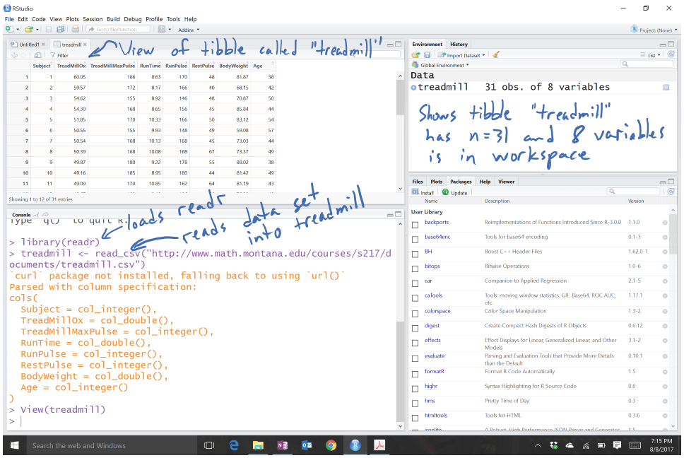
Figure 1.3: RStudio with initial data set loaded.
Just directly typing (or using) a line of code like this is actually the
other way that we can read in
files. If you choose to use the text-only interface, then you need to tell R
where to look in your computer to find the data file. read_csv is a
function that takes a path as an argument. To use it, specify the path to
your data file, put quotes around it, and put it as the input to
read_csv(...). For some examples later in the book, you will be able to
copy a command like this from the text and read data sets and other
code directly from the website, assuming you are connected to the
internet.
To verify that you read the data set in correctly, it is always good to check
its contents. We can view the first and last rows in the data set using the
head and tail functions on the data set, which show the following
results for the
treadmill data. Note that you will sometimes need to resize the console
window in RStudio to get all the columns to display
in a single row which can be performed by dragging the gray bars that separate
the panels.
> head(treadmill)
# A tibble: 6 x 8
  Subject TreadMillOx TreadMillMaxPulse RunTime RunPulse RestPulse BodyWeight   Age
    <int>       <dbl>             <int>   <dbl>    <int>     <int>      <dbl> <int>
1       1       60.05               186    8.63      170        48      81.87    38
2       2       59.57               172    8.17      166        40      68.15    42
3       3       54.62               155    8.92      146        48      70.87    50
4       4       54.30               168    8.65      156        45      85.84    44
5       5       51.85               170   10.33      166        50      83.12    54
6       6       50.55               155    9.93      148        49      59.08    57

> tail(treadmill)
# A tibble: 6 x 8
  Subject TreadMillOx TreadMillMaxPulse RunTime RunPulse RestPulse BodyWeight   Age
    <int>       <dbl>             <int>   <dbl>    <int>     <int>      <dbl> <int>
1      26       44.61               182   11.37      178        62      89.47    44
2      27       40.84               172   10.95      168        57      69.63    51
3      28       39.44               176   13.08      174        63      81.42    44
4      29       39.41               176   12.63      174        58      73.37    57
5      30       39.20               172   12.88      168        44      91.63    54
6      31       37.39               192   14.03      186        56      87.66    45
When you load an installed package with library, you may see a warning message about versions of the package and versions of
R – this is usually something you can ignore. Other warning messages could
be more ominous for proceeding but before getting too concerned, there are
couple of basic things to check.
First, double check that the package is
installed (see
previous steps). Second, check for typographical errors in your code –
especially for mis-spellings or unintended capitalization. If you are still
having issues, try repeating the installation process. Then click on the “Update” button to check for potentially newer versions of packages. If all that fails, try the cloud version of RStudio discussed before and repeat the steps there.
To help you go from basic to intermediate R usage and especially to help with more complicated problems, you will want to learn how to manage and save your R code. The best way to do this is using the upper left panel in RStudio. If you just want to manage code, then you can use what are called R Scripts, which are files that have a file extension of “.R”. To start a new “.R” file to store your code, click on File, then New File, then R Script. This will create a blank page to enter and edit code – then save the file as something like “MyFileName.R” in your preferred location. Saving your code will mean that you can return to where you were working last by simply re-running the saved script file. With code in the script window, you can place the cursor on a line of code or highlight a chunk of code and hit the “Run” button8 on the upper part of the panel. It will appear in the console with results just like what you would obtain if you typed it after the command prompt and hit enter for each line. Figure 1.4 shows the screen with the code used in this section in the upper left panel, saved in a file called “Ch1.R”, with the results of highlighting and executing the first section of code using the “Run” button.
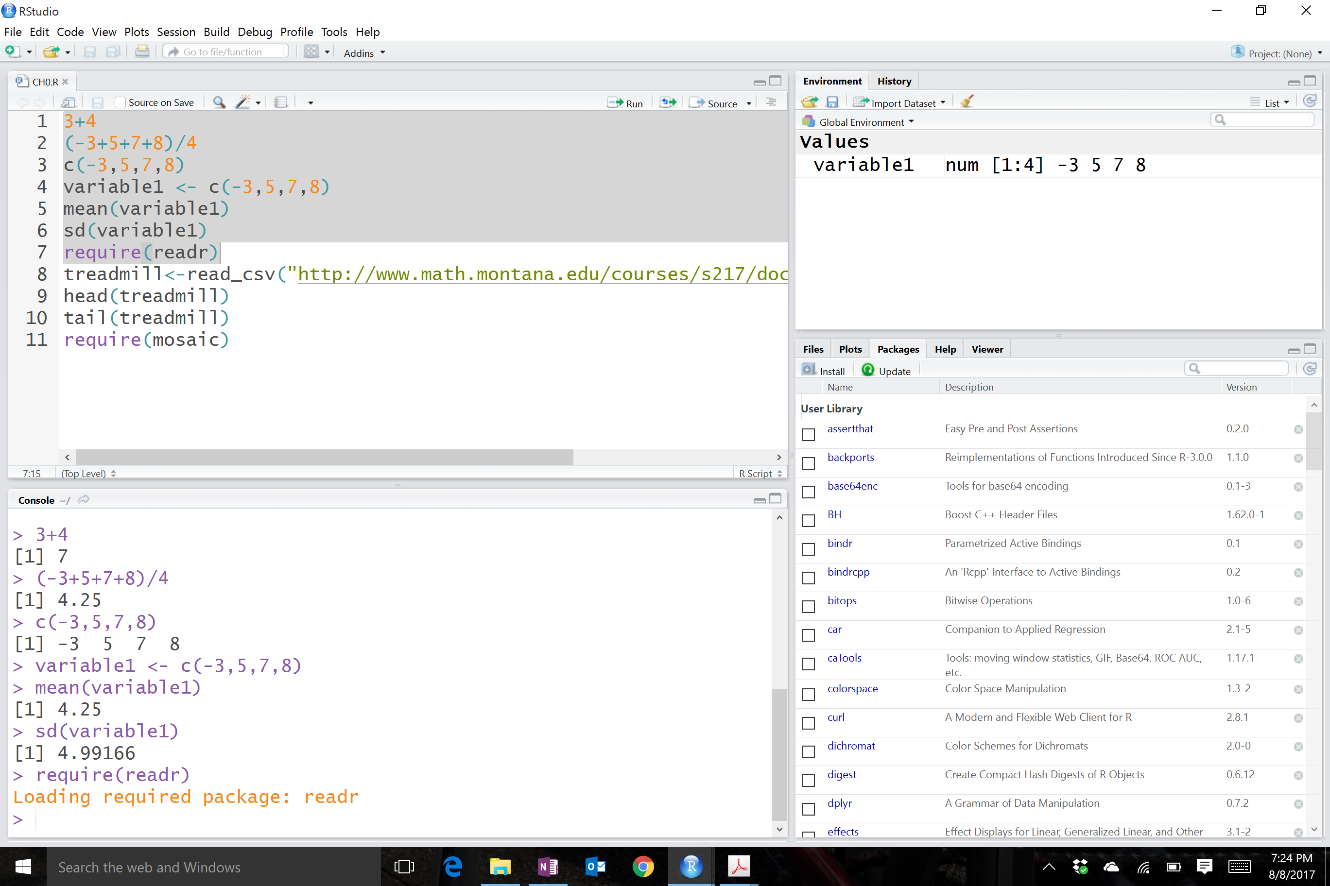
Figure 1.4: RStudio with highlighted code run.
1.3 Basic summary statistics, histograms, and boxplots using R
For the following material, you will need to install and load the mosaic package (Pruim, Kaplan, and Horton 2019).
It provides a suite of enhanced functions to aid our initial explorations. With RStudio running, the mosaic package loaded, a place to write and
save code, and the treadmill data set loaded, we can (finally!) start to
summarize the results of the study. The treadmill object is what R calls a
tibble9 and contains columns corresponding to each variable in
the spreadsheet. Every
function in R will involve specifying the variable(s) of interest and how you
want to use them. To access a particular variable (column) in a tibble, you
can use a $ between the name of the tibble and the name of the variable of
interest, generically as tibblename$variablename. You can think of this as tibblename’s variablename where the ’s is replaced by the dollar sign. To identify the
RunTime variable here it would be treadmill$RunTime. In the command line it would look like:
> treadmill$RunTime
[1]  8.63  8.17  8.92  8.65 10.33  9.93 10.13 10.08  9.22  8.95 10.85  9.40 11.50 10.50
[15] 10.60 10.25 10.00 11.17 10.47 11.95  9.63 10.07 11.08 11.63 11.12 11.37 10.95 13.08
[29] 12.63 12.88 14.03
Just as in the previous section, we can generate summary statistics using functions like mean and sd by running them on a specific variable:
And now we know that the average running time for 1.5 miles for the subjects in the study was 10.6 minutes with a standard deviation (SD) of 1.39 minutes. But you should remember that the
mean and SD are only appropriate summaries if the distribution is roughly
symmetric (both sides of the distribution are approximately the same shape and length). The
mosaic package provides a useful function called favstats that provides
the mean and SD as well as the 5 number summary:
the minimum (min), the first quartile (Q1, the 25th percentile),
the median (50th percentile), the third quartile (Q3, the 75th
percentile), and the maximum (max). It also provides the number of
observations (n) which was 31, as noted above, and a count of whether any
missing values were encountered (missing), which was 0 here since all
subjects had measurements available on this variable.
> favstats(treadmill$RunTime)
  min   Q1 median    Q3   max     mean       sd  n missing
 8.17 9.78  10.47 11.27 14.03 10.58613 1.387414 31       0
We are starting to get somewhere with understanding that the runners were somewhat fit with the worst runner covering 1.5 miles in 14 minutes (the equivalent of a 9.3 minute mile) and the best running at a 5.4 minute mile pace. The limited variation in the results suggests that the sample was obtained from a restricted group with somewhat common characteristics. When you explore the ages and weights of the subjects in the Practice Problems in Section 1.6, you will get even more information about how similar all the subjects in this study were. Researchers often publish numerical summaries of this sort of demographic information to help readers understand the subjects that they studied and that their results might apply to.
A graphical display of these results will help us to assess the shape
of the distribution of run times – including considering the potential for the presence of a skew (whether the right or left tail of the distribution
is noticeably more spread out, with left skew meaning that the left tail
is more spread out than the right tail) and outliers
(unusual observations). A histogram is a good place to start.
Histograms display connected bars with counts of observations defining
the height of bars based on a set of bins of values of the quantitative variable.
We will apply the hist function to the RunTime variable, which produces
Figure 1.5.
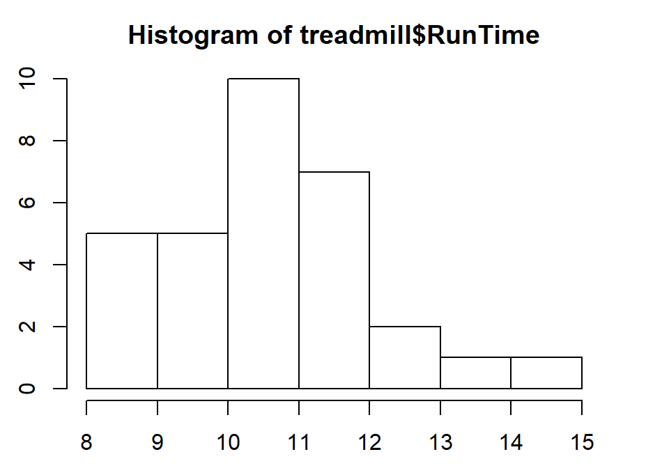
Figure 1.5: Histogram of Run Times (minutes) of \(n\)=31 subjects in Treadmill study, bar heights are counts.
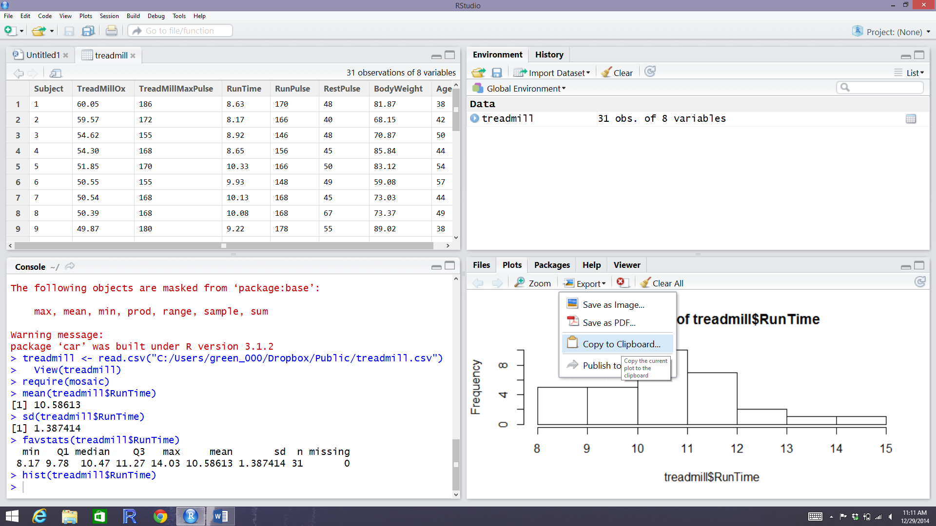
Figure 1.6: RStudio while in the process of copying the histogram.
You can save this plot by clicking on the Export button found above the plot, followed by Copy to Clipboard and clicking on the Copy Plot button. Then if you open your favorite word-processing program, you should be able to paste it into a document for writing reports that include the figures. You can see the first parts of this process in the screen grab in Figure 1.6. You can also directly save the figures as separate files using Save as Image or Save as PDF and then insert them into your word processing documents.
The function hist defaults into providing a histogram on the frequency
(count) scale. In most R functions, there are the default options that will
occur if we don’t make any specific choices but we
can override the default options if we desire. One option we can modify here is
to add labels to the bars to be able to see exactly how many observations fell
into each bar. Specifically, we can turn the labels option “on” by making it true (“T”) by adding labels=T to the previous call to the hist function, separated by a comma. Note that we will use the = sign only for changing options within functions.
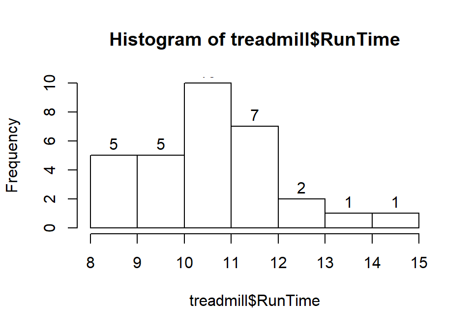
Figure 1.7: Histogram of Run Times with counts in bars labeled.
Based on this histogram, it does not appear that there any outliers in the responses since there are no bars that are separated from the other observations. However, the distribution does not look symmetric and there might be a skew to the distribution. Specifically, it appears to be skewed right (the right tail is longer than the left). But histograms can sometimes mask features of the data set by binning observations and it is hard to find the percentiles accurately from the plot.
When assessing outliers and skew, the boxplot
(or Box and Whiskers plot) can also be helpful (Figure 1.8) to describe the
shape of the distribution as it displays the 5-number summary and will also indicate
observations that are “far” above the middle of the observations.
R’s boxplot function uses the standard rule to indicate an observation as a
potential outlier if it falls more than 1.5 times the IQR
(Inter-Quartile Range, calculated as Q3 – Q1) below Q1 or above Q3.
The potential outliers
are plotted with circles and the Whiskers (lines that extend from Q1 and Q3 typically to
the minimum and maximum) are shortened to only go as far as
observations that are within \(1.5*\)IQR of the upper and lower quartiles. The box
part of the boxplot is a box that goes from Q1 to Q3 and the median is displayed as a line
somewhere inside the box.10 Looking back at the summary statistics above, Q1=9.78 and Q3=11.27, providing an IQR of:
One observation (the maximum value of 14.03) is indicated as a potential outlier based on this result by being larger than Q3 \(+1.5*\)IQR, which was 13.505:
The boxplot also shows a slight indication of a right skew (skew towards larger values) with the distance from the minimum to the median being smaller than the distance from the median to the maximum. Additionally, the distance from Q1 to the median is smaller than the distance from the median to Q3. It is modest skew, but worth noting.
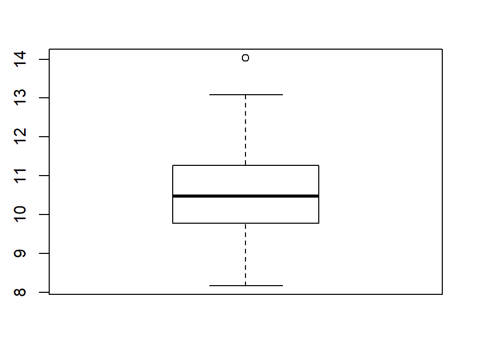
Figure 1.8: Boxplot of 1.5 mile Run Times.
While the default boxplot is fine, it fails to provide good graphical labels,
especially on the y-axis. Additionally, there is no title on the plot. The
following code provides some enhancements to the plot by using the ylab and
main options in the call to boxplot, with the results displayed in
Figure 1.9. When we add text to plots, it will be contained within quotes and
be assigned into the options ylab (for y-axis) or main
(for the title) here to put it into those locations.
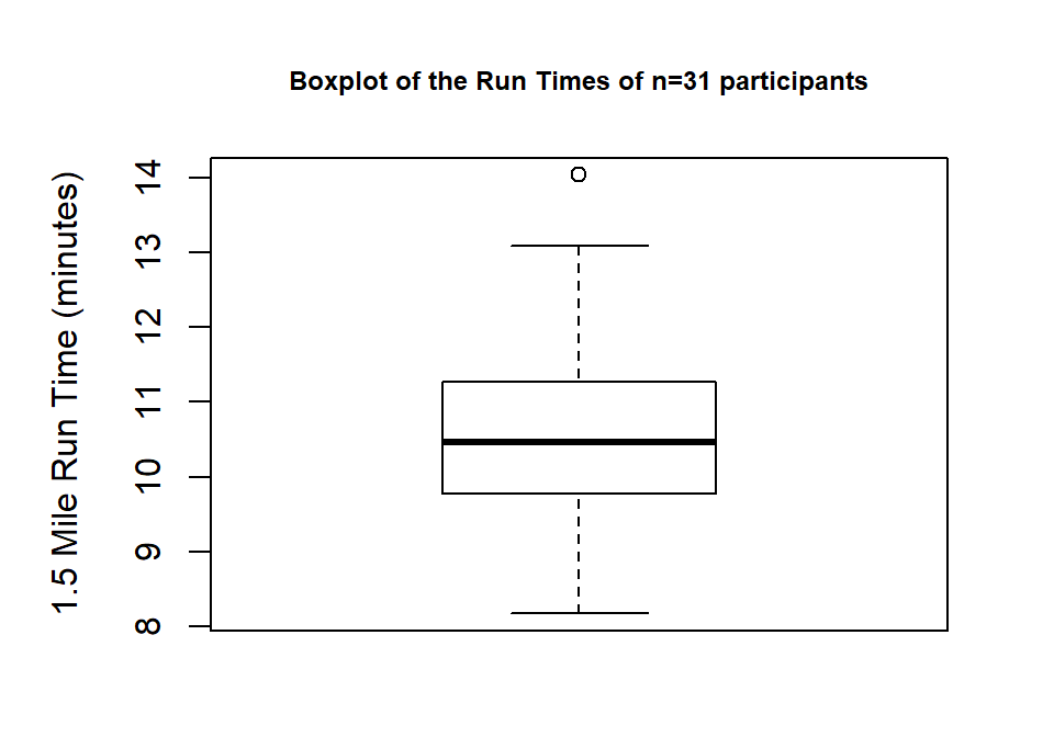
Figure 1.9: Boxplot of Run Times with improved labels.
> boxplot(treadmill$RunTime, ylab="1.5 Mile Run Time (minutes)",
          main="Boxplot of the Run Times of n=31 participants")
Throughout the book, we will often use extra options to make figures that are easier for you to understand. There are often simpler versions of the functions that will suffice but the extra work to get better labeled figures is often worth it. I guess the point is that “a picture is worth a thousand words” but in data visualization, that is only true if the reader can understand what is being displayed. It is also important to think about the quality of the information that is being displayed, regardless of how pretty the graphic might be. So maybe it is better to say “a picture can be worth a thousand words” if it is well-labeled?
All the previous results were created by running the R code and then copying the
results from either the console or by copying the figure and then pasting the results
into the typesetting program. There is another way
to use RStudio where you can have it compile the results (both output and
figures) directly into a document together with other writing and the code that generated it,
using what is called R Markdown (http://shiny.rstudio.com/articles/rmarkdown.html).
It is basically what we used to prepare this book and what you should learn to use to do your work.
From here forward, you will see a
change in formatting of the R code and output as you will no
longer see the command prompt (“>”) with the code. The output will be
flagged by having two “##”’s before it. For example, the summary statistics for
the RunTime variable from favstats function would look like when run using R Markdown:
##   min   Q1 median    Q3   max     mean       sd  n missing
##  8.17 9.78  10.47 11.27 14.03 10.58613 1.387414 31       0
Statisticians (and other scientists) are starting to use R Markdown and similar methods because they provide what is called “Reproducible research” (Gandrud 2015) where all the code and output it produced are available in a single place. This allows different researchers to run and verify results (so “reproducible results”) or the original researchers to revisit their earlier work at a later date and recreate all their results exactly. Scientific publications are currently encouraging researchers to work in this way and may someday require it. The term reproducible can also be related to whether repeated studies get the same result (also called replication) – further discussion of these terms and the implications for scientific research are discussed in Chapter 2.
In order to get some practice using R Markdown, create a sample document in this format using File -> New File -> R Markdown… Choose a title for your file and select the “Word” option. This will create a new file in the upper left window where we stored our .R script. Save that file to your computer. Then you can use the “Knit” button to have RStudio run the code and create a word document with the results. R Markdown documents contain basically two components, “code chunks” that contain your code and the rest of the document where you can write descriptions and interpretations of the results that code generates. The code chunks can be inserted using the “Insert” button by selecting the “R” option. Then write your code in between the ```{r} and ``` lines (it should have grey highlights for those lines and white for the rest of the portions of the .Rmd document). Once you write some code inside a code chunk, you can test your code using the triangle on the upper right side of it to run all the code that resides in that chunk. Keep your write up outside of these code chunks to avoid code errors and failures to compile. Once you think your code and writing is done, you can use the “Knit” button to try to compile the file. As you are learning, you may find this challenging, so start with trying to review the sample document and knit each time you get a line of code written so you know when you broke the file. Also look around for posted examples of .Rmd files to learn how others have incorporated code with write-ups. You might even be given a template of homework or projects as .Rmd files from your instructor. After you do this a couple of times, you will find that the challenge of working with markdown files is more than matched by the simplicity of the final product and, at least to researchers, the reproducibility and documentation of work that this method provides.
Finally, when you are done with your work and attempt to exit out of RStudio,
it will
ask you to save your workspace. DO NOT DO THIS! It will just create a cluttered
workspace and could even cause you to get incorrect results. In fact, you should go into the Tools -> Global Options and then make sure that “Save workspace to .RData on exit” option on the first screen you will see is set to Never. If you
save your R code either as a .R or (better) an R-markdown file, you can re-create any results by simply
re-running that code or re-knitting the file. If you find that you have lots of “stuff” in your
workspace because you accidentally saved your workspace, just run rm(list = ls()).
It will delete all the data sets from your workspace.
1.4 Chapter summary
This chapter covered getting R and RStudio downloaded and some basics of working with R via RStudio. You should be able to read a data set into R and run some basic functions, all done using the RStudio interface. If you are struggling with this, you should seek additional help with these technical issues so that you are ready for more complicated statistical methods that are going to be encountered in the following chapters. The way everyone learns R is by starting with some example code that does most of what you want to do and then you modify it. If you can complete the Practice Problems that follow, you are well on your way to learning to use R.
The statistical methods in this chapter were minimal and all should have been review. They involved a quick reminder of summarizing the center, spread, and shape of distributions using numerical summaries of the mean and SD and/or the min, Q1, median, Q3, and max and the histogram and boxplot as graphical summaries. We revisited the ideas of symmetry and skew. But the main point was really to get a start on using R via RStudio to provide results you should be familiar with from your previous statistics experience(s).
1.5 Summary of important R code
To help you learn and use R, there is a section highlighting the most important R code used near the end of each chapter. The bold text will never change but the lighter and/or ALL CAPS text (red in the online or digital version) will need to be customized to your particular application. The sub-bullet for each function will discuss the use of the function and pertinent options or packages required. You can use this as a guide to finding the function names and some hints about options that will help you to get the code to work. You can also revisit the worked examples using each of the functions.
FILENAME
<-read_csv(“path to csv file/FILENAME.csv”)Can be generated using “Import Dataset” button or by modifying this text.
Requires the
readrpackage to be loaded (library(readr)) when using the code directly.Imports a text file saved in the CSV format.
DATASETNAME$VARIABLENAME
- To access a particular variable in a tibble called DATASETNAME, use a $ and then the VARIABLENAME.
head(DATASETNAME)
- Provides a list of the first few rows of the data set for all the variables in it.
tail(DATASETNAME)
- Provides a list of the last few rows of the data set for all the variables in it.
mean(DATASETNAME$VARIABLENAME)
- Calculates the mean of the observations in a variable.
sd(DATASETNAME$VARIABLENAME)
- Calculates the standard deviation of the observations in a variable.
favstats(DATASETNAME$VARIABLENAME)
Requires the
mosaicpackage to be loaded (library(mosaic)) after installing the package).Provides a suite of numerical summaries of the observations in a variable.
hist(DATASETNAME$VARIABLENAME)
- Makes a histogram.
boxplot(DATASETNAME$VARIABLENAME)
- Makes a boxplot.
1.6 Practice problems
In each chapter, the last section contains some questions for you to complete to make sure you understood the material. You can download the code to answer questions 1.1 to 1.5 below at http://www.math.montana.edu/courses/s217/documents/Ch1.Rmd. But to practice learning R, it would be most useful for you to try to accomplish the requested tasks yourself and then only refer to the provided R code if/when you struggle. These questions provide a great venue to check your learning, often to see the methods applied to another data set, and for something to discuss in study groups, with your instructor, and at the Math Learning Center.
1.1. Read in the treadmill data set
discussed previously and find the mean and SD of the Ages (Age variable) and Body
Weights (BodyWeight variable). In studies involving human subjects, it is
common to report a
summary of characteristics of the subjects. Why does this matter? Think about
how your interpretation of any study of the fitness of subjects would change if
the mean age (same spread) had been 20 years older or 35 years younger.
1.2. How does knowing about the distribution of results for Age and BodyWeight help you understand the results for the Run Times discussed previously?
1.3. The mean and SD are most useful as summary statistics only if the distribution is relatively symmetric. Make a histogram of Age responses and discuss the shape of the distribution (is it skewed right, skewed left, approximately symmetric?; are there outliers?). Approximately what range of ages does this study pertain to?
1.4. The weight responses are in
kilograms and you might prefer to see them in pounds. The conversion is
lbs=2.205*kgs. Create a new variable in the treadmill
tibble called BWlb using this code:
and find the mean and SD of the new variable (BWlb).
1.5. Make histograms and boxplots of the original BodyWeight and new BWlb variables. Discuss aspects of the distributions that changed and those that remained the same with the transformation from kilograms to pounds. What does this tell you about changing the units of a variable in terms of its distribution?
References
Gandrud, Christopher. 2015. Reproducible Research with R and R Studio, Second Edition. Chapman Hall, CRC.
Pruim, Randall, Daniel T. Kaplan, and Nicholas J. Horton. 2019. Mosaic: Project Mosaic Statistics and Mathematics Teaching Utilities. https://CRAN.R-project.org/package=mosaic.
R Core Team. 2019. R: A Language and Environment for Statistical Computing. Vienna, Austria: R Foundation for Statistical Computing. https://www.R-project.org/.
RStudio Team. 2018. RStudio: Integrated Development Environment for R. Boston, MA: RStudio, Inc. http://www.rstudio.com/.
Westfall, Peter H., and S. Stanley Young. 1993. Resampling-Based Multiple Testing: Examples and Methods for P-Value Adjustment. New York: Wiley.
Wickham, Hadley, Jim Hester, and Romain Francois. 2018. Readr: Read Rectangular Text Data. https://CRAN.R-project.org/package=readr.