Chapter 7 Simple linear regression inference
7.1 Model
In Chapter 6, we learned how to estimate and interpret correlations and regression equations with a single predictor variable (simple linear regression or SLR). We carefully explored the variety of things that could go wrong and how to check for problems in regression situations. In this chapter, that work provides the basis for performing statistical inference that mainly focuses on the population slope coefficient based on the sample slope coefficient. As a reminder, the estimated regression model is \(\hat{y}_i = b_0 + b_1x_i\). The population regression equation is \(y_i = \beta_0 + \beta_1x_i + \varepsilon_i\) where \(\beta_0\) is the population (or true) y-intercept and \(\beta_1\) is the population (or true) slope coefficient. These are population parameters (fixed but typically unknown). This model can be re-written to think about different components and their roles. The mean of a random variable is statistically denoted as \(E(y_i)\), the expected value of \(\mathbf{y_i}\), or as \(\mu_{y_i}\) and the mean of the response variable in a simple linear model is specified by \(E(y_i) = \mu_{y_i} = \beta_0 + \beta_1x_i\). This uses the true regression line to define the model for the mean of the responses as a function of the value of the explanatory variable99.
The other part of any statistical model is specifying a model for the variability around the mean. There are two aspects to the variability to specify here – the shape of the distribution and the spread of the distribution. This is where the normal distribution and our “normality assumption” re-appears. And for normal distributions, we need to define a variance parameter, \(\sigma^2\). Combined, the complete regression model is
\[y_i \sim N(\mu_{y_i},\sigma^2), \text{ with } \mu_{y_i} = \beta_0 + \beta_1x_i,\]
which can be read as “y follows a normal distribution with mean mu-y and variance sigma-squared” and that “mu-y is equal to beta-0 plus beta-1 times x”. This also implies that the random variability around the true mean, the errors, follow a normal distribution with mean 0 and that same variance, \(\varepsilon_i \sim N(0,\sigma^2)\). The true deviations (\(\varepsilon_i\)) are once again estimated by the residuals, \(e_i = y_i - \hat{y}_i\) = observed response – predicted response. We can use the residuals to estimate \(\sigma\), which is also called the residual standard error, \(\hat{\sigma} = \sqrt{\Sigma e^2_i / (n-2)}\). We will find this quantity near the end of the regression output as discussed below so the formula is not heavily used here. This provides us with the three parameters that are estimated as part of our SLR model: \(\beta_0, \beta_1,\text{ and } \sigma\).
These definitions also formalize the assumptions implicit in the regression model:
The errors follow a normal distribution (Normality assumption).
The errors have the same variance (Constant variance assumption).
The observations are independent (Independence assumption).
The model for the mean is “correct” (Linearity, No Influential points, Only one group).
The diagnostics described at the end of Chapter 6 provide techniques for checking these assumptions – at least not having clear issues with those assumptions is fundamental to having a regression line that we trust and inferences from it that we also can trust.
To make this clearer, suppose that in the Beers and BAC study that they had randomly assigned 20 students to consume each number of beers. We would expect some variation in the BAC for each group of 20 at each level of Beers but that each group of observations will be centered at the true mean BAC for each number of Beers. The regression model assumes that the BAC values are normally distributed around the mean for each Beer level, \(\text{BAC}_i \sim N(\beta_0 + \beta_1\text{ Beers}_i,\sigma^2)\), with the mean defined by the regression equation. We actually do not need to obtain more than one observation at each \(x\) value to make this assumption or assess it, but the plots below show you what this could look like. The sketch in Figure 7.1 attempts to show the idea of normal distributions that are centered at the true regression line, all with the same shape and variance that is an assumption of the regression model. Figure 7.2 contains simulated realizations from a normal distribution of 20 subjects at each Beer level around the assumed true regression line with two different residual SEs of 0.02 and 0.06. The original BAC model has a residual SE of 0.02 but had many fewer observations at each Beer value.
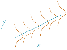
Figure 7.1: Sketch of assumed normal distributions for the responses centered at the regression line.
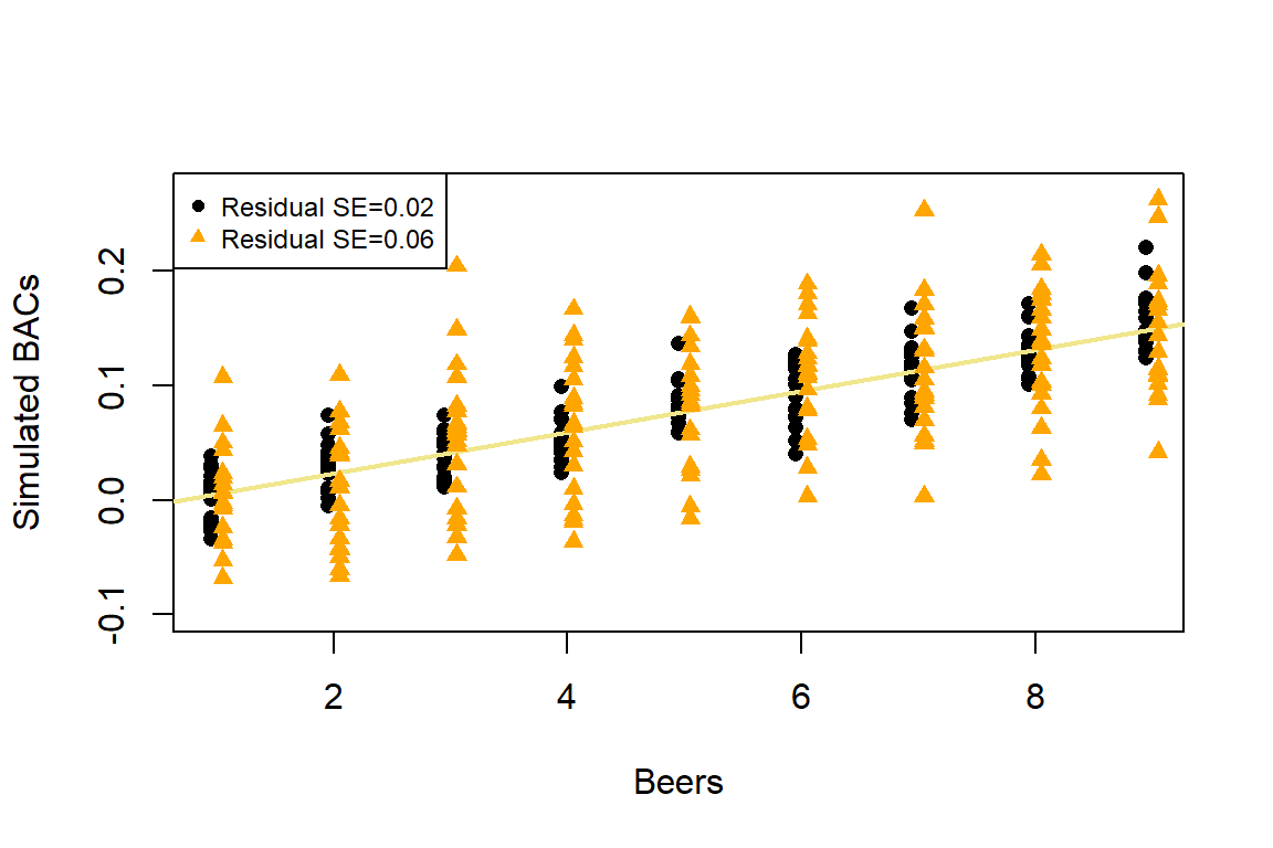
Figure 7.2: Simulated data for Beers and BAC assuming two different residual standard errors (0.02 and 0.06).
Along with getting the idea that regression models define normal distributions in the y-direction that are centered at the regression line, you can also get a sense of how variable samples from a normal distribution can appear. Each distribution of 20 subjects at each \(x\) value came from a normal distribution but there are some of those distributions that might appear to generate small outliers and have slightly different variances. This can help us to remember to not be too particular when assessing assumptions and allow for some variability in spreads and a few observations from the tails of the distribution to occasionally arise.
In sampling from the population, we expect some amount of variability of each estimator around its true value. This variability leads to the potential variability in estimated regression lines (think of a suite of potential estimated regression lines that would be created by different random samples from the same population). Figure 7.3 contains the true regression line (bold, red) and realizations of the estimated regression line in simulated data based on results similar to the real data set. This variability due to random sampling is something that needs to be properly accounted for to use the single estimated regression line to make inferences about the true line and parameters based on the sample-based estimates. The next sections develop those inferential tools.
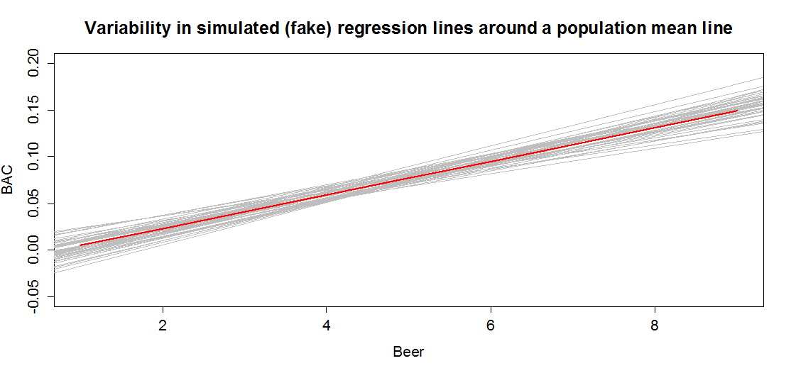
Figure 7.3: Variability in realized regression lines based on sampling variation. Light grey lines are simulated realizations assuming the bold (red) line is the true SLR model and variability is similar to the original BAC data set. Simulated observations from the estimated models using the simulate function as was used in Chapter 2 were used to create this plot.
7.2 Confidence interval and hypothesis tests for the slope and intercept
Our inference techniques will resemble previous material with an interest in forming confidence intervals and doing hypothesis testing, although the interpretation of confidence intervals for slope coefficients take some extra care. Remember that the general form of any parametric confidence interval is
\[\text{estimate} \mp t^*\text{SE}_{estimate},\]
so we need to obtain the appropriate standard error for regression model coefficients and the degrees of freedom to define the \(t\)-distribution to look up \(t^*\) multiplier. We will find the \(\text{SE}_{b_0}\) and \(\text{SE}_{b_1}\) in the model summary. The degrees of freedom for the \(t\)-distribution in simple linear regression are \(\mathbf{df=n-2}\). Putting this together, the confidence interval for the true y-intercept, \(\beta_0\), is \(\mathbf{b_0 \mp t^*_{n-2}}\textbf{SE}_{\mathbf{b_0}}\) although this confidence interval is rarely of interest. The confidence interval that is almost always of interest is for the true slope coefficient, \(\beta_1\), that is \(\mathbf{b_1 \mp t^*_{n-2}}\textbf{SE}_{\mathbf{b_1}}\). The slope confidence interval is used to do two things: (1) inference for the amount of change in the mean of \(y\) for a unit change in \(x\) in the population and (2) to potentially do hypothesis testing by checking whether 0 is in the CI or not. The sketch in Figure 7.4 illustrates the roles of the CI for the slope in terms of determining where the population slope, \(\beta_1\), coefficient might be – centered at the sample slope coefficient – our best guess for the true slope. This sketch also informs an interpretation of the slope coefficient confidence interval:
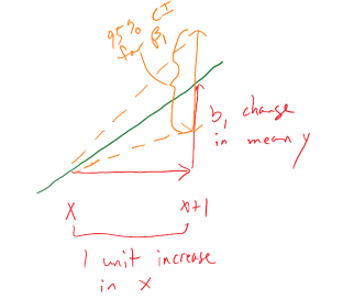
Figure 7.4: Graphic illustrating the confidence interval for a slope coefficient for a 1 unit increase in \(x\).
For a 1 [units of X] increase in X, we are ___ % confident that the true change in the mean of Y will be between LL and UL [units of Y].
In this interpretation, LL and UL are the calculated lower and upper limits of the confidence interval. This builds on our previous interpretation of the slope coefficient, adding in the information about pinning down the true change (population change) in the mean of the response variable for a difference of 1 unit in the \(x\)-direction. The interpretation of the y-intercept CI is:
For an x of 0 [units of X], we are 95% confident that the true mean of Y will be between LL and UL [units of Y].
This is really only interesting if the value of \(x=0\) is interesting – we’ll see a method for generating CIs for the true mean at potentially more interesting values of \(x\) in Section 7.7. To trust the results from these confidence intervals, it is critical that any issues with the regression validity conditions are minor.
The only hypothesis test of interest in this situation is for the slope coefficient. To develop the hypotheses of interest in SLR, note the effect of having \(\beta_1=0\) in the mean of the regression equation, \(\mu_{y_i} = \beta_0 + \beta_1x_i = \beta_0 + 0x_i = \beta_0\). This is the “intercept-only” or “mean-only” model that suggests that the mean of \(y\) does not vary with different values of \(x\) as it is always \(\beta_0\). We saw this model in the ANOVA material as the reduced model when the null hypothesis of no difference in the true means across the groups was true. Here, this is the same as saying that there is no linear relationship between \(x\) and \(y\), or that \(x\) is of no use in predicting \(y\), or that we make the same prediction for \(y\) for every value of \(x\). Thus
\[\boldsymbol{H_0: \beta_1=0}\]
is a test for no linear relationship between \(\mathbf{x}\) and \(\mathbf{y}\) in the population. The alternative of \(\boldsymbol{H_A: \beta_1\ne 0}\), that there is some linear relationship between \(x\) and \(y\) in the population, is our main test of interest in these situations. It is also possible to test greater than or less than alternatives in certain situations.
Test statistics for regression coefficients are developed, if we can trust our assumptions, using the \(t\)-distribution with \(n-2\) degrees of freedom. The \(t\)-test statistic is generally
\[t=\frac{b_i}{\text{SE}_{b_i}}\]
with the main interest in the test for \(\beta_1\) based on \(b_1\) initially.
The p-value would be calculated using the two-tailed area from the
\(t_{n-2}\) distribution calculated using the pt function.
The p-value
to test these hypotheses is also provided
in the model summary as we will see below.
The greater than or
less than alternatives can have interesting interpretations in certain
situations. For example, the greater than alternative
\(\left(\boldsymbol{H_A: \beta_1 > 0}\right)\) tests an alternative of a
positive linear relationship, with the p-value extracted just from the
right tail of the same \(t\)-distribution. This could be
used when a researcher would only find a result “interesting” if a positive
relationship is detected, such as in the study of tree height and tree diameter
where a researcher might be justified in deciding to test only for a positive
linear relationship. Similarly, the left-tailed alternative is also possible,
\(\boldsymbol{H_A: \beta_1 < 0}\). To get one-tailed p-values from two-tailed
results (the default), first check that the observed test statistic is
in the direction of the alternative (\(t>0\) for \(H_A:\beta_1>0\) or \(t<0\)
for \(H_A:\beta_1<0\)).
If these conditions are met, then the p-value for
the one-sided test from the two-sided version is found by dividing the
reported p-value by 2. If \(t>0\) for \(H_A:\beta_1>0\) or \(t<0\)
for \(H_A:\beta_1<0\) are not met, then the p-value would be greater than
0.5 and it would be easiest to look it up directly using pt using the tail area direction in the direction of the alternative.
We can revisit a couple of examples for a last time with these ideas in hand to complete the analyses.
For the Beers, BAC data, the 95% confidence for the true slope coefficient, \(\beta_1\), is
\[\begin{array}{rl} \boldsymbol{b_1 \mp t^*_{n-2}} \textbf{SE}_{\boldsymbol{b_1}} & \boldsymbol{= 0.01796 \mp 2.144787 * 0.002402} \\ & \boldsymbol{= 0.01796 \mp 0.00515} \\ & \boldsymbol{\rightarrow (0.0128, 0.0231).} \end{array}\]
You can find the components of this
calculation in the model summary and from qt(0.975, df=n-2) which was
2.145 for the \(t^*\)-multiplier. Be careful not to use the \(t\)-value of
7.48 in the model summary to
make confidence intervals – that is the test statistic used below. The related
calculations are shown at the bottom of the following code:
##
## Call:
## lm(formula = BAC ~ Beers, data = BB)
##
## Residuals:
##       Min        1Q    Median        3Q       Max
## -0.027118 -0.017350  0.001773  0.008623  0.041027
##
## Coefficients:
##              Estimate Std. Error t value Pr(>|t|)
## (Intercept) -0.012701   0.012638  -1.005    0.332
## Beers        0.017964   0.002402   7.480 2.97e-06
##
## Residual standard error: 0.02044 on 14 degrees of freedom
## Multiple R-squared:  0.7998, Adjusted R-squared:  0.7855
## F-statistic: 55.94 on 1 and 14 DF, p-value: 2.969e-06## [1] 2.144787## [1] 0.01281222 0.02311578## [1] 0.005151778We can also get the confidence interval
directly from the confint function run on our regression model,
saving some calculation
effort and providing both the CI for the y-intercept and the slope coefficient.
##                   2.5 %     97.5 %
## (Intercept) -0.03980535 0.01440414
## Beers        0.01281262 0.02311490
We interpret the 95% CI for the slope coefficient as follows: For a 1 beer increase in number of beers consumed, we are 95% confident that the true change in the mean BAC will be between 0.0128 and 0.0231 g/dL. While the estimated slope is our best guess of the impacts of an extra beer consumed based on our sample, this CI provides information about the likely range of potential impacts on the mean in the population. It also could be used to test the two-sided hypothesis test and would suggest strong evidence against the null hypothesis since the confidence interval does not contain 0, but its main use is to quantify where we think the true slope coefficient resides.
The width of the CI, interpreted loosely as the precision of the estimated slope, is impacted by the variability of the observations around the estimated regression line, the overall sample size, and the positioning of the \(x\)-observations. Basically all those aspects relate to how “clearly” known the regression line is and that determines the estimated precision in the slope. For example, the more variability around the line that is present, the more uncertainty there is about the correct line to use (Least Squares (LS) can still find an estimated line but there are other lines that might be “close” to its optimizing choice). Similarly, more observations help us get a better estimate of the mean – an idea that permeates all statistical methods. Finally, the location of \(x\)-values can impact the precision in a slope coefficient. We’ll revisit this in the context of multi-collinearity in the next chapter, and often we have no control of \(x\)-values, but just note that different patterns of \(x\)-values can lead to different precision of estimated slope coefficients100.
For hypothesis testing, we will almost always stick with two-sided tests in regression modeling as it is a more conservative approach and does not require us to have an expectation of a direction for relationships a priori. In this example, the null hypothesis for the slope coefficient is that there is no linear relationship between Beers and BAC in the population. The alternative hypothesis is that there is some linear relationship between Beers and BAC in the population. The test statistic is \(t=0.01796/0.002402 =7.48\) which, if model assumptions hold, follows a \(t(14)\) distribution under the null hypothesis. The model summary provides the calculation of the test statistic and the two-sided test p-value of \(2.97\text{e-6} = 0.00000297\). So we would just report “p-value < 0.0001”. This suggests that there is very strong evidence against the null hypothesis of no linear relationship between Beers and BAC in the population, so we would conclude that there is a linear relationship between them. Because of the random assignment, we can also say that drinking beers causes changes in BAC but, because the sample was made up of volunteers, we cannot infer that these results would hold in the general population of OSU students or more generally.
There are also results for the y-intercept in the output. The 95% CI is from -0.0398 to 0.0144, that the true mean BAC for a 0 beer consuming subject is between -0.0398 to 0.01445. This is really not a big surprise but possibly is comforting to know that these results would not show much evidence against the null hypothesis that the true mean BAC for 0 Beers is 0. Finding little evidence of a difference from 0 makes sense and makes the estimated y-intercept of -0.013 not so problematic. In other situations, the results for the y-intercept may be more illogical but this will often be because the y-intercept is extrapolating far beyond the scope of observations. The y-intercept’s main function in regression models is to be at the right level for the slope to “work” to make a line that describes the responses and thus is usually of lesser interest even though it plays an important role in the model.
As a second example, we can revisit modeling the Hematocrit of female Australian athletes as a function of body fat %. The sample size is \(n=99\) so the df are 97 in any \(t\)-distributions. In Chapter 6, the relationship between Hematocrit and body fat % for females appeared to be a weak negative linear association. The 95% confidence interval for the slope is -0.186 to 0.0155. For a 1% increase in body fat %, we are 95% confident that the change in the true mean Hematocrit is between -0.186 and 0.0155% of blood. This suggests that we would find little evidence against the null hypothesis of no linear relationship because this CI contains 0. In fact the p-value is 0.0965 which is larger than 0.05 and so provides a consistent conclusion with using the 95% confidence interval to perform a hypothesis test. Either way, we would conclude that there is not strong evidence against the null hypothesis but there is some evidence against it with a p-value of that size since more extreme results are somewhat common but still fairly rare if we assume the null is true. If you think p-values around 0.10 provide moderate evidence, you might have a different opinion about the evidence against the null hypothesis here. For this reason, we sometimes interpret this sort of marginal result as having some or marginal evidence against the null but certainly would never say that this presents strong evidence.
library(alr3)
data(ais)
library(tibble)
ais <- as_tibble(ais)
aisR2 <- ais[-c(56,166), c("Ht","Hc","Bfat","Sex")]
m2 <- lm(Hc~Bfat, data=subset(aisR2,Sex==1)) # Results for Females

summary(m2)
##
## Call:
## lm(formula = Hc ~ Bfat, data = subset(aisR2, Sex == 1))
##
## Residuals:
## Min 1Q Median 3Q Max
## -5.2399 -2.2132 -0.1061 1.8917 6.6453
##
## Coefficients:
## Estimate Std. Error t value Pr(>|t|)
## (Intercept) 42.01378 0.93269 45.046 <2e-16
## Bfat -0.08504 0.05067 -1.678 0.0965
##
## Residual standard error: 2.598 on 97 degrees of freedom
## Multiple R-squared: 0.02822, Adjusted R-squared: 0.0182
## F-statistic: 2.816 on 1 and 97 DF, p-value: 0.09653## 2.5 % 97.5 %
## (Intercept) 40.1626516 43.86490713
## Bfat -0.1856071 0.01553165One more worked example is provided from the Montana fire data. In this example pay particular attention to how we are handling the units of the response variable, log-hectares, and to the changes to doing inferences with a 99% confidence level CI, and where you can find the needed results in the following output:
mtfires$loghectares <- log(mtfires$hectares)
fire1 <- lm(loghectares~Temperature, data=mtfires)
summary(fire1)
##
## Call:
## lm(formula = loghectares ~ Temperature, data = mtfires)
##
## Residuals:
## Min 1Q Median 3Q Max
## -3.0822 -0.9549 0.1210 1.0007 2.4728
##
## Coefficients:
## Estimate Std. Error t value Pr(>|t|)
## (Intercept) -69.7845 12.3132 -5.667 1.26e-05
## Temperature 1.3884 0.2165 6.412 2.35e-06
##
## Residual standard error: 1.476 on 21 degrees of freedom
## Multiple R-squared: 0.6619, Adjusted R-squared: 0.6458
## F-statistic: 41.12 on 1 and 21 DF, p-value: 2.347e-06## 0.5 % 99.5 %
## (Intercept) -104.6477287 -34.921286
## Temperature 0.7753784 2.001499## [1] 2.83136Based on the estimated regression model, we can say that if the average temperature is 0, we expect that, on average, the log-area burned would be -69.8 log-hectares.
From the regression model summary, \(b_1=1.39\) with \(\text{SE}_{b_1}=0.2165\) and \(\mathbf{t=6.41}\).
There were \(n=23\) measurements taken, so \(\mathbf{df=n-2=23-3=21}\).
Suppose that we want to test for a linear relationship between temperature and log-hectares burned:
\[H_0: \beta_1=0\]
- In words, the true slope coefficient between Temperature and log-area burned is 0 OR there is no linear relationship between Temperature and log-area burned in the population.
\[H_A: \beta_1\ne 0\]
- In words, the alternative states that the true slope coefficient between Temperature and log-area burned is not 0 OR there is a linear relationship between Temperature and log-area burned in the population.
Test statistic: \(t = 1.39/0.217 = 6.41\)
- Assuming the null hypothesis to be true (no linear relationship), the \(t\)-statistic follows a \(t\)-distribution with \(n-2 = 23-2=21\) degrees of freedom (or simply \(t_{21}\)).
p-value:
From the model summary, the p-value is \(\mathbf{2.35*10^{-6}}\)
- Interpretation: There is less than a 0.01% chance that we would observe slope coefficient like we did or something more extreme (greater than 1.39 log(hectares)/\(^\circ F\)) if there were in fact no linear relationship between temperature (\(^\circ F\)) and log-area burned (log-hectares) in the population.
Conclusion: There is very strong evidence against the null hypothesis of no linear relationship, so we would conclude that there is, in fact, a linear relationship between Temperature and log(Hectares) burned.
Scope of Inference: Since we have a time series of results, our inferences pertain to the results we could have observed for these years but not for years we did not observe – so just for the true slope for this sample of years. Because we can’t randomly assign the amount of area burned, we cannot make causal inferences – there are many reasons why both the average temperature and area burned would vary together that would not involve a direct connection between them.
\[\text{99}\% \text{ CI for } \beta_1: \boldsymbol{b_1 \mp t^*_{n-2}}\textbf{SE}_{\boldsymbol{b_1}} \rightarrow 1.39 \mp 2.831\bullet 0.217 \rightarrow (0.78, 2.00)\]
Interpretation of 99% CI for slope coefficient:
- For a 1 degree F increase in Temperature, we are 99% confident that the change in the true mean log-area burned is between 0.78 and 2.00 log(Hectares).
Another way to interpret this is:
- For a 1 degree F increase in Temperature, we are 99% confident that the mean Area Burned will change by between 0.78 and 2.00 log(Hectares) in the population.
Also \(R^2\) is 66.2%, which tells us that Temperature explains 66.2% of the variation in log(Hectares) burned. Or that the linear regression model built using Temperature explains 66.2% of the variation in yearly log(Hectares) burned so this model explains quite a bit but not all the variation in the responses.
7.3 Bozeman temperature trend
For a new example, consider the yearly average maximum temperatures in Bozeman, MT. For over 100 years, daily measurements have been taken of the minimum and maximum temperatures at hundreds of weather stations across the US. In early years, this involved manual recording of the temperatures and resetting the thermometer to track the extremes for the following day. More recently, these measures have been replaced by digital temperature recording devices that continue to track this sort of information with much less human effort and, possibly, errors. This sort of information is often aggregated to monthly or yearly averages to be able to see “on average” changes from month-to-month or year-to-year as opposed to the day-to-day variation in the temperature101. Often the local information is aggregated further to provide regional, hemispheric, or even global average temperatures. Climate change research involves attempting to quantify the changes over time in these and other long-term temperature or temperature proxies.
These data were extracted from the National Oceanic and Atmospheric Administration’s National Centers for Environmental Information’s database (http://www.ncdc.noaa.gov/cdo-web/) and we will focus on the yearly average of the monthly averages of the daily maximum temperature in Bozeman in degrees F from 1901 to 2014. We can call them yearly average maximum temperatures but note that it was a little more complicated than that to arrive at the response variable we are analyzing.
##     meanmax           Year
##  Min.   :49.75   Min.   :1901
##  1st Qu.:53.97   1st Qu.:1930
##  Median :55.43   Median :1959
##  Mean   :55.34   Mean   :1958
##  3rd Qu.:57.02   3rd Qu.:1986
## Max. :60.05 Max. :2014## [1] 109library(car)
scatterplot(meanmax~Year, data=bozemantemps,
ylab="Mean Maximum Temperature (degrees F)", smooth=list(spread=F),
main="Scatterplot of Bozeman Yearly Average Max Temperatures")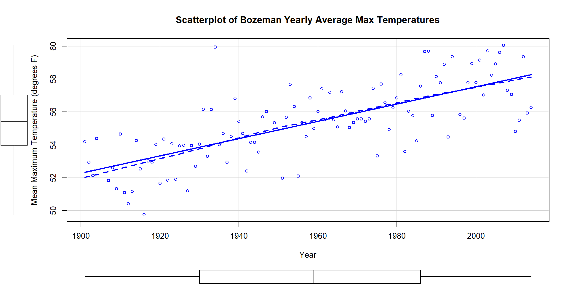
Figure 7.5: Scatterplot of average yearly maximum temperatures in Bozeman from 1900 to 2014 with SLR (solid) and smoothing (dashed) lines.
The scatterplot in Figure 7.5 shows the results between 1901 and 2014 based on a sample of \(n=109\) years because four years had too many missing months to fairly include in the responses. Missing values occur for many reasons and in this case were likely just machine or human error102. These are time series data and in time series analysis we assume that the population of interest for inference is all possible realizations from the underlying process over this time frame even though we only ever get to observe one realization. In terms of climate change research, we would want to (a) assess evidence for a trend over time (hopefully assessing whether any observed trend is clearly different from a result that could have been observed by chance if there really is no change over time in the true process) and (b) quantify the size of the change over time along with the uncertainty in that estimate relative to the underlying true mean change over time. The hypothesis test for the slope answers (a) and the confidence interval for the slope addresses (b). We also should be concerned about problematic (influential) points, changing variance, and potential nonlinearity in the trend over time causing problems for the SLR inferences. The scatterplot suggests that there is a moderate or strong positive linear relationship between temperatures and year. Both looking at the points and at the smoothing line does not suggest a clear curve in these responses over time and the variability seems similar across the years. There appears to be one potential large outlier in the late 1930s.
We’ll perform all 6+ steps of the hypothesis test for the slope coefficient and use the confidence interval interpretation to discuss the size of the change. First, we need to select our hypotheses (the 2-sided test would be a conservative choice and no one that does climate change research wants to be accused of taking a liberal approach in their analyses103) and our test statistic, \(t=\frac{b_1}{\text{SE}_{b_1}}\). The scatterplot is the perfect tool to illustrate the situation.
- Hypotheses for the slope coefficient test:
\[H_0: \beta_1=0 \text{ vs } H_A: \beta_1 \ne 0\]
- Validity conditions:
Quantitative variables condition
- Both
Yearand yearly averageTemperatureare quantitative variables so are suitable for an SLR analysis.
- Both
Independence of observations
- There may be a lack of independence among years since a warm year might be followed by another warmer than average year. It would take more sophisticated models to account for this and the standard error on the slope coefficient could either get larger or smaller depending on the type of autocorrelation (correlation between neighboring time points or correlation with oneself at some time lag) present. This creates a caveat on these results but this model is often the first one researchers fit in these situations and often is reasonably correct even in the presence of some autocorrelation.
To assess the remaining conditions, we need to fit the regression model and use the diagnostic plots in Figure 7.6 to aid our assessment:
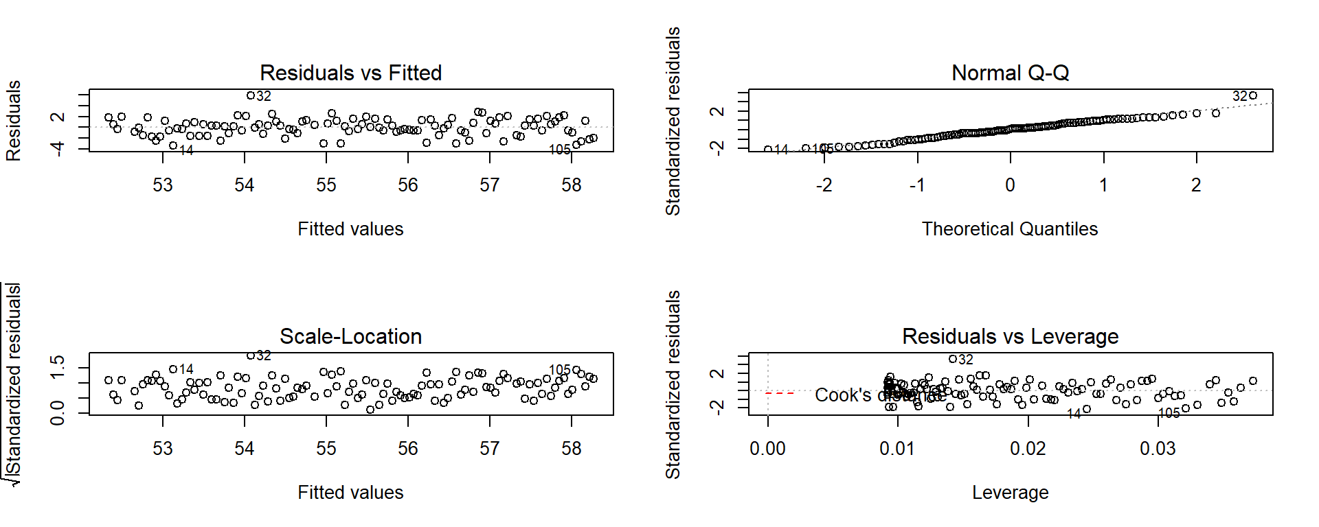
Figure 7.6: Diagnostic plots of the Bozeman yearly temperature simple linear regression model.
Linearity of relationship
Examine the Residuals vs Fitted plot:
- There does not appear to be a clear curve remaining in the residuals so we should be able to proceed without worrying too much about missed nonlinearity.
Equal (constant) variance
- Examining the Residuals vs Fitted and the “Scale-Location” plots provide little to no evidence of changing variance. The variability does decrease slightly in the middle fitted values but those changes are really minor and present no real evidence of changing variability.
Normality of residuals
- Examining the Normal QQ-plot for violations of the normality assumption shows only one real problem in the outlier from the 32nd observation in the data set (the temperature observed in 1934) which was identified as a large outlier when examining the original scatterplot. We should be careful about inferences that assume normality and contain this point in the analysis. We might consider running the analysis with it and without that point to see how much it impacts the results just to be sure it isn’t creating evidence of a trend because of a violation of the normality assumption. The next check reassures us that re-running the model without this point would only result in slightly changing the SEs and not the slopes.
No influential points:
There are no influential points displayed in the Residuals vs Leverage plot since the Cook’s D contours are not displayed.
- Note: by default this plot contains a smoothing line that is
relatively meaningless, so ignore it
if is displayed. We suppressed it using the
add.smooth=Foption inplot(temp1)but if you forget to do that, just ignore the smoothers in the diagnostic plots especially in the Residuals vs Leverage plot.
- Note: by default this plot contains a smoothing line that is
relatively meaningless, so ignore it
if is displayed. We suppressed it using the
These results tells us that the outlier was not influential. If you look back at the scatterplot, it was located near the middle of the observed \(x\text{'s}\) so its potential leverage is low. You can find its leverage based on the plot to be around 0.12 when there are observations in the data set with leverages over 0.3. The high leverage points occur at the beginning and the end of the record because they are at the edges of the observed \(x\text{'s}\) and most of these points follow the overall pattern fairly well.
So the main issues are with the assumption of independence of observations and one non-influential outlier that might be compromising our normality assumption a bit.
Calculate the test statistic and p-value:
- \(t=0.05244/0.00476 = 11.02\)
##
## Call:
## lm(formula = meanmax ~ Year, data = bozemantemps)
##
## Residuals:
##     Min      1Q  Median      3Q     Max
## -3.3779 -0.9300  0.1078  1.1960  5.8698
##
## Coefficients:
##              Estimate Std. Error t value Pr(>|t|)
## (Intercept) -47.35123    9.32184   -5.08 1.61e-06
## Year          0.05244    0.00476   11.02  < 2e-16
##
## Residual standard error: 1.624 on 107 degrees of freedom
## Multiple R-squared:  0.5315, Adjusted R-squared:  0.5271
## F-statistic: 121.4 on 1 and 107 DF,  p-value: < 2.2e-16
From the model summary: p-value < 2e-16 or just < 0.0001
The test statistic is assumed to follow a \(t\)-distribution with \(n-2=109-2=107\) degrees of freedom. The p-value can also be calculated as:
## [1] 2.498481e-19- Which is then reported as < 0.0001, which means that the chances of observing a slope coefficient as extreme or more extreme than 0.052 if the null hypothesis of no linear relationship is true is less than 0.01%.
Write a conclusion:
- There is very strong evidence against the null hypothesis of no linear relationship between Year and yearly mean Temperature so we can conclude that there is, in fact, some linear relationship between Year and yearly mean maximum Temperature in Bozeman.
Size:
- For a one year increase in Year, we estimate that, on average, the yearly average maximum temperature will change by 0.0524 \(^\circ F\) (95% CI: 0.043 to 0.062). This suggests a modest but noticeable change in the mean temperature in Bozeman and the confidence suggests minimal variation around this estimate, going from 0.04 to 0.06 \(^\circ F\). The “size” of this change is discussed more in Section 7.5.
##                    2.5 %       97.5 %
## (Intercept) -65.83068375 -28.87177785
## Year          0.04300681   0.06187746
Scope of inference:
- We can conclude that this detected trend pertains to the Bozeman area in the years 1901 to 2014 but not outside of either this area or time frame. We cannot say that time caused the observed changes since it was not randomly assigned and we cannot attribute the changes to any other factors because we did not consider them. But knowing that there was a trend toward increasing temperatures is an intriguing first step in a more complete analysis of changing climate in the area.
It is also good to report the percentage of variation that the model explains: Year explains 54.91% of the variation in yearly average maximum Temperature. If the coefficient of determination value had been very small, we might discount the previous result. Since it is moderately large, that suggests that just by using a linear trend over time we can account for quite a bit of the variation in yearly average maximum temperatures in Bozeman. Note that the percentage of variation explained would get much worse if we tried to analyze the monthly or original daily maximum temperature data even though we might find about the same estimated mean change over time.
Interpreting a confidence interval provides more useful information than the hypothesis test here – instead of just assessing evidence against the null hypothesis, we can actually provide our best guess at the true change in the mean of \(y\) for a change in \(x\). Here, the 95% CI is (0.043, 0.062). This tells us that for a 1 year increase in Year, we are 95% confident that the change in the true mean of the yearly average maximum Temperatures in Bozeman is between 0.043 and 0.062 \(^\circ F\).
Sometimes the scale of the \(x\)-variable makes interpretation a little difficult, so we can re-scale it to make the resulting slope coefficient more interpretable without changing how the model fits the responses. One option is to re-scale the variable and re-fit the regression model and the other (easier) option is to re-scale our interpretation. The idea here is that a 100-year change might be easier and more meaningful scale to interpret than a single year change. If we have a slope in the model of 0.052 (for a 1 year change), we can also say that a 100 year change in the mean is estimated to be 0.052*100 = 0.52\(^\circ F\). Similarly, the 95% CI for the population mean 100-year change would be from 0.43\(^\circ F\) to 0.62\(^\circ F\). In 2007, the IPCC (Intergovernmental Panel on Climate Change; http://www.ipcc.ch/publications_and_data/ar4/wg1/en/tssts-3-1-1.html) estimated the global temperature change from 1906 to 2005 to be 0.74\(^\circ C\) per decade or, scaled up, 7.4\(^\circ C\) per century (1.33\(^\circ F\)). There are many reasons why our local temperature trend might differ, including that our analysis was of average maximum temperatures and the IPCC was considering the average temperature (which was not measured locally or in most places in a good way until digital instrumentation was installed) and that local trends are likely to vary around the global average change based on localized environmental conditions.
One issue that arises in studies of climate change is that researchers often consider these sorts of tests at many locations and on many response variables (if I did the maximum temperature, why not also do the same analysis of the minimum temperature time series as well? And if I did the analysis for Bozeman, what about Butte and Helena and…?). Remember our discussion of multiple testing issues? This issue can arise when regression modeling is repeated in many similar data sets, say different sites or different response variables or both, in one study. In Moore, Harper, and Greenwood (2007), we considered the impacts on the assessment of evidence of trends of earlier spring onset timing in the Mountain West when the number of tests across many sites is accounted for. We found that the evidence for time trends decreases substantially but does not disappear. In a related study, Greenwood, Harper, and Moore (2011) found evidence for regional trends to earlier spring onset using more sophisticated statistical models. The main point here is to be careful when using simple statistical methods repeatedly if you are not accounting for the number of tests performed.
Along with the confidence interval, we can also plot the estimated model
(Figure 7.7) using a term-plot from the effects package
(Fox, 2003). This is the same function we used for visualizing results
in the ANOVA models and in its basic application you just need
plot(allEffects(MODELNAME)) although we from time to time, we will add some options.
In
regression models, we get to see the regression line along with bounds for
95% confidence intervals for the mean at every value of \(x\) that was observed
(explained in the next section). Note that there is also a rugplot on the \(x\)-axis
showing you where values of the explanatory variable were obtained, which is
useful to understanding how much information is available for different aspects
of the line. Here it provides gaps for missing years of observations as sort of
broken teeth in a comb. Also not used here, we can also turn on the residuals=T option, which in SLR just plots the original points and adds a smoothing line to this plot to reinforce the previous assessment of assumptions.
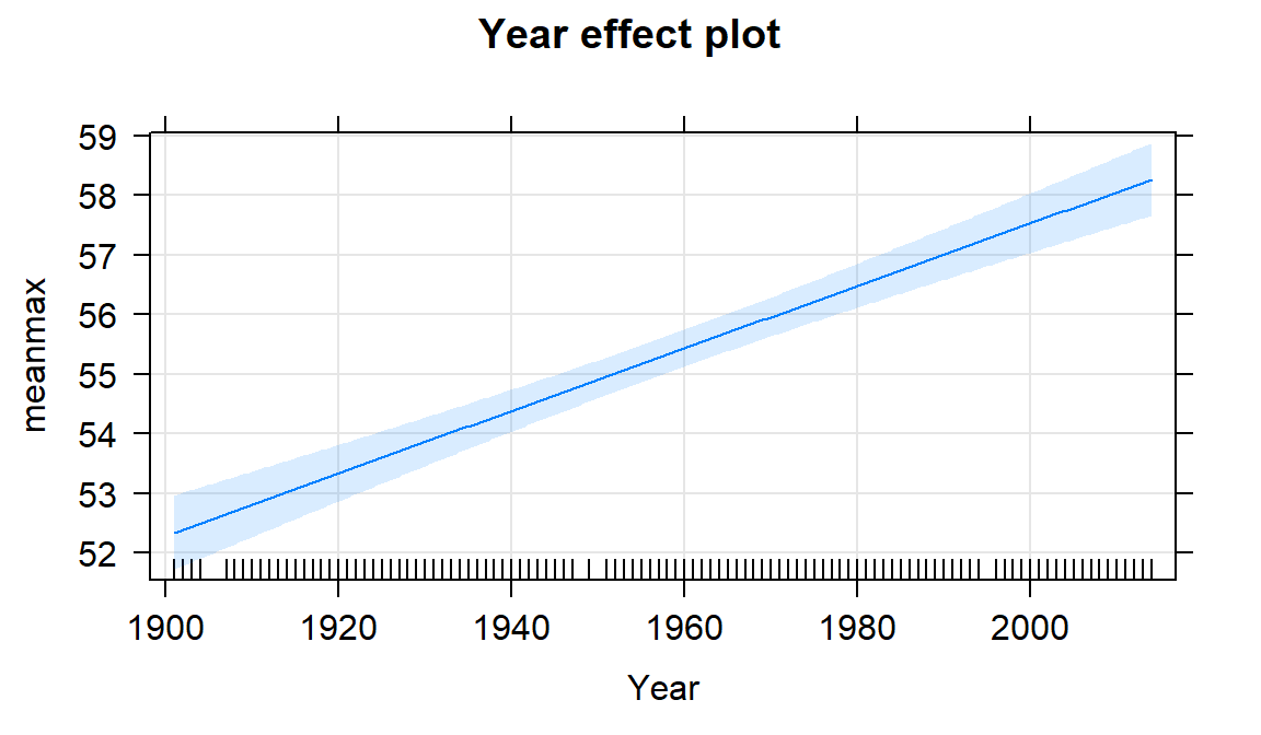
Figure 7.7: Term-plot for the Bozeman mean yearly maximum temperature linear regression model with 95% confidence interval bands for the mean in each year.
If we extended the plot for the model to Year = 0, we could see the
reason that the y-intercept in this model is -47.4\(^\circ F\). This is
obviously a large extrapolation for these data and provides a silly result.
However, in paleoclimate data that goes back
thousands of years using tree rings, ice cores, or sea sediments, the estimated
mean in year 0 might be interesting and within the scope of observed values or it might not. For example, in Santibáñez et al. (2018), the data were a time series from 27,000 to about 9,000 years before present extracted from Antarctic ice cores. It all depends on the application.
To make the y-intercept more interesting for our data set, we can re-scale the \(x\text{'s}\) before we fit the model to have the first year in the data set (1901) be “0”. This is accomplished by calculating \(\text{Year2} = \text{Year}-1901\).
##    Min. 1st Qu.  Median    Mean 3rd Qu.    Max.
##    0.00   29.00   58.00   57.27   85.00  113.00
The new estimated regression equation is
\(\widehat{\text{Temp}}_i = 52.34 + 0.052\cdot\text{Year2}_i\). The slope and
its test statistic are the same as in the previous model. The y-intercept
has changed dramatically with a 95% CI from 51.72\(^\circ F\) to 52.96\(^\circ F\)
for Year2=0. But we know that Year2 has a 0 value for 1901 because
of our subtraction. That means that this CI is
for the true mean in 1901 and is now at least somewhat interesting. If you
revisit Figure 7.7 you will actually see that the displayed
confidence intervals
provide upper and lower bounds that match this result for 1901 – the
y-intercept CI matches the 95% CI for the true mean in the first year of the data set.
##
## Call:
## lm(formula = meanmax ~ Year2, data = bozemantemps)
##
## Residuals:
##     Min      1Q  Median      3Q     Max
## -3.3779 -0.9300  0.1078  1.1960  5.8698
##
## Coefficients:
##             Estimate Std. Error t value Pr(>|t|)
## (Intercept) 52.34126    0.31383  166.78   <2e-16
## Year2        0.05244    0.00476   11.02   <2e-16
##
## Residual standard error: 1.624 on 107 degrees of freedom
## Multiple R-squared:  0.5315, Adjusted R-squared:  0.5271
## F-statistic: 121.4 on 1 and 107 DF, p-value: < 2.2e-16## 2.5 % 97.5 %
## (Intercept) 51.71913822 52.96339150
## Year2 0.04300681 0.06187746Ideally, we want to find a regression model that does not violate any assumptions, has a high \(\mathbf{R^2}\) value, and a slope coefficient with a small p-value. If any of these are not the case, then we are not completely satisfied with the regression and should be suspicious of any inference we perform. We can sometimes resolve some of the systematic issues noted above using transformations, discussed in Sections 7.5 and 7.6.
7.4 Randomization-based inferences for the slope coefficient
Exploring permutation testing in SLR provides an opportunity to gauge the observed
relationship against the sorts of relationships we would expect to see if there
was no linear relationship between the variables. If the relationship is linear
(not curvilinear) and the null hypothesis of \(\beta_1=0\) is true, then any
configuration of the responses relative to the
predictor variable’s values is as good as any other.
Consider the four scatterplots of
the Bozeman temperature data versus Year and permuted versions of Year
in Figure 7.8. First, think about which of the panels you
think present the most
evidence of a linear relationship between Year and Temperature?
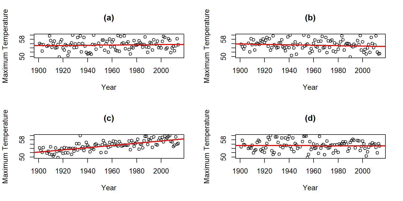
Figure 7.8: Plot of the Temperature responses versus four versions of Year, three of which are permutations of the Year variable relative to the Temperatures.
Hopefully you can see that panel (c) contains the most clear linear relationship among the choices. The plot in panel (c) is actually the real data set and pretty clearly presents itself as “different” from the other results. When we have small p-values, the real data set will be clearly different from the permuted results because it will be almost impossible to find a permuted data set that can attain as large a slope coefficient as was observed in the real data set104. This result ties back into our original interests in this climate change research situation – does our result look like it is different from what could have been observed just by chance if there were no linear relationship between \(x\) and \(y\)? It seems unlikely…
Repeating this permutation process and tracking the estimated slope coefficients, as \(T^*\), provides another method to obtain a p-value in SLR applications. This could also be performed on the \(t\)-statistic for the slope coefficient and would provide the same p-values but the sampling distribution would have a different \(x\)-axis scaling. In this situation, the observed slope of 0.052 is really far from any possible values that can be obtained using permutations as shown in Figure 7.9. The p-value would be reported as \(<0.001\) for the two-sided permutation test.
##       Year
## 0.05244213
B <- 1000
Tstar <- matrix(NA, nrow=B)
for (b in (1:B)){
Tstar[b] <- lm(meanmax~shuffle(Year), data=bozemantemps)$coef[2]
}
pdata(abs(Tstar), abs(Tobs), lower.tail=F)[[1]]## [1] 0par(mfrow=c(1,2))
hist(Tstar, xlim=c(-1,1)*Tobs)
abline(v=c(-1,1)*Tobs, col="red", lwd=3)
plot(density(Tstar), main="Density curve of Tstar", xlim=c(-1,1)*Tobs)
abline(v=c(-1,1)*Tobs, col="red", lwd=3)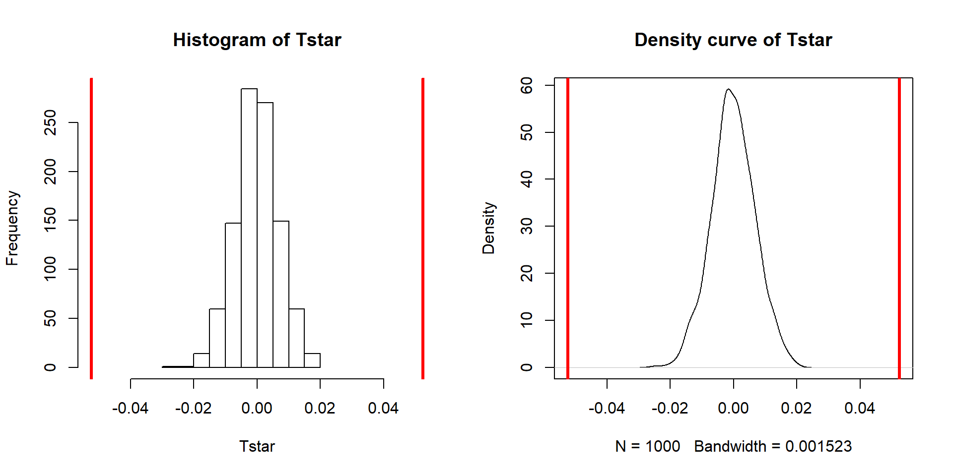
Figure 7.9: Permutation distribution of the slope coefficient in the Bozeman temperature linear regression model with bold vertical lines at \(\pm b_1=0.56\) based on the observed estimated slope.
One other interesting aspect of exploring the permuted data sets as in Figure 7.8 is that the outlier in the late 1930s “disappears” in the permuted data sets because there were many other observations that were that warm, just none that happened around that time of the century in the real data set. This reinforces the evidence for changes over time that seem to be present in these data – old unusual years don’t look unusual in more recent years (which is a pretty concerning result).
The permutation approach can be useful in situations where the normality assumption is compromised, but there are no influential points. In these situations, we might find more trustworthy p-values using permutations but only if we are working with an initial estimated regression equation that we generally trust. I personally like the permutation approach as a way of explaining what a p-value is actually measuring – the chance of seeing something like what we saw, or more extreme, if the null is true. And the previous scatterplots show what the “by chance” versions of this relationship might look like.
In a similar situation where we want to focus on confidence intervals for slope coefficients but are not completely comfortable with the normality assumption, it is also possible to generate bootstrap confidence intervals by sampling with replacement from the data set. This idea was introduced in Sections 2.8 and 2.9. This provides a 95% bootstrap confidence interval from 0.433 to 0.61, which almost exactly matches the parametric \(t\)-based confidence interval. The bootstrap distributions are very symmetric (Figure 7.10). The interpretation is the same and this result reinforces the other assessments that the parametric approach is not unreasonable here except possibly for the independence assumption. These randomization approaches provide no robustness against violations of the independence assumption.
##       Year
## 0.05244213
B <- 1000
Tstar <- matrix(NA, nrow=B)
for (b in (1:B)){
Tstar[b] <- lm(meanmax~Year, data=resample(bozemantemps))$coef[2]
}
quantiles <- qdata(Tstar, c(0.025,0.975))
quantiles## quantile p
## 2.5% 0.04326952 0.025
## 97.5% 0.06131044 0.975par(mfrow=c(1,2))
hist(Tstar, labels=T, ylim=c(0,200))
abline(v=Tobs, col="red", lwd=2)
abline(v=quantiles$quantile, col="blue", lwd=3)
plot(density(Tstar), main="Density curve of Tstar")
abline(v=Tobs, col="red", lwd=2)
abline(v=quantiles$quantile, col="blue", lwd=3)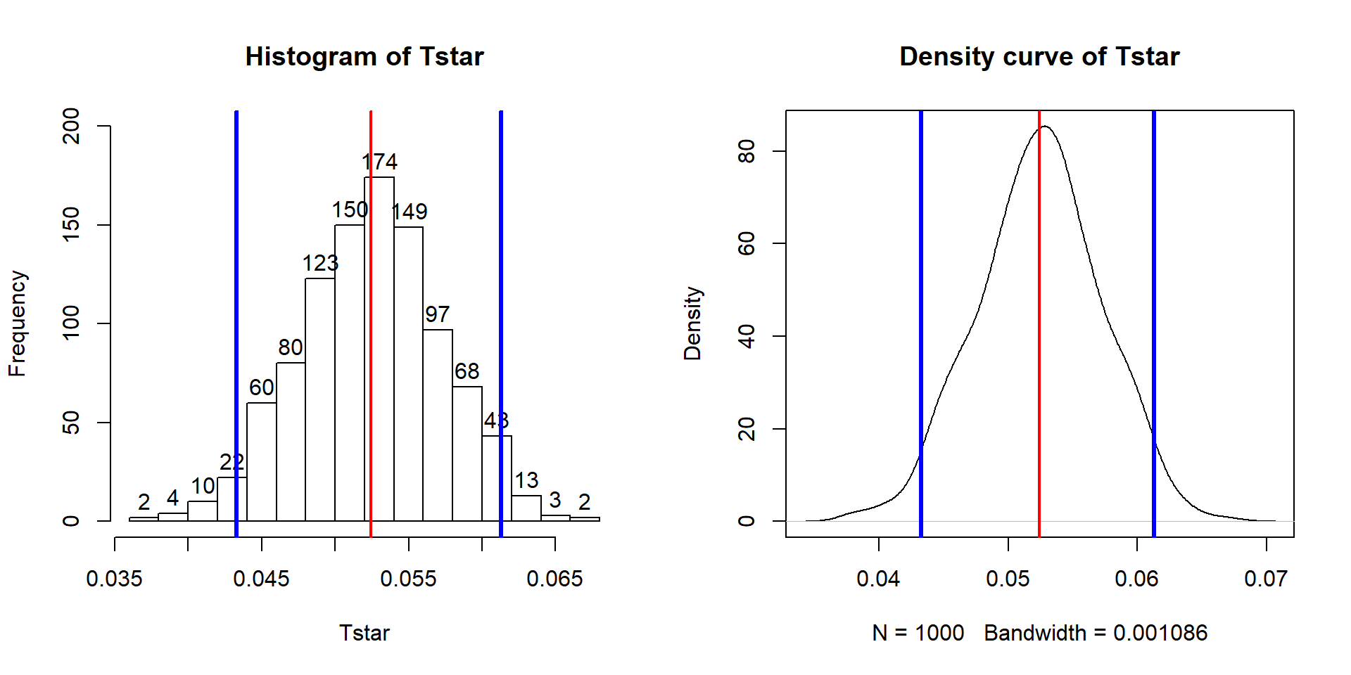
Figure 7.10: Bootstrap distribution of the slope coefficient in the Bozeman temperature linear regression model with bold vertical lines delineating the 95% confidence interval and observed slope of 0.52.
7.5 Transformations part I: Linearizing relationships
When the influential point, linearity, constant variance and/or normality assumptions are clearly violated, we cannot trust any of the inferences generated by the regression model. The violations occur on gradients from minor to really major problems. As we have seen from the examples in the previous chapters, it has been hard to find data sets that were free of all issues. Furthermore, it may seem hopeless to be able to make successful inferences in some of these situations with the previous tools. There are three potential solutions to violations of the validity conditions:
Consider removing an offending point or two and see if this improves the results, presenting results both with and without those points to describe their impact105,
Try to transform the response, explanatory, or both variables and see if you can force the data set to meet our SLR assumptions after transformation (the focus of this and the next section), or
Consider more advanced statistical models that can account for these issues (the focus of subsequent statistics courses, if you continue on further).
Transformations involve applying a function to
one or both variables.
After applying this transformation, one hopes to have
alleviated whatever issues encouraged its consideration. Linear transformation
functions, of the form \(z_{\text{new}}=a*x+b\), will never help us to fix
assumptions in regression situations; linear transformations change the scaling
of the variables but not their shape or the relationship between two variables.
For example, in the Bozeman Temperature data example, we subtracted 1901 from
the Year variable to have Year2 start at 0 and go up to 113. We could
also apply a linear transformation to change Temperature from being measured in
\(^\circ F\) to \(^\circ C\) using \(^\circ C=[^\circ F - 32] *(5/9)\). The
scatterplots on both the original and transformed scales are provided in
Figure 7.11. All the
coefficients in the regression model and the labels on the axes change, but the
“picture” is still the same. Additionally, all the inferences remain the same –
p-values are unchanged by linear transformations. So linear transformations
can be “fun” but really are only useful if they make the coefficients easier to
interpret.
Here if you like temperature changes in \(^\circ C\) for a 1 year increase, the
slope coefficient is 0.029 and if you like the original change in \(^\circ F\) for
a 1 year increase, the slope coefficient is 0.052. More useful than this is the switch into units of 100 years (so each year increase would just be 0.1 instead of 1), so that the slope is the temperature change over 100 years.
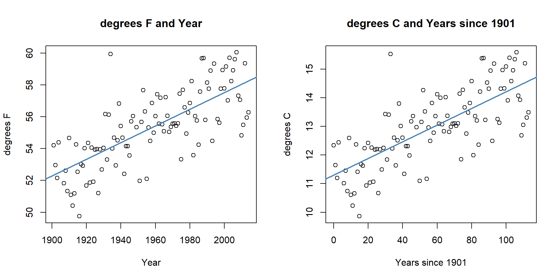
Figure 7.11: Scatterplots of Temperature (\(^\circ F\)) versus Year (left) and Temperature (\(^\circ C\)) vs Years since 1901 (right).
bozemantemps$meanmaxC <- (bozemantemps$meanmax - 32)*(5/9)
temp3 <- lm(meanmaxC~Year2, data=bozemantemps)
summary(temp1)
##
## Call:
## lm(formula = meanmax ~ Year, data = bozemantemps)
##
## Residuals:
## Min 1Q Median 3Q Max
## -3.3779 -0.9300 0.1078 1.1960 5.8698
##
## Coefficients:
## Estimate Std. Error t value Pr(>|t|)
## (Intercept) -47.35123 9.32184 -5.08 1.61e-06
## Year 0.05244 0.00476 11.02 < 2e-16
##
## Residual standard error: 1.624 on 107 degrees of freedom
## Multiple R-squared: 0.5315, Adjusted R-squared: 0.5271
## F-statistic: 121.4 on 1 and 107 DF, p-value: < 2.2e-16##
## Call:
## lm(formula = meanmaxC ~ Year2, data = bozemantemps)
##
## Residuals:
## Min 1Q Median 3Q Max
## -1.8766 -0.5167 0.0599 0.6644 3.2610
##
## Coefficients:
## Estimate Std. Error t value Pr(>|t|)
## (Intercept) 11.300703 0.174349 64.82 <2e-16
## Year2 0.029135 0.002644 11.02 <2e-16
##
## Residual standard error: 0.9022 on 107 degrees of freedom
## Multiple R-squared: 0.5315, Adjusted R-squared: 0.5271
## F-statistic: 121.4 on 1 and 107 DF, p-value: < 2.2e-16Nonlinear transformation functions are where we apply something more complicated than this shift and scaling, something like \(y_{\text{new}}=f(y)\), where \(f(\cdot)\) could be a log or power of the original variable \(y\). When we apply these sorts of transformations, interesting things can happen to our linear models and their problems. Some examples of transformations that are at least occasionally used for transforming the response variable are provided in Table 7.1, ranging from taking \(y\) to different powers from \(y^{-2}\) to \(y^2\). Typical transformations used in statistical modeling exist along a gradient of powers of the response variable, defined as \(y^{\lambda}\) with \(\boldsymbol{\lambda}\) being the power of the transformation of the response variable and \(\lambda = 0\) implying a log-transformation. Except for \(\lambda = 1\), the transformations are all nonlinear functions of \(y\).
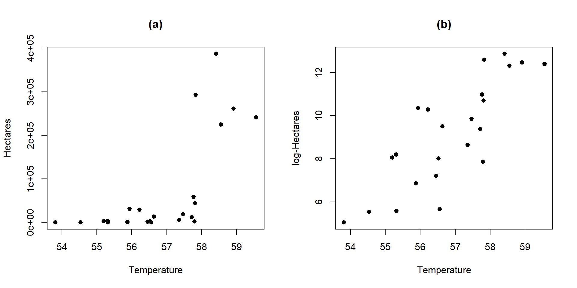
Figure 7.12: Scatterplots of Hectares (a) and log-Hectares (b) vs Temperature.
| Power | Formula | Usage |
|---|---|---|
| 2 | \(y^2\) | seldom used |
| 1 | \(y^1=y\) | no change |
| \(1/2\) | \(y^{0.5}=\sqrt{y}\) | counts and area responses |
| 0 | \(\log(y)\) natural log of \(y\) | counts, normality, curves, non-constant variance |
| \(-1/2\) | \(y^{-0.5}=1/\sqrt{y}\) | uncommon |
| \(-1\) | \(y^{-1}=1/y\) | for ratios |
| \(-2\) | \(y^{-2}=1/y^2\) | seldom used |
There are even more transformations possible, for example \(y^{0.33}\) is sometimes useful for variables involved in measuring the volume of something. And we can also consider applying any of these transformations to the explanatory variable, and consider using them on both the response and explanatory variables at the same time. The most common application of these ideas is to transform the response variable using the log-transformation, at least as a starting point. In fact, the log-transformation is so commonly used (or maybe overused), that we will just focus on its use. It is so commonplace in some fields that some researchers log-transform their data prior to even plotting it. In other situations, such as when measuring acidity (pH), noise (decibels), or earthquake size (Richter scale), the measurements are already on logarithmic scales.
Actually, we have already analyzed data that benefited from a log-transformation – the log-area burned vs. summer temperature data for Montana. Figure 7.12 compares the relationship between these variables on the original hectares scale and the log-hectares scale.
par(mfrow=c(1,2))
plot(hectares~Temperature, data=mtfires, main="(a)",
     ylab="Hectares", pch=16)
plot(loghectares~Temperature, data=mtfires, main="(b)",
     ylab="log-Hectares", pch=16)
Figure 7.12(a) displays a relationship that would be hard fit using SLR – it has a curve and the variance is increasing with increasing temperatures. With a log-transformation of Hectares, the relationship appears to be relatively linear and have constant variance (in (b)). We considered regression models for this situation previously. This shows at least one situation where a log-transformation of a response variable can linearize a relationship and reduce non-constant variance.
This transformation does not always work to “fix” curvilinear relationships, in fact in some situations it can make the relationship more nonlinear. For example, reconsider the relationship between tree diameter and tree height, which contained some curvature that we could not account for in an SLR. Figure 7.13 shows the original version of the variables and Figure 7.14 shows the same information with the response variable (height) log-transformed.
library(spuRs)
data(ufc)
ufc <- as_tibble(ufc)
scatterplot(height.m~dbh.cm, data=ufc[-168,], smooth=list(spread=F),
            main="Tree height vs tree diameter")
scatterplot(log(height.m)~dbh.cm, data=ufc[-168,], smooth=list(spread=F),
            main="log-Tree height vs tree diameter")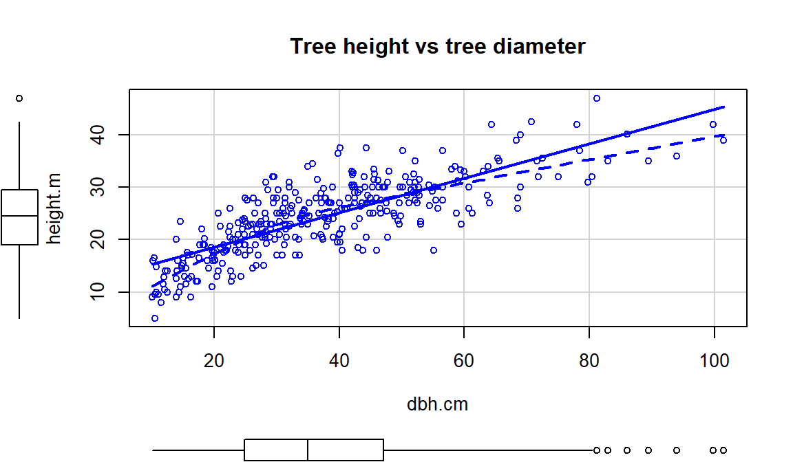
Figure 7.13: Scatterplot of tree height versus tree diameter.
Figure 7.14 with the log-transformed height response seems to show a more nonlinear relationship and may even have more issues with non-constant variance. This example shows that log-transforming the response variable cannot fix all problems, even though I’ve seen some researchers assume it can. It is OK to try a transformation but remember to always plot the results to make sure it actually helped and did not make the situation worse.
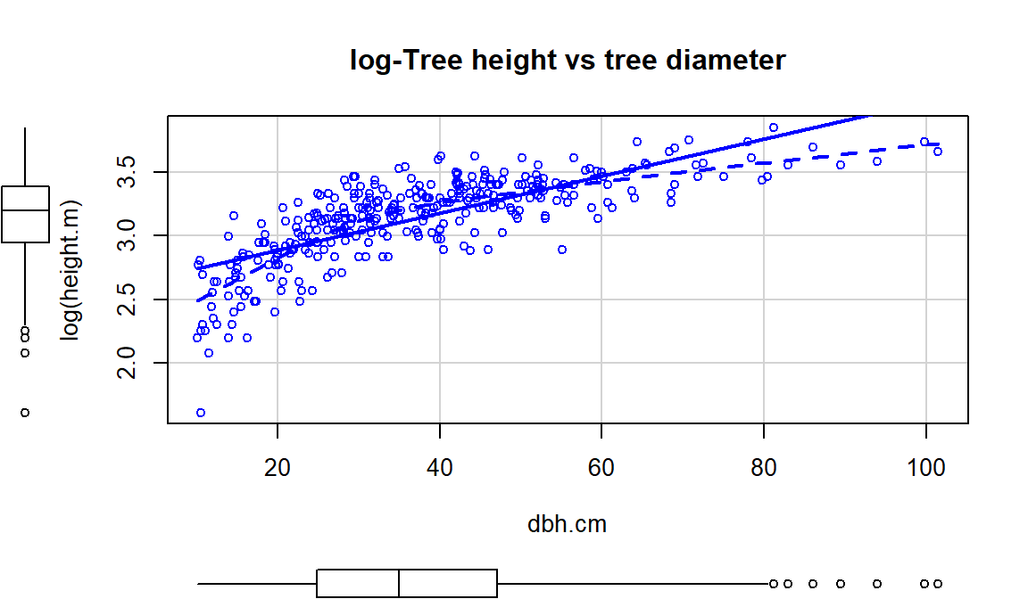
Figure 7.14: Scatterplot of log(tree height) versus tree diameter.
All is not lost in this situation, we can consider two other potential
uses of the log-transformation
and see if they can “fix” the relationship up a bit. One option is to apply the
transformation to the explanatory variable (y~log(x)), displayed in
Figure 7.15. If the distribution of the explanatory
variable is right skewed (see the boxplot on
the \(x\)-axis), then consider log-transforming the explanatory variable. This will
often reduce the leverage of those most extreme observations which can be
useful. In this situation, it also seems to have been quite successful at
linearizing the relationship, leaving some minor
non-constant variance, but providing a big improvement from the relationship on
the original scale.
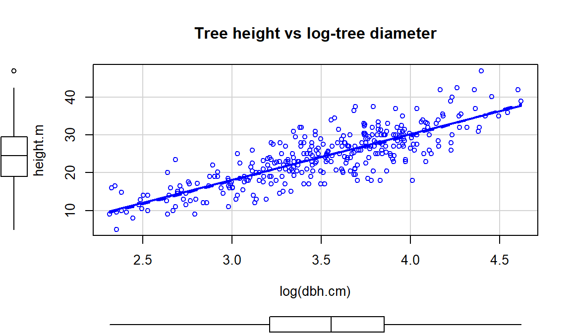
Figure 7.15: Scatterplot of tree height versus log(tree diameter).
The other option, especially when everything else fails, is to apply the
log-transformation to
both the explanatory and response variables (log(y)~log(x)), as
displayed in Figure 7.16. For this example, the
transformation seems to be better than the first two options
(none and only \(\log(y)\)), but demonstrates some decreasing variability with
larger \(x\) and \(y\) values. It has also created a new and different curve in the relationship (see the smoothing (dashed) line start below the SLR line, then go above it, and the finish below it). In the end, we might prefer to fit an SLR model to the
tree height vs log(diameter) versions of the variables
(Figure 7.15).
scatterplot(log(height.m)~log(dbh.cm), data=ufc[-168,], smooth=list(spread=F),
            main="log-Tree height vs log-tree diameter")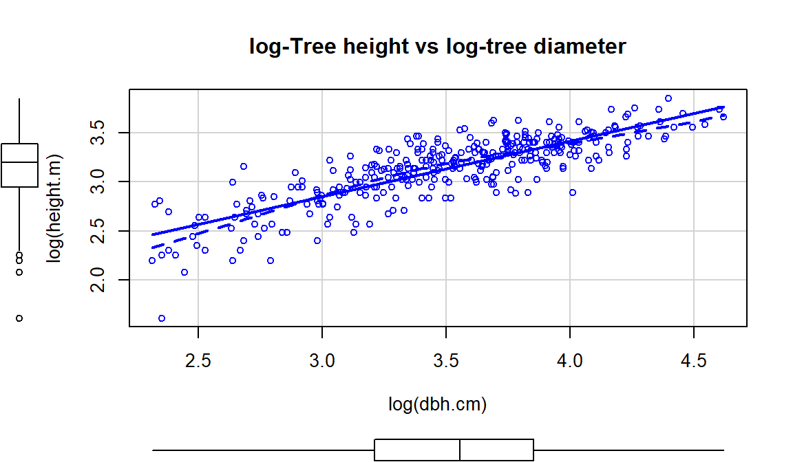
Figure 7.16: Scatterplot of log(tree height) versus log(tree diameter).
Economists also like to use \(\log(y) \sim \log(x)\) transformations. The log-log transformation tends to linearize certain relationships and has specific interpretations in terms of Economics theory. The log-log transformation shows up in many different disciplines as a way of obtaining a linear relationship on the log-log scale, but different fields discuss it differently. The following example shows a situation where transformations of both \(x\) and \(y\) are required and this double transformation seems to be quite successful in what looks like an initially hopeless situation for our linear modeling approach.
Data were collected in 1988 on the rates of infant mortality
(infant deaths per 1,000
live births) and gross domestic product (GDP) per capita (in 1998 US dollars)
from \(n=207\) countries. These data are available from the carData package
(Fox, Weisberg, and Price (2018), Fox (2003)) in a data set called UN.
The four panels in
Figure 7.17 show the original relationship and the impacts of
log-transforming one or both variables.
The only scatterplot that could potentially be modeled using SLR is the lower
right panel (d) that shows the relationship between log(infant mortality)
and log(GDP). In the next section, we will fit models to some of these
relationships and use our diagnostic plots to help us assess “success” of
the transformations.
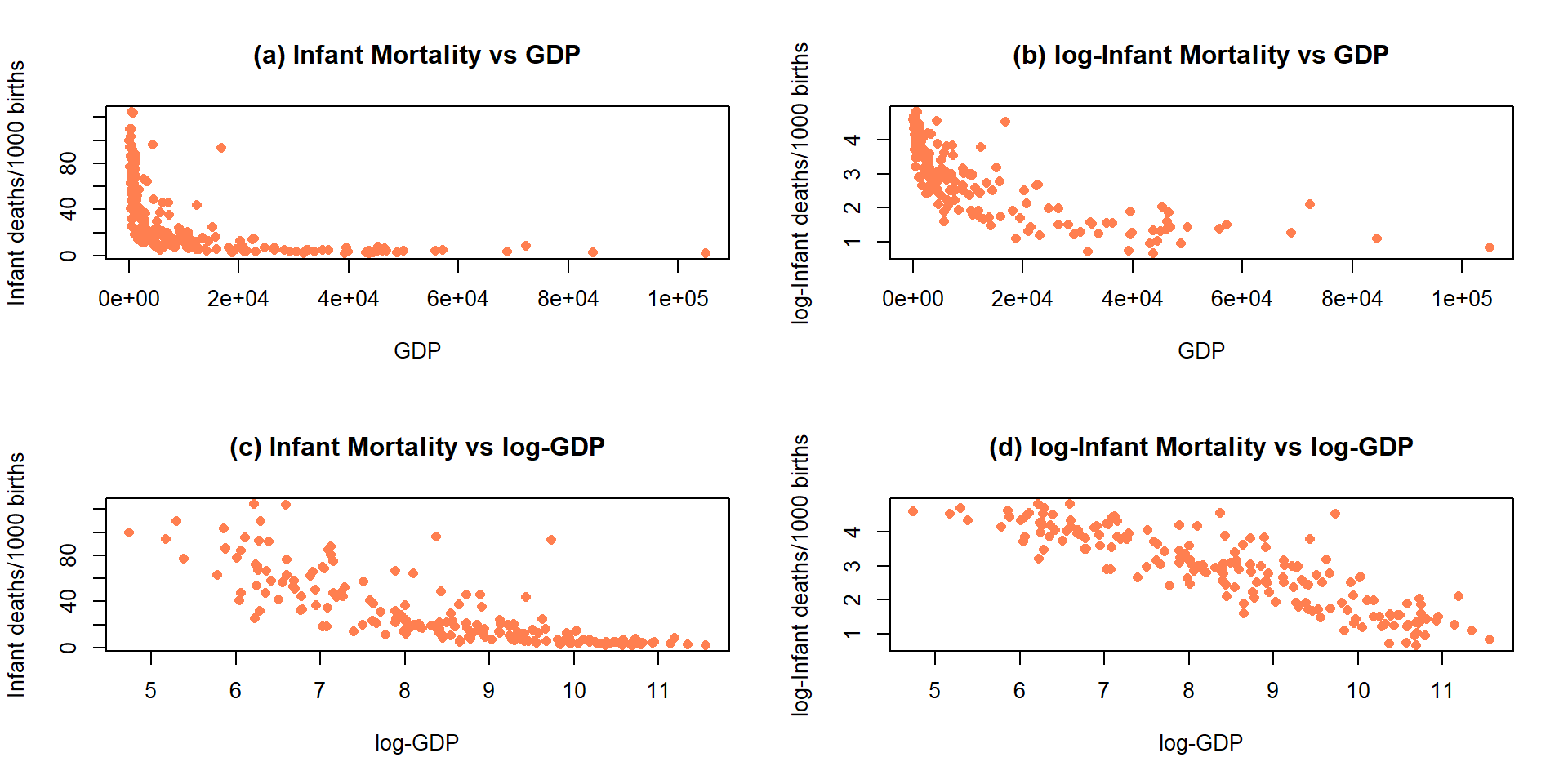
Figure 7.17: Scatterplots of Infant Mortality vs GDP under four different combinations of log-transformations.
Almost all nonlinear transformations assume that the variables are strictly
greater than 0. For example, consider what happens when we apply the
log function to 0 or a negative value in R:
## [1] NaN## [1] -InfSo be careful to think about the domain of the transformation function before using transformations. For example, when using the log-transformation make sure that the data values are non-zero and positive or you will get some surprises when you go to fit your regression model to a data set with NaNs (not a number) and/or \(-\infty\text{'s}\) in it. When using fractional powers (square-roots or similar), just having non-negative values are required and so 0 is acceptable.
Sometimes the log-transformations will not be entirely successful. If the relationship is monotonic (strictly positive or strictly negative but not both), then possibly another stop on the ladder of transformations in Table 7.1 might work. If the relationship is not monotonic, then it may be better to consider a more complex regression model that can accommodate the shape in the relationship or to bin the predictor, response, or both into categories so you can use ANOVA or Chi-square methods and avoid at least the linearity assumption.
Finally, remember that log in statistics and especially in R means the
natural log (ln or log base e as you might see it elsewhere). In
these situations, applying the log10 function (which provides log base 10)
to the variables would lead to very similar results, but readers may assume
you used ln if you don’t state that you used \(log_{10}\). The main thing
to remember to do is to be clear when communicating the version you are
using. As an example, I was working with researchers on a study
(Dieser, Greenwood, and Foreman 2010) related to impacts of environmental
stresses on bacterial survival. The response variable was log-transformed
counts and involved smoothed regression lines fit on this scale. I was using
natural logs to fit the models and then shared the fitted values from the
models and my collaborators back-transformed the results assuming that I had
used \(log_{10}\). We quickly resolved our differences once we discovered them but
this serves as a reminder at how important communication is in group projects
– we both said we were working with log-transformations and didn’t know that we
defaulted to different bases.
| Generally, in statistics, it’s safe to assume |
| that everything is log base e unless otherwise specified. |
7.6 Transformations part II: Impacts on SLR interpretations: log(y), log(x), & both log(y) & log(x)
The previous attempts to linearize relationships imply a desire to be able to fit SLR models. The log-transformations, when successful, provide the potential to validly apply our SLR model. There are then two options for interpretations: you can either interpret the model on the transformed scale or you can translate the SLR model on the transformed scale back to the original scale of the variables. It ends up that log-transformations have special interpretations on the original scales depending on whether the log was applied to the response variable, the explanatory variable, or both.
Scenario 1: log(y) vs x model:
First consider the \(\log(y) \sim x\) situations where the estimated model is of the form \(\widehat{\log(y)} = b_0 + b_1x\). When only the response is log-transformed, some people call this a semi-log model. But many researchers will use this model without any special considerations, as long as it provides a situation where the SLR assumptions are reasonably well-satisfied. To understand the properties and eventually the interpretation of transformed-variables models, we need to try to “reverse” our transformation. If we exponentiate106 both sides of \(\log(y)=b_0 + b_1x\), we get:
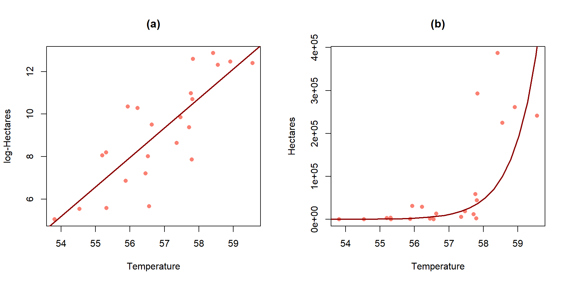
Figure 7.18: Plot of the estimated SLR (a) and implied model for the median on the original Hectares scale (b) for the area burned vs temperature data.
\(\exp(\log(y))=\exp(b_0 + b_1x)\), which is
\(y=\exp(b_0 + b_1x)\), which can be re-written as
\(y=\exp(b_0)\exp(b_1x)\). This is based on the rules for
exp()where \(\exp(a+b)=\exp(a)\exp(b)\).Now consider what happens if we increase \(x\) by 1 unit, going from \(x\) to \(x+1\), providing a new predicted \(y\) that we can call \(y^*\): \(y^*=\exp(b_0)\exp[b_1(x+1)]\):
\(y^*={\color{red}{\underline{\boldsymbol{\exp(b_0)\exp(b_1x)}}}}\exp(b_1)\). Now note that the underlined, bold component was the y-value for \(x\).
\(y^* = {\color{red}{\boldsymbol{y}}}\exp(b_1)\). Found by replacing \(\color{red}{\mathbf{\exp(b_0)\exp(b_1x)}}\) with \(\color{red}{\mathbf{y}}\), the value for \(x\).
So the difference in fitted values between \(x\) and \(x+1\) is to multiply the result for \(x\) (that was predicting \(\color{red}{\mathbf{y}}\)) by \(\exp(b_1)\) to get to the predicted result for \(x+1\) (called \(y^*\)). We can then use this result to form our \(\mathit{\boldsymbol{\log(y)\sim x}}\) slope interpretation: for a 1 unit increase in \(x\), we observe a multiplicative change of \(\mathbf{exp(b_1)}\) in the response. When we compute a mean on logged variables that are symmetrically distributed (this should occur if our transformation was successful) and then exponentiate the results, the proper interpretation is that the changes are happening in the median of the original responses. This is the only time in the course that we will switch our inferences to medians instead of means, and we don’t do this because we want to, we do it because it is result of modeling on the \(\log(y)\) scale, if successful.
When we are working with regression equations, slopes can either be positive or negative and our interpretations change based on this result to either result in growth (\(b_1>0\)) or decay (\(b_1<0\)) in the responses as the explanatory variable is increased. As an example, consider \(b_1=0.4\) and \(\exp(b_1)=\exp(0.4)=1.492\). There are a couple of ways to interpret this on the original scale of the response variable \(y\):
For \(\mathbf{b_1>0}\):
For a 1 unit increase in \(x\), the median of \(y\) is estimated to change by 1.492 times.
We can convert this into a percentage increase by subtracting 1 from \(\exp(0.4)\), \(1.492-1.0=0.492\) and multiplying the result by 100, \(0.492*100=49.2\%\). This is interpreted as: For a 1 unit increase in \(x\), the median of \(y\) is estimated to increase by 49.2%.
## [1] 1.491825For \(\mathbf{b_1<0}\), the change on the log-scale is negative and that implies on the original scale that the curve decays to 0. For example, consider \(b_1=-0.3\) and \(\exp(-0.3)=0.741\). Again, there are two versions of the interpretation possible:
For a 1 unit increase in \(x\), the median of \(y\) is estimated to change by 0.741 times.
For negative slope coefficients, the percentage decrease is calculated as \((1-\exp(b_1))*100\%\). For \(\exp(-0.3)=0.741\), this is \((1-0.741)*100=25.9\%\). This is interpreted as: For a 1 unit increase in \(x\), the median of \(y\) is estimated to decrease by 25.9%.
We suspect that you will typically prefer interpretation #1 for both directions but it is important to be able think about the results in terms of % change of the medians to make the scale of change more understandable. Some examples will help us see how these ideas can be used in applications.
For the area burned data set, the estimated regression model is \(\log(\widehat{\text{hectares}})=-69.8+1.39\cdot\text{ Temp}\). On the original scale, this implies that the model is \(\widehat{\text{hectares}}=\exp(-69.8)\exp(1.39\text{ Temp})\). Figure 7.18 provides the \(\log(y)\) scale version of the model and the model transformed to the original scale of measurement. On the log-hectares scale, the interpretation of the slope is: For a 1\(^\circ F\) increase in summer temperature, we estimate a 1.39 log-hectares/1\(^\circ F\) change, on average, in the log-area burned. On the original scale: A 1\(^\circ F\) increase in temperature is related to an estimated multiplicative change in the median number of hectares burned of \(\exp(1.39)=4.01\) times higher areas. That seems like a big rate of growth but the curve does grow rapidly as shown in panel (b), especially for values over 58\(^\circ F\) where the area burned is starting to be really large. You can think of the multiplicative change here in the following way: the median number of hectares burned is 4 times higher at 58\(^\circ F\) than at 57\(^\circ F\) and the median area burned is 4 times larger at 59\(^\circ F\) than at 58\(^\circ F\)… This can also be interpreted on a % change scale: A 1\(^\circ F\) increase in temperature is related to an estimated \((4.01-1)*100 = 301\%\) increase in the median number of hectares burned.
Scenario 2: y vs log(x) model:
When only the explanatory variable is log-transformed, it has a different sort of impact on the regression model interpretation. Effectively we move the percentage change onto the \(x\)-scale and modify the first part of our slope interpretation when we consider the results on the original scale for \(x\). Once again, we will consider the mathematics underlying the changes in the model and then work on applying it to real situations. When the explanatory variable is logged, the estimated regression model is \(\color{red}{\boldsymbol{y=b_0+b_1\log(x)}}\). This models the relationship between \(y\) and \(x\) in terms of multiplicative changes in \(x\) having an effect on the average \(y\). To develop an interpretation on the \(x\)-scale (not \(\log(x)\)), consider the impact of doubling \(x\). This change will take us from the point (\(x,\color{red}{\boldsymbol{y=b_0+b_1\log(x)}}\)) to the point \((2x,\boldsymbol{y^*=b_0+b_1\log(2x)})\). Now the impact of doubling \(x\) can be simplified using the rules for logs to be:
\(\boldsymbol{y^*=b_0+b_1\log(2x)}\),
\(\boldsymbol{y^*}={\color{red}{\underline{\boldsymbol{b_0+b_1\log(x)}}}} + b_1\log(2)\). Based on the rules for logs: \(log(2x)=log(x)+log(2)\).
\(y^* = {\color{red}{\boldsymbol{y}}}+b_1\log(2)\)
So if we double \(x\), we change the mean of \(y\) by \(b_1\log(2)\).
As before, there are couple of ways to interpret these sorts of results,
log-scale interpretation of log(x) only model: for a 1 log-unit increase in \(x\), we estimate a \(b_1\) unit change in the mean of \(y\) or
original scale interpretation of log(x) only model: for a doubling of \(x\), we estimate a \(b_1\log(2)\) change in the mean of \(y\). Note that both interpretations are for the mean of the \(y\text{'s}\) since we haven’t changed the \(y\sim\) part of the model.
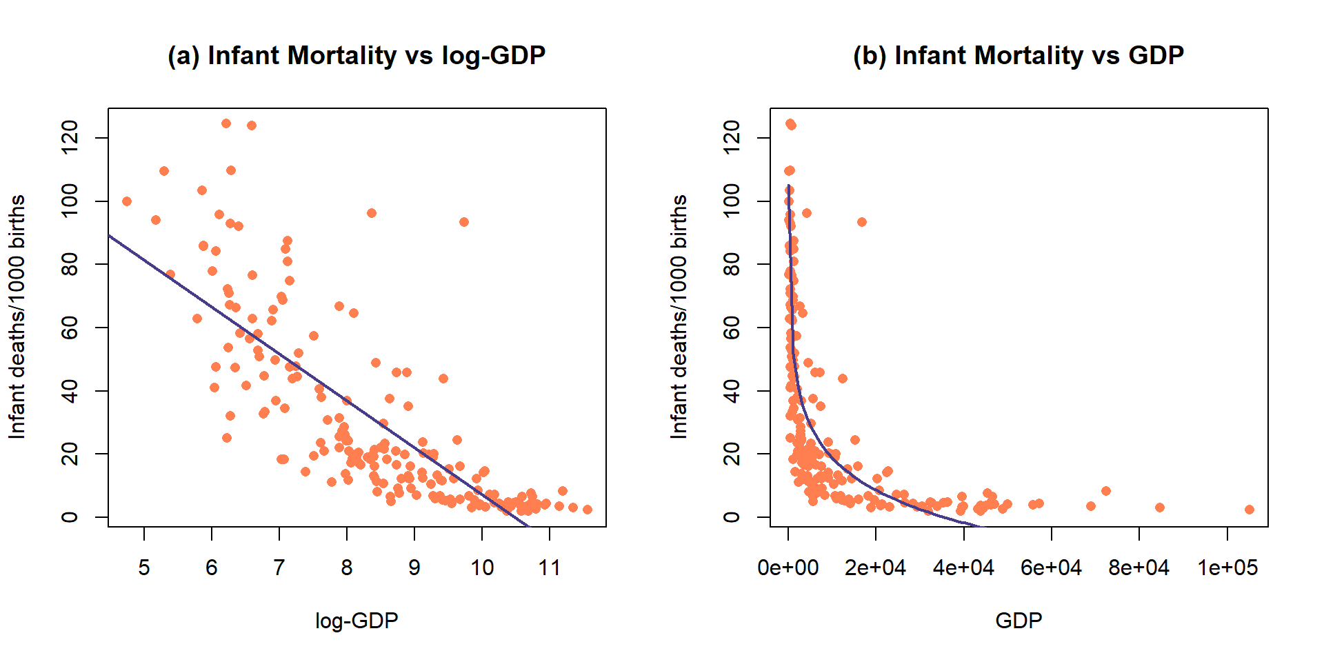
Figure 7.19: Plot of the observations and estimated SLR model (mortality~ log(GDP)) (top) and implied model (bottom) for the infant mortality data.
While it is not a perfect model (no model is), let’s consider the model for infant mortality \(\sim\) log(GDP) in order to practice the interpretation using this type of model. This model was estimated to be \(\widehat{\text{infantmortality}}=155.77-14.86\cdot\log(\text{GDP})\). The first (simplest) interpretation of the slope coefficient is: For a 1 log-dollar increase in GDP per capita, we estimate infant mortality to change, on average, by -14.86 deaths/1000 live births. The second interpretation is on the original GDP scale: For a doubling of GDP, we estimate infant mortality to change, on average, by \(-14.86\log(2) = -10.3\) deaths/1000 live births. Or, the mean infant mortality is reduced by 10.3 deaths per 1000 live births for each doubling of GDP. Both versions of the model are displayed in Figure 7.19 – one on the scale the SLR model was fit (panel a) and the other on the original \(x\)-scale (panel b) that matches these last interpretations.
##
## Call:
## lm(formula = infantMortality ~ log(ppgdp), data = UN)
##
## Residuals:
##     Min      1Q  Median      3Q     Max
## -38.239 -11.609  -2.829   8.122  82.183
##
## Coefficients:
##             Estimate Std. Error t value Pr(>|t|)
## (Intercept) 155.7698     7.2431   21.51   <2e-16
## log(ppgdp)  -14.8617     0.8468  -17.55   <2e-16
##
## Residual standard error: 18.14 on 191 degrees of freedom
##   (20 observations deleted due to missingness)
## Multiple R-squared:  0.6172, Adjusted R-squared:  0.6152
## F-statistic: 308 on 1 and 191 DF, p-value: < 2.2e-16## [1] -10.30017It appears that our model does not fit too well and that there might be some non-constant variance so we should check the diagnostic plots (available in Figure 7.20) before we trust any of those previous interpretations.
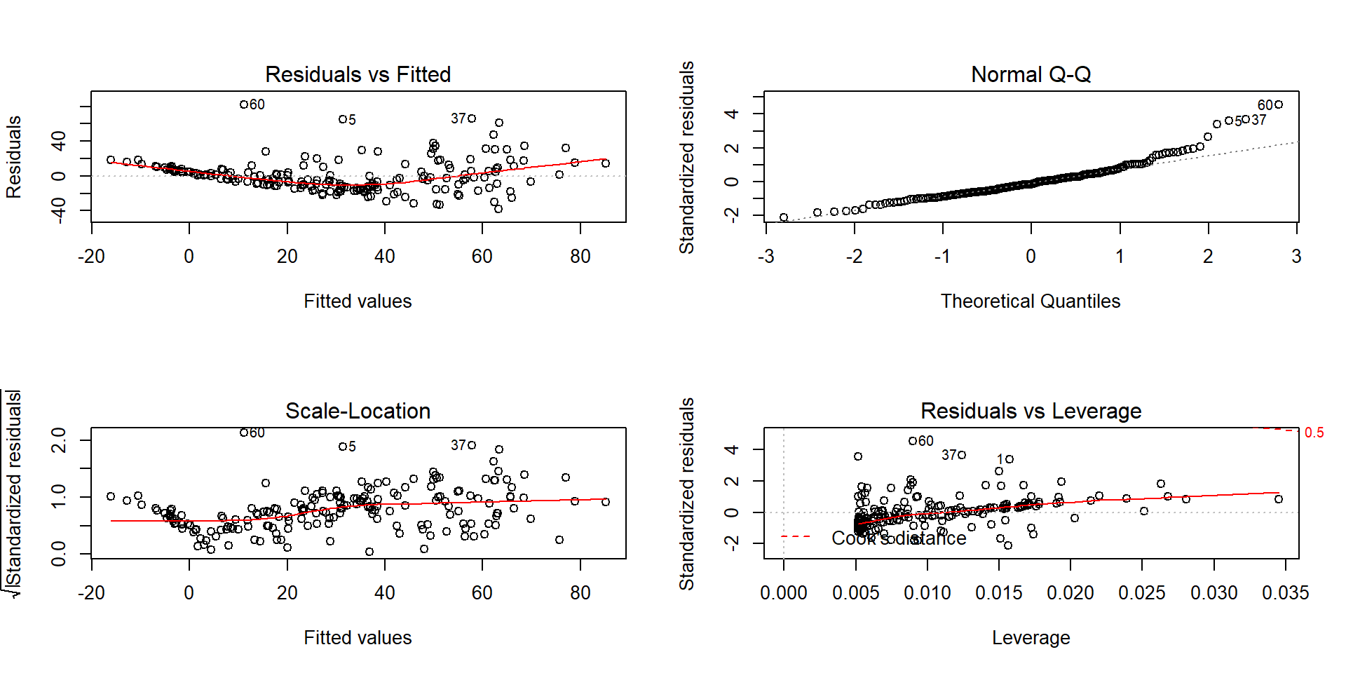
Figure 7.20: Diagnostics plots of the infant mortality model with log(GDP).
There appear to be issues with outliers and a long right tail violating the normality assumption as it suggests a clear right skewed residual distribution. There is curvature and non-constant variance in the results as well. There are no influential points, but we are far from happy with this model and will be revisiting this example with the responses also transformed. Remember that the log-transformation of the response can potentially fix non-constant variance, normality, and curvature issues.
Scenario 3: log(y)~log(x) model
A final model combines log-transformations of both \(x\) and \(y\), combining the interpretations used in the previous two situations. This model is called the log-log model and in some fields is also called the power law model. The power-law model is usually written as \(y = \beta_0x^{\beta_1}+\varepsilon\), where \(y\) is thought to be proportional to \(x\) raised to an estimated power of \(\beta_1\) (linear if \(\beta_1=1\) and quadratic if \(\beta_1=2\)). It is one of the models that has been used in Geomorphology to model the shape of glaciated valley elevation profiles (that classic U-shape that comes with glacier-eroded mountain valleys)107. If you ignore the error term, it is possible to estimate the power-law model using our SLR approach. Consider the log-transformation of both sides of this equation starting with the power-law version:
\(\log(y) = \log(\beta_0x^{\beta_1})\),
\(\log(y) = \log(\beta_0) + \log(x^{\beta_1}).\) Based on the rules for logs: \(\log(ab) = \log(a) + \log(b)\).
\(\log(y) = \log(\beta_0) + \beta_1\log(x).\) Based on the rules for logs: \(\log(x^b) = b\log(x)\).
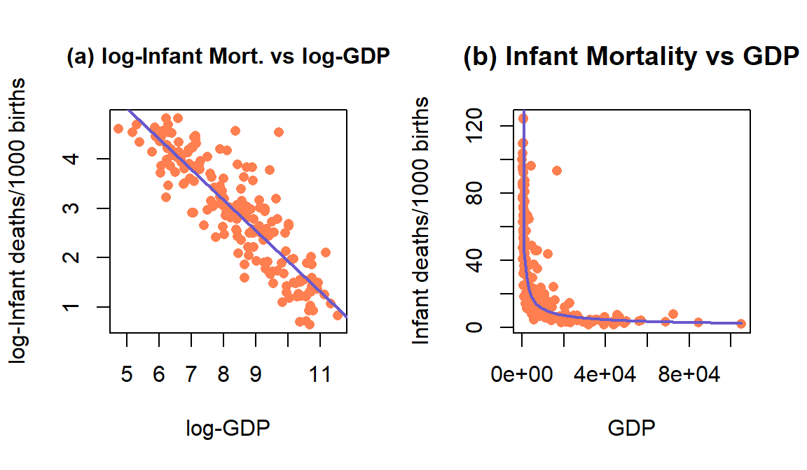
Figure 7.21: Plot of the observations and estimated SLR model log(mortality) \(\sim\) log(GDP) (left) and implied model (right) for the infant mortality data.
So other than \(\log(\beta_0)\) in the model, this looks just like our regular SLR model with \(x\) and \(y\) both log-transformed. The slope coefficient for \(\log(x)\) is the power coefficient in the original power law model and determines whether the relationship between the original \(x\) and \(y\) in \(y=\beta_0x^{\beta_1}\) is linear \((y=\beta_0x^1)\) or quadratic \((y=\beta_0x^2)\) or even quartic \((y=\beta_0x^4)\) in some really heavily glacier carved U-shaped valleys. There are some issues with “ignoring the errors” in using SLR to estimate these models (Greenwood and Humphrey 2002) but it is still a pretty powerful result to be able to estimate the coefficients in \((y=\beta_0x^{\beta_1})\) using SLR.
We don’t typically use the previous ideas to interpret the typical log-log regression model, instead we combine our two previous interpretation techniques to generate our interpretation. We need to work out the mathematics of doubling \(x\) and the changes in \(y\) starting with the \(\mathit{\boldsymbol{\log(y)\sim \log(x)}}\) model that we would get out of fitting the SLR with both variables log-transformed:
\(\log(y) = b_0 + b_1\log(x)\),
\(y = \exp(b_0 + b_1\log(x))\). Exponentiate both sides.
\(y = \exp(b_0)\exp(b_1\log(x))=\exp(b_0)x^{b_1}\). Rules for exponents and logs, simplifying.
Now we can consider the impacts of doubling \(x\) on \(y\), going from \((x,{\color{red}{\boldsymbol{y=\exp(b_0)x^{b_1}}}})\) to \((2x,y^*)\) with
\(y^* = \exp(b_0)(2x)^{b_1}\),
\(y^* = \exp(b_0)2^{b_1}x^{b_1} = 2^{b_1}{\color{red}{\boldsymbol{\exp(b_0)x^{b_1}}}}=2^{b_1}{\color{red}{\boldsymbol{y}}}\)
So doubling \(x\) leads to a multiplicative change in the median of \(y\) of \(2^{b_1}\).
Let’s apply this idea to the GDP and infant mortality data where a \(\log(x) \sim \log(y)\) transformation actually made the resulting relationship look like it might be close to being reasonably modeled with an SLR. The regression line in Figure 7.21 actually looks pretty good on both the estimated log-log scale (panel a) and on the original scale (panel b) as it captures the severe nonlinearity in the relationship between the two variables.
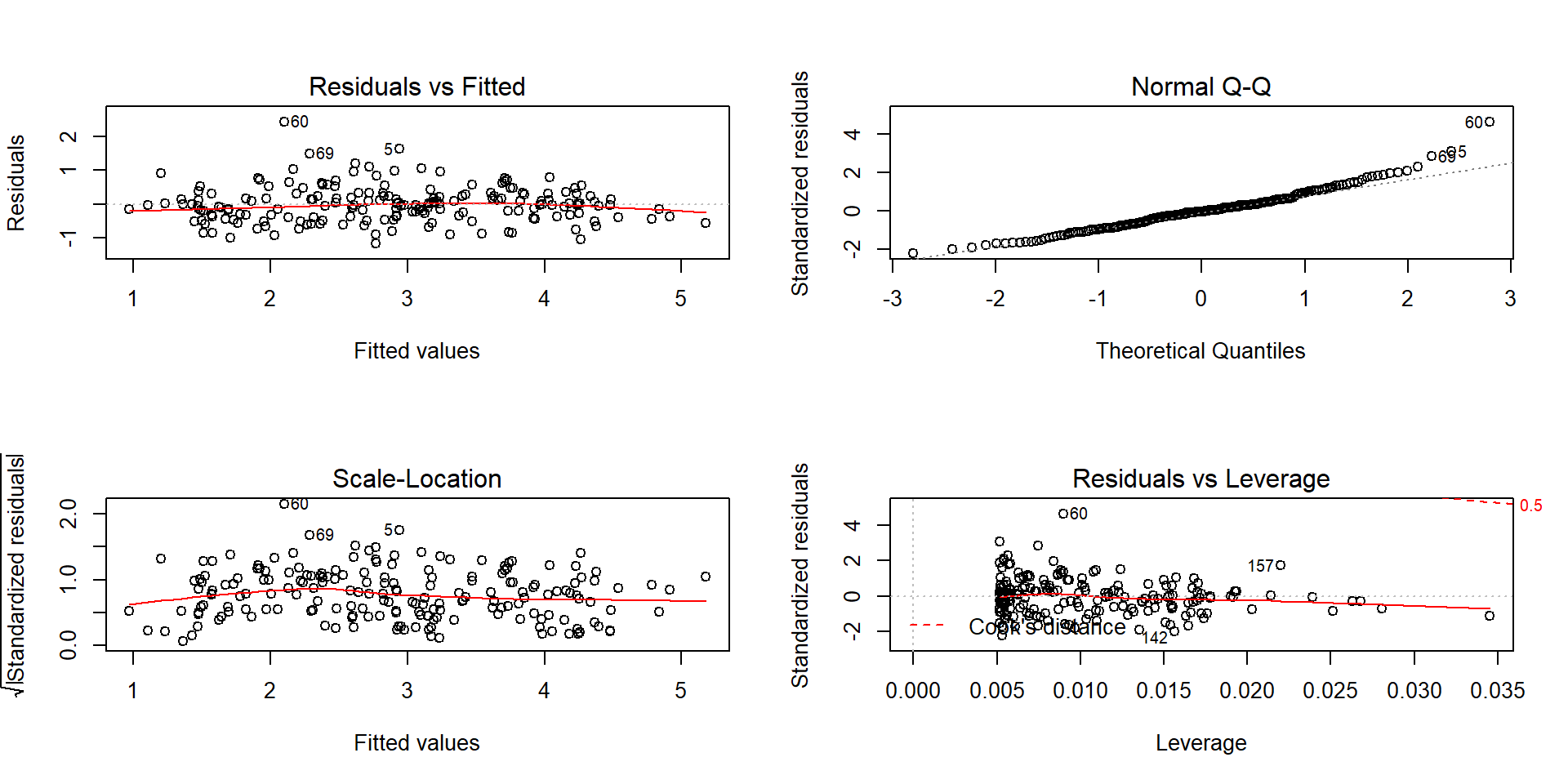
Figure 7.22: Diagnostic plots for the log-log infant mortality model.
##
## Call:
## lm(formula = log(infantMortality) ~ log(ppgdp), data = UN)
##
## Residuals:
##      Min       1Q   Median       3Q      Max
## -1.16789 -0.36738 -0.02351  0.24544  2.43503
##
## Coefficients:
##             Estimate Std. Error t value Pr(>|t|)
## (Intercept)  8.10377    0.21087   38.43   <2e-16
## log(ppgdp)  -0.61680    0.02465  -25.02   <2e-16
##
## Residual standard error: 0.5281 on 191 degrees of freedom
##   (20 observations deleted due to missingness)
## Multiple R-squared:  0.7662, Adjusted R-squared:  0.765
## F-statistic: 625.9 on 1 and 191 DF,  p-value: < 2.2e-16
The estimated regression model is \(\log(\widehat{\text{infantmortality}})=8.104-0.617\cdot\log(\text{GDP})\). The slope coefficient can be interpreted two ways.
On the log-log scale: For a 1 log-dollar increase in GDP, we estimate, on average, a change of \(-0.617\) log(deaths/1000 live births) in infant mortality.
On the original scale: For a doubling of GDP, we expect a \(2^{b_1} = 2^{-0.617} = 0.652\) multiplicative change in the estimated median infant mortality. That is a 34.8% decrease in the estimated median infant mortality for each doubling of GDP.
The diagnostics of the log-log SLR model (Figure 7.22) show minimal evidence of violations of assumptions although the tails of the residuals are a little heavy (more spread out than a normal distribution) and there might still be a little pattern remaining in the residuals vs fitted values. There are no influential points to be concerned about in this situation.
While we will not revisit this at all except in the case-studies in Chapter 9, log-transformations can be applied to the response variable in ONE and TWO-WAY ANOVA models when we are concerned about non-constant variance and non-normality issues108. The remaining methods in this chapter return to SLR and assuming that the model is at least reasonable to consider in each situation, possibly after transformation(s). In fact, the methods in Section 7.7 are some of the most sensitive results to violations of the assumptions that we will explore.
7.7 Confidence interval for the mean and prediction intervals for a new observation
Figure 7.7 provided a term-plot of the estimated regression line and a shaded area surrounding the estimated regression equation. Those shaded areas are based on connecting the dots on 95% confidence intervals constructed for the true mean \(y\) value across all the \(x\)-values. To formalize this idea, consider a specific value of \(x\), and call it \(\boldsymbol{x_{\nu}}\) (pronounced x-new109). Then the true mean response for this subpopulation (a subpopulation is all observations we could obtain at \(\boldsymbol{x=x_{\nu}}\)) is given by \(\boldsymbol{E(Y)=\mu_\nu=\beta_0+\beta_1x_{\nu}}\). To estimate the mean response at \(\boldsymbol{x_{\nu}}\), we plug \(\boldsymbol{x_{\nu}}\) into the estimated regression equation:
\[\hat{\mu}_{\nu} = b_0 + b_1x_{\nu}.\]
To form the confidence interval, we appeal to our standard formula of \(\textbf{estimate} \boldsymbol{\mp t^*}\textbf{SE}_{\textbf{estimate}}\). The standard error for the estimated mean at any \(x\)-value, denoted \(\text{SE}_{\hat{\mu}_{\nu}}\), can be calculated as
\[\text{SE}_{\hat{\mu}_{\nu}} = \sqrt{\text{SE}^2_{b_1}(x_{\nu}-\bar{x})^2 + \frac{\hat{\sigma}^2}{n}}\]
where \(\hat{\sigma}^2\) is the squared residual standard error. This formula
combines the variability in the slope estimate, \(\text{SE}_{b_1}\), scaled
based on the distance of \(x_{\nu}\) from \(\bar{x}\) and the variability
around the regression line, \(\hat{\sigma}^2\). Fortunately, R’s
predict function can be used to provide these results for us
and avoid doing this calculation by hand most of the time. The
confidence interval for \(\boldsymbol{\mu_{\nu}}\), the population
mean response at \(x_{\nu}\), is
\[\boldsymbol{\hat{\mu}_{\nu} \mp t^*_{n-2}}\textbf{SE}_{\boldsymbol{\hat{\mu}_{\nu}}}.\]
In application, these intervals get wider the further we go from the mean of the \(x\text{'s}\). These have interpretations that are exactly like those for the y-intercept:
For an \(x\)-value of \(\boldsymbol{x_{\nu}}\), we are __% confident that the true mean of y is between LL and UL [units of y].
It is also useful to remember that this interpretation applies individually to every \(x\) displayed in term-plots.
A second type of interval in this situation takes on a more challenging task – to place an interval on where we think a new observation will fall, called a prediction interval (PI). This PI will need to be much wider than the CI for the mean since we need to account for both the uncertainty in the mean and the randomness in sampling a new observation from the normal distribution centered at the true mean for \(x_{\nu}\). The interval is centered at the estimated regression line (where else could we center it?) with the estimate denoted as \(\hat{y}_{\nu}\) to help us see that this interval is for a new \(y\) at this \(x\)-value. The \(\text{SE}_{\hat{y}_{\nu}}\) incorporates the core of the previous SE calculation and adds in the variability of a new observation in \(\boldsymbol{\hat{\sigma}^2}\):
\[\text{SE}_{\hat{y}_{\nu}} = \sqrt{\text{SE}^2_{b_1}(x_{\nu}-\bar{x})^2 + \dfrac{\hat{\sigma}^2}{n} + \boldsymbol{\hat{\sigma}^2}} = \sqrt{\text{SE}_{\hat{\mu}_{\nu}}^2 + \boldsymbol{\hat{\sigma}^2}}\]
The __% PI is calculated as
\[\boldsymbol{\hat{y}_{\nu} \mp t^*_{n-2}}\textbf{SE}_{\boldsymbol{\hat{y}_{\nu}}}\]
and interpreted as:
We are __% sure that a new observation at \(\boldsymbol{x_{\nu}}\) will be between LL and UL [units of y]. Since \(\text{SE}_{\hat{y}_{\nu}} > \text{SE}_{\hat{\mu}_{\nu}}\), the PI will always be wider than the CI.
As in confidence intervals, we assume that a 95% PI “succeeds” – now when it succeeds it contains the new observation – in 95% of applications of the methods and fails the other 5% of the time. Remember that for any interval estimate, the true value is either in the interval or it is not and our confidence level essentially sets our failure rate! Because PIs push into the tails of the assumed distribution of the responses these methods are very sensitive to violations of assumptions so we should not use these if there are any concerns about violations of assumptions as they will work as advertised (at the nominal (specified) level).
There are two ways to explore CIs for the mean and PIs for a new observation.
The first is to focus on a specific \(x\)-value of interest. The second is to
plot the results for all \(x\text{'s}\). To do both of these, but especially
to make plots, we want to learn to use the predict function. It can
either produce the estimate for a particular \(x_{\nu}\) and the
\(\text{SE}_{\hat{\mu}_{\nu}}\) or we can get it to directly calculate
the CI and PI. The first way to use it is predict(MODELNAME, se.fit=T)
which will provide fitted values and \(\text{SE}_{\hat{\mu}_{\nu}}\)
for all observed \(x\text{'s}\). We can then use the
\(\text{SE}_{\hat{\mu}_{\nu}}\) to calculate \(\text{SE}_{\hat{y}_{\nu}}\)
and form our own PIs. If you want CIs, run
predict(MODELNAME, interval= "confidence"); if you want PIs, run
predict(MODELNAME, interval="prediction"). If you want to do
prediction at an \(x\)-value that was not in the original
observations, add the option newdata=tibble(XVARIABLENAME_FROM_ORIGINAL_MODEL=Xnu)
to the predict function call.
Some examples of using the predict function follow110. For example, it might be interesting to use the regression
model to find a 95%
CI and PI for the Beers vs BAC study for a student who would
consume 8 beers. Four different applications of the predict function follow.
Note that lwr and upr in the output depend on what we
requested. The first use of predict just returns the estimated mean
for 8 beers:
##         1
## 0.1310095
By turning on the se.fit=T option, we also get the SE for the
confidence interval and degrees of freedom.
Note that elements returned
are labelled as $fit, $se.fit, etc. and provide some of the information to calculate CIs or PIs “by hand”.
## $fit
##         1
## 0.1310095
##
## $se.fit
## [1] 0.009204354
##
## $df
## [1] 14
##
## $residual.scale
## [1] 0.02044095
Instead of using the components of the intervals to
make them, we can also directly request the CI or PI using the
interval=... option, as in the following two lines of code.
##         fit       lwr       upr
## 1 0.1310095 0.1112681 0.1507509## fit lwr upr
## 1 0.1310095 0.08292834 0.1790906Based on these results, we are 95% confident that the true mean BAC
for 8 beers consumed is between 0.111 and 0.15 grams of alcohol per dL of
blood. For a new student drinking 8 beers, we are 95% sure that the observed
BAC will be between 0.083 and 0.179 g/dL. You can see from these results that
the PI is much wider than the CI – it has to capture a new individual’s results
95% of the time which is much harder than trying to capture the true mean at 8 beers consumed. For
completeness, we should do these same calculations “by hand”. The
predict(..., se.fit=T) output provides almost all the pieces we need
to calculate the CI and PI. The $fit is the
\(\text{estimate} = \hat{\mu}_{\nu}=0.131\), the $se.fit is the SE
for the estimate of the \(\text{mean} = \text{SE}_{\hat{\mu}_{\nu}}=0.0092\)
, $df is \(n-2 = 16-2=14\), and $residual.scale is
\(\hat{\sigma}=0.02044\). So we just need the \(t^*\) multiplier for 95%
confidence and 14 df:
## [1] 2.144787The 95% CI for the true mean at \(\boldsymbol{x_{\nu}=8}\) is then:
## [1] 0.1112678 0.1507322Which matches the previous output quite well.
The 95% PI requires the calculation of \(\sqrt{\text{SE}_{\hat{\mu}_{\nu}}^2 + \boldsymbol{\hat{\sigma}^2}} = \sqrt{(0.0092)^2+(0.02044)^2}=0.0224\).
## [1] 0.02241503The 95% PI at \(\boldsymbol{x_{\nu}=8}\) is
## [1] 0.08295648 0.17904352These calculations are “fun” and informative but displaying these results
for all \(x\)-values is a bit more
informative about the performance of the two types of intervals and for results
we might expect in this application. The calculations we just performed provide
endpoints of both intervals at Beers= 8. To make this plot, we need to
create a sequence of Beers values to get other results for, say from 0 to 10 beers,
using the seq function. The seq function requires three arguments, that the endpoints (from and to) are defined and
the length.out, which defines the resolution of the grid of equally spaced points
to create. Here, length.out=30 provides 30 points evenly spaced between 0 and 10 and is more than enough to make
the confidence and prediction intervals from 0 to 10 Beers.
## [1] 0.0000000 0.3448276 0.6896552 1.0344828 1.3793103 1.7241379## [1] 8.275862 8.620690 8.965517 9.310345 9.655172 10.000000Now we can call the predict function at the values stored in
beerf to get the CIs across that range of Beers values:
## # A tibble: 6 x 3
##         fit      lwr    upr
##       <dbl>    <dbl>  <dbl>
## 1 -0.0127   -0.0398  0.0144
## 2 -0.00651  -0.0320  0.0190
## 3 -0.000312 -0.0242  0.0236
## 4  0.00588  -0.0165  0.0282
## 5  0.0121   -0.00873 0.0329
## 6  0.0183   -0.00105 0.0376
And the PIs:
## # A tibble: 6 x 3
##         fit     lwr    upr
##       <dbl>   <dbl>  <dbl>
## 1 -0.0127   -0.0642 0.0388
## 2 -0.00651  -0.0572 0.0442
## 3 -0.000312 -0.0502 0.0496
## 4  0.00588  -0.0433 0.0551
## 5  0.0121   -0.0365 0.0606
## 6  0.0183   -0.0296 0.0662
The rest of the code is just making a scatterplot and adding the five lines
with a legend. The lines function connects the points with a line that provided and only works to add lines to the previously made plot.
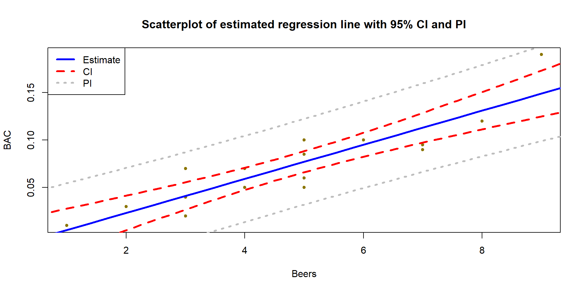
Figure 7.23: Estimated SLR for BAC data with 95% confidence (darker, dashed lines) and 95% prediction (lighter, dotted lines) intervals.
par(mfrow=c(1,1))
plot(BAC~Beers, data=BB, xlab="Beers", ylab="BAC", col="gold4",
     pch=20, main="Scatterplot of estimated regression line with 95% CI and PI")
lines(fit~beerf, data=BBCI, col="blue", lwd=3) #Plot fitted values
lines(lwr~beerf, data=BBCI, col="red", lty=2, lwd=3) #Plot the CI lower bound
lines(upr~beerf, data=BBCI, col="red", lty=2, lwd=3) #Plot the CI upper bound
lines(lwr~beerf, data=BBPI, col="grey", lty=3, lwd=3) #Plot the PI lower bound
lines(upr~beerf, data=BBPI,col="grey", lty=3, lwd=3) #Plot the PI upper bound
legend("topleft", c("Estimate","CI","PI"), lwd=3, lty=c(1,2,3),
       col = c("blue","red","grey")) #Add a legend to explain lines
More importantly, note that the CI in Figure 7.23 clearly shows widening as we move further away from the mean of the \(x\text{'s}\) to the edges of the observed \(x\)-values. This reflects a decrease in knowledge of the true mean as we move away from the mean of the \(x\text{'s}\). The PI also is widening slightly but not as clearly in this situation. The difference in widths in the two types of intervals becomes extremely clear when they are displayed together, with the PI much wider than the CI for any \(x\)-value.
Similarly, the 95% CI and PIs for the Bozeman yearly average maximum temperatures in Figure 7.24 provide interesting information on the uncertainty in the estimated mean temperature over time. It is also interesting to explore how many of the observations fall within the 95% prediction intervals. The PIs are for new observations, but you can see how the PIs that were constructed to contain almost all the observations in the original data set but not all of them. In fact, only 2 of the 109 observations (1.8%) fall outside the 95% PIs. Since the PI needs to be concerned with unobserved new observations it makes sense that it might contain more than 95% of the observations used to make it.
temp1 <- lm(meanmax~Year, data=bozemantemps)
Yearf <- seq(from=1901,to=2014,length.out=75)

TCI <- as_tibble(predict(temp1,newdata= tibble(Year=Yearf),interval="confidence"))

TPI <- as_tibble(predict(temp1,newdata=tibble(Year=Yearf),interval="prediction"))

plot(meanmax~Year,data=bozemantemps,xlab="Year", ylab="degrees F", col="darkgreen",
     pch=20, main="Scatterplot of estimated regression line with 95% CI and PI")
lines(fit~Yearf,data=TCI,col="blue",lwd=3)
lines(lwr~Yearf,data=TCI,col="red",lty=2,lwd=3)
lines(upr~Yearf,data=TCI,col="red",lty=2,lwd=3)
lines(lwr~Yearf,data=TPI,col="grey",lty=3,lwd=3)
lines(upr~Yearf,data=TPI,col="grey",lty=3,lwd=3)
legend("topleft", c("Estimate", "CI","PI"),lwd=3,lty=c(1,2,3),
       col = c("blue", "red","grey"))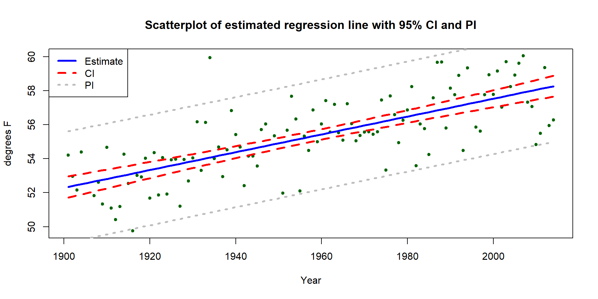
Figure 7.24: Estimated SLR for Bozeman temperature data with 95% confidence (dashed lines) and 95% prediction (lighter, dotted lines) intervals.
We can also use these same methods to do a prediction for the year after the data set ended, 2015, and in 2050:
##        fit     lwr      upr
## 1 58.31967 57.7019 58.93744## fit lwr upr
## 1 58.31967 55.04146 61.59787## fit lwr upr
## 1 60.15514 59.23631 61.07397## fit lwr upr
## 1 60.15514 56.80712 63.50316These results tell us that we are 95% confident that the true mean yearly average maximum temperature in 2015 is (I guess “was”) between 55.04\(^\circ F\) and 61.6\(^\circ F\). And we are 95% sure that the observed yearly average maximum temperature in 2015 will be (I guess “would have been”) between 59.2\(^\circ F\) and 61.1\(^\circ F\). Obviously, 2015 has occurred, but since the data were not published when the data set was downloaded in July 2016, we can probably best treat 2015 as a potential “future” observation. The results for 2050 are clearly for the future mean and a new observation111 in 2050. Note that up to 2014, no values of this response had been observed above 60\(^\circ F\) and the predicted mean in 2050 is over 60\(^\circ F\) if the trend persists. It is easy to criticize the use of this model for 2050 because of its extreme amount of extrapolation.
7.8 Chapter summary
In this chapter, we raised our SLR modeling to a new level, considering inference techniques for relationships between two quantitative variables. The next chapter will build on these same techniques but add in additional explanatory variables for what is called multiple linear regression (MLR) modeling. For example, in the Beers vs BAC study, it would have been useful to control for the weight of the subjects since people of different sizes metabolize alcohol at different rates and body size might explain some of the variability in BAC. We still would want to study the effects of beer consumption but also would be able to control for the differences in subject’s weights. Or if they had studied both male and female students, we might need to change the slope or intercept based on gender, allowing the relationship between Beers and BAC to change between these groups. That will also be handled using MLR techniques but result in two simple linear regression equations – one for each group.
In this chapter you learned how to interpret SLR models. The next chapter will feel like it is completely new initially but it actually contains very little new material, just more complicated models that use the same concepts. There will be a couple of new issues to consider for MLR and we’ll need to learn how to work with categorical variables in a regression setting – but we actually fit linear models with categorical variables in Chapters 2, 3, and 4 so that isn’t actually completely new either.
SLR is a simple (thus its name) tool for analyzing the relationship between two quantitative variables. It contains assumptions about the estimated regression line being reasonable and about the distribution of the responses around that line to do inferences for the population regression line. Our diagnostic plots help us to carefully assess those assumptions. If we cannot trust the assumptions, then the estimated line and any inferences for the population are un-trustworthy. Transformations can fix things so that we can use SLR to fit regression models. Transformations can complicate the interpretations on the original, untransformed scale but have minimal impact on the interpretations on the transformed scale. It is important to be careful with the units of the variables, especially when dealing with transformations, as this can lead to big changes in the results depending on which scale (original or transformed) the results are being interpreted on.
7.9 Summary of important R code
The main components of the R code used in this chapter follow with the
components to modify in lighter and/or ALL CAPS text where y is a response variable, x is an
explanatory variable, and the data are in DATASETNAME.
scatterplot(y~x, data=DATASETNAME, smooth=F)
Requires the
carpackage.Provides a scatterplot with a regression line.
Turn on
smooth=Tto add a smoothing line to help detect nonlinear relationships.
MODELNAME
<-lm(y~ x, data=DATASETNAME)- Estimates a regression model using least squares.
summary(MODELNAME)
- Provides parameter estimates and R-squared (used heavily in Chapter 8 as well).
par(mfrow=c(2, 2)); plot(MODELNAME)
- Provides four regression diagnostic plots in one plot.
confint(MODELNAME, level=0.95)
Provides 95% confidence intervals for the regression model coefficients.
Change
levelif you want other confidence levels.
plot(allEffects(MODELNAME))
Requires the
effectspackage.Provides a term-plot of the estimated regression line with 95% confidence interval for the mean.
DATASETNAME$log.y
<-log(DATASETNAME$y)- Creates a transformed variable called log.y – change this to be more specific to your “\(y\)” or “\(x\)”.
predict(MODELNAME, se.fit=T)
- Provides fitted values for all observed \(x\text{'s}\) with SEs for the mean.
predict(MODELNAME, newdata=tibble(x = XNEW), interval=“confidence”)
- Provides fitted value for a specific \(x\) (XNEW) with CI for the mean.
Replace
xwith name of explanatory variable.
- Provides fitted value for a specific \(x\) (XNEW) with CI for the mean.
Replace
predict(MODELNAME, newdata=tibble(x = XNEW), interval=“prediction”)
- Provides fitted value for a specific \(x\) (XNEW) with PI for a new
observation. Replace
xwith name of explanatory variable.
- Provides fitted value for a specific \(x\) (XNEW) with PI for a new
observation. Replace
qt(0.975, df=n - 2)
- Gets the \(t^*\) multiplier for making a 95% confidence or prediction interval with \(n-2\) replaced by the sample size – 2.
7.10 Practice problems
7.1. Treadmill data analysis We will continue with the treadmill data set introduced in Chapter 1 and the SLR fit in the practice problems in Chapter 6. The following code will get you back to where we stopped at the end of Chapter 6:
treadmill <- read_csv("http://www.math.montana.edu/courses/s217/documents/treadmill.csv")
plot(TreadMillOx~RunTime, data=treadmill)
tm <- lm(TreadMillOx~RunTime, data=treadmill)
summary(tm1)
7.1.1. Use the output to test for a linear relationship between treadmill oxygen and run time, writing out all 6+ steps of the hypothesis test. Make sure to address scope of inference and interpret the p-value.
7.1.2. Form and interpret a 95% confidence interval for the slope coefficient “by hand” using the provided multiplier:
## [1] 2.045237.1.3. Use the confint function to find a similar confidence interval,
checking your previous calculation.
7.1.4. Use the predict function to find fitted values, 95% confidence, and 95%
prediction intervals for run times of 11 and 16 minutes.
7.1.5. Interpret the CI and PI for the 11 minute run time.
7.1.6. Compare the width of either set of CIs and PIs – why are they different? For the two different predictions, why are the intervals wider for 16 minutes than for 11 minutes?
7.1.7. The Residuals vs Fitted plot considered in Chapter 6 should have suggested slight non-constant variance and maybe a little missed nonlinearity. Perform a log-transformation of the treadmill oxygen response variable and re-fit the SLR model. Remake the diagnostic plots and discuss whether the transformation changed any of them.
7.1.8 Summarize the \(\log(y) \sim x\) model and interpret the slope coefficient on the transformed and original scales, regardless of the answer to the previous question.
References
Dieser, Markus, Mark C. Greenwood, and Christine M. Foreman. 2010. “Carotenoid Pigmentation in Antarctic Heterotrophic Bacteria as a Strategy to Withstand Environmental Stresses.” Arctic, Antarctic, and Alpine Research 42(4): 396–405. https://doi.org/10.1657/1938-4246-42.4.396.
Fox, John. 2003. “Effect Displays in R for Generalised Linear Models.” Journal of Statistical Software 8 (15): 1–27. http://www.jstatsoft.org/v08/i15/.
Fox, John, Sanford Weisberg, and Brad Price. 2018. CarData: Companion to Applied Regression Data Sets. https://CRAN.R-project.org/package=carData.
Greenwood, Mark C., Joel Harper, and Johnnie Moore. 2011. “An Application of Statistics in Climate Change: Detection of Nonlinear Changes in a Streamflow Timing Measure in the Columbia and Missouri Headwaters.” In Handbook of the Philosophy of Science, Vol. 7: Statistics, edited by P. S. Bandyopadhyay and M. Forster, 1117–42. Elsevier.
Greenwood, Mark C., and N. F. Humphrey. 2002. “Glaciated Valley Profiles: An Application of Nonlinear Regression.” Computing Science and Statistics 34: 452–60.
Moore, Johnnie N., Joel T. Harper, and Mark C. Greenwood. 2007. “Significance of Trends Toward Earlier Snowmelt Runoff, Columbia and Missouri Basin Headwaters, Western United States.” Geophysical Research Letters 34 (16). https://doi.org/10.1029/2007GL031022.
Santibáñez, Pamela A., Olivia J. Maselli, Mark C. Greenwood, Mackenzie M. Grieman, Eric S. Saltzman, Joseph R. McConnell, and John C. Priscu. 2018. “Prokaryotes in the Wais Divide Ice Core Reflect Source and Transport Changes Between Last Glacial Maximum and the Early Holocene.” Global Change Biology 24 (5): 2182–97. https://doi.org/10.1111/gcb.14042.