Chapter 9 Case studies
9.1 Overview of material covered
At the beginning of the text, we provided a schematic of methods that you would learn about that was (probably) gibberish. Hopefully, revisiting that same diagram (Figure 9.1) will bring back memories of each of the chapters. One common theme was that categorical variables create special challenges whether they are explanatory or response variables.
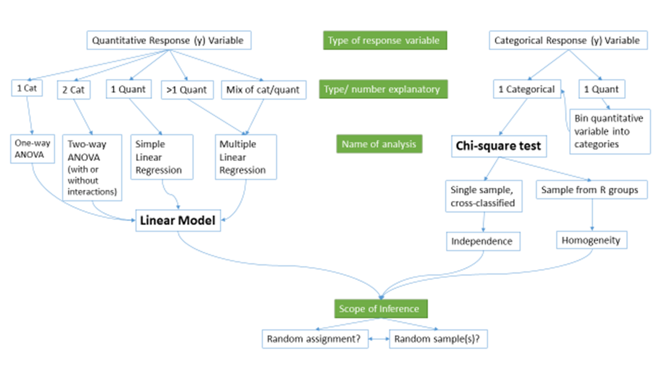
Figure 9.1: Schematic of methods covered.
Every scenario with a quantitative response variable was handled using linear models. The last material on multiple linear regression modeling tied back to the One-Way and Two-Way ANOVA models as categorical variables were added to the models. As both a review and to emphasize the connections, let’s connect some of the different versions of the general linear model that we considered.
If we start with the One-Way ANOVA, the referenced-coded model was written out as:
\[y_{ij}=\alpha + \tau_j + \varepsilon_{ij}.\]
We didn’t want to introduce indicator variables at that early stage of the material, but we can now write out the same model using our indicator variable approach from Chapter 8 for a \(J\)-level categorical explanatory variable using \(J-1\) indicator variables as:
\[y_i = \beta_0 + \beta_1I_{\text{Level }2,i} + \beta_2I_{\text{Level }3,i} + \cdots + \beta_{J-1}I_{\text{Level }J,i} + \varepsilon_i.\]
We now know how the indicator variables are either 0 or 1 for each observation and only one takes in the value 1 (is “turned on”) at a time for each response. We can then equate the general notation from Chapter 8 with our specific One-Way ANOVA (Chapter 3) notation as follows:
For the baseline category, the mean is:
\[\alpha = \beta_0\]
- The mean for the baseline category was modeled using \(\alpha\) which is the intercept term in the output that we called \(\beta_0\) in the regression models.
For category \(j\), the mean is:
- From the One-Way ANOVA model:
\[\alpha + \tau_j\]
- From the regression model where the only indicator variable that is 1 is \(I_{\text{Level }j,i}\):
\[\begin{array}{rl} &\beta_0 + \beta_1I_{\text{Level }2,i} + \beta_2I_{\text{Level }3,i} + \cdots + \beta_JI_{\text{Level }J,i} \\ &= \beta_0 + \beta_{j-1}\cdot1\\ &= \beta_0 + \beta_{j-1} \end{array}\]
- So with intercepts being equal, \(\beta_{j-1}=\tau_j\).
The ANOVA reference-coding notation was used to focus on the coefficients that were “turned on” and their interpretation without getting bogged down in the full power (and notation) of general linear models.
The same equivalence is possible to equate our work in the Two-Way ANOVA interaction model,
\[y_{ijk} = \alpha + \tau_j + \gamma_k + \omega_{jk} + \varepsilon_{ijk},\]
with the regression notation from the MLR model with an interaction:
\[\begin{array}{rc} y_i=&\beta_0 + \beta_1x_i +\beta_2I_{\text{Level }2,i}+\beta_3I_{\text{Level }3,i} +\cdots+\beta_JI_{\text{Level }J,i} +\beta_{J+1}I_{\text{Level }2,i}\:x_i \\ &+\beta_{J+2}I_{\text{Level }3,i}\:x_i +\cdots+\beta_{2J-1}I_{\text{Level }J,i}\:x_i +\varepsilon_i \end{array}\]
If one of the categorical variables only had two levels, then we could simply
replace \(x_i\) with the pertinent indicator variable and be able to equate the
two versions of the notation. That said, we won’t attempt that here. And if
both variables have more than 2 levels, the number of coefficients to keep
track of grows rapidly. The great increase in complexity of notation to fully
writing out the indicator variables in the regression approach with
interactions with two categorical variables is the other reason we explored the
Two-Way ANOVA using a “simplified” notation system even though lm used the
indicator approach to estimate the model. The Two-Way ANOVA notation helped us
distinguish which coefficients related to main effects and the interaction,
something that the regression notation doesn’t make clear.
In the following four sections, you will have additional opportunities to see applications of the methods considered here to real data. The data sets are taken directly from published research articles, so you can see the potential utility of the methods we’ve been discussing for handling real problems. They are focused on biological applications because most come from a particular journal (Biology Letters) that encourages authors to share their data sets, making our re-analyses possible. Use these sections to review the methods from earlier in the book and to see some hints about possible extensions of the methods you have learned.
9.2 The impact of simulated chronic nitrogen deposition on the biomass and N2-fixation activity of two boreal feather moss–cyanobacteria associations
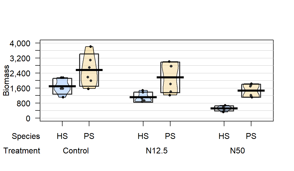
Figure 9.2: Pirate-plot of biomass responses by treatment and species.
In a 16-year experiment, Gundale, Bach, and Nordin (2013) studied the impacts
of Nitrogen (N) additions on the mass of two feather moss species
(Pleurozium schreberi (PS) and Hylocomium (HS)) in the Svartberget
Experimental Forest in Sweden. They used a randomized block design: here this
means that within each of 6 blocks (pre-specified areas that were divided into
three experimental units or plots of area 0.1 hectare), one of the three
treatments were randomly applied. Randomized block designs involve
randomization of levels within blocks or groups as opposed to completely
randomized designs where each experimental unit (the subject or plot
that will be measured) could be randomly assigned to any treatment.
This is
done in agricultural studies to control for systematic differences across the
fields by making sure each treatment level is used in each area or block
of the field. In this example, it resulted in a balanced design with six replicates at each combination of Species and Treatment.
The three treatments involved different levels of N applied immediately after snow melt, Control (no additional N – just the naturally deposited amount), 12.5 kg N \(\text{ha}^{-1}\text{yr}^{-1}\) (N12.5), and 50 kg N \(\text{ha}^{-1}\text{yr}^{-1}\) (N50). The researchers were interested in whether the treatments would have differential impacts on the two species of moss growth. They measured a variety of other variables, but here we focus on the estimated biomass per hectare (mg/ha) of the species (PS or HS), both measured for each plot within each block, considering differences across the treatments (Control, N12.5, or N50). The pirate-plot in Figure 9.2 provides some initial information about the responses. Initially there seem to be some differences in the combinations of groups and some differences in variability in the different groups, especially with much more variability in the control treatment level and more variability in the PS responses than for the HS responses.
gdn <- read_csv("http://www.math.montana.edu/courses/s217/documents/gundalebachnordin_2.csv")
gdn$Species <- factor(gdn$Species)
gdn$Treatment <- factor(gdn$Treatment)
library(yarrr)
pirateplot(Massperha~Species+Treatment, data=gdn, inf.method="ci",
           ylab="Biomass",point.o=1, inf.f.o=0.5,pal="southpark")
The Two-WAY ANOVA model that contains a species by treatment interaction is of interest (this has a quantitative response variable of biomass and two categorical predictors of species and treatment)141. We can make an interaction plot to focus on the observed patterns of the means across the combinations of levels as provided in Figure 9.3. The interaction plot suggests a relatively additive pattern of differences between PS and HS across the three treatment levels. However, the variability seems to be quite different based on this plot as well.
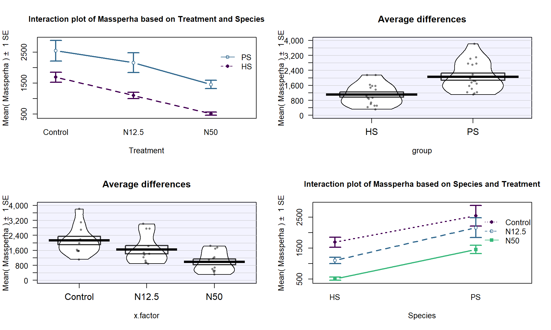
Figure 9.3: Interaction plot of biomass responses by treatment and species.
source("http://www.math.montana.edu/courses/s217/documents/intplotfunctions_v2.R")
intplotarray(Massperha~Species*Treatment, data=gdn, col=viridis(4)[1:3],
             lwd=2, cex.main=1)
Based on the initial plots, we are going to be concerned about the equal variance assumption initially. We can fit the interaction model and explore the diagnostic plots to verify that we have a problem.
##
## Call:
## lm(formula = Massperha ~ Species * Treatment, data = gdn)
##
## Residuals:
##    Min     1Q Median     3Q    Max
## -992.6 -252.2  -64.6  308.0 1252.9
##
## Coefficients:
##                          Estimate Std. Error t value Pr(>|t|)
## (Intercept)               1694.80     211.86   8.000 6.27e-09
## SpeciesPS                  859.88     299.62   2.870  0.00745
## TreatmentN12.5            -588.26     299.62  -1.963  0.05893
## TreatmentN50             -1182.91     299.62  -3.948  0.00044
## SpeciesPS:TreatmentN12.5   199.42     423.72   0.471  0.64130
## SpeciesPS:TreatmentN50      88.29     423.72   0.208  0.83636
##
## Residual standard error: 519 on 30 degrees of freedom
## Multiple R-squared:  0.6661, Adjusted R-squared:  0.6104
## F-statistic: 11.97 on 5 and 30 DF,  p-value: 2.009e-06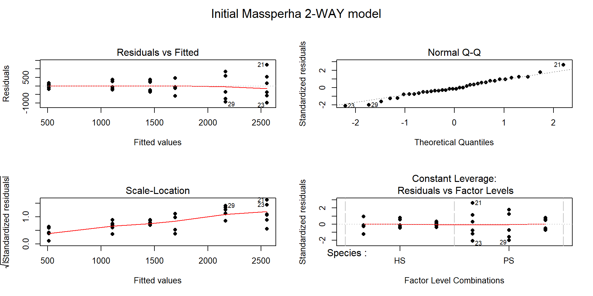
Figure 9.4: Diagnostic plots of treatment by species interaction model for Biomass.
There is a clear problem with non-constant variance showing up in a fanning shape142 in the Residuals versus Fitted and Scale-Location plots in Figure 9.4. Interestingly, the normality assumption is not an issue as the residuals track the 1-1 line in the QQ-plot quite closely so hopefully we will not worsen this result by using a transformation to try to address the non-constant variance issue. The independence assumption is violated in two ways for this model by this study design – the blocks create clusters or groups of observations and the block should be accounted for (they did this in their models by adding block as a categorical variable to their models). Using blocked designs and accounting for the blocks in the model will typically give more precise inferences for the effects of interest, the treatments randomized within the blocks. Additionally, there are two measurements on each plot within block, one for SP and one for HS and these might be related (for example, high HS biomass might be associated with high or low SP) so putting both observations into a model violates the independence assumption at a second level. It takes more advanced statistical models (called linear mixed models) to see how to fully deal with this, for now it is important to recognize the issues. The more complicated models provide similar results here and include the treatment by species interaction we are going to explore, they just add to this basic model to account for these other issues.
Remember that before using a log-transformation, you always must check that the responses are strictly greater than 0:
##    Min. 1st Qu.  Median    Mean 3rd Qu.    Max.
##   319.1  1015.1  1521.8  1582.3  2026.6  3807.6
The minimum is 319.1 so it is safe to apply the natural log-transformation to the response variable (Biomass) and repeat the previous plots:
gdn$logMassperha <- log(gdn$Massperha)
par(mfrow=c(2,1))
pirateplot(logMassperha~Species+Treatment, data=gdn, inf.method="ci",
           ylab="Biomass",point.o=1, inf.f.o=0.5,pal="southpark", main="(a)")
intplot(logMassperha~Species*Treatment, data=gdn, col=viridis(4)[1:3], lwd=2, main="(b)")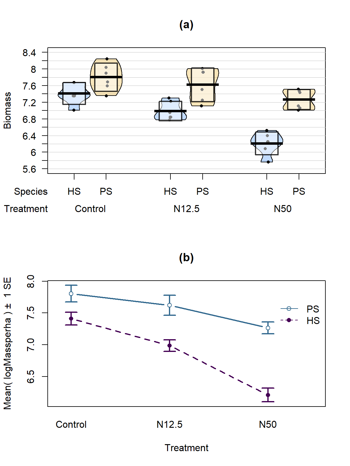
Figure 9.5: Pirate-plot and interaction plot of the log-Biomass responses by treatment and species.
The variability in the pirate-plot in Figure 9.5(a) appears to be more consistent across the groups but the lines appear to be a little less parallel in the interaction plot Figure 9.5(b) for the log-scale response. That is not problematic but suggests that we may now have an interaction present – it is hard to tell visually sometimes. Again, fitting the interaction model and exploring the diagnostics is the best way to assess the success of the transformation applied.
The log(Mass per ha) version of the response variable has little issue with changing variability present in the residuals in Figure 9.6 with much more similar variation in the residuals across the fitted values. The normality assumption is leaning toward a slight violation with too little variability in the right tail and so maybe a little bit of a left skew. This is only a minor issue and fixes the other big issue (clear non-constant variance), so this model is at least closer to giving us trustworthy inferences than the original model. The model presents moderate evidence against the null hypothesis of no Species by Treatment interaction on the log-biomass (\(F(2,30)=4.2\), p-value\(=0.026\)). This suggests that the effects on the log-biomass of the treatments differ between the two species. The mean log-biomass is lower for HS than PS with the impacts of increased nitrogen causing HS mean log-biomass to decrease more rapidly than for PS. In other words, increasing nitrogen has more of an impact on the resulting log-biomass for HS than for PS. The highest mean log-biomass rates were observed under the control conditions for both species making nitrogen appear to inhibit growth of these species.
##
## Call:
## lm(formula = logMassperha ~ Species * Treatment, data = gdn)
##
## Residuals:
##      Min       1Q   Median       3Q      Max
## -0.51138 -0.16821 -0.02663  0.23925  0.44190
##
## Coefficients:
##                          Estimate Std. Error t value Pr(>|t|)
## (Intercept)                7.4108     0.1160  63.902  < 2e-16
## SpeciesPS                  0.3921     0.1640   2.391  0.02329
## TreatmentN12.5            -0.4228     0.1640  -2.578  0.01510
## TreatmentN50              -1.1999     0.1640  -7.316 3.79e-08
## SpeciesPS:TreatmentN12.5   0.2413     0.2319   1.040  0.30645
## SpeciesPS:TreatmentN50     0.6616     0.2319   2.853  0.00778
##
## Residual standard error: 0.2841 on 30 degrees of freedom
## Multiple R-squared:  0.7998, Adjusted R-squared:  0.7664
## F-statistic: 23.96 on 5 and 30 DF, p-value: 1.204e-09## Anova Table (Type II tests)
##
## Response: logMassperha
## Sum Sq Df F value Pr(>F)
## Species 4.3233 1 53.577 3.755e-08
## Treatment 4.6725 2 28.952 9.923e-08
## Species:Treatment 0.6727 2 4.168 0.02528
## Residuals 2.4208 30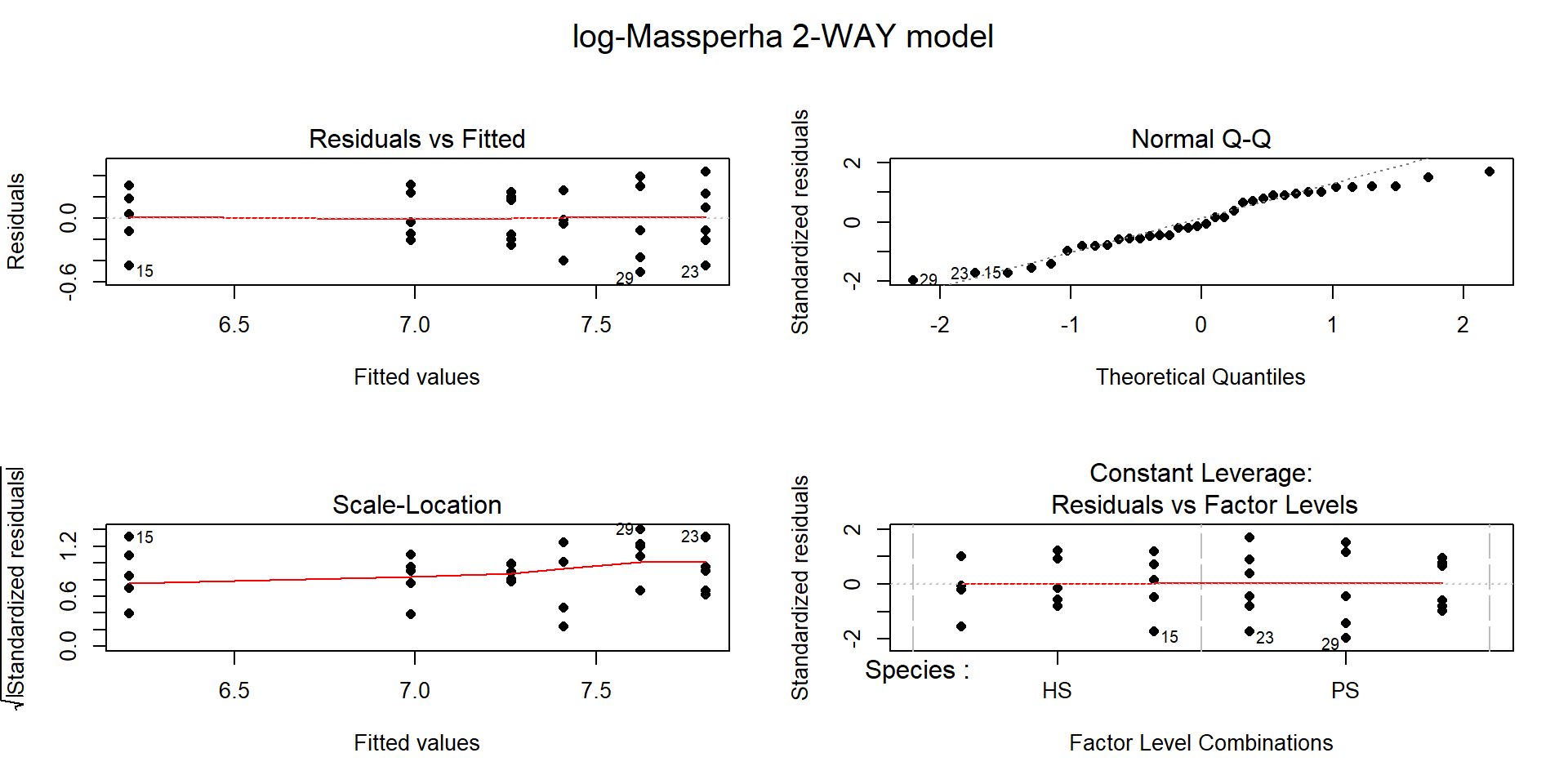
Figure 9.6: Diagnostic plots of treatment by species interaction model for log-Biomass.
The researchers actually applied a \(\log(y+1)\) transformation to all the variables. This was used because one of their many variables had a value of 0 and so they added 1 to avoid analyzing a \(-\infty\) response. This was not needed for most of their variables because most did not attain the value of 0. Adding a small value to observations and then log-transforming is a common but completely arbitrary practice and the choice of the added value can impact the results. Sometimes considering a square-root transformation can accomplish similar benefits as the log-transform and be applied safely to responses that include 0s. Or more complicated statistical models can be used that allow 0s in responses and still account for the violations of the linear model assumptions – see a statistician or continue exploring more advanced statistical methods for ideas in this direction.
The term-plot in Figure 9.7 provides another display of the results with some information on the results for each combination of the species and treatments. Retaining the interaction because of moderate evidence in the interaction test suggests that the treatments caused different results for the different species. And it appears that there are some clear differences among certain combinations such as the mean for PS-Control is clearly larger than for HS-N50. The researchers were probably really interested in whether the N12.5 results differed from Control for HS and whether the species differed at Control sites. As part of performing all pair-wise comparisons, we can assess those sorts of detailed questions. This sort of follow-up could be considered in any Two-Way ANOVA model but will be most interesting in situations where there are important interactions.
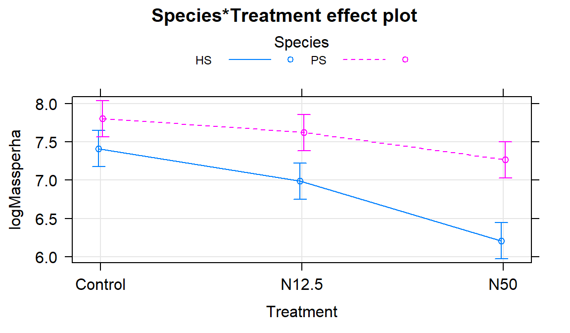
Figure 9.7: Term-plot of the interaction model for log-biomass.
Follow-up Pairwise Comparisons:
Given at least moderate evidence against the null hypothesis of no interaction, many researchers would like more
details about the source of the differences. We can re-fit the model with a
unique mean for each combination of the two predictor variables, fitting a
One-Way ANOVA model (here with six levels) and using Tukey’s HSD to provide
safe inferences for differences among pairs of the true means. There are six
groups corresponding to all combinations of Species (HS, PS) and
treatment levels (Control, N12.5, and N50) provided in the new
variable SpTrt by the interaction function with new levels of
HS.Control, PS.Control, HS.N12.5, PS.N12.5, HS.N50, and PS.N50. The
One-Way ANOVA \(F\)-test (\(F(5,30)=23.96\), p-value \(<0.0001\)) suggests that there
is strong evidence against the null hypothesis of no difference in the true mean log-biomass among the six
treatment/species combinations and so we would conclude that at least on differs from the others. Note that the One-Way ANOVA table contains the test for
at least one of those means being different from the others; the interaction
test above was testing a more refined hypothesis – does the effect of
treatment differ between the two species? As in any situation with a small p-value from the overall
One-Way ANOVA test, the pair-wise comparisons should be of interest.
## [1] "HS.Control" "PS.Control" "HS.N12.5"   "PS.N12.5"   "HS.N50"
## [6] "PS.N50"## Anova Table (Type II tests)
##
## Response: logMassperha
## Sum Sq Df F value Pr(>F)
## SpTrt 9.6685 5 23.963 1.204e-09
## Residuals 2.4208 30##
## Simultaneous Confidence Intervals
##
## Multiple Comparisons of Means: Tukey Contrasts
##
##
## Fit: lm(formula = logMassperha ~ SpTrt, data = gdn)
##
## Quantile = 3.0421
## 95% family-wise confidence level
##
##
## Linear Hypotheses:
## Estimate lwr upr
## PS.Control - HS.Control == 0 0.39210 -0.10682 0.89102
## HS.N12.5 - HS.Control == 0 -0.42277 -0.92169 0.07615
## PS.N12.5 - HS.Control == 0 0.21064 -0.28828 0.70957
## HS.N50 - HS.Control == 0 -1.19994 -1.69886 -0.70102
## PS.N50 - HS.Control == 0 -0.14620 -0.64512 0.35272
## HS.N12.5 - PS.Control == 0 -0.81487 -1.31379 -0.31595
## PS.N12.5 - PS.Control == 0 -0.18146 -0.68038 0.31746
## HS.N50 - PS.Control == 0 -1.59204 -2.09096 -1.09312
## PS.N50 - PS.Control == 0 -0.53830 -1.03722 -0.03938
## PS.N12.5 - HS.N12.5 == 0 0.63342 0.13450 1.13234
## HS.N50 - HS.N12.5 == 0 -0.77717 -1.27609 -0.27824
## PS.N50 - HS.N12.5 == 0 0.27657 -0.22235 0.77549
## HS.N50 - PS.N12.5 == 0 -1.41058 -1.90950 -0.91166
## PS.N50 - PS.N12.5 == 0 -0.35685 -0.85577 0.14208
## PS.N50 - HS.N50 == 0 1.05374 0.55482 1.55266We can also generate the Compact Letter Display (CLD) to help us group up the results.
## HS.Control PS.Control   HS.N12.5   PS.N12.5     HS.N50     PS.N50
##       "bd"        "d"        "b"       "cd"        "a"       "bc"
And we can add the CLD to an interaction plot to create Figure
9.8. Researchers often use displays like this to simplify the
presentation of pair-wise comparisons. Sometimes researchers add bars or stars
to provide the same information about pairs that are or are not detectably
different. The following code creates the plot of these results using our
intplot function and the cld=T option.
intplot(logMassperha~Species*Treatment, cld=T, cldshift=0.15, data=gdn, lwd=2,
        main="Interaction with CLD from Tukey's HSD on One-Way ANOVA")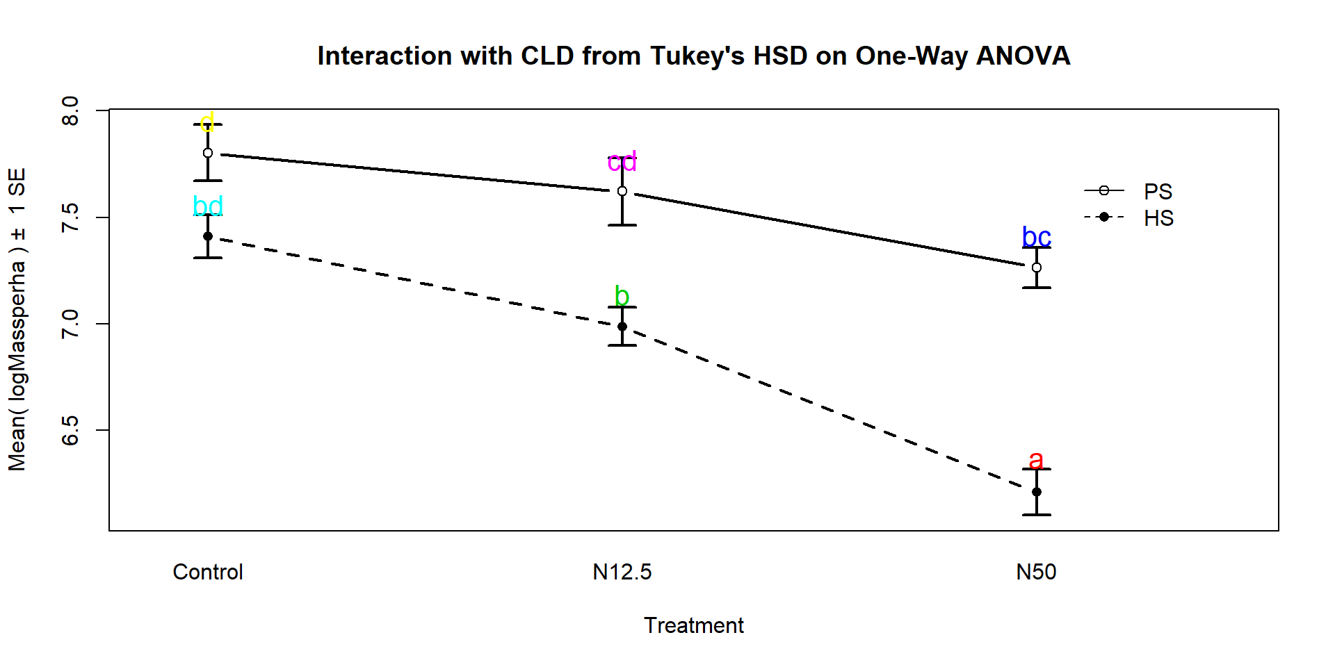
Figure 9.8: Interaction plot for log-biomass with CLD from Tukey’s HSD for all pairwise comparisons.
These results suggest that HS-N50 is detectably different from all the other groups (letter “a”). The rest of the story is more complicated since many of the sets contain overlapping groups in terms of detectable differences. Some specific aspects of those results are most interesting. The mean log-biomasses were not detectably different between the species in the control group (they share a “d”). In other words, without treatment, there is little to no evidence against the null hypothesis of no difference in how much of the two species are present in the sites. For N12.5 and N50 treatments, there are detectable differences between the Species. These comparisons are probably of the most interest initially and suggest that the treatments have a different impact on the two species, remembering that in the control treatments, the results for the two species were not detectably different. Further explorations of the sizes of the differences that can be extracted from selected confidence intervals in the Tukey’s HSD results printed above. Because these results are for the log-scale responses, we could exponentiate coefficients for groups that are deviations from the baseline category and interpret those as multiplicative changes in the median relative to the baseline group, but at the end of this amount of material, I thought that might stop you from reading on any further…
9.3 Ants learn to rely on more informative attributes during decision-making
In Sasaki and Pratt (2013), a set of ant colonies were randomly assigned to one of two treatments to study whether the ants could be “trained” to have a preference for or against certain attributes for potential nest sites. The colonies were either randomly assigned to experience the repeated choice of two identical colony sites except for having an inferior light or entrance size attribute. Then the ants were allowed to choose between two nests, one that had a large entrance but was dark and the other that had a small entrance but was bright. 54 of the 60 colonies that were randomly assigned to one of the two treatments completed the experiment by making a choice between the two types of sites. The data set and some processing code follows.
The first question is what type of analysis is appropriate here. Once we recognize that there are two categorical variables being considered (Treatment group with two levels and After choice with two levels SmallBright or LargeDark for what the colonies selected), then this is recognized as being within our Chi-square testing framework. The random assignment of colonies (the subjects here) to treatment levels tells us that the Chi-square Homogeneity test is appropriate here and that we can make causal statements about the effects of the Treatment groups.
sasakipratt$group <- factor(sasakipratt$group)
levels(sasakipratt$group) <- c("Light","Entrance")
sasakipratt$after <- factor(sasakipratt$after)
levels(sasakipratt$after) <- c("SmallBright","LargeDark")
sasakipratt$before <- factor(sasakipratt$before)
levels(sasakipratt$before) <- c("SmallBright","LargeDark")
plot(after~group, data=sasakipratt)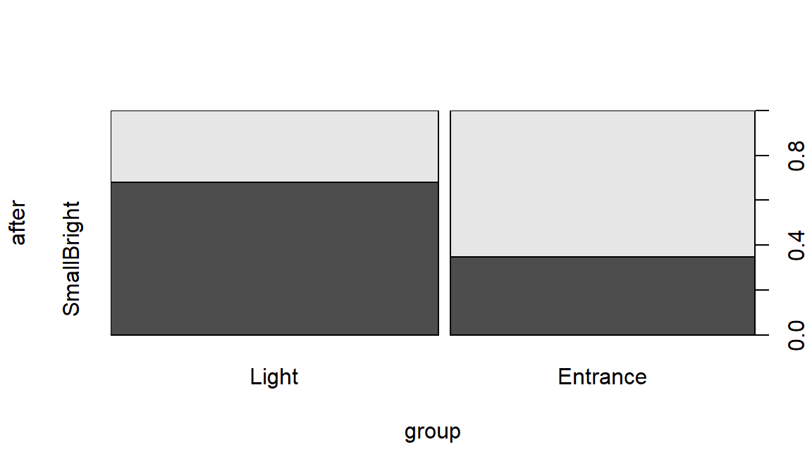
Figure 9.9: Stacked bar chart for Ant Colony results.
##           after
## group      SmallBright LargeDark
##   Light             19         9
## Entrance 9 17The null hypothesis of interest here is that there is no difference in the distribution of responses on After – the rates of their choice of den types – between the two treatment groups in the population of all ant colonies like those studied. The alternative is that there is some difference in the distributions of After between the groups in the population.
To use the Chi-square distribution to find a p-value for the \(X^2\) statistic,
we need all the expected cell counts to be larger than 5, so we should check
that. Note that in the following, the correct=F option is used to keep the
function from slightly modifying the statistic used that occurs when overall
sample sizes are small.
##           after
## group      SmallBright LargeDark
##   Light       14.51852  13.48148
##   Entrance    13.48148  12.51852
Our expected cell count condition is met, so we can proceed to explore the results of the parametric test:
##
##  Pearson's Chi-squared test
##
## data:  table1
## X-squared = 5.9671, df = 1, p-value = 0.01458
The \(X^2\) statistic is 5.97 which, if our assumptions hold, should approximately follow a Chi-square distribution with \((R-1)*(C-1)=1\) degrees of freedom under the null hypothesis. The p-value is 0.015, suggesting that there is moderate to strong evidence against the null hypothesis and we can conclude that there is a difference in the distribution of the responses between the two treated groups in the population of all ant colonies that could have been treated. Because of the random assignment, we can say that the treatments caused differences in the colony choices. These results cannot be extended to ants beyond those being studied by these researchers because they were not randomly selected.
Further exploration of the standardized residuals can provide more insights in some situations, although here they are similar for all the cells:
##           after
## group      SmallBright LargeDark
##   Light       1.176144 -1.220542
##   Entrance   -1.220542  1.266616
When all the standardized residual contributions are similar, that suggests that there are differences in all the cells from what we would expect if the null hypothesis were true. Basically, that means that what we observed is a bit larger than expected for the Light treatment group in the SmallBright choice and lower than expected in LargeDark – those treated ants preferred the small and bright den. And for the Entrance treated group, they preferred the large entrance, dark den at a higher rate than expected if the null is true and lower than expected in the small entrance, bright location.
The researchers extended this basic result a little further using a statistical model called logistic regression, which involves using something like a linear model but with a categorical response variable (well – it actually only works for a two-category response variable). They also had measured which of the two types of dens that each colony chose before treatment and used this model to control for that choice. So the actual model used in their paper contained two predictor variables – the randomized treatment received that we explored here and the prior choice of den type. The interpretation of their results related to the same treatment effect, but they were able to discuss it after adjusting for the colonies previous selection. Their conclusions were similar to those found with our simpler analysis. Logistic regression models are a special case of what are called generalized linear models and are a topic for the next level of statistics if you continue exploring.
9.4 Multi-variate models are essential for understanding vertebrate diversification in deep time
Benson and Mannion (2012) published a paleontology study that considered modeling the diversity of Sauropodomorphs across \(n=26\) “stage-level” time bins. Diversity is measured by the count of the number of different species that have been found in a particular level of fossils. Specifically, the counts in the Sauropodomorphs group were obtained for stages between Carnian and Maastrichtian, with the first three stages in the Triassic, the next ten in the Jurassic, and the last eleven in the Cretaceous. They were concerned about variation in sampling efforts and the ability of paleontologists to find fossils across different stages creating a false impression of the changes in biodiversity (counts of species) over time. They first wanted to see if the species counts were related to factors such as the count of dinosaur-bearing-formations (DBF) and the count of dinosaur-bearing-collections (DBC) that have been identified for each period. The thought is that if there are more formations or collections of fossils from certain stages, the diversity might be better counted (more found of those available to find) and those stages with less information available might be under-counted. They also measured the length of each stage (Duration) but did not consider it in their models since they want to reflect the diversity and longer stages would likely have higher diversity.
Their main goal was to develop a model that would control for the effects of sampling efforts and allow them to perform inferences for whether the diversity was different between the Triassic/Jurassic (grouped together) and considered models that included two different versions of sampling effort variables and one for the comparisons of periods (an indicator variable TJK=0 if the observation is in Triassic or Jurassic or 1 if in Cretaceous), which are more explicitly coded below. They log-e transformed all their quantitative variables because the untransformed variables created diagnostic issues including influential points. They explored a model just based on the DBC predictor143 and they analyzed the residuals from that model to see if the biodiversity was different in the Cretaceous or before, finding a “p-value >= 0.0001” (I think they meant < 0.0001144). They were comparing the MLR models you learned to some extended regression models that incorporated a correction for correlation in the responses over time, but we can proceed with fitting some of their MLR models and using an AIC comparison similar to what they used. There are some obvious flaws in their analysis and results that we will avoid145.
First, we start with a plot of the log-diversity vs the log-dinosaur bearing collections by period. We can see fairly strong positive relationships between the log amounts of collections and species found with potentially similar slopes for the two periods but what look like different intercepts. Especially for TJK level 1 (Cretaceous period) observations, we might need to worry about a curving relationship. Note that a similar plot can also be made using the formations version of the quantitative predictor variable and that the research questions involve whether DBF or DBC are better predictor variables.
bm2 <- bm[,-c(9:10)]
bm$logSpecies <- log(bm$Species)
bm$logDBCs <- log(bm$DBCs)
bm$logDBFs <- log(bm$DBFs)
bm$TJK <- factor(bm$TJK)
levels(bm$TJK) <- c("Trias_Juras","Cretaceous")
library(car); library(viridis)
scatterplot(logSpecies~logDBCs|TJK, data=bm, smooth=T,
            main="Scatterplot of log-diversity vs log-DBCs by period",
            legend=list(coords="topleft",columns=1), lwd=2, col=viridis(7)[c(5,1)])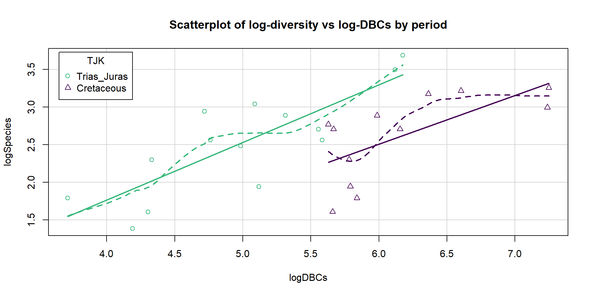
Figure 9.10: Scatterplot of log-biodiversity vs log-DBCs by TJK.
The following results will allow us to explore models similar to theirs. One “full” model they considered is:
\[\log{(\text{count})}_i=\beta_0 + \beta_1\cdot\log{(\text{DBC})}_i + \beta_2I_{\text{TJK},i} + \varepsilon_i\]
which was compared to
\[\log{(\text{count})}_i=\beta_0 + \beta_1\cdot\log{(\text{DBF})}_i + \beta_2I_{\text{TJK},i} + \varepsilon_i\]
as well as the simpler models that each suggests:
\[\begin{array}{rl} \log{(\text{count})}_i &=\beta_0 + \beta_1\cdot\log{(\text{DBC})}_i + \varepsilon_i, \\ \log{(\text{count})}_i &=\beta_0 + \beta_1\cdot\log{(\text{DBF})}_i + \varepsilon_i, \\ \log{(\text{count})}_i &=\beta_0 + \beta_2I_{\text{TJK},i} + \varepsilon_i, \text{ and} \\ \log{(\text{count})}_i &=\beta_0 + \varepsilon_i. \\ \end{array}\]
Both versions of the models (based on DBF or DBC) start with an MLR model with a quantitative variable and two slopes. We can obtain some of the needed model selection results from the first full model using:
bd1 <- lm(logSpecies~logDBCs+TJK, data=bm)
library(MuMIn)
options(na.action = "na.fail")
dredge(bd1, rank="AIC",
       extra=c("R^2", adjRsq=function(x) summary(x)$adj.r.squared))
## Global model call: lm(formula = logSpecies ~ logDBCs + TJK, data = bm)
## ---
## Model selection table
## (Intrc) lgDBC TJK R^2 adjRsq df logLik AIC delta weight
## 4 -1.0890 0.7243 + 0.580900 0.54440 4 -12.652 33.3 0.00 0.987
## 2 0.1988 0.4283 0.369100 0.34280 3 -17.969 41.9 8.63 0.013
## 1 2.5690 0.000000 0.00000 2 -23.956 51.9 18.61 0.000
## 3 2.5300 + 0.004823 -0.03664 3 -23.893 53.8 20.48 0.000
## Models ranked by AIC(x)And from the second model:
bd2 <- lm(logSpecies~logDBFs+TJK, data=bm)
dredge(bd2, rank="AIC",
       extra=c("R^2", adjRsq=function(x) summary(x)$adj.r.squared))
## Global model call: lm(formula = logSpecies ~ logDBFs + TJK, data = bm)
## ---
## Model selection table
## (Intrc) lgDBF TJK R^2 adjRsq df logLik AIC delta weight
## 4 -2.4100 1.3710 + 0.519900 0.47810 4 -14.418 36.8 0.00 0.995
## 2 0.5964 0.4882 0.209800 0.17690 3 -20.895 47.8 10.95 0.004
## 1 2.5690 0.000000 0.00000 2 -23.956 51.9 15.08 0.001
## 3 2.5300 + 0.004823 -0.03664 3 -23.893 53.8 16.95 0.000
## Models ranked by AIC(x)The top AIC model is
\(\log{(\text{count})}_i=\beta_0 + \beta_1\cdot\log{(\text{DBC})}_i + \beta_2I_{\text{TJK},i} + \varepsilon_i\)
with an AIC of 33.3. The next best ranked model on AICs was \(\log{(\text{count})}_i=\beta_0 + \beta_1\cdot\log{(\text{DBF})}_i + \beta_2I_{\text{TJK},i} + \varepsilon_i\)
with an AIC of 36.8, so 3.5 AIC units worse than the top model and so there is clear evidence to support the DBC+TJK model over the best version with DBF and all others. We put these
two runs of results together in Table 9.1, re-computing all the
AICs based on the top model from the first full model considered to make it easier to see this.
| Model | R2 | adj R2 | df | logLik | AIC | \(\BD\)AIC |
|---|---|---|---|---|---|---|
| \(\log(\text{count})_i=\beta_0 + \beta_1\cdot\log(\text{DBC})_i + \beta_2I_{\text{TJK},i} + \varepsilon_i\) | 0.5809 | 0.5444 | 4 | -12.652 | 33.3 | 0 |
| \(\log(\text{count})_i=\beta_0 + \beta_1\cdot\log(\text{DBF})_i + \beta_2I_{\text{TJK},i} + \varepsilon_i\) | 0.5199 | 0.4781 | 4 | -14.418 | 36.8 | 3.5 |
| \(\log(\text{count})_i=\beta_0 + \beta_1\cdot\log(\text{DBC})_i + \varepsilon_i\) | 0.3691 | 0.3428 | 3 | -17.969 | 41.9 | 8.6 |
| \(\log(\text{count})_i=\beta_0 + \beta_1\cdot\log(\text{DBF})_i + \varepsilon_i\) | 0.2098 | 0.1769 | 3 | -20.895 | 47.8 | 14.5 |
| \(\log(\text{count})_i=\beta_0 + \varepsilon_i\) | 0 | 0 | 2 | -23.956 | 51.9 | 18.6 |
| \(\log(\text{count})_i=\beta_0 + \beta_2I_{\text{TJK},i} + \varepsilon_i\) | 0.0048 | -0.0366 | 3 | -23.893 | 53.8 | 20.5 |
Table 9.1 suggests some interesting results. By itself, \(TJK\) leads to the worst performing model on the AIC measure, ranking below a model with nothing in it (mean-only) and 20.5 AIC units worse than the top model. But the two top models distinctly benefit from the inclusion of TJK. This suggests that after controlling for the sampling effort, either through DBC or DBF, the differences in the stages captured by TJK can be more clearly observed.
So the top model in our (correct) results146 suggests that log(DBC) is important as well as different intercepts for the two periods. We can interrogate this model further but we should check the diagnostics (Figure 9.11) and consider our model assumptions first as AICs are not valid if the model assumptions are clearly violated.
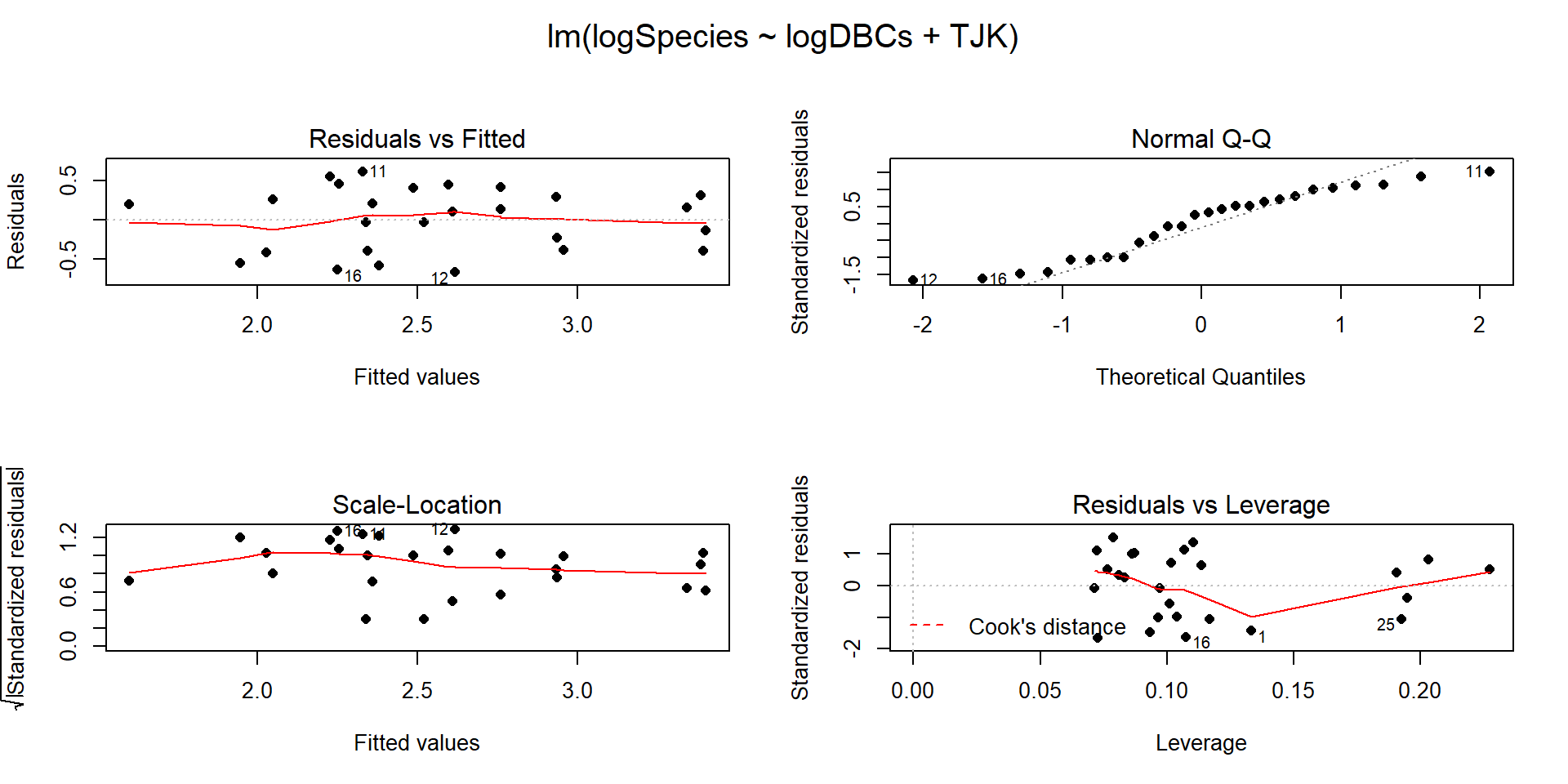
Figure 9.11: Diagnostic plots for the top AIC model.
The constant variance, linearity, and assessment of influence do not suggest any problems with those assumptions. This is reinforced in the partial residuals in Figure 9.12. The normality assumption is possibly violated but shows lighter tails than expected from a normal distribution and so should cause few problems with inferences (we would be looking for an answer of “yes, there is a violation of the normality assumption but that problem is minor because the pattern is not the problematic type of violation because both the upper and lower tails are shorter than expected from a normal distribution”). The other assumption that is violated for all our models is that the observations are independent. Between neighboring stages in time, there would likely be some sort of relationship in the biodiversity so we should not assume that the observations are independent (this is another time series of observations). The authors acknowledged this issue but unskillfully attempted to deal with it. Because an interaction was not considered in any of the models, there also is an assumption that the results are parallel enough for the two groups. The scatterplot in Figure 9.10 suggests that using parallel lines for the two groups is probably reasonable but a full assessment really should also explore that fully to verify that there is no support for an interaction which would relate to different impacts of sampling efforts on the response across the levels of TJK.
Ignoring the violation of the independence assumption, we are otherwise OK to explore the model more and see what it tells us about biodiversity of Sauropodomorphs. The top model is estimated to be \(\log{(\widehat{\text{count}})}_i=-1.089 + 0.724\cdot\log{(\text{DBC})}_i -0.75I_{\text{TJK},i}\). This suggests that for the early observations (TJK=Trias_Juras), the model is \(\log{(\widehat{\text{count}})}_i=-1.089 + 0.724\cdot\log{(\text{DBC})}_i\) and for the Cretaceous period (TJK=Cretaceous), the model is \(\log{(\widehat{\text{count}})}_i=-1.089 + -0.75+0.724\cdot\log{(\text{DBC})}_i\) which simplifies to \(\log{(\widehat{\text{count}})}_i=-1.84 + 0.724\cdot\log{(\text{DBC})}_i\). This suggests that the sampling efforts have the same impacts on all observations and having an increase in logDBCs is associated with increases in the mean log-biodiversity. Specifically, for a 1 log-count increase in the log-DBCs, we estimate, on average, to have a 0.724 log-count change in the mean log-biodiversity, after accounting for different intercepts for the two periods considered. We could also translate this to the original count scale but will leave it as is, because their real question of interest involves the differences between the periods. The change in the y-intercepts of -0.76 suggests that the Cretaceous has a lower average log-biodiversity by 0.75 log-count, after controlling for the log-sampling effort. This suggests that the Cretaceous had a lower corrected mean log-Sauropodomorph biodiversity \(\require{enclose} (t_{23}=-3.41;\enclose{horizontalstrike}{\text{p-value}=0.0024})\) than the combined results for the Triassic and Jurassic. On the original count scale, this suggests \(\exp(-0.76)=0.47\) times (53% drop in) the median biodiversity count per stage for Cretaceous versus the prior time period, after correcting for log-sampling effort in each stage.
##
## Call:
## lm(formula = logSpecies ~ logDBCs + TJK, data = bm)
##
## Residuals:
##     Min      1Q  Median      3Q     Max
## -0.6721 -0.3955  0.1149  0.2999  0.6158
##
## Coefficients:
##               Estimate Std. Error t value Pr(>|t|)
## (Intercept)    -1.0887     0.6533  -1.666   0.1092
## logDBCs         0.7243     0.1288   5.622 1.01e-05
## TJKCretaceous  -0.7598     0.2229  -3.409   0.0024
##
## Residual standard error: 0.4185 on 23 degrees of freedom
## Multiple R-squared:  0.5809, Adjusted R-squared:  0.5444
## F-statistic: 15.94 on 2 and 23 DF,  p-value: 4.54e-05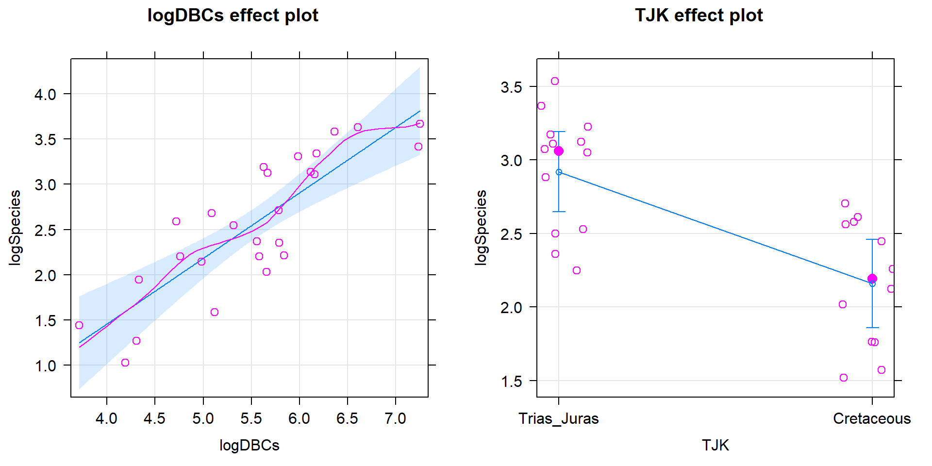
Figure 9.12: Term-plots for the top AIC model with partial residuals.
Their study shows some interesting contrasts between methods. They tried to use AIC-based model selection methods across all the models but then used p-values to really make their final conclusions. This presents a philosophical inconsistency that bothers some more than others but should bother everyone. One thought is whether they needed to use AICs at all since they wanted to use p-values? The one reason they might have preferred to use AICs is that it allows the direct comparison of
\[\log{(\text{count})}_i=\beta_0 + \beta_1\log{(\text{DBC})}_i + \beta_2I_{\text{TJK},i} + \varepsilon_i\]
to
\[\log{(\text{count})}_i=\beta_0 + \beta_1\cdot\log{(\text{DBF})}_i + \beta_2I_{\text{TJK},i} + \varepsilon_i,\]
exploring whether DBC or DBF is “better” with TJK in the model. There is no hypothesis test to compare these two models because one is not nested in the other – it is not possible to get from one model to the other by setting one or more slope coefficients to 0 so we can’t hypothesis test our way from one model to the other one. The AICs suggest strong support for the model with DBC and TJK as compared to the model with DBF and TJK, so that helps us make that decision. After that step, we could rely on \(t\)-tests or ANOVA \(F\)-tests to decide whether further refinement is suggested/possible for the model with DBC and TJK. This would provide the direct inferences that they probably want and are trying to obtain from AICs along with p-values in their paper.
Finally, their results would actually be more valid if they had used a set of statistical methods designed for modeling responses that are counts of events or things, especially those whose measurements change as a function of sampling effort; models called Poisson rate models would be ideal for their application which are also special cases of the generalized linear models noted in the extensions for modeling categorical responses. The other aspect of the biodiversity that they measured for each stage was the duration of the stage. They never incorporated that information and it makes sense given their interests in comparing biodiversity across stages, not understanding why more or less biodiversity might occur. But other researchers might want to estimate the biodiversity after also controlling for the length of time that the stage lasted and the sampling efforts involved in detecting the biodiversity of each stage, models that are only a few steps away from those considered here. In general, this paper presents some of the pitfalls of attempting to use advanced statistical methods as well as hinting at the benefits. The statistical models are the only way to access the results of interest; inaccurate usage of statistical models can provide inaccurate conclusions. They seemed to mostly get the right answers despite a suite of errors in their work.
9.5 What do didgeridoos really do about sleepiness?
In the practice problems at the end of Chapter 4, a study (Puhan et al. (2006)) related to a pre-post, two group comparison of the sleepiness ratings of subjects was introduced. They obtained \(n=25\) volunteers and they randomized the subjects to either get a lesson or be placed on a waiting list for lessons. They constrained the randomization based on the high/low apnoea and high/low on the Epworth scale of the subjects in their initial observations to make sure they balanced the types of subjects going into the treatment and control groups. They measured the subjects’ Epworth value (daytime sleepiness, higher is more sleepy) initially and after four months, where only the treated subjects (those who took lessons) had any intervention. We are interested in whether the mean Epworth scale values changed differently over the four months in the group that got didgeridoo lessons than it did in the control group (that got no lessons). Each subject was measured twice (so the total sample size in the data set is 50) in the data set provided that is available at http://www.math.montana.edu/courses/s217/documents/epworthdata.csv.
The data set was not initially provided by the researchers, but they
did provide a plot very similar to Figure 9.13. Since this
is the last section of the book, I am going to use a new package to make the plot,
qplot from the ggplot2 package (Wickham et al. 2019), that violates one of
the rules used for R functions to this point - it doesn’t have a formula interface.
If you continue much further in learning to use R, you will see the benefits
of some other functions and styles of functions. You will also likely run into
the ggplot2 package, which is part of the “tidyverse” and has been developed
to implement sophisticated graphics. For more on this, you can visit
https://ggplot2.tidyverse.org/ and the related book by Hadley Wickham, who works for RStudio. We could have used ggplot2 to make every graph in the
book, but elected to focus on functions that rely on formula interfaces. For now, I am going to use it to make Figure
9.13 with the qplot function that allows me to display a
line for each subject over the two time points (pre and post) of observation
and indicate which group the subjects were assigned to. This allows us to see
the variation at a given time across subjects and changes over time, which is
critical here as this shows clearly why we had a violation of the independence
assumption in these data. In the plot, you can see that there are not clear differences in the two groups at the “Pre” time but that treated group seems
to have most of the lines go down to lower sleepiness ratings and that this is
not happening much for the subjects in the control group. The violation of the independence assumption is diagnosable from the study design (two observations on each subject). The plot allows us to go further and see that many subjects had similar Epworth scores from pre to post (high in pre, generally high in post) once we account for systematic changes in the treated subjects that seemed to drop a bit on average.
epworthdata$Time <- factor(epworthdata$Time)
levels(epworthdata$Time) <- c("Pre" , "Post")
epworthdata$Group <- factor(epworthdata$Group)
levels(epworthdata$Group) <- c("Control" , "Didgeridoo")

library(ggplot2); library(ggthemes)
qplot(x = Time, y = Epworth, data = epworthdata,
      group = Subject, colour = Group, geom = c("line",
"point"))+theme_bw()+scale_color_viridis(discrete=TRUE) 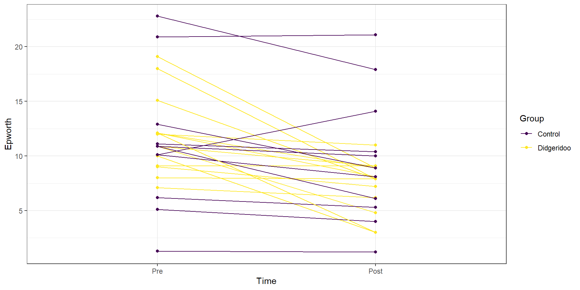
Figure 9.13: Plot of Epworth responses for each subject, initially and after four months, based on treatment groups with one line for each subject connecting observations made over time.
This plot seems to contradict the result from the following Two-Way ANOVA (that is a repeat of what you would have seen had you done the practice problem earlier in the book and the related interaction plot) – there is little to no evidence against the null hypothesis of no interaction between Time and Treatment group on Epworth scale ratings (\(F(1,46)=1.37\), p-value\(=0.2484\) as seen in Table 9.2). But this model assumes all the observations are independent and so does not account for the repeated measures on the same subjects. It ends up that if we account for systematic differences in subjects, we can (sometimes) find the differences we are interested in more clearly. We can see that this model does not really seem to capture the full structure of the real data by comparing simulated data to the original one, as in Figure 9.14. The real data set had fairly strong relationships between the pre and post scores but this connection seems to disappear in responses simulated from the estimated Two-Way ANOVA model (that assumes all observations are independent).
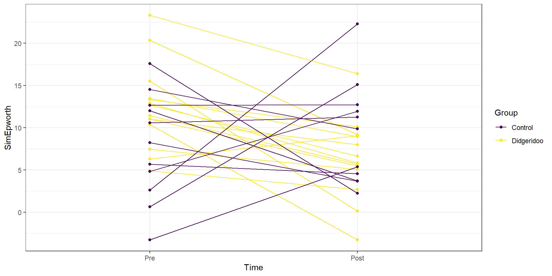
Figure 9.14: Plot of simulated data from the Two-Way ANOVA model that does not assume observations are on repeated measures on subjects to compare to the real data set. Even though the treatment levels seem to decrease on average, there is a much less clear relationship between the starting and ending values in the individuals.
| Sum Sq | Df | F value | Pr(>F) | |
|---|---|---|---|---|
| Time | 120.746 | 1 | 5.653 | 0.022 |
| Group | 8.651 | 1 | 0.405 | 0.528 |
| Time:Group | 29.265 | 1 | 1.370 | 0.248 |
| Residuals | 982.540 | 46 |
If the issue is failing to account for differences in subjects, then why not add “Subject” to the model? There are two things to consider. First, we would need to make sure that “Subject” is a factor variable as the “Subject” variable is initially numerical from 1 to 25. Second, we have to deal with having a factor variable with 25 levels (so 24 indicator variables!). This is a big number and would make writing out the model and interpreting the term-plot for Subject extremely challenging. Fortunately, we are not too concerned about how much higher or lower an individual is than a baseline subject, but we do need to account for it in the model. This sort of “repeated measures” modeling is more often handled by a more complex set of extended regression models that are called linear mixed models and are designed to handle this sort of grouping variable with many levels.
But if we put the Subject factor variable into the previous model, we
can use Type II ANOVA tests to test for an interaction between Time and Group
(our primary research question) after controlling for subject-to-subject
variation. There is a warning message about aliasing that occurs when you
do this which means that it is not possible to estimate all the \(\beta\)s in
this model (and why we more typically used mixed models to do this sort of
thing). Despite this, the test for Time:Group in Table 9.3
is correct and now accounts for the repeated measures on the subject. It
provides \(F(1,23)=5.43\) with a p-value of 0.029, suggesting that there is
moderate evidence against the null hypothesis of no interaction of time and group once we account for subject. This is a
notably different result from what we observed in the Two-Way ANOVA
interaction model that didn’t account for repeated measures on the subjects and matches the results in the original paper closely.
epworthdata$Subject <- factor(epworthdata$Subject)
lm_int_wsub <- lm(Epworth ~ Time * Group + Subject,data=epworthdata)
Anova(lm_int_wsub)| Sum Sq | Df | F value | Pr(>F) | |
|---|---|---|---|---|
| Time | 120.746 | 1 | 22.410 | 0.000 |
| Group | 0 | |||
| Subject | 858.615 | 23 | 6.929 | 0.000 |
| Time:Group | 29.265 | 1 | 5.431 | 0.029 |
| Residuals | 123.924 | 23 |
With this result, we would usually explore the term-plots from this
model to get a sense of the pattern of the changes over time in the treatment
and control groups. That aliasing issue means that the “effects” function also
has some issues. To see the effects plots, we need to use a linear mixed model
from the nlme package. This model is beyond the scope of this material, but
it provides the same \(F\)-statistic for the interaction (\(F(1,23)=5.43\)) and the
term-plots can now be produced (Figure 9.15). In that plot, we
again see that the didgeridoo group mean for “Post” is noticeably lower than in
the “Pre” and that the changes in the control group were minimal over the four
months. This difference in the changes over time was present in the initial
graphical exploration but we needed to account for variation in subjects to be
able to detect this difference. While these results rely on more complex models
than we have time to discuss here, hopefully the similarity of the results of
interest should resonate with the methods we have been exploring while hinting
at more possibilities if you learn more statistical methods.
library(nlme)
lme_int <- lme(Epworth ~ Time*Group, random=~1|Subject, data=epworthdata)
anova(lme_int)
## numDF denDF F-value p-value
## (Intercept) 1 23 132.81354 <.0001
## Time 1 23 22.41014 0.0001
## Group 1 23 0.23175 0.6348
## Time:Group 1 23 5.43151 0.0289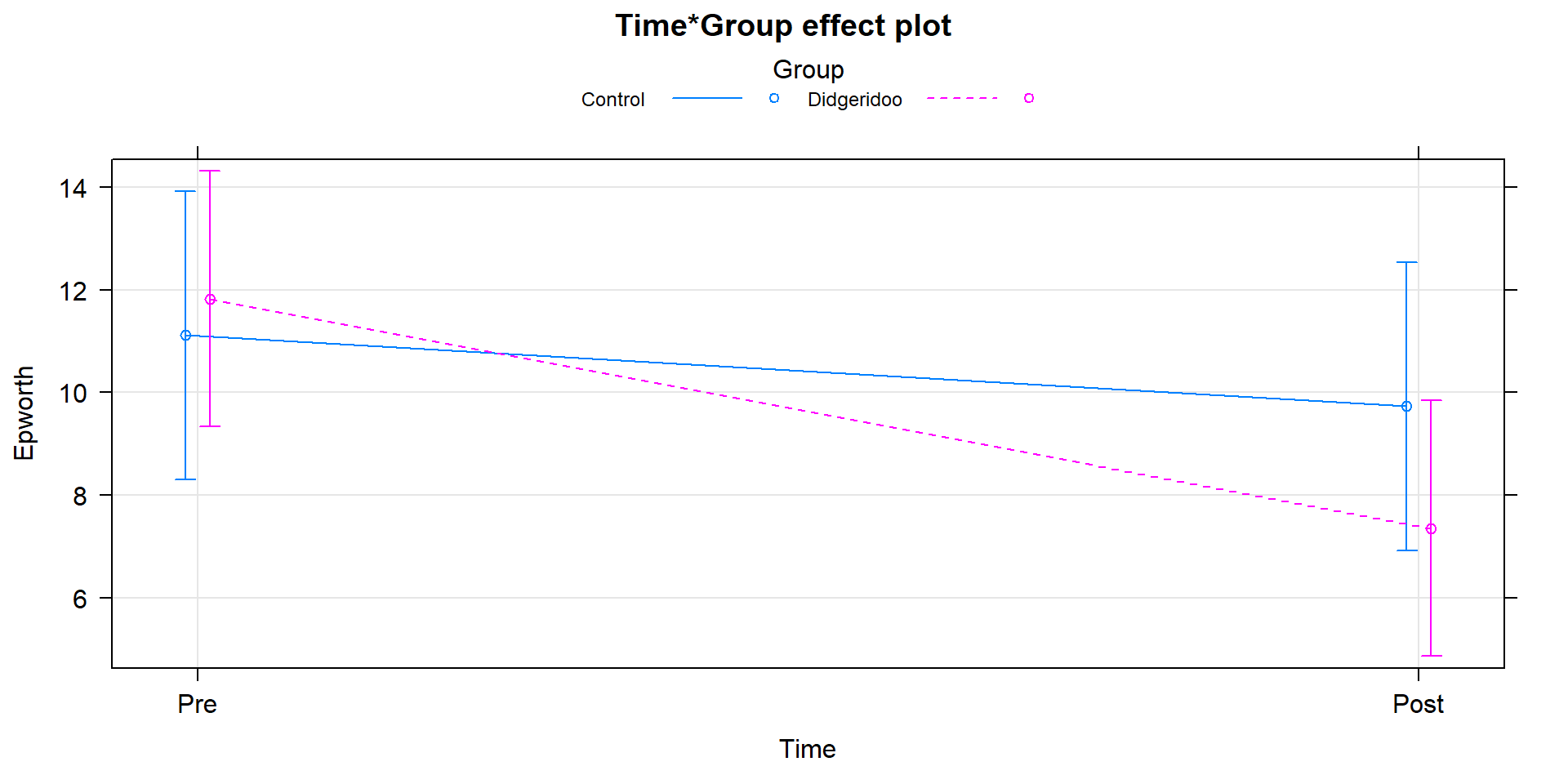
Figure 9.15: Term-plot of Time by Group interaction, results are from model that accounts for subject-to-subject variation in a mixed model.
9.6 General summary
As we wrap up, it is important to remember that these tools are limited by the quality of the data collected. If you are ever involved in applying these statistical models, whether in a research or industrial setting, make sure that the research questions are discussed before data collection. And before data collection is started, make sure that the methods will provide results that can address the research questions. And, finally, make sure someone involved in the project knows how to perform the appropriate graphical and statistical analysis. One way to make sure you know how to analyze a data set and, often, clarify the research questions and data collection needs, is to make a simulated data set that resembles the one you want to collect and analyze it. This can highlight the sorts of questions the research can address and potentially expose issues before the study starts. With this sort of preparation, many issues can be avoided. Remember to think about reasons why assumptions of your proposed method might be violated.
You are now armed and a bit dangerous with statistical methods. If you go to use them, remember the fundamentals and find the story in the data. After deciding on any research questions of interest, graph the data and make sure that the statistical methods will give you results that make some sense based on the graphical results. In the MLR results, it is possible that graphs will not be able to completely tell you the story, but all the other methods should follow the pictures you see. Even when (or especially when) you use sophisticated statistical methods, graphical presentations are critical to helping others understand the results. We have discussed examples that involve displaying categorical and quantitative variables and even some displays that bridge both types of variables. We hope you have enjoyed this material and been able to continue to develop your interests in statistics. You will see it in many future situations both in courses in your area of study and outside of academia to try to address problems that need answers. You are also prepared to take more advanced statistics courses.
References
Benson, Roger B. J., and Philip D. Mannion. 2012. “Multi-Variate Models Are Essential for Understanding Vertebrate Diversification in Deep Time.” Biology Letters 8: 127–30. https://doi.org/10.1098/rsbl.2011.0460.
Gundale, Michael J., Lisbet H. Bach, and Annika Nordin. 2013. “The Impact of Simulated Chronic Nitrogen Deposition on the Biomass and N2-Fixation Activity of Two Boreal Feather Moss–Cyanobacteria Associations.” Biology Letters 9 (6). https://doi.org/10.1098/rsbl.2013.0797.
Puhan, Milo A, Alex Suarez, Christian Lo Cascio, Alfred Zahn, Markus Heitz, and Otto Braendli. 2006. “Didgeridoo Playing as Alternative Treatment for Obstructive Sleep Apnoea Syndrome: Randomised Controlled Trial.” BMJ 332 (7536): 266–70. https://doi.org/10.1136/bmj.38705.470590.55.
Sasaki, Takao, and Stephen C. Pratt. 2013. “Ants Learn to Rely on More Informative Attributes During Decision-Making.” Biology Letters 9 (6). https://doi.org/10.1098/rsbl.2013.0667.
Wickham, Hadley, Winston Chang, Lionel Henry, Thomas Lin Pedersen, Kohske Takahashi, Claus Wilke, Kara Woo, and Hiroaki Yutani. 2019. Ggplot2: Create Elegant Data Visualisations Using the Grammar of Graphics. https://CRAN.R-project.org/package=ggplot2.