Chapter 3 One-Way ANOVA
3.1 Situation
In Chapter 2, tools for comparing the means of two groups were considered. More generally, these methods are used for a quantitative response and a categorical explanatory variable (group) which had two and only two levels. The complete overtake distance data set actually contained seven groups (Figure 3.1) with the outfit for each commute randomly assigned. In a situation with more than two groups, we have two choices. First, we could rely on our two group comparisons, performing tests for every possible pair (commute vs casual, casual vs highviz, commute vs highviz, …, polite vs racer), which would entail 21 different comparisons. But this would engage multiple testing issues and inflation of Type I error rates if not accounted for in some fashion. We would also end up with 21 p-values that answer detailed questions but none that addresses a simple but initially useful question – is there a difference somewhere among the pairs of groups or, under the null hypothesis, are all the true group means the same? In this chapter, we will learn a new method, called Analysis of Variance, ANOVA, or sometimes AOV that directly assesses evidence against the null hypothesis of no difference and then possibly leading to the ability to conclude that there is some overall difference in the means among the groups. This version of an ANOVA is called a One-Way ANOVA since there is just one48 grouping variable. After we perform our One-Way ANOVA test for overall evidence of some difference, we will revisit the comparisons similar to those considered in Chapter 2 to get more details on specific differences among all the pairs of groups – what we call pair-wise comparisons. We will augment our previous methods for comparing two groups with an adjusted method for pairwise comparisons to make our results valid called Tukey’s Honest Significant Difference.
To make this more concrete, we return to the original overtake data, making
a pirate-plot (Figure 3.1) as well as
summarizing the overtake distances by the seven groups using favstats.
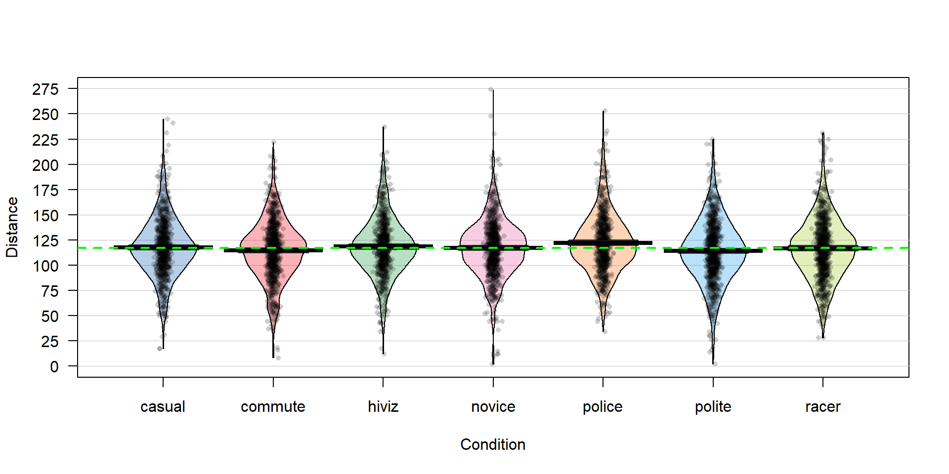
Figure 3.1: Pirate-plot of the overtake distances for the seven groups with group mean (bold lines with boxes indicating 95% confidence intervals) and the overall sample mean (dashed line) of 117.1 cm added.
##   Condition min    Q1 median  Q3 max     mean       sd   n missing
## 1    casual  17 100.0    117 134 245 117.6110 29.86954 779       0
## 2   commute   8  98.0    116 132 222 114.6079 29.63166 857       0
## 3     hiviz  12 101.0    117 134 237 118.4383 29.03384 737       0
## 4    novice   2 100.5    118 133 274 116.9405 29.03812 807       0
## 5    police  34 104.0    119 138 253 122.1215 29.73662 790       0
## 6    polite   2  95.0    114 133 225 114.0518 31.23684 868       0
## 7 racer 28 98.0 117 135 231 116.7559 30.60059 852 0library(mosaic)
library(readr)
library(yarrr)
dd <- read_csv("http://www.math.montana.edu/courses/s217/documents/Walker2014_mod.csv")
dd$Condition <- factor(dd$Condition)
pirateplot(Distance~Condition,data=dd,inf.method="ci")
abline(h=mean(dd$Distance), lwd=2, col="green", lty=2) # Adds overall mean to plot
favstats(Distance~Condition,data=dd)There are slight differences in the sample sizes in the seven groups with between \(737\) and \(868\) observations, providing a data set has a total sample size of \(N=5,690\). The sample means vary from 114.05 to 122.12 cm. In Chapter 2, we found moderate evidence regarding the difference in commute and casual. It is less clear whether we might find evidence of a difference between, say, commute and novice groups since we are comparing means of 114.05 and 116.94 cm. All the distributions appear to have similar shapes that are generally symmetric and bell-shaped and have relatively similar variability. The police vest group of observations seems to have highest sample mean, but there are many open questions about what differences might really exist here and there are many comparisons that could be considered.
3.2 Linear model for One-Way ANOVA (cell means and reference-coding)
We introduced the statistical model \(y_{ij} = \mu_j+\varepsilon_{ij}\) in Chapter 2 for the situation with \(j = 1 \text{ or } 2\) to denote a situation where there were two groups and, for the model that is consistent with the alternative hypothesis, the means differed. Now there are seven groups and the previous model can be extended to this new situation by allowing \(j\) to be 1, 2, 3, …, 7. As before, the linear model assumes that the responses follow a normal distribution with the model defining the mean of the normal distributions and all observations have the same variance. Linear models assume that the parameters for the mean in the model enter linearly. This last condition is hard to explain at this level of material – it is sufficient to know that there are models where the parameters enter the model nonlinearly and that they are beyond the scope of this function and this material and you won’t run into them in most statistical models. By employing this general “linear” modeling methodology, we will be able to use the same general modeling framework for the methods in Chapters 3, 4, 6, 7, and 8.
As in Chapter 2, the null hypothesis defines a situation (and model) where all the groups have the same mean. Specifically, the null hypothesis in the general situation with \(J\) groups (\(J\ge 2\)) is to have all the \(\underline{\text{true}}\) group means equal,
\[H_0:\mu_1 = \ldots = \mu_J.\]
This defines a model where all the groups have the same mean so it can be defined in terms of a single mean, \(\mu\), for the \(i^{th}\) observation from the \(j^{th}\) group as \(y_{ij} = \mu+\varepsilon_{ij}\). This is not the model that most researchers want to be the final description of their study as it implies no difference in the groups. There is more caution required to specify the alternative hypothesis with more than two groups. The alternative hypothesis needs to be the logical negation of this null hypothesis of all groups having equal means; to make the null hypothesis false, we only need one group to differ but more than one group could differ from the others. Essentially, there are many ways to “violate” the null hypothesis so we choose some delicate wording for the alternative hypothesis when there are more than 2 groups. Specifically, we state the alternative as
\[H_A: \text{ Not all } \mu_j \text{ are equal}\]
or, in words, at least one of the true means differs among the J groups. You might be attracted to trying to say that all means are different in the alternative but we do not put this strict a requirement in place to reject the null hypothesis. The alternative model allows all the true group means to differ but does require that they are actually all different with the model written as
\[y_{ij} = {\color{red}{\mu_j}}+\varepsilon_{ij}.\]
This linear model states that the response for the \(i^{th}\) observation in the \(j^{th}\) group, \(\mathbf{y_{ij}}\), is modeled with a group \(j\) (\(j=1, \ldots, J\)) population mean, \(\mu_j\), and a random error for each subject in each group, \(\varepsilon_{ij}\), that we assume follows a normal distribution and that all the random errors have the same variance, \(\sigma^2\). We can write the assumption about the random errors, often called the normality assumption, as \(\varepsilon_{ij} \sim N(0,\sigma^2)\). There is a second way to write out this model that allows extension to more complex models discussed below, so we need a name for this version of the model. The model written in terms of the \({\color{red}{\mu_j}}\text{'s}\) is called the cell means model and is the easier version of this model to understand.
One of the reasons we learned about pirate-plots is that it helps us visually consider all the aspects of this model. In Figure 3.1, we can see the bold horizontal lines that provide the estimated (sample) group means. The bigger the differences in the sample means (especially relative to the variability around the means), the more evidence we will find against the null hypothesis. You can also see the null model on the plot that assumes all the groups have the same mean as displayed in the dashed horizontal line at 117.1 cm (the R code below shows the overall mean of Distance is 117.1). While the hypotheses focus on the means, the model also contains assumptions about the distribution of the responses – specifically that the distributions are normal and that all the groups have the same variability, which do not appear to be clearly violated in this situation.
## [1] 117.126There is a second way to write out the One-Way ANOVA model that provides a framework for extensions to more complex models described in Chapter 4 and beyond. The other parameterization (way of writing out or defining) of the model is called the reference-coded model since it writes out the model in terms of a baseline group and deviations from that baseline or reference level. The reference-coded model for the \(i^{th}\) subject in the \(j^{th}\) group is \(y_{ij} ={\color{purple}{\boldsymbol{\alpha + \tau_j}}}+\varepsilon_{ij}\) where \(\color{purple}{\boldsymbol{\alpha}}\) (“alpha”) is the true mean for the baseline group (usually first alphabetically) and the \(\color{purple}{\boldsymbol{\tau_j}}\) (tau \(j\)) are the deviations from the baseline group for group \(j\). The deviation for the baseline group, \(\color{purple}{\boldsymbol{\tau_1}}\), is always set to 0 so there are really just deviations for groups 2 through \(J\). The equivalence between the reference-coded and cell means models can be seen by considering the mean for the first, second, and \(J^{th}\) groups in both models:
\[\begin{array}{lccc} & \textbf{Cell means:} && \textbf{Reference-coded:}\\ \textbf{Group } 1: & \color{red}{\mu_1} && \color{purple}{\boldsymbol{\alpha}} \\ \textbf{Group } 2: & \color{red}{\mu_2} && \color{purple}{\boldsymbol{\alpha + \tau_2}} \\ \ldots & \ldots && \ldots \\ \textbf{Group } J: & \color{red}{\mu_J} && \color{purple}{\boldsymbol{\alpha +\tau_J}} \end{array}\]
The hypotheses for the reference-coded model are similar to those in the cell means coding except that they are defined in terms of the deviations, \({\color{purple}{\boldsymbol{\tau_j}}}\). The null hypothesis is that there is no deviation from the baseline for any group – that all the \({\color{purple}{\boldsymbol{\tau_j\text{'s}}}}=0\),
\[\boldsymbol{H_0: \tau_2=\ldots=\tau_J=0}.\]
The alternative hypothesis is that at least one of the deviations is not 0,
\[\boldsymbol{H_A:} \textbf{ Not all } \boldsymbol{\tau_j} \textbf{ equal } \bf{0}.\]
In this chapter, you are welcome to use either version (unless we instruct you
otherwise) but we have to use the reference-coding in subsequent chapters. The
next task is to learn how to use R’s linear model, lm, function to get
estimates of the parameters49 in each model, but first a quick review of these
new ideas:
Cell Means Version
\(H_0: {\color{red}{\mu_1= \ldots = \mu_J}}\) \(H_A: {\color{red}{\text{ Not all } \mu_j \text{ equal}}}\)
Null hypothesis in words: No difference in the true means among the groups.
Null model: \(y_{ij} = \mu+\varepsilon_{ij}\)
Alternative hypothesis in words: At least one of the true means differs among the groups.
Alternative model: \(y_{ij} = \color{red}{\mu_j}+\varepsilon_{ij}.\)
Reference-coded Version
\(H_0: \color{purple}{\boldsymbol{\tau_2 = \ldots = \tau_J = 0}}\) \(H_A: \color{purple}{\text{ Not all } \tau_j \text{ equal 0}}\)
Null hypothesis in words: No deviation of the true mean for any groups from the baseline group.
Null model: \(y_{ij} =\boldsymbol{\alpha} +\varepsilon_{ij}\)
Alternative hypothesis in words: At least one of the true deviations is different from 0 or that at least one group has a different true mean than the baseline group.
Alternative model: \(y_{ij} =\color{purple}{\boldsymbol{\alpha + \tau_j}}+\varepsilon_{ij}\)
In order to estimate the models discussed above, the lm function is used50. The lm function continues to
use the same format as previous functions and in Chapter 2 , lm(Y~X, data=datasetname).
It ends up that lm generates the reference-coded version of the
model by default (The developers of R thought it was that important!).
But we want to start with the
cell means version of the model,
so we have to override the standard technique
and add a “-1” to the formula interface to tell R that we want to the
cell means coding. Generally, this looks like lm(Y~X-1, data=datasetname).
Once we fit a model in R, the summary function run on the model provides a
useful “summary” of the model coefficients and a suite of other potentially
interesting information. For the moment, we will focus on the estimated model
coefficients, so only those lines are provided. When fitting the cell means version
of the One-Way ANOVA model,
you will find a row of output for each group relating estimating the \(\mu_j\text{'s}\).
The output contains columns for an estimate (Estimate), standard error
(Std. Error), \(t\)-value (t value), and p-value (Pr(>|t|)). We’ll
explore which of these are of interest in these models below, but focus
on the estimates of the parameters that the function provides in the first
column (“Estimate”) of the coefficient table and compare these results to what was found using favstats.
##                  Estimate Std. Error  t value Pr(>|t|)
## Conditioncasual  117.6110   1.071873 109.7248        0
## Conditioncommute 114.6079   1.021931 112.1484        0
## Conditionhiviz   118.4383   1.101992 107.4765        0
## Conditionnovice  116.9405   1.053114 111.0426        0
## Conditionpolice  122.1215   1.064384 114.7344        0
## Conditionpolite  114.0518   1.015435 112.3182        0
## Conditionracer   116.7559   1.024925 113.9164        0
In general, we denote estimated parameters with a hat over the parameter of
interest to show that it is an estimate. For the true mean of group \(j\),
\(\mu_j\), we estimate it with \(\widehat{\mu}_j\), which is just the sample mean for group
\(j\), \(\bar{x}_j\). The model suggests an estimate for each observation that we denote
as \(\widehat{y}_{ij}\) that we will also call a fitted value based on the model
being considered. The
same estimate is used for all observations in the each group in this model. R tries to help you to
sort out which row of output corresponds to which group by appending the group name
with the variable name. Here, the variable name was Condition and the first group
alphabetically was casual, so R provides a row labeled Conditioncasual
with an estimate of 117.61. The sample means from the seven groups can be seen to
directly match the favstats results presented previously.
The reference-coded version of the same model is more complicated but ends up giving the same results once we understand what it is doing. It uses a different parameterization to accomplish this, so has different model output. Here is the model summary:
##                     Estimate Std. Error     t value    Pr(>|t|)
## (Intercept)      117.6110398   1.071873 109.7247845 0.000000000
## Conditioncommute  -3.0031051   1.480964  -2.0278039 0.042626835
## Conditionhiviz     0.8272234   1.537302   0.5381008 0.590528548
## Conditionnovice   -0.6705193   1.502651  -0.4462242 0.655452292
## Conditionpolice    4.5104792   1.510571   2.9859423 0.002839115
## Conditionpolite   -3.5591965   1.476489  -2.4105807 0.015958695
## Conditionracer    -0.8551713   1.483032  -0.5766371 0.564207492
The estimated model coefficients are \(\widehat{\alpha} = 117.61\) cm, \(\widehat{\tau}_2 =-3.00\) cm, \(\widehat{\tau}_3=0.83\) cm, and so on up to \(\widehat{\tau}_7=-0.86\) cm, where R selected group 1 for casual, 2 for commute, 3 for hiviz, all the way up to group 7 for racer. The way you can figure out the baseline group (group 1 is casual here) is to see which category label is not present in the reference-coded output. The baseline level is typically the first group label alphabetically, but you should always check this51. Based on these definitions, there are interpretations available for each coefficient. For \(\widehat{\alpha} = 117.61\) cm, this is an estimate of the mean overtake distance for the casual outfit group. \(\widehat{\tau}_2 =-3.00\) cm is the deviation of the commute group’s mean from the causal group’s mean (specifically, it is \(3.00\) cm lower and was a quantity we explored in detail in Chapter 2 when we just focused on comparing casual and commute groups). \(\widehat{\tau}_3=0.83\) cm tells us that the hiviz group mean distance is 0.83 cm higher than the casual group mean and \(\widehat{\tau}_7=-0.86\) says that the racer sample mean was 0.86 cm lower than for the casual group. These interpretations are interesting as they directly relate to comparisons of groups with the baseline and lead directly to reconstructing the estimated means for each group by combining the baseline and a pertinent deviation as shown in Table 3.1.
| Group | Formula | Estimates |
|---|---|---|
| casual | \(\widehat{\alpha}\) | 117.61 cm |
| commute | \(\widehat{\alpha}+\widehat{\tau}_2\) | 117.61 - 3.00 = 114.61 cm |
| hiviz | \(\widehat{\alpha}+\widehat{\tau}_3\) | 117.61 + 0.83 = 118.44 cm |
| novice | \(\widehat{\alpha}+\widehat{\tau}_4\) | 117.61 - 0.67 = 116.94 cm |
| police | \(\widehat{\alpha}+\widehat{\tau}_5\) | 117.61 + 4.51 = 122.12 cm |
| polite | \(\widehat{\alpha}+\widehat{\tau}_6\) | 117.61 - 3.56 = 114.05 cm |
| racer | \(\widehat{\alpha}+\widehat{\tau}_7\) | 117.61 - 0.86 = 116.75 cm |
We can also visualize the results of our linear models using what are called
term-plots or effect-plots
(from the effects package; (Fox et al. 2019))
as displayed in Figure 3.2. We don’t want to use the word
“effect” for these model components unless we have random assignment in the study
design so we generically call these term-plots as they display terms or
components from the model in hopefully useful ways to aid in model interpretation
even in the presence of complicated model parameterizations. The word “effect” has a causal connotation that we want to avoid as much as possible in non-causal (so non-randomly assigned) situations. Term-plots take an estimated model and show you its estimates along with 95% confidence
intervals generated by the linear model. These confidence intervals may differ from the confidence intervals in the pirate-plots since the pirate-plots make them for each group separately and term-plots are combining information across groups via the estimated model and then doing inferences for individual group means. To make term-plots, you need to install and
load the effects package and then use plot(allEffects(...)) functions
together on the lm object called lm2 that was estimated above. You can
find the correspondence between the displayed means and the estimates that were
constructed in Table 3.1.
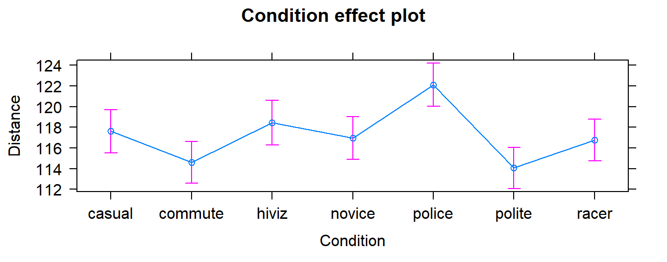
Figure 3.2: Plot of the estimated group mean distances from the reference-coded model for the overtake data from the effects package.
In order to assess overall evidence against having the same means for the all groups (vs not having the same means), we
compare either of the previous models (cell means or reference-coded) to a null
model based on the null hypothesis of \(H_0: \mu_1 = \ldots = \mu_J\), which implies a
model of \(\color{red}{y_{ij} = \mu+\varepsilon_{ij}}\) in the cell means version
where \({\color{red}{\mu}}\) is a common mean for all the observations. We will call
this the mean-only model since it only has a single mean
in it. In the reference-coded version of the model, we have a null hypothesis of
\(H_0: \tau_2 = \ldots = \tau_J = 0\), so the “mean-only” model is
\(\color{purple}{y_{ij} =\boldsymbol{\alpha}+\varepsilon_{ij}}\) with
\(\color{purple}{\boldsymbol{\alpha}}\) having the same definition as
\(\color{red}{\mu}\) for the cell means model – it forces a common value for the
mean for all the groups. Moving from the reference-coded model to the mean-only
model is also an example of a situation where we move from a “full” model
to a
“reduced” model by setting some coefficients in the “full” model to 0 and, by doing
this, get a simpler or “reduced” model.
Simple models can be good as they are easier
to interpret, but having a model for \(J\) groups that suggests no difference in the
groups is not a very exciting result
in most, but not all, situations52. In order for R to provide
results for the mean-only model, we remove the grouping variable, Condition, from
the model formula and just include a “1”. The (Intercept) row of the output
provides the estimate for the mean-only model as a reduced model from either the
cell means or reference-coded models when we assume that the mean is the same
for all groups:
##             Estimate Std. Error t value Pr(>|t|)
## (Intercept)  117.126  0.3977533 294.469        0
This model provides an estimate of the common mean for all observations of \(117.13 = \widehat{\mu} = \widehat{\alpha}\) cm. This value also is the dashed horizontal line in the pirate-plot in Figure 3.1. Some people call this mean-only model estimate the “grand” or “overall” mean and notationally is represented as \(\bar{\bar{y}}\).
3.3 One-Way ANOVA Sums of Squares, Mean Squares, and F-test
The previous discussion showed two ways of parameterizing models for the One-Way ANOVA model and getting estimates from output but still hasn’t addressed how to assess evidence related to whether the observed differences in the means among the groups is “real”. In this section, we develop what is called the ANOVA F-test that provides a method of aggregating the differences among the means of 2 or more groups and testing (assessing evidence against) our null hypothesis of no difference in the means vs the alternative. In order to develop the test, some additional notation is needed. The sample size in each group is denoted \(n_j\) and the total sample size is \(\boldsymbol{N=\Sigma n_j = n_1 + n_2 + \ldots + n_J}\) where \(\Sigma\) (capital sigma) means “add up over whatever follows”. An estimated residual (\(e_{ij}\)) is the difference between an observation, \(y_{ij}\), and the model estimate, \(\widehat{y}_{ij} = \widehat{\mu}_j\), for that observation, \(y_{ij}-\widehat{y}_{ij} = e_{ij}\). It is basically what is left over that the mean part of the model (\(\widehat{\mu}_{j}\)) does not explain. It is also a window into how “good” the model might be because it reflects what the model was unable to explain.
Consider the four different fake results for a situation with four groups (\(J=4\)) displayed in Figure 3.3. Which of the different results shows the most and least evidence of differences in the means? In trying to answer this, think about both how different the means are (obviously important) and how variable the results are around the mean. These situations were created to have the same means in Scenarios 1 and 2 as well as matching means in Scenarios 3 and 4. In Scenarios 1 and 2, the differences in the means is smaller than in the other two results. But Scenario 2 should provide more evidence of what little difference is present than Scenario 1 because it has less variability around the means. The best situation for finding group differences here is Scenario 4 since it has the largest difference in the means and the least variability around those means. Our test statistic somehow needs to allow a comparison of the variability in the means to the overall variability to help us get results that reflect that Scenario 4 has the strongest evidence of a difference (most variability in the means and least variability around those means) and Scenario 1 would have the least evidence(least variability in the means and most variability around those means).
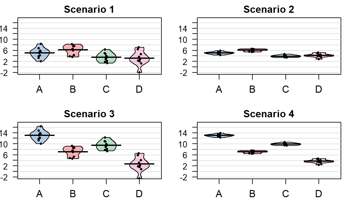
Figure 3.3: Demonstration of different amounts of difference in means relative to variability. Scenarios have the same means in rows and same variance around means in columns of plot. Confidence intervals not reported in the pirate-plots.
The statistic that allows the comparison of relative amounts of variation is called the ANOVA F-statistic. It is developed using sums of squares which are measures of total variation like those that are used in the numerator of the standard deviation (\(\Sigma_1^N(y_i-\bar{y})^2\)) that took all the observations, subtracted the mean, squared the differences, and then added up the results over all the observations to generate a measure of total variability. With multiple groups, we will focus on decomposing that total variability (Total Sums of Squares) into variability among the means (we’ll call this Explanatory Variable \(\mathbf{A}\textbf{'s}\) Sums of Squares) and variability in the residuals or errors (Error Sums of Squares). We define each of these quantities in the One-Way ANOVA situation as follows:
\(\textbf{SS}_{\textbf{Total}} =\) Total Sums of Squares \(= \Sigma^J_{j=1}\Sigma^{n_j}_{i=1}(y_{ij}-\bar{\bar{y}})^2\)
This is the total variation in the responses around the grand mean (\(\bar{\bar{y}}\), the estimated mean for all the observations and available from the mean-only model).
By summing over all \(n_j\) observations in each group, \(\Sigma^{n_j}_{i=1}(\ )\), and then adding those results up across the groups, \(\Sigma^J_{j=1}(\ )\), we accumulate the variation across all \(N\) observations.
Note: this is the residual variation if the null model is used, so there is no further decomposition possible for that model.
This is also equivalent to the numerator of the sample variance, \(\Sigma^{N}_{1}(y_{i}-\bar{y})^2\) which is what you get when you ignore the information on the potential differences in the groups.
\(\textbf{SS}_{\textbf{A}} =\) Explanatory Variable A’s Sums of Squares \(=\Sigma^J_{j=1}\Sigma^{n_j}_{i=1}(\bar{y}_{j}-\bar{\bar{y}})^2 =\Sigma^J_{j=1}n_j(\bar{y}_{j}-\bar{\bar{y}})^2\)
This is the variation in the group means around the grand mean based on the explanatory variable \(A\).
This is also called sums of squares for the treatment, regression, or model.
\(\textbf{SS}_\textbf{E} =\) Error (Residual) Sums of Squares \(=\Sigma^J_{j=1}\Sigma^{n_j}_{i=1}(y_{ij}-\bar{y}_j)^2 = \Sigma^J_{j=1}\Sigma^{n_j}_{i=1}(e_{ij})^2\)
This is the variation in the responses around the group means.
Also called the sums of squares for the residuals, especially when using the second version of the formula, which shows that it is just the squared residuals added up across all the observations.
The possibly surprising result given the mass of notation just presented is that the total sums of squares is ALWAYS equal to the sum of explanatory variable \(A\text{'s}\) sum of squares and the error sums of squares,
\[\textbf{SS}_{\textbf{Total}} \mathbf{=} \textbf{SS}_\textbf{A} \mathbf{+} \textbf{SS}_\textbf{E}.\]
This result is called the sums of squares decomposition formula.
The equality implies that if the \(\textbf{SS}_\textbf{A}\) goes up, then the
\(\textbf{SS}_\textbf{E}\) must go down if \(\textbf{SS}_{\textbf{Total}}\) remains
the same. We use these results to build our test statistic and organize this information in
what is called an ANOVA table.
The ANOVA table is generated using the
anova function applied to the reference-coded model, lm2:
## Analysis of Variance Table
##
## Response: Distance
##             Df  Sum Sq Mean Sq F value    Pr(>F)
## Condition    6   34948  5824.7  6.5081 7.392e-07
## Residuals 5683 5086298   895.0
Note that the ANOVA table has a row labelled Condition, which contains information
for the grouping variable (we’ll generally refer to this as explanatory variable
\(A\) but here it is the outfit group that was randomly assigned), and a row
labeled Residuals, which is synonymous with “Error”. The Sums of Squares
(SS) are available in the Sum Sq column. It doesn’t show a row for “Total” but
the \(\textbf{SS}_{\textbf{Total}} \mathbf{=} \textbf{SS}_\textbf{A} \mathbf{+} \textbf{SS}_\textbf{E} = 5,121,246\).
## [1] 5121246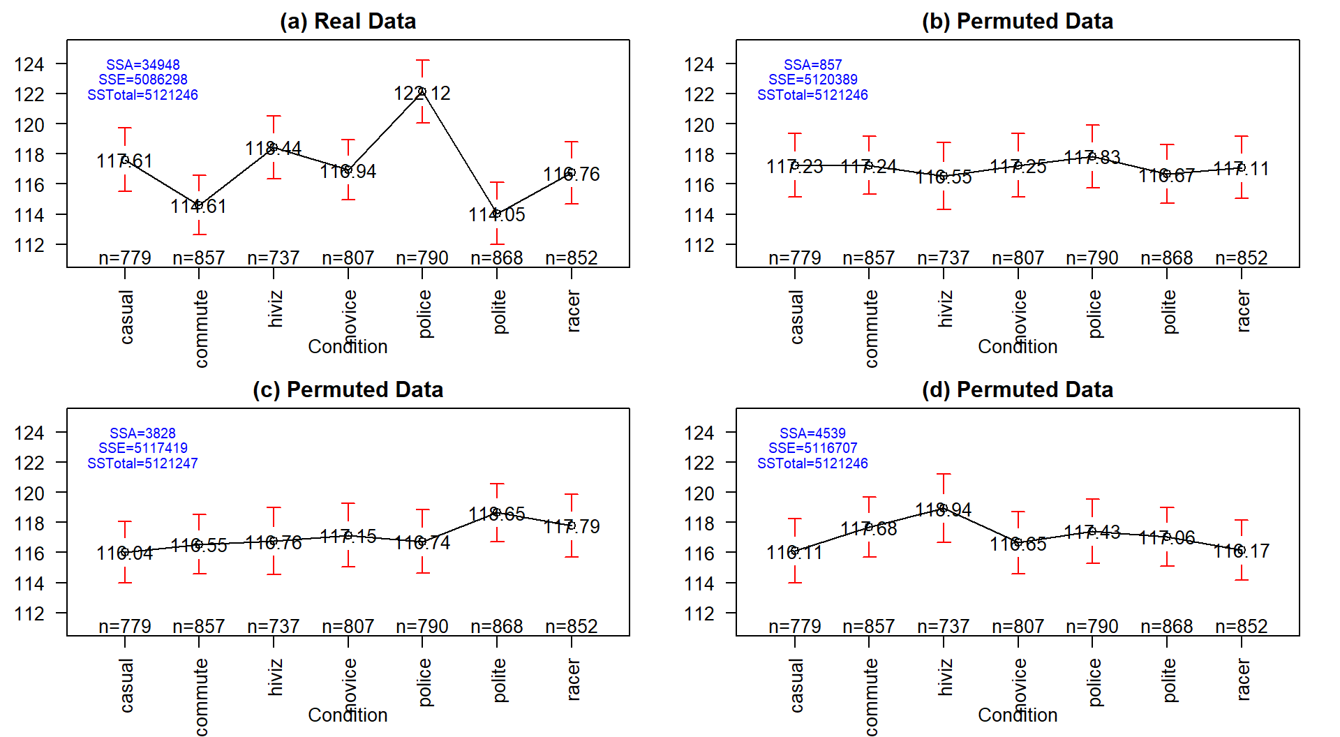
Figure 3.4: Plot of means and 95% confidence intervals for the three groups for the real overtake data (a) and three different permutations of the outfit group labels to the same responses in (b), (c), and (d). Note that SSTotal is always the same but the different amounts of variation associated with the means (SSA) or the errors (SSE) changes in permutation.
It may be easiest to understand the sums of squares decomposition by connecting it to our permutation ideas. In a permutation situation, the total variation (\(SS_\text{Total}\)) cannot change – it is the same responses varying around the same grand mean. However, the amount of variation attributed to variation among the means and in the residuals can change if we change which observations go with which group. In Figure 3.4 (panel a), the means, sums of squares, and 95% confidence intervals for each mean are displayed for the seven groups from the original overtake data. Three permuted versions of the data set are summarized in panels (b), (c), and (d). The \(\text{SS}_A\) is 34948 in the real data set and between 857 and 4539 in the permuted data sets. If you had to pick among the plots for the one with the most evidence of a difference in the means, you hopefully would pick panel (a). This visual “unusualness” suggests that this observed result is unusual relative to the possibilities under permutations, which are, again, the possibilities tied to having the null hypothesis being true. But note that the differences here are not that great between these three permuted data sets and the real one. It is likely that at least some might have selected panel (d) as also looking like it shows some evidence of differences, although the variation in the means in the real data set is clearly more pronounced than in this or the other permutations.
One way to think about \(\textbf{SS}_\textbf{A}\) is that it is a function that converts the variation in the group means into a single value. This makes it a reasonable test statistic in a permutation testing context. By comparing the observed \(\text{SS}_A =\) 34948 to the permutation results of 857, 3828, and 4539 we see that the observed result is much more extreme than the three alternate versions. In contrast to our previous test statistics where positive and negative differences were possible, \(\text{SS}_A\) is always positive with a value of 0 corresponding to no variation in the means. The larger the \(\text{SS}_A\), the more variation there is in the means. The permutation p-value for the alternative hypothesis of some (not of greater or less than!) difference in the true means of the groups will involve counting the number of permuted \(SS_A^*\) results that are as large or larger than what we observed.
To do a permutation test,
we need to be able to calculate and extract the
\(\text{SS}_A\) value. In the ANOVA table, it is the second number in the first row;
we can use the bracket, [,], referencing to extract that
number from the ANOVA table that anova produces with
anova(lm(Distance~Condition, data=dd))[1, 2]. We’ll store the observed value
of \(\text{SS}_A\) in Tobs, reusing some ideas from Chapter 2.
## [1] 34948.43The following code performs the permutations B=1,000 times using the
shuffle function, builds up a vector of results in Tobs, and then makes
a plot of the resulting permutation distribution:
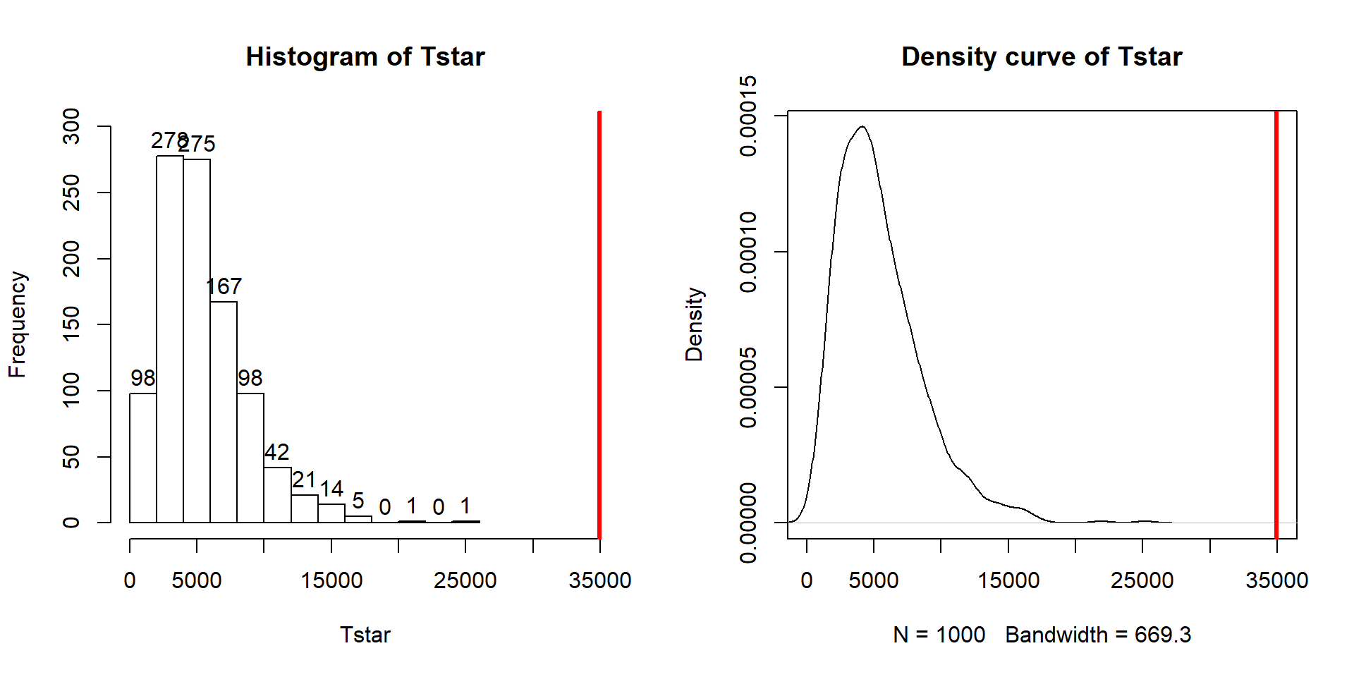
Figure 3.5: Histogram and density curve of permutation distribution of \(\text{SS}_A\) with the observed value of \(\text{SS}_A\) displayed as a bold, vertical line. The proportion of results that are as large or larger than the observed value of \(\text{SS}_A\) provides an estimate of the p-value.
B <- 1000
Tstar <- matrix(NA, nrow=B)
for (b in (1:B)){
  Tstar[b] <- anova(lm(Distance~shuffle(Condition), data=dd))[1,2]
  }
hist(Tstar, labels=T, ylim=c(0,300))
abline(v=Tobs, col="red", lwd=3)
plot(density(Tstar), main="Density curve of Tstar")
abline(v=Tobs, col="red", lwd=3)
The right-skewed distribution (Figure 3.5) contains the
distribution of \(\text{SS}^*_A\text{'s}\) under permutations (where
all the groups are assumed to be equivalent under the null hypothesis). The observed result is larger than all of the \(\text{SS}^*_A\text{'s}\). The proportion
of permuted results that exceed the observed value is found using pdata
as before, except only for the area to the right of the observed result. We know
that Tobs will always be positive so no absolute values are required here.
## [1] 0Because there were no permutations that exceeded the observed value, the p-value should be reported as p-value < 0.001 (less than 1 in 1,000) and not 0. This suggests very strong evidence against the null hypothesis of no difference in the true means. We would interpret this p-value as saying that there is less than a 0.1% chance of getting a \(\text{SS}_A\) as large or larger than we observed, given that the null hypothesis is true.
It ends up that some nice parametric statistical results are available (if our assumptions are met) for the ratio of estimated variances, the estimated variances are called Mean Squares. To turn sums of squares into mean square (variance) estimates, we divide the sums of squares by the amount of free information available. For example, remember the typical variance estimator introductory statistics, \(\Sigma^N_1(y_i-\bar{y})^2/(N-1)\)? Your instructor probably spent some time trying various approaches to explaining why the denominator is the sample size minus 1. The most useful explanation for our purposes moving forward is that we “lose” one piece of information to estimate the mean and there are \(N\) deviations around the single mean so we divide by \(N-1\). The main point is that the sums of squares were divided by something and we got an estimator for the variance, in that situation for the observations overall.
Now consider \(\text{SS}_E = \Sigma^J_{j=1}\Sigma^{n_j}_{i=1}(y_{ij}-\bar{y}_j)^2\) which still has \(N\) deviations but it varies around the \(J\) means, so the
\[\textbf{Mean Square Error} = \text{MS}_E = \text{SS}_E/(N-J).\]
Basically, we lose \(J\) pieces of information in this calculation because we have to estimate \(J\) means. The similar calculation of the Mean Square for variable \(\mathbf{A}\) (\(\text{MS}_A\)) is harder to see in the formula (\(\text{SS}_A = \Sigma^J_{j=1}n_j(\bar{y}_i-\bar{\bar{y}})^2\)), but the same reasoning can be used to understand the denominator for forming \(\text{MS}_A\): there are \(J\) means that vary around the grand mean so
\[\text{MS}_A = \text{SS}_A/(J-1).\]
In summary, the two mean squares are simply:
\(\text{MS}_A = \text{SS}_A/(J-1)\), which estimates the variance of the group means around the grand mean.
\(\text{MS}_{\text{Error}} = \text{SS}_{\text{Error}}/(N-J)\), which estimates the variation of the errors around the group means.
These results are put together using a ratio to define the ANOVA F-statistic (also called the F-ratio) as:
\[F=\text{MS}_A/\text{MS}_{\text{Error}}.\]
If the variability in the means is “similar” to the variability in the residuals, the statistic would have a value around 1. If that variability is similar then there would be no evidence of a difference in the means. If the \(\text{MS}_A\) is much larger than the \(\text{MS}_E\), the \(F\)-statistic will provide evidence against the null hypothesis. The “size” of the \(F\)-statistic is formalized by finding the p-value. The \(F\)-statistic, if assumptions discussed below are not violated and we assume the null hypothesis is true, follows what is called an \(F\)-distribution. The F-distribution is a right-skewed distribution whose shape is defined by what are called the numerator degrees of freedom (\(J-1\)) and the denominator degrees of freedom (\(N-J\)). These names correspond to the values that we used to calculate the mean squares and where in the \(F\)-ratio each mean square was used; \(F\)-distributions are denoted by their degrees of freedom using the convention of \(F\) (numerator df, denominator df). Some examples of different \(F\)-distributions are displayed for you in Figure 3.6.
The characteristics of the F-distribution can be summarized as:
Right skewed,
Nonzero probabilities for values greater than 0,
Its shape changes depending on the numerator DF and denominator DF, and
Always use the right-tailed area for p-values.
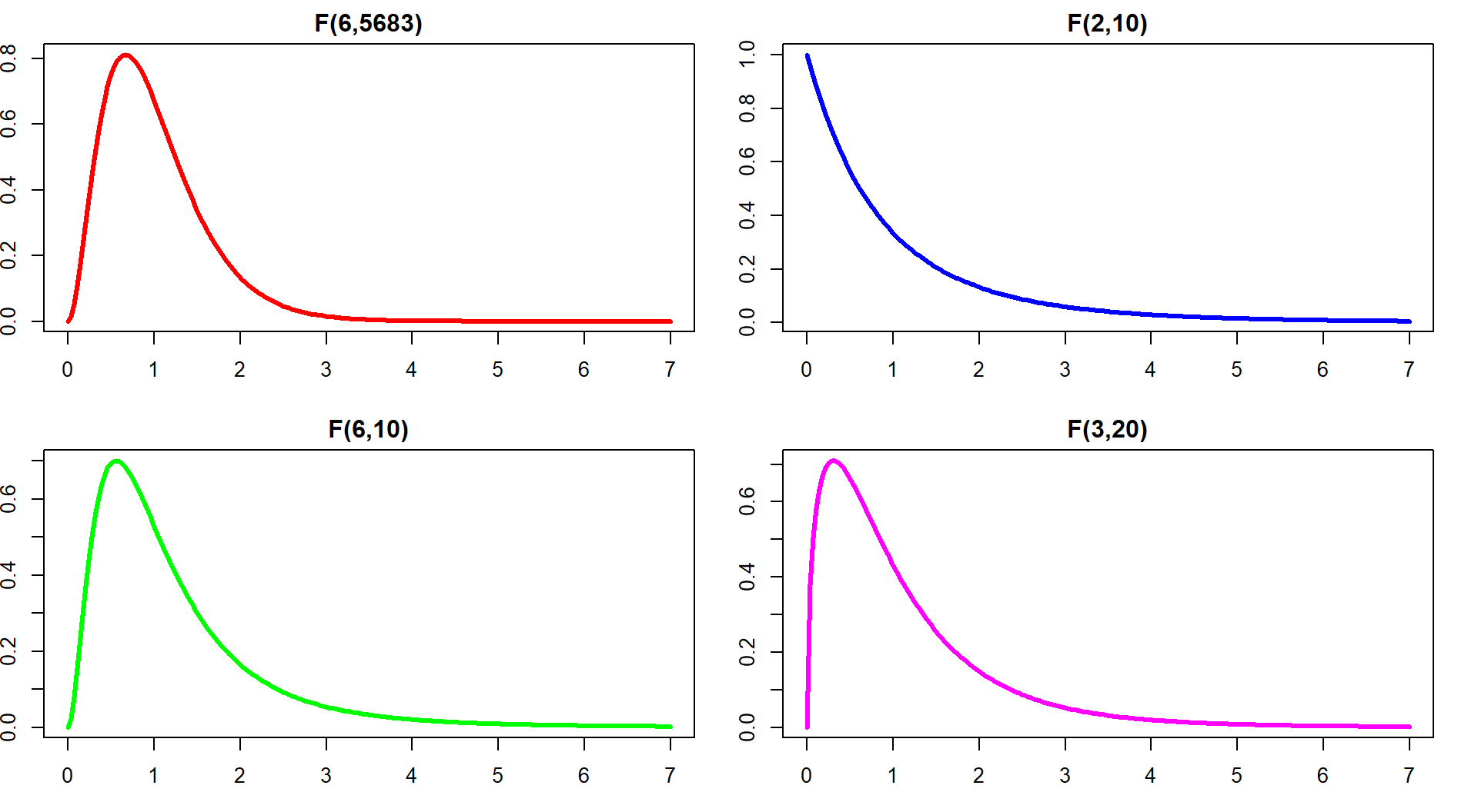
Figure 3.6: Density curves of four different \(F\)-distributions. Upper left is an \(F(6, 5683)\), upper right is \(F(2, 10)\), lower left is \(F(6, 10)\), and lower right is \(F(3, 20)\). P-values are found using the areas to the right of the observed \(F\)-statistic value in all F-distributions.
Now we are ready to discuss an ANOVA table since we know about each of its components. Note the general format of the ANOVA table is in Table 3.253:
| Source | DF | Sums of Squares |
Mean Squares | F-ratio | P-value |
|---|---|---|---|---|---|
| Variable A | \(J-1\) | \(\text{SS}_A\) | \(\text{MS}_A=\text{SS}_A/(J-1)\) | \(F=\text{MS}_A/\text{MS}_E\) | Right tail of \(F(J-1,N-J)\) |
| Residuals | \(N-J\) | \(\text{SS}_E\) | \(\text{MS}_E = \text{SS}_E/(N-J)\) | ||
| Total | \(N-1\) | \(\text{SS}_{\text{Total}}\) |
The table is oriented to help you reconstruct the \(F\)-ratio from each of its
components. The output from R is similar although it does not provide the last row
and sometimes switches the order of columns in different functions we will use. The R version of the table for the type
of outfit effect (Condition) with \(J=7\) levels and \(N=5,690\) observations, repeated
from above, is:
## Analysis of Variance Table
##
## Response: Distance
##             Df  Sum Sq Mean Sq F value       Pr(>F)
## Condition    6   34948  5824.7  6.5081 0.0000007392
## Residuals 5683 5086298   895.0
The p-value from the \(F\)-distribution is 0.0000007 so we can report it54 as a p-value < 0.0001. We can
verify this result using the observed \(F\)-statistic of 6.51
(which came from taking the ratio of the two mean squares,
F=5824.74/895)
which follows an \(F(6, 5683)\) distribution if the null hypothesis is true and some
other assumptions are met. Using the pf function provides us with areas in the
specified \(F\)-distribution with the df1 provided to the function as the
numerator df and df2 as the denominator df and lower.tail=F reflecting
our desire for a right tailed area.
## [1] 0.0000007353832The result from the \(F\)-distribution using this parametric procedure is similar to
the p-value obtained using permutations with the test statistic of the
\(\text{SS}_A\), which was < 0.0001. The \(F\)-statistic obviously is another
potential test statistic to use as a test statistic in a permutation approach,
now that we know about it. We should check that we get similar results from it
with permutations as we did from using \(\text{SS}_A\) as a permutation-test test
statistic. The following code generates the permutation distribution
for the
\(F\)-statistic (Figure 3.7) and assesses how unusual the observed
\(F\)-statistic of 6.51 was in this permutation distribution.
The only change in the code involves moving from extracting \(\text{SS}_A\) to
extracting the \(F\)-ratio which is in the 4th column of the anova
output:
## [1] 6.508071B <- 1000
Tstar <- matrix(NA, nrow=B)
for (b in (1:B)){
Tstar[b] <- anova(lm(Distance~shuffle(Condition), data=dd))[1,4]
}
pdata(Tstar, Tobs, lower.tail=F)[[1]]## [1] 0hist(Tstar, labels=T)
abline(v=Tobs, col="red", lwd=3)
plot(density(Tstar), main="Density curve of Tstar")
abline(v=Tobs, col="red", lwd=3)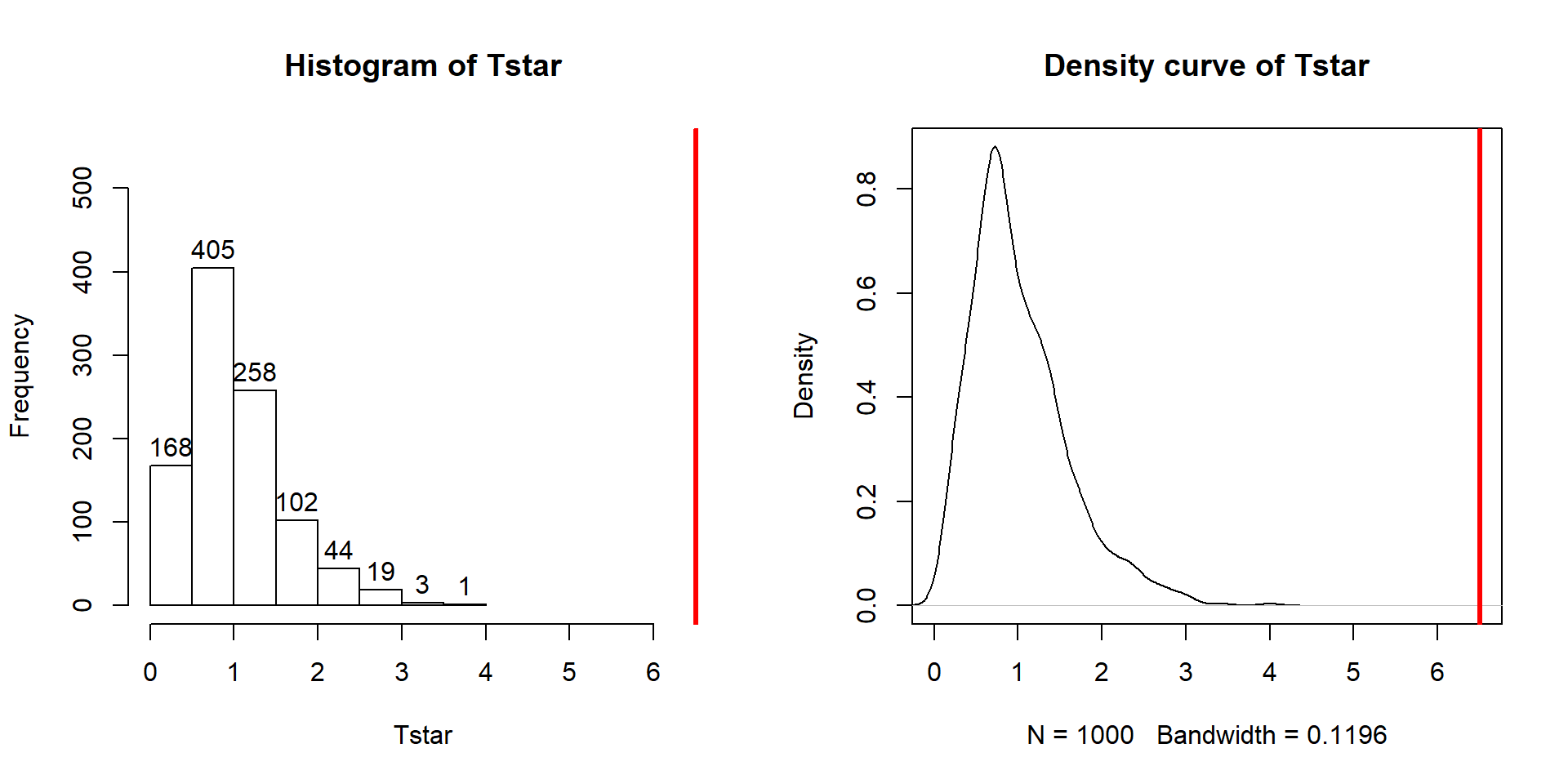
Figure 3.7: Histogram and density curve of the permutation distribution of the F-statistic with bold, vertical line for the observed value of the test statistic of 6.51.
The permutation-based p-value is again at less than 1 in 1,000, which matches the other results closely. The first conclusion is that using a test statistic of either the \(F\)-statistic or the \(\text{SS}_A\) provide similar permutation results. However, we tend to favor using the \(F\)-statistic because it is more commonly used in reporting ANOVA results, not because it is any better in a permutation context .
It is also interesting to compare the permutation distribution for the \(F\)-statistic and the parametric \(F(6, 6583)\) distribution (Figure 3.8). They do not match perfectly but are quite similar. Some the differences around 0 are due to the behavior of the method used to create the density curve and are not really a problem for the methods. The similarity in the two curves explains why both methods would give similar p-value results for almost any test statistic value. In some situations, the correspondence will not be quite so close.
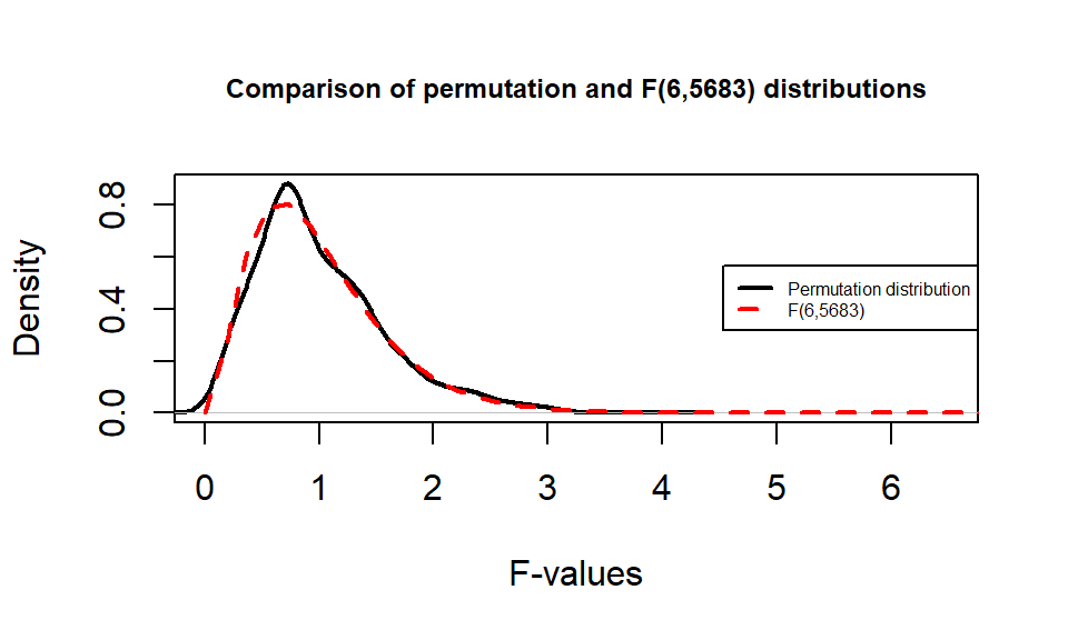
Figure 3.8: Comparison of \(F(6, 6583)\) (dashed line) and permutation distribution (solid line).
So how can we rectify this result (p-value < 0.0001) and the Chapter 2 result that reported moderate evidence against the null hypothesis of no difference between commute and casual with a \(\text{p-value}\approx 0.04\)? I selected the two groups to compare in Chapter 2 because they were somewhat far apart but not too far apart. I could have selected police and polite as they are furthest apart and just focused on that difference. “Cherry-picking” a comparison when many are present, especially one that is most different, without accounting for this choice creates a false sense of the real situation and inflates the Type I error rate because of the selection55. If the entire suite of pairwise comparisons are considered, this result may lose some of its luster. In other words, if we consider the suite of 21 pair-wise differences (and the tests) implicit in comparing all of them, we may need really strong evidence against the null in at least some of the pairs to suggest overall differences. In this situation, the hiviz and casual groups are not that different from each other so their difference does not contribute much to the overall \(F\)-test. In Section 3.6, we will revisit this topic and consider a method that is statistically valid for performing all possible pair-wise comparisons that is also consistent with our overall test results.
3.4 ANOVA model diagnostics including QQ-plots
The requirements for a One-Way ANOVA \(F\)-test are similar to those discussed in Chapter 2, except that there are now \(J\) groups instead of only 2. Specifically, the linear model assumes:
Independent observations,
Equal variances, and
Normal distributions.
For assessing equal variances across the groups, it is best to use plots to assess this. We can use pirate-plots to compare the spreads of the
groups, which were provided in Figure 3.1. The spreads (both in terms of extrema and rest of the distributions) should look relatively similar across the groups for you to suggest that there is not evidence of a
problem with this assumption. You should start with noting how clear or big the
violation of the conditions might be but remember that there will always be some
differences in the variation among groups even if the true variability is exactly
equal in the populations. In addition to our direct plotting, there are some
diagnostic plots available from the lm function that can help us more
clearly assess potential violations of the assumptions.
We can obtain a suite of four diagnostic plots by using the plot function on
any linear model object that we have fit. To get all the plots together in four
panels we need to add the par(mfrow=c(2,2)) command to tell R to make a graph
with 4 panels56.
There are two plots in Figure 3.9 with useful information for assessing the equal variance assumption. The “Residuals vs Fitted” panel in the top left panel displays the residuals \((e_{ij} = y_{ij}-\widehat{y}_{ij})\) on the y-axis and the fitted values \((\widehat{y}_{ij})\) on the x-axis. This allows you to see if the variability of the observations differs across the groups as a function of the mean of the groups, because all the observations in the same group get the same fitted value – the mean of the group. In this plot, the points seem to have fairly similar spreads at the fitted values for the seven groups with fitted values at 114 up to 122 cm. The “Scale-Location” plot in the lower left panel has the same x-axis of fitted values but the y-axis contains the square-root of the absolute value of the standardized residuals. The standardization scales the residuals to have a variance of 1 so help you in other displays to get a sense of how many standard deviations you are away from the mean in the residual distribution. The absolute value transforms all the residuals into a magnitude scale (removing direction) and the square-root helps you see differences in variability more accurately. The visual assessment is similar in the two plots – you want to consider whether it appears that the groups have somewhat similar or noticeably different amounts of variability. If you see a clear funnel shape (narrow (less variability) on the left or right and wide (more variability) at the right or left) in the Residuals vs Fitted and/or an increase or decrease in the height of the upper edge of points in the Scale-Location plot that may indicate a violation of the constant variance assumption. Remember that some variation across the groups is expected, does not suggest a violation of a validity conditions, and means that you can proceed with trusting your inferences, but large differences in the spread are problematic for all the procedures that involve linear models. When discussing these results, you want to discuss how clearly the differences in variation are and whether that shows a clear violation of the condition of equal variance for all observations. Like in hypothesis testing, you can never prove that an assumption is true based on a plot “looking OK”, but you can say that there is no clear evidence that the condition is violated!
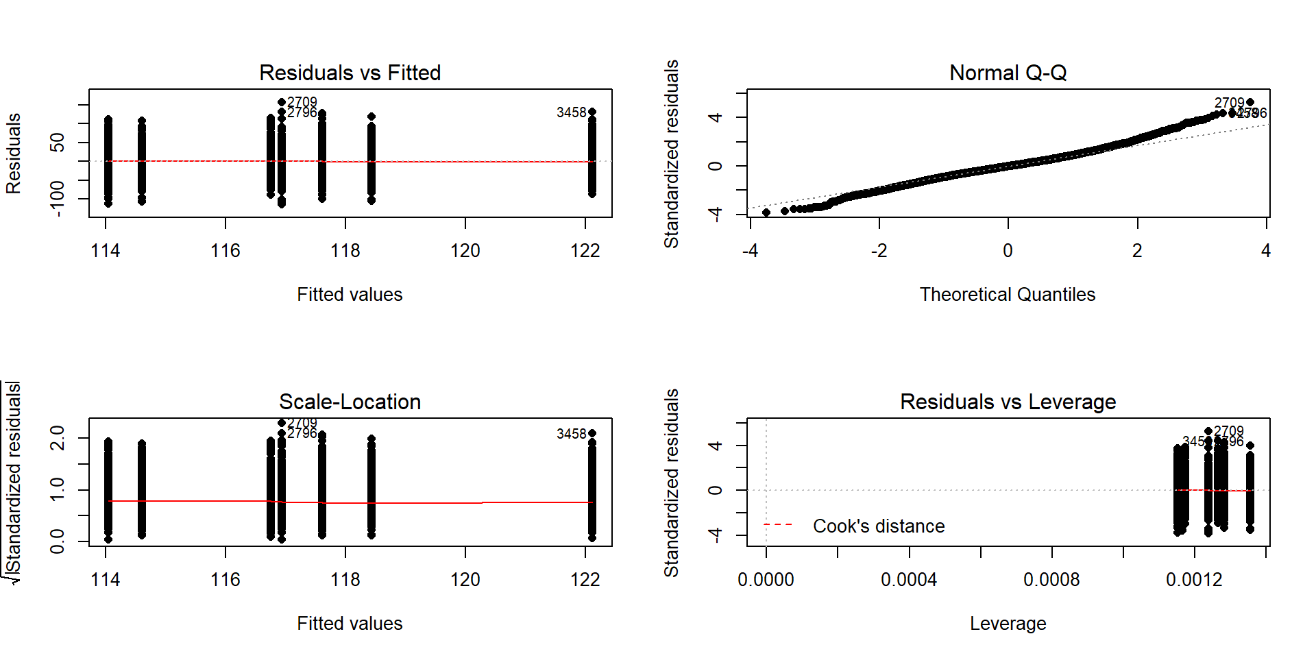
Figure 3.9: Default diagnostic plots for the full overtake data linear model.
The linear model also assumes that all the random errors (\(\varepsilon_{ij}\)) follow a
normal distribution. To gain insight into the validity of this assumption, we
can explore the original observations as displayed in the pirate-plots, mentally
subtracting off the differences in the means and focusing on the shapes of the
distributions of observations in each group. Each group should look approximately normal to avoid a concern on this assumption. These plots are especially good for
assessing whether there is a skew or are outliers present in each group. If either skew or clear outliers are present,
by definition, the normality assumption is violated. But our assumption is
about the distribution of all the errors after removing the differences
in the means and so we want an overall assessment technique to understand how
reasonable our assumption might be overall for our model. The residuals from the entire
model provide us with estimates of the random errors and if the normality
assumption is met, then the residuals all-together should approximately follow a
normal distribution. The Normal QQ-Plot in the upper right panel of
Figure 3.9 also provides a direct visual assessment of how well our
residuals match what we would expect from a normal distribution. Outliers, skew,
heavy and light-tailed aspects of distributions (all violations of normality)
show up in this plot once you learn to read it – which is our next task. To
make it easier to read QQ-plots, it is nice to start with just considering
histograms and/or density plots of the residuals and to see how that maps into
this new display. We can obtain the residuals from the linear model using the
residuals function on any linear model object. Figure 3.10 makes both a histogram and density curve of these residuals. It shows that they have a subtle right skew present (right half of the distribution is a little more spread out than the left, so the skew is to the right) once we accounted for the different means in the groups but there are no apparent outliers.
par(mfrow=c(1,2))
eij <- residuals(lm2)
hist(eij, main="Histogram of residuals")
plot(density(eij), main="Density plot of residuals", ylab="Density",
     xlab="Residuals")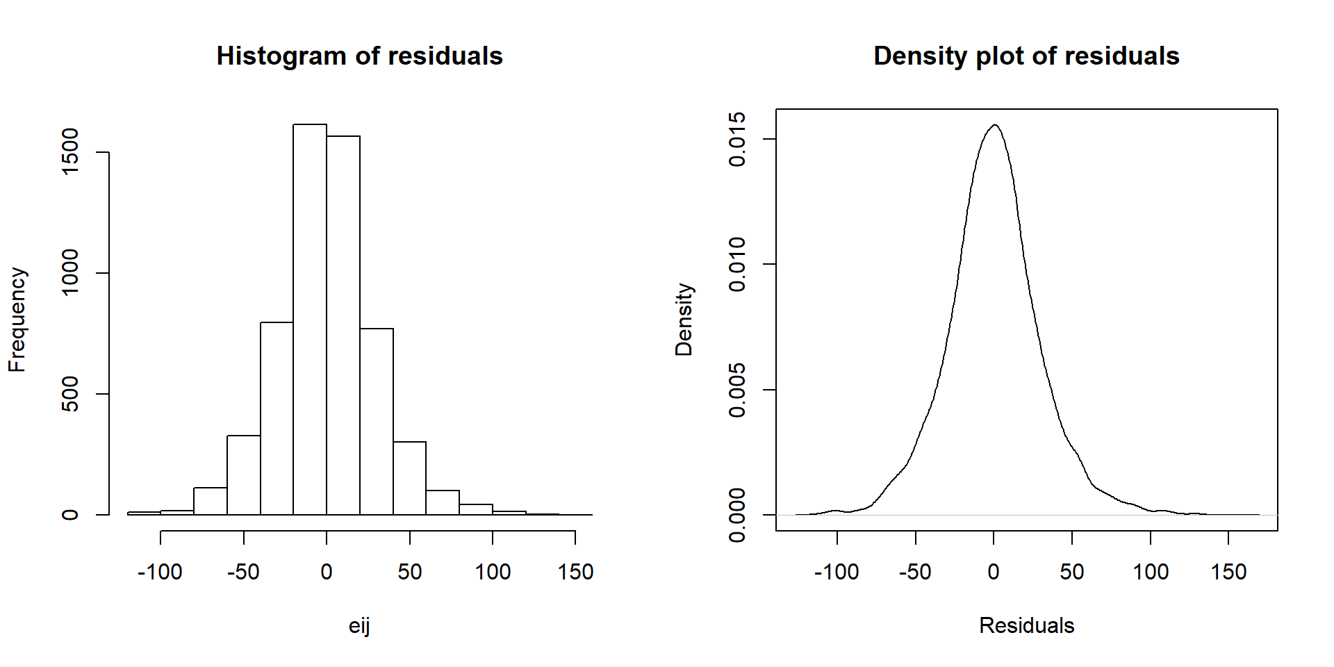
Figure 3.10: Histogram and density curve of the linear model raw residuals from the overtake data linear model.
A Quantile-Quantile plot (QQ-plot) shows the “match” of an observed distribution with a theoretical distribution, almost always the normal distribution. They are also known as Quantile Comparison, Normal Probability, or Normal Q-Q plots, with the last two names being specific to comparing results to a normal distribution. In this version57, the QQ-plots display the value of observed percentiles in the residual distribution on the y-axis versus the percentiles of a theoretical normal distribution on the x-axis. If the observed distribution of the residuals matches the shape of the normal distribution, then the plotted points should follow a 1-1 relationship. If the points follow the displayed straight line then that suggests that the residuals have a similar shape to a normal distribution. Some variation is expected around the line and some patterns of deviation are worse than others for our models, so you need to go beyond saying “it does not match a normal distribution”. It is best to be specific about the type of deviation you are detecting and how clear or obvious that deviation is. And to do that, we need to practice interpreting some QQ-plots.
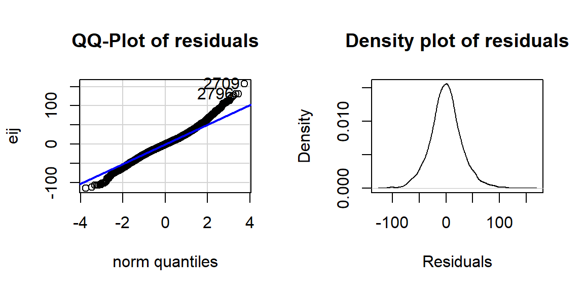
Figure 3.11: QQ-plot of residuals from overtake data linear model.
The QQ-plot of the linear model residuals from Figure 3.9 is extracted and enhanced a little to make Figure 3.11 so we
can just focus on it.
We know from looking at the histogram that this is a
(very) slightly right skewed distribution. Either version of the QQ-plots we will work with place the observed residuals on the y-axis and the expected results for a normal distribution on the x-axis. In some plots, the standardized58 residuals are used (Figure 3.9) and in others the raw residuals are used (Figure 3.11) to compare the residual distribution to a normal one. Both the upper and lower tails (upper tail in the upper right and the lower tail in the lower right of the plot) show some separation from the 1-1 line. The separation in the upper tail is more clear and these positive residuals are higher than the line “predicts” if the distribution had been normal. Being higher than the line in the right tail means being bigger than expected and so more spread out in that direction than a normal distribution should be. The left tail for the negative residuals also shows some separation from the line to have more extreme (here more negative) than expected, suggesting a little extra spread in the lower tail than suggested by a normal distribution. If the two sides had been similarly far from the 1-1 line, then we would have a symmetric and heavy-tailed distribution. Here, the slight difference in the two sides suggests that the right tail is more spread out than the left and we should be concerned about a minor violation of the normality assumption. If the distribution had followed the
normal distribution here, there would be no clear pattern of deviation from the 1-1 line (not all points need to be on the line!) and the standardized residuals would not have quite so many extreme results (over 5 in both tails). Note that the diagnostic plots will label a few points (3 by default) that might be of interest for further exploration. These identifications are not to be used for any other purpose – this is not the software identifying outliers or other problematic points – that is your responsibility to assess using these plots. For example, the point “2709” is identified in Figures 3.9 and 3.11 (the 2709th
observation in the data set) as a potentially interesting point that falls in the far right-tail of positive residuals with a raw residual of almost 160 cm. This is a great opportunity to review what residuals are and how they are calculated for this observation. First, we can extract the row for this observation and find that it was a novice vest observation with a distance of 274 cm (that is almost 9 feet). The fitted value for this observation can be obtained using the fitted function on the estimated lm – which here is just the sample mean of the group of the observations (novice) of 116.94 cm. The residual is stored in the 2,709th value of eij or can be calculated by taking 274 minus the fitted value of 116.94. Given the large magnitude of this passing distance (it was the maximum distance observed in the Distance variable), it is not too surprising that it ends up as the largest positive residual.
## # A tibble: 1 x 2
##   Condition Distance
##   <fct>        <dbl>
## 1 novice 274## 2709
## 116.9405## 2709
## 157.0595## [1] 157.0595Generally, when both tails deviate on the same side of the line (forming a sort of quadratic curve, especially in more extreme cases), that is evidence of a clearly skewed residual distribution (the one above has a very minor skew so this does not occur). To see some different potential shapes in QQ-plots, six different data sets are displayed in Figures 3.12 and 3.13. In each row, a QQ-plot and associated density curve are displayed. If the points form a pattern where all are above the 1-1 line in the lower and upper tails as in Figure 3.12(a), then the pattern is a right skew, more extreme and easy to see than in the previous real data set. If the points form a pattern where they are below the 1-1 line in both tails as in Figure 3.12(c), then the pattern is identified as a left skew. Skewed residual distributions (either direction) are problematic for models that assume normally distributed responses but not necessarily for our permutation approaches if all the groups have similar skewed shapes. The other problematic pattern is to have more spread than a normal curve as in Figure 3.12(e) and (f). This shows up with the points being below the line in the left tail (more extreme negative than expected by the normal) and the points being above the line for the right tail (more extreme positive than the normal predicts). We call these distributions heavy-tailed which can manifest as distributions with outliers in both tails or just a bit more spread out than a normal distribution. Heavy-tailed residual distributions can be problematic for our models as the variation is greater than what the normal distribution can account for and our methods might under-estimate the variability in the results. The opposite pattern with the left tail above the line and the right tail below the line suggests less spread (light-tailed) than a normal as in Figure 3.12(g) and (h). This pattern is relatively harmless and you can proceed with methods that assume normality safely as they will just be a little conservative. For any of the patterns, you would note a potential violation of the normality assumption and then proceed to describe the type of violation and how clear or extreme it seems to be.
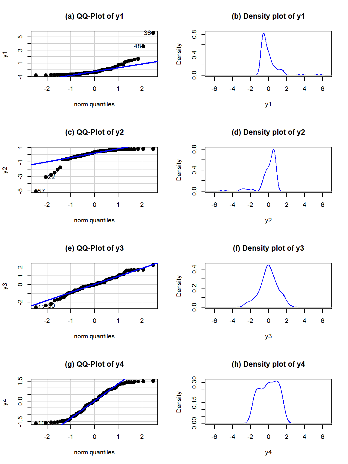
Figure 3.12: QQ-plots and density curves of four simulated distributions with different shapes.
Finally, to help you calibrate expectations for data that are actually normally distributed, two data sets simulated from normal distributions are displayed in Figure 3.13. Note how neither follows the line exactly but that the overall pattern matches fairly well. You have to allow for some variation from the line in real data sets and focus on when there are really noticeable issues in the distribution of the residuals such as those displayed above. Again, you will never be able to prove that you have normally distributed residuals even if the residuals are all exactly on the line, but if you see QQ-plots as in Figure 3.12 you can determine that there is clear evidence of violations of the normality assumption.
Figure 3.13: Two more simulated data sets, both generated from normal distributions.
The last issues with assessing the assumptions in an ANOVA relates to
situations where the methods are more or less resistant59 to violations of assumptions.
In simulation studies of the performance of the \(F\)-test, researchers
have found that the
parametric ANOVA \(F\)-test is more resistant to violations of the assumptions of
the normality and equal variance assumptions if the design is balanced.
A balanced design occurs when each group is measured the same number of
times. The resistance decreases as the data set becomes less balanced, as the
sample sizes in the groups are more different, so having close to balance is
preferred to a more imbalanced situation if there is a choice available. There
is some intuition available here – it makes some sense that you would have better
results in comparing groups if the information available is similar in all the
groups and none are relatively under-represented. We can check the number of
observations in each group to see if they are equal or similar using the
tally function from the mosaic package. This function is useful for
being able to get counts of observations, especially for cross-classifying
observations on two variables that is used in Chapter 5. For just
a single variable, we use tally(~x, data=...):
## Condition
##  casual commute   hiviz  novice  police  polite   racer
##     779     857     737     807     790     868     852
So the sample sizes do vary among the groups and the design is not balanced, but all the sample sizes are between 737 and 868 so it is (in percentage terms at least) not too far from balanced. It is better then having, say, 50 in one group and 1,200 in another. This tells us that the \(F\)-test should have some resistance to violations of assumptions. We also get more resistance to violation of assumptions as our sample sizes increase. With such as large data set here and only minor concerns with the normality assumption, the inferences generated for the means should be trustworthy and we will get similar results from parametric and nonparametric procedures. If we had only 15 observations per group and a slightly skewed residual distribution, then we might want to appeal to the permutation approach to have more trustworthy results, even if the design were balanced.
3.5 Guinea pig tooth growth One-Way ANOVA example
A second example of the One-way ANOVA methods involves a study of length of
odontoblasts (cells that are responsible for tooth growth) in 60 Guinea Pigs
(measured in microns) from Crampton (1947) and is available in base R using data(ToothGrowth). \(N=60\) Guinea Pigs were obtained
from a local breeder and each received one of three dosages (0.5, 1, or
2 mg/day) of Vitamin C via one of two delivery methods, Orange Juice (OJ) or
ascorbic acid (the stuff in vitamin C capsules, called \(\text{VC}\) below) as the source
of Vitamin C in their diets. Each guinea pig was randomly assigned to receive
one of the six different treatment combinations possible
(OJ at 0.5 mg, OJ at 1 mg, OJ at 2 mg, VC at 0.5 mg, VC at 1 mg, and VC at 2 mg).
The animals were treated similarly otherwise and we can assume lived in
separate cages and only one observation was taken for each guinea pig, so we
can assume the observations are independent60. We need to create a variable that
combines the levels of delivery type (OJ, VC) and the dosages (0.5, 1, and 2)
to use our One-Way ANOVA on the six levels. The interaction function can be
used create a new variable that is based on combinations of the levels of other
variables. Here a new variable is created in the ToothGrowth tibble that
we called Treat using the interaction function that provides a six-level grouping variable for our One-Way
ANOVA to compare the combinations of treatments. To get a sense of the pattern of
observations in the data set, the counts in supp (supplement type) and
dose are provided and then the counts in the new categorical explanatory variable, Treat.
data(ToothGrowth) #Available in Base R
library(tibble)
ToothGrowth <- as_tibble(ToothGrowth) #Convert data.frame to tibble
library(mosaic)## supp
## OJ VC
## 30 30## dose
## 0.5 1 2
## 20 20 20#Creates a new variable Treat with 6 levels
ToothGrowth$Treat <- with(ToothGrowth, interaction(supp, dose))
#New variable that combines supplement type and dosage
tally(~Treat, data=ToothGrowth) ## Treat
## OJ.0.5 VC.0.5 OJ.1 VC.1 OJ.2 VC.2
## 10 10 10 10 10 10The tally function helps us to check for balance;
this is a balanced design
because the same number of guinea pigs (\(n_j=10 \text{ for } j=1, 2,\ldots, 6\))
were measured in each treatment combination.
With the variable Treat prepared, the first task is to visualize the results
using pirate-plots61 (Figure 3.14) and generate some summary statistics for
each group using favstats.
##    Treat  min     Q1 median     Q3  max  mean       sd  n missing
## 1 OJ.0.5  8.2  9.700  12.25 16.175 21.5 13.23 4.459709 10       0
## 2 VC.0.5  4.2  5.950   7.15 10.900 11.5  7.98 2.746634 10       0
## 3   OJ.1 14.5 20.300  23.45 25.650 27.3 22.70 3.910953 10       0
## 4   VC.1 13.6 15.275  16.50 17.300 22.5 16.77 2.515309 10       0
## 5   OJ.2 22.4 24.575  25.95 27.075 30.9 26.06 2.655058 10       0
## 6 VC.2 18.5 23.375 25.95 28.800 33.9 26.14 4.797731 10 0pirateplot(len~Treat, data=ToothGrowth, inf.method="ci",
ylab="Odontoblast Growth in microns", point.o=.7)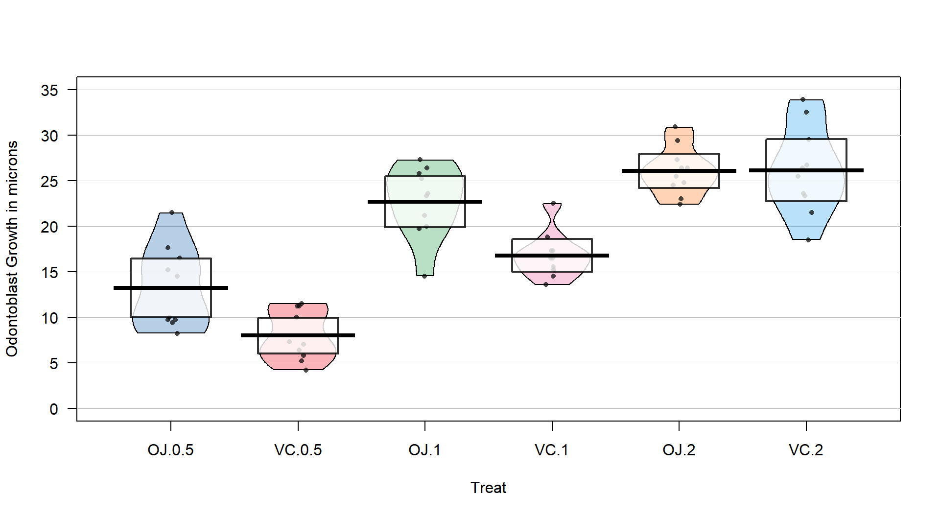
Figure 3.14: Pirate-plot of odontoblast growth responses for the six treatment level combinations.
Figure 3.14 suggests that the mean tooth growth increases with the dosage level and that OJ might lead to higher growth rates than VC except at a dosage of 2 mg/day. The variability around the means looks to be small relative to the differences among the means, so we should expect a small p-value from our \(F\)-test. The design is balanced as noted above (\(n_j=10\) for all six groups) so the methods are some what resistant to impacts from potential non-normality and non-constant variance but we should still assess the patterns in the plots, especially with smaller sample sizes in each group. There is some suggestion of non-constant variance in the plots but this will be explored further below when we can remove the difference in the means and combine all the residuals together. There might be some skew in the responses in some of the groups (for example in OJ.0.5 a right skew may be present and in OJ.1 a left skew) but there are only 10 observations per group so visual evidence of skew in the pirate-plots could be generated by impacts of very few of the observations. This actually highlights an issue with residual explorations: when the sample sizes are small, our assumptions matter more than when the sample sizes are large, but when the sample sizes are small, we don’t have much information to assess the assumptions and come to a clear conclusion.
Now we can apply our 6+ steps for performing a hypothesis test with these observations.
The research question is about differences in odontoblast growth across these combinations of treatments and they seem to have collected data that allow this to explored. A pirate-plot would be a good start to displaying the results and understanding all the combinations of the predictor variable.
Hypotheses:
\(\boldsymbol{H_0: \mu_{\text{OJ}0.5} = \mu_{\text{VC}0.5} = \mu_{\text{OJ}1} = \mu_{\text{VC}1} = \mu_{\text{OJ}2} = \mu_{\text{VC}2}}\)
vs
\(\boldsymbol{H_A:}\textbf{ Not all } \boldsymbol{\mu_j} \textbf{ equal}\)
The null hypothesis could also be written in reference-coding as below since OJ.0.5 is chosen as the baseline group (discussed below).
- \(\boldsymbol{H_0:\tau_{\text{VC}0.5}=\tau_{\text{OJ}1}=\tau_{\text{VC}1}=\tau_{\text{OJ}2}=\tau_{\text{VC}2}=0}\)
The alternative hypothesis can be left a bit less specific:
- \(\boldsymbol{H_A:} \textbf{ Not all } \boldsymbol{\tau_j} \textbf{ equal 0}\) for \(j = 2, \ldots, 6\)
Plot the data and assess validity conditions:
Independence:
This is where the separate cages note above is important. Suppose that there were cages that contained multiple animals and they competed for food or could share illness or levels of activity. The animals in one cage might be systematically different from the others and this “clustering” of observations would present a potential violation of the independence assumption.
If the experiment had the animals in separate cages, there is no clear dependency in the design of the study and we can assume62 that there is no problem with this assumption.
Constant variance:
- There is some indication of a difference in the variability among the groups in the pirate-plots but the sample size was small in each group. We need to fit the linear model to get the other diagnostic plots to make an overall assessment.
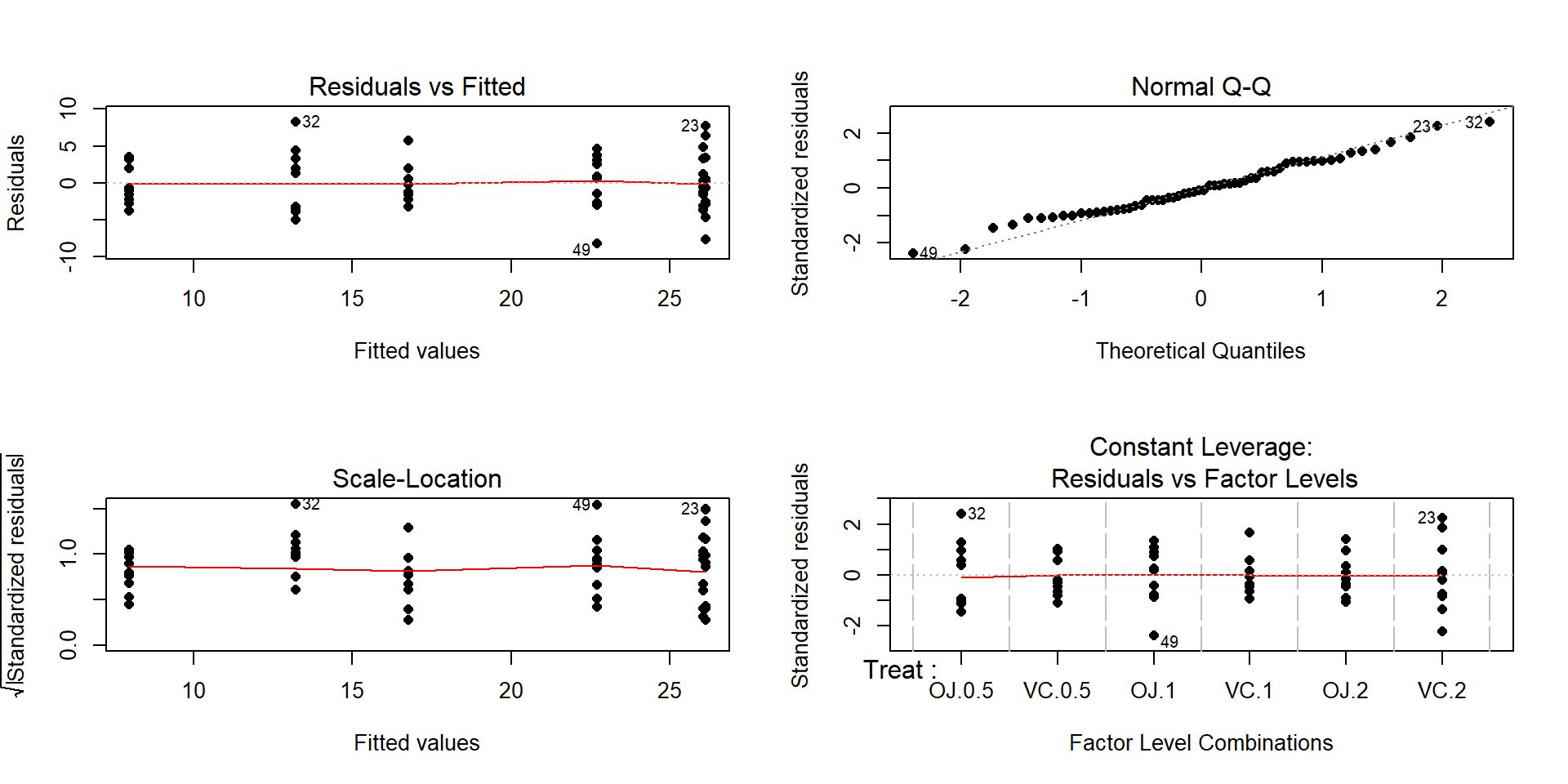
Figure 3.15: Diagnostic plots for the odontoblast growth model.
The Residuals vs Fitted panel in Figure 3.15 shows some difference in the spreads but the spread is not that different among the groups.
The Scale-Location plot also shows just a little less variability in the group with the smallest fitted value but the spread of the groups looks fairly similar in this alternative presentation related to assessing equal variance.
Put together, the evidence for non-constant variance is not that strong and we can proceed comfortably that there is at least not a clear issue with this assumption. Because of the balanced design, we also get a little more resistance to violation of the equal variance assumption.
Normality of residuals:
- The Normal Q-Q plot shows a small deviation in the lower tail but nothing that we wouldn’t expect from a normal distribution. So there is no evidence of a problem with the normality assumption based on the upper right panel of Figure 3.15. Because of the balanced design, we also get a little more resistance to violation of the normality assumption.
Calculate the test statistic and find the p-value:
- The ANOVA table for our model follows, providing an \(F\)-statistic of 41.557:
## Analysis of Variance Table
##
## Response: len
##           Df  Sum Sq Mean Sq F value    Pr(>F)
## Treat      5 2740.10  548.02  41.557 < 2.2e-16
## Residuals 54  712.11   13.19
There are two options here, especially since it seems that our assumptions about variance and normality are not violated (note that we do not say “met” – we just have no clear evidence against them). The parametric and nonparametric approaches should provide similar results here.
The parametric approach is easiest – the p-value comes from the previous ANOVA table as
< 2e-16. First, note that this is in scientific notation that is a compact way of saying that the p-value here is \(2.2*10^{-16}\) or 0.00000000000000022. When you see2.2e-16in R output, it also means that the calculation is at the numerical precision limits of the computer. What R is really trying to report is that this is a very small number. When you encounter p-values that are smaller than 0.0001, you should just report that the p-value < 0.0001. Do not report that it is 0 as this gives the false impression that there is no chance of the result occurring when it is just a really small probability. This p-value came from an \(F(5,54)\) distribution (this is the distribution of the test statistic if the null hypothesis is true) with an \(F\)-statistic of 41.56.The nonparametric approach is not too hard so we can compare the two approaches here as well:
## [1] 41.55718par(mfrow=c(1,2)) B <- 1000 Tstar <- matrix(NA, nrow=B) for (b in (1:B)){ Tstar[b] <- anova(lm(len~shuffle(Treat), data=ToothGrowth))[1,4] } pdata(Tstar, Tobs, lower.tail=F)[[1]]## [1] 0hist(Tstar, xlim=c(0,Tobs+3)) abline(v=Tobs, col="red", lwd=3) plot(density(Tstar), xlim=c(0,Tobs+3), main="Density curve of Tstar") abline(v=Tobs, col="red", lwd=3)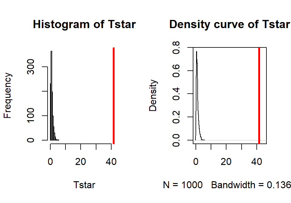
Figure 3.16: Histogram and density curve of permutation distribution for \(F\)-statistic for odontoblast growth data. Observed test statistic in bold, vertical line at 41.56.
- The permutation p-value was reported as 0. This should be reported as p-value < 0.001 since we did 1,000 permutations and found that none of the permuted \(F\)-statistics, \(F^*\), were larger than the observed \(F\)-statistic of 41.56. The permuted results do not exceed 6 as seen in Figure 3.16, so the observed result is really unusual relative to the null hypothesis. As suggested previously, the parametric and nonparametric approaches should be similar here and they were.
Write a conclusion:
There is strong evidence against the null hypothesis that the different treatments (combinations of OJ/VC and dosage levels) have the same true mean odontoblast growth for these guinea pigs, so we would conclude that the treatments cause at least one of the combinations to have a different true mean.
We can make the causal statement of the treatment causing differences because the treatments were randomly assigned but these inferences only apply to these guinea pigs since they were not randomly selected from a larger population.
Remember that we are making inferences to the population or true means and not the sample means and want to make that clear in any conclusion. When there is not a random sample from a population it is more natural to discuss the true means since we can’t extend to the population values.
The alternative is that there is some difference in the true means – be sure to make the wording clear that you aren’t saying that all the means differ. In fact, if you look back at Figure 3.14, the means for the 2 mg dosages look almost the same so we will have a tough time arguing that all groups differ. The \(F\)-test is about finding evidence of some difference somewhere among the true means. The next section will provide some additional tools to get more specific about the source of those detected differences and allow us to get at estimates of the differences we observed to complete our interpretation.
Discuss size of differences:
It appears that increasing dose levels are related to increased odontoblast growth and that the differences in dose effects change based on the type of delivery method. The difference between 7 and 26 microns for the average length of the cells could be quite interesting to the researchers. This result is harder for me to judge and likely for you than the average distances of cars to bikes but the differences could be very interesting to these researchers.
The “size” discussion can be further augmented by estimated pair-wise differences using methods discussed below.
Scope of inference:
We can make a causal statement of the treatment causing differences in the responses because the treatments were randomly assigned but these inferences only apply to these guinea pigs since they were not randomly selected from a larger population.
- Remember that we are making inferences to the population or true means and not the sample means and want to make that clear. When there is not a random sample from a population it is often more natural to discuss the true means since we can’t extend the results to the population values.
Before we leave this example, we should revisit our model estimates and
interpretations. The default model parameterization uses reference-coding.
Running the model summary function on m2 provides the estimated
coefficients:
##             Estimate Std. Error   t value     Pr(>|t|)
## (Intercept)    13.23   1.148353 11.520847 3.602548e-16
## TreatVC.0.5    -5.25   1.624017 -3.232726 2.092470e-03
## TreatOJ.1       9.47   1.624017  5.831222 3.175641e-07
## TreatVC.1       3.54   1.624017  2.179781 3.365317e-02
## TreatOJ.2      12.83   1.624017  7.900166 1.429712e-10
## TreatVC.2      12.91   1.624017  7.949427 1.190410e-10
For some practice with the reference-coding used in these models, let’s find
the estimates (fitted values) for observations for a couple of the groups. To work with the
parameters, you need to start with determining the baseline category that was
used by considering which level is not displayed in the output. The
levels function can list the groups in a categorical variable and their
coding in the data set. The first level is usually the baseline category but
you should check this in the model summary as well.
## [1] "OJ.0.5" "VC.0.5" "OJ.1" "VC.1" "OJ.2" "VC.2"There is a VC.0.5 in the second row of the model summary, but there is no row for
0J.0.5 and so this must be the baseline category. That means that the fitted value
or model estimate for the OJ at 0.5 mg/day group is the same as the (Intercept) row
or \(\widehat{\alpha}\), estimating a mean tooth growth of 13.23 microns when the pigs get OJ
at a 0.5 mg/day dosage level. You should always start with working on the baseline level
in a reference-coded model. To get estimates for any other group, then you can use the
(Intercept) estimate and add the deviation (which could be negative) for the group of interest. For
VC.0.5, the estimated mean tooth growth is
\(\widehat{\alpha} + \widehat{\tau}_2 = \widehat{\alpha} + \widehat{\tau}_{\text{VC}0.5}=13.23 + (-5.25)=7.98\)
microns. It is also potentially interesting to directly interpret the estimated difference
(or deviation) between OJ.0.5 (the baseline) and VC.0.5 (group 2) that
is \(\widehat{\tau}_{\text{VC}0.5}= -5.25\): we estimate that the mean tooth growth in
VC.0.5 is 5.25 microns shorter than it is in OJ.0.5. This and many other
direct comparisons of groups are likely of interest to researchers involved in
studying the impacts of these supplements on tooth growth and the next section
will show us how to do that (correctly!).
The reference-coding is still going to feel a little uncomfortable so the comparison
to the cell means model and exploring the effect plot can help to reinforce
that both models patch together the same estimated means for each group. For
example, we can find our estimate of 7.98 microns for the VC0.5 group in the
output and Figure 3.17. Also note that Figure
3.17 is the same whether you plot the results from
m2 or m3.
##
## Call:
## lm(formula = len ~ Treat - 1, data = ToothGrowth)
##
## Residuals:
##    Min     1Q Median     3Q    Max
##  -8.20  -2.72  -0.27   2.65   8.27
##
## Coefficients:
##             Estimate Std. Error t value Pr(>|t|)
## TreatOJ.0.5   13.230      1.148  11.521 3.60e-16
## TreatVC.0.5    7.980      1.148   6.949 4.98e-09
## TreatOJ.1     22.700      1.148  19.767  < 2e-16
## TreatVC.1     16.770      1.148  14.604  < 2e-16
## TreatOJ.2     26.060      1.148  22.693  < 2e-16
## TreatVC.2     26.140      1.148  22.763  < 2e-16
##
## Residual standard error: 3.631 on 54 degrees of freedom
## Multiple R-squared:  0.9712, Adjusted R-squared:  0.968
## F-statistic:   303 on 6 and 54 DF,  p-value: < 2.2e-16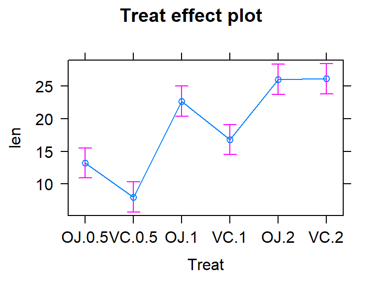
Figure 3.17: Effect plot of the One-Way ANOVA model for the odontoblast growth data.
3.6 Multiple (pair-wise) comparisons using Tukey’s HSD and the compact letter display
With evidence that the true means are likely not all equal, many researchers want to explore which groups show evidence of differing from one another. This provides information on the source of the overall difference that was detected and detailed information on which groups differed from one another. Because this is a shot-gun/unfocused sort of approach, some people think it is an over-used procedure. Others feel that it is an important method of addressing detailed questions about group comparisons in a valid and safe way. For example, we might want to know if OJ is different from VC at the 0.5 mg/day dosage level and these methods will allow us to get an answer to this sort of question. It also will test for differences between the OJ.0.5 and VC.2 groups and every other pair of levels that you can construct (15 total!). This method actually takes us back to the methods in Chapter 2 where we compared the means of two groups except that we need to deal with potentially many pair-wise comparisons, making an adjustment to account for that inflation in Type I errors that occurs due to many tests being performed at the same time. A commonly used method to make all the pair-wise comparisons that includes a correction for doing this is called Tukey’s Honest Significant Difference (Tukey’s HSD) method63. The name suggests that not using it could lead to a dishonest answer and that it will give you an honest result. It is more that if you don’t do some sort of correction for all the tests you are performing, you might find some spurious64 results. There are other methods that could be used to do a similar correction and also provide “honest” inferences; we are just going to learn one of them. Tukey’s method employs a different correction from the Bonferroni method discussed in Chapter 2 but also controls the family-wise error rate across all the pairs being compared.
In pair-wise comparisons between all the pairs of means in a One-Way ANOVA, the number of
tests is based on the number of pairs. We can calculate the number of tests using
\(J\) choose 2, \(\begin{pmatrix}J\\2\end{pmatrix}\), to get the number of unique pairs of
size 2 that we can make out of \(J\) individual treatment levels. We don’t need to
explore the combinatorics formula for this, as the choose function in R can give us the
answers:
## [1] 3## [1] 6## [1] 10## [1] 15## [1] 21So if you have three groups (the smallest number where we have to worry about more than one pair), there are three unique pairs to compare. For six groups, like in the Guinea Pig study, we have to consider 15 tests to compare all the unique pairs of groups and with seven groups, there are 21 tests. Once there are more than two groups to compare, it seems like we should be worried about inflated family-wise error rates. Fortunately, the Tukey’s HSD method controls the family-wise error rate at your specified level (say 0.05) across any number of pair-wise comparisons. This means that the overall rate of at least one Type I error across all the tests is controlled at the specified significance level, often 5%. To do this, each test must use a slightly more conservative cut-off than if just one test is performed and the procedure helps us figure out how much more conservative we need to be.
Tukey’s HSD starts with focusing on the difference between the groups with the largest and smallest means (\(\bar{y}_{max}-\bar{y}_{min}\)). If \((\bar{y}_{max}-\bar{y}_{min}) \le \text{Margin of Error}\) for the difference in the means, then all other pairwise differences, say \(\vert \bar{y}_j - \bar{y}_{j'}\vert\), for two groups \(j\) and \(j'\), will be less than or equal to that margin of error. This also means that any confidence intervals for any difference in the means will contain 0. Tukey’s HSD selects a critical value so that (\(\bar{y}_{max}-\bar{y}_{min}\)) will be less than the margin of error in 95% of data sets drawn from populations with a common mean. This implies that in 95% of data sets in which all the population means are the same, all confidence intervals for differences in pairs of means will contain 0. Tukey’s HSD provides confidence intervals for the difference in true means between groups \(j\) and \(j'\), \(\mu_j-\mu_{j'}\), for all pairs where \(j \ne j'\), using
\[(\bar{y}_j - \bar{y}_{j'}) \mp \frac{q^*}{\sqrt{2}}\sqrt{\text{MS}_E\left(\frac{1}{n_j}+ \frac{1}{n_{j'}}\right)}\]
where
\(\frac{q^*}{\sqrt{2}}\sqrt{\text{MS}_E\left(\frac{1}{n_j}+\frac{1}{n_{j'}}\right)}\)
is the margin of error for the intervals. The distribution used
to find the multiplier, \(q^*\), for the confidence intervals is available in the
qtukey function and generally provides a slightly larger multiplier than the
regular \(t^*\) from our two-sample \(t\)-based confidence interval discussed in
Chapter 2. The formula otherwise is very similar to the one used in Chapter 2 with the SE for the difference in the means based on a measure of residual variance (here \(MS_E\)) times \(\left(\frac{1}{n_j}+\frac{1}{n_{j'}}\right)\) which weights the results based on the relative sample sizes in the groups.
We will use the confint, cld, and plot functions
applied to output from the glht function (all from the multcomp package;
Hothorn, Bretz, and Westfall (2008), (Hothorn, Bretz, and Westfall 2019)) to get the required comparisons from our
ANOVA model.
Unfortunately, its code format is a little complicated – but there are
just two places to modify the code: include the model name and after mcp
(stands for multiple comparison procedure) in the linfct option, you need to include the
explanatory variable name as VARIABLENAME="Tukey". The last part is to get the
Tukey HSD multiple comparisons run on our explanatory variable65. Once we obtain the
intervals using the confint function or using plot applied to the stored results, we can use them to test \(H_0: \mu_j = \mu_{j'} \text{ vs } H_A: \mu_j \ne \mu_{j'}\)
by assessing whether 0 is in the confidence interval for each pair. If 0 is in the
interval, then there is weak evidence against the null hypothesis for that pair, so we do not detect a difference in that pair and do not conclude that there is a difference. If 0 is not in the
interval, then we have strong evidence against \(H_0\) for that pair, detect a difference, and conclude that there is a difference in that pair at the specified family-wise significance
level. You will see a switch to using the
word “detection” to describe null hypotheses that we find strong evidence against as it
can help to compactly write up these complicated results. The following code provides the numerical
and graphical66 results of applying Tukey’s HSD
to the linear model for the Guinea Pig data:
##
##   Simultaneous Confidence Intervals
##
## Multiple Comparisons of Means: Tukey Contrasts
##
##
## Fit: lm(formula = len ~ Treat, data = ToothGrowth)
##
## Quantile = 2.955
## 95% family-wise confidence level
##
##
## Linear Hypotheses:
##                      Estimate lwr      upr
## VC.0.5 - OJ.0.5 == 0  -5.2500 -10.0490  -0.4510
## OJ.1 - OJ.0.5 == 0     9.4700   4.6710  14.2690
## VC.1 - OJ.0.5 == 0     3.5400  -1.2590   8.3390
## OJ.2 - OJ.0.5 == 0    12.8300   8.0310  17.6290
## VC.2 - OJ.0.5 == 0    12.9100   8.1110  17.7090
## OJ.1 - VC.0.5 == 0    14.7200   9.9210  19.5190
## VC.1 - VC.0.5 == 0     8.7900   3.9910  13.5890
## OJ.2 - VC.0.5 == 0    18.0800  13.2810  22.8790
## VC.2 - VC.0.5 == 0    18.1600  13.3610  22.9590
## VC.1 - OJ.1 == 0      -5.9300 -10.7290  -1.1310
## OJ.2 - OJ.1 == 0       3.3600  -1.4390   8.1590
## VC.2 - OJ.1 == 0       3.4400  -1.3590   8.2390
## OJ.2 - VC.1 == 0       9.2900   4.4910  14.0890
## VC.2 - VC.1 == 0       9.3700   4.5710  14.1690
## VC.2 - OJ.2 == 0       0.0800  -4.7190   4.8790
Figure 3.18: Graphical display of pair-wise comparisons from Tukey’s HSD for the Guinea Pig data. Any confidence intervals that do not contain 0 provide strong evidence against the null hypothesis of no difference in the true means for that pair of groups.
Figure 3.18 contains confidence intervals for the difference in
the means for all 15 pairs of groups. For example, the first row in the plot contains
the confidence interval for comparing VC.0.5 and OJ.0.5 (VC.0.5 minus OJ.0.5). In the numerical output, you can find that this 95%
family-wise confidence interval goes from -10.05 to -0.45 microns (lwr and
upr in the numerical output provide the CI endpoints). This interval does not
contain 0 since its upper end point is -0.45 microns and so we can now say that
there is strong evidence against the null hypothesis of no difference in this pair and that we detect that OJ and VC have different true mean growth rates at the 0.5 mg
dosage level. We can go further and say that we are 95% confident that the difference
in the true mean tooth growth between VC.0.5 and OJ.0.5 (VC.0.5-OJ.0.5) is between
-10.05 and -0.45 microns, after adjusting for comparing all the pairs of groups. The center of this CI is -5.25 which is \(\widehat{\tau}_2\) and the estimate difference between VC.0.5 and the baseline category of OJ.0.5. That means we can get an un-adjusted 95% confidence interval from the confint function to compare to this adjusted CI. The interval that does not account for all the comparisons goes from -8.51 to -1.99 microns (second row out confint output), showing the increased width needed in Tukey’s interval to control the family-wise error rate when many pairs are being compared. With 14 other intervals, we obviously can’t give them all this much attention…
##                  2.5 %    97.5 %
## (Intercept) 10.9276907 15.532309
## TreatVC.0.5 -8.5059571 -1.994043
## TreatOJ.1    6.2140429 12.725957
## TreatVC.1    0.2840429  6.795957
## TreatOJ.2    9.5740429 16.085957
## TreatVC.2    9.6540429 16.165957
If you put all these pair-wise tests together, you can generate an overall interpretation of Tukey’s HSD results that discusses sets of groups that are not detectably different from one another and those groups that were distinguished from other sets of groups. To do this, start with listing out the groups that are not detectably different (CIs contain 0), which, here, only occurs for four of the pairs. The CIs that contain 0 are for the pairs VC.1 and OJ.0.5, OJ.2 and OJ.1, VC.2 and OJ.1, and, finally, VC.2 and OJ.2. So VC.2, OJ.1, and OJ.2 are all not detectably different from each other and VC.1 and OJ.0.5 are also not detectably different. If you look carefully, VC.0.5 is detected as different from every other group. So there are basically three sets of groups that can be grouped together as “similar”: VC.2, OJ.1, and OJ.2; VC.1 and OJ.0.5; and VC.0.5. Sometimes groups overlap with some levels not being detectably different from other levels that belong to different groups and the story is not as clear as it is in this case. An example of this sort of overlap is seen in the next section.
There is a method that many researchers use to more efficiently generate and
report these sorts of results that is called a compact letter display
(CLD, Piepho (2004))67. The cld function can be applied to the results from
glht to generate the CLD that we can use to provide a “simple” summary of
the sets of groups. In this discussion, we define a set as a union of different
groups that can contain one or more members and the member of these groups are
the different treatment levels.
## OJ.0.5 VC.0.5   OJ.1   VC.1   OJ.2   VC.2
##    "b"    "a"    "c"    "b"    "c"    "c"
Groups with the same letter are not detectably different (are in the same set) and groups that are detectably different get different letters (are in different sets). Groups can have more than one letter to reflect “overlap” between the sets of groups and sometimes a set of groups contains only a single treatment level (VC.0.5 is a set of size 1). Note that if the groups have the same letter, this does not mean they are the same, just that there is insufficient evidence to declare a difference for that pair. If we consider the previous output for the CLD, the “a” set contains VC.0.5, the “b” set contains OJ.0.5 and VC.1, and the “c” set contains OJ.1, OJ.2, and VC.2. These are exactly the groups of treatment levels that we obtained by going through all fifteen pairwise results.
One benefit of this work is that the CLD letters can be added to a plot (such as the pirate-plot) to
help fully report the results and understand the sorts of differences Tukey’s
HSD detected. The code with text involves placing text on the figure. In the text function, the x and y axis locations are specified (x-axis goes from 1 to 6 for the 6 categories) as well as the text to add (the CLD here). Some trial and error for locations may be needed to get the letters to be easily seen in a given pirate-plot. Figure 3.19 enhances the discussion by showing that the
“a” group with VC.0.5 had the lowest average tooth
growth, the “b” group had intermediate tooth growth
for treatments OJ.0.5 and VC.1, and the highest growth rates came from
OJ.1, OJ.2, and VC.2. Even though VC.2 had the highest average growth rate,
we are not able to prove that its true mean is any higher
than the other groups labeled with “c”. Hopefully the
ease of getting to the story of the Tukey’s HSD results from a plot like this
explains why it is common to report results using these methods instead of
reporting 15 confidence intervals for all the pair-wise differences, either in a table or the plot.
#Options theme=2,inf.f.o = 0,point.o = .5 added to focus on CLD
pirateplot(len~Treat, data=ToothGrowth, ylab="Growth (microns)", inf.method="ci",
           theme=2,inf.f.o = 0,point.o = .5)
text(x=2,y=10,"a",col="blue",cex=1.5) #CLD added
text(x=c(1,4),y=c(15,18),"b",col="red",cex=1.5)
text(x=c(3,5,6),y=c(25,28,28),"c",col="green",cex=1.5)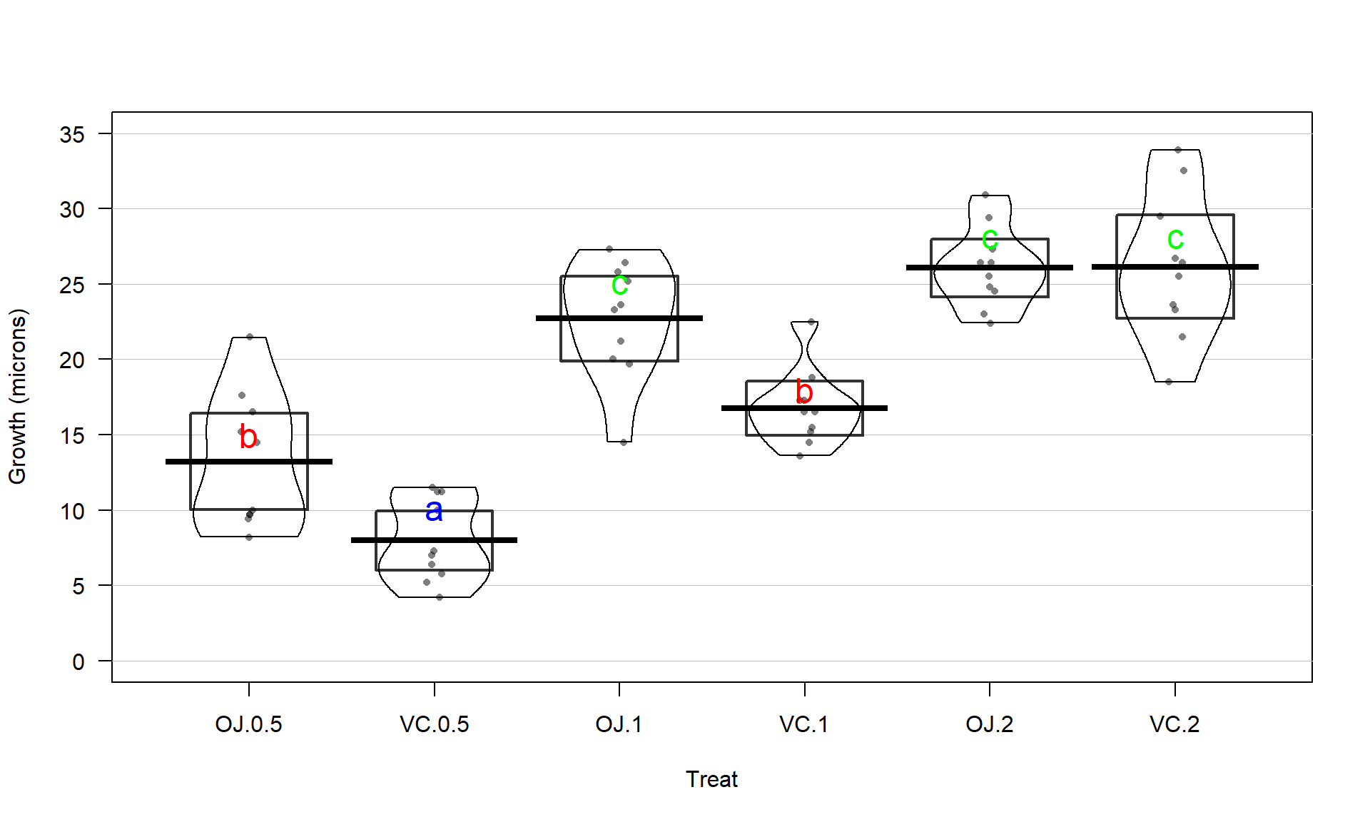
Figure 3.19: Pirate-plot of odontoblast growth by group with Tukey’s HSD compact letter display. Note some extra pirate-plot options are used to enhance focus on the CLD results.
There are just a couple of other details to mention on this set of methods. First,
note that we interpret the set of confidence intervals simultaneously: We are
95% confident that ALL the intervals contain the respective differences in
the true means (this is a family-wise interpretation). These intervals are
adjusted from our regular two-sample \(t\) intervals that came from lm from Chapter 2
to allow this stronger interpretation. Specifically,
they are wider. Second, if sample sizes are unequal in the groups, Tukey’s HSD
is conservative and provides a family-wise error rate that is lower than the
nominal (or specified) level. In other words, it fails less often than expected
and the intervals provided are a little wider than needed, containing all the
pairwise differences at higher than the nominal confidence level of (typically)
95%. Third, this is a parametric approach and violations of normality and
constant variance will push the method in the other direction, potentially
making the technique dangerously liberal. Nonparametric approaches to this
problem are also possible, but will not be considered here.
Tukey’s HSD results can also be displayed as p-values for each pair-wise test result. This is a little less common but can allow you to directly assess the strength of evidence for a particular pair instead of using the detected/not result that the family-wise CIs provide. But the family-wise CIs are useful for exploring the size of the differences in the pairs and we need to simplify things to detect/not in these situations because there are so many tests. But if you want to see the Tukey HSD p-values, you can use
##
##   Simultaneous Tests for General Linear Hypotheses
##
## Multiple Comparisons of Means: Tukey Contrasts
##
##
## Fit: lm(formula = len ~ Treat, data = ToothGrowth)
##
## Linear Hypotheses:
##                      Estimate Std. Error t value Pr(>|t|)
## VC.0.5 - OJ.0.5 == 0   -5.250      1.624  -3.233  0.02424
## OJ.1 - OJ.0.5 == 0      9.470      1.624   5.831  < 0.001
## VC.1 - OJ.0.5 == 0      3.540      1.624   2.180  0.26411
## OJ.2 - OJ.0.5 == 0     12.830      1.624   7.900  < 0.001
## VC.2 - OJ.0.5 == 0     12.910      1.624   7.949  < 0.001
## OJ.1 - VC.0.5 == 0     14.720      1.624   9.064  < 0.001
## VC.1 - VC.0.5 == 0      8.790      1.624   5.413  < 0.001
## OJ.2 - VC.0.5 == 0     18.080      1.624  11.133  < 0.001
## VC.2 - VC.0.5 == 0     18.160      1.624  11.182  < 0.001
## VC.1 - OJ.1 == 0       -5.930      1.624  -3.651  0.00739
## OJ.2 - OJ.1 == 0        3.360      1.624   2.069  0.31868
## VC.2 - OJ.1 == 0        3.440      1.624   2.118  0.29372
## OJ.2 - VC.1 == 0        9.290      1.624   5.720  < 0.001
## VC.2 - VC.1 == 0        9.370      1.624   5.770  < 0.001
## VC.2 - OJ.2 == 0        0.080      1.624   0.049  1.00000
## (Adjusted p values reported -- single-step method)
These reinforce the strong evidence for many of the pairs and less strong evidence for four pairs that were not detected to be different. So these p-values provide another method to employ to report the Tukey’s HSD results – you would only need to report and explore the confidence intervals or the p-values, not both.
Tukey’s HSD does not require you to find a small p-value from your overall \(F\)-test to employ the methods but if you apply it to situations with p-values larger than your a priori significance level, you are unlikely to find any pairs that are detected as being different. Some statisticians suggest that you shouldn’t employ follow-up tests such as Tukey’s HSD when there is not sufficient evidence to reject the overall null hypothesis.
3.7 Pair-wise comparisons for the Overtake data
In our previous work with the overtake data, the overall ANOVA test
led to a conclusion that there is some difference in the true means across the
seven groups with a p-value < 0.001 giving very strong evidence against the null hypothesis. The original authors followed up their overall \(F\)-test with comparing every pair of outfits using one of the other methods for multiple testing adjustments available in the p.adjust function and detected differences between the police outfit and all others except for hiviz and no other pairs had p-values less than 0.05 using their approach. We will employ the Tukey’s HSD approach to address the same exploration and get basically the same results as they obtained.
The code is similar68 to the previous example focusing on the Condition variable for the 21 pairs to compare. To make these results easier to read and generally to make all the results with seven groups easier to understand, we can sort the levels of the explanatory based on the values in the response, using something like the the means or medians of the responses for the groups. This does not change the analyses (the \(F\)-statistic and all pair-wise comparisons are the same), it just sorts them to be easier to discuss. Note that it might change the baseline group so would impact the reference-coded model even though the fitted values are the same. Specifically, we can use the reorder function based on the mean using something like reorder(FACTORVARIABLE, RESPONSEVARIABLE, FUN=mean). Unfortunately the reorder function doesn’t have a data=... option, so we will let the function know where to find the two variables with a wrapper around it of with(DATASETNAME, reorder(...)); this approach saves us from having to use dd$... to reference each variable. I like to put this “reordered” factor into a new variable so I can always go back to the other version if I want it. The code creates Condition2 here and checking the levels for it and the original Condition variable show the change in the order of the levels of the two factor variables:
## [1] "casual" "commute" "hiviz" "novice" "police" "polite" "racer"## [1] "polite" "commute" "racer" "novice" "casual" "hiviz" "police"And to verify that this worked, we can compare the means based on Condition and Condition2, and now it is even more clear which groups have the smallest and largest mean passing distances:
##   casual  commute    hiviz   novice   police   polite    racer
## 117.6110 114.6079 118.4383 116.9405 122.1215 114.0518 116.7559## polite commute racer novice casual hiviz police
## 114.0518 114.6079 116.7559 116.9405 117.6110 118.4383 122.1215In Figure 3.20, the 95% family-wise confidence intervals are displayed. There are only five pairs that have confidence intervals that do not contain 0 and all contain comparisons of the police group with others. So there is a detectable difference between police and polite, commute, racer, novice, and casual. The police versus casual comparison is hard to see whether 0 is in the interval or not in the plot, but the confidence interval goes from 0.06 to 8.97 cm (look at the results from confint), so suggests sufficient evidence to detect a difference in these groups (barely!) at the 5% family-wise significance level.
Figure 3.20: Tukey’s HSD confidence interval results at the 95% family-wise confidence level for the overtake distances linear model using the new Condition2 explanatory variable.
lm2 <- lm(Distance~Condition2, data=dd)
library(multcomp)
TmOV <- glht(lm2, linfct = mcp(Condition2 = "Tukey"))##
## Simultaneous Confidence Intervals
##
## Multiple Comparisons of Means: Tukey Contrasts
##
##
## Fit: lm(formula = Distance ~ Condition2, data = dd)
##
## Quantile = 2.9486
## 95% family-wise confidence level
##
##
## Linear Hypotheses:
## Estimate lwr upr
## commute - polite == 0 0.55609 -3.69182 4.80400
## racer - polite == 0 2.70403 -1.55015 6.95820
## novice - polite == 0 2.88868 -1.42494 7.20230
## casual - polite == 0 3.55920 -0.79441 7.91281
## hiviz - polite == 0 4.38642 -0.03208 8.80492
## police - polite == 0 8.06968 3.73207 12.40728
## racer - commute == 0 2.14793 -2.11975 6.41562
## novice - commute == 0 2.33259 -1.99435 6.65952
## casual - commute == 0 3.00311 -1.36370 7.36991
## hiviz - commute == 0 3.83033 -0.60118 8.26183
## police - commute == 0 7.51358 3.16273 11.86443
## novice - racer == 0 0.18465 -4.14844 4.51774
## casual - racer == 0 0.85517 -3.51773 5.22807
## hiviz - racer == 0 1.68239 -2.75512 6.11991
## police - racer == 0 5.36565 1.00868 9.72262
## casual - novice == 0 0.67052 -3.76023 5.10127
## hiviz - novice == 0 1.49774 -2.99679 5.99227
## police - novice == 0 5.18100 0.76597 9.59603
## hiviz - casual == 0 0.82722 -3.70570 5.36015
## police - casual == 0 4.51048 0.05637 8.96458
## police - hiviz == 0 3.68326 -0.83430 8.20081## polite commute racer novice casual hiviz police
## "a" "a" "a" "a" "a" "ab" "b"The CLD also reinforces the previous discussion of which levels were detected as different and elucidates the other aspects of the results. Specifically, police is in a group with hiviz only (group “b”, not detectably different). But hiviz is also in a group with all the other levels so also is in group “a”. Figure 3.21 adds the CLD to the pirate-plot with the sorted means to help visually present these results with the original data, reiterating the benefits of sorting factor levels to make these plots easier to read. To wrap up this example (finally), we can see that we found that there was clear evidence against the null hypothesis of no difference in the true means, so concluded that there was some difference. The follow-up explorations show that we can really only suggest that the police outfit has detectably different mean distances and that is only for five of the six other levels. So if you are bike commuter (in the UK near London?), you are left to consider the size of this difference. The biggest estimated mean difference was 8.07 cm (3.2 inches) between police and polite. Do you think it is worth this potential extra average distance, especially given the wide variability in the distances, to make and then wear this vest? It is interesting that this result is found but it also is a fairly minimal size of a difference. It required an extremely large data set to detect these differences because the differences in the means are not very large relative to the variability in the responses. It seems like there might be many other reasons for why overtake distances vary that were not included our suite of predictors (they explored traffic volume in the paper as one other factor but we don’t have that in our data set) or maybe it is just unexplainably variable. But it makes me wonder whether it matters what I wear when I bike and whether it has an impact that matters for average overtake distances – even in the face of these “statistically significant” results. But maybe there is an impact on the “close calls” as you can see some differences in the lower tails of the distributions across the groups. The authors looked at the rates of “closer” overtakes by classifying the distances as either less than 100 cm (39.4 inches) as closer or not and also found some interesting results. Chapter 5 discusses a method called a Chi-square test of Homogeneity that would be appropriate here and allow for an analysis of the rates of closer passes and this study is revisited in the Practice Problems (Section 5.14) there. It ends up showing that rates of “closer passes” are smallest in the police group.
#old.par <- par(mai=c(0.5,1,1,1))
pirateplot(Distance~Condition2, data=dd, ylab="Distance (cm)", inf.method="ci",
           theme=2,inf.f.o = 0)
text(x=1:5,y=200,"a",col="blue",cex=1.5) #CLD added
text(x=5.9,y=210,"a",col="blue",cex=1.5)
text(x=6.1,y=210,"b",col="red",cex=1.5)
text(x=7,y=215,"b",col="red",cex=1.5)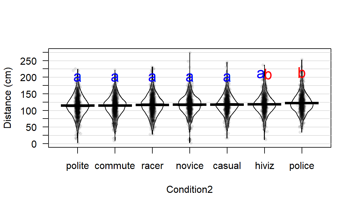
Figure 3.21: Pirate-plot of overtake distances by group, sorted by sample means with Tukey’s HSD CLD displayed.
3.8 Chapter summary
In this chapter, we explored methods for comparing a quantitative response across \(J\) groups (\(J \ge 2\)), with what is called the One-Way ANOVA procedure. The initial test is based on assessing evidence against a null hypothesis of no difference in the true means for the \(J\) groups. There are two different methods for estimating these One-Way ANOVA models: the cell means model and the reference-coded versions of the model. There are times when either model will be preferred, but for the rest of the text, the reference coding is used (sorry!). The ANOVA \(F\)-statistic, often presented with underlying information in the ANOVA table, provides a method of assessing evidence against the null hypothesis either using permutations or via the \(F\)-distribution. Pair-wise comparisons using Tukey’s HSD provide a method for comparing all the groups and are a nice complement to the overall ANOVA results. A compact letter display was shown that enhanced the interpretation of Tukey’s HSD result.
In the Guinea Pig example, we are left with some lingering questions based on these results. It appears that the effect of dosage changes as a function of the delivery method (OJ, VC) because the size of the differences between OJ and VC change for different dosages. These methods can’t directly assess the question of whether the effect of delivery method is the same or not across the different dosages. In Chapter 4, the two variables, Dosage and Delivery method are modeled as two separate variables so we can consider their effects both separately and together. This allows more refined hypotheses, such as Is the effect of delivery method the same for all dosages?, to be tested. This will introduce new models and methods for analyzing data where there are two factors as explanatory variables in a model for a quantitative response variable in what is called the Two-Way ANOVA.
3.9 Summary of important R code
The main components of R code used in this chapter follow with components to modify in lighter and/or ALL CAPS text, remembering that any R packages mentioned need to be installed and loaded for this code to have a chance of working:
MODELNAME <- lm(Y~X, data=DATASETNAME)
Probably the most frequently used command in R.
Here it is used to fit the reference-coded One-Way ANOVA model with Y as the response variable and X as the grouping variable, storing the estimated model object in MODELNAME. Remember that X should be defined as a factor variable.
MODELNAME <- lm(Y~X-1, data=DATASETNAME)
- Fits the cell means version of the One-Way ANOVA model.
summary(MODELNAME)
- Generates model summary information including the estimated model coefficients, SEs, t-tests, and p-values.
anova(MODELNAME)
Generates the ANOVA table but must only be run on the reference-coded version of the model.
Results are incorrect if run on the cell means model since the reduced model under the null is that the mean of all the observations is 0!
pf(FSTATISTIC, df1=NUMDF, df2=DENOMDF, lower.tail=F)
- Finds the p-value for an observed \(F\)-statistic with NUMDF and DENOMDF degrees of freedom.
par(mfrow=c(2,2)); plot(MODELNAME)
- Generates four diagnostic plots including the Residuals vs Fitted and Normal Q-Q plot.
plot(allEffects(MODELNAME))
Requires the
effectspackage be loaded.Plots the estimated model component.
Tm2 <- glht(MODELNAME, linfct=mcp(X=“Tukey”)); confint(Tm2); plot(Tm2); summary(Tm2); cld(Tm2)
Requires the
multcomppackage to be installed and loaded.Can only be run on the reference-coded version of the model.
Generates the text output and plot for Tukey’s HSD as well as the compact letter display information.
3.10 Practice problems
3.1. Cholesterol Analysis For the first practice problems, you will work with the cholesterol data set from
the multcomp package that was used to generate the Tukey’s HSD results. To
load the data set and learn more about the study, use the following code:
library(multcomp)
data(cholesterol)
library(tibble)
cholesterol <- as_tibble(cholesterol)
help(cholesterol)
3.1.1. Graphically explore the differences in the changes in Cholesterol levels for the five levels using pirate-plots.
3.1.2. Is the design balanced? How can assess this?
3.1.3. Complete all 6+ steps of the hypothesis test using the parametric \(F\)-test, reporting the ANOVA table and the distribution of the test statistic under the null. When you discuss the scope of inference, make sure you note that the treatment levels were randomly assigned to volunteers in the study.
3.1.4. Generate the permutation distribution and find the p-value. Compare the parametric p-value to the permutation test results.
3.1.5. Perform Tukey’s HSD on the data set. Discuss the results – which pairs were detected as different and which were not? Bigger reductions in cholesterol are good, so are there any levels you would recommend or that might provide similar reductions?
3.1.6. Find and interpret the CLD and compare that to your interpretation of results from 3.1.5.
3.2. Sting Location Analysis These data come from (Smith 2014) where the author experimented on himself by daily stinging himself five times on randomly selected body locations over the course of months. You can read more about this fascinating (and cringe inducing) study at https://peerj.com/articles/338/. The following code gets the data prepared for analysis by removing the observations he took each day on how painful it was to sting himself on his forearm before and after the other three observations that were of interest each day of the study. It also sorts of the levels (there are many) based on the mean pain rating in each group using the reorder function.
library(readr)
sd_fixed <- read_csv("http://www.math.montana.edu/courses/s217/documents/stingdata_fixed.csv")
sd_fixed$BLs <- sd_fixed$Body_Location
sd_fixed$BLs <- with(sd_fixed, reorder(Body_Location, Rating, mean))
sd_fixedR <- subset(sd_fixed,!xor(BLs=="Forearm",BLs=="Forearm1"))
sd_fixedR$BLs <- factor(sd_fixedR$BLs)
3.2.1. Graphically explore the differences in the pain ratings across the different Body_Location levels using boxplots and pirate-plots. How are boxplots misleading for representing these data? Hint: look for discreteness in the responses.
3.2.2. Is the design balanced?
3.2.3. How does taking 3 measurements that are of interest each day lead to a violation of the independence assumption here?
3.2.4. Complete all 6+ steps of the hypothesis test using the parametric \(F\)-test, reporting the ANOVA table and the distribution of the test statistic under the null. For the scope of inference use the information that the sting locations were randomly assigned but only one person (the researcher) participated in the study.
3.2.5. Generate the permutation distribution and find the p-value. Compare the parametric p-value to the permutation test results.
3.2.6. Often we might consider Tukey’s pairwise comparisons given the initial result here. How many levels are there in Body_Location? How many pairs would be compared if we tried Tukey’s – calculate using the choose function?
References
Crampton, E. 1947. “The Growth of the Odontoblast of the Incisor Teeth as a Criterion of Vitamin c Intake of the Guinea Pig.” The Journal of Nutrition 33 (5): 491–504. http://jn.nutrition.org/content/33/5/491.full.pdf.
Fox, John, Sanford Weisberg, Brad Price, Michael Friendly, and Jangman Hong. 2019. Effects: Effect Displays for Linear, Generalized Linear, and Other Models. https://CRAN.R-project.org/package=effects.
Hothorn, Torsten, Frank Bretz, and Peter Westfall. 2008. “Simultaneous Inference in General Parametric Models.” Biometrical Journal 50 (3): 346–63.
Hothorn, Torsten, Frank Bretz, and Peter Westfall. 2019. Multcomp: Simultaneous Inference in General Parametric Models. https://CRAN.R-project.org/package=multcomp.
Piepho, Hans-Peter. 2004. “An Algorithm for a Letter-Based Representation of All-Pairwise Comparisons.” Journal of Computational and Graphical Statistics 13 (2): 456–66.
Smith, Michael L. 2014. “Honey Bee Sting Pain Index by Body Location.” PeerJ 2 (April): e338. https://doi.org/10.7717/peerj.338.