Chapter 2 (R)e-Introduction to statistics
The previous material served to get us started in R and to get a quick review of same basic graphical and descriptive statistics. Now we will begin to engage some new material and exploit the power of R to do statistical inference. Because inference is one of the hardest topics to master in statistics, we will also review some basic terminology that is required to move forward in learning more sophisticated statistical methods. To keep this “review” as short as possible, we will not consider every situation you learned in introductory statistics and instead focus exclusively on the situation where we have a quantitative response variable measured on two groups, adding a new graphic called a “pirate-plot” to help us see the differences in the observations in the groups.
2.1 Histograms, boxplots, and density curves
Part of learning statistics is learning to correctly use the terminology, some of which is used colloquially differently than it is used in formal statistical settings. The most commonly “misused” statistical term is data. In statistical parlance, we want to note the plurality of data. Specifically, datum is a single measurement, possibly on multiple random variables, and so it is appropriate to say that “a datum is…”. Once we move to discussing data, we are now referring to more than one observation, again on one, or possibly more than one, random variable, and so we need to use “data are…” when talking about our observations. We want to distinguish our use of the term “data” from its more colloquial11 usage that often involves treating it as singular. In a statistical setting “data” refers to measurements of our cases or units. When we summarize the results of a study (say providing the mean and SD), that information is not “data”. We used our data to generate that information. Sometimes we also use the term “data set” to refer to all our observations and this is a singular term to refer to the group of observations and this makes it really easy to make mistakes on the usage of “data”12.
It is also really important to note that variables have to vary – if you measure the level of education of your subjects but all are high school graduates, then you do not have a “variable”. You may not know if you have real variability in a “variable” until you explore the results you obtained.
The last, but probably most important, aspect of data is the context of the measurement. The “who, what, when, and where” of the collection of the observations is critical to the sort of conclusions we can make based on the results. The information on the study design provides information required to assess the scope of inference of the study. Generally, remember to think about the research questions the researchers were trying to answer and whether their study actually would answer those questions. There are no formulas to help us sort some of these things out, just critical thinking about the context of the measurements.
To make this concrete, consider the data collected from a study (Walker, Garrard, and Jowitt 2014) to investigate whether clothing worn by a bicyclist might impact the passing distance of cars. One of the authors wore seven different outfits (outfit for the day was chosen randomly by shuffling seven playing cards) on his regular 26 km commute near London in the United Kingdom. Using a specially instrumented bicycle, they measured how close the vehicles passed to the widest point on the handlebars. The seven outfits (“conditions”) that you can view at https://www.sciencedirect.com/science/article/pii/S0001457513004636 were:
COMMUTE: Plain cycling jersey and pants, reflective cycle clips, commuting helmet, and bike gloves.
CASUAL: Rugby shirt with pants tucked into socks, wool hat or baseball cap, plain gloves, and small backpack.
HIVIZ: Bright yellow reflective cycle commuting jacket, plain pants, reflective cycle clips, commuting helmet, and bike gloves.
RACER: Colorful, skin-tight, Tour de France cycle jersey with sponsor logos, Lycra bike shorts or tights, race helmet, and bike gloves.
NOVICE: Yellow reflective vest with “Novice Cyclist, Pass Slowly” and plain pants, reflective cycle clips, commuting helmet, and bike gloves.
POLICE: Yellow reflective vest with “POLICEwitness.com – Move Over – Camera Cyclist” and plain pants, reflective cycle clips, commuting helmet, and bike gloves.
POLITE: Yellow reflective vest with blue and white checked banding and the words “POLITE notice, Pass Slowly” looking similar to a police jacket and plain pants, reflective cycle clips, commuting helmet, and bike gloves.
They collected data (distance to the vehicle in cm for each car “overtake”) on between 8 and 11 rides in each outfit and between 737 and 868 “overtakings” across these rides. The outfit is a categorical predictor or explanatory variable) that has seven different levels here. The distance is the response variable and is a quantitative variable here13. Note that we do not have the information on which overtake came from which ride in the data provided or the conditions related to individual overtake observations other than the distance to the vehicle (they only included overtakings that had consistent conditions for the road and riding).
The data are posted on my website14 at http://www.math.montana.edu/courses/s217/documents/Walker2014_mod.csv if you want to download the file to a local directory and then import the data into R using “Import Dataset”. Or you can use the code in the following codechunk to directly read the data set into R using the URL.
suppressMessages(library(readr))
dd <- read_csv("http://www.math.montana.edu/courses/s217/documents/Walker2014_mod.csv")
It is always good to review the data you have read by running the code and printing the tibble by typing the tibble name (here > dd) at the command prompt in the console, using the View function, (here View(dd)), to open a spreadsheet-like view, or using the head and tail functions have been show the first and last ten observations:
## # A tibble: 6 x 8
##   Condition Distance Shirt Helmet Pants Gloves ReflectClips Backpack
##   <chr>        <dbl> <chr> <chr>  <chr> <chr>  <chr>        <chr>
## 1 casual         132 Rugby hat    plain plain  no           yes
## 2 casual         137 Rugby hat    plain plain  no           yes
## 3 casual         174 Rugby hat    plain plain  no           yes
## 4 casual          82 Rugby hat    plain plain  no           yes
## 5 casual         106 Rugby hat    plain plain  no           yes
## 6 casual 48 Rugby hat plain plain no yes## # A tibble: 6 x 8
## Condition Distance Shirt Helmet Pants Gloves ReflectClips Backpack
## <chr> <dbl> <chr> <chr> <chr> <chr> <chr> <chr>
## 1 racer 122 TourJersey race lycra bike yes no
## 2 racer 204 TourJersey race lycra bike yes no
## 3 racer 116 TourJersey race lycra bike yes no
## 4 racer 132 TourJersey race lycra bike yes no
## 5 racer 224 TourJersey race lycra bike yes no
## 6 racer 72 TourJersey race lycra bike yes noAnother option is to directly access specific rows and/or columns of the tibble, especially for larger data sets. In objects containing data, we can select certain rows and columns using the brackets, [..., ...], to specify the row (first element) and column (second element). For example, we can extract the datum in the fourth row and second column using dd[4,2]:
## # A tibble: 1 x 1
##   Distance
##      <dbl>
## 1       82
This provides the distance (in cm) of a pass at 82 cm. To get all of either the rows or columns, a space is used instead of specifying a particular number. For example, the information in all the columns on the fourth observation can be obtained using dd[4, ]:
## # A tibble: 1 x 8
##   Condition Distance Shirt Helmet Pants Gloves ReflectClips Backpack
##   <chr>        <dbl> <chr> <chr>  <chr> <chr>  <chr>        <chr>
## 1 casual          82 Rugby hat    plain plain  no           yes
So this was an observation from the casual condition that had a passing distance of 82 cm. The other columns describe some other specific aspects of the condition. To get a more complete sense of the data set, we can extract a suite of observations from each condition using their row numbers concatenated, c(), together, extracting all columns for two observations from each of the conditions based on their rows.
## # A tibble: 14 x 8
##    Condition Distance Shirt      Helmet  Pants Gloves ReflectClips Backpack
##    <chr>        <dbl> <chr>      <chr>   <chr> <chr>  <chr>        <chr>
##  1 casual         132 Rugby      hat     plain plain  no           yes
##  2 casual         137 Rugby      hat     plain plain  no           yes
##  3 commute         70 PlainJers~ commut~ plain bike   yes          no
##  4 commute        151 PlainJers~ commut~ plain bike   yes          no
##  5 hiviz           94 Jacket     commut~ plain bike   yes          no
##  6 hiviz          145 Jacket     commut~ plain bike   yes          no
##  7 novice          12 Vest_Novi~ commut~ plain bike   yes          no
##  8 novice         122 Vest_Novi~ commut~ plain bike   yes          no
##  9 police         113 Vest_Poli~ commut~ plain bike   yes          no
## 10 police         174 Vest_Poli~ commut~ plain bike   yes          no
## 11 polite         156 Vest_Poli~ commut~ plain bike   yes          no
## 12 polite          14 Vest_Poli~ commut~ plain bike   yes          no
## 13 racer          104 TourJersey race    lycra bike   yes          no
## 14 racer          141 TourJersey race    lycra bike   yes          no
Now we can see the Condition variable seems to have seven different levels, the Distance variable contains the overtake distance, and then a suite of columns that describe aspects of each outfit, such as the type of shirt or whether reflective cycling clips were used or not. We will only use the “Distance” and “Condition” variables to start with.
When working with data, we should always start with summarizing the sample size. We will use n for the number of subjects in the sample and denote the population size (if available) with N. Here, the sample size is n=5690. In this situation, we do not have a random sample from a population (these were all of the overtakes that met the criteria during the rides) so we cannot make inferences from our sample to a larger group (other rides or for other situations like different places, times, or riders). But we can assess whether there is a causal effect15: if sufficient evidence is found to conclude that there is some difference in the responses across the conditions, we can attribute those differences to the treatments applied, since the overtake events should be same otherwise due to the outfit being randomly assigned to the rides. The story of the data set – that it was collected on a particular route for a particular rider in the UK – becomes pretty important in thinking about the ramifications of any results. Are drivers in Montana or South Dakota different from drivers near London? Are the road and traffic conditions likely to be different? If so, then we should not assume that the detected differences, if detected, would also exist in some other location for a different rider. The lack of a random sample here from all the overtakes in the area (or more generally all that happen around the world) makes it impossible to assume that this set of overtakes might be like others. So there are definite limitations to the inferences in the following results. But it is still interesting to see if the outfits worn caused a difference in the mean overtake distances, even though the inferences are limited to the conditions in this individual’s commute. If this had been an observational study (suppose that the researcher could select their outfit), then we would have to avoid any of the “causal” language that we can consider here because the outfits were not randomly assigned to the rides. Without random assignment, the explanatory variable of outfit choice could be confounded with another characteristic of rides that might be related to the passing distances, such as wearing a particular outfit because of an expectation of heavy traffic or poor light conditions. Confounding is not the only reason to avoid causal statements with non-random assignment but the inability to separate the effect of other variables (measured or unmeasured) from the differences we are observing means that our inferences in these situations need to be carefully stated to avoid implying causal effects.
In order to get some summary statistics, we will rely on the R package called
mosaic (Pruim, Kaplan, and Horton 2019) as introduced previously. First (but only once),
you need to install the package, which can
be done either using the Packages tab in the lower right panel of RStudio or
using the install.packages function with quotes around the package name:
If you open a .Rmd file that contains code that incorporates packages and they are not installed, the bar at the top of the markdown document will prompt you to install those missing packages. This is the easiest way to get packages you might need installed. After making sure that any required packages are installed, use the library
function around the package name (no quotes now!) to load the package, something that
you need to do any time you want to use features of a package.
When you are loading a package, R might mention a need to install other packages. If the output says that it needs a package that is unavailable, then follow the same process noted above to install that package and then repeat trying to load the package you wanted. These are called package “dependencies” and are due to one package developer relying on functions that already exist in another package.
With tibbles, you have to declare categorical variables as “factors” to have R correctly handle the variables using the factor function. This can be a bit time repetitive but provides some utility for data wrangling in more complex situations to read in the data and then declare their type. For quantitative variables, this is not required and they are stored as numeric variables. The following code declares the categorical variables in the data set as factors and saves them back into the variables of the same names:
dd$Condition <- factor(dd$Condition)
dd$Shirt <- factor(dd$Shirt)
dd$Helmet <- factor(dd$Helmet)
dd$Pants <- factor(dd$Pants)
dd$Gloves <- factor(dd$Gloves)
dd$ReflectClips <- factor(dd$ReflectClips)
dd$Backpack <- factor(dd$Backpack)
With many variables in a data set, it is often useful to get some
quick information about all of them; the summary function provides
useful information whether the variables are categorical or
quantitative and notes if any values were missing.
##    Condition      Distance             Shirt          Helmet       Pants        Gloves     ReflectClips Backpack
##  casual :779   Min.   :  2.0   Jacket     :737   commuter:4059   lycra: 852   bike :4911   no : 779     no :4911
##  commute:857   1st Qu.: 99.0   PlainJersey:857   hat     : 779   plain:4838   plain: 779   yes:4911     yes: 779
##  hiviz  :737   Median :117.0   Rugby      :779   race    : 852
##  novice :807   Mean   :117.1   TourJersey :852
##  police :790   3rd Qu.:134.0   Vest_Novice:807
##  polite :868   Max.   :274.0   Vest_Police:790
##  racer  :852                   Vest_Polite:868
The output is organized by variable,
providing summary information based on the type of
variable, either counts by category for categorical variables or the 5-number summary plus the mean for the quantitative
variable Distance. If present, you would also get a count of missing values that are
called “NAs” in R. For the first variable, called Condition and that we might more explicitly name Outfit, we find counts of the
number of overtakes for each outfit: \(779\) out of \(5,690\) were when wearing the casual outfit, \(857\) for “commute”, and the other observations from the other five outfits, with the most observations when wearing the “polite” vest.
We can also see that overtake distances (variable
Distance) ranged from 2 cm to 274 cm with a median of 117 cm.
To accompany the numerical summaries, histograms and boxplots can
provide some initial information on the shape of the distribution of
the responses for the different Outfits. Figure 2.1
contains the histogram
and boxplot of Distance, ignoring any information on which outfit was being worn. The calls to the two plotting functions are
enhanced slightly to add better labels using xlab, ylab, and main.
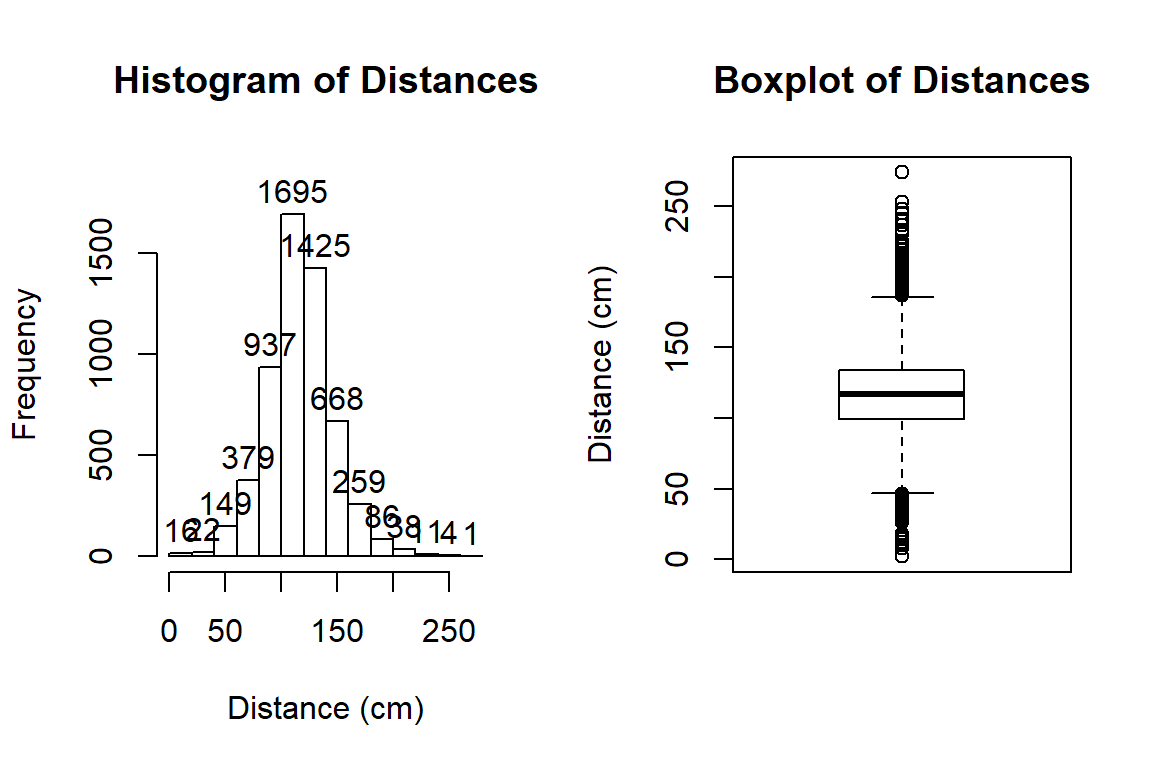
Figure 2.1: Histogram and boxplot of passing distances in cm.
hist(dd$Distance, xlab="Distance (cm)", labels=T, main="Histogram of Distances")
boxplot(dd$Distance, ylab="Distance (cm)", main="Boxplot of Distances")
The distribution appears to be relatively symmetric with many observations in both tails flagged as potential outliers. Despite being flagged as potential outliers, they seem to be part of a common distribution. In real data sets, outliers are commonly encountered and the first step is to verify that they were not errors in recording (if so, fixing or removing them is easily justified). If they cannot be easily dismissed or fixed, the next step is to study their impact on the statistical analyses performed, potentially considering reporting results with and without the influential observation(s) in the results (if there are just handful). If the analysis is unaffected by the “unusual” observations, then it matters little whether they are dropped or not. If they do affect the results, then reporting both versions of results allows the reader to judge the impacts for themselves. It is important to remember that sometimes the outliers are the most interesting part of the data set. For example, those observations that were the closest would be of great interest, whether they are outliers or not.
Often when statisticians think of distributions of data, we think of the smooth underlying shape that led to the data set that is being displayed in the histogram. Instead of binning up observations and making bars in the histogram, we can estimate what is called a density curve as a smooth curve that represents the observed distribution of the responses. Density curves can sometimes help us see features of the data sets more clearly.
To understand the density curve, it is useful to initially see
the histogram and density curve together. The height of the density curve is scaled
so that the total area under the curve16 is 1. To make a comparable histogram, the
y-axis needs to be scaled so that the histogram is also on the “density”
scale which makes the bar heights adjust so that the proportion of the
total data set in each bar is represented by the area in each bar
(remember that area is height times width). So the height depends on the
width of the bars and the total area across all the bars has to be 1. In the
hist function, the freq=F option does this required re-scaling to get
density-scaled histogram bars. The
density curve is added to the histogram using the R code of
lines(density()), producing the result in Figure 2.2 with
added modifications of options for lwd (line width) and col (color)
to make the plot more visually appealing. You can see how the density curve
somewhat matches the histogram bars but deals with the bumps up and down
and edges a little differently. We can pick out the relatively symmetric distribution using
either display and will rarely make both together.
hist(dd$Distance, freq=F, xlab="Distance (cm)", labels=T, main="Histogram of Distances")
lines(density(dd$Distance), lwd=3,col="purple")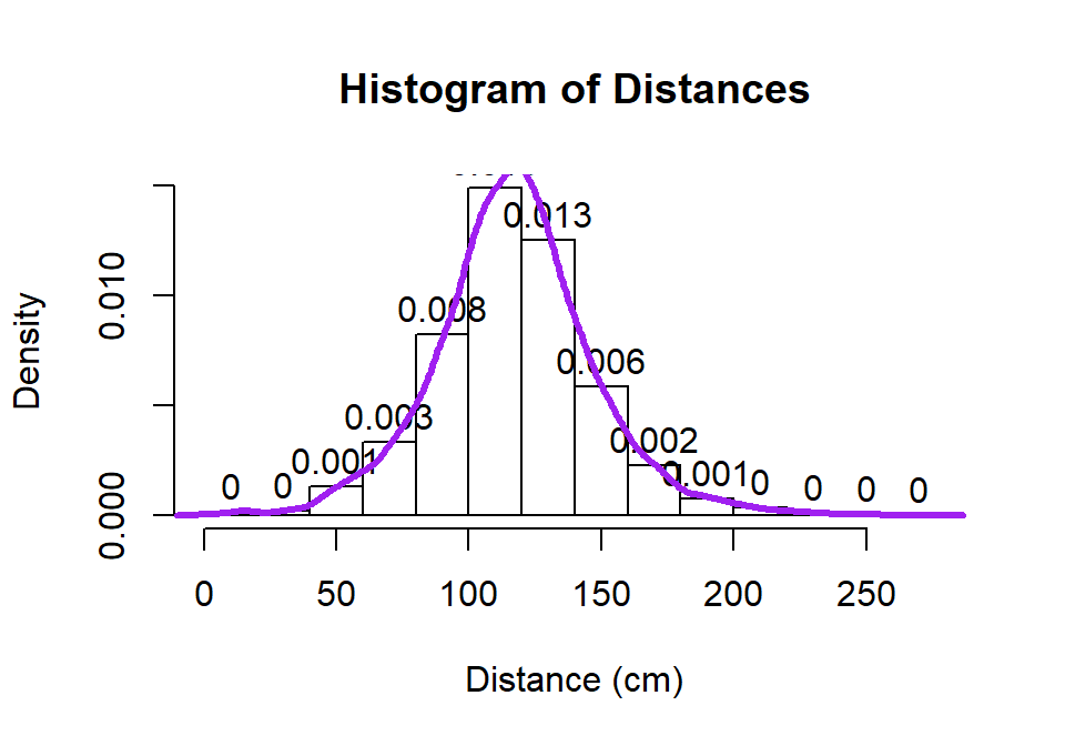
Figure 2.2: Histogram and density curve of Distance responses.
Histograms can be sensitive to the choice of the number of bars and
even the cut-offs used to define the bins for a given number of bars.
Small changes in the definition of cut-offs for the bins can have
noticeable impacts on the shapes observed but
this does not impact density curves. We are not going to tinker with the
default choices for bars in histogram, as they are reasonably selected in R, but we
can add information on the original observations being included in each bar to
better understand the choices that hist is making. In the previous
display, we can add what is called a rug to the plot, where a tick
mark is made on the x-axis for each observation. Because the responses appear to be rounded to the nearest cm, there is some discreteness in the responses and we need to use a graphical
technique called jittering to add a little noise17 to each observation so all the
observations at each distance value do not
plot as a single line. In Figure 2.3, the added tick marks
on the x-axis show the approximate locations of the original observations.
We can (barely) see how there are 2 observations at 2 cm (the noise
added generates a wider line than for an individual observation so it is possible to see that it is more than one observation there). A limitation of the
histogram arises at the center of the distribution where the bar that goes from 100 to 120 cm suggests that the mode (peak) is in this range (but it is unclear where) but the density curve suggests that the peak is closer to 120 than 100. The
density curve also shows some small bumps in the tails of the distributions tied to individual observations that are not really displayed in the histogram. Density curves are, however,
not perfect and this one shows a tiny bit of area for distances less than 0 cm which is
not possible here. When we make density curves below, we will cut off the curves at the most extreme values to avoid this issue.
hist(dd$Distance, freq=F, xlab="Distance (cm)", labels=T,
     main="Histogram of Distances with density curve and rug", ylim=c(0,0.017))
lines(density(dd$Distance), lwd=3,col="purple")
set.seed(900)
rug(jitter(dd$Distance), col="red", lwd=1)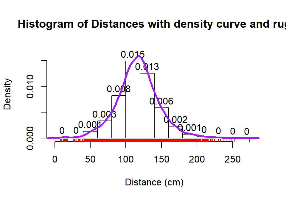
Figure 2.3: Histogram with density curve and rug plot of the jittered distance responses.
The graphical tools we’ve just discussed are going to help us move to comparing the
distribution of responses across more than one group. We will have two displays
that will help us make these comparisons. The simplest is
the side-by-side boxplot, where a boxplot is displayed for each group
of interest using the same y-axis scaling. In R, we can use its formula
notation to see if the response (Distance) differs based on the group
(Condition) by using something like Y~X or, here, Distance~Condition.
We also need to tell R where to find the variables – use the last option in the command, data=DATASETNAME , to inform R of the tibble to look in
to find the variables. In this example, data=dd. We will use
the formula and data=... options in almost every function we use
from here forward. Figure 2.4 contains the side-by-side
boxplots showing similar distributions for all the groups, with a slightly higher median in the “police” group and some outliers identified in all groups.
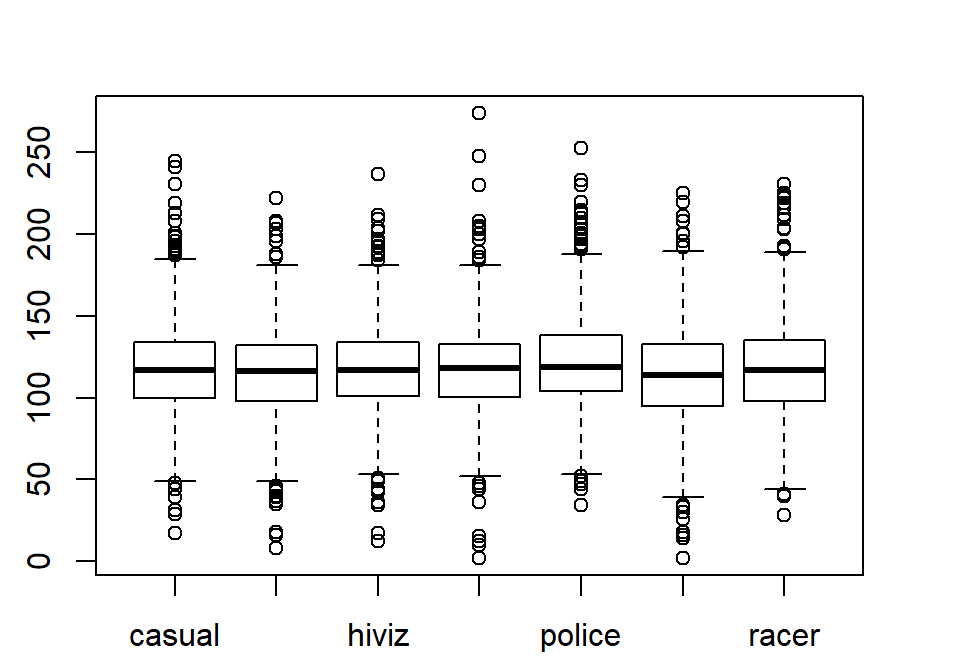
Figure 2.4: Side-by-side boxplot of distances based on outfits.
The “~” (which is read as the tilde symbol18, which you can find in the
upper left corner of your keyboard) notation will be used in two ways in this
material. The formula use in R employed previously declares that the
response variable here is Distance and the explanatory variable is Condition.
The other use for “~” is as shorthand for “is distributed as” and is used in
the context of \(Y \sim N(0,1)\), which translates (in statistics) to defining the
random variable Y as following a Normal distribution19
with mean 0
and standard deviation of 1. In the current situation, we could ask whether
the Distance variable seems like it may follow a normal distribution in each group, in
other words, is \(\text{Distance}\sim N(\mu,\sigma^2)\)? Since the responses are relatively symmetric, it is not clear that we have a violation of the assumption of the normality assumption for the Distance variable for any of the seven groups (more later on how we can assess this and the issues that occur when we have a violation of this assumption). Remember that
\(\mu\) and \(\sigma\) are parameters where
\(\mu\) (“mu”) is our standard symbol for the population mean
and that \(\sigma\) (“sigma”) is the symbol of the
population standard deviation.
2.2 Pirate-plots
An alternative graphical display for comparing multiple groups that we will use is a display called a pirate-plot (Phillips 2017a) from the yarrr package20. Figure 2.5
shows an example of a pirate-plot that provides a side-by-side display that
contains the density curves, the original observations that generated the
density curve as jittered points (jittered both vertically and horizontally a little), the sample mean of each group (wide bar), and a box that represents the confidence interval for the true mean of that group. For each group, the density curves
are mirrored to aid in visual assessment of the shape of the distribution. This mirroring also
creates a shape that resembles the outline of a violin with skewed distributions so versions of this
display have also been called a “violin plot” or a “bean plot”. All together this plot shows us information
on the original observations, center (mean) and its confidence interval, spread, and shape of the distributions of the responses. Our inferences typically focus on the means of the groups and this plot allows
us to compare those across the groups while gaining information on the shapes
of the distributions of responses in each group.
To use the pirateplot function we need to install and then load the yarrr
package (Phillips 2017b).
The function works like the boxplot used previously
except that options
for the type of confidence interval needs to be specified with inf.method="ci" - otherwise you will get a different kind of interval than you learned in introductory statistics and we don’t want to get caught up in trying to understand the kind of interval it makes by default. There are many other options in the function that might be useful in certain situations, but that is the only one that is really needed to get started with pirate-plots.
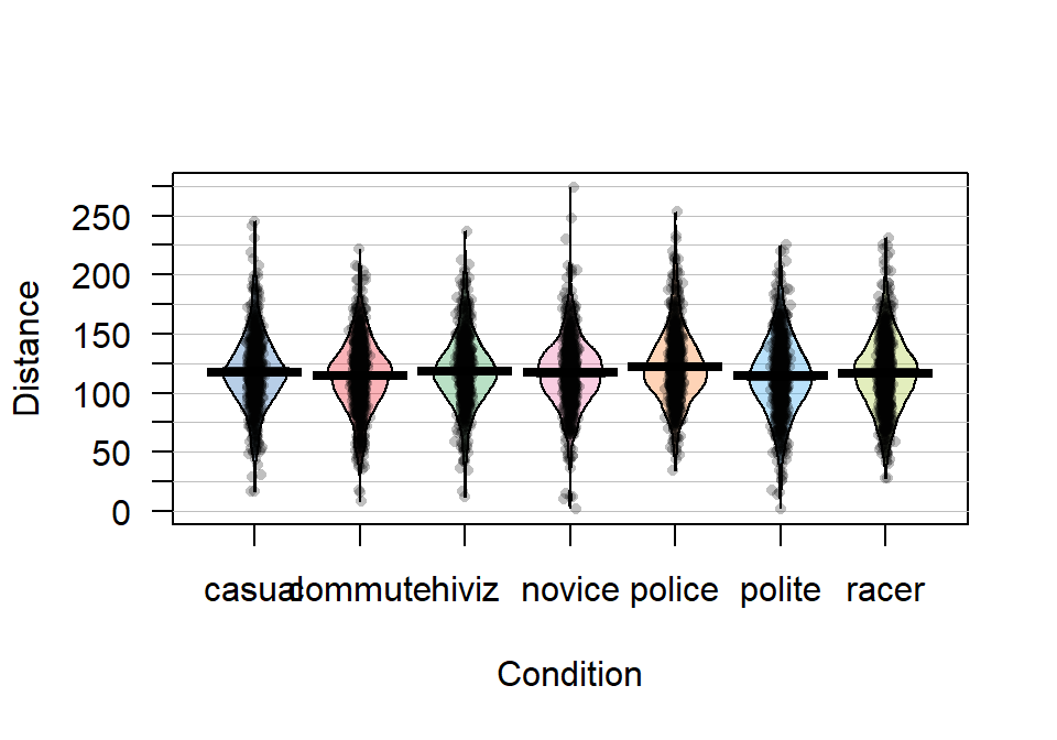
Figure 2.5: Pirate-plot of distances by outfit group. Bold horizontal lines correspond to sample mean of each group, boxes around lines (here they are very tight to the lines for the means) are the 95% confidence intervals.
Figure 2.5 suggests that the distributions are relatively symmetric which would suggest that the means and medians are similar even though only the means are displayed in these plots. In this display, none of the observations are flagged as outliers (it is not a part of this display). It is up to the consumer of the graphic to decide if observations look to be outside of the overall pattern of the rest of the observations. By plotting the observations by groups, we can also explore the narrowest (and likely most scary) overtakes in the data set. The police and racer conditions seem to have all observations over 25 cm and the most close passes were in the novice and polite outfits, including the two 2 cm passes. By displaying the original observations, we are able to explore and identify features that aggregation and summarization in plots can sometimes obfuscate. But the pirate-plots also allow you to compare the shape of the distributions (relatively symmetric and somewhat bell-shaped), variability (they look to have relatively similar variability), and the means of the groups. Our inferences are going to focus on the means but those inferences are only valid if the distributions are either approximately normal or at least have similar shapes and spreads (more on this soon).
It appears that the mean for police is higher than the other groups but that the others are not too different. But is this difference real? We will never
know the answer to that question, but we
can assess how likely we are to have seen a result as extreme or more
extreme than our result, assuming that there is no difference in the
means of the groups. And if the observed result is
(extremely) unlikely to occur, then we can reject the hypothesis that the
groups have the same mean and conclude that there is evidence of a real
difference. After that, we will want to carefully explore how big the estimated differences in the means are - is this enough of a difference to matter to you or the subject in the study? To accompany the pirate-plot, we
need to have numerical values to compare. We can get means and standard
deviations by groups easily using the same formula notation as for the plots with the mean
and sd functions, if the mosaic package is loaded.
##   casual  commute    hiviz   novice   police   polite    racer
## 117.6110 114.6079 118.4383 116.9405 122.1215 114.0518 116.7559## casual commute hiviz novice police polite racer
## 29.86954 29.63166 29.03384 29.03812 29.73662 31.23684 30.60059We can also use the favstats function to get those summaries and others by groups.
##   Condition min    Q1 median  Q3 max     mean       sd   n missing
## 1    casual  17 100.0    117 134 245 117.6110 29.86954 779       0
## 2   commute   8  98.0    116 132 222 114.6079 29.63166 857       0
## 3     hiviz  12 101.0    117 134 237 118.4383 29.03384 737       0
## 4    novice   2 100.5    118 133 274 116.9405 29.03812 807       0
## 5    police  34 104.0    119 138 253 122.1215 29.73662 790       0
## 6    polite   2  95.0    114 133 225 114.0518 31.23684 868       0
## 7     racer  28  98.0    117 135 231 116.7559 30.60059 852       0
Based on these results, we can see that there is an estimated difference of over 8 cm between the smallest mean (polite at 114.05 cm) and the largest mean (police at 122.12 cm). The differences among some of the other groups are much smaller, such as between casual and commute with sample means of 117.611 and 114.608 cm, respectively. Because there are seven groups being compared in this study, we will have to wait until Chapter 3 and the One-Way ANOVA test to fully assess evidence related to some difference among the seven groups. For now, we are going to focus on comparing the mean Distance between casual and commute groups – which is a two independent sample mean situation and something you should have seen before. Remember that the “independent” sample part of this refers to observations that are independently observed for the two groups as opposed to the paired sample situation that you may have explored where one observation from the first group is related to an observation in the second group (the same person with one measurement in each group (we generically call this “repeated measures”) or the famous “twin” studies with one twin assigned to each group). This study has some potential violations of the “independent” sample situation (for example, repeated measurements made during a single ride), but those do not clearly fit into the matched pairs situation, so we will note this potential issue and proceed with exploring the method that assumes that we have independent samples, even though this is not true here. In Chapter 9, methods for more complex study designs like this one will be discussed briefly, but mostly this is beyond the scope of this material.
Here we are going to use the “simple” two independent group scenario to review some basic statistical concepts and connect two different frameworks for conducting statistical inference: randomization and parametric inference techniques. Parametric statistical methods involve making assumptions about the distribution of the responses and obtaining confidence intervals and/or p-values using a named distribution (like the \(z\) or \(t\)-distributions). Typically these results are generated using formulas and looking up areas under curves or cutoffs using a table or a computer. Randomization-based statistical methods use a computer to shuffle, sample, or simulate observations in ways that allow you to obtain distributions of possible results to find areas and cutoffs without resorting to using tables and named distributions. Randomization methods are what are called nonparametric methods that often make fewer assumptions (they are not free of assumptions!) and so can handle a larger set of problems more easily than parametric methods. When the assumptions involved in the parametric procedures are met by a data set, the randomization methods often provide very similar results to those provided by the parametric techniques. To be a more sophisticated statistical consumer, it is useful to have some knowledge of both of these techniques for performing statistical inference and the fact that they can provide similar results might deepen your understanding of both approaches.
To be able to work just with the observations from two of the conditions (casual and commute) we could remove all the other observations in a spreadsheet program and read that new data set
back into R, but it is actually pretty easy to use R to do data
management once the data set is loaded. It is also a better scientific process to do as much of your data management within R as possible so that your steps in managing the data are fully documented and reproducible. Highlighting and clicking in spreadsheet programs is a dangerous way to work and can be impossible to recreate steps that were taken from initial data set to the version that was analyzed. In R, we could identify the rows that contain the observations we want to retain and just extract those rows, but this is hard with over five thousand observations. The subset function (also an option in some functions) is the best way to be able to focus on observations that meet a particular condition, we can “subset” the data set to retain those rows. The subset function takes the data set as its first argument and then in the “subset” option, we need to define the condition we want to meet to retain those rows. Specifically, we need to define the variable we want to work with, Condition, and then request rows that meet a condition (are %in%) and the aspects that meet that condition (here by concatenating “casual” and “commute”), leading to code of:
subset(dd, Condition %in% c("casual", "commute"))We would actually want to save that new subsetted data set into a new tibble for future work, so we can use the following to save the reduced data set into ddsub:
There is also a “select” option that we could also use to just focus on certain columns in the data set and we can use that just to focus on the Condition and Distance variables using:
You will always want to check that the correct observations were dropped
either using View(ddsub) or by doing a quick summary of the
Condition variable in the new tibble.
##  casual commute   hiviz  novice  police  polite   racer
##     779     857       0       0       0       0       0
It ends up that R remembers the other categories even though there are
0 observations in them now and that can cause us some problems. When we remove a
group of observations, we sometimes need to clean up categorical variables to
just reflect the categories that are present. The factor
function
creates categorical variables based on the levels of the variables that are
observed and is useful to run here to clean up Condition to just reflect the categories that are now present.
##  casual commute
##     779     857
The two categories of interest now were selected because neither looks particularly “racey” or has high visibility but could present a common choice between getting fully “geared up” for the commute or just jumping on a bike to go to work. Now if we remake the boxplots and pirate-plots, they only contain results for the two groups of interest here as seen in Figure 2.6. Note that these are available in the previous version of the plots, but now we will just focus on these two groups.
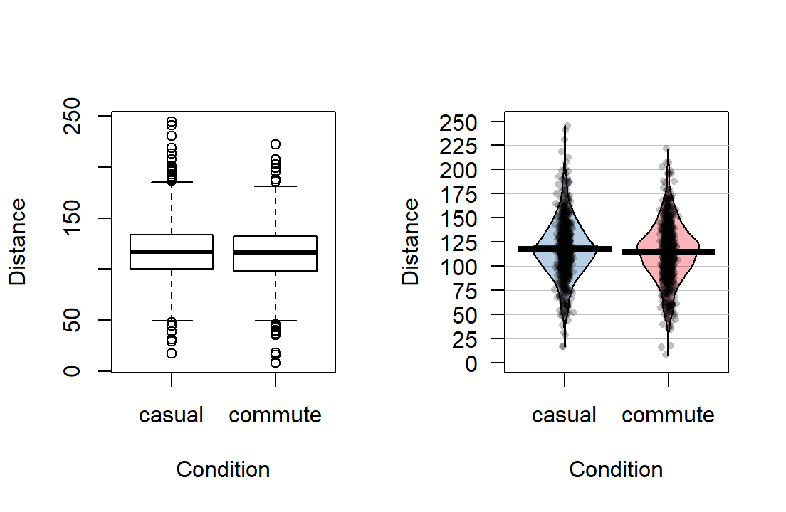
Figure 2.6: Boxplot and pirate-plot of the Distance responses on the reduced ddsub data set.
The two-sample mean techniques you learned in your previous course all
start with comparing the means the two groups. We can obtain the two
means using the mean function or directly obtain the difference
in the means using the diffmean function (both require the mosaic
package). The diffmean function provides
\(\bar{x}_\text{commute} - \bar{x}_\text{casual}\) where \(\bar{x}\)
(read as “x-bar”) is the sample mean of observations in the subscripted
group. Note that there are two directions that you could compare the
means and this function chooses to take the mean from the second group
name alphabetically and subtract the mean from the first alphabetical group
name. It is always good to check the direction of this calculation as
having a difference of \(-3.003\) cm versus \(3.003\) cm could be important.
##   casual  commute
## 117.6110 114.6079## diffmean
## -3.0031052.3 Models, hypotheses, and permutations for the two sample mean situation
There appears to be some evidence that the casual clothing group is getting higher average overtake distances than the commute group of observations, but we want to try to make sure that the difference is real – that there is evidence to reject the assumption that the means are the same “in the population”. First, a null hypothesis21 which defines a null model22 needs to be determined in terms of parameters (the true values in the population). The research question should help you determine the form of the hypotheses for the assumed population. In the two independent sample mean problem, the interest is in testing a null hypothesis of \(H_0: \mu_1 = \mu_2\) versus the alternative hypothesis of \(H_A: \mu_1 \ne \mu_2\), where \(\mu_1\) is the parameter for the true mean of the first group and \(\mu_2\) is the parameter for the true mean of the second group. The alternative hypothesis involves assuming a statistical model for the \(i^{th}\ (i=1,\ldots,n_j)\) response from the \(j^{th}\ (j=1,2)\) group, \(\boldsymbol{y}_{ij}\), that involves modeling it as \(y_{ij} = \mu_j + \varepsilon_{ij}\), where we assume that \(\varepsilon_{ij} \sim N(0,\sigma^2)\). For the moment, focus on the models that either assume the means are the same (null) or different (alternative), which imply:
Null Model: \(y_{ij} = \mu + \varepsilon_{ij}\) There is no difference in true means for the two groups.
Alternative Model: \(y_{ij} = \mu_j + \varepsilon_{ij}\) There is a difference in true means for the two groups.
Suppose we are considering the alternative model for the 4th observation (\(i=4\)) from the second group (\(j=2\)), then the model for this observation is \(y_{42} = \mu_2 +\varepsilon_{42}\), that defines the response as coming from the true mean for the second group plus a random error term for that observation, \(\varepsilon_{42}\). For, say, the 5th observation from the first group (\(j=1\)), the model is \(y_{51} = \mu_1 +\varepsilon_{51}\). If we were working with the null model, the mean is always the same (\(\mu\)) – the group specified does not change the mean we use for that observation, so the model for \(y_{42}\) would be \(\mu +\varepsilon_{42}\).
It can be helpful to think about the null and alternative models graphically. By assuming the null hypothesis is true (means are equal) and that the random errors around the mean follow a normal distribution, we assume that the truth is as displayed in the left panel of Figure 2.7 – two normal distributions with the same mean and variability. The alternative model allows the two groups to potentially have different means, such as those displayed in the right panel of Figure 2.7 where the second group has a larger mean. Note that in this scenario, we assume that the observations all came from the same distribution except that they had different means. Depending on the statistical procedure we are using, we basically are going to assume that the observations (\(y_{ij}\)) either were generated as samples from the null or alternative model. You can imagine drawing observations at random from the pictured distributions. For hypothesis testing, the null model is assumed to be true and then the unusualness of the actual result is assessed relative to that assumption. In hypothesis testing, we have to decide if we have enough evidence to reject the assumption that the null model (or hypothesis) is true. If we reject the null hypothesis, then we would conclude that the other model considered (the alternative model) is more reasonable. The researchers obviously would have hoped to encounter some sort of noticeable difference in the distances for the different outfits and have been able to find enough evidence to reject the null model where the groups “look the same”.
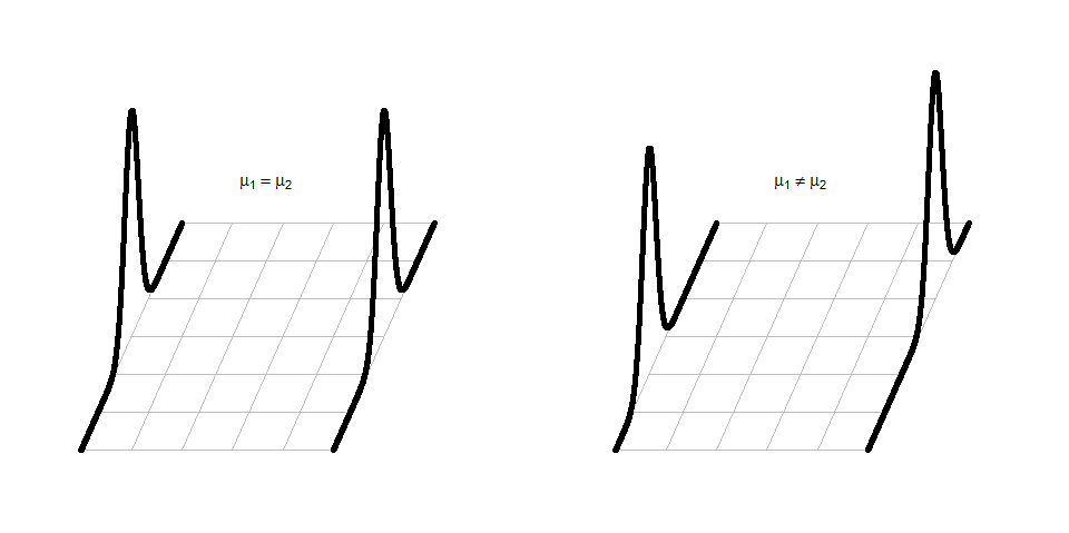
Figure 2.7: Illustration of the assumed situations under the null (left) and a single possibility that could occur if the alternative were true (right) and the true means were different. There are an infinite number of ways to make a plot like the right panel that satisfies the alternative hypothesis.
In statistical inference, null hypotheses (and their implied models) are set up as “straw men” with every interest in rejecting them even though we assume they are true to be able to assess the evidence \(\underline{\text{against them}}\). Consider the original study design here, the outfits were randomly assigned to the rides. If the null hypothesis were true, then we would have no difference in the population means of the groups. And this would apply if we had done a different random assignment of the outfits. So let’s try this: assume that the null hypothesis is true and randomly re-assign the treatments (outfits) to the observations that were obtained. In other words, keep the Distance results the same and shuffle the group labels randomly. The technical term for this is doing a permutation (a random shuffling of a grouping variable relative to the observed responses). If the null is true and the means in the two groups are the same, then we should be able to re-shuffle the groups to the observed Distance values and get results similar to those we actually observed. If the null is false and the means are really different in the two groups, then what we observed should differ from what we get under other random permutations. The differences between the two groups should be more noticeable in the observed data set than in (most) of the shuffled data sets. It helps to see an example of a permutation of the labels to understand what this means here.
The data set we are working with is a little on the large size, especially to explore individual observations. So for the moment we are going to work with a random sample of 30 of the \(n=1,636\) observations in ddsub, fifteen from each group, that are generated using the sample function. To do this23, we will use the sample function twice - once to sample from the subsetted commute observations (creating the s1 data set) and once to sample from the casual ones (creating s2). A new function for us, called rbind, is used to bind the rows together — much like pasting a chunk of rows below another chunk in a spreadsheet program. This operation only works if the columns all have the same names and meanings both for rbind and in a spreadsheet. Together this code creates the dsample data set that we will analyze below and compare to results from the full data set. The sample means are now 135.8 and 109.87 cm for casual and commute groups, respectively, and so the difference in the sample means has increased in magnitude to -25.93 cm (commute - casual). This difference would vary based on the different random samples from the larger data set, but for the moment pretend this was the entire data set that the researchers had collected and that we want to try to find evidence against the null hypothesis that the true means are the same in these two groups.
set.seed(9432)
s1 <- sample(subset(ddsub, Condition %in% "commute"), size=15)
s2 <- sample(subset(ddsub, Condition %in% "casual"), size=15)
dsample <- rbind(s1, s2)
mean(Distance~Condition, data=dsample)
## casual commute
## 135.8000 109.8667In order to assess evidence against the null hypothesis of no difference, we want to permute the group labels versus the observations. In the mosaic package, the shuffle function allows us to easily perform
a permutation24. One permutation of the
treatment labels is provided in the PermutedCondition variable below. Note
that the Distances are held in the same place while the group labels are shuffled.
Perm1 <- with(dsample, tibble(Distance, Condition, PermutedCondition=shuffle(Condition)))
#To force the tibble to print out all rows in data set - not used often
data.frame(Perm1)
## Distance Condition PermutedCondition
## 1 168 commute commute
## 2 137 commute commute
## 3 80 commute casual
## 4 107 commute commute
## 5 104 commute casual
## 6 60 commute casual
## 7 88 commute commute
## 8 126 commute commute
## 9 115 commute casual
## 10 120 commute casual
## 11 146 commute commute
## 12 113 commute casual
## 13 89 commute commute
## 14 77 commute commute
## 15 118 commute casual
## 16 148 casual casual
## 17 114 casual casual
## 18 124 casual commute
## 19 115 casual casual
## 20 102 casual casual
## 21 77 casual casual
## 22 72 casual commute
## 23 193 casual commute
## 24 111 casual commute
## 25 161 casual casual
## 26 208 casual commute
## 27 179 casual casual
## 28 143 casual commute
## 29 144 casual commute
## 30 146 casual casualIf you count up the number of subjects in each group by counting the number
of times each label (commute, casual) occurs, it is the same in both the
Condition and PermutedCondition columns (15 each). Permutations involve randomly
re-ordering the values of a variable – here the Condition group labels – without
changing the content of the variable.
This result can also be generated using
what is called sampling without replacement: sequentially select \(n\) labels
from the original variable (Condition), removing each observed label and making sure that each of the
original Condition labels is selected once and only once. The new, randomly
selected order of selected labels provides the permuted labels. Stepping
through the process helps to understand how it works: after the initial random
sample of one label, there would \(n - 1\) choices possible; on the \(n^{th}\)
selection, there would only be one label remaining to select. This makes sure
that all original labels are re-used but that the order is random. Sampling
without replacement is like picking names out of a hat, one-at-a-time, and not
putting the names back in after they are selected. It is an exhaustive process
for all the original observations. Sampling with replacement, in contrast,
involves sampling from the specified list with each observation having an equal
chance of selection for each sampled observation – in other words, observations
can be selected more than once. This is like picking \(n\) names out of a hat that
contains \(n\) names, except that every time a name is selected, it goes back into
the hat – we’ll use this technique in Section 2.9
to do what is called bootstrapping.
Both sampling mechanisms can be
used to generate inferences but each has particular situations
where they are most useful. For hypothesis testing,
we will use permutations
(sampling without replacement) as its mechanism most closely matches the null hypotheses we will be testing.
The comparison of the pirate-plots between the real \(n=30\) data set and permuted version is what is really interesting (Figure 2.8). The original difference in the sample means of the two groups was -25.93 cm (commute - casual). The sample means are the statistics that estimate the parameters for the true means of the two groups and the difference in the sample means is a way to create a single number that tracks a quantity directly related to the difference between the null and alternative models. In the permuted data set, the difference in the means is 12.07 cm in the opposite direction (the commute group had a higher mean than casual in the permuted data).
##   casual  commute
## 116.8000 128.8667## diffmean
## 12.06667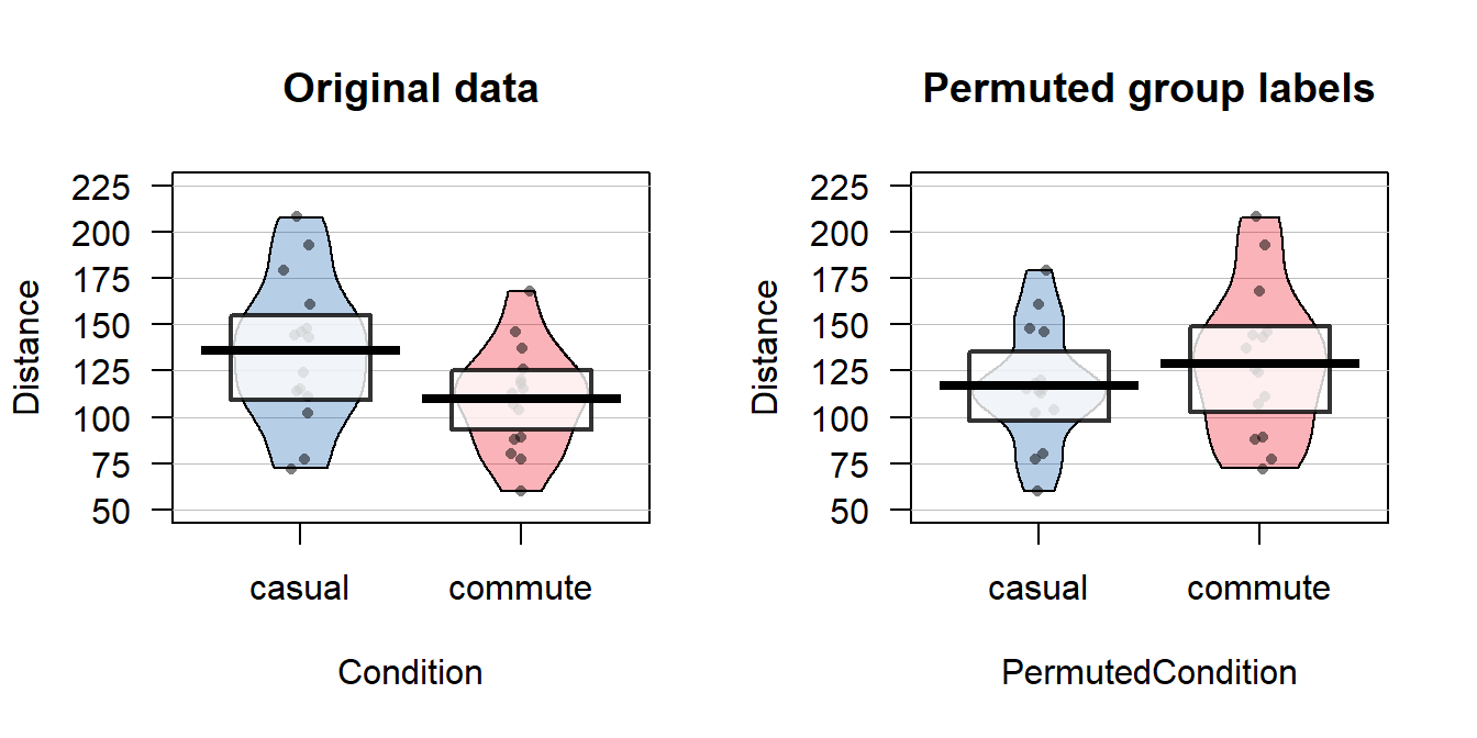
Figure 2.8: Pirate-plots of Distance responses versus actual treatment groups and permuted groups. Note how the responses are the same but that they are shuffled between the two groups differently in the permuted data set. With the smaller sample size, the 95% confidence intervals are more clearly visible than with the original large data set.
The diffmean function is a simple way to get the differences in the means, but we can also start to learn about using the lm function - that will be used for every chapter except for Chapter 5. The lm stands for linear model and, as we will see moving forward, encompasses a wide array of different models and scenarios. Here we will consider among its simplest usage25 to be able to estimate the difference in the mean of two groups. Notationally, it is very similar to other functions we have considered, lm(y ~ x, data=...) where y is the response variable and x is the explanatory variable. Here that is lm(Distance~Condition, data=dsample) with Condition defined as a factor variable. With linear models, we will need to interrogate them to obtain a variety of useful information and our first “interrogation” function is usually the summary function. To use it, it is best to have stored the model into an object, something like lm1, and then we can apply the summary() function to the stored model object to get a suite of output:
##
## Call:
## lm(formula = Distance ~ Condition, data = dsample)
##
## Residuals:
##     Min      1Q  Median      3Q     Max
## -63.800 -21.850   4.133  15.150  72.200
##
## Coefficients:
##                  Estimate Std. Error t value Pr(>|t|)
## (Intercept)       135.800      8.863  15.322 3.83e-15
## Conditioncommute  -25.933     12.534  -2.069   0.0479
##
## Residual standard error: 34.33 on 28 degrees of freedom
## Multiple R-squared:  0.1326, Adjusted R-squared:  0.1016
## F-statistic: 4.281 on 1 and 28 DF,  p-value: 0.04789
This output is explored more in Chapter 3, but for the moment, focus on the row labeled as Conditioncommute in the middle of the output. In the first (Estimate) column, there is -25.933. This is a number we saw before – it is the difference in the sample means between commute and casual (commute - casual). When lm denotes a category in the row of the output (here commute), it is trying to indicate that the information to follow relates to the difference between this category and a baseline or reference category (here casual). The first ((Intercept)) row also contains a number we have seen before: - 135.8 is the sample mean for the casual group. So the lm is generating a coefficient for the mean of one of the groups and another as the difference in the two groups26. In developing a test to assess evidence against the null hypothesis, we will focus on the difference in the sample means. So we want to be able to extract that number from this large suite of information. It ends up that we can apply the coef function to lm models and then access that second coefficient using the bracket notation. Specifically:
## Conditioncommute
##        -25.93333
This is the same result as using the diffmean function, so either could be used here. The estimated difference in the sample means in the permuted data set of 12.07 cm is available with:
## PermutedConditioncommute
##                 12.06667
Comparing the pirate-plots and the estimated difference in the sample means suggests that the observed difference was larger than what we got when we did a single permutation. Conceptually, permuting observations between group labels is consistent with the null hypothesis – this is a technique to generate results that we might have gotten if the null hypothesis were true since the responses are the same in the two groups if the null is true. We just need to repeat the permutation process many times and track how unusual our observed result is relative to this distribution of potential responses if the null were true. If the observed differences are unusual relative to the results under permutations, then there is evidence against the null hypothesis, and we can conclude, in the direction of the alternative hypothesis, that the true means differ. If the observed differences are similar to (or at least not unusual relative to) what we get under random shuffling under the null model, we would have a tough time concluding that there is any real difference between the groups based on our observed data set. This is formalized using the p-value as a measure of the strength of evidence against the null hypothesis and how we use it.
2.4 Permutation testing for the two sample mean situation
In any testing situation, you must define some function of the observations that gives us a single number that addresses our question of interest. This quantity is called a test statistic. These often take on complicated forms and have names like \(t\) or \(z\) statistics that relate to their parametric (named) distributions so we know where to look up p-values27. In randomization settings, they can have simpler forms because we use the data set to find the distribution of the statistic under the null hypothesis and don’t need to rely on a named distribution. We will label our test statistic T (for Test statistic) unless the test statistic has a commonly used name. Since we are interested in comparing the means of the two groups, we can define
\[T=\bar{x}_\text{commute} - \bar{x}_\text{casual},\]
which coincidentally is what the diffmean function and the second coefficient from the lm provided us previously.
We label our observed test statistic (the one from the original data
set) as
\[T_{obs}=\bar{x}_\text{commute} - \bar{x}_\text{casual},\]
which happened to be -25.933 cm here. We will compare this result to the results for the test statistic that we obtain from permuting the group labels. To denote permuted results, we will add an * to the labels:
\[T^*=\bar{x}_{\text{commute}^*}-\bar{x}_{\text{casual}^*}.\]
We then compare the \(T_{obs}=\bar{x}_\text{commute} - \bar{x}_\text{casual} = -25.933\) to the distribution of results that are possible for the permuted results (\(T^*\)) which corresponds to assuming the null hypothesis is true.
We need to consider lots of permutations to do a permutation test.
In contrast to
your introductory statistics course where, if you did this, it was just a click
away, we are going to learn what was going on “under the hood” of the software you were using. Specifically, we
need a for loop in R to be able to repeatedly generate the permuted data
sets and record \(T^*\) for each one. Loops are a basic programming task that make
randomization methods possible as well as potentially simplifying any repetitive
computing task. To write a “for loop”, we need to choose how many times we want
to do the loop (call that B) and decide on a counter to keep track of where
we are at in the loops (call that b, which goes from 1 up to B). The
simplest loop just involves printing out the index, print(b) at each step.
This is our first use of curly braces, { and }, that are used to group the code
we want to repeatedly run as we proceed through the loop. By typing the following
code in a codechunk and then highlighting it all and hitting the run button,
R will go through the loop B = 5 times, printing out the counter:
B <- 5
for (b in (1:B)){
  print(b)
}
Note that when you highlight and run the code, it will look about the same with “+” printed after the first line to indicate that all the code is connected when it appears in the console, looking like this:
When you run these three lines of code (or compile a .Rmd file that contains this), the console will show you the following output:
Instead of printing the counter, we want to use the loop to repeatedly compute
our test statistic across B random permutations of the observations. The
shuffle function performs permutations of the group labels relative to
responses and the coef(lmP)[2] extracts the estimated difference in the two group means in the permuted
data set. For a single permutation, the combination of shuffling Condition and
finding the difference in the means, storing it in a variable called Ts is:
## shuffle(Condition)commute
##                      16.6
And putting this inside the print function allows us to find the test
statistic under 5 different permutations easily:
B <- 5
for (b in (1:B)){
  lmP <- lm(Distance~shuffle(Condition), data=dsample)
  Ts <- coef(lmP)[2]
  print(Ts)
}
## shuffle(Condition)commute
## -1.8
## shuffle(Condition)commute
## -9.533333
## shuffle(Condition)commute
## 3.8
## shuffle(Condition)commute
## 9.4
## shuffle(Condition)commute
## 26.73333Finally, we would like to store the values of the test statistic instead of
just printing them out on each pass through the loop. To do this, we need to
create a variable to store the results, let’s call it Tstar. We know that
we need to store B results so will create a vector28 of length B, which
contains B elements, full of missing values (NA) using the matrix function with the nrow option specifying the number of elements:
##      [,1]
## [1,]   NA
## [2,]   NA
## [3,]   NA
## [4,]   NA
## [5,]   NA
Now we can run our loop B times and store the results in Tstar.
for (b in (1:B)){
  lmP <- lm(Distance~shuffle(Condition), data=dsample)
  Tstar[b] <- coef(lmP)[2]
}
#Print out the results stored in Tstar with the next line of code## [,1]
## [1,] 9.533333
## [2,] 9.933333
## [3,] 23.000000
## [4,] -11.000000
## [5,] -17.400000Five permutations are still not enough to assess whether our \(T_{obs}\)
of -25.933 is unusual and we need to do many permutations to get an accurate
assessment of the possibilities under the null hypothesis.
It is common practice
to consider something like 1,000 permutations. The Tstar vector when we set
B to be large, say B=1000, contains the permutation distribution for the
selected test statistic under29 the null
hypothesis – what is called the null distribution of the statistic. The
null distribution is the distribution of possible values of a statistic
under the null hypothesis. We want to visualize this distribution and use it to
assess how unusual our \(T_{obs}\) result of -25.933 cm was relative to all the
possibilities under permutations (under the null hypothesis). So we repeat the
loop, now with \(B=1000\) and generate a histogram, density curve, and summary
statistics of the results:
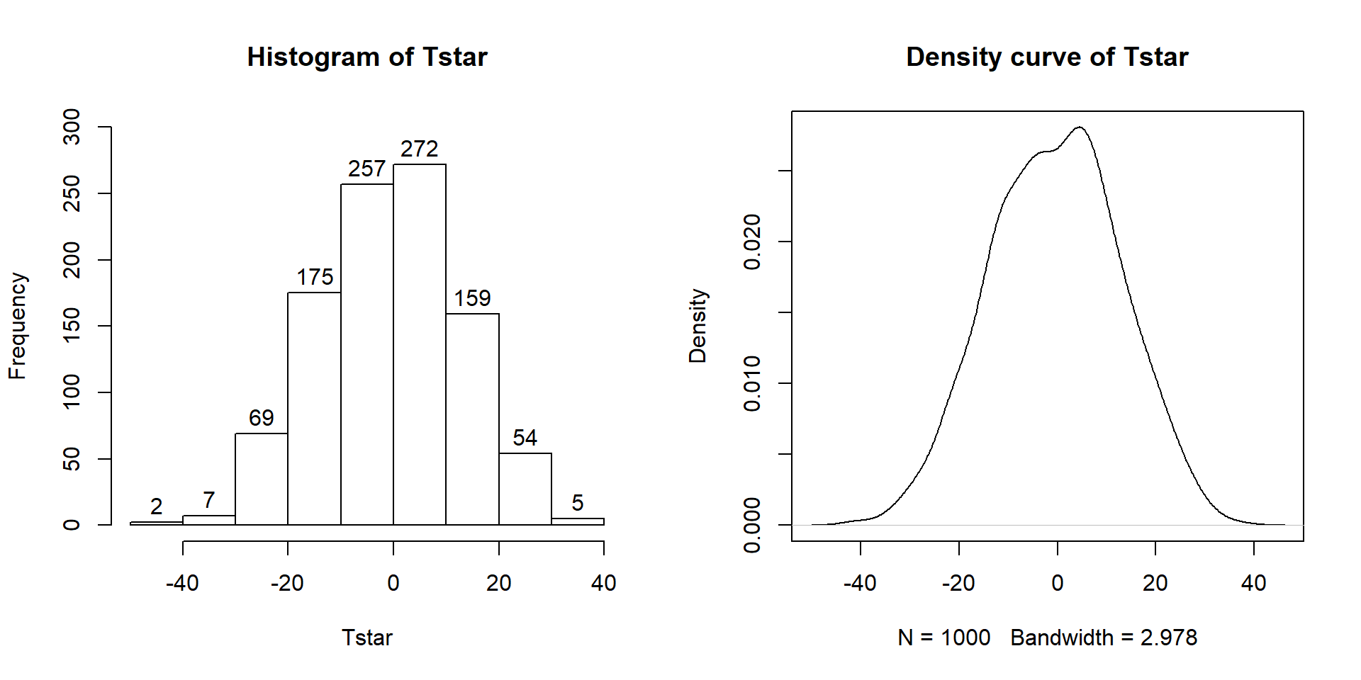
Figure 2.9: Histogram (left, with counts in bars) and density curve (right) of values of test statistic for B = 1,000 permutations.
B <- 1000
Tstar <- matrix(NA, nrow=B)
for (b in (1:B)){
  lmP <- lm(Distance~shuffle(Condition), data=dsample)
  Tstar[b] <- coef(lmP)[2]
}
hist(Tstar, label=T,ylim=c(0,300))
plot(density(Tstar), main="Density curve of Tstar")## min Q1 median Q3 max mean sd n
## -41.26667 -10.06667 -0.3333333 8.6 37.26667 -0.5054667 13.17156 1000
## missing
## 0Figure 2.9 contains visualizations of \(T^*\) and the favstats
summary provides the related numerical summaries. Our observed \(T_{obs}\)
of -25.933 seems somewhat unusual relative to these results with only
9 \(T^*\) values smaller than -30 based on the
histogram. We need to make more specific comparisons of the permuted results
versus our observed result to be able to clearly decide whether our observed
result is really unusual.
To make the comparisons more concrete, first we can enhance the previous graphs
by adding the value of the test statistic from the real data set, as shown in
Figure 2.10, using the abline function to draw a vertical
line at our \(T_{obs}\) value specified in the v (for vertical) option.
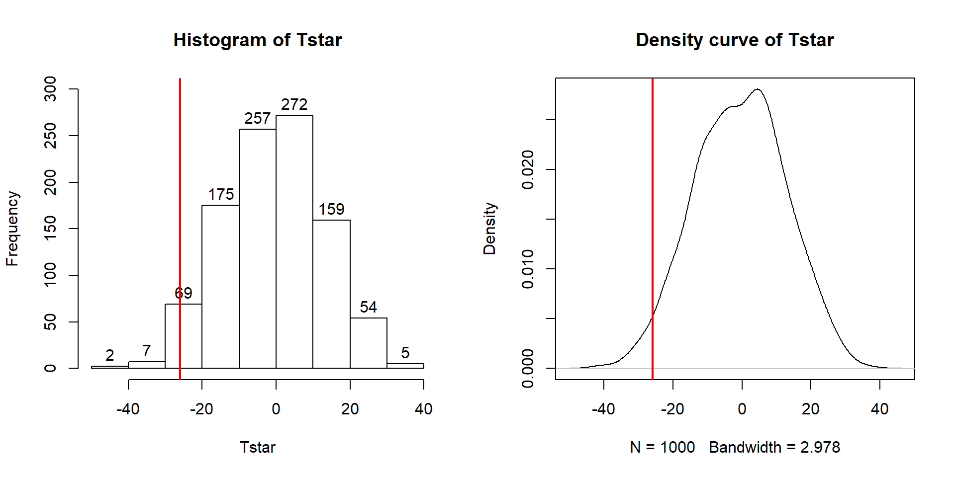
Figure 2.10: Histogram (left) and density curve (right) of values of test statistic for 1,000 permutations with bold vertical line for value of observed test statistic.
Tobs <- -25.933
hist(Tstar, labels=T)
abline(v=Tobs, lwd=2, col="red")
plot(density(Tstar), main="Density curve of Tstar")
abline(v=Tobs, lwd=2, col="red")
Second, we can calculate the exact number of permuted results that were as
small or smaller
than what we observed. To calculate the proportion of the 1,000 values that were
as small or smaller than what we observed, we will use the pdata function.
To use this
function, we need to provide the distribution of values to compare to the cut-off
(Tstar), the cut-off point (Tobs), and whether we want calculate the
proportion that are below (left of) or above (right of) the cut-off
(lower.tail=T option provides the proportion of values to the left of (below) the cutoff
of interest).
## [1] 0.027The proportion of 0.027 tells us that 27 of the 1,000 permuted results (2.7%) were as small or smaller than what we observed. This type of work is how we can generate p-values using permutation distributions. P-values, as you should remember, are the probability of getting a result as extreme as or more extreme than what we observed, \(\underline{\text{given that the null is true}}\). Finding only 27 permutations of 1,000 that were as small or smaller than our observed result suggests that it is hard to find a result like what we observed if there really were no difference, although it is not impossible.
When testing hypotheses for two groups, there are two types of alternative
hypotheses, one-sided or two-sided. One-sided tests involve only considering
differences in one-direction (like \(\mu_1 > \mu_2\)) and are performed when
researchers can decide a priori30 which group should have a larger mean
if there is going to be any sort of difference. In this situation, we did not
know enough about the potential impacts of the outfits to know which group should
be larger than the other so should do a two-sided test. It is important to
remember that you can’t look at the responses to decide on the hypotheses. It is
often safer and more conservative31 to start with a
two-sided alternative (\(\mathbf{H_A: \mu_1 \ne \mu_2}\)). To do a 2-sided
test, find the area smaller than what we observed as above (or larger if the test statistic had been positive). We also need to add
the area in the other tail (here the right tail) similar to what we observed in the
right tail. Some statisticians suggest doubling the area in one tail but we will collect
information on the number that were as or more extreme than the same
value in the other
tail32. In other words, we count the proportion below -25.933 and over 25.933. So
we need to find how many of the permuted results were larger than or equal
to 25.933 cm
to add to our previous proportion. Using pdata with -Tobs as the cut-off
and lower.tail =F provides this result:
## [1] 0.017So the p-value to test our null hypothesis of no difference in the true means between the groups is 0.027 + 0.017, providing a p-value of 0.044. Figure 2.11 shows both cut-offs on the histogram and density curve.
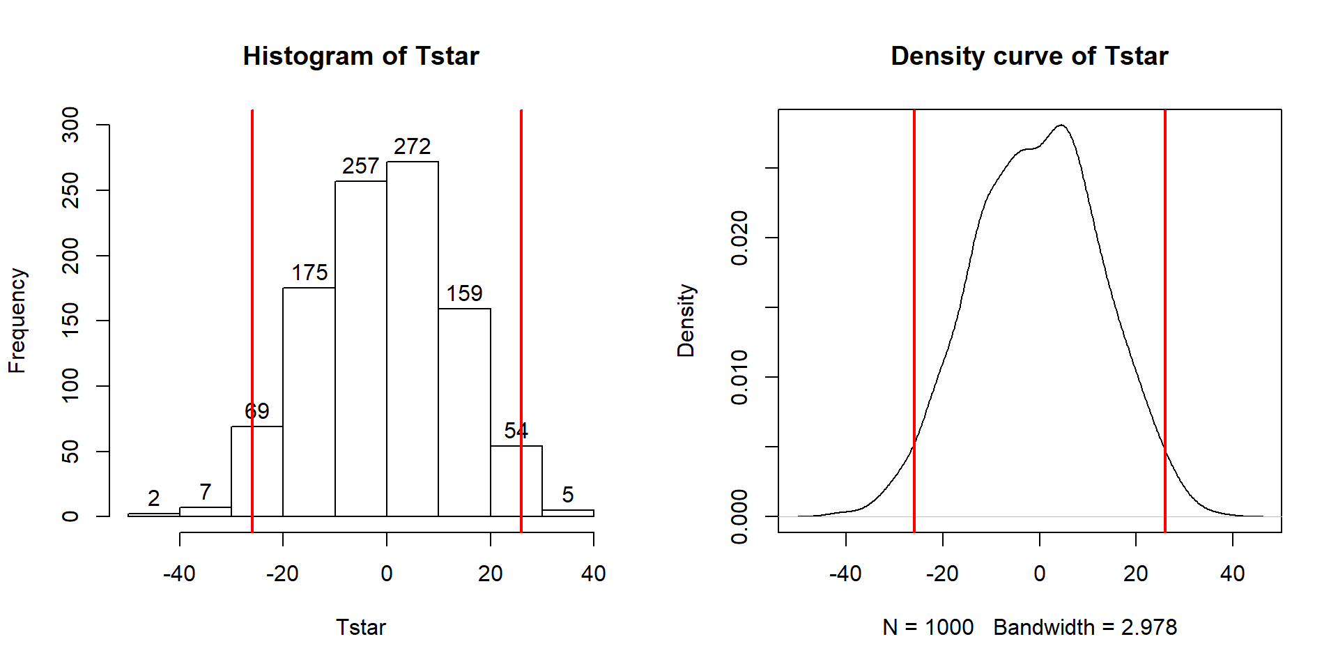
Figure 2.11: Histogram and density curve of values of test statistic for 1,000 permutations with bold lines for value of observed test statistic (-25.933) and its opposite value (25.933) required for performing the two-sided test.
hist(Tstar, labels=T)
abline(v=c(-1,1)*Tobs, lwd=2, col="red")
plot(density(Tstar), main="Density curve of Tstar")
abline(v=c(-1,1)*Tobs, lwd=2, col="red")
In general, the one-sided test p-value
is the proportion of the
permuted results that are as extreme or more extreme than observed in the
direction of the alternative
hypothesis (lower or upper tail, remembering that this also depends on the
direction of the difference taken). For the two-sided test, the p-value
is the
proportion of the permuted results that are less than or equal to the negative
version of the observed statistic and greater than or equal to the positive
version of the observed statistic. Using absolute
values (| |), we can simplify this: the two-sided p-value is the
proportion of the |permuted statistics| that are as large or larger than
|observed statistic|.
This will always work and finds areas in both tails regardless of whether the
observed statistic is positive or negative. In R, the abs function provides the
absolute value and we can again use pdata to find our p-value in one line
of code:
## [1] 0.044We will encourage you to think through what might constitute strong evidence against your null hypotheses and then discuss how strong you feel the evidence is against the null hypothesis in the p-value that you obtained. Basically, p-values present a measure of evidence against the null hypothesis, with smaller values presenting more evidence against the null. They range from 0 to 1 and you should interpret them on a graded scale from strong evidence (close to 0) to little evidence to no evidence (1). We will discuss the use of a fixed significance level below as it is still commonly used in many fields and is necessary to discuss to think about the theory of hypothesis testing, but, for the moment, we can conclude that there is moderate evidence against the null hypothesis presented by having a p-value of 0.044 because our observed result is somewhat rare relative to what we would expect if the null hypothesis was true. And so we might conclude (in the direction of the alternative) that there is a difference in the population means in the two groups, but that depends on what you think about how unusual that result was.
Before we move on, let’s note some interesting features of the permutation distribution of the difference in the sample means shown in Figure 2.11.
It is basically centered at 0. Since we are performing permutations assuming the null model is true, we are assuming that \(\mu_1 = \mu_2\) which implies that \(\mu_1 - \mu_2 = 0\). This also suggests that 0 should be the center of the permutation distribution and it was.
It is approximately normally distributed. This is due to the Central Limit Theorem33, where the sampling distribution (distribution of all possible results for samples of this size) of the difference in sample means (\(\bar{x}_1 - \bar{x}_2\)) becomes more normally distributed as the sample sizes increase. With 15 observations in each group, we have no guarantee to have a relatively normal looking distribution of the difference in the sample means but with the distributions of the original observations looking somewhat normally distributed, the sampling distribution of the sample means likely will look fairly normal. This result will allow us to use a parametric method to approximate this sampling distribution under the null model if some assumptions are met, as we’ll discuss below.
Our observed difference in the sample means (-25.933) is a fairly unusual result relative to the rest of these results but there are some permuted data sets that produce more extreme differences in the sample means. When the observed differences are really large, we may not see any permuted results that are as extreme as what we observed. When
pdatagives you 0, the p-value should be reported to be smaller than 0.001 (not 0!) if B is 1,000 since it happened in less than 1 in 1,000 tries but does occur once – in the actual data set.Since our null model is not specific about the direction of the difference, considering a result like ours but in the other direction (25.933 cm) needs to be included. The observed result seems to put about the same area in both tails of the distribution but it is not exactly the same. The small difference in the tails is a useful aspect of this approach compared to the parametric method discussed below as it accounts for potential asymmetry in the sampling distribution.
Earlier, we decided that the p-value provided moderate evidence against the null hypothesis. You should use your own judgment about whether the p-value obtain is sufficiently small to conclude that you think the null hypothesis is wrong. Remembering that the p-value is the probability you would observe a result like you did (or more extreme), assuming the null hypothesis is true; this tells you that the smaller the p-value is, the more evidence you have against the null. Figure 2.12 provides a diagram of some suggestions for the graded p-value interpretation that you can use. The next section provides a more formal review of the hypothesis testing infrastructure, terminology, and some of things that can happen when testing hypotheses. P-values have been (validly) criticized for the inability of studies to be reproduced, for the bias in publications to only include studies that have small p-values, and for the lack of thought that often accompanies using a fixed significance level to make decisions (and only focusing on that decision). To alleviate some of these criticisms, we recommend reporting the strength of evidence of the result based on the p-value and also reporting and discussing the size of the estimated results (with a measure of precision of the estimated difference). We will explore the implications of how p-values are used in scientific research in Section 2.8.
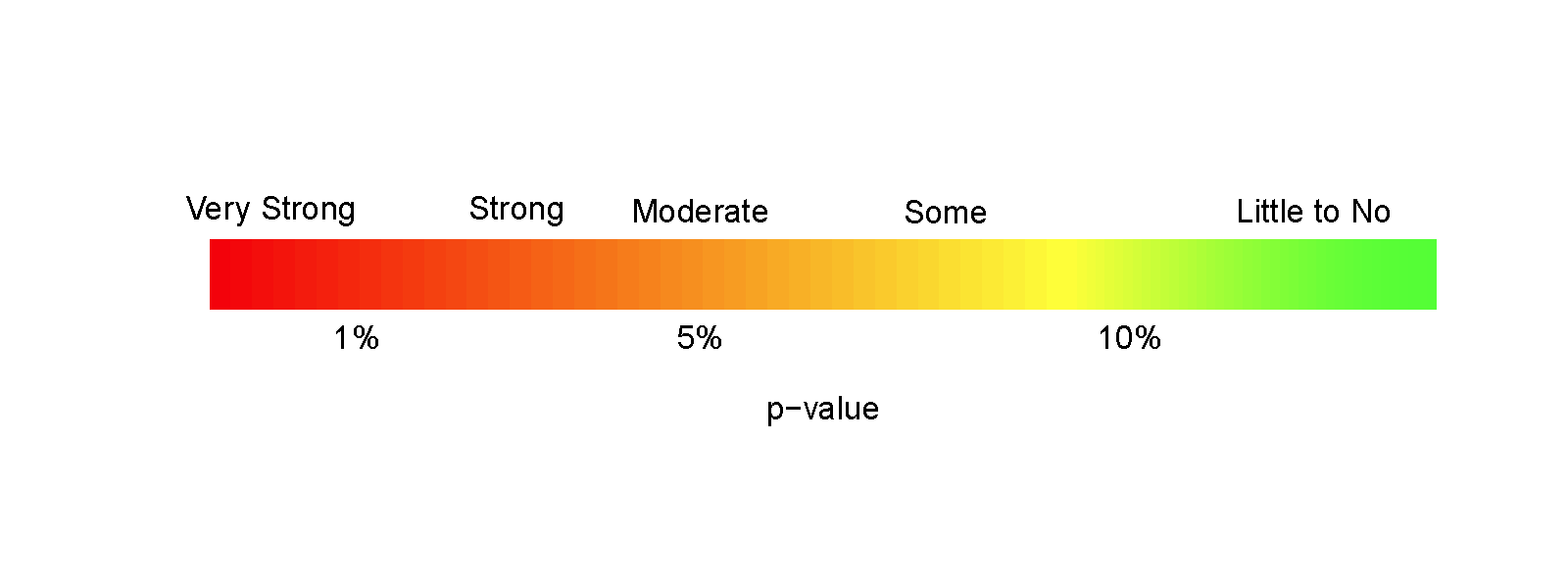
Figure 2.12: Graphic suggesting potential interpretations of strength of evidence based on gradient of p-values.
2.5 Hypothesis testing (general)
In hypothesis testing (sometimes more explicitly called “Null Hypothesis Significance Testing” or NHST), it is formulated to answer a specific question about a population or true parameter(s) using a statistic based on a data set. In your previous statistics course, you (hopefully) considered one-sample hypotheses about population means and proportions and the two-sample mean situation we are focused on here. Hypotheses relate to trying to answer the question about whether the population mean overtake distances between the two groups are different, with an initial assumption of no difference.
NHST is much like a criminal trial with a jury where you are in the role of a jury member. Initially, the defendant is assumed innocent. In our situation, the true means are assumed to be equal between the groups. Then evidence is presented and, as a juror, you analyze it. In statistical hypothesis testing, data are collected and analyzed. Then you have to decide if we had “enough” evidence to reject the initial assumption (“innocence” that is initially assumed). To make this decision, you want to have thought about and decided on the standard of evidence required to reject the initial assumption. In criminal cases, “beyond a reasonable doubt” is used. Wikipedia’s definition (https://en.wikipedia.org/wiki/Reasonable_doubt) suggests that this standard is that “there can still be a doubt, but only to the extent that it would not affect a reasonable person’s belief regarding whether or not the defendant is guilty”. In civil trials, a lower standard called a “preponderance of evidence” is used. Based on that defined and pre-decided (a priori) measure, you decide that the defendant is guilty or not guilty. In statistics, the standard is set by choosing a significance level, \(\alpha\), and then you compare the p-value to it. In this approach, if the p-value is less than \(\alpha\), we reject the null hypothesis. The choice of the significance level is like the variation in standards of evidence between criminal and civil trials – and in all situations everyone should know the standards required for rejecting the initial assumption before any information is “analyzed”. Once someone is found guilty, then there is the matter of sentencing which is related to the impacts (“size”) of the crime. In statistics, this is similar to the estimated size of differences and the related judgments about whether the differences are practically important or not. If the crime is proven beyond a reasonable doubt but it is a minor crime, then the sentence will be small. With the same level of evidence and a more serious crime, the sentence will be more dramatic. This latter step is more critical than the p-value as it directly relates to actions to be taken based on the research but unfortunately p-values and the related decisions get most of the attention.
There are some important aspects of the testing process to note that inform how we interpret statistical hypothesis test results. When someone is found “not guilty”, it does not mean “innocent”, it just means that there was not enough evidence to find the person guilty “beyond a reasonable doubt”. Not finding enough evidence to reject the null hypothesis does not imply that the true means are equal, just that there was not enough evidence to conclude that they were different. There are many potential reasons why we might fail to reject the null, but the most common one is that our sample size was too small (which is related to having too little evidence). Other reasons include simply the variation in taking a random sample from the population(s). This randomness in samples and the differences in the sample means also implies that p-values are random and can easily vary if the data set had been slightly different. This also relates to the suggestion of using a graded interpretation of p-values instead of the fixed \(\alpha\) usage – if the p-value is an estimated quantity, is there really any difference between p-values of 0.049 and 0.051? We probably shouldn’t think there is a big difference in results for these two p-values even though the standard NHST reject/fail to reject the null approach considers these as completely different results. So where does that leave us? Interpret the p-values using strength of evidence against the null hypothesis, remembering that smaller (but not really small) p-values can still be interesting. And if you think the p-value is small enough, then you can reject the null hypothesis and conclude that the alternative hypothesis is a better characterization of the truth – and then estimate the size of the differences.
Throughout this material, we will continue to re-iterate the distinctions between parameters and statistics and want you to be clear about the distinctions between estimates based on the sample and inferences for the population or true values of the parameters of interest. Remember that statistics are summaries of the sample information and parameters are characteristics of populations (which we rarely know). In the two-sample mean situation, the sample means are always at least a little different – that is not an interesting conclusion. What is interesting is whether we have enough evidence to feel like we have proven that the population or true means differ “beyond a reasonable doubt”.
The scope of any inferences is constrained based on whether there is a random sample (RS) and/or random assignment (RA). Table 2.1 contains the four possible combinations of these two characteristics of a given study. Random assignment of treatment levels to subjects allows for causal inferences for differences that are observed – the difference in treatment levels is said to cause differences in the mean responses. Random sampling (or at least some sort of representative sample) allows inferences to be made to the population of interest. If we do not have RA, then causal inferences cannot be made. If we do not have a representative sample, then our inferences are limited to the sampled subjects.
| Random Sampling/Random Assignment |
Random Assignment (RA) – Yes (controlled experiment) |
Random Assignment (RA) – No (observational study) |
|---|---|---|
| Random Sampling (RS) – Yes (or some method that results in a representative sample of population of interest) |
Because we have RS, we can generalize inferences to the population the RS was taken from. Because we have RA we can assume the groups were equivalent on all aspects except for the treatment and can establish causal inference. |
Can generalize inference to population the RS was taken from but cannot establish causal inference (no RA – cannot isolate treatment variable as only difference among groups, could be confounding variables). |
| Random Sampling (RS) – No (usually a convenience sample) |
Cannot generalize inference
to the population of interest because the sample was not random and could be biased – may not be “representative” of the population of interest. Can establish causal inference due to RA \(\rightarrow\) the inference from this type of study applies only to the sample. |
Cannot generalize inference
to the population of interest because the sample was not random and could be biased – may not be “representative” of the population of interest. Cannot establish causal inference due to lack of RA of the treatment. |
A simple example helps to clarify how the scope of inference can change based on the study design. Suppose we are interested in studying the GPA of students. If we had taken a random sample from, say, Intermediate Statistics students in a given semester at a university, our scope of inference would be the population of students in that semester taking that course. If we had taken a random sample from the entire population of students at that school, then the inferences would be to the entire population of students in that semester. These are similar types of problems but the two populations are very different and the group you are trying to make conclusions about should be noted carefully in your results – it does matter! If we did not have a representative sample, say the students could choose to provide this information or not and some chose not to, then we can only make inferences to volunteers. These volunteers might differ in systematic ways from the entire population of Intermediate Statistics students (for example, they are proud of their GPA) so we cannot safely extend our inferences beyond the group that volunteered.
To consider the impacts of RA versus results from purely observational studies, we need to be comparing groups. Suppose that we are interested in differences in the mean GPAs for different sections of Intermediate Statistics and that we take a random sample of students from each section and compare the results and find evidence of some difference. In this scenario, we can conclude that there is some difference in the population of these statistics students but we can’t say that being in different sections caused the differences in the mean GPAs. Now suppose that we randomly assigned every student to get extra training in one of three different study techniques and found evidence of differences among the training methods. We could conclude that the training methods caused the differences in these students. These conclusions would only apply to Intermediate Statistics students at this university in this semester and could not be generalized to a larger population of students. If we took a random sample of Intermediate Statistics students (say only 10 from each section) and then randomly assigned them to one of three training programs and found evidence of differences, then we can say that the training programs caused the differences. But we can also say that we have evidence that those differences pertain to the population of Intermediate Statistics students in that semester at this university. This seems similar to the scenario where all the students participated in the training programs except that by using random sampling, only a fraction of the population needs to actually be studied to make inferences to the entire population of interest – saving time and money.
A quick summary of the terminology of hypothesis testing is useful at this point. The null hypothesis (\(H_0\)) states that there is no difference or no relationship in the population. This is the statement of no effect or no difference and the claim that we are trying to find evidence against in NHST. In this chapter, \(H_0\): \(\mu_1=\mu_2\). When doing two-group problems, you always need to specify which group is 1 and which one is 2 because the order does matter. The alternative hypothesis (\(H_1\) or \(H_A\)) states a specific difference between parameters. This is the research hypothesis and the claim about the population that we often hope to demonstrate is more reasonable to conclude than the null hypothesis. In the two-group situation, we can have one-sided alternatives \(H_A: \mu_1 > \mu_2\) (greater than) or \(H_A: \mu_1 < \mu_2\) (less than) or, the more common, two-sided alternative \(H_A: \mu_1 \ne \mu_2\) (not equal to). We usually default to using two-sided tests because we often do not know enough to know the direction of a difference a priori, especially in more complicated situations. The sampling distribution under the null is the distribution of all possible values of a statistic under the assumption that \(H_0\) is true. It is used to calculate the p-value, the probability of obtaining a result as extreme or more extreme (defined by the alternative) than what we observed given that the null hypothesis is true. We will find sampling distributions using nonparametric approaches (like the permutation approach used previously) and parametric methods (using “named” distributions like the \(t\), F, and \(\chi^2\)).
Small p-values are evidence against the null hypothesis because the observed result is unlikely due to chance if \(H_0\) is true. Large p-values provide little to no evidence against \(H_0\) but do not allow us to conclude that the null hypothesis is correct – just that we didn’t find enough evidence to think it was wrong. The level of significance is an a priori definition of how small the p-value needs to be to provide “enough” (sufficient) evidence against \(H_0\). This is most useful to prevent sliding the standards after the results are found but you can interpret p-values as strength of evidence against the null hypothesis without employing the fixed significance level. If using a fixed significance level, we can compare the p-value to the level of significance to decide if the p-value is small enough to constitute sufficient evidence to reject the null hypothesis. We use \(\alpha\) to denote the level of significance and most typically use 0.05 which we refer to as the 5% significance level. We can compare the p-value to this level and make a decision, focusing our interpretation on the strength of evidence we found based on the p-value from very strong to little to none. If we are using the strict version of NHST, the two options for decisions are to either reject the null hypothesis if the p-value \(\le \alpha\) or fail to reject the null hypothesis if the p-value \(> \alpha\). When interpreting hypothesis testing results, remember that the p-value is a measure of how unlikely the observed outcome was, assuming that the null hypothesis is true. It is NOT the probability of the data or the probability of either hypothesis being true. The p-value, simply, is a measure of evidence against the null hypothesis.
Although we want to use graded evidence to interpret p-values, there is one situation where thinking about comparisons to fixed \(\alpha\) levels is useful for understanding and studying statistical hypothesis testing. The specific definition of \(\alpha\) is that it is the probability of rejecting \(H_0\) when \(H_0\) is true, the probability of what is called a Type I error. Type I errors are also called false rejections or false detections. In the two-group mean situation, a Type I error would be concluding that there is a difference in the true means between the groups when none really exists in the population. In the courtroom setting, this is like falsely finding someone guilty. We don’t want to do this very often, so we use small values of the significance level, allowing us to control the rate of Type I errors at \(\alpha\). We also have to worry about Type II errors, which are failing to reject the null hypothesis when it’s false. In a courtroom, this is the same as failing to convict a truly guilty person. This most often occurs due to a lack of evidence that could be due to a small sample size or merely just an unusual sample from the population. You can use the Table 2.2 to help you remember all the possibilities.
| \(\mathbf{H_0}\) True | \(\mathbf{H_0}\) False | |
|---|---|---|
| FTR \(\mathbf{H_0}\) | Correct decision | Type II error |
| Reject \(\mathbf{H_0}\) | Type I error | Correct decision |
In comparing different procedures or in planning studies, there is an interest in studying the rate or probability of Type I and II errors. The probability of a Type I error was defined previously as \(\alpha\), the significance level. The power of a procedure is the probability of rejecting the null hypothesis when it is false. Power is defined as
\[\text{Power} = 1 - \text{Probability(Type II error) } = \text{Probability(Reject } H_0 | H_0 \text{ is false),}\]
or, in words, the probability of detecting a difference when it actually exists. We want to use a statistical procedure that controls the Type I error rate at the pre-specified level and has high power to detect false null hypotheses. Increasing the sample size is one of the most commonly used methods for increasing the power in a given situation. Sometimes we can choose among different procedures and use the power of the procedures to help us make that selection. Note that there are many ways \(H_0\) can be false and the power changes based on how false the null hypothesis actually is. To make this concrete, suppose that the true mean overtake distances differed by either 1 or 30 cm in previous example. The chances of rejecting the null hypothesis are much larger when the groups actually differ by 30 cm than if they differ by just 1 cm, given the same sample size. The null hypothesis is false in both cases. Similarly, for a given difference in the true means, the larger the sample, the higher the power of the study to actually find evidence of a difference in the groups. We will see this difference when we return to using the entire overtake data set instead of the sample of \(n=30\) used to illustrate the permutation procedures.
After making a decision (was there enough evidence to reject the null or not), we want to make the conclusions specific to the problem of interest. If we reject \(H_0\), then we can conclude that there was sufficient evidence at the \(\alpha\)-level that the null hypothesis is wrong (and the results point in the direction of the alternative). If we fail to reject \(H_0\) (FTR \(H_0\)), then we can conclude that there was insufficient evidence at the \(\alpha\)-level to say that the null hypothesis is wrong. We are NOT saying that the null is correct and we NEVER accept the null hypothesis. We just failed to find enough evidence to say it’s wrong. If we find sufficient evidence to reject the null, then we need to revisit the method of data collection and design of the study to discuss the scope of inference. Can we discuss causality (due to RA) and/or make inferences to a larger group than those in the sample (due to RS)?
To perform a hypothesis test, there are some steps to remember to complete to make sure you have thought through and reported all aspects of the results.
| Outline of 6+ steps to perform a Hypothesis Test |
| Preliminary steps: |
| * Define research question (RQ) and consider study design - what question can the data collected address? |
| * What graphs are appropriate to visualize the data? |
| * What model/statistic (T) is needed to address RQ? |
| 1. Write the null and alternative hypotheses, |
| 2. Plot the data and assess the “Validity Conditions” for the procedure being used (discussed below), |
| 3. Find the value of the appropriate test statistic and p-value for your hypotheses, |
| 4. Write a conclusion specific to the problem based on the p-value, reporting the strength of evidence against the null hypothesis (include test statistic, its distribution under the null hypothesis, and p-value). |
| 5. Report and discuss an estimate of the size of the differences, with confidence interval(s) if appropriate. |
| 6. Scope of inference discussion for results. |
2.6 Connecting randomization (nonparametric) and parametric tests
In developing statistical inference techniques, we need to define the test statistic, \(T\), that measures the quantity of interest. To compare the means of two groups, a statistic is needed that measures their differences. In general, for comparing two groups, the choice is simple – a difference in the means often works well and is a natural choice. There are other options such as tracking the ratio of means or possibly the difference in medians. Instead of just using the difference in the means, we also could “standardize” the difference in the means by dividing by an appropriate quantity that reflects the variation in the difference in the means. All of these are valid and can sometimes provide similar results - it ends up that there are many possibilities for testing using the randomization (nonparametric) techniques introduced previously. Parametric statistical methods focus on means because the statistical theory surrounding means is quite a bit easier (not easy, just easier) than other options. There are just a couple of test statistics that you can use and end up with named distributions to use for generating inferences. Randomization techniques allow inference for other quantities (such as ratios of means or differences in medians) but our focus here will be on using randomization for inferences on means to see the similarities with the more traditional parametric procedures used in these situations.
In two-sample mean situations, instead of working just with the difference in the means, we often calculate a test statistic that is called the equal variance two-independent samples t-statistic. The test statistic is
\[t = \frac{\bar{x}_1 - \bar{x}_2}{s_p\sqrt{\frac{1}{n_1}+\frac{1}{n_2}}},\]
where \(s_1^2\) and \(s_2^2\) are the sample variances for the two groups, \(n_1\) and \(n_2\) are the sample sizes for the two groups, and the pooled sample standard deviation,
\[s_p = \sqrt{\frac{(n_1-1)s_1^2 + (n_2-1)s_2^2}{n_1+n_2-2}}.\]
The \(t\)-statistic keeps the important comparison between the means in the
numerator that we used before and standardizes (re-scales) that difference so
that \(t\) will follow a \(t\)-distribution
(a parametric
“named” distribution) if
certain assumptions are met. But first we should see if standardizing the
difference in the means had an impact on our permutation test
results. It ends up that, while not too obvious, the summary of the lm we fit earlier contains this test statistic34. Instead
of using the second model coefficient that estimates the difference in the means of the groups, we will extract the test statistic from the table of summary output that is in the coef object in the summary – using $ to reference the coef information only. In the coef object in the summary, results related to the ConditionCommute are again useful for the comparison of two groups.
##                   Estimate Std. Error   t value     Pr(>|t|)
## (Intercept)      135.80000   8.862996 15.322133 3.832161e-15
## Conditioncommute -25.93333  12.534169 -2.069011 4.788928e-02
The first column of numbers contains the estimated difference in the sample means (-25.933 here) that was used before. The next column is the Std. Error column that contains the standard error (SE) of the estimated difference in the means, which is \(s_p\sqrt{\frac{1}{n_1}+\frac{1}{n_2}}\) and also the denominator used to form the \(t\)-test statistic (12.53 here). It will be a common theme in this material to take the ratio of the estimate (-25.933) to its SE (12.53) to generate test statistics, which provides -2.07 – this is the “standardized” estimate of the difference in the means. It is also a test statistic (\(T\)) that we can use in a permutation test. This value is in the second row and third column of summary(lm1)$coef and to extract it the bracket notation is again employed. Specifically we want to extract summary(lm1)$coef[2,3] and using it and its permuted data equivalents to calculate a p-value. Since we are doing a two-sided
test, the code resembles the permutation test code in Section 2.4
with the new \(t\)-statistic replacing the difference in the sample means that we
used before.
## [1] -2.069011B <- 1000
set.seed(406)
Tstar <- matrix(NA, nrow=B)
for (b in (1:B)){
lmP <- lm(Distance~shuffle(Condition), data=dsample)
Tstar[b] <- summary(lmP)$coef[2,3]
}
pdata(abs(Tstar), abs(Tobs), lower.tail=F)## [1] 0.041The permutation distribution in Figure 2.13 looks similar to the previous results with slightly different \(x\)-axis scaling. The observed \(t\)-statistic was \(-2.07\) and the proportion of permuted results that were as or more extreme than the observed result was 0.041. This difference is due to a different set of random permutations being selected. If you run permutation code, you will often get slightly different results each time you run it. If you are uncomfortable with the variation in the results, you can run more than B = 1,000 permutations (say 10,000) and the variability in the resulting p-values will be reduced further. Usually this uncertainty will not cause any substantive problems – but do not be surprised if your results vary if you use different random number seeds.
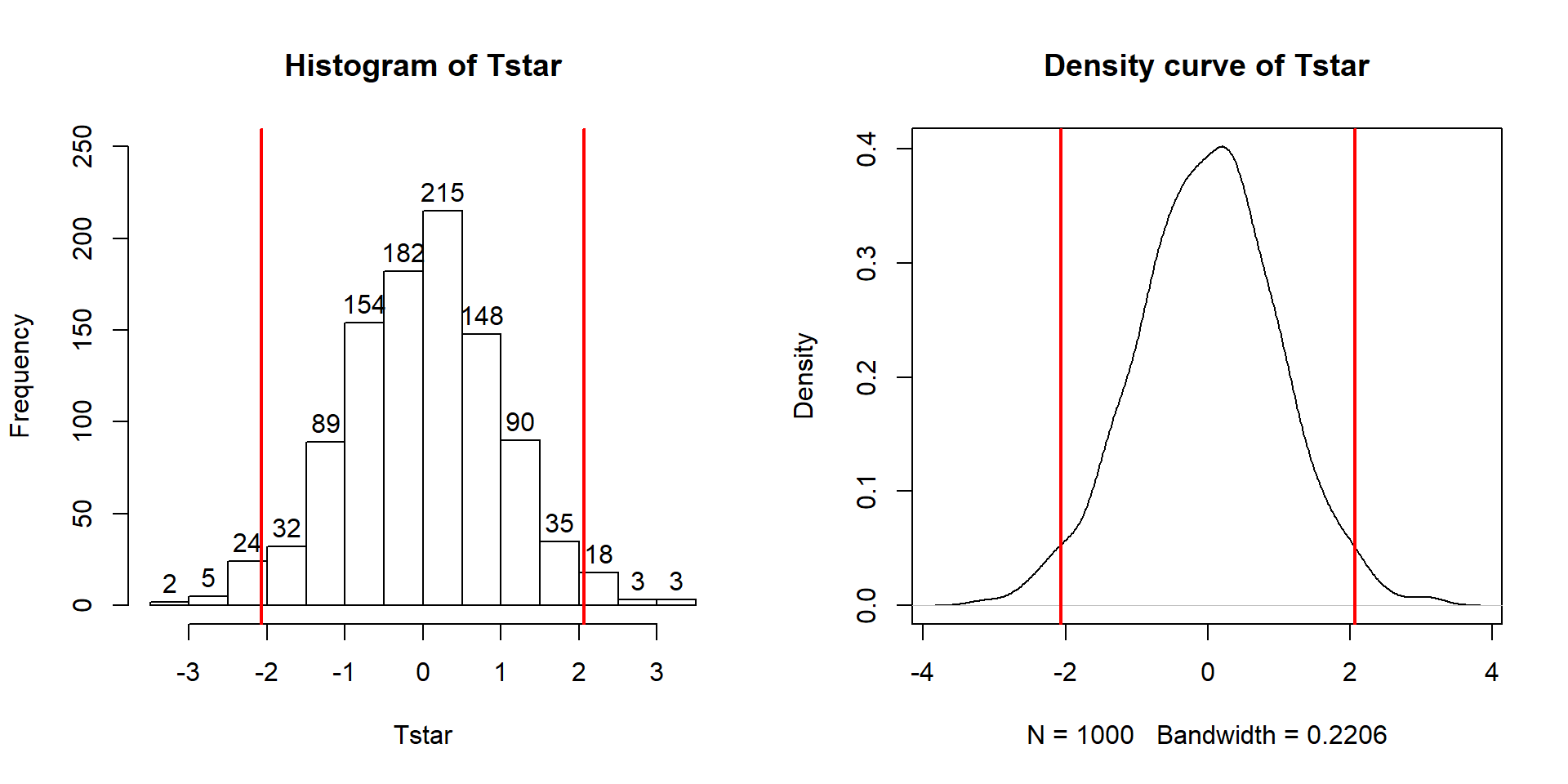
Figure 2.13: Permutation distribution of the \(t\)-statistic.
hist(Tstar, labels=T)
abline(v=c(-1,1)*Tobs, lwd=2, col="red")
plot(density(Tstar), main="Density curve of Tstar")
abline(v=c(-1,1)*Tobs, lwd=2, col="red")
The parametric version
of these results is based on using what is called
the two-independent sample t-test. There are actually two versions of this
test, one that assumes that variances are equal in the groups and one that
does not. There is a rule of thumb that if the ratio of the larger standard
deviation over the smaller standard deviation is less than 2, the equal variance
procedure is OK. It ends up that this assumption
is less important if the sample sizes in the groups are approximately equal
and more important if the groups contain different numbers of observations. In
comparing the two potential test statistics, the procedure that assumes equal
variances has a complicated denominator (see the formula above for \(t\)
involving \(s_p\)) but a simple formula for degrees of freedom (df)
for the \(t\)-distribution (\(df=n_1+n_2-2\)) that approximates the
distribution of the test statistic, \(t\), under the null hypothesis. The
procedure that assumes unequal variances has a simpler test statistic and a
very complicated degrees of freedom formula. The equal variance procedure is
equivalent to the methods we will consider in Chapters
3 and 4 so that
will be our focus for the two group problem and is what we get when using the lm model to estimate the differences in the group means. The unequal variance version of the two-sample t-test is available in the t.test function if needed.
Figure 2.14: Plots of \(t\)-distributions with 2, 10, and 20 degrees of freedom and a normal distribution (dashed line). Note how the \(t\)-distributions get closer to the normal distribution as the degrees of freedom increase and at 20 degrees of freedom, the \(t\)-distribution almost matches a standard normal curve.
If the assumptions for the equal variance \(t\)-test and the null hypothesis are true, then the sampling distribution of the test statistic should follow a \(t\)-distribution with \(n_1+n_2-2\) degrees of freedom (so the total sample size, \(n\), minus 2). The t-distribution is a bell-shaped curve that is more spread out for smaller values of degrees of freedom as shown in Figure 2.14. The \(t\)-distribution looks more and more like a standard normal distribution (\(N(0,1)\)) as the degrees of freedom increase.
To get the p-value for the parametric \(t\)-test,
we need to calculate the
test statistic and \(df\), then look up the areas in the tails of the
\(t\)-distribution
relative to the observed \(t\)-statistic. We’ll learn how to use
R to do this below, but for now we will allow the summary of the lm function to take
care of this. In the ConditionCommute row of the summary and the Pr(>|t|) column, we can find the p-value associated with the test statistic. We can either calculate the degrees of freedom for the \(t\)-distribution using \(n_1+n_2-2 = 15+15-2 = 28\) or explore the full suite of the model summary that is repeated below. In the first row below the ConditionCommute row, it reports “… 28 degrees of freedom” and these are the same \(df\) that are needed to report and look up for any of the \(t\)-statistics in the model summary.
##
## Call:
## lm(formula = Distance ~ Condition, data = dsample)
##
## Residuals:
##     Min      1Q  Median      3Q     Max
## -63.800 -21.850   4.133  15.150  72.200
##
## Coefficients:
##                  Estimate Std. Error t value Pr(>|t|)
## (Intercept)       135.800      8.863  15.322 3.83e-15
## Conditioncommute  -25.933     12.534  -2.069   0.0479
##
## Residual standard error: 34.33 on 28 degrees of freedom
## Multiple R-squared:  0.1326, Adjusted R-squared:  0.1016
## F-statistic: 4.281 on 1 and 28 DF,  p-value: 0.04789
So the parametric \(t\)-test gives a p-value of 0.0479 from a test statistic of -2.07. The p-value is very similar to the two permutation results found before. The reason for this similarity is that the permutation distribution looks like a \(t\)-distribution with 28 degrees of freedom. Figure 2.15 shows how similar the two distributions happened to be here, where the only difference in shape is near the peak of the distributions with a slight difference of the permutation distribution to shift to the right.
Figure 2.15: Plot of permutation and \(t\)-distribution with \(df=28\). Note the close match in the two distributions, especially in the tails of the distributions where we are obtaining the p-values.
In your previous statistics course, you might have used an applet or
a table to find p-values such as what was provided in the previous R output.
When not directly provided in the output of a function, R can be used to look up
p-values35 from
named distributions such as the \(t\)-distribution. In this case, the distribution
of the test statistic under the null hypothesis is a \(t(28)\) or a \(t\) with 28
degrees of freedom. The pt function is used to get p-values from the
\(t\)-distribution in the same manner that pdata could help us to find p-values
from the permutation distribution.
We need to provide the df=... and specify
the tail of the distribution of interest using the lower.tail option along
with the cutoff of interest. If we want the area to the left of -2.07:
## [1] 0.02394519And we can double it to get the p-value that was in the output, because the \(t\)-distribution is symmetric:
## [1] 0.04789038More generally, we could always make the test statistic positive using the
absolute value (abs), find the area to the right of it (lower.tail=F), and then double that for a
two-sided test p-value:
## [1] 0.04789038Permutation distributions do not need to match the named parametric distribution to work correctly, although this happened in the previous example. The parametric approach, the \(t\)-test, requires certain conditions to be true (or at least not be clearly violated) for the sampling distribution of the statistic to follow the named distribution and provide accurate p-values. The conditions for the \(t\)-test are:
Independent observations: Each observation obtained is unrelated to all other observations. To assess this, consider whether anything in the data collection might lead to clustered or related observations that are un-related to the differences in the groups. For example, was the same person measured more than once36?
Equal variances in the groups (because we used a procedure that assumes equal variances! – there is another procedure that allows you to relax this assumption if needed…). To assess this, compare the standard deviations and variability in the pirate-plots and see if they look noticeably different. Be particularly critical of this assessment if the sample sizes differ greatly between groups.
Normal distributions of the observations in each group. We’ll learn more diagnostics later, but the pirate-plots are a good place to start to help you look for potential skew or outliers. If you find skew and/or outliers, that would suggest a problem with the assumption of normality as normal distributions are symmetric and extreme observations occur very rarely.
For the permutation test, we relax the third condition and replace it with:
- Similar distributions for the groups: The permutation approach allows valid inferences as long as the two groups have similar shapes and only possibly differ in their centers. In other words, the distributions need not look normal for the procedure to work well, but they do need to look similar.
In the bicycle overtake study, the independent observation condition is violated because of multiple measurements taken on the same ride. The fact that the same rider was used for all observations is not really a violation of independence here because there was only one subject used. If multiple subjects had been used, then that also could present a violation of the independence assumption. This violation is important to note as the inferences may not be correct due to the violation of this assumption and more sophisticated statistical methods would be needed to complete this analysis correctly. The equal variance condition does not appear to be violated. The standard deviations are 28.4 vs 39.4, so this difference is not “large” according to the rule of thumb noted above (ratio of SDs is about 1.4). There is also little evidence in the pirate-plots to suggest a violation of the normality condition for each of the groups (Figure 2.6). Additionally, the shapes look similar for the two groups so we also could feel comfortable using the permutation approach based on its version of condition (3) above. Note that when assessing assumptions, it is important to never state that assumptions are met – we never know the truth and can only look at the information in the sample to look for evidence of problems with particular conditions. Violations of those conditions suggest a need for either more sophisticated statistical tools37 or possibly transformations of the response variable (discussed in Chapter 7).
The permutation approach is resistant to impacts of violations of the normality assumption. It is not resistant to impacts of violations of any of the other assumptions. In fact, it can be quite sensitive to unequal variances as it will detect differences in the variances of the groups instead of differences in the means. Its scope of inference is the same as the parametric approach. It also provides similarly inaccurate conclusions in the presence of non-independent observations as for the parametric approach. In this example, we discover that parametric and permutation approaches provide very similar inferences, but both are subject to concerns related to violations of the independent observations condition. And we haven’t directly addressed the size and direction of the differences, which is addressed in the coming discussion of confidence intervals.
For comparison, we can also explore the original data set of all \(n=1,636\) observations for the two outfits. The estimated difference in the means is -3.003 cm (commute minus casual), the standard error is 1.472, the \(t\)-statistic is -2.039 and using a \(t\)-distribution with 1634 \(df\), the p-value is 0.0416. The estimated difference in the means is much smaller but the p-value is similar to the results for the sub-sample we analyzed. The SE is much smaller with the large sample size which corresponds to having higher power to detect smaller differences.
##
## Call:
## lm(formula = Distance ~ Condition, data = ddsub)
##
## Residuals:
##      Min       1Q   Median       3Q      Max
## -106.608  -17.608    0.389   16.392  127.389
##
## Coefficients:
##                  Estimate Std. Error t value Pr(>|t|)
## (Intercept)       117.611      1.066 110.357   <2e-16
## Conditioncommute   -3.003      1.472  -2.039   0.0416
##
## Residual standard error: 29.75 on 1634 degrees of freedom
## Multiple R-squared:  0.002539,   Adjusted R-squared:  0.001929
## F-statistic:  4.16 on 1 and 1634 DF,  p-value: 0.04156
The permutations take a little more computing power with almost two thousand observations to shuffle, but this is manageable on a modern laptop as it only has to be completed once to fill in the distribution of the test statistic under 1,000 shuffles. And the p-value obtained is a close match to the parametric result at 0.045 for the permutation version and 0.042 for the parametric approach. So we would get similar inferences for strength of evidence against the null with either the smaller data set or the full data set but the estimated size of the differences is quite a bit different. It is important to note that other random samples from the larger data set would give different p-values and this one happened to match the larger set more closely than one might expect in general.
## [1] -2.039491B <- 1000
set.seed(406)
Tstar <- matrix(NA, nrow=B)
for (b in (1:B)){
lmP <- lm(Distance~shuffle(Condition), data=ddsub)
Tstar[b] <- summary(lmP)$coef[2,3]
}
pdata(abs(Tstar), abs(Tobs), lower.tail=F)## [1] 0.045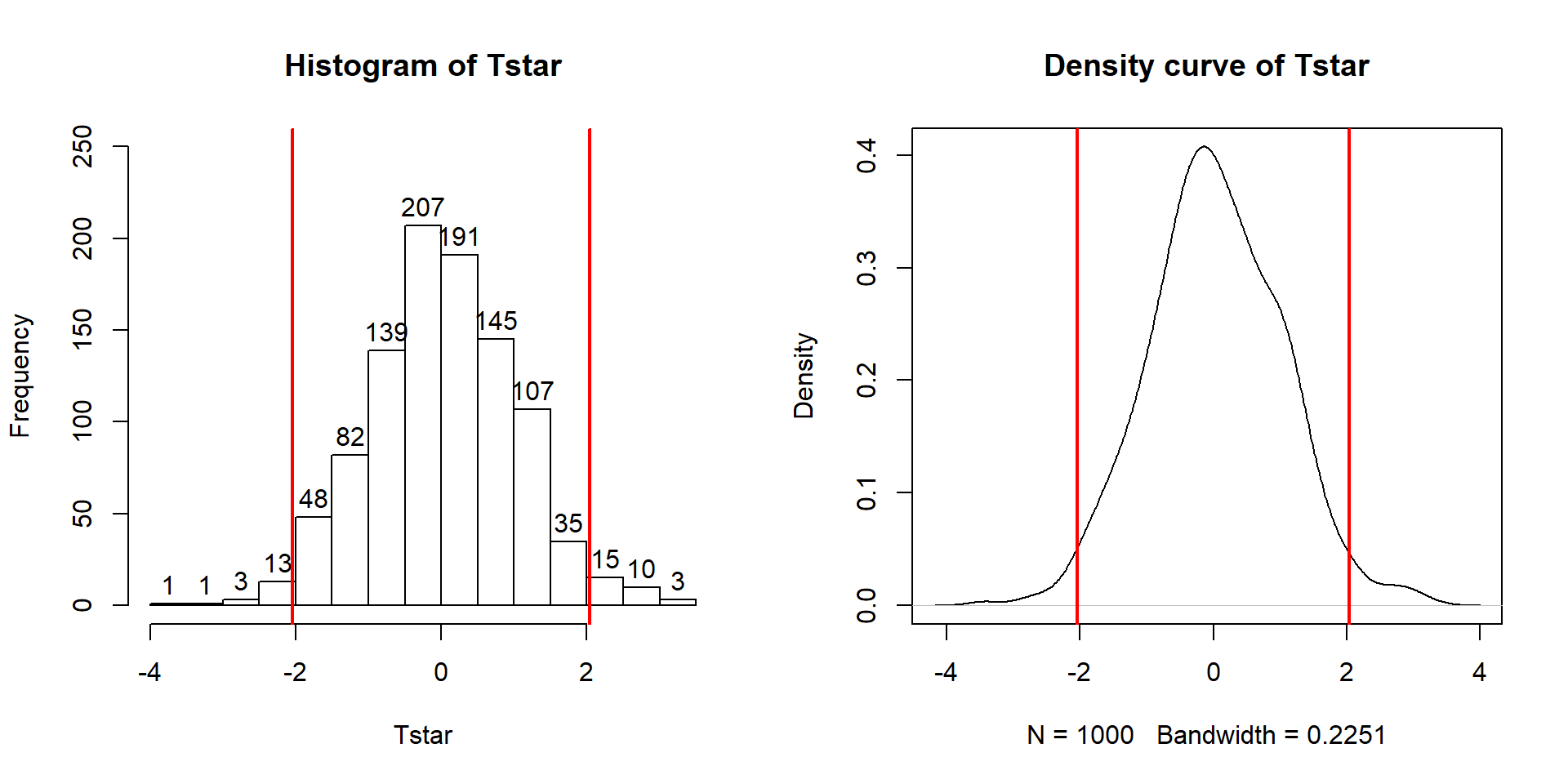
Figure 2.16: Permutation distribution of the \(t\)-statistic for \(n=1,636\) overtake data set.
2.7 Second example of permutation tests
In every chapter, the first example, used to motivate and explain the methods, is followed with a “worked” example where we focus just on the results. In a previous semester, some of the Intermediate Statistics students at Montana State University (n=79) provided information on their Sex38, Age, and current cumulative GPA. We might be interested in whether Males and Females had different average GPAs. First, we can take a look at the difference in the responses by groups based on the output and as displayed in Figure 2.17.
s217 <- read_csv("http://www.math.montana.edu/courses/s217/documents/s217.csv")
library(mosaic)
library(yarrr)## F M
## 3.338378 3.088571## Sex min Q1 median Q3 max mean sd n missing
## 1 F 2.50 3.1 3.400 3.70 4 3.338378 0.4074549 37 0
## 2 M 1.96 2.8 3.175 3.46 4 3.088571 0.4151789 42 0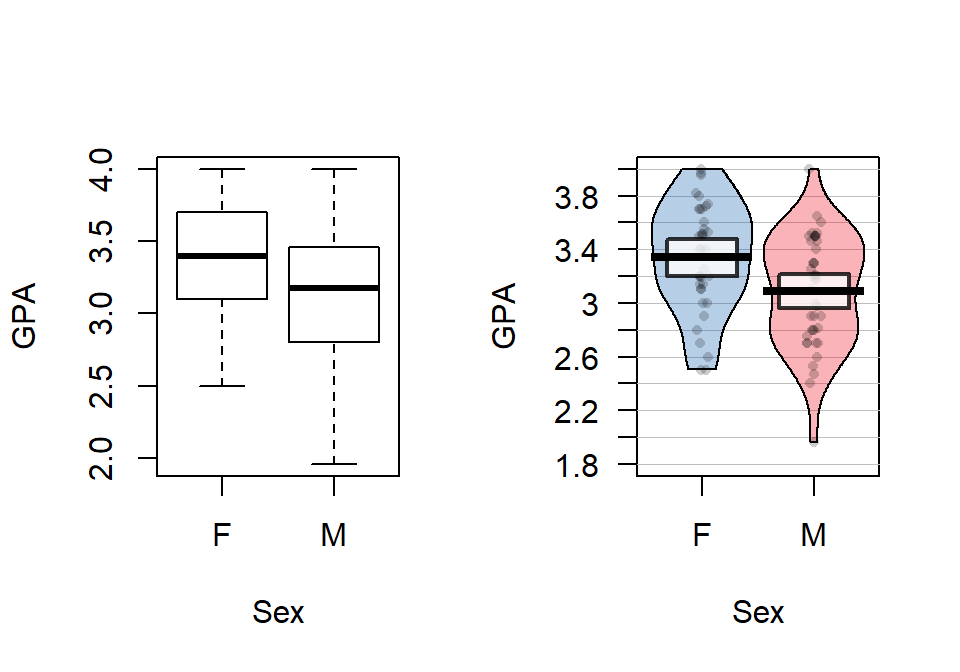
Figure 2.17: Side-by-side boxplot and pirate-plot of GPAs of Intermediate Statistics students by sex.
In these data, the distributions of the GPAs look to be left skewed. The Female GPAs look to be slightly higher than for Males (0.25 GPA difference in the means) but is that a “real” difference? We need our inference tools to more fully assess these differences.
First, we can try the parametric approach:
##
## Call:
## lm(formula = GPA ~ Sex, data = s217)
##
## Residuals:
## Min 1Q Median 3Q Max
## -1.12857 -0.28857 0.06162 0.36162 0.91143
##
## Coefficients:
## Estimate Std. Error t value Pr(>|t|)
## (Intercept) 3.33838 0.06766 49.337 < 2e-16
## SexM -0.24981 0.09280 -2.692 0.00871
##
## Residual standard error: 0.4116 on 77 degrees of freedom
## Multiple R-squared: 0.08601, Adjusted R-squared: 0.07414
## F-statistic: 7.246 on 1 and 77 DF, p-value: 0.008713So the test statistic was observed to be \(t=2.69\) and it hopefully follows a \(t(77)\) distribution under the null hypothesis. This provides a p-value of 0.008713 that we can trust if the conditions to use this procedure are at least not clearly violated. Compare these results to the permutation approach, which relaxes that normality assumption, with the results that follow. In the permutation test, \(T=-2.692\) and the p-value is 0.011 which is a little larger than the result provided by the parametric approach. The general agreement of the two approaches, again, provides some re-assurance about the use of either approach when there are not dramatic violations of validity conditions.
B=1000
Tobs <- summary(lm_GPA)$coef[2,3]
Tstar <- matrix(NA, nrow=B)
for (b in (1:B)){
lmP <- lm(GPA~shuffle(Sex), data=s217)
Tstar[b] <- summary(lmP)$coef[2,3]
}
pdata(abs(Tstar),abs(Tobs),lower.tail=F)[[1]]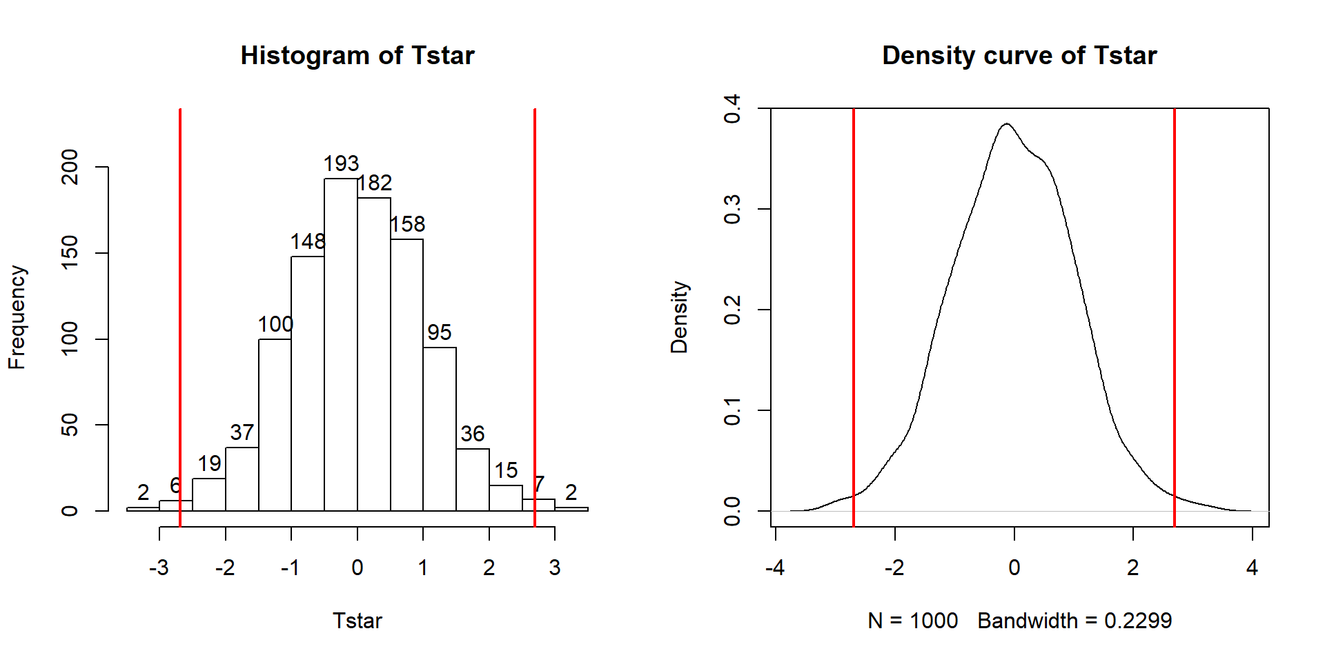
Figure 2.18: Histogram and density curve of permutation distribution of test statistic for Intermediate Statistics student GPAs.
hist(Tstar, labels=T)
abline(v=c(-1,1)*Tobs, lwd=2, col="red")
plot(density(Tstar), main="Density curve of Tstar")
abline(v=c(-1,1)*Tobs, lwd=2, col="red")Here is a full write-up of the results using all 6+ hypothesis testing steps, using the permutation results for the grade data:
The research question involves exploring differences in GPAs between males and females. With data collected from both groups, we should be able to assess this RQ. The pirate-plot with GPAs by gender is a useful visualization. We could use either differences in the sample means or the \(t\)-statistic for the test statistic here.
Write the null and alternative hypotheses:
\(H_0: \mu_\text{male} = \mu_\text{female}\)
- where \(\mu_\text{male}\) is the true mean GPA for males and \(\mu_\text{female}\) is true mean GPA for females.
\(H_A: \mu_\text{male} \ne \mu_\text{female}\)
Plot the data and assess the “Validity Conditions” for the procedure being used:
Independent observations condition: It does not appear that this assumption is violated because there is no reason to assume any clustering or grouping of responses that might create dependence in the observations. The only possible consideration is that the observations were taken from different sections and there could be some differences among the sections. However, for overall GPA there is not too much likelihood that the overall GPAs would vary greatly so this not likely to be a big issue. However, it is possible that certain sections (times of day) attract students with different GPA levels.
Equal variance condition: There is a small difference in the range of the observations in the two groups but the standard deviations are very similar (close to 0.41) so there is little evidence that this condition is violated.
Similar distribution condition: Based on the side-by-side boxplots and pirate-plots, it appears that both groups have slightly left-skewed distributions, which could be problematic for the parametric approach. The two distributions are not exactly alike but they are similar enough that the permutation approach condition is not clearly violated.
Find the value of the appropriate test statistic and p-value for your hypotheses:
\(T=-2.69\) from the previous R output.
p-value \(=\) 0.011 from the permutation distribution results.
This means that there is about a 1.1% chance we would observe a difference in mean GPA (female-male or male-female) of 0.25 points or more if there in fact is no difference in true mean GPA between females and males in Intermediate Statistics in a particular semester.
Write a conclusion specific to the problem based on the p-value:
- There is strong evidence against the null hypothesis of no difference in the true mean GPA between males and females for the Intermediate Statistics students in this semester and so we conclude that there is a difference in the mean GPAs between males and females in these students.
Report and discuss an estimate of the size of the differences, with confidence interval(s) if appropriate.
- Females were estimated to have a higher mean GPA by 0.25 points. The next section discusses confidence intervals that we could add to this result to quantify the uncertainty in this estimate since an estimate without any idea of its precision is only a partial result. This difference of 0.25 on a GPA scale does not seem like a very large difference in the means even though we were able to detect a difference in the groups.
Scope of inference:
- Because this was not a randomized experiment in our explanatory variable, we can’t say that the difference in gender causes the difference in mean GPA. Because it was not a random sample from a larger population (they were asked to participate but not required to and not all the students did participate), our inferences only pertain the Intermediate Statistics students that responded to the survey in that semester.
2.8 Reproducibility Crisis: Moving beyond p < 0.05, publication bias, and multiple testing issues
In the previous examples, some variation in p-values was observed as different methods (parametric, nonparametric) were applied to the same data set and in the permutation approach, the p-values can vary as well from one set of permutations to another. P-values also vary based on randomness in the data that were collected – take a different (random) sample and you will get different data and a different p-value. We want the best estimate of a p-value we can obtain, so should use the best sampling method and inference technique that we can. But it is just an estimate of the evidence against the null hypothesis. These sources of variability make fixed \(\alpha\) NHST especially worry-some as sampling variability could take a p-value from just below to just above \(\alpha\) and this would lead to completely different inferences if the only focus is on rejecting the null hypothesis at a fixed significance level. But viewing p-values on a gradient from extremely strong (close to 0) to no (1) evidence against the null hypothesis, p-values of, say, 0.046 and 0.054 provide basically the same evidence against the null hypothesis. The fixed \(\alpha\) decision-making is tied into the use of the terminology of “significant results” or, slightly better, “statistically significant results” that are intended to convey that there was sufficient evidence to reject the null hypothesis at some pre-decided \(\alpha\) level. You will notice that this is the only time that the “s-word” (significant) is considered here.
The focus on p-values has been criticized for a suite of reasons (Wasserstein and Lazar 2016). There are situations when p-values do not address the question of interest or the fact that a small p-value was obtained is so un-surprising that one wonders why it was even reported. For example, in Smith (Smith 2014) the researcher considered bee sting pain ratings across 27 different body locations39. I don’t think anyone would be surprised to learn that there was strong evidence against the null hypothesis of no difference in the true mean pain ratings across different body locations. What is really of interest are the differences in the means – especially which locations are most painful and how much more painful those locations were than others, on average.
As a field, Statistics is trying to encourage a move away from the focus on p-values and the use of the term “significant”, even when modified by “statistically”. There are a variety of reasons for this change. Science (especially in research going into academic journals and in some introductory statistics books) has taken to using p-value < 0.05 and rejected null hypotheses as the only way to “certify” that a result is interesting. It has (and unfortunately still is) hard to publish a paper with a primary result with a p-value that is higher than 0.05, even if the p-value is close to that “magical” threshold. One thing that is lost when using that strict cut-off for decisions is that any p-value that is not exactly 1 suggests that there is at least some evidence against the null hypothesis in the data and that evidence is then on a continuum from none to very strong. And that p-values are both a function of the size of the difference and the sample size. It is easy to get small p-values for small size differences with large data sets. A small p-value can be associated with an unimportant (not practically meaningful) size difference. And large p-values, especially in smaller sample situations, could be associated with very meaningful differences in size even though evidence is not strong against the null hypothesis. It is critical to always try to estimate and discuss the size of the differences, whether a large or small p-value is encountered.
There are some other related issues to consider in working with p-values that help to illustrate some of the issues with how p-values and “statistical significance” are used in practice. In many studies, researchers have a suite of outcome variables that they measure on their subjects. For example, in an agricultural experiment they might measure the yield of the crops, the protein concentration, the digestibility, and other characteristics of the crops. In various “omics” fields such as genomics, proteomics, and metabolomics, responses for each subject on hundreds, thousands, or even millions of variables are considered and a p-value may be generated for each of those variables. In education, researchers might be interested in impacts on grades (as in the previous discussion) but we could also be interested in reading comprehension, student interest in the subject, and the amount of time spent studying, each as response variables in their own right. In each of these situations it means that we are considering not just one null hypothesis and assessing evidence against it, but are doing it many times, from just a few to millions of repetitions. There are two aspects of this process and implications for research to explore further: the impacts on scientific research of focusing solely on “statistically significant” results and the impacts of considering more than one hypothesis test in the same study.
There is the systematic bias in scientific research that has emerged from scientists having a difficult time publishing research if p-values for their data are not smaller than 0.05. This has two implications. Many researchers have assumed that results with “large” p-values are not interesting – so they either exclude these results from papers (they put them in their file drawer instead of into their papers - the so-called “file-drawer” bias) or reviewers reject papers because they did not have small p-values to support their discussions (only results with small p-values are judged as being of interest for publication - the so-called “publication bias”). Some also include bias from researchers only choosing to move forward with attempting to publish results if they are in the same direction that the researchers expect/theorized as part of this problem – ignoring results that contradict their theories is an example of “confirmation bias” but also would hinder the evolution of scientific theories to ignore contradictory results. But since most researchers focus on p-values and not on estimates of size (and direction) of differences, that will be our focus here.
We will use some of our new abilities in R to begin to study some of the impacts of systematically favoring only results with small p-values using a “simulation study” inspired by the explorations in Schneck (2017). Specifically, let’s focus on the bicycle passing data. We start with assuming that there really is no difference in the two groups, so the true mean is the same in both groups, the variability is the same around the means in the two groups, and all responses follow normal distributions. This is basically like the permutation idea where we assumed the group labels could be equivalently swapped among responses if the null hypothesis were true except that observations will be generated by a normal distribution instead of shuffling the original observations among groups. This is a little stronger assumption than in the permutation approach but makes it possible to study Type I error rates, power, and to explore a process that is similar to how statistical results are generated and used in academic research settings.
Now let’s suppose that we are interested in what happens when we do ten independent studies of the same research question. You could think of this as ten different researchers conducting their own studies of the same topic (say passing distance) or ten times the same researchers did the the same study or (less obviously) a researcher focusing on ten different response variables in the same study. Now suppose that one of two things happens with these ten unique response variables – we just report one of them (any could be used, but suppose the first one is selected) OR we only report the one of the ten with the smallest p-value. This would correspond to reporting the results of a study or to reporting the “most significant” of ten tries at the same study – either because nine researchers decided not to publish/ got their papers rejected by journals or because one researcher put the other nine results into their drawer of “failed studies” and never even tried to report the results.
The following code generates one realization of this process to explore both the p-values that are created and the estimated differences. To simulate new observations with the null hypothesis true, there are two new ideas to consider. First, we need to fit a model that makes the means the same in both groups. This is called the “mean-only” model and is implemented with lm(y~1, data=...), with the ~1 indicating that no predictor variable is used and that a common mean is considered for all observations. Note that this notation also works in the favstats function to get summary statistics for the response variable without splitting it apart based on a grouping variable. In the \(n=30\) passing distance data set, the mean of all the observations is 116.04 cm and this estimate is present in the (Intercept) row in the lm_commonmean model summary.
##
## Call:
## lm(formula = Distance ~ 1, data = ddsub)
##
## Residuals:
## Min 1Q Median 3Q Max
## -108.038 -17.038 -0.038 16.962 128.962
##
## Coefficients:
## Estimate Std. Error t value Pr(>|t|)
## (Intercept) 116.0379 0.7361 157.6 <2e-16
##
## Residual standard error: 29.77 on 1635 degrees of freedom## 1 min Q1 median Q3 max mean sd n missing
## 1 1 8 99 116 133 245 116.0379 29.77388 1636 0The second new R code needed is the simulate function that can be applied to lm-objects; it generates a new data set that contains the same number of observations as the original one but assumes that all the aspects of the estimated model (mean(s), variance, and normal distributions) are true to generate the new observations. In this situation that implies generating new observations with the same mean (116.04) and standard deviation (29.77, also found as the “residual standard error” in the model summary). The new responses are stored in ddsub$SimDistance and then plotted in Figure 2.19.
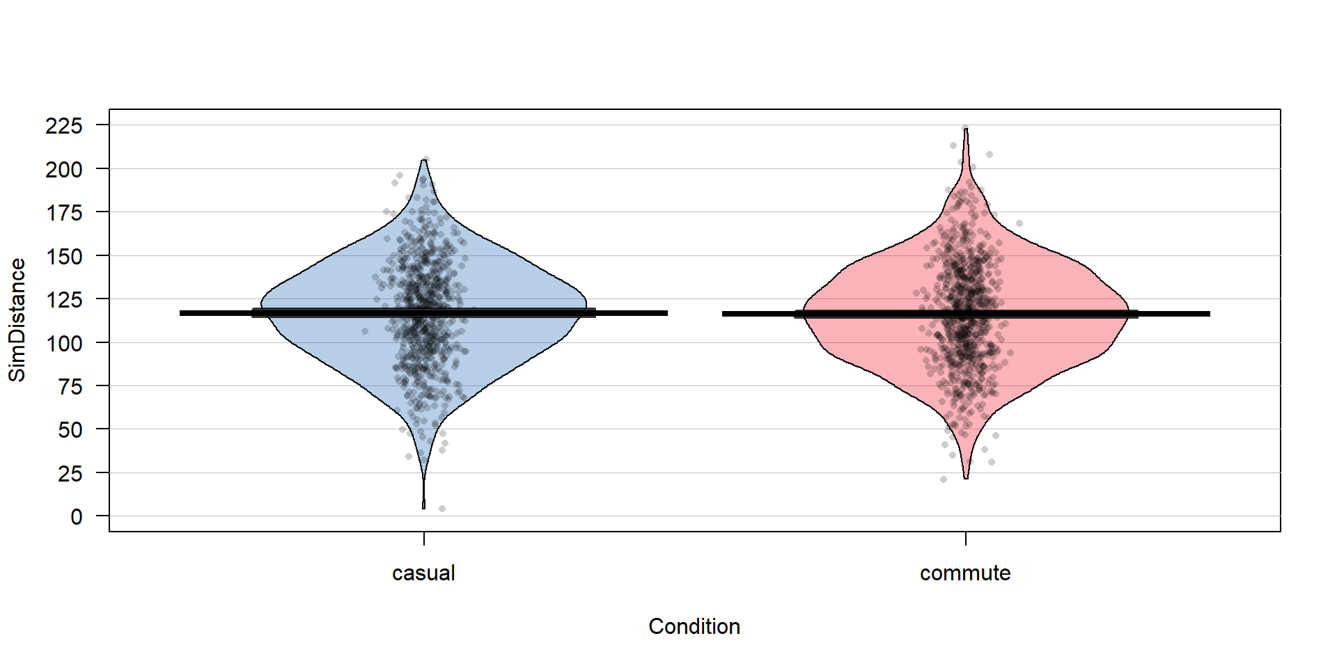
Figure 2.19: Pirate-plot of a simulated data set that assumes the same mean for both groups. The means in the two groups are very similar.
The following codechunk generates one run through generating ten data sets as the loop works through the index c, simulates a new set of responses (ddsub$SimDistance), fits a model that explores the difference in the means of the two groups (lm_sim), and extracts the ten p-values (stored in pval10) and estimated difference in the means (stored in diff10). The smallest p-value of the ten p-values (min(pval10)) is 0.00576. By finding the value of diff10 where pval10 is equal to (==) the min(pval10), the estimated difference in the means from the simulated responses that produced the smallest p-value can be extracted. The difference was -4.17 here. As in the previous initial explorations of permutations, this is just one realization of this process and it needs to be repeated many times to study the impacts of using (1) the first realization of the responses to estimate the difference and p-value and (2) the result with the smallest p-value from ten different realizations of the responses to estimate the difference and p-value. In the following code, we added
octothorpes (#)40 and then some text to explain what is being calculated. In computer code, octothorpes
provide a way of adding comments that tell the software (here R) to ignore any
text after a “#” on a given line. In the color version of the text, comments are
even more clearly distinguished.
#For one iteration through generating 10 data sets:
diff10 <- pval10 <- matrix(NA, nrow=10) #Create empty vectors to store 10 results
set.seed(222)
#Create 10 data sets, keep estimated differences and p-values in diff10 and pval10
for (c in (1:10)){
ddsub$SimDistance <- simulate(lm_commonmean)[[1]]
#Estimate two group model using simulated responses
lm_sim <- lm(SimDistance ~ Condition, data=ddsub)
diff10[c] <- coef(lm_sim)[2]
pval10[c] <- summary(lm_sim)$coef[2,4]
}
tibble(pval10, diff10) ## # A tibble: 10 x 2
## pval10[,1] diff10[,1]
## <dbl> <dbl>
## 1 0.735 -0.492
## 2 0.326 1.44
## 3 0.158 -2.06
## 4 0.265 -1.66
## 5 0.153 2.09
## 6 0.00576 -4.17
## 7 0.915 0.160
## 8 0.313 -1.50
## 9 0.983 0.0307
## 10 0.268 -1.69## [1] 0.005764602## [1] -4.170526In these results, the first data set shows little evidence against the null hypothesis with a p-value of 0.735 and an estimated difference of -0.49. But if you repeat this process and focus just on the “top” p-value result, you think that there is moderate evidence against the null hypothesis with a p-value from the sixth data set due to its p-value of 0.0057. Remember that these are all data sets simulated with the null hypothesis being true, so we should not reject the null hypothesis. But we would expect an occasional false detection (Type I error – rejecting the null hypothesis when it is true) due to sampling variability in the data sets. But by exploring many results and selecting a single result from that suite of results (and not accounting for that selection process in the results), there is a clear issue with exaggerating the strength of evidence. While not obvious yet, we also create an issue with the estimated mean difference in the groups that is demonstrated below.
To fully explore the impacts of either the office drawer or publication bias (they basically have the same impacts on published results even though they are different mechanisms), this process must be repeated many times. The code is a bit more complex here, as the previous code that created ten data sets needs to be replicated B = 1,000 times and four sets of results stored (estimated mean differences and p-values for the first data set and the smallest p-value one). This involves a loop that is very similar to our permutation loop but with more activity inside that loop, with the code for generating and extracting the realization of ten results repeated B times. Figure 2.20 contains the results for the simulation study. In the left plot that contains the p-values we can immediately see some important differences in the distribution of p-values. In the “first” result, the p-values are evenly spread from 0 to 1 – this is what happens when the null hypothesis is true and you simulate from that scenario one time and track the p-values. A good testing method should make a mistake at the \(\alpha\)-level at a rate around \(\alpha\) (a 5% significance level test should make a mistake 5% of the time). If the p-values are evenly spread from 0 to 1, then about 0.05 will be between 0 and 0.05 (think of areas in rectangles with a height of 1 where the total area from 0 to 1 has to add up to 1). But when a researcher focuses only on the top result of ten, then the p-value distribution is smashed toward 0. Using favstats on each distribution of p-values shows that the median for the p-values from taking the first result is around 0.5 but for taking the minimum of ten results, the median p-value is 0.065. So half the results are at the “moderate” evidence level or better when selection of results is included. This gets even worse as more results are explored but seems quite problematic here.
The estimated difference in the means also presents an interesting story. When just reporting the first result, the distribution of the estimated means in panel b of Figure 2.20 shows a symmetric distribution that is centered around 0 with results extending just past \(\pm\) 4 in each tail. When selection of results is included, only more extreme estimated differences are considered and no results close to 0 are even reported. There are two modes here around \(\pm\) 2.5 and multiple results close to \(\pm\) 5 are observed. Interestingly, the mean of both distributions is close to 0 so both are “unbiased”41 estimators but the distribution for the estimated difference from the selected “top” result is clearly flawed and would not give correct inferences for differences when the null hypothesis is correct. If a one-sided test had been employed, the selection of the top result would result is a clearly biased estimator as only one of the two modes would be selected. The presentation of these results is a great example of why pirate-plots are better than boxplots as a boxplot of these results would not allow the viewer to notice the two distinct groups of results.
# Simulation study of generating 10 data sets and either using the first
# or "best p-value" result:
set.seed(1234)
B <- 1000 # # of simulations
# To store results
Diffmeans <- pvalues <- Diffmeans_Min <- pvalues_Min <- matrix(NA, nrow=B)
for (b in (1:B)){ #Simulation study loop to repeat process B times
# Create empty vectors to store 10 results for each b
diff10 <- pval10 <- matrix(NA, nrow=10)
for (c in (1:10)){ #Loop to create 10 data sets and extract results
ddsub$SimDistance <- simulate(lm_commonmean)[[1]]
# Estimate two group model using simulated responses
lm_sim <- lm(SimDistance ~ Condition, data=ddsub)
diff10[c] <- coef(lm_sim)[2]
pval10[c] <- summary(lm_sim)$coef[2,4]
}
pvalues[b] <- pval10[1] #Store first result p-value
Diffmeans[b] <- diff10[1] #Store first result estimated difference
pvalues_Min[b] <- min(pval10) #Store smallest p-value
Diffmeans_Min[b] <- diff10[pval10==min(pval10)] #Store est. diff of smallest p-value
}
#Put results together
results <- tibble(pvalue_results=c(pvalues,pvalues_Min),
Diffmeans_results=c(Diffmeans, Diffmeans_Min),
Scenario = rep(c("First", "Min"), each=B))
par(mfrow=c(1,2)) #Plot results
pirateplot(pvalue_results~Scenario,data=results, inf.f.o = 0,inf.b.o = 0,
avg.line.o = 0, main="(a) P-value results")
abline(h=0.05, lwd=2, col="red", lty=2)
pirateplot(Diffmeans_results~Scenario,data=results, inf.f.o = 0,inf.b.o = 0,
avg.line.o = 0, main="(b) Estimated difference in mean results")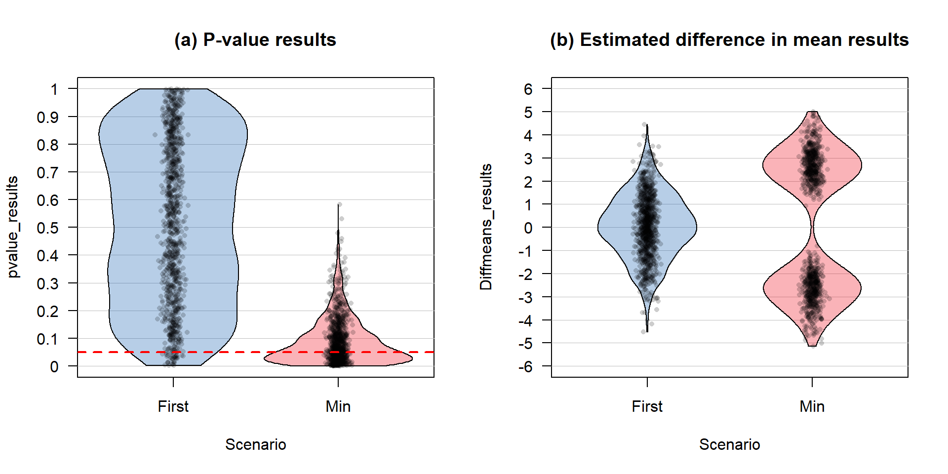
Figure 2.20: Pirate-plot of a simulation study results. Panel (a) contains the B = 1,000 p-values and (b) contains the B=1,000 estimated differences in the means. Note that the estimated means and confidence intervals normally present in pirate-plots are suppressed here with inf.f.o = 0, inf.b.o = 0, avg.line.o = 0 because these plots are being used to summarize simulation results instead of an original data set.
## Scenario min Q1 median Q3 max
## 1 First 0.0017051496 0.27075755 0.5234412 0.7784957 0.9995293
## 2 Min 0.0005727895 0.02718018 0.0646370 0.1273880 0.5830232
## mean sd n missing
## 1 0.51899179 0.28823469 1000 0
## 2 0.09156364 0.08611836 1000 0## Scenario min Q1 median Q3 max mean
## 1 First -4.531864 -0.8424604 0.07360378 1.002228 4.458951 0.05411473
## 2 Min -5.136510 -2.6857436 1.24042295 2.736930 5.011190 0.03539750
## sd n missing
## 1 1.392940 1000 0
## 2 2.874454 1000 0Generally, the challenge in this situation is that if you perform many tests (ten were the focus before) at the same time (instead of just one test), you inflate the Type I error rate across the tests. We can define the family-wise error rate as the probability that at least one error is made on a set of tests or, more compactly, Pr(At least 1 error is made) where Pr() is the probability of an event occurring. The family-wise error is meant to capture the overall situation in terms of measuring the likelihood of making a mistake if we consider many tests, each with some chance of making their own mistake, and focus on how often we make at least one error when we do many tests. A quick probability calculation shows the magnitude of the problem. If we start with a 5% significance level test, then Pr(Type I error on one test) = 0.05 and the Pr(no errors made on one test) = 0.95, by definition. This is our standard hypothesis testing situation. Now, suppose we have \(m\) independent tests, then
\[\begin{array}{ll} & \text{Pr(make at least 1 Type I error given all null hypotheses are true)} \\ & = 1 - \text{Pr(no errors made)} \\ & = 1 - 0.95^m. \end{array}\]
Figure 2.21 shows how the probability of having at least one false detection grows rapidly with the number of tests, \(m\). The plot stops at 100 tests since it is effectively a 100% chance of at least one false detection. It might seem like doing 100 tests is a lot, but, as mentioned before, some researchers consider situations where millions of tests are considered. Researchers want to make sure that when they report a “significant” result that it is really likely to be a real result and will show up as a difference in the next data set they collect. Some researchers are now collecting multiple data sets to use in a single study and using one data set to identify interesting results and then using a validation or test data set that they withheld from initial analysis to try to verify that the first results are also present in that second data set. This also has problems but the only way to develop an understanding of a process is to look across a suite of studies and learn from that accumulation of evidence. This is a good start but needs to be coupled with complete reporting of all results, even those that have p-values larger than 0.05 to avoid the bias identified in the previous simulation study.
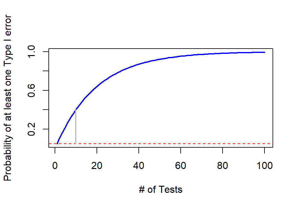
Figure 2.21: Plot of family-wise error rate (Bold solid line) as the number of tests performed increases. Dashed line indicates 0.05 and grey solid line highlights the probability of at least on error on \(m\)=10 tests.
All hope is not lost when multiple tests are being considered in the same study or by a researcher and exploring more than one result need not lead to clearly biased and flawed results being reported. To account for multiple testing in the same study/analysis, there are many approaches that adjust results to acknowledge that multiple tests are being considered. A simple approach called the “Bonferroni Correction” (Bland and Altman 1995) is a good starting point for learning about these methods. It works to control the family-wise error rate of a suite of tests by either dividing \(\alpha\) by the number of tests (\(\alpha/m\)) or, equivalently and more usefully, multiplying the p-value by the number of tests being considered (\(p-value_{adjusted} = p-value \cdot m\) or \(1\) if \(p-value \cdot m > 1\)). The “Bonferroni adjusted p-values” are then used as regular p-values to assess evidence against each null hypothesis but now accounting for exploring many of them together. There are some assumptions that this adjustment method makes that make it to generally be a conservative adjustment method. In particular, it assumes that all \(m\) tests are independent of each other and that the null hypothesis was true for all \(m\) tests conducted. While all p-values should be reported in this situation when considering ten results, the impacts of using a Bonferroni correction are that the resulting p-values are not driving inflated Type I error rates even if the smallest p-value is the main focus of the results. The correction also provides a suggestion of decreasing evidence in the first test result because it is now incorporated in considering ten results instead of one.
The following code repeats the simulation study but with the p-values adjusted for multiple testing within each simulation but does not repeat tracking the estimated differences in the means as this is not impacted by the p-value adjustment process. The p.adjust function provides Bonferroni corrections to a vector of p-values (here ten are collected together) using the bonferroni method option (p.adjust(pval10, method="bonferroni")) and then stores those results. Figure 2.22 shows the results for the first result and minimum result again, but now with these corrections incorporated. The plots may look a bit odd, but in the first data set, so many of the first data sets had p-values that were “large” that they were adjusted to have p-values of 1 (so no evidence against the null once we account for multiple testing). The distribution for the minimum p-value results with adjustment more closely resembles the distribution of the first result p-values from Figure 2.20, except for some minor clumping up at adjusted p-values of 1.
# Simulation study of generating 10 data sets and either using the first
# or "best p-value" result:
set.seed(1234)
B <- 1000 # # of simulations
pvalues <- pvalues_Min <- matrix(NA, nrow=B) #To store results
for (b in (1:B)){ #Simulation study loop to repeat process B times
# Create empty vectors to store 10 results for each b
pval10 <- matrix(NA, nrow=10)
for (c in (1:10)){ #Loop to create 10 data sets and extract results
ddsub$SimDistance <- simulate(lm_commonmean)[[1]]
# Estimate two group model using simulated responses
lm_sim <- lm(SimDistance ~ Condition, data=ddsub)
pval10[c] <- summary(lm_sim)$coef[2,4]
}
pval10 <- p.adjust(pval10, method="bonferroni")
pvalues[b] <- pval10[1] #Store first result adjusted p-value
pvalues_Min[b] <- min(pval10) #Store smallest adjusted p-value
}
#Put results together
results <- tibble(pvalue_results=c(pvalues,pvalues_Min),
Scenario = rep(c("First", "Min"), each=B))
pirateplot(pvalue_results~Scenario,data=results, inf.f.o = 0,inf.b.o = 0,
avg.line.o = 0, main="(a) P-value results")
abline(h=0.05, lwd=2, col="red", lty=2)
Figure 2.22: Pirate-plot of a simulation study results of p-values with Bonferroni correction.
By applying the pdata function to the two groups of results we can directly assess how many of each type of result resulted in p-values less than 0.05. It ends up that if adjust for ten tests and just focus on the first result, it is really hard to find moderate or strong evidence against the null hypothesis as only 3 in 1,000 results had adjusted p-values less than 0.05. When the focus is on the “top” p-value result when ten are considered and adjustments are made, 52 out of 1,000 results (0.052) show at least moderate evidence against the null hypothesis. This is the rate we would expect from a well-behaved hypothesis test when the null hypothesis is true – that we would only make a mistake 5% of the time when \(\alpha\) is 0.05.
## Scenario min Q1 median Q3 max mean sd n missing
## 1 First 0.017051496 1.0000000 1.00000 1 1 0.9628911 0.1502805 1000 0
## 2 Min 0.005727895 0.2718018 0.64637 1 1 0.6212932 0.3597701 1000 0#Proportion of simulations with adjusted p-values less than 0.05
pdata(pvalue_results~Scenario,data=results,.05, lower.tail=T)## Scenario pdata_v
## 1 First 0.003
## 2 Min 0.052So adjusting for multiple testing is suggested when multiple tests are being considered “simultaneously”. The Bonferroni adjustment is easy but also crude and can be conservative in applications, especially when the number of tests grows very large (think of multiplying all your p-values by \(m\)=1,000,000). So other approaches are considered in situations with many tests (there are six other options in the p.adjust function and other functions for doing similar things in R) and there are other approaches that are customized for particular situations with one example discussed in Chapter 3. The biggest lesson as a statistics student to take from this is that all results are of interest and should be reported and that adjustment of p-values should be considered in studies where many results are being considered. If you are reading results that seem to have walked discretely around these issues you should be suspicious of the real strength of their evidence.
While it wasn’t used here, the same general code used to explore this multiple testing issue could be used to explore the power of a particular procedure. If simulations were created from a model with a difference in the means in the groups, then the null hypothesis would have been false and the rate of correctly rejecting the null hypothesis could be studied. The rate of correct rejections is the power of a procedure for a chosen version of a true alternative hypothesis (there are many ways to have it be true and you have to choose one to study power) and simply switching the model being simulated from would allow that to be explored. We could also use similar code to compare the power and Type I error rates of parametric versus permutation procedures or to explore situations where an assumption is not true. The steps would be similar – decide on what you need to simulate from and track a quantity of interest across repeated simulated data sets.
2.9 Confidence intervals and bootstrapping
Up to this point the focus has been on hypotheses, p-values, and estimates of the size of differences. But so far this has not explored inference techniques for the size of the difference. Confidence intervals provide an interval where we are __% confident that the true parameter lies. The idea of “confidence” is that if we repeated randomly sampling from the same population and made a similar confidence interval, the collection of all these confidence intervals would contain the true parameter at the specified confidence level (usually 95%). We only get to make one interval and so it either has the true parameter in it or not, and we don’t know the truth in real situations.
Confidence intervals can be constructed with parametric and a nonparametric approaches. The nonparametric approach will be using what is called bootstrapping and draws its name from “pull yourself up by your bootstraps” where you improve your situation based on your own efforts. In statistics, we make our situation or inferences better by re-using the observations we have by assuming that the sample represents the population. Since each observation represents other similar observations in the population that we didn’t get to measure, if we sample with replacement to generate a new data set of size n from our data set (also of size n) it mimics the process of taking repeated random samples of size \(n\) from our population of interest. This process also ends up giving us useful sampling distributions of statistics even when our standard normality assumption is violated, similar to what we encountered in the permutation tests. Bootstrapping is especially useful in situations where we are interested in statistics other than the mean (say we want a confidence interval for a median or a standard deviation) or when we consider functions of more than one parameter and don’t want to derive the distribution of the statistic (say the difference in two medians). Here, bootstrapping is used to provide more trustworthy inferences when some of our assumptions (especially normality) might be violated for our parametric confidence interval procedure.
To perform bootstrapping, the resample function from the
mosaic package will be used. We can apply this function to a data set and get a new
version of the
data set by sampling new observations with replacement from the original one42.
The new, bootstrapped version of the data set (called dsample_BTS below)
contains a new variable called orig.id which is the number of the subject
from the original data set. By summarizing how often each of these id’s
occurred in a bootstrapped data set, we can see how the re-sampling works.
The table function will count up how many times each observation was used in
the bootstrap sample,
providing a row with the id followed by a row with the
count43. In the first bootstrap
sample shown, the 1st, 14th, and 26th observations
were sampled twice, the 9th and 28th observations were sampled four
times, and the 4th, 5th, 6th, and many others
were not sampled at all. Bootstrap sampling thus picks some observations
multiple times and to do that it has to ignore some44 observations.
##
## 1 2 3 7 8 9 10 11 12 13 14 16 18 19 23 24 25 26 27 28 30
## 2 1 1 1 1 4 1 1 1 1 2 1 1 1 1 1 1 2 1 4 1Like in permutations, one randomization isn’t enough. A second bootstrap sample is also provided to help you get a sense of what bootstrap data sets contain. It did not select observations two through five but did select eight others more than once. You can see other variations in the resulting re-sampling of subjects with the most sampled observation used four times. With \(n=30\), the the chance of selecting any observation for any slot in the new data set is \(1/30\) and the expected or mean number of appearances we expect to see for an observation is the number of random draws times the probably of selection on each so \(30*1/30=1\). So we expect to see each observation in the bootstrap sample on average once but random variability in the samples then creates the possibility of seeing it more than once or not all.
##
## 1 6 7 8 9 10 11 12 13 16 17 20 22 23 24 25 26 28 30
## 2 2 1 1 2 1 4 1 3 1 1 1 2 2 1 1 2 1 1We can use the two results to get an idea of distribution of results in terms of number of times observations might be re-sampled when sampling with replacement and the variation in those results, as shown in Figure 2.23. We could also derive the expected counts for each number of times of re-sampling when we start with all observations having an equal chance and sampling with replacement but this isn’t important for using bootstrapping methods.
Figure 2.23: Counts of number of times of observation (or not observed for times re-sampled of 0) for two bootstrap samples.
The main point of this exploration was to see that each run of the
resample function provides a new version of the data set. Repeating this
\(B\) times using
another for loop, we will track our quantity of interest, say \(T\), in all
these new “data sets” and call those results \(T^*\). The distribution of the
bootstrapped
\(T^*\) statistics tells us about the range of results to expect
for the statistic. The middle % of the \(T^*\)’s provides a %
bootstrap confidence interval45 for the true parameter – here the difference in the two population means.
To make this concrete, we can revisit our previous examples, starting
with the dsample data created before and our interest in comparing the
mean passing distances for the commuter and casual outfit groups in the \(n=30\) stratified random sample that was extracted. The
bootstrapping code is very similar to the permutation code except that we apply
the resample function to the entire data set used in lm as opposed to the shuffle
function that was applied only to the explanatory variable.
## Conditioncommute
## -25.93333B <- 1000
set.seed(1234)
Tstar <- matrix(NA, nrow=B)
for (b in (1:B)){
lmP <- lm(Distance~Condition, data=resample(dsample))
Tstar[b] <- coef(lmP)[2]
}## min Q1 median Q3 max mean sd n missing
## -66.96429 -34.57159 -25.65881 -17.12391 17.17857 -25.73641 12.30987 1000 0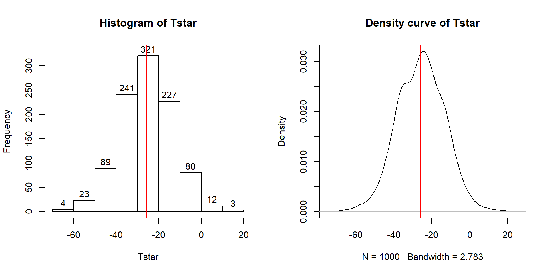
Figure 2.24: Histogram and density curve of bootstrap distributions of difference in sample mean Distances with vertical line for the observed difference in the means of -25.933.
hist(Tstar, labels=T)
abline(v=Tobs, col="red", lwd=2)
plot(density(Tstar), main="Density curve of Tstar")
abline(v=Tobs, col="red", lwd=2)In this situation, the observed difference in the mean passing distances is -25.933 cm (commute - casual), which is the bold vertical line in Figure 2.24. The bootstrap distribution shows the results for the difference in the sample means when fake data sets are re-constructed by sampling from the original data set with replacement. The bootstrap distribution is approximately centered at the observed value (difference in the sample means) and is relatively symmetric.
The permutation distribution in the same situation (Figure 2.11) had a similar shape but was centered at 0. Permutations create sampling distributions based on assuming the null hypothesis is true, which is useful for hypothesis testing. Bootstrapping creates distributions centered at the observed result, which is the sampling distribution “under the alternative” or when no null hypothesis is assumed; bootstrap distributions are useful for generating confidence intervals for the true parameter values.
To create a 95% bootstrap confidence interval for the difference in
the true mean distances (\(\mu_\text{commute}-\mu_\text{casual}\)), select the
middle 95% of results from
the bootstrap distribution. Specifically, find the 2.5th
percentile and the 97.5th percentile (values that put 2.5 and 97.5%
of the results to the left) in the bootstrap distribution, which leaves 95% in
the middle for the confidence interval. To find percentiles in a distribution
in R, functions are of the form q[Name of distribution], with the function
qt extracting percentiles from a \(t\)-distribution (examples below). From the
bootstrap results, use the qdata function on the Tstar results that
contain the bootstrap distribution of the statistic of interest.
## p quantile
## 0.0250 -50.0055## p quantile
## 0.975000 -2.248774These results tell us that the 2.5th percentile of the bootstrap distribution is at -50.01 cm and the 97.5th percentile is at -2.249 cm. We can combine these results to provide a 95% confidence for \(\mu_\text{commute}-\mu_\text{casaual}\) that is between -50 and -2.25 cm. This interval is interpreted as with any confidence interval, that we are 95% confident that the difference in the true mean distances (commute minus casual groups) is between -50 and -2.25 cm. Or we can switch the direction of the comparison and say that we are 95% confident that the difference in the true means is between 2.25 and 50 cm (casual minus commute). This result would be incorporated into step 5 of the hypothesis testing protocol to accompany discussing the size of the estimated difference in the groups or used as a result of interest in itself. Both percentiles can be obtained in one line of code using:
## quantile p
## 2.5% -50.005502 0.025
## 97.5% -2.248774 0.975Figure 2.25 displays those same percentiles on the bootstrap distribution residing in Tstar.
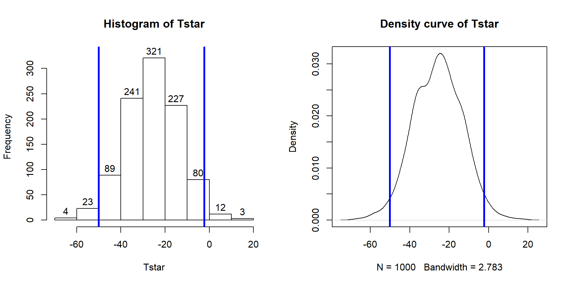
Figure 2.25: Histogram and density curve of bootstrap distribution with 95% bootstrap confidence intervals displayed (bold vertical lines).
hist(Tstar, labels=T)
abline(v=quantiles$quantile, col="blue", lwd=3)
plot(density(Tstar), main="Density curve of Tstar")
abline(v=quantiles$quantile, col="blue", lwd=3)Although confidence intervals can exist without referencing hypotheses, we can revisit our previous hypotheses and see what this confidence interval tells us about the test of \(H_0: \mu_\text{commute} = \mu_\text{casual}\). This null hypothesis is equivalent to testing \(H_0: \mu_\text{commute} - \mu_\text{casual} = 0\), that the difference in the true means is equal to 0 cm. And the difference in the means was the scale for our confidence interval, which did not contain 0 cm. The 0 cm values is an interesting reference value for the confidence interval, because here it is the value where the true means are equal to each other (have a difference of 0 cm). In general, if our confidence interval does not contain 0, then it is saying that 0 is not one of the likely values for the difference in the true means at the selected confidence level. This implies that we should reject a claim that they are equal. This provides the same inferences for the hypotheses that we considered previously using both parametric and permutation approaches using a fixed \(\alpha\) approach where \(\alpha\) = 1 - confidence level.
The general summary is that we can use confidence intervals to test hypotheses by assessing whether the reference value under the null hypothesis is in the confidence interval (suggests insufficient evidence against \(H_0\) to reject it, at least at the \(\alpha\) level and equivalent to having a p-value larger than \(\alpha\)) or outside the confidence interval (sufficient evidence against \(H_0\) to reject it and equivalent to having a p-value that is less than \(\alpha\)). P-values are more informative about hypotheses (measure of evidence against the null hypothesis) but confidence intervals are more informative about the size of differences, so both offer useful information and, as shown here, can provide consistent conclusions about hypotheses. But it is best practice to use p-values to assess evidence against null hypotheses and confidence intervals to do inferences for the size of differences.
As in the previous situation, we also want to consider the parametric
approach
for comparison purposes and to have that method available, especially to help
us understand some methods where we will only consider parametric inferences
in later chapters. The parametric confidence interval is called the
equal variance, two-sample t confidence interval and additionally
assumes that the populations
being sampled from are normally distributed instead of just that they have similar shapes in the bootstrap approach. The parametric method leads to using a \(t\)-distribution
to form the interval with the degrees of freedom for the \(t\)-distribution of \(n-2\) although we can obtain it without direct reference to this distribution using the confint function applied to the lm model. This function generates two confidence intervals and the one in the second row is the one we are interested as it pertains to the difference in the true means of the two groups. The parametric 95% confidence interval here is from -51.6 to -0.26 cm which is a bit different in width from the nonparametric bootstrap interval that was from -50 and -2.25 cm.
## 2.5 % 97.5 %
## (Intercept) 117.64498 153.9550243
## Conditioncommute -51.60841 -0.2582517The bootstrap interval was narrower by almost 4 cm and its upper limit was much further from 0. The bootstrap CI can vary depending on the random number seed used and additional runs of the code produced intervals of (-49.6, -2.8), (-48.3, -2.5), and (-50.9, -1.1) so the differences between the parametric and nonparametric approaches was not just due to an unusual bootstrap distribution. It is not entirely clear why the two intervals differ but there are slightly more results in the left tail of Figure 2.25 than in the right tail and this shifts the 95% confidence slightly away from 0 as compared to the parametric approach. All intervals have the same interpretation, only the methods for calculating the intervals and the assumptions differ. Specifically, the bootstrap interval can tolerate different distribution shapes other than normal and still provide intervals that work well46. The other assumptions are all the same as for the hypothesis test, where we continue to assume that we have independent observations with equal variances for the two groups and maintain concerns about inferences here due to the violation of independence in these responses.
The formula that lm is using to calculate the parametric
equal variance, two-sample \(t\)-based confidence interval is:
\[\bar{x}_1 - \bar{x}_2 \mp t^*_{df}s_p\sqrt{\frac{1}{n_1}+\frac{1}{n_2}}\]
In this situation, the df is again \(n_1+n_2-2\) (the total sample size - 2) and \(s_p = \sqrt{\frac{(n_1-1)s_1^2 + (n_2-1)s_2^2}{n_1+n_2-2}}\). The \(t^*_{df}\) is a multiplier that comes from finding the percentile from the \(t\)-distribution that puts \(C\)% in the middle of the distribution with \(C\) being the confidence level. It is important to note that this \(t^*\) has nothing to do with the previous test statistic \(t\). It is confusing and students first engaging these two options often happily take the result from a test statistic calculation and use it for a multiplier in a \(t\)-based confidence interval – try to focus on which \(t\) you are interested in before you use either. Figure 2.26 shows the \(t\)-distribution with 28 degrees of freedom and the cut-offs that put 95% of the area in the middle.
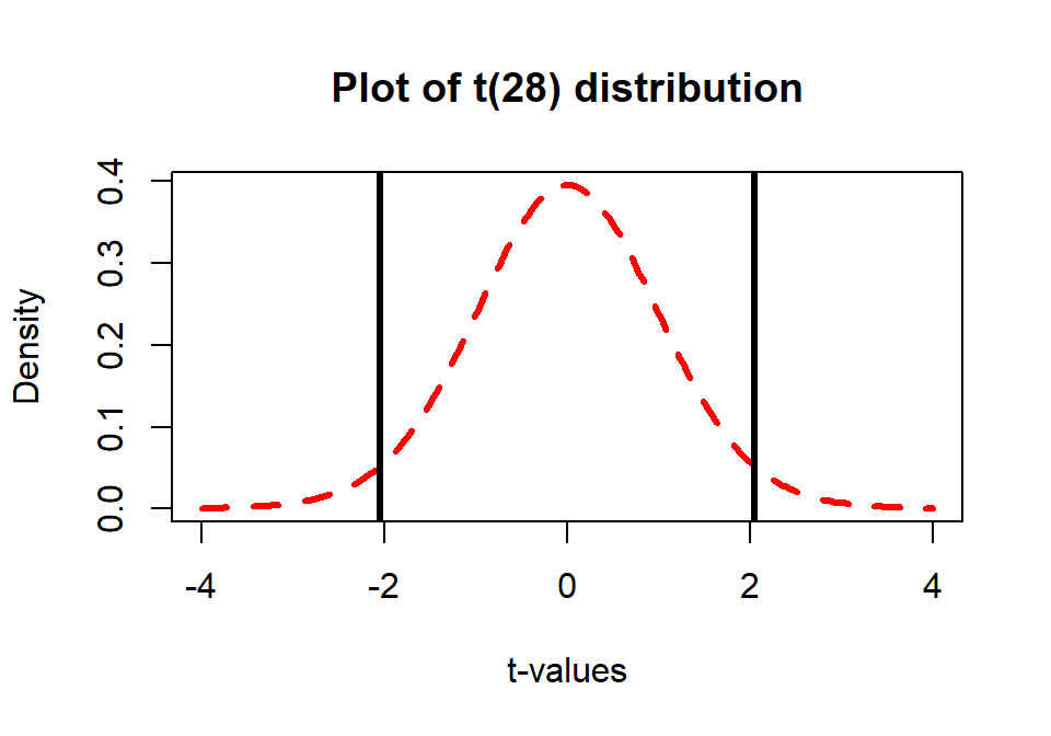
Figure 2.26: Plot of \(t(28)\) with cut-offs for putting 95% of distribution in the middle that delineate the \(t^*\) multiplier to make a 95% confidence interval.
For 95% confidence intervals, the multiplier is going to be close to 2 and
anything else is a likely indication of a mistake. We can use R to get the multipliers for
confidence intervals using the qt function in a similar fashion to how
qdata was used in the bootstrap results, except that this new value must be
used in the previous confidence interval formula. This function produces values
for requested percentiles, so if we want to put 95% in the middle, we place
2.5% in each tail of the distribution and need to request the 97.5th
percentile. Because the \(t\)-distribution is always symmetric around 0, we merely
need to look up the value for the 97.5th percentile and know that the
multiplier for the 2.5th percentile is just \(-t^*\). The \(t^*\)
multiplier to form the confidence interval is 2.0484 for a 95% confidence interval
when the \(df=28\) based on the results from qt:
## [1] 2.048407Note that the 2.5th percentile is just the negative of this value due to symmetry and the real source of the minus in the minus/plus in the formula for the confidence interval.
## [1] -2.048407We can also re-write the confidence interval formula into a slightly more general forms as
\[\bar{x}_1 - \bar{x}_2 \mp t^*_{df}SE_{\bar{x}_1 - \bar{x}_2}\ \text{ OR }\ \bar{x}_1 - \bar{x}_2 \mp ME\]
where \(SE_{\bar{x}_1 - \bar{x}_2} = s_p\sqrt{\frac{1}{n_1}+\frac{1}{n_2}}\) and
\(ME = t^*_{df}SE_{\bar{x}_1 - \bar{x}_2}\). The SE is available in the lm model summary for the line related to the difference in groups in the “Std. Error” column. In some situations, researchers will
report the standard error (SE) or margin of error (ME) as a method
of quantifying the uncertainty in a statistic. The SE is an estimate of the
standard deviation of the statistic (here \(\bar{x}_1 - \bar{x}_2\)) and the ME
is an estimate of the precision of a statistic that can be used to directly
form a confidence interval. The ME depends on the choice of confidence level
although 95% is almost always selected.
To finish this example, R can be used to help you do calculations much
like a calculator except with much more power “under the hood”. You have to
make sure you are careful with using ( ) to group items and remember that
the asterisk (*) is used for multiplication. We need the pertinent
information which is available from the favstats output repeated below to
calculate the confidence interval “by hand”47 using R.
## Condition min Q1 median Q3 max mean sd n missing
## 1 casual 72 112.5 143 154.5 208 135.8000 39.36133 15 0
## 2 commute 60 88.5 113 123.0 168 109.8667 28.41244 15 0Start with typing the following command to calculate \(s_p\) and store it in a
variable named sp:
## [1] 34.32622Then calculate the confidence interval that confint provided using:
## [1] -51.6083698 -0.2582302Or using the information from the model summary:
## [1] -51.6077351 -0.2582649The previous results all use c(-1, 1) times the margin of error to subtract and add
the ME to the difference in the sample means (\(109.8667-135.8\)), which generates the
lower and then upper bounds of the confidence interval. If desired, we can also
use just the last portion of the calculation to find the margin of error,
which is 25.675 here.
## [1] 25.67507For the entire \(n=1,636\) data set for these two groups, the results are obtained using the following code. The estimated difference in the means is -3 cm (commute minus casual). The \(t\)-based 95% confidence interval is from -5.89 to -0.11.
## 2.5 % 97.5 %
## (Intercept) 115.520697 119.7013823
## Conditioncommute -5.891248 -0.1149621The bootstrap 95% confidence interval is from -5.82 to -0.076. With this large data set, the differences between parametric and permutation approaches decrease and they essentially equivalent here. The bootstrap distribution (not displayed) for the differences in the sample means is relatively symmetric and centered around the estimated difference of -3 cm. So using all the observations we would be 95% confident that the true mean difference in overtake distances (commute - casual) is between -5.89 and -0.11 cm, providing additional information about the estimated difference in the sample means of -3 cm.
## Conditioncommute
## -3.003105B <- 1000
set.seed(1234)
Tstar <- matrix(NA, nrow=B)
for (b in (1:B)){
lmP <- lm(Distance~Condition, data=resample(ddsub))
Tstar[b] <- coef(lmP)[2]
}## quantile p
## 2.5% -5.81626474 0.025
## 97.5% -0.07606663 0.9752.10 Bootstrap confidence intervals for difference in GPAs
We can now apply the new confidence interval methods on the STAT 217 grade data.
This time we start with the parametric 95% confidence interval “by hand” in R
and then use lm to verify our result. The favstats output provides
us with the required information to calculate the confidence interval, with the estimated difference in the sample mean GPAs of \(3.338-3.0886 = 0.2494\):
##   Sex  min  Q1 median   Q3 max     mean        sd  n missing
## 1   F 2.50 3.1  3.400 3.70   4 3.338378 0.4074549 37       0
## 2 M 1.96 2.8 3.175 3.46 4 3.088571 0.4151789 42 0The \(df\) are \(37+42-2 = 77\). Using the SDs from the two groups and their sample sizes, we can calculate \(s_p\):
## [1] 0.4116072The margin of error is:
## [1] 0.1847982All together, the 95% confidence interval is:
## [1] 0.0646018 0.4341982So we are 95% confident that the difference in the true mean GPAs between
females and males (females minus males) is between 0.065 and 0.434 GPA points.
We get a similar result from confint on lm, except that lm switched the direction of the comparison from what was done “by hand” above, with the estimated mean difference of -0.25 GPA points (male - female) and similarly switched CI:
##
## Call:
## lm(formula = GPA ~ Sex, data = s217)
##
## Residuals:
##      Min       1Q   Median       3Q      Max
## -1.12857 -0.28857  0.06162  0.36162  0.91143
##
## Coefficients:
##             Estimate Std. Error t value Pr(>|t|)
## (Intercept)  3.33838    0.06766  49.337  < 2e-16
## SexM        -0.24981    0.09280  -2.692  0.00871
##
## Residual standard error: 0.4116 on 77 degrees of freedom
## Multiple R-squared:  0.08601,    Adjusted R-squared:  0.07414
## F-statistic: 7.246 on 1 and 77 DF, p-value: 0.008713## 2.5 % 97.5 %
## (Intercept) 3.2036416 3.47311517
## SexM -0.4345955 -0.06501838Note that we can easily switch to 90% or 99% confidence intervals by simply
changing the percentile in qt or changing the level option in the
confint function.
## [1] 1.664885## [1] 2.641198## 5 % 95 %
## (Intercept) 3.2257252 3.45103159
## SexM -0.4043084 -0.09530553## 0.5 % 99.5 %
## (Intercept) 3.1596636 3.517093108
## SexM -0.4949103 -0.004703598As a review of some basic ideas with confidence intervals make sure you can answer the following questions:
What is the impact of increasing the confidence level in this situation?
What happens to the width of the confidence interval if the size of the SE increases or decreases?
What about increasing the sample size – should that increase or decrease the width of the interval?
All the general results you learned before about impacts to widths of CIs hold in this situation whether we are considering the parametric or bootstrap methods…
To finish this example, we will generate the comparable bootstrap 90% confidence interval using the bootstrap distribution in Figure 2.27.
##       SexM
## -0.2498069
B <- 1000
set.seed(1234)
Tstar <- matrix(NA, nrow=B)
for (b in (1:B)){
lmP <- lm(GPA~Sex, data=resample(s217))
Tstar[b] <- coef(lmP)[2]
}
quantiles <- qdata(Tstar, c(0.05, 0.95))
quantiles## quantile p
## 5% -0.39290566 0.05
## 95% -0.09622185 0.95The output tells us that the 90% confidence interval is from -0.393 to -0.096 GPA points. The bootstrap distribution with the observed difference in the sample means and these cut-offs is displayed in Figure 2.27 using this code:
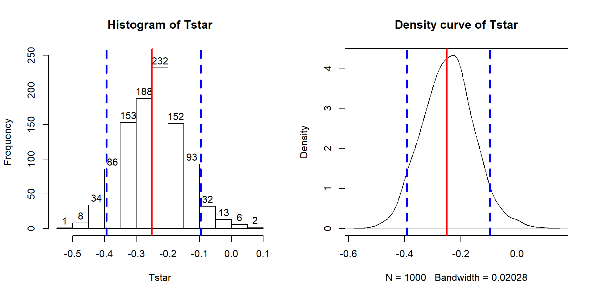
Figure 2.27: Histogram and density curve of bootstrap distribution of difference in sample mean GPAs (male minus female) with observed difference (solid vertical line) and quantiles that delineate the 90% confidence intervals (dashed vertical lines).
par(mfrow=c(1,2))
hist(Tstar,labels=T)
abline(v=Tobs,col="red",lwd=2)
abline(v=quantiles$quantile,col="blue",lwd=3,lty=2)
plot(density(Tstar),main="Density curve of Tstar")
abline(v=Tobs,col="red",lwd=2)
abline(v=quantiles$quantile,col="blue",lwd=3,lty=2)
In the previous output, the parametric 90% confidence interval is from -0.404 to -0.095, suggesting similar results again from the two approaches. Based on the bootstrap CI, we can say that we are 90% confident that the difference in the true mean GPAs for STAT 217 students is between -0.393 to -0.094 GPA points (male minus females). This result would be usefully added to step 5 in the 6+ steps of the hypothesis testing protocol with an updated result of:
Report and discuss an estimate of the size of the differences, with confidence interval(s) if appropriate.
- Females were estimated to have a higher mean GPA by 0.25 points (90% bootstrap confidence interval: 0.094 to 0.393). This difference of 0.25 on a GPA scale does not seem like a very large difference in the means even though we were able to detect a difference in the groups.
Throughout the text, pay attention to the distinctions between parameters and statistics, focusing on the differences between estimates based on the sample and inferences for the population of interest in the form of the parameters of interest. Remember that statistics are summaries of the sample information and parameters are characteristics of populations (which we rarely know). And that our inferences are limited to the population that we randomly sampled from, if we randomly sampled.
2.11 Chapter summary
In this chapter, we reviewed basic statistical inference methods in the context
of a two-sample mean problem using linear models and the lm function. You were introduced to using R to do enhanced visualizations (pirate-plots), permutation
testing, and generate bootstrap confidence intervals as well as obtaining
parametric \(t\)-test and confidence intervals. You should
have learned how to use a for loop for doing the nonparametric inferences
and the lm and confint functions for generating parametric inferences. In the examples considered, the parametric and nonparametric methods provided similar
results, suggesting that the assumptions were not too violated for the parametric procedures. When parametric and nonparametric approaches
disagree, the nonparametric methods are likely to be more trustworthy since
they have less restrictive assumptions but can still make assumptions and can have problems.
When the noted conditions are violated in a hypothesis testing situation, the Type I error rates can be inflated, meaning that we reject the null hypothesis more often than we have allowed to occur by chance. Specifically, we could have a situation where our assumed 5% significance level test might actually reject the null when it is true 20% of the time. If this is occurring, we call a procedure liberal (it rejects too easily) and if the procedure is liberal, how could we trust a small p-value to be a “real” result and not just an artifact of violating the assumptions of the procedure? Likewise, for confidence intervals we hope that our 95% confidence level procedure, when repeated, will contain the true parameter 95% of the time. If our assumptions are violated, we might actually have an 80% confidence level procedure and it makes it hard to trust the reported results for our observed data set. Statistical inference relies on a belief in the methods underlying our inferences. If we don’t trust our assumptions, we shouldn’t trust the conclusions to perform the way we want them to. As sample sizes increase and/or violations of conditions lessen, then the procedures will perform better. In Chapter 3, some new tools for doing diagnostics are introduced to help us assess how and how much those validity conditions are violated.
2.12 Summary of important R code
The main components of R code used in this chapter follow with components to modify in lighter and/or ALL CAPS text, remembering that any R packages mentioned need to be installed and loaded for this code to have a chance of working:
summary(DATASETNAME)
- Provides numerical summaries of all variables in the data set.
summary(lm(Y ~ X, data=DATASETNAME))
- Provides estimate, SE, test statistic, and p-value for difference in second row of coefficient table.
confint(lm(Y ~ X, data=DATASETNAME), level=0.95)
- Provides 95% confidence interval for difference in second row of output.
2
*pt(abs(Tobs), df=DF, lower.tail=F)- Finds the two-sided test p-value for an observed 2-sample t-test
statistic of
Tobs.
- Finds the two-sided test p-value for an observed 2-sample t-test
statistic of
hist(DATASETNAME$Y)
- Makes a histogram of a variable named
Yfrom the data set of interest.
- Makes a histogram of a variable named
boxplot(Y~X, data=DATASETNAME)
- Makes a boxplot of a variable named Y for groups in X from the data set.
pirateplot(Y~X, data=DATASETNAME, inf.method=“ci”)
Requires the
yarrrpackage is loaded.Makes a pirate-plot of a variable named Y for groups in X from the data set with estimated means and 95% confidence intervals for each group.
mean(Y~X, data=DATASETNAME); sd(Y~X, data=DATASETNAME)
This usage of
meanandsdrequires themosaicpackage.Provides the mean and sd of responses of Y for each group described in X.
favstats(Y~X, data=DATASETNAME)
- Provides numerical summaries of Y by groups described in X.
Tobs
<-coef(lm(Y~X, data=DATASETNAME))[2]; Tobs
B<-1000
Tstar<-matrix(NA, nrow=B)
for (b in (1:B)){
lmP<-lm(Y~shuffle(X), data=DATASETNAME)
Tstar[b]<-coef(lmP)[2]
}- Code to run a
forloop to generate 1000 permuted versions of the test statistic using theshufflefunction and keep track of the results inTstar
- Code to run a
pdata(Tstar, abs(Tobs), lower.tail=F)[[1]]
- Finds the proportion of the permuted test statistics in Tstar that are less than -|Tobs| or greater than |Tobs|, useful for finding the two-sided test p-value.
Tobs
<-coef(lm(Y~X, data=DATASETNAME))[2]; Tobs
B<-1000
Tstar<-matrix(NA, nrow=B)
for (b in (1:B)){
lmP<-lm(Y~X, data=resample(DATASETNAME))
Tstar[b]<-coef(lmP)[2]
}- Code to run a
forloop to generate 1000 bootstrapped versions of the data set using theresamplefunction and keep track of the results of the statistic inTstar.
- Code to run a
qdata(Tstar, c(0.025, 0.975))
- Provides the values that delineate the middle 95% of the results in the
bootstrap distribution (
Tstar).
- Provides the values that delineate the middle 95% of the results in the
bootstrap distribution (
2.13 Practice problems
2.1. Overtake Distance Analysis The tests for the overtake distance data were performed with two-sided alternatives and so two-sided areas used to find the p-values. Suppose that the researchers expected that the average passing distance would be less (closer) for the commute clothing than for the casual clothing group. Repeat obtaining the permutation-based p-value for the one-sided test for either the full or smaller sample data set. Hint: Your p-value should be just about half of what it was before and in the direction of the alternative.
2.2. HELP Study Data Analysis Load the HELPrct data set from the mosaicData package (Pruim, Kaplan, and Horton 2018)
(you need to
install the mosaicData package once to be able to load it). The HELP study
was a clinical trial for adult inpatients recruited from a
detoxification unit. Patients with no primary care physician were randomly
assigned to receive a multidisciplinary assessment and a brief motivational
intervention or usual care and various outcomes were observed. Two of the
variables in the data set are sex, a factor with levels male and female
and daysanysub which is the time (in days) to first use of any substance
post-detox. We are interested in the difference in mean number of days to first
use of any substance post-detox between males and females. There are some
missing responses and the following code will produce favstats with the
missing values and then provide a data set that by
applying the na.omit function removes any observations with missing
values.
library(mosaicData)
data(HELPrct)
HELPrct2 <- HELPrct[, c("daysanysub", "sex")] #Just focus on two variables
HELPrct3 <- na.omit(HELPrct2) #Removes subjects with missing values
favstats(daysanysub~sex, data=HELPrct2)
favstats(daysanysub~sex, data=HELPrct3)
2.2.1. Based on the results provided, how many observations were missing for males and females? Missing values here likely mean that the subjects didn’t use any substances post-detox in the time of the study but might have at a later date – the study just didn’t run long enough. This is called censoring. What is the problem with the numerical summaries here if the missing responses were all something larger than the largest observation?
2.2.2. Make a pirate-plot and a boxplot of daysanysub ~ sex using the
HELPrct3 data set created above. Compare the distributions, recommending
parametric or nonparametric inferences.
2.2.3. Generate the permutation results and write out the 6+ steps of the hypothesis test.
2.2.4. Interpret the p-value for these results.
2.2.5. Generate the parametric test results using lm, reporting the test-statistic,
its distribution under the null hypothesis, and compare the p-value to those
observed using the permutation approach.
2.2.6. Make and interpret a 95% bootstrap confidence interval for the difference in the means.
References
Bland, J Martin, and Douglas G Altman. 1995. “Multiple Significance Tests: The Bonferroni Method.” BMJ 310 (6973): 170. https://doi.org/10.1136/bmj.310.6973.170.
Phillips, Nathaniel. 2017a. Yarrr: A Companion to the E-Book "Yarrr!: The Pirate’s Guide to R". https://CRAN.R-project.org/package=yarrr.
Phillips, Nathaniel. 2017b. Yarrr: A Companion to the E-Book "Yarrr!: The Pirate’s Guide to R". https://CRAN.R-project.org/package=yarrr.
Pruim, Randall, Daniel Kaplan, and Nicholas Horton. 2018. MosaicData: Project Mosaic Data Sets. https://CRAN.R-project.org/package=mosaicData.
Pruim, Randall, Daniel T. Kaplan, and Nicholas J. Horton. 2019. Mosaic: Project Mosaic Statistics and Mathematics Teaching Utilities. https://CRAN.R-project.org/package=mosaic.
Schneck, Andreas. 2017. “Examining Publication Bias—a Simulation-Based Evaluation of Statistical Tests on Publication Bias.” PeerJ 5 (November): e4115. https://doi.org/10.7717/peerj.4115.
Smith, Michael L. 2014. “Honey Bee Sting Pain Index by Body Location.” PeerJ 2 (April): e338. https://doi.org/10.7717/peerj.338.
Walker, Ian, Ian Garrard, and Felicity Jowitt. 2014. “The Influence of a Bicycle Commuter’s Appearance on Drivers’ Overtaking Proximities: An on-Road Test of Bicyclist Stereotypes, High-Visibility Clothing and Safety Aids in the United Kingdom.” Accident Analysis U+0026 Prevention 64: 69–77. https://doi.org/https://doi.org/10.1016/j.aap.2013.11.007.
Wasserstein, Ronald L., and Nicole A. Lazar. 2016. “The Asa Statement on P-Values: Context, Process, and Purpose.” The American Statistician 70 (2): 129–33. https://doi.org/10.1080/00031305.2016.1154108.