Capstone: A Business Experiment in R
A business experiment is a controlled A/B test that ties a product change to a number the business actually cares about, then makes a ship-or-not decision from the result. This capstone runs one end to end in R: we define the metrics, size the test, monitor it, analyze it, and write the one-page memo that a product owner can act on.
Most tutorials stop at "the p-value is 0.02, so it works." Real experiments are harder, because the metric that moves is often not the metric that pays. This chapter walks through a single, realistic experiment where signups jump but revenue does not, and shows you how to tell that honest story in numbers. Everything runs in your browser, so you can change an assumption and watch the memo change with it.
What business decision are we testing, and how do we measure it?
Picture a subscription product, something like a note-taking app, with a large base of free users. The growth team has redesigned the pricing page. They believe the new page will convince more free users to upgrade to a paid plan. Before rolling it out to everyone, they run an experiment: half of the logged-in free users see the old page (control), half see the new page (treatment), for four weeks.
The first thing to settle, before any code, is what "success" means. A serious experiment names three kinds of metric up front:
- Primary metric: the one number the decision hinges on. Here it is the upgrade rate, the share of users who buy a paid plan during the test.
- Guardrail metric: a number that must not get worse, even if the primary improves. Here it is revenue per user, because a page could win more signups while quietly costing money.
- Secondary metric: context that explains the result. Here it is the plan mix, whether upgraders chose the cheap or the expensive plan.
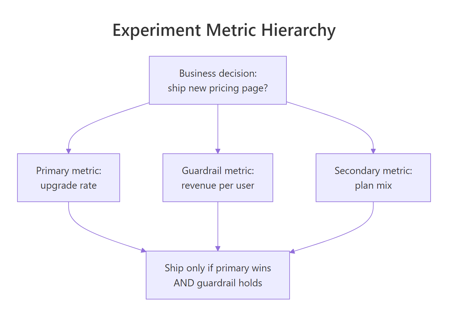
Figure 1: The metric hierarchy: one primary, one guardrail, one secondary, and the rule that ships only when the primary wins and the guardrail holds.
Let's make this concrete by simulating the experiment. The code below builds one row per user, with the treatment assignment, some pre-test history we will use later, the channel they arrived through, whether they upgraded, and their in-test revenue. You do not need to follow every line yet; run it and look at the shape of the data.
Each row is one user. Most have converted = 0 because upgrade rates are low, a few percent, which is normal for a freemium product. The in_rev column is their total revenue in the four-week window, and it is non-zero even for non-upgraders because free users can still spend on small add-ons.
Now the payoff. Let's compare the two arms on both the primary metric and the guardrail at the same time.
Read the two columns side by side. The upgrade rate climbs from about 3.18% in control to about 4.04% in treatment, a clear jump. Revenue per user, meanwhile, barely moves, from $24.78 to $24.84. That is the whole drama of this chapter in two rows: the primary metric says "big win," the guardrail says "nothing happened." A responsible analyst does not pick the flattering number. They explain the gap.
Try it: Compute the overall upgrade rate across both arms combined, ignoring the group split. This is the blended number a dashboard would show if nobody split by variant.
Click to reveal solution
Explanation: converted is coded as 0 and 1, so its mean is the proportion of 1s, which is the upgrade rate. Averaging across both arms blends the two rates by their sample sizes.
How big must the experiment be, and when do we stop?
A test that is too small cannot see a real effect, and a test you stop the moment it looks good will lie to you. Both problems are settled before launch, on paper, with two decisions: how big an effect is worth detecting, and how long to run.
Start with the effect size. The minimum detectable effect (MDE) is the smallest improvement you care about enough to build and maintain. It comes from business stakes, not statistics. Suppose the team decides that anything smaller than a lift from 3.0% to 3.6% (an extra 0.6 percentage points) is not worth the engineering cost of maintaining the new page. That 0.6-point gap is our MDE.
Given the MDE, R tells you the sample size. power.prop.test answers: how many users per arm do we need to detect a jump from 3.0% to 3.6%, with the usual 80% power and a 5% significance level? Here power is the chance of detecting a real effect of that size when it exists (80% means we would catch it 4 times out of 5), and the significance level is the false-positive rate we accept (5% means a 1-in-20 chance of calling a winner when the two pages are actually identical).
The answer is about 13,914 users per arm. Small effects are expensive: detecting a 0.6-point move needs nearly 28,000 users total. Now translate that into calendar time using real traffic. If roughly 1,000 eligible free users enter each arm per day, the run length is the sample size divided by the daily flow.
Fourteen days. That is a tidy two-week test, and running it in whole weeks matters, because weekday and weekend users behave differently and you want equal numbers of each.
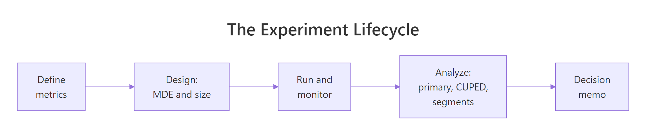
Figure 2: The five stages of the experiment, from defining metrics to the decision memo.
Now the stopping rule, which is where most real experiments go wrong. It is tempting to watch the p-value every day and stop the moment it dips below 0.05. That habit, called the peeking problem, wrecks your error rate. Every extra look is another chance for random noise to cross the line. Let's prove it. We simulate 4,000 experiments where the two pages are truly identical (no real effect), check the p-value on each of 14 days, and count how often we would have declared a winner.
With no real effect at all, an analyst who stops on the first significant day calls a winner 21.7% of the time. An analyst who ignores the daily numbers and looks only once, at the planned end, calls a winner 5.1% of the time, exactly the 5% we asked for. Peeking quadrupled the false-positive rate.
So our rule is committed in writing before launch: run for the full 14 days, then look once. No early stopping.
Try it: Suppose the team wants to detect an even smaller lift, from 3.0% to 3.4%. Compute the required sample size per arm. A smaller effect should need more users.
Click to reveal solution
Explanation: Shrinking the target lift from 0.6 points to 0.4 points more than doubles the sample size, from about 13,900 to about 30,400 per arm. Sample size grows roughly with the inverse square of the effect, so a smaller effect costs disproportionately more users, which is why tiny effects are so expensive to prove.
How do we know the experiment ran cleanly?
Before trusting any result, confirm the plumbing worked. The single most important integrity check is the sample ratio mismatch, or SRM. We asked for a 50/50 split. If the arms come back badly unbalanced, something in the assignment or logging is broken, and every downstream number is suspect.
A chi-square goodness-of-fit test compares the observed split to the expected 50/50.
The split is 13,984 versus 14,016, and the p-value is 0.85. A high p-value here is good news: the tiny imbalance is exactly what random assignment produces, so the test passes. If this p-value were very small, say below 0.001, you would stop and debug the pipeline rather than read the results.
Alongside the integrity check, you watch the guardrail as the test runs. A guardrail dashboard is just the guardrail metric plotted over time per arm, so a sudden drop is visible on day two rather than at the end. Here is the daily revenue per user in each arm.
The two columns move around $24 to $25 day by day, crossing over each other with no sign of a sustained gap. That is a healthy guardrail: the new page is not costing revenue. A picture makes the pattern obvious, so plot the same daily series.
The two lines stay close and cross back and forth across all fourteen days. There is no day where treatment drops sharply below control, which is what you watch for in a live monitoring dashboard.
Try it: Run an SRM check for a badly broken experiment where 28,000 users split 15,400 to 12,600 instead of 50/50. Report the chi-square statistic and p-value.
Click to reveal solution
Explanation: A 55/45 split across 28,000 users is wildly unlikely by chance, so the chi-square statistic is enormous (280) and the p-value is effectively zero. In real life this points to a logging or randomization bug, and you would not analyze the experiment until it is fixed.
Did the new page win on the primary metric?
Now the headline test. The primary metric is a proportion, so the right tool is a two-proportion test. prop.test compares the upgrade rates and, just as usefully, hands back a confidence interval for the difference.
Three things to read here. The p-value is 0.0001, far below 0.05, so the lift is very unlikely to be noise. The two rates are 4.04% (treatment) and 3.18% (control). The confidence interval for the difference runs from 0.0043 to 0.0130, meaning we are 95% confident the new page adds somewhere between 0.4 and 1.3 percentage points of upgrade rate. The whole interval is above zero, which is the visual sign of a real effect.
Try it: Compute the relative lift, the percentage increase from the control rate to the treatment rate. The two rates are already stored in the upgrades and visitors vectors.
Click to reveal solution
Explanation: A 0.86-point absolute lift on a 3.18% base is a 27% relative gain. Relative framing makes small-baseline wins sound impressive, which is exactly why you pair it with the absolute number.
Why did more signups not mean more revenue?
The primary metric won, clearly. Yet back in the first section, revenue per user barely moved. This is the moment that separates an analyst from a p-value printer: you have to explain the gap honestly, and you have two strategies for looking at revenue. We will run both.
Strategy one is the plain test: compare in-test revenue per user between the arms with a t-test.
The p-value is 0.70, nowhere near significant, and the confidence interval runs from about minus $0.25 to plus $0.38 per user. It comfortably includes zero. On the revenue metric, we cannot distinguish the new page from the old one. The interval is wide because revenue per user is noisy: a handful of big spenders swamp the small upgrade signal.
Strategy two tackles that noise directly. CUPED (Controlled-experiment Using Pre-Experiment Data) uses each user's history to strip out predictable variation before comparing the arms. The idea is simple: a user who spent a lot in the four weeks before the test will probably spend a lot during it, regardless of which page they saw. That predictable part is noise for our purposes, so we subtract it.
The adjustment removes the part of the in-test metric that a straight line from the pre-test metric can predict:
$$Y^{\text{adj}}_i = Y_i - \theta\,(X_i - \bar{X}), \qquad \theta = \frac{\operatorname{cov}(Y, X)}{\operatorname{var}(X)}$$
Where:
- $Y_i$ = the in-test metric (revenue per user) for user $i$
- $X_i$ = the same user's pre-experiment metric (revenue in the prior four weeks)
- $\theta$ = the slope that best predicts $Y$ from $X$
- $\bar{X}$ = the average pre-experiment metric across all users
Because we subtract the same predictable slice from both arms, the average difference between arms is left almost untouched, but the noise around it shrinks. Here is the whole adjustment in three lines.
The variance of the metric drops from 182.5 to 96.4, a 47% reduction, just by using history we already had. Now re-run the same t-test on the adjusted metric.
The interval tightened from a width of about $0.63 to about $0.46, roughly 27% narrower, which matches the variance drop. Notice what did not change: the conclusion. Revenue still shows no significant difference. CUPED did not manufacture an effect, it just let us bound the revenue change more precisely: we can now say with confidence that the new page did not move revenue per user by more than a few cents in either direction.
So why did signups rise without revenue following? The secondary metric holds the answer. The new page converts more people, but it steers them toward the cheaper Basic plan. More upgrades at a lower average price roughly cancel out, leaving revenue per user flat.

Figure 3: How a real signup win can leave revenue per user flat when the new page shifts buyers to cheaper plans.
Try it: CUPED helps most when the pre-experiment metric strongly predicts the in-test metric. Compute the correlation between pre_rev and in_rev, and its square, which is the theoretical fraction of variance CUPED can remove.
Click to reveal solution
Explanation: CUPED removes a fraction of variance equal to the squared correlation between the pre-experiment and in-test metrics. A correlation of 0.69 means about 47% of the variance is predictable and can be cancelled, which is exactly the reduction we saw.
Does the effect hold in every segment?
Averages hide differences. Maybe the new page helps some traffic sources more than others. Slicing by segment is tempting, but it is also the fastest way to fool yourself, because every extra slice is another chance for a fluke to look significant. This is the multiple comparisons problem, and it needs the same discipline as the peeking problem.
Let's test the upgrade lift within each acquisition channel, then correct for the fact that we ran four tests instead of one.
The Bonferroni correction is the strictest fix: with four tests, we require each p-value to beat 0.05 divided by 4, or 0.0125, before we believe it. Only one channel clears that bar. Paid traffic shows a 1.68-point lift with a p-value of 0.0001, well past the corrected threshold. The other three channels have small, noisy lifts that do not survive. Without the correction, you might have been tempted to tell a story about the Email segment too; the discipline stops you.
The honest read across the whole population versus segments: the new page is a genuine win overall, and that win is concentrated in Paid traffic. That is a real, actionable finding, not a fishing expedition, precisely because it survived the correction.
Try it: Bonferroni is strict. The Benjamini-Hochberg method controls the false discovery rate and is often preferred. Apply it to the four segment p-values with p.adjust.
Click to reveal solution
Explanation: After the BH adjustment, only the Paid channel (the second value, 0.0004) stays significant; the other three are pushed up to 0.2774. Both Bonferroni and BH agree here: Paid is the only real segment effect.
How do we turn this into a decision memo?
The analysis is done. The deliverable is not a notebook full of tests; it is a one-page memo that the person who owns the roadmap can read in two minutes and act on. A good memo has five parts: the result, the uncertainty, the revenue math, the recommendation, and what to run next.
First, ground the revenue math in real numbers. If we ship to the full eligible population of about 60,000 users a month, how many extra upgrades and how much extra revenue does that imply?
Read this carefully, because it is where honesty matters most. The best guess for extra upgrades is about 518 per month, a solid number. The best guess for extra revenue is about $3,700 per month, but the 95% interval runs from minus $15,000 to plus $22,000. In plain words: we are confident about the signups and completely unsure about the revenue. The memo must say both.
Here is the memo, written for the roadmap owner.
| Memo field | What we found |
|---|---|
| Result | The new pricing page lifts the upgrade rate from 3.18% to 4.04%, a 27% relative gain (p = 0.0001). |
| Uncertainty | The upgrade lift is solid (95% CI: +0.4 to +1.3 points). Revenue per user is flat and cannot be distinguished from zero, even after CUPED. |
| Revenue math | About +518 upgrades per month. Revenue point estimate is +$3,700 per month, but the interval spans minus $15k to plus $22k, so we cannot claim a revenue gain. |
| Recommendation | Ship the new page. It clearly grows signups, the revenue guardrail did not drop, and the win is real. But do not credit it with a revenue increase in the forecast. |
| What we would run next | The new page steers buyers to the cheaper plan. Run a follow-up that keeps the new layout but nudges toward the Pro plan, aiming to convert the signup win into a revenue win. Consider shipping to Paid traffic first, where the effect is strongest. |
That memo is the point of the whole exercise. Every test we ran feeds one line of it, and the honest handling of the flat revenue metric is what makes it trustworthy.
Try it: Project the extra upgrades over a full year at 60,000 visitors a month, so the memo can state an annual figure.
Click to reveal solution
Explanation: Scaling the monthly figure by twelve gives roughly 6,200 extra upgrades a year. This is the kind of headline number a memo leads with, as long as it is paired with the caveat that revenue per upgrade is lower.
Practice Exercises
These combine several ideas from the chapter. Each uses distinct variable names so it will not overwrite the tutorial data.
Exercise 1: Confirm the cheaper-plan mechanism
We claimed the new page shifts buyers to cheaper plans. Verify it directly: among users who upgraded, compute the mean in-test revenue per user in each arm. Treatment converters should show lower revenue than control converters.
Click to reveal solution
Explanation: Among people who actually upgraded, treatment users bring in about $44.89 versus $48.16 in control. The new page wins more buyers but each is worth less, which is precisely why total revenue per user stayed flat.
Exercise 2: Measure how much CUPED sharpened the guardrail
Quantify the precision gain from CUPED. Compute the half-width of the 95% confidence interval for the raw revenue difference and for the CUPED-adjusted difference, then report the percentage shrinkage.
Click to reveal solution
Explanation: CUPED shrank the interval half-width by 27%. A tighter interval on the same data means you could have reached the same precision with fewer users, which is why teams adopt CUPED to shorten tests.
Exercise 3: Make the Paid-only ship decision
The segment analysis flagged Paid traffic as the strongest responder. Produce the number a manager would want for a Paid-only rollout: the upgrade lift and its 95% confidence interval, in percentage points, for the Paid channel alone.
Click to reveal solution
Explanation: Within Paid traffic the lift is +1.68 points, with a 95% interval of +0.85 to +2.50 points. The entire interval sits above zero, so a Paid-only rollout rests on firm ground even after the multiple-comparisons scrutiny.
Frequently Asked Questions
Why not just make revenue per user the primary metric?
Revenue per user is noisy and slow, so a test powered to detect a small revenue change would need to run for months. Upgrade rate is a faster, more sensitive signal that usually leads revenue. The pattern is to power on the sensitive primary metric and keep the money metric as a guardrail, which is exactly what we did.
Is CUPED a form of cheating or p-hacking?
No. CUPED uses only pre-experiment data, which cannot have been affected by the treatment, so it does not bias the estimated difference. It is planned before launch, not chosen after seeing results. It is a variance-reduction technique, and it leaves an honest null result null, as we saw.
What should I do if the SRM check fails?
Stop and debug before analyzing anything. A sample ratio mismatch almost always signals a bug in assignment, tracking, or filtering, and that same bug usually biases who ends up in each arm. Fixing the pipeline and rerunning is the only safe path; there is no statistical patch that rescues a broken split.
Should the primary test be one-sided or two-sided?
Use two-sided by default, which is what prop.test gives you. A one-sided test assumes the change can only help, and real product changes can hurt. Two-sided testing keeps you honest about the possibility that the new page is worse.
The revenue result was not significant. Does that mean revenue is unchanged?
Not exactly. It means we could not detect a change and, thanks to CUPED, we can bound it tightly: revenue per user did not move by more than a few cents either way. "No significant difference" plus a narrow confidence interval is a much stronger statement than "no significant difference" alone.
Why run a full two weeks instead of stopping when it hit significance?
Because stopping early on a fixed-horizon test inflates the false-positive rate, as our peeking simulation showed (from 5% to about 22%). The committed stopping date is what keeps the promised error rate honest. If you need to look early, switch to a proper sequential design with corrected thresholds.
Summary
This capstone ran one business experiment from decision to memo. The stages, and the one-line lesson from each, were these:
| Stage | What we did | The lesson |
|---|---|---|
| Define | Named primary, guardrail, and secondary metrics before launch | The metric that moves is often not the metric that pays |
| Design | Set the MDE, sized the test with power.prop.test, committed a stopping rule | Small effects are expensive, and peeking inflates false positives |
| Monitor | Ran the SRM check and a daily guardrail dashboard | A broken split invalidates everything downstream |
| Analyze | prop.test for the primary, raw versus CUPED for revenue, segments with correction | CUPED buys precision, and corrections stop segment fishing |
| Decide | Wrote a five-part memo with honest revenue math | Ship the signup win, but do not credit it with revenue it did not earn |
The final recommendation: ship the new pricing page, because it grows upgrades by 27% without hurting the revenue guardrail, but forecast it as a signup win rather than a revenue win, and run a follow-up that pushes the higher-value plan.
References
- Kohavi, R., Tang, D., and Xu, Y. Trustworthy Online Controlled Experiments: A Practical Guide to A/B Testing. Cambridge University Press (2020). Link - the standard practitioner book on online experiments; covers metrics, guardrails, and SRM in depth.
- Deng, A., Xu, Y., Kohavi, R., and Walker, T. Improving the Sensitivity of Online Controlled Experiments by Utilizing Pre-Experiment Data (CUPED). WSDM (2013). Link - the original CUPED paper, with the variance-reduction derivation this post applies.
- R Core Team.
power.prop.testdocumentation. Link - the function reference for the two-proportion sample-size calculation used here. - R Core Team.
prop.testdocumentation. Link - the function reference for the two-proportion test and its confidence interval. - Fabijan, A. et al. Diagnosing Sample Ratio Mismatch in A/B Testing. Microsoft Experimentation Platform. Link - a focused treatment of what causes SRM and how to diagnose it.
- Optimizely. CUPED in A/B testing and experimentation. Link - a plain-language explainer of CUPED for practitioners.
Continue Learning
- A/B Testing in R: Plan Your Sample Size, Analyse Correctly, and Know When to Stop - the mechanics of sizing and analyzing a single test in depth.
- A/B Testing Interview Cases - practice reading experiment readouts the way interviewers ask you to.
- p-Hacking, Forking Paths and Preregistration - why committing your analysis plan before you look protects your results.