Chapter 7 Plotting tree with data
Integrating user data to annotate phylogenetic tree can be done at different
levels. The treeio package implements full_join methods to
combine tree data to phylogenetic tree object.
The tidytree package supports linking tree data to phylogeny
using tidyverse verbs.
ggtree supports mapping external data to phylogeny for
visualization and annotation on the fly. Although the feature of linking external data is overlapping among these packages, they have different application scopes. For example, in addition to the treedata object, ggtree also supports several other tree objects (see chapter 9), including phylo4d, phyloseq and obkData that were designed to contain domain specific data. The design of these objects did not consider to support linking external data to the object (it can not be done at tree object level). We can visualize trees from these objects using ggtree and link external data at visualization level (Yu et al. 2018).
ggtree provides two general methods for mapping and visualizing associated external data on phylogenies. Method 1 allows external data to be mapped on the tree structure and used as visual characteristic in tree and data visualization. Method 2 plots the data with the tree side by side using different geometric functions after reordering the data based on the tree structure. These two methods integrate data with phylogeny for further exploration and comparison in the evolutionary biology context.
7.1 Mapping data to the tree structure
In ggtree, we implemented an operator, %<+%, to attach annotation data to a ggtree graphic object. Any data that contains a column of “node” or first column of taxa labels can be integrated using the %<+% operator. Multiple datasets can be attached progressively. When the data are attached, all the information stored in the data serve as numerical/categorical node attributes and can be directly used to visualize the tree by scaling the attributes as different colors or line sizes, label the tree using the original values of the attributes or parsing them as math expression, emoji or silhouette image. The following example uses the %<+% operator to integrat taxon (tip_data.csv) and internal node (inode_data.csv) information and map the data to different colors or shapes of symbolic points and labels (Figure 7.1). The tip data contains imageURL that links to online figures of the species, which can be parsed and used as tip labels in ggtree (see chapter 8).
library(ggimage)
library(ggtree)
## url <- paste0("https://raw.githubusercontent.com/TreeViz/",
##             "metastyle/master/design/viz_targets_exercise/")

## x <- read.tree(paste0(url, "tree_boots.nwk"))
## info <- read.csv(paste0(url, "tip_data.csv"))

x <- read.tree("data/tree_boots.nwk")
info <- read.csv("data/tip_data.csv")

p <- ggtree(x) %<+% info + xlim(-.1, 4)
p2 <- p + geom_tiplab(offset = .6, hjust = .5) +
    geom_tippoint(aes(shape = trophic_habit, color = trophic_habit, size = mass_in_kg)) +
    theme(legend.position = "right") + scale_size_continuous(range = c(3, 10))

## d2 <- read.csv(paste0(url, "inode_data.csv"))
d2 <- read.csv("data/inode_data.csv")
p2 %<+% d2 + geom_label(aes(label = vernacularName.y, fill = posterior)) +
    scale_fill_gradientn(colors = RColorBrewer::brewer.pal(3, "YlGnBu"))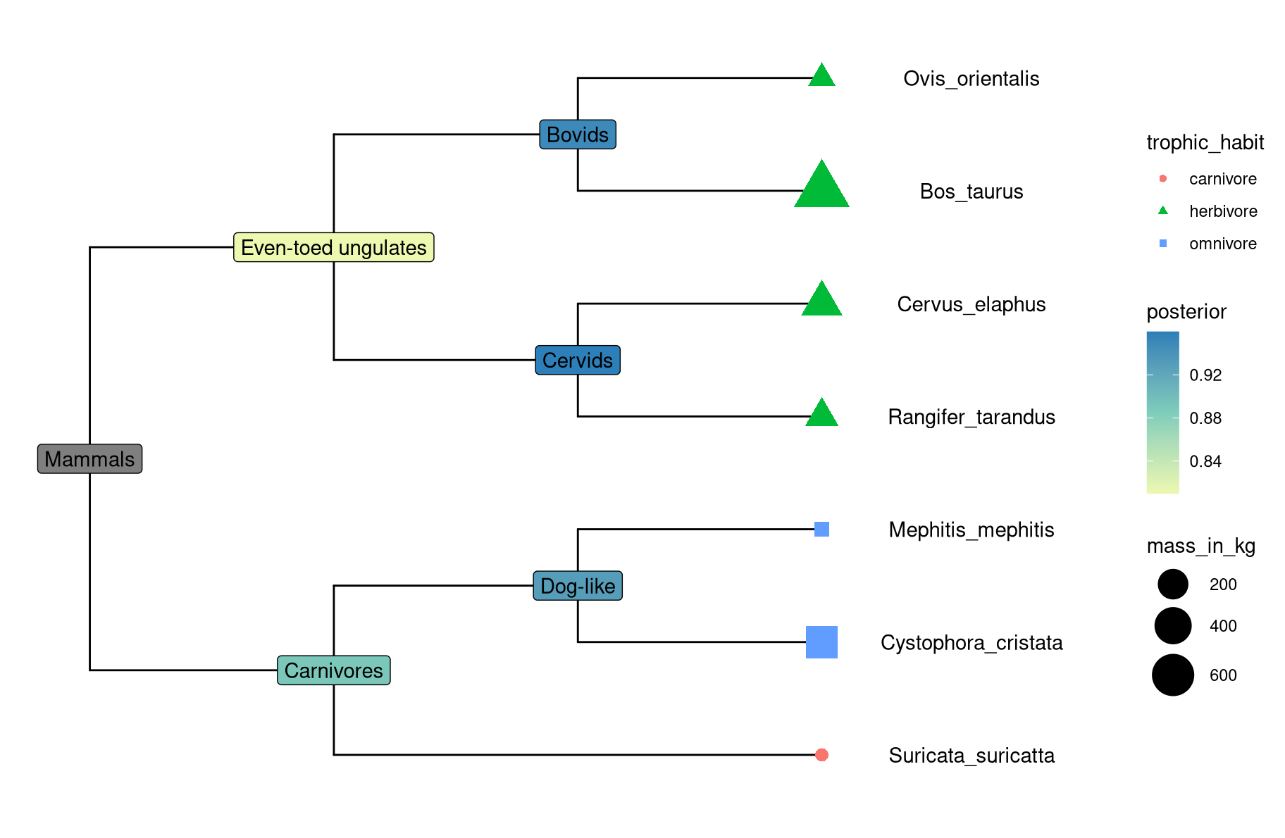
Figure 7.1: Example of attaching multiple datasets.
Although the data integrated by the %<+% operator in ggtree is for tree visualization, the data attached to the ggtree graphic object can be converted to treedata object that contains the tree and the attached data (see session 7.5).
7.2 Aligning graph to the tree based on tree structure
For associating phylogenetic tree with different type of plot produced by user’s data, ggtree provides geom_facet layer and facet_plot function which accept an input data.frame and a geom function to draw the input data. The data will be displayed in an additional panel of the plot. The geom_facet (or facet_plot) is a general solution for linking graphic layer to a tree. The function internally re-orders the input data based on the tree structure and visualizes the data at the specific panel by the geometric layer. Users are free to visualize several panels to plot different types of data as demonstrated in Figure 9.4 and to use different geometric layers to plot the same dataset (Figure 13.1) or different datasets on the same panel.
The geom_facet is designed to work with most of the geom layers defined in ggplot2 and other ggplot2-based packages. A list of the geometric layers that work seamlessly with geom_facet and facet_plot can be found in Table H.1. As the ggplot2 community keeps expanding and more geom layers will be implemented in either ggplot2 or other extensions, geom_facet and facet_plot will gain more power to present data in future. Note that different geom layers can be combined to present data on the same panel and the combinations of different geom layers create the possibility to present more complex data with phylogeny.
library(ggtree)
## remote_folder <- paste0("https://raw.githubusercontent.com/katholt/",
##                         "plotTree/master/tree_example_april2015/")
remote_folder <- "data/tree_example_april2015/"

## read the phylogenetic tree
tree <- read.tree(paste0(remote_folder, "tree.nwk"))

## read the sampling information data set
info <- read.csv(paste0(remote_folder,"info.csv"))

## read and process the allele table
snps<-read.csv(paste0(remote_folder, "alleles.csv"), header = F,
                row.names = 1, stringsAsFactor = F)
snps_strainCols <- snps[1,]
snps<-snps[-1,] # drop strain names
colnames(snps) <- snps_strainCols

gapChar <- "?"
snp <- t(snps)
lsnp <- apply(snp, 1, function(x) {
        x != snp[1,] & x != gapChar & snp[1,] != gapChar
    })
lsnp <- as.data.frame(lsnp)
lsnp$pos <- as.numeric(rownames(lsnp))
lsnp <- tidyr::gather(lsnp, name, value, -pos)
snp_data <- lsnp[lsnp$value, c("name", "pos")]

## read the trait data
bar_data <- read.csv(paste0(remote_folder, "bar.csv"))

## visualize the tree
p <- ggtree(tree)

## attach the sampling information data set
## and add symbols colored by location
p <- p %<+% info + geom_tippoint(aes(color=location))

## visualize SNP and Trait data using dot and bar charts,
## and align them based on tree structure
p + geom_facet(panel = "SNP", data = snp_data, geom = geom_point,
               mapping=aes(x = pos, color = location), shape = '|') +
    geom_facet(panel = "Trait", data = bar_data, geom = ggstance::geom_barh,
                aes(x = dummy_bar_value, color = location, fill = location),
                stat = "identity", width = .6) +
    theme_tree2(legend.position=c(.05, .85))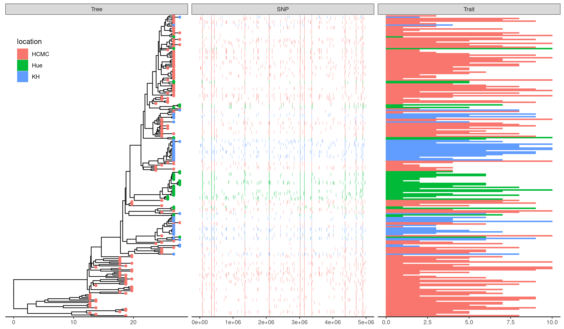
Figure 7.2: Example of plotting SNP and trait data.
We can also use cowplot or patchwork to create composite plots as described in session 7.6.
7.3 Visualize tree with associated matrix
The gheatmap function is designed to visualize phylogenetic tree with heatmap of associated matrix (either numerical or categorical). geom_facet is a general solution for plotting data with the tree, including heatmap. gheatmap is specifically designed for plotting heatmap with tree and provides shortcut for handling column labels and color palette. Another difference is that geom_facet only supports rectangular and slanted tree layouts while gheatmap supports rectangular, slanted and circular (Figure 7.4) layouts.
In the following example, we visualized a tree of H3 influenza viruses with their associated genotype (Figure 7.3A).
beast_file <- system.file("examples/MCC_FluA_H3.tree", package="ggtree")
beast_tree <- read.beast(beast_file)

genotype_file <- system.file("examples/Genotype.txt", package="ggtree")
genotype <- read.table(genotype_file, sep="\t", stringsAsFactor=F)
colnames(genotype) <- sub("\\.$", "", colnames(genotype))
p <- ggtree(beast_tree, mrsd="2013-01-01") +
    geom_treescale(x=2008, y=1, offset=2) +
    geom_tiplab(size=2)
gheatmap(p, genotype, offset=5, width=0.5, font.size=3,
        colnames_angle=-45, hjust=0) +
    scale_fill_manual(breaks=c("HuH3N2", "pdm", "trig"),
        values=c("steelblue", "firebrick", "darkgreen"), name="genotype")
The width parameter is to control the width of the heatmap. It supports another parameter offset for controlling the distance between the tree and the heatmap, for instance to allocate space for tip labels.
For time-scaled tree, as in this example, it’s more often to use x axis by using theme_tree2. But with this solution, the heatmap is just another layer and will change the x axis. To overcome this issue, we implemented scale_x_ggtree to set the x axis more reasonable (Figure 7.3A).
p <- ggtree(beast_tree, mrsd="2013-01-01") +
    geom_tiplab(size=2, align=TRUE, linesize=.5) +
    theme_tree2()
gheatmap(p, genotype, offset=8, width=0.6,
        colnames=FALSE, legend_title="genotype") +
    scale_x_ggtree() +
    scale_y_continuous(expand=c(0, 0.3))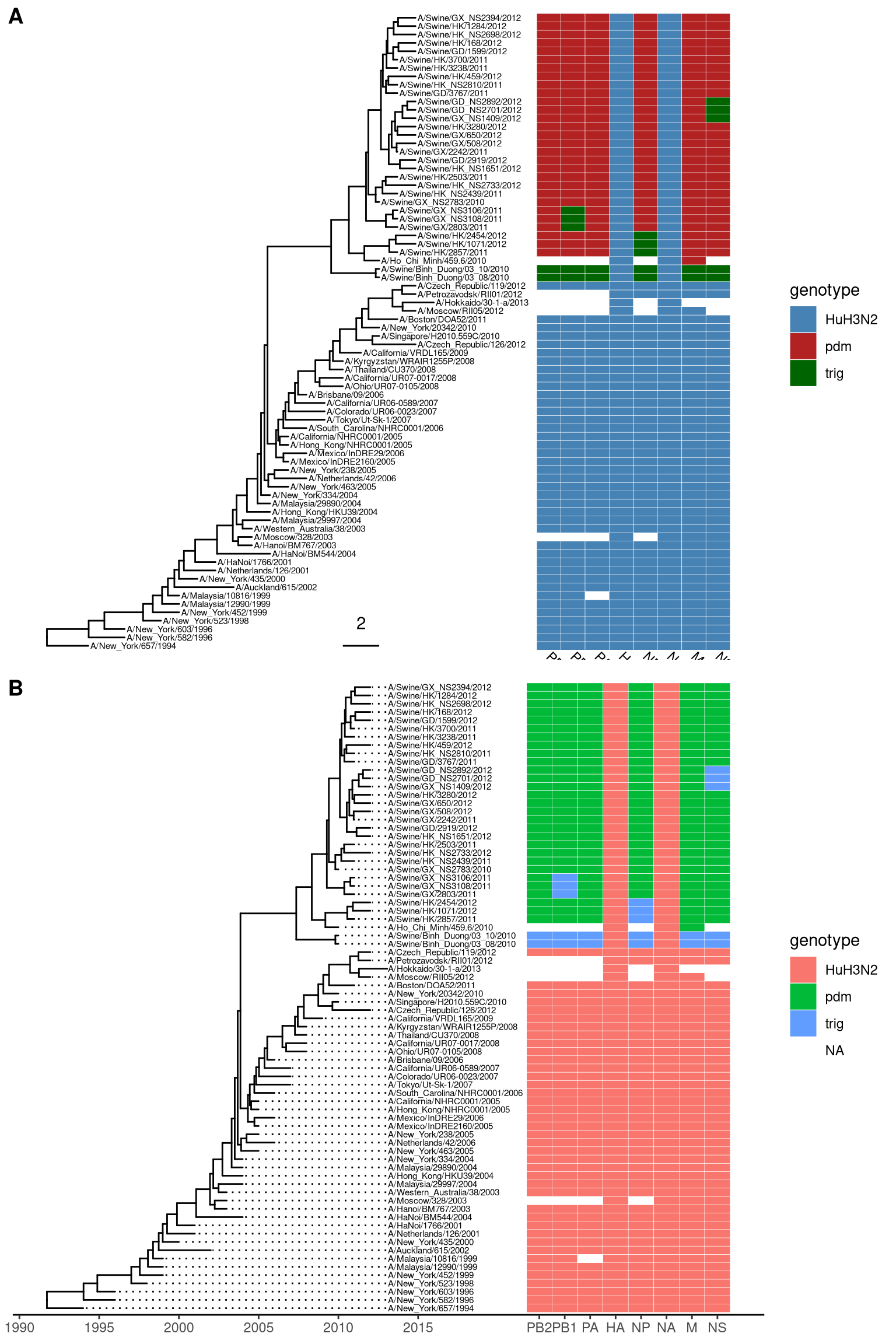
Figure 7.3: Example of plotting matrix with gheatmap.
7.3.1 Visualize tree with multiple associated matrix
Of course, we can use multiple gheatmap function call to align several associated matrix with the tree, however, ggplot2 doesn’t allow us to use multiple fill scales14.
To solve this issue, we can use ggnewscale to create new fill scales. Here is an example of using ggnewscale with gheatmap.
nwk <- system.file("extdata", "sample.nwk", package="treeio")

tree <- read.tree(nwk)
circ <- ggtree(tree, layout = "circular")

df <- data.frame(first=c("a", "b", "a", "c", "d", "d", "a", "b", "e", "e", "f", "c", "f"),
                 second= c("z", "z", "z", "z", "y", "y", "y", "y", "x", "x", "x", "a", "a"))
rownames(df) <- tree$tip.label

df2 <- as.data.frame(matrix(rnorm(39), ncol=3))
rownames(df2) <- tree$tip.label
colnames(df2) <- LETTERS[1:3]


p1 <- gheatmap(circ, df, offset=.8, width=.2,
               colnames_angle=95, colnames_offset_y = .25) +
    scale_fill_viridis_d(option="D", name="discrete\nvalue")


library(ggnewscale)
p2 <- p1 + new_scale_fill()
gheatmap(p2, df2, offset=15, width=.3,
         colnames_angle=90, colnames_offset_y = .25) +
    scale_fill_viridis_c(option="A", name="continuous\nvalue")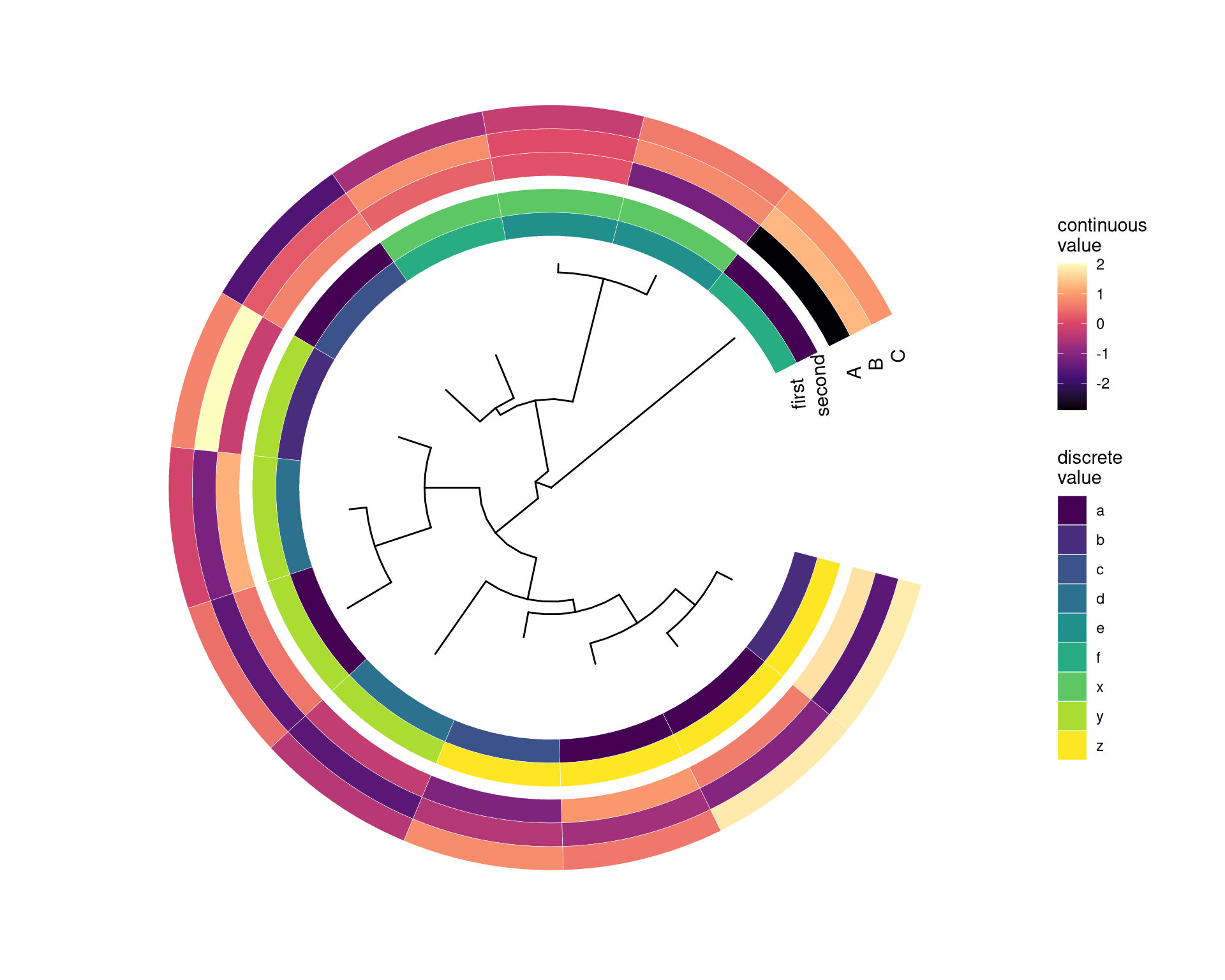
Figure 7.4: Example of plotting matrix with gheatmap.
7.4 Visualize tree with multiple sequence alignment
The msaplot accepts a tree (output of ggtree) and a fasta file, then it can visualize the tree with sequence alignment. We can specify the width (relative to the tree) of the alignment and adjust relative position by offset, that are similar to gheatmap function.
tree <- read.tree("data/tree.nwk")
p <- ggtree(tree) + geom_tiplab(size=3)
msaplot(p, "data/sequence.fasta", offset=3, width=2)
A specific slice of the alignment can also be displayed by specifying window parameter.
p <- ggtree(tree, layout='circular') +
    geom_tiplab(offset=4, align=TRUE) + xlim(NA, 12)
msaplot(p, "data/sequence.fasta", window=c(120, 200)) 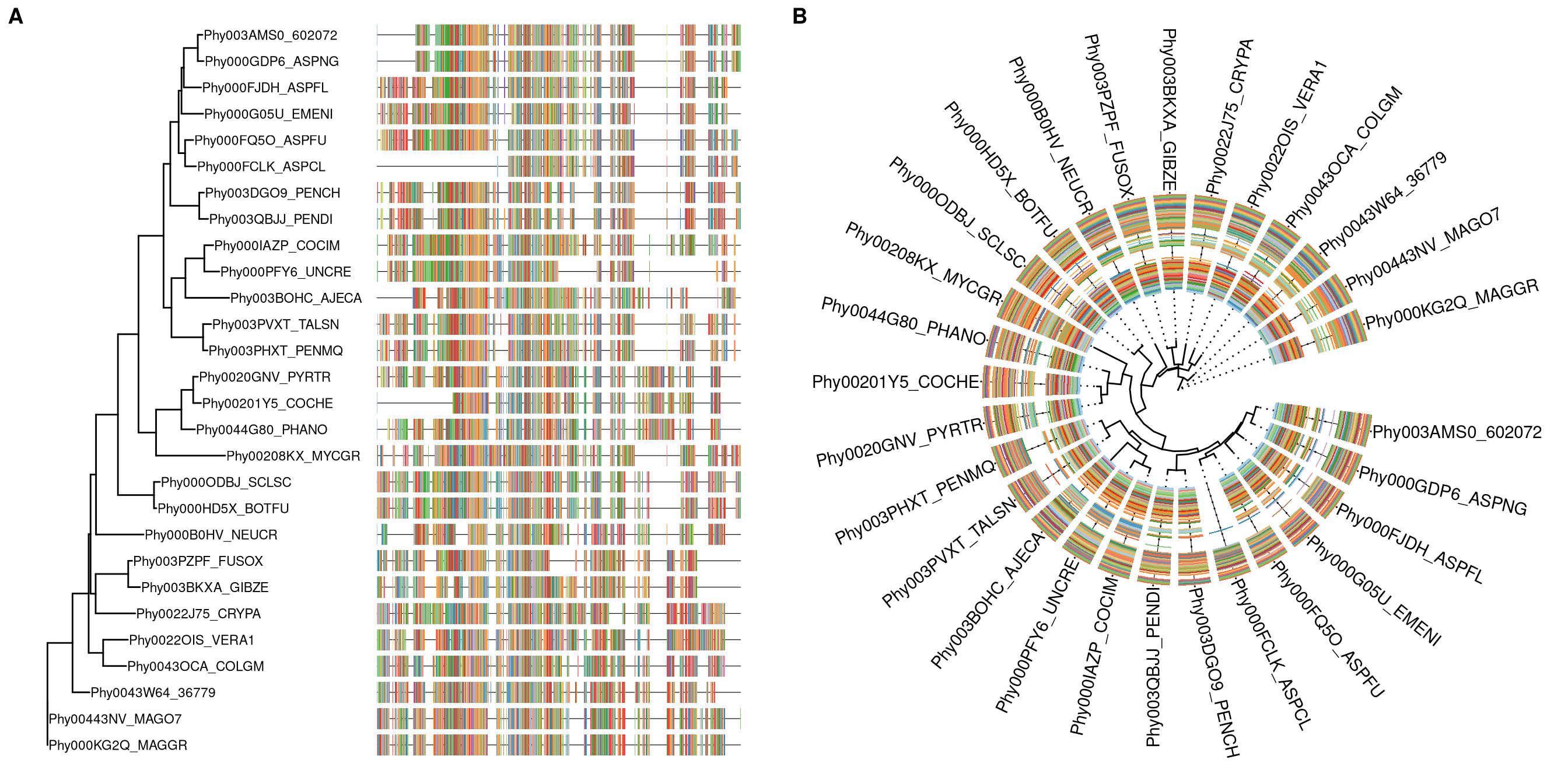
Figure 7.5: Example of plotting multiple sequence alignment with a tree.
7.5 Composite plots
In addition to aligning graph to a tree using geom_facet and special cases using gheatmap and msaplot, users can use aplot to create composite plots.
In the following example, we have a tree with two associated datasets.
library(ggplot2)
library(ggtree)

set.seed(2019-10-31)
tr <- rtree(10)

d1 <- data.frame(
    # only some labels match
    label = c(tr$tip.label[sample(5, 5)], "A"),
    value = sample(1:6, 6))

d2 <- data.frame(
    label = rep(tr$tip.label, 5),
    category = rep(LETTERS[1:5], each=10),
    value = rnorm(50, 0, 3))

g <- ggtree(tr) + geom_tiplab(align=TRUE)
p1 <- ggplot(d1, aes(label, value)) + geom_col(aes(fill=label)) +
coord_flip() + theme_tree2() + theme(legend.position='none')
p2 <- ggplot(d2, aes(x=category, y=label)) +
geom_tile(aes(fill=value)) + scale_fill_viridis_c() +
theme_tree2() Now we can use aplot to align these associated subplots as demonstrated in Figure 7.6.
library(aplot)
p2 %>% insert_left(g) %>% insert_right(p1, width=.5)
Figure 7.6: Example of aligning tree with data side by side by creating composite plot.
7.6 The ggtree object
7.7 Summary
Although there are many software packages support visualizing phylogenetic tree, plotting tree with data is often missing or with only limited supports. Some of the packages defines S4 classes to store phylogenetic tree with domain specific data, such as OutbreakTools (Jombart et al. 2014) defined obkData for storing tree with epidemiology data and phyloseq (McMurdie and Holmes 2013) defines phyloseq for storing tree with microbiome data. These packages are capable to present some of the data stored in the object on the tree. However, not all the associated data are supported. For example, species abundance stored in phyloseq object is not supported to be visualized using phyloseq package. These packages did not provide any utilities to integrate external data for tree visualization. None of these packages support visualizing external data and align the plot to tree based on the tree structure.
ggtree provides general solutions for integrating data. Method 1, the %<+% operator, can integrate external and internal node data and map the data as visual characteristic to visualize the tree and other datasets used in geom_facet. Method 2, the geom_facet layer, has no restriction of input data as long as there is a geom function available to plot the data (e.g. species abundance displayed by geom_density_ridges as demonstrated in Figure 9.4). Users are free to combine different panels and combine different geom layers in the same panel (Figure 13.1). ggtree has many unique features that cannot be found in other implementations:
- Integrating node/edge data to the tree can be mapped to visual characteristics of the tree or other datasets (Figure ).
- Capable of parsing expression (math symbols or text formatting), emoji and image files (chapter 8).
- No predefined of input data types or how the data should be plotted in
geom_facet(Table H.1). - Combining different
geomfunctions to visualize associated data is supported (Figure 13.1). - Visualizing different datasets on the same panel is supported.
- Data integrated by
%<+%can be used ingeom_facet. - Able to add further annotation to specific layers.
- Modular design by separating tree visualization, data integration (method 1) and graph alignment (method 2).
Modular design is a unique feature for ggtree to stand out from other packages. The tree can be visualized with data stored in tree object or external data linked by %<+% operator, and fully annotated with multiple layers of annotations (Figure 7.1 and 13.1), before passing it to geom_facet. geom_facet can be called progressively to add multiple panels or multiple layers on the same panels (Figure 13.1). This creates the possiblity of plotting full annotated tree with complex data panels that contains multiple graphic layers.
ggtree fits the R ecosystem and extends the abilities of integrating and presenting data with trees to existing phylogenetic packages. As demonstrated in Figure 9.4, we are able to plot species abundance distributions with phyloseq object. This cannot be easily done without ggtree. With ggtree, we are able to attach additional data to tree objects using %<+% and align graph to tree using geom_facet. Integrating ggtree to existing workflows will definitely extends the abilities and broadens the applications to present phylogeny-associated data, especially for comparative studies.
References
Jombart, Thibaut, David M. Aanensen, Marc Baguelin, Paul Birrell, Simon Cauchemez, Anton Camacho, Caroline Colijn, et al. 2014. “OutbreakTools: A New Platform for Disease Outbreak Analysis Using the R Software.” Epidemics 7 (June): 28–34. https://doi.org/10.1016/j.epidem.2014.04.003.
McMurdie, Paul J., and Susan Holmes. 2013. “Phyloseq: An R Package for Reproducible Interactive Analysis and Graphics of Microbiome Census Data.” PLoS ONE 8 (4): e61217. https://doi.org/10.1371/journal.pone.0061217.
Yu, Guangchuang, Tommy Tsan-Yuk Lam, Huachen Zhu, and Yi Guan. 2018. “Two Methods for Mapping and Visualizing Associated Data on Phylogeny Using Ggtree.” Molecular Biology and Evolution 35 (12): 3041–3. https://doi.org/10.1093/molbev/msy194.