- Cover
- Acknowledgments
- 1 Preface
- 2 (R)e-Introduction to statistics
- 2.1 Histograms, boxplots, and density curves
- 2.2 Pirate-plots
- 2.3 Models, hypotheses, and permutations for the two sample mean situation
- 2.4 Permutation testing for the two sample mean situation
- 2.5 Hypothesis testing (general)
- 2.6 Connecting randomization (nonparametric) and parametric tests
- 2.7 Second example of permutation tests
- 2.8 Reproducibility Crisis: Moving beyond p < 0.05, publication bias, and multiple testing issues
- 2.9 Confidence intervals and bootstrapping
- 2.10 Bootstrap confidence intervals for difference in GPAs
- 2.11 Chapter summary
- 2.12 Summary of important R code
- 2.13 Practice problems
- 3 One-Way ANOVA
- 3.1 Situation
- 3.2 Linear model for One-Way ANOVA (cell-means and reference-coding)
- 3.3 One-Way ANOVA Sums of Squares, Mean Squares, and F-test
- 3.4 ANOVA model diagnostics including QQ-plots
- 3.5 Guinea pig tooth growth One-Way ANOVA example
- 3.6 Multiple (pair-wise) comparisons using Tukey’s HSD and the compact letter display
- 3.7 Pair-wise comparisons for the Overtake data
- 3.8 Chapter summary
- 3.9 Summary of important R code
- 3.10 Practice problems
- 4 Two-Way ANOVA
- 4.1 Situation
- 4.2 Designing a two-way experiment and visualizing results
- 4.3 Two-Way ANOVA models and hypothesis tests
- 4.4 Guinea pig tooth growth analysis with Two-Way ANOVA
- 4.5 Observational study example: The Psychology of Debt
- 4.6 Pushing Two-Way ANOVA to the limit: Un-replicated designs and Estimability
- 4.7 Chapter summary
- 4.8 Summary of important R code
- 4.9 Practice problems
- 5 Chi-square tests
- 5.1 Situation, contingency tables, and tableplots
- 5.2 Homogeneity test hypotheses
- 5.3 Independence test hypotheses
- 5.4 Models for R by C tables
- 5.5 Permutation tests for the \(X^2\) statistic
- 5.6 Chi-square distribution for the \(X^2\) statistic
- 5.7 Examining residuals for the source of differences
- 5.8 General protocol for \(X^2\) tests
- 5.9 Political party and voting results: Complete analysis
- 5.10 Is cheating and lying related in students?
- 5.11 Analyzing a stratified random sample of California schools
- 5.12 Chapter summary
- 5.13 Summary of important R commands
- 5.14 Practice problems
- 6 Correlation and Simple Linear Regression
- 6.1 Relationships between two quantitative variables
- 6.2 Estimating the correlation coefficient
- 6.3 Relationships between variables by groups
- 6.4 Inference for the correlation coefficient
- 6.5 Are tree diameters related to tree heights?
- 6.6 Describing relationships with a regression model
- 6.7 Least Squares Estimation
- 6.8 Measuring the strength of regressions: R2
- 6.9 Outliers: leverage and influence
- 6.10 Residual diagnostics – setting the stage for inference
- 6.11 Old Faithful discharge and waiting times
- 6.12 Chapter summary
- 6.13 Summary of important R code
- 6.14 Practice problems
- 7 Simple linear regression inference
- 7.1 Model
- 7.2 Confidence interval and hypothesis tests for the slope and intercept
- 7.3 Bozeman temperature trend
- 7.4 Randomization-based inferences for the slope coefficient
- 7.5 Transformations part I: Linearizing relationships
- 7.6 Transformations part II: Impacts on SLR interpretations: log(y), log(x), & both log(y) & log(x)
- 7.7 Confidence interval for the mean and prediction intervals for a new observation
- 7.8 Chapter summary
- 7.9 Summary of important R code
- 7.10 Practice problems
- 8 Multiple linear regression
- 8.1 Going from SLR to MLR
- 8.2 Validity conditions in MLR
- 8.3 Interpretation of MLR terms
- 8.4 Comparing multiple regression models
- 8.5 General recommendations for MLR interpretations and VIFs
- 8.6 MLR inference: Parameter inferences using the t-distribution
- 8.7 Overall F-test in multiple linear regression
- 8.8 Case study: First year college GPA and SATs
- 8.9 Different intercepts for different groups: MLR with indicator variables
- 8.10 Additive MLR with more than two groups: Headache example
- 8.11 Different slopes and different intercepts
- 8.12 F-tests for MLR models with quantitative and categorical variables and interactions
- 8.13 AICs for model selection
- 8.14 Case study: Forced expiratory volume model selection using AICs
- 8.15 Chapter summary
- 8.16 Summary of important R code
- 8.17 Practice problems
- 9 Case studies
- 9.1 Overview of material covered
- 9.2 The impact of simulated chronic nitrogen deposition on the biomass and N2-fixation activity of two boreal feather moss–cyanobacteria associations
- 9.3 Ants learn to rely on more informative attributes during decision-making
- 9.4 Multi-variate models are essential for understanding vertebrate diversification in deep time
- 9.5 What do didgeridoos really do about sleepiness?
- 9.6 General summary
- References
1.3 Basic summary statistics, histograms, and boxplots using R
For the following material, you will need to install and load the mosaic package (Pruim, Kaplan, and Horton 2019).
It provides a suite of enhanced functions to aid our initial explorations. With RStudio running, the mosaic package loaded, a place to write and
save code, and the treadmill data set loaded, we can (finally!) start to
summarize the results of the study. The treadmill object is what R calls a
tibble10 and contains columns corresponding to each variable in
the spreadsheet. Every
function in R will involve specifying the variable(s) of interest and how you
want to use them. To access a particular variable (column) in a tibble, you
can use a $ between the name of the tibble and the name of the variable of
interest, generically as tibblename$variablename. You can think of this as tibblename’s variablename where the ’s is replaced by the dollar sign. To identify the
RunTime variable here it would be treadmill$RunTime. In the command line it would look like:
> treadmill$RunTime
[1]  8.63  8.17  8.92  8.65 10.33  9.93 10.13 10.08  9.22  8.95 10.85  9.40 11.50 10.50
[15] 10.60 10.25 10.00 11.17 10.47 11.95  9.63 10.07 11.08 11.63 11.12 11.37 10.95 13.08
[29] 12.63 12.88 14.03
Just as in the previous section, we can generate summary statistics using functions like mean and sd by running them on a specific variable:
And now we know that the average running time for 1.5 miles for the subjects in the study was 10.6 minutes with a standard deviation (SD) of 1.39 minutes. But you should remember that the
mean and SD are only appropriate summaries if the distribution is roughly
symmetric (both sides of the distribution are approximately the same shape and length). The
mosaic package provides a useful function called favstats that provides
the mean and SD as well as the 5 number summary:
the minimum (min), the first quartile (Q1, the 25th percentile),
the median (50th percentile), the third quartile (Q3, the 75th
percentile), and the maximum (max). It also provides the number of
observations (n) which was 31, as noted above, and a count of whether any
missing values were encountered (missing), which was 0 here since all
subjects had measurements available on this variable.
> favstats(treadmill$RunTime)
  min   Q1 median    Q3   max     mean       sd  n missing
 8.17 9.78  10.47 11.27 14.03 10.58613 1.387414 31       0
We are starting to get somewhere with understanding that the runners were somewhat fit with worst runner covering 1.5 miles in 14 minutes (the equivalent of a 9.3 minute mile) and the best running at a 5.4 minute mile pace. The limited variation in the results suggests that the sample was obtained from a restricted group with somewhat common characteristics. When you explore the ages and weights of the subjects in the Practice Problems in Section 1.6, you will get even more information about how similar all the subjects in this study were. Researchers often publish numerical summaries of this sort of demographic information to help readers understand the subjects that they studied and that their results might apply to.
A graphical display of these results will help us to assess the shape
of the distribution of run times – including considering the potential for the presence of a skew (whether the right or left tail of the distribution
is noticeably more spread out, with left skew meaning that the left tail
is more spread out than the right tail) and outliers
(unusual observations). A histogram is a good place to start.
Histograms display connected bars with counts of observations defining
the height of bars based on a set of bins of values of the quantitative variable.
We will apply the hist function to the RunTime variable, which produces
Figure 1.5.
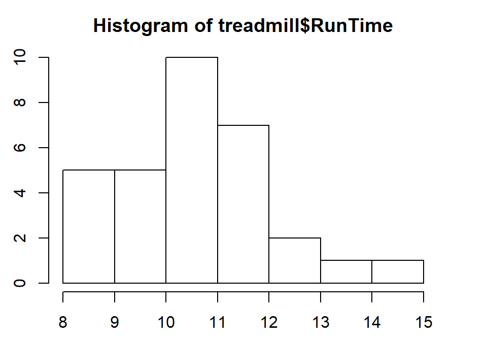
Figure 1.5: Histogram of Run Times (minutes) of \(n\)=31 subjects in Treadmill study, bar heights are counts.
You can save this plot by clicking on the Export button found above the plot, followed by Copy to Clipboard and clicking on the Copy Plot button. Then if you open your favorite word-processing program, you should be able to paste it into a document for writing reports that include the figures. You can see the first parts of this process in the screen grab in Figure 1.6. You can also directly save the figures as separate files using Save as Image or Save as PDF and then insert them into your word processing documents.
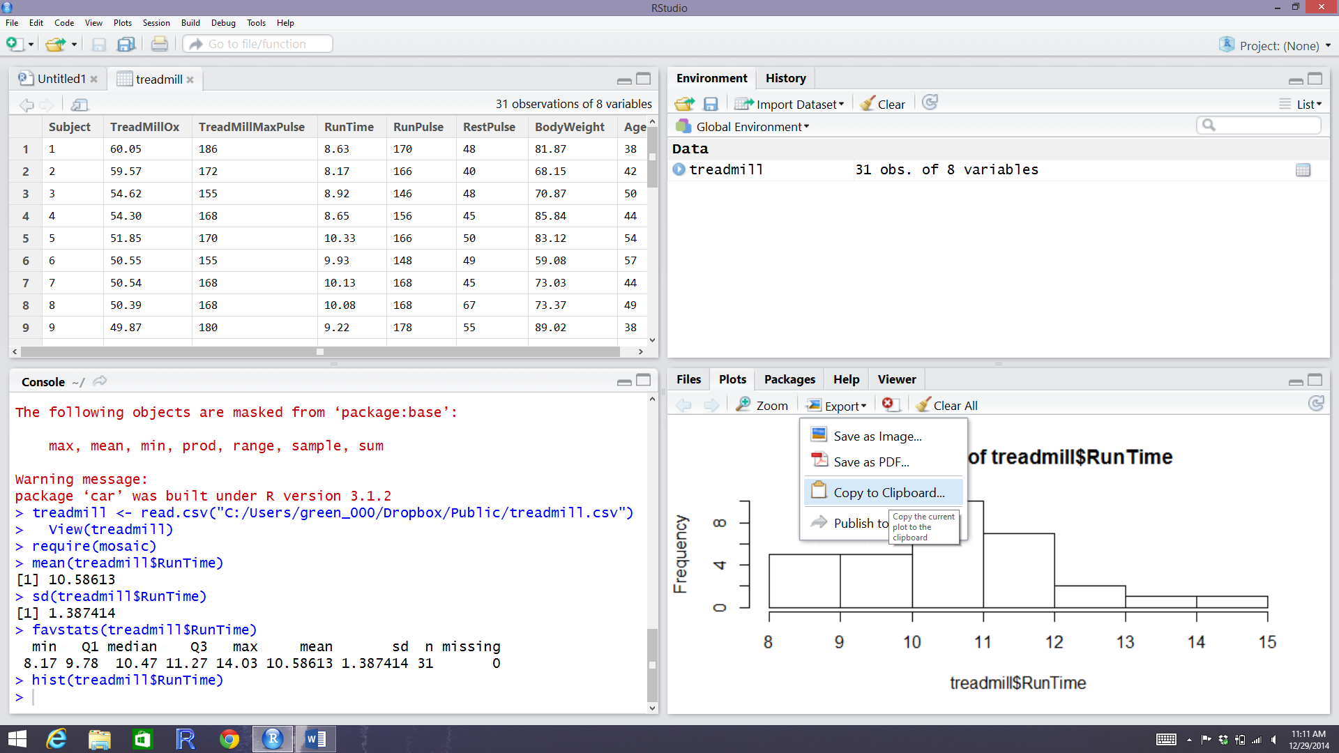
Figure 1.6: RStudio while in the process of copying the histogram.
The function hist defaults into providing a histogram on the frequency
(count) scale. In most R functions, there are the default options that will
occur if we don’t make any specific choices but we
can override the default options if we desire. One option we can modify here is
to add labels to the bars to be able to see exactly how many observations fell
into each bar. Specifically, we can turn the labels option “on” by making it true (“T”) by adding labels=T to the previous call to the hist function, separated by a comma. Note that we will use the = sign only for changing options within functions.
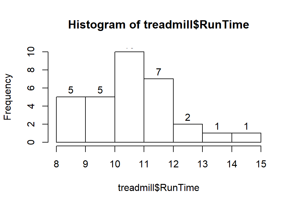
Figure 1.7: Histogram of Run Times with counts in bars labeled.
Based on this histogram, it does not appear that there any outliers in the responses since there are no bars that are separated from the other observations. However, the distribution does not look symmetric and there might be a skew to the distribution. Specifically, it appears to be skewed right (the right tail is longer than the left). But histograms can sometimes mask features of the data set by binning observations and it is hard to find the percentiles accurately from the plot.
When assessing outliers and skew, the boxplot
(or Box and Whiskers plot) can also be helpful (Figure 1.8) to describe the
shape of the distribution as it displays the 5-number summary and will also indicate
observations that are “far” above the middle of the observations.
R’s boxplot function uses the standard rule to indicate an observation as a
potential outlier if it falls more than 1.5 times the IQR
(Inter-Quartile Range, calculated as Q3 – Q1) below Q1 or above Q3.
The potential outliers
are plotted with circles and the Whiskers (lines that extend from Q1 and Q3 typically to
the minimum and maximum) are shortened to only go as far as
observations that are within \(1.5*\)IQR of the upper and lower quartiles. The box
part of the boxplot is a box that goes from Q1 to Q3 and the median is displayed as a line
somewhere inside the box.11 Looking back at the summary statistics above, Q1=9.78 and Q3=11.27, providing an IQR of:
One observation (the maximum value of 14.03) is indicated as a potential outlier based on this result by being larger than Q3 \(+1.5*\)IQR, which was 13.505:
The boxplot also shows a slight indication of a right skew (skew towards larger values) with the distance from the minimum to the median being smaller than the distance from the median to the maximum. Additionally, the distance from Q1 to the median is smaller than the distance from the median to Q3. It is modest skew, but worth noting.
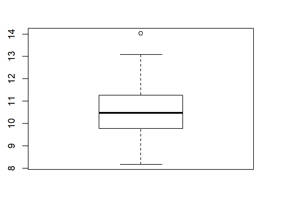
Figure 1.8: Boxplot of 1.5 mile Run Times.
While the default boxplot is fine, it fails to provide good graphical labels,
especially on the y-axis. Additionally, there is no title on the plot. The
following code provides some enhancements to the plot by using the ylab and
main options in the call to boxplot, with the results displayed in
Figure 1.9. When we add text to plots, it will be contained within quotes and
be assigned into the options ylab (for y-axis) or main
(for the title) here to put it into those locations.
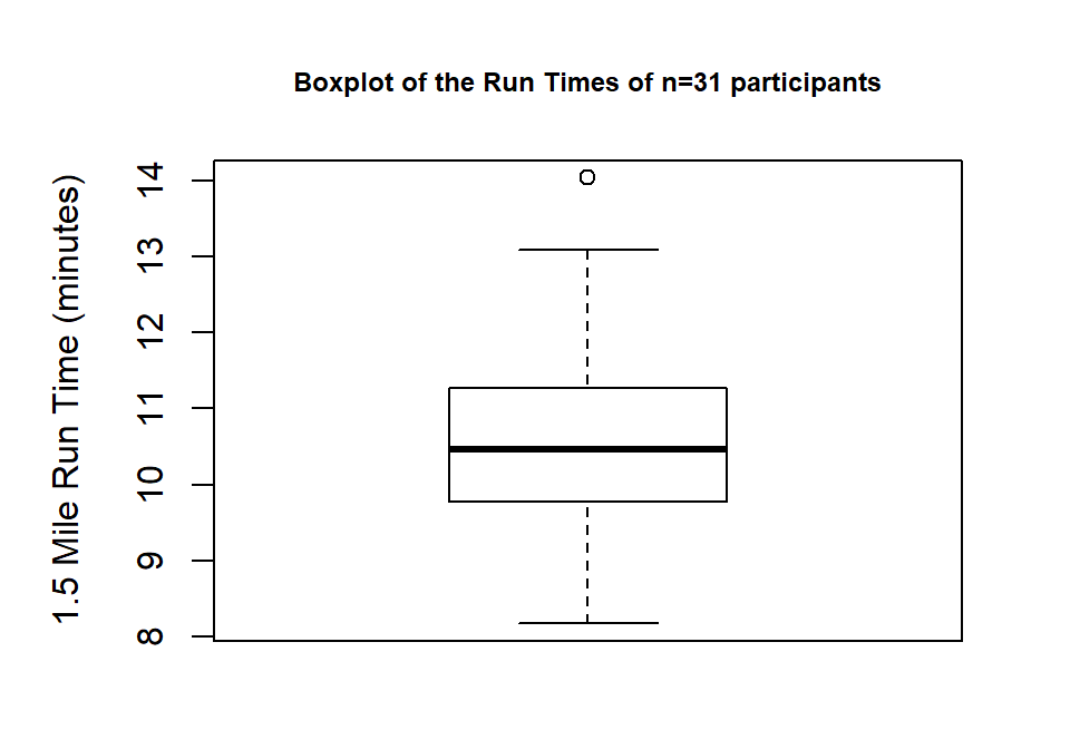
Figure 1.9: Boxplot of Run Times with improved labels.
> boxplot(treadmill$RunTime, ylab="1.5 Mile Run Time (minutes)",
          main="Boxplot of the Run Times of n=31 participants")
Throughout the book, we will often use extra options to make figures that are easier for you to understand. There are often simpler versions of the functions that will suffice but the extra work to get better labeled figures is often worth it. I guess the point is that “a picture is worth a thousand words” but in data visualization, that is only true if the reader can understand what is being displayed. It is also important to think about the quality of the information that is being displayed, regardless of how pretty the graphic might be. So maybe it is better to say “a picture can be worth a thousand words” if it is well-labeled?
All the previous results were created by running the R code and then copying the
results from either the console or by copying the figure and then pasting the results
into the typesetting program. There is another way
to use RStudio where you can have it compile the results (both output and
figures) directly into a document together with the code that generated it,
using what is called R Markdown (http://shiny.rstudio.com/articles/rmarkdown.html).
It is basically what we used to prepare this book and what you should learn to use to do your work.
From here forward, you will see a
change in formatting of the R code and output as you will no
longer see the command prompt (“>”) with the code. The output will be
flagged by having two “##”’s before it. For example, the summary statistics for
the RunTime variable from favstats function would look like when run using R Markdown:
##   min   Q1 median    Q3   max     mean       sd  n missing
##  8.17 9.78  10.47 11.27 14.03 10.58613 1.387414 31       0
Statisticians (and other scientists) are starting to use R Markdown and similar methods because they provide what is called “Reproducible research” (Gandrud 2015) where all the code and output it produced are available in a single place. This allows different researchers to run and verify results (so “reproducible results”) or the original researchers to revisit their earlier work at a later date and recreate all their results exactly. Scientific publications are currently encouraging researchers to work in this way and may someday require it. The term reproducible can also be related to whether repeated studies get the same result (also called replication) - further discussion of these terms and the implications for scientific research are discussed in Chapter XX.
In order to get some practice using R Markdown, there are two options. First, try to create a sample document in this format using File -> New File -> R Markdown… Choose a title for your file and select the “Word” option. This will create a new file in the XXX window. Save that file to your computer. Then you can use the “Knit” button to have RStudio run the code and create a word document with the results. R Markdown documents contain basically two components, “code chunks” that contain your code and places where you can write descriptions and interpretations of those results. The code chunks can be inserted using the “Insert” button and select the “R” option. Then write your code in between the {r} and lines. Once you do this, you can test your code using the triangle on the right side of the code chunk to run that chunk. Keep your write up outside of these code chunks. Once you think your code and writing is done, you can use the “Knit” button to try to compile the file. As you are learning, you may find this challenging, so start with trying to review the sample document and
Finally, when you are done with your work and attempt to exit out of RStudio,
it will
ask you to save your workspace. DO NOT DO THIS! It will just create a cluttered
workspace and could even cause you to get incorrect results. If you
save your R code (and edit it to only contain the parts of it that worked) via the
script window, you can re-create any results by simply
re-running that code. If you find that you have lots of “stuff” in your
workspace because you accidentally saved your workspace, just run rm(list = ls()).
It will delete all the data sets from your workspace.
References
Gandrud, Christopher. 2015. Reproducible Research with R and R Studio, Second Edition. Chapman Hall, CRC.
Pruim, Randall, Daniel T. Kaplan, and Nicholas J. Horton. 2019. Mosaic: Project Mosaic Statistics and Mathematics Teaching Utilities. https://CRAN.R-project.org/package=mosaic.
Tibbles are R are objects that can contain both categorical and quantitative variables on your \(n\) subjects with a name for each variable that is also the name of each column in a matrix. Each subject is a row of the data set. The name (supposedly) is due to the way table sounds in the accent of a particularly influential developer at RStudio who is from New Zealand.↩
The median, quartiles and whiskers sometimes occur at the same values when there are many tied observations. If you can’t see all the components of the boxplot, produce the numerical summary to help you understand what happened.↩