- Cover
- Acknowledgments
- 1 Preface
- 2 (R)e-Introduction to statistics
- 2.1 Histograms, boxplots, and density curves
- 2.2 Pirate-plots
- 2.3 Models, hypotheses, and permutations for the two sample mean situation
- 2.4 Permutation testing for the two sample mean situation
- 2.5 Hypothesis testing (general)
- 2.6 Connecting randomization (nonparametric) and parametric tests
- 2.7 Second example of permutation tests
- 2.8 Reproducibility Crisis: Moving beyond p < 0.05, publication bias, and multiple testing issues
- 2.9 Confidence intervals and bootstrapping
- 2.10 Bootstrap confidence intervals for difference in GPAs
- 2.11 Chapter summary
- 2.12 Summary of important R code
- 2.13 Practice problems
- 3 One-Way ANOVA
- 3.1 Situation
- 3.2 Linear model for One-Way ANOVA (cell-means and reference-coding)
- 3.3 One-Way ANOVA Sums of Squares, Mean Squares, and F-test
- 3.4 ANOVA model diagnostics including QQ-plots
- 3.5 Guinea pig tooth growth One-Way ANOVA example
- 3.6 Multiple (pair-wise) comparisons using Tukey’s HSD and the compact letter display
- 3.7 Pair-wise comparisons for the Overtake data
- 3.8 Chapter summary
- 3.9 Summary of important R code
- 3.10 Practice problems
- 4 Two-Way ANOVA
- 4.1 Situation
- 4.2 Designing a two-way experiment and visualizing results
- 4.3 Two-Way ANOVA models and hypothesis tests
- 4.4 Guinea pig tooth growth analysis with Two-Way ANOVA
- 4.5 Observational study example: The Psychology of Debt
- 4.6 Pushing Two-Way ANOVA to the limit: Un-replicated designs and Estimability
- 4.7 Chapter summary
- 4.8 Summary of important R code
- 4.9 Practice problems
- 5 Chi-square tests
- 5.1 Situation, contingency tables, and tableplots
- 5.2 Homogeneity test hypotheses
- 5.3 Independence test hypotheses
- 5.4 Models for R by C tables
- 5.5 Permutation tests for the \(X^2\) statistic
- 5.6 Chi-square distribution for the \(X^2\) statistic
- 5.7 Examining residuals for the source of differences
- 5.8 General protocol for \(X^2\) tests
- 5.9 Political party and voting results: Complete analysis
- 5.10 Is cheating and lying related in students?
- 5.11 Analyzing a stratified random sample of California schools
- 5.12 Chapter summary
- 5.13 Summary of important R commands
- 5.14 Practice problems
- 6 Correlation and Simple Linear Regression
- 6.1 Relationships between two quantitative variables
- 6.2 Estimating the correlation coefficient
- 6.3 Relationships between variables by groups
- 6.4 Inference for the correlation coefficient
- 6.5 Are tree diameters related to tree heights?
- 6.6 Describing relationships with a regression model
- 6.7 Least Squares Estimation
- 6.8 Measuring the strength of regressions: R2
- 6.9 Outliers: leverage and influence
- 6.10 Residual diagnostics – setting the stage for inference
- 6.11 Old Faithful discharge and waiting times
- 6.12 Chapter summary
- 6.13 Summary of important R code
- 6.14 Practice problems
- 7 Simple linear regression inference
- 7.1 Model
- 7.2 Confidence interval and hypothesis tests for the slope and intercept
- 7.3 Bozeman temperature trend
- 7.4 Randomization-based inferences for the slope coefficient
- 7.5 Transformations part I: Linearizing relationships
- 7.6 Transformations part II: Impacts on SLR interpretations: log(y), log(x), & both log(y) & log(x)
- 7.7 Confidence interval for the mean and prediction intervals for a new observation
- 7.8 Chapter summary
- 7.9 Summary of important R code
- 7.10 Practice problems
- 8 Multiple linear regression
- 8.1 Going from SLR to MLR
- 8.2 Validity conditions in MLR
- 8.3 Interpretation of MLR terms
- 8.4 Comparing multiple regression models
- 8.5 General recommendations for MLR interpretations and VIFs
- 8.6 MLR inference: Parameter inferences using the t-distribution
- 8.7 Overall F-test in multiple linear regression
- 8.8 Case study: First year college GPA and SATs
- 8.9 Different intercepts for different groups: MLR with indicator variables
- 8.10 Additive MLR with more than two groups: Headache example
- 8.11 Different slopes and different intercepts
- 8.12 F-tests for MLR models with quantitative and categorical variables and interactions
- 8.13 AICs for model selection
- 8.14 Case study: Forced expiratory volume model selection using AICs
- 8.15 Chapter summary
- 8.16 Summary of important R code
- 8.17 Practice problems
- 9 Case studies
- 9.1 Overview of material covered
- 9.2 The impact of simulated chronic nitrogen deposition on the biomass and N2-fixation activity of two boreal feather moss–cyanobacteria associations
- 9.3 Ants learn to rely on more informative attributes during decision-making
- 9.4 Multi-variate models are essential for understanding vertebrate diversification in deep time
- 9.5 What do didgeridoos really do about sleepiness?
- 9.6 General summary
- References
5.5 Permutation tests for the \(X^2\) statistic
In order to assess the evidence against our null hypotheses of no difference in distributions or no relationship between the variables, we need to define a test statistic and find its distribution under the null hypothesis. The test statistic used with both types of tests is called the \(\mathbf{X^2}\) statistic (we want to call the statistic X-square not Chi-square). The statistic compares the observed counts in the contingency table to the expected counts under the null hypothesis, with large differences between what we observed and what we expect under the null leading to evidence against the null hypothesis. To help this statistic to follow a named parametric distribution and provide some insights into sources of interesting differences from the null hypothesis, we standardize84 the difference between the observed and expected counts by the square-root of the expected count. The \(\mathbf{X^2}\) statistic is based on the sum of squared standardized differences,
\[\boldsymbol{X^2 = \Sigma^{RC}_{i=1}\left(\frac{Observed_i-Expected_i} {\sqrt{Expected_i}}\right)^2},\]
which is the sum over all (\(R\) times \(C\)) cells in the contingency table of the square of the difference between observed and expected cell counts divided by the square root of the expected cell count. To calculate this test statistic, it useful to start with a table of expected cell counts to go with our contingency table of observed counts. The expected cell counts are easiest to understand in the homogeneity situation but are calculated the same in either scenario.
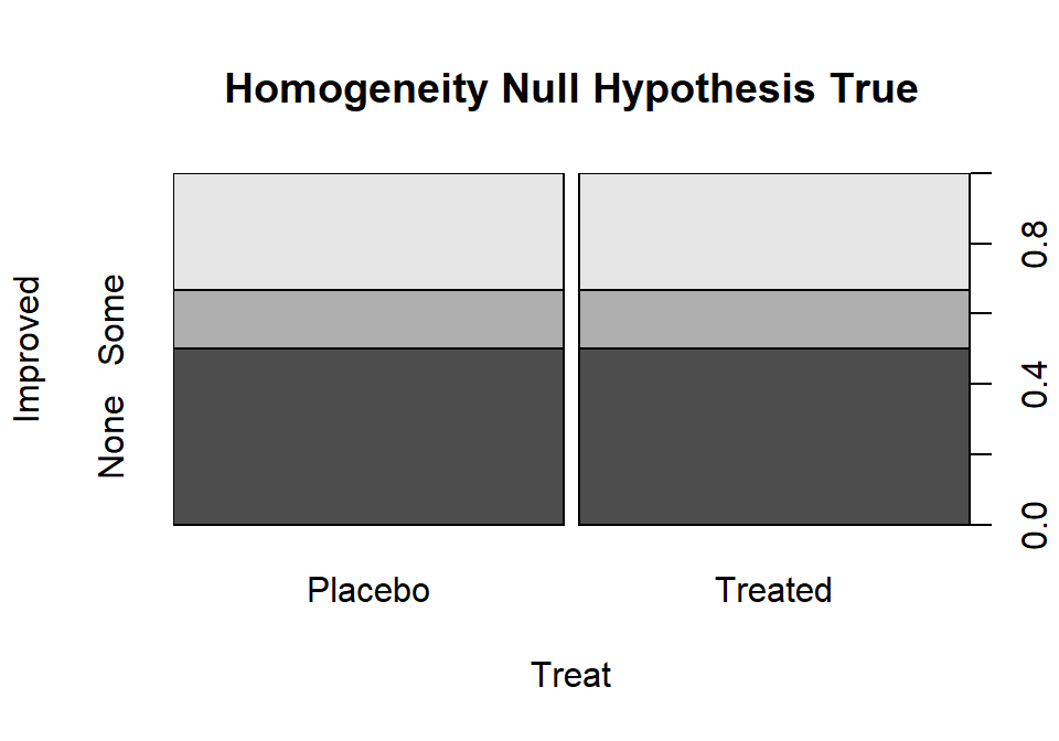
The idea underlying finding the expected cell counts is to find how many observations we would expect in category \(c\) given the sample size in that group, \(\mathbf{n_{r\bullet}}\), if the null hypothesis is true. Under the null hypothesis across all \(R\) groups the conditional probabilities in each response category must be the same. Consider Figure 2.78 where, under the null hypothesis, the probability of None, Some, and Marked are the same in both treatment groups. Specifically we have \(\text{Pr}(None)=0.5\), \(\text{Pr}(Some)=0.167\), and \(\text{Pr}(Marked)=0.333\). With \(\mathbf{n_{Placebo\bullet}}=43\) and \(\text{Pr}(None)=0.50\), we would expect \(43*0.50=21.5\) subjects to be found in the Placebo, None combination if the null hypothesis were true. Similarly, with \(\text{Pr}(Some)=0.167\), we would expect \(43*0.167=7.18\) in the Placebo, Some cell. And for the Treated group with \(\mathbf{n_{Treated\bullet}}=41\), the expected count in the Marked improvement group would be \(41*0.333=13.65\). Those conditional probabilities came from aggregating across the rows because, under the null, the row (Treatment) should not matter. So, the conditional probability was actually calculated as \(\mathbf{n_{\bullet c}/N}\) = total number of responses in category \(c\) divided by the table total. Since each expected cell count was a conditional probability times the number of observations in the row, we can re-write the expected cell count formula for row \(r\) and column \(c\) as:
\[\mathbf{Expected\ cell\ count_{rc} = \frac{(n_{r\bullet}*n_{\bullet c})}{N}} = \frac{(\text{row } r \text{ total }*\text{ column } c \text{ total})} {\text{table total}}.\]
Table 2.10 demonstrates the calculations of the expected cell counts using this formula for all 6 cells in the \(2\times 3\) table.
(ref:fig5-7) Stacked bar chart that could occur if the null hypothesis were true for the Arthritis study.

Figure 2.78: (ref:fig5-7)
(ref:tab5-3) Demonstration of calculation of expected cell counts for Arthritis data.
| None | Some | Marked | Totals | |
|---|---|---|---|---|
| Placebo | \(\boldsymbol{\dfrac{n_{\text{Placebo}\bullet}*n_{\bullet\text{None}}}{N}}\) \(\boldsymbol{=\dfrac{43*42}{84}}\) \(\boldsymbol{=\color{red}{\mathbf{21.5}}}\) |
\(\boldsymbol{\dfrac{n_{\text{Placebo}\bullet}*n_{\bullet\text{Some}}}{N}}\) \(\boldsymbol{=\dfrac{43*14}{84}}\) \(\boldsymbol{=\color{red}{\mathbf{7.167}}}\) |
\(\boldsymbol{\dfrac{n_{\text{Placebo}\bullet}*n_{\bullet\text{Marked}}}{N}}\) \(\boldsymbol{=\dfrac{43*28}{84}}\) \(\boldsymbol{=\color{red}{\mathbf{14.33}}}\) |
\(\boldsymbol{n_{\text{Placebo}\bullet}=43}\) |
| Treated | \(\boldsymbol{\dfrac{n_{\text{Treated}\bullet}*n_{\bullet\text{None}}}{N}}\) \(\boldsymbol{=\dfrac{41*42}{84}}\) \(\boldsymbol{=\color{red}{\mathbf{20.5}}}\) |
\(\boldsymbol{\dfrac{n_{\text{Treated}\bullet}*n_{\bullet\text{Some}}}{N}}\) \(\boldsymbol{=\dfrac{41*14}{84}}\) \(\boldsymbol{=\color{red}{\mathbf{6.83}}}\) |
\(\boldsymbol{\dfrac{n_{\text{Treated}\bullet}*n_{\bullet\text{Marked}}}{N}}\) \(\boldsymbol{=\dfrac{41*28}{84}}\) \(\boldsymbol{=\color{red}{\mathbf{13.67}}}\) |
\(\boldsymbol{n_{\text{Treated}\bullet}=41}\) |
| Totals | \(\boldsymbol{n_{\bullet\text{None}}=42}\) | \(\boldsymbol{n_{\bullet\text{Some}}=14}\) | \(\boldsymbol{n_{\bullet\text{Marked}}=28}\) | \(\boldsymbol{N=84}\) |
Of course, using R can help us avoid tedium like this… The main
engine for results in this chapter is the chisq.test
function. It operates on a table of
counts that has been produced without row or column totals.
For example, Arthtable below contains just the observed cell
counts. Applying the chisq.test function85 to Arthtable
provides a variety of useful output. For the moment, we are just
going to extract the information in the “expected” attribute of
the results from running this function (using chisq.test()$expected).
These are the expected cell counts which match the previous calculations
except for some rounding in the hand-calculations.
##          Improved
## Treatment None Some Marked
##   Placebo   29    7      7
## Treated 13 7 21## Improved
## Treatment None Some Marked
## Placebo 21.5 7.166667 14.33333
## Treated 20.5 6.833333 13.66667With the observed and expected cell counts in hand, we can turn our attention to calculating the test statistic. It is possible to lay out the “contributions” to the \(X^2\) statistic in a table format, allowing a simple way to finally calculate the statistic without losing any information. For each cell we need to find
\[(\text{observed}-\text{expected})/\sqrt{\text{expected}}),\]
square them, and then we need to add them all up. In the current example, there are 6 cells to add up (\(R=2\) times \(C=3\)), shown in Table 2.11.
| None | Some | Marked | |
|---|---|---|---|
| Placebo | \(\left(\frac{29-21.5}{\sqrt{21.5}}\right)^2=\color{red}{\mathbf{2.616}}\) | \(\left(\frac{7-7.167}{\sqrt{7.167}}\right)^2=\color{red}{\mathbf{0.004}}\) | \(\left(\frac{7-14.33}{\sqrt{14.33}}\right)^2=\color{red}{\mathbf{3.752}}\) |
| Treated | \(\left(\frac{13-20.5}{\sqrt{20.5}}\right)^2=\color{red}{\mathbf{2.744}}\) | \(\left(\frac{7-6.833}{\sqrt{6.833}}\right)^2=\color{red}{\mathbf{0.004}}\) | \(\left(\frac{21-13.67}{\sqrt{13.67}}\right)^2=\color{red}{\mathbf{3.935}}\) |
Finally, the \(X^2\) statistic here is the sum of these six results \(={\color{red}{2.616+0.004+3.752+2.744+0.004+3.935}}=13.055\)
Our favorite function in this chapter, chisq.test, does not provide
the contributions to the \(X^2\) statistic directly. It provides a related
quantity called the
\[\textbf{standardized residual}=\left(\frac{\text{Observed}_i - \text{Expected}_i}{\sqrt{\text{Expected}_i}}\right),\]
which, when squared (in R, squaring is accomplished using ^2),
is the contribution of that particular cell to the \(X^2\)
statistic that is displayed in Table 2.11.
##          Improved
## Treatment        None        Some      Marked
##   Placebo 2.616279070 0.003875969 3.751937984
##   Treated 2.743902439 0.004065041 3.934959350
The most common error made in calculating the \(X^2\) statistic by hand
involves having observed less than expected
and then failing to make the \(X^2\) contribution positive for all cells
(remember you are squaring the entire quantity in the parentheses
and so the sign has to go positive!). In R, we can add up the cells using
the sum function over the entire table of numbers:
## [1] 13.05502Or we can let R do all this hard work for us and get straight to the good stuff:
##
##  Pearson's Chi-squared test
##
## data:  Arthtable
## X-squared = 13.055, df = 2, p-value = 0.001463
The chisq.test function reports a p-value by
default. Before we discover how it got that result, we can rely on our
permutation methods to obtain a distribution for the \(X^2\) statistic
under the null hypothesis. As in Chapters 2 and ??,
this will allow us to find a
p-value while relaxing one of our assumptions86.
In the One-WAY ANOVA in Chapter ??, we permuted the
grouping variable relative
to the responses, mimicking the null hypothesis that the groups are the same
and so we can shuffle them around if the null is true. That same technique is
useful here. If we randomly permute the grouping variable used to form the rows
in the contingency table relative to the responses in the other variable and
track the possibilities available for the \(X^2\) statistic under
permutations, we can find the probability of getting a result as extreme as or
more extreme than what we observed assuming the null is true, our p-value.
The observed statistic is the
\(X^2\) calculated using the formula above.
Like the \(F\)-statistic, it ends up
that only results in the right tail of this distribution are desirable for
finding evidence against the null hypothesis
because all the values showing deviation from the null in any direction going into the statistic have to be positive. You can see this by observing that
values of the \(X^2\) statistic close to 0 are generated when the
observed values are close to the expected values and that sort of result should
not be used to find evidence against the null. When the observed and expected
values are “far apart”, then we should find evidence against the null. It is
helpful to work through some examples to be able to understand how the \(X^2\)
statistic “measures” differences between observed and expected.
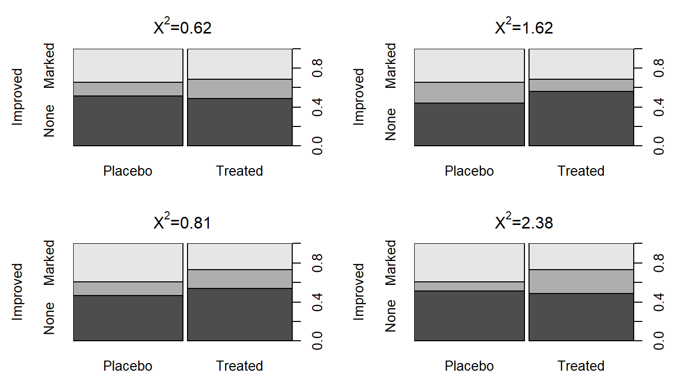
To start, compare the previous observed \(X^2\) of 13.055 to the sort of results we obtain in a single permutation of the treated/placebo labels – Figure 2.79 (top left panel) shows a permuted data set that produced \(X^{2*} = 0.62\). Visually, you can only see minimal differences between the treatment and placebo groups showing up in the stacked bar-chart. Three other permuted data sets are displayed in Figure 2.79 showing the variability in results in permutations but that none get close to showing the differences in the bars observed in the real data set in Figure 2.73.
##              Improved
## PermTreatment None Some Marked
##       Placebo   22    6     15
## Treated 20 8 13##
## Pearson's Chi-squared test
##
## data: Arthpermtable
## X-squared = 0.47646, df = 2, p-value = 0.788(ref:fig5-8) Stacked bar charts of four permuted Arthritis data sets that produced \(X^2\) between 0.62 and 2.38.

Figure 2.79: (ref:fig5-8)
To build the permutation-based null distribution for the \(X^2\) statistic,
we need to collect up the test statistics (\(X^{2*}\)) in many of these permuted
results. The code is similar to permutation tests in Chapters
2 and ?? except
that each permutation generates a new contingency table that is summarized and
provided to chisq.test to analyze. We extract the
$statistic attribute of the results from running chisq.test.
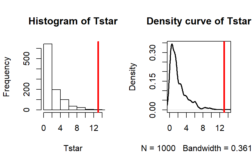
(ref:fig5-9) Permutation distribution for the \(X^2\) statistic for the Arthritis data with an observed \(X^2\) of 13.1 (bold, vertical line).
## X-squared
## 13.05502par(mfrow=c(1,2))
B <- 1000
Tstar <- matrix(NA, nrow=B)
for (b in (1:B)){
Tstar[b] <- chisq.test(tally(~shuffle(Treatment)+Improved,
data=Arthritis))$statistic
}
pdata(Tstar, Tobs, lower.tail=F)[[1]]## [1] 0.002hist(Tstar, xlim=c(0,Tobs+1))
abline(v=Tobs, col="red",lwd=3)
plot(density(Tstar), main="Density curve of Tstar",
xlim=c(0,Tobs+1), lwd=2)
abline(v=Tobs, col="red", lwd=3)
Figure 2.80: (ref:fig5-9)
For an observed \(X^2\) statistic of 13.055, two out of 1,000 permutation
results matched or exceeded this value (pdata returned a value of
0.002) as displayed in Figure 2.80.
This suggests that our observed result is quite extreme
relative to the null
hypothesis and provides strong evidence against it.
Validity conditions for a permutation \(X^2\) test are:
Independence of observations.
Both variables are categorical.
Expected cell counts > 0 (otherwise \(X^2\) is not defined).
For the permutation approach described here to provide valid inferences we need to be working with observations that are independent of one another. One way that a violation of independence can sometimes occur in this situation is when a single subject shows up in the table more than once. For example, if a single individual completes a survey more than once and those results are reported as if they came from \(N\) independent individuals. Be careful about this as it is really easy to make tables of poorly collected or non-independent observations and then consider them for these analyses. Poor data still lead to poor conclusions even if you have fancy new statistical tools to use!
Standardizing involves dividing by the standard deviation of a quantity so it has a standard deviation 1 regardless of its original variability and that is what is happening here even though it doesn’t look like the standardization you are used to with continuous variables.↩
Note that in smaller data sets to get results as discussed here, use the
correct=Foption. If you get output that contains “...with Yate's continuity correction”, a slightly modified version of this test is being used.↩Here it allows us to relax a requirement that all the expected cell counts are larger than 5 for the parametric test (Section 5.6).↩