- Cover
- Acknowledgments
- 1 Preface
- 2 (R)e-Introduction to statistics
- 2.1 Histograms, boxplots, and density curves
- 2.2 Pirate-plots
- 2.3 Models, hypotheses, and permutations for the two sample mean situation
- 2.4 Permutation testing for the two sample mean situation
- 2.5 Hypothesis testing (general)
- 2.6 Connecting randomization (nonparametric) and parametric tests
- 2.7 Second example of permutation tests
- 2.8 Reproducibility Crisis: Moving beyond p < 0.05, publication bias, and multiple testing issues
- 2.9 Confidence intervals and bootstrapping
- 2.10 Bootstrap confidence intervals for difference in GPAs
- 2.11 Chapter summary
- 2.12 Summary of important R code
- 2.13 Practice problems
- 3 One-Way ANOVA
- 3.1 Situation
- 3.2 Linear model for One-Way ANOVA (cell-means and reference-coding)
- 3.3 One-Way ANOVA Sums of Squares, Mean Squares, and F-test
- 3.4 ANOVA model diagnostics including QQ-plots
- 3.5 Guinea pig tooth growth One-Way ANOVA example
- 3.6 Multiple (pair-wise) comparisons using Tukey’s HSD and the compact letter display
- 3.7 Pair-wise comparisons for the Overtake data
- 3.8 Chapter summary
- 3.9 Summary of important R code
- 3.10 Practice problems
- 4 Two-Way ANOVA
- 4.1 Situation
- 4.2 Designing a two-way experiment and visualizing results
- 4.3 Two-Way ANOVA models and hypothesis tests
- 4.4 Guinea pig tooth growth analysis with Two-Way ANOVA
- 4.5 Observational study example: The Psychology of Debt
- 4.6 Pushing Two-Way ANOVA to the limit: Un-replicated designs and Estimability
- 4.7 Chapter summary
- 4.8 Summary of important R code
- 4.9 Practice problems
- 5 Chi-square tests
- 5.1 Situation, contingency tables, and tableplots
- 5.2 Homogeneity test hypotheses
- 5.3 Independence test hypotheses
- 5.4 Models for R by C tables
- 5.5 Permutation tests for the \(X^2\) statistic
- 5.6 Chi-square distribution for the \(X^2\) statistic
- 5.7 Examining residuals for the source of differences
- 5.8 General protocol for \(X^2\) tests
- 5.9 Political party and voting results: Complete analysis
- 5.10 Is cheating and lying related in students?
- 5.11 Analyzing a stratified random sample of California schools
- 5.12 Chapter summary
- 5.13 Summary of important R commands
- 5.14 Practice problems
- 6 Correlation and Simple Linear Regression
- 6.1 Relationships between two quantitative variables
- 6.2 Estimating the correlation coefficient
- 6.3 Relationships between variables by groups
- 6.4 Inference for the correlation coefficient
- 6.5 Are tree diameters related to tree heights?
- 6.6 Describing relationships with a regression model
- 6.7 Least Squares Estimation
- 6.8 Measuring the strength of regressions: R2
- 6.9 Outliers: leverage and influence
- 6.10 Residual diagnostics – setting the stage for inference
- 6.11 Old Faithful discharge and waiting times
- 6.12 Chapter summary
- 6.13 Summary of important R code
- 6.14 Practice problems
- 7 Simple linear regression inference
- 7.1 Model
- 7.2 Confidence interval and hypothesis tests for the slope and intercept
- 7.3 Bozeman temperature trend
- 7.4 Randomization-based inferences for the slope coefficient
- 7.5 Transformations part I: Linearizing relationships
- 7.6 Transformations part II: Impacts on SLR interpretations: log(y), log(x), & both log(y) & log(x)
- 7.7 Confidence interval for the mean and prediction intervals for a new observation
- 7.8 Chapter summary
- 7.9 Summary of important R code
- 7.10 Practice problems
- 8 Multiple linear regression
- 8.1 Going from SLR to MLR
- 8.2 Validity conditions in MLR
- 8.3 Interpretation of MLR terms
- 8.4 Comparing multiple regression models
- 8.5 General recommendations for MLR interpretations and VIFs
- 8.6 MLR inference: Parameter inferences using the t-distribution
- 8.7 Overall F-test in multiple linear regression
- 8.8 Case study: First year college GPA and SATs
- 8.9 Different intercepts for different groups: MLR with indicator variables
- 8.10 Additive MLR with more than two groups: Headache example
- 8.11 Different slopes and different intercepts
- 8.12 F-tests for MLR models with quantitative and categorical variables and interactions
- 8.13 AICs for model selection
- 8.14 Case study: Forced expiratory volume model selection using AICs
- 8.15 Chapter summary
- 8.16 Summary of important R code
- 8.17 Practice problems
- 9 Case studies
- 9.1 Overview of material covered
- 9.2 The impact of simulated chronic nitrogen deposition on the biomass and N2-fixation activity of two boreal feather moss–cyanobacteria associations
- 9.3 Ants learn to rely on more informative attributes during decision-making
- 9.4 Multi-variate models are essential for understanding vertebrate diversification in deep time
- 9.5 What do didgeridoos really do about sleepiness?
- 9.6 General summary
- References
8.10 Additive MLR with more than two groups: Headache example
The same techniques can be extended to more than two groups. A study was
conducted to explore sound tolerances using \(n=98\) subjects with the data
available in the Headache data set from the heplots package
(Fox and Friendly 2018).
Each
subject was initially exposed to a tone, stopping when the tone became definitely
intolerable (DU) and that decibel level was recorded (variable called du1).
Then the subjects were randomly assigned to one of four treatments: T1
(Listened again to the tone at their initial DU level, for the same amount of
time they were able to tolerate it before); T2 (Same as T1, with one
additional minute of exposure); T3 (Same as T2, but the subjects were
explicitly instructed to use the relaxation techniques); and Control (these
subjects experienced no further exposure to the noise tone until the final
sensitivity measures were taken). Then the DU was measured again (variable
called du2). One would expect that there would be a relationship between the
upper tolerance levels of the subjects before and after treatment. But
maybe the treatments impact that relationship? We can use our indicator
approach to see if the treatments provide a shift to higher tolerances after
accounting for the relationship between the two measurements129. The scatterplot130
of the results in Figure 2.171 shows some variation in the
slopes and the intercepts for the groups although the variation in intercepts
seems more prominent than differences in slopes. Note that the relevel function was applied to the treatment variable with an option of "Control" to make the Control category the baseline category as the person who created the data set had set T1 as the baseline in the treatment variable.
(ref:fig8-21) Scatterplot of post-treatment decibel tolerance (du2) vs pre-treatment tolerance (du1) by treatment level (4 groups).
## # A tibble: 98 x 6
##    type    treatment    u1   du1    u2   du2
##    <fct>   <fct>     <dbl> <dbl> <dbl> <dbl>
##  1 Migrane T3         2.34  5.3   5.8   8.52
##  2 Migrane T1         2.73  6.85  4.68  6.68
##  3 Tension T1         0.37  0.53  0.55  0.84
##  4 Migrane T3         7.5   9.12  5.7   7.88
##  5 Migrane T3         4.63  7.21  5.63  6.75
##  6 Migrane T3         3.6   7.3   4.83  7.32
##  7 Migrane T2         2.45  3.75  2.5   3.18
##  8 Migrane T1         2.31  3.25  2     3.3
##  9 Migrane T1         1.38  2.33  2.23  3.98
## 10 Tension T3         0.85  1.42  1.37  1.89
## # ... with 88 more rowsHeadache$treatment <- factor(Headache$treatment)
Headache$treatment <- relevel(Headache$treatment, "Control") #Make Control the baseline category
scatterplot(du2~du1|treatment, data=Headache, smooth=F, lwd=2,
main="Plot of Maximum DB tolerances before & after treatment (by treatment)",
legend=list(coords="topleft",columns=2), col=viridis(4))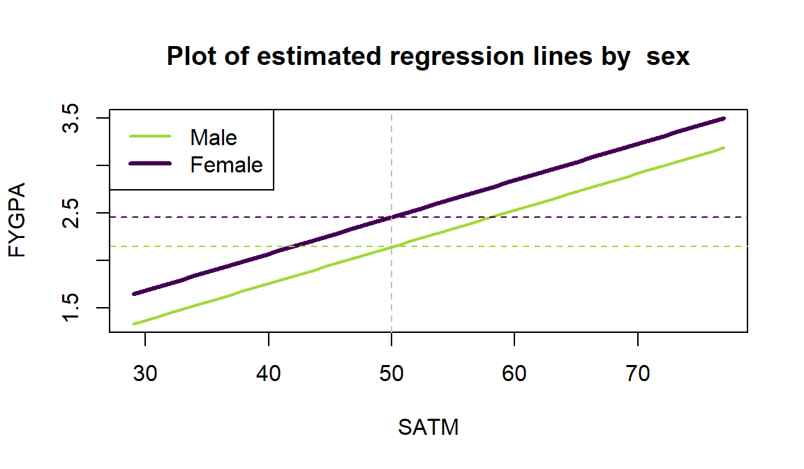
Figure 2.171: (ref:fig8-21)
This data set contains a categorical variable with 4 levels. To go beyond two groups, we have to add more than one indicator variable, defining three indicators to turn on (1) or off (0) for three of the levels of the variable with the same reference level used for all the indicators. For this example, the Control group is chosen as the baseline group so it hides in the background while we define indicators for the other three levels. The indicators for T1, T2, and T3 treatment levels are:
Indicator for T1: \(I_{T1,i}=\left\{\begin{array}{rl} 1 & \text{if Treatment}=T1 \\ 0 & \text{else} \end{array}\right.\)
Indicator for T2: \(I_{T2,i}=\left\{\begin{array}{rl} 1 & \text{if Treatment}=T2 \\ 0 & \text{else} \end{array}\right.\)
Indicator for T3: \(I_{T3,i}=\left\{\begin{array}{rl} 1 & \text{if Treatment}=T3 \\ 0 & \text{else} \end{array}\right.\)
We can see the values of these indicators for a few observations and their
original variable (treatment) in the following output. The bolded
observations show each of the indicators being “turned on”. For Control all the
indicators stay at 0.
| Treatment | I_T1 | I_T2 | I_T3 |
|---|---|---|---|
| T3 | 0 | 0 | 1 |
| T1 | 1 | 0 | 0 |
| T1 | 1 | 0 | 0 |
| T3 | 0 | 0 | 1 |
| T3 | 0 | 0 | 1 |
| T3 | 0 | 0 | 1 |
| T2 | 0 | 1 | 0 |
| T1 | 1 | 0 | 0 |
| T1 | 1 | 0 | 0 |
| T3 | 0 | 0 | 1 |
| T3 | 0 | 0 | 1 |
| T2 | 0 | 1 | 0 |
| T3 | 0 | 0 | 1 |
| T1 | 1 | 0 | 0 |
| T3 | 0 | 0 | 1 |
| Control | 0 | 0 | 0 |
| T3 | 0 | 0 | 1 |
When we fit the additive model of the form y~x+group, the lm
function takes the \(\boldsymbol{J}\) categories and creates \(\boldsymbol{J-1}\)
indicator variables.
The baseline level is always handled in the intercept.
The true model will be of the form
\[y_i=\beta_0 + \beta_1x_i +\beta_2I_{\text{Level}2,i}+\beta_3I_{\text{Level}3,i} +\cdots+\beta_{J}I_{\text{Level}J,i}+\varepsilon_i\]
where the \(I_{\text{CatName}j,i}\text{'s}\) are the different indicator variables. Note that each indicator variable gets a coefficient associated with it and is “turned on” whenever the \(i^{th}\) observation is in that category. At most only one of the \(I_{\text{CatName}j,i}\text{'s}\) is a 1 for any observation, so the y-intercept will either be \(\beta_0\) for the baseline group or \(\beta_0+\beta_j\) for \(j=2,\ldots,J\). It is important to remember that this is an “additive” model since the effects just add and there is no interaction between the grouping variable and the quantitative predictor. To be able to trust this model, we need to check that we do not need different slope coefficients for the groups as discussed in the next section.
For these types of models, it is always good to start with a plot of the data
set with regression lines for each group – assessing whether the lines look
relatively parallel or not.
In Figure 2.171, there are some
differences in slopes – we investigate that further in the next section. For
now, we can proceed with fitting the additive model with different intercepts
for the four levels of treatment and the quantitative explanatory variable, du1.
##
## Call:
## lm(formula = du2 ~ du1 + treatment, data = Headache)
##
## Residuals:
##     Min      1Q  Median      3Q     Max
## -6.9085 -0.9551 -0.3118  1.1141 10.5364
##
## Coefficients:
##             Estimate Std. Error t value Pr(>|t|)
## (Intercept)  0.25165    0.51624   0.487   0.6271
## du1          0.83705    0.05176  16.172   <2e-16
## treatmentT1  0.55752    0.61830   0.902   0.3695
## treatmentT2  0.63444    0.63884   0.993   0.3232
## treatmentT3  1.36671    0.60608   2.255   0.0265
##
## Residual standard error: 2.14 on 93 degrees of freedom
## Multiple R-squared:  0.7511, Adjusted R-squared:  0.7404
## F-statistic: 70.16 on 4 and 93 DF,  p-value: < 2.2e-16
The complete estimated regression model is
\[\widehat{\text{du2}}_i=0.252+0.837\cdot\text{du1}_i +0.558I_{\text{T1},i}+0.634I_{\text{T2},i}+1.367I_{\text{T3},i}\ .\]
For each group, the model simplifies to an SLR as follows:
- For Control (baseline):
\[\begin{array}{rl} \widehat{\text{du2}}_i &=0.252+0.837\cdot\text{du1}_i +0.558I_{\text{T1},i}+0.634I_{\text{T2},i}+1.367I_{\text{T3},i} \\ &= 0.252+0.837\cdot\text{du1}_i+0.558*0+0.634*0+1.367*0 \\ &= 0.252+0.837\cdot\text{du1}_i. \end{array}\]
- For T1:
\[\begin{array}{rl} \widehat{\text{du2}}_i &=0.252+0.837\cdot\text{du1}_i +0.558I_{\text{T1},i}+0.634I_{\text{T2},i}+1.367I_{\text{T3},i} \\ &= 0.252+0.837\cdot\text{du1}_i+0.558*1+0.634*0+1.367*0 \\ &= 0.809+0.837\cdot\text{du1}_i + 0.558 \\ &= 0.81+0.837\cdot\text{du1}_i. \end{array}\]
- Similarly for T2:
\[\widehat{\text{du2}}_i = 0.886 + 0.837\cdot\text{du1}_i\ .\]
- Finally for T3:
\[\widehat{\text{du2}}_i = 1.62 + 0.837\cdot\text{du1}_i\ .\]
To reinforce what this additive model is doing, Figure 2.172 displays the estimated regression lines for all four groups, showing the shifts in the y-intercepts among the groups.
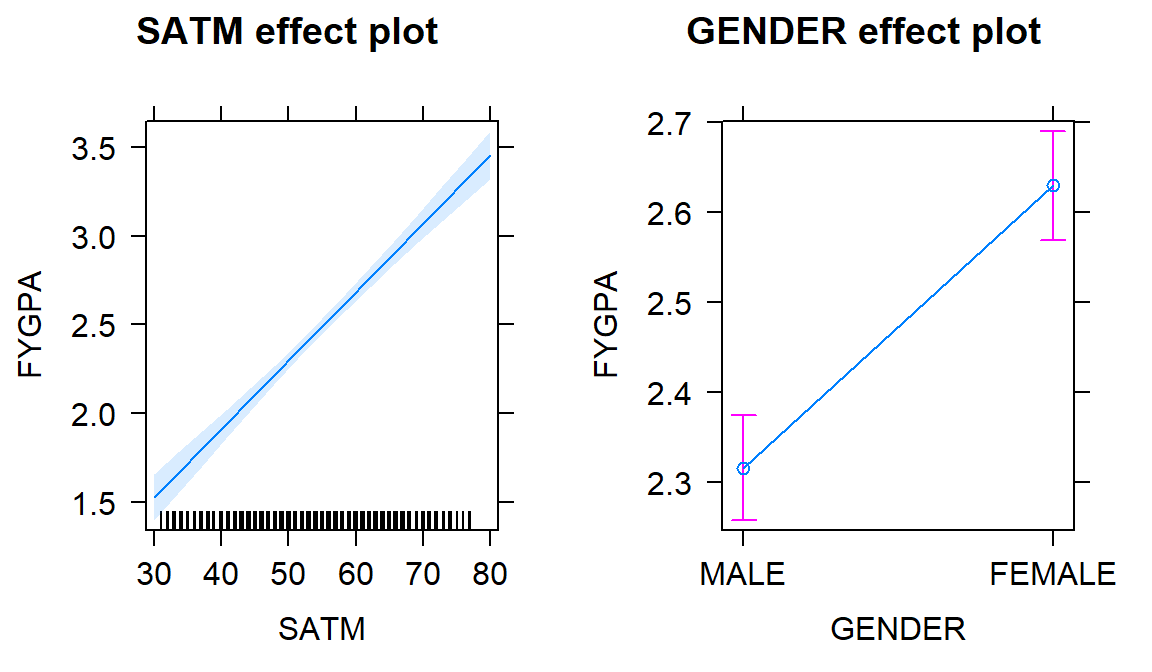
Figure 2.172: Plot of estimated noise tolerance additive model.
The right panel of the term-plot (Figure 2.173) shows how the T3 group
seems to have shifted up the most relative to
the others and the Control group seems to have a mean that is a bit lower than the others,
in the model that otherwise assumes that the same linear relationship holds between
du1 and du2 for all the groups. After controlling for the Treatment
group, for a 1 decibel increase in initial tolerances, we estimate, on average,
to obtain a 0.84 decibel change in the second tolerance measurement. The
R2 shows that this is a decent model for the responses, with
this model explaining 75.1% percent of the
variation in the second decibel tolerance measure. We should check the
diagnostic plots and VIFs to check for any issues – all the diagnostics and
assumptions are as before except that there is no assumption of linearity
between the grouping variable and the responses.
Additionally, sometimes we
need to add group information to diagnostics to see if any patterns in residuals look
different in different groups, like linearity or non-constant variance, when we are fitting models that might contain multiple groups.
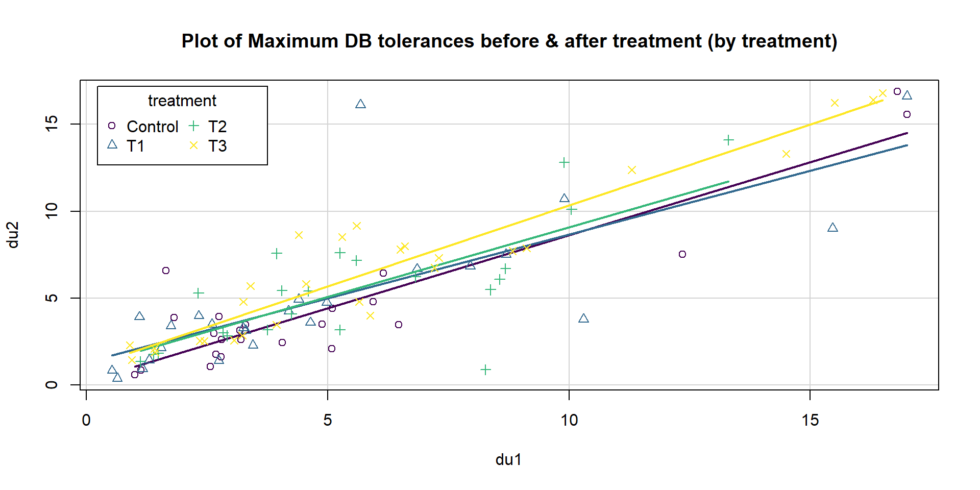
Figure 2.173: Term-plots of the additive decibel tolerance model with partial residuals.
The diagnostic plots in Figure 2.174 provides some indications of a few observations in the tails that deviate from a normal distribution to having slightly heavier tails but only one outlier is of real concern and causes some concern about the normality assumption. There is a small indication of increasing variability as a function of the fitted values as both the Residuals vs. Fitted and Scale-Location plots show some fanning out for higher values but this is a minor issue. There are no influential points here since all the Cook’s D values are less than 0.5.
par(mfrow=c(2,2), oma=c(0,0,2,0))
plot(head1,
     sub.caption="Plot of diagnostics for additive model with du1 and treatment for du2", pch=16)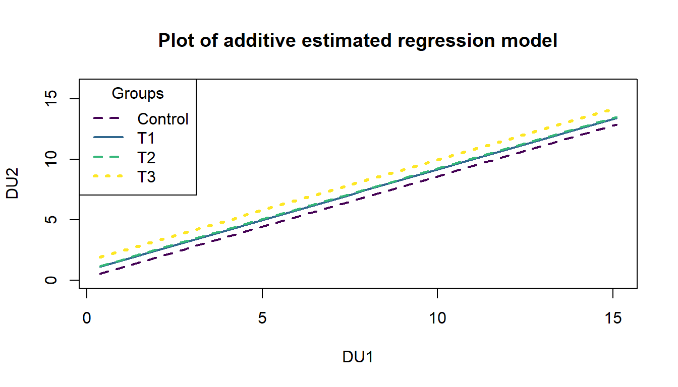
Figure 2.174: Diagnostic plots for the additive decibel tolerance model.
Additionally, sometimes we
need to add group information to diagnostics to see if any patterns in residuals look
different in different groups, like linearity or non-constant variance, when we are fitting models that might contain multiple groups. We can use the scatterplot function to plot the residuals (extracted using the residuals function) versus the fitted values (extracted using the fitted function) by groups as in Figure 2.175. In this example, there are no additional patterns extracted by making this plot, but it is a good additional check in these multi-group situations.
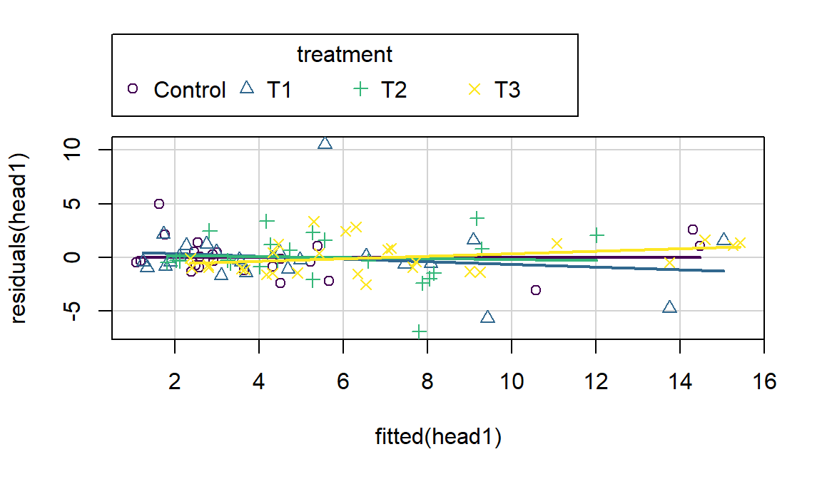
Figure 2.175: Plot of residuals versus fitted values by treatment group from the additive decibel tolerance model.
The VIFs are different for categorical variables than for quantitative
predictors in MLR. The 4 levels
are combined in a measure called the generalized VIF (GVIF). For GVIFs,
we only focus on the inflation of the SE scale (square root for 1 df effects
and raised to the power \(1/(2*J)\) for a \(J\)-level predictor). On this scale,
the interpretation is as the multiplicative increase in the SEs for the coefficients on all the indicator variables due to
multicollinearity with other predictors. In this model, the SE for du1 is
1.009 times larger due to multicollinearity with other predictors
and the SEs for the indicator variables for treatment are 1.003 times larger due to multicollinearity than they otherwise
would have been. Neither are large so multicollinearity is not a problem in
this model.
##              GVIF Df GVIF^(1/(2*Df))
## du1       1.01786  1        1.008891
## treatment 1.01786  3        1.002955
While there are inferences available in the model output, the tests for the indicator variables are not too informative since they only compare each group to the baseline. In Section 8.12, we see how to use ANOVA F-tests to help us ask general questions about including a categorical predictor in the model. But we can compare adjusted R2 values with and without Treatment to see if including the categorical variable was “worth it”:
##
## Call:
## lm(formula = du2 ~ du1, data = Headache)
##
## Residuals:
##     Min      1Q  Median      3Q     Max
## -6.9887 -0.8820 -0.2765  1.1529 10.4165
##
## Coefficients:
##             Estimate Std. Error t value Pr(>|t|)
## (Intercept)  0.84744    0.36045   2.351   0.0208
## du1          0.85142    0.05189  16.408   <2e-16
##
## Residual standard error: 2.165 on 96 degrees of freedom
## Multiple R-squared:  0.7371, Adjusted R-squared:  0.7344
## F-statistic: 269.2 on 1 and 96 DF,  p-value: < 2.2e-16
The adjusted R2 in the model with both Treatment and du1 is 0.7404 and the adjusted R2 for this reduced model with just du1 is 0.7344, suggesting the Treatment is useful. The next section provides a technique to be able to work with different slopes on the quantitative predictor for each group. Comparing those results to the results for the additive model allows assessment of the assumption in this section that all the groups had the same slope coefficient for the quantitative variable.
References
Fox, John, and Michael Friendly. 2018. Heplots: Visualizing Hypothesis Tests in Multivariate Linear Models. https://CRAN.R-project.org/package=heplots.
Models like this with a categorical variable and quantitative variable are often called ANCOVA or analysis of covariance models but really are just versions of our linear models we’ve been using throughout this material.↩
Note that we employed some specific options in the
legendoption to get the legend to fit on this scatterplot better. Usually you can avoid this but thecoordsoption defined a location and thecolumnsoption made it a two column legend. Theviridis(4)code makes the plot in a suite of four colors from theviridispackage. (Garnier 2018)↩