- Cover
- Acknowledgments
- 1 Preface
- 2 (R)e-Introduction to statistics
- 2.1 Histograms, boxplots, and density curves
- 2.2 Pirate-plots
- 2.3 Models, hypotheses, and permutations for the two sample mean situation
- 2.4 Permutation testing for the two sample mean situation
- 2.5 Hypothesis testing (general)
- 2.6 Connecting randomization (nonparametric) and parametric tests
- 2.7 Second example of permutation tests
- 2.8 Reproducibility Crisis: Moving beyond p < 0.05, publication bias, and multiple testing issues
- 2.9 Confidence intervals and bootstrapping
- 2.10 Bootstrap confidence intervals for difference in GPAs
- 2.11 Chapter summary
- 2.12 Summary of important R code
- 2.13 Practice problems
- 3 One-Way ANOVA
- 3.1 Situation
- 3.2 Linear model for One-Way ANOVA (cell-means and reference-coding)
- 3.3 One-Way ANOVA Sums of Squares, Mean Squares, and F-test
- 3.4 ANOVA model diagnostics including QQ-plots
- 3.5 Guinea pig tooth growth One-Way ANOVA example
- 3.6 Multiple (pair-wise) comparisons using Tukey’s HSD and the compact letter display
- 3.7 Pair-wise comparisons for the Overtake data
- 3.8 Chapter summary
- 3.9 Summary of important R code
- 3.10 Practice problems
- 4 Two-Way ANOVA
- 4.1 Situation
- 4.2 Designing a two-way experiment and visualizing results
- 4.3 Two-Way ANOVA models and hypothesis tests
- 4.4 Guinea pig tooth growth analysis with Two-Way ANOVA
- 4.5 Observational study example: The Psychology of Debt
- 4.6 Pushing Two-Way ANOVA to the limit: Un-replicated designs and Estimability
- 4.7 Chapter summary
- 4.8 Summary of important R code
- 4.9 Practice problems
- 5 Chi-square tests
- 5.1 Situation, contingency tables, and tableplots
- 5.2 Homogeneity test hypotheses
- 5.3 Independence test hypotheses
- 5.4 Models for R by C tables
- 5.5 Permutation tests for the \(X^2\) statistic
- 5.6 Chi-square distribution for the \(X^2\) statistic
- 5.7 Examining residuals for the source of differences
- 5.8 General protocol for \(X^2\) tests
- 5.9 Political party and voting results: Complete analysis
- 5.10 Is cheating and lying related in students?
- 5.11 Analyzing a stratified random sample of California schools
- 5.12 Chapter summary
- 5.13 Summary of important R commands
- 5.14 Practice problems
- 6 Correlation and Simple Linear Regression
- 6.1 Relationships between two quantitative variables
- 6.2 Estimating the correlation coefficient
- 6.3 Relationships between variables by groups
- 6.4 Inference for the correlation coefficient
- 6.5 Are tree diameters related to tree heights?
- 6.6 Describing relationships with a regression model
- 6.7 Least Squares Estimation
- 6.8 Measuring the strength of regressions: R2
- 6.9 Outliers: leverage and influence
- 6.10 Residual diagnostics – setting the stage for inference
- 6.11 Old Faithful discharge and waiting times
- 6.12 Chapter summary
- 6.13 Summary of important R code
- 6.14 Practice problems
- 7 Simple linear regression inference
- 7.1 Model
- 7.2 Confidence interval and hypothesis tests for the slope and intercept
- 7.3 Bozeman temperature trend
- 7.4 Randomization-based inferences for the slope coefficient
- 7.5 Transformations part I: Linearizing relationships
- 7.6 Transformations part II: Impacts on SLR interpretations: log(y), log(x), & both log(y) & log(x)
- 7.7 Confidence interval for the mean and prediction intervals for a new observation
- 7.8 Chapter summary
- 7.9 Summary of important R code
- 7.10 Practice problems
- 8 Multiple linear regression
- 8.1 Going from SLR to MLR
- 8.2 Validity conditions in MLR
- 8.3 Interpretation of MLR terms
- 8.4 Comparing multiple regression models
- 8.5 General recommendations for MLR interpretations and VIFs
- 8.6 MLR inference: Parameter inferences using the t-distribution
- 8.7 Overall F-test in multiple linear regression
- 8.8 Case study: First year college GPA and SATs
- 8.9 Different intercepts for different groups: MLR with indicator variables
- 8.10 Additive MLR with more than two groups: Headache example
- 8.11 Different slopes and different intercepts
- 8.12 F-tests for MLR models with quantitative and categorical variables and interactions
- 8.13 AICs for model selection
- 8.14 Case study: Forced expiratory volume model selection using AICs
- 8.15 Chapter summary
- 8.16 Summary of important R code
- 8.17 Practice problems
- 9 Case studies
- 9.1 Overview of material covered
- 9.2 The impact of simulated chronic nitrogen deposition on the biomass and N2-fixation activity of two boreal feather moss–cyanobacteria associations
- 9.3 Ants learn to rely on more informative attributes during decision-making
- 9.4 Multi-variate models are essential for understanding vertebrate diversification in deep time
- 9.5 What do didgeridoos really do about sleepiness?
- 9.6 General summary
- References
7.7 Confidence interval for the mean and prediction intervals for a new observation
Figure 2.131 provided a term-plot of the estimated regression line and a shaded area surrounding the estimated regression equation. Those shaded areas are based on connecting the dots on 95% confidence intervals constructed for the true mean \(y\) value across all the x-values. To formalize this idea, consider a specific value of \(x\), and call it \(\boldsymbol{x_{\nu}}\) (pronounced x-new110). Then the true mean response for this subpopulation (a subpopulation is all observations we could obtain at \(\boldsymbol{x=x_{\nu}}\)) is given by \(\boldsymbol{E(Y)=\mu_\nu=\beta_0+\beta_1x_{\nu}}\). To estimate the mean response at \(\boldsymbol{x_{\nu}}\), we plug \(\boldsymbol{x_{\nu}}\) into the estimated regression equation:
\[\hat{\mu}_{\nu} = b_0 + b_1x_{\nu}.\]
To form the confidence interval, we appeal to our standard formula of \(\textbf{estimate} \boldsymbol{\mp t^*}\textbf{SE}_{\textbf{estimate}}\). The standard error for the estimated mean at any x-value, denoted \(\text{SE}_{\hat{\mu}_{\nu}}\), can be calculated as
\[\text{SE}_{\hat{\mu}_{\nu}} = \sqrt{\text{SE}^2_{b_1}(x_{\nu}-\bar{x})^2 + \frac{\hat{\sigma}^2}{n}}\]
where \(\hat{\sigma}^2\) is the squared residual standard error. This formula
combines the variability in the slope estimate, \(\text{SE}_{b_1}\), scaled
based on the distance of \(x_{\nu}\) from \(\bar{x}\) and the variability
around the regression line, \(\hat{\sigma}^2\). Fortunately, R’s
predict function can be used to provide these results for us
and avoid doing this calculation by hand most of the time. The
confidence interval for \(\boldsymbol{\mu_{\nu}}\), the population
mean response at \(x_{\nu}\), is
\[\boldsymbol{\hat{\mu}_{\nu} \mp t^*_{n-2}}\textbf{SE}_{\boldsymbol{\hat{\mu}_{\nu}}}.\]
In application, these intervals get wider the further we go from the mean of the \(x\text{'s}\). These have interpretations that are exactly like those for the y-intercept:
For an x-value of \(\boldsymbol{x_{\nu}}\), we are __% confident that the true mean of y is between LL and UL [units of y].
It is also useful to remember that this interpretation applies individually to every \(x\) displayed in term-plots.
A second type of interval in this situation takes on a more challenging task – to place an interval on where we think a new observation will fall, called a prediction interval (PI). This PI will need to be much wider than the CI for the mean since we need to account for both the uncertainty in the mean and the randomness in sampling a new observation from the normal distribution centered at the true mean for \(x_{\nu}\). The interval is centered at the estimated regression line (where else could we center it?) with the estimate denoted as \(\hat{y}_{\nu}\) to help us see that this interval is for a new \(y\) at this x-value. The \(\text{SE}_{\hat{y}_{\nu}}\) incorporates the core of the previous SE calculation and adds in the variability of a new observation in \(\boldsymbol{\hat{\sigma}^2}\):
\[\text{SE}_{\hat{y}_{\nu}} = \sqrt{\text{SE}^2_{b_1}(x_{\nu}-\bar{x})^2 + \dfrac{\hat{\sigma}^2}{n} + \boldsymbol{\hat{\sigma}^2}} = \sqrt{\text{SE}_{\hat{\mu}_{\nu}}^2 + \boldsymbol{\hat{\sigma}^2}}\]
The __% PI is calculated as
\[\boldsymbol{\hat{y}_{\nu} \mp t^*_{n-2}}\textbf{SE}_{\boldsymbol{\hat{y}_{\nu}}}\]
and interpreted as:
We are __% sure that a new observation at \(\boldsymbol{x_{\nu}}\) will be between LL and UL [units of y]. Since \(\text{SE}_{\hat{y}_{\nu}} > \text{SE}_{\hat{\mu}_{\nu}}\), the PI will always be wider than the CI.
As in confidence intervals, we assume that a 95% PI “succeeds” – now when it succeeds it contains the new observation – in 95% of applications of the methods and fails the other 5% of the time. Remember that for any interval estimate, the true value is either in the interval or it is not and our confidence level essentially sets our failure rate! Because PIs push into the tails of the assumed distribution of the responses these methods are very sensitive to violations of assumptions so we should not use these if there are any concerns about violations of assumptions as they will work as advertised (at the nominal (specified) level).
There are two ways to explore CIs for the mean and PIs for a new observation.
The first is to focus on a specific x-value of interest. The second is to
plot the results for all \(x\text{'s}\). To do both of these, but especially
to make plots, we want to learn to use the predict function. It can
either produce the estimate for a particular \(x_{\nu}\) and the
\(\text{SE}_{\hat{\mu}_{\nu}}\) or we can get it to directly calculate
the CI and PI. The first way to use it is predict(MODELNAME, se.fit=T)
which will provide fitted values and \(\text{SE}_{\hat{\mu}_{\nu}}\)
for all observed \(x\text{'s}\). We can then use the
\(\text{SE}_{\hat{\mu}_{\nu}}\) to calculate \(\text{SE}_{\hat{y}_{\nu}}\)
and form our own PIs. If you want CIs, run
predict(MODELNAME, interval= "confidence"); if you want PIs, run
predict(MODELNAME, interval="prediction"). If you want to do
prediction at an x-value that was not in the original
observations, add the option newdata=tibble(XVARIABLENAME_FROM_ORIGINAL_MODEL=Xnu)
to the predict function call.
Some examples of using the predict function follow111. For example, it might be interesting to use the regression
model to find a 95%
CI and PI for the Beers vs BAC study for a student who would
consume 8 beers. Four different applications of the predict function follow.
Note that lwr and upr in the output depend on what we
requested. The first use of predict just returns the estimated mean
for 8 beers:
##         1
## 0.1310095
By turning on the se.fit=T option, we also get the SE for the
confidence interval and degrees of freedom.
Note that elements returned
are labelled as $fit, $se.fit, etc. and provide some of the information to calculate CIs or PIs “by hand”.
## $fit
##         1
## 0.1310095
##
## $se.fit
## [1] 0.009204354
##
## $df
## [1] 14
##
## $residual.scale
## [1] 0.02044095
Instead of using the components of the intervals to
make them, we can also directly request the CI or PI using the
interval=... option, as in the following two lines of code.
##         fit       lwr       upr
## 1 0.1310095 0.1112681 0.1507509## fit lwr upr
## 1 0.1310095 0.08292834 0.1790906Based on these results, we are 95% confident that the true mean BAC
for 8 beers consumed is between 0.111 and 0.15 grams of alcohol per dL of
blood. For a new student drinking 8 beers, we are 95% sure that the observed
BAC will be between 0.083 and 0.179 g/dL. You can see from these results that
the PI is much wider than the CI – it has to capture a new individual’s results
95% of the time which is much harder than trying to capture the true mean at 8 beers consumed. For
completeness, we should do these same calculations “by hand”. The
predict(..., se.fit=T) output provides almost all the pieces we need
to calculate the CI and PI. The $fit is the
\(\text{estimate} = \hat{\mu}_{\nu}=0.131\), the $se.fit is the SE
for the estimate of the \(\text{mean} = \text{SE}_{\hat{\mu}_{\nu}}=0.0092\)
, $df is \(n-2 = 16-2=14\), and $residual.scale is
\(\hat{\sigma}=0.02044\). So we just need the \(t^*\) multiplier for 95%
confidence and 14 df:
## [1] 2.144787The 95% CI for the true mean at \(\boldsymbol{x_{\nu}=8}\) is then:
## [1] 0.1112678 0.1507322Which matches the previous output quite well.
The 95% PI requires the calculation of \(\sqrt{\text{SE}_{\hat{\mu}_{\nu}}^2 + \boldsymbol{\hat{\sigma}^2}} = \sqrt{(0.0092)^2+(0.02044)^2}=0.0224\).
## [1] 0.02241503The 95% PI at \(\boldsymbol{x_{\nu}=8}\) is
## [1] 0.08295648 0.17904352These calculations are “fun” and informative but displaying these results
for all x-values is a bit more
informative about the performance of the two types of intervals and for results
we might expect in this application. The calculations we just performed provide
endpoints of both intervals at Beers= 8. To make this plot, we need to
create a sequence of Beers values to get other results for, say from 0 to 10 beers,
using the seq function. The seq function requires three arguments, that the endpoints (from and to) are defined and
the length.out, which defines the resolution of the grid of equally spaced points
to create. Here, length.out=30 provides 30 points evenly spaced between 0 and 10 and is more than enough to make
the confidence and prediction intervals from 0 to 10 Beers.
## [1] 0.0000000 0.3448276 0.6896552 1.0344828 1.3793103 1.7241379## [1] 8.275862 8.620690 8.965517 9.310345 9.655172 10.000000Now we can call the predict function at the values stored in
beerf to get the CIs across that range of Beers values:
## # A tibble: 6 x 3
##         fit      lwr    upr
##       <dbl>    <dbl>  <dbl>
## 1 -0.0127   -0.0398  0.0144
## 2 -0.00651  -0.0320  0.0190
## 3 -0.000312 -0.0242  0.0236
## 4  0.00588  -0.0165  0.0282
## 5  0.0121   -0.00873 0.0329
## 6  0.0183   -0.00105 0.0376
And the PIs:
## # A tibble: 6 x 3
##         fit     lwr    upr
##       <dbl>   <dbl>  <dbl>
## 1 -0.0127   -0.0642 0.0388
## 2 -0.00651  -0.0572 0.0442
## 3 -0.000312 -0.0502 0.0496
## 4  0.00588  -0.0433 0.0551
## 5  0.0121   -0.0365 0.0606
## 6  0.0183   -0.0296 0.0662
The rest of the code is just making a scatterplot and adding the five lines
with a legend. The lines function connects the points with a line that provided and only works to add lines to the previously made plot. (lines()))
(ref:fig7-23) Estimated SLR for BAC data with 95% confidence (darker, dashed lines) and 95% prediction (lighter, dotted lines) intervals.
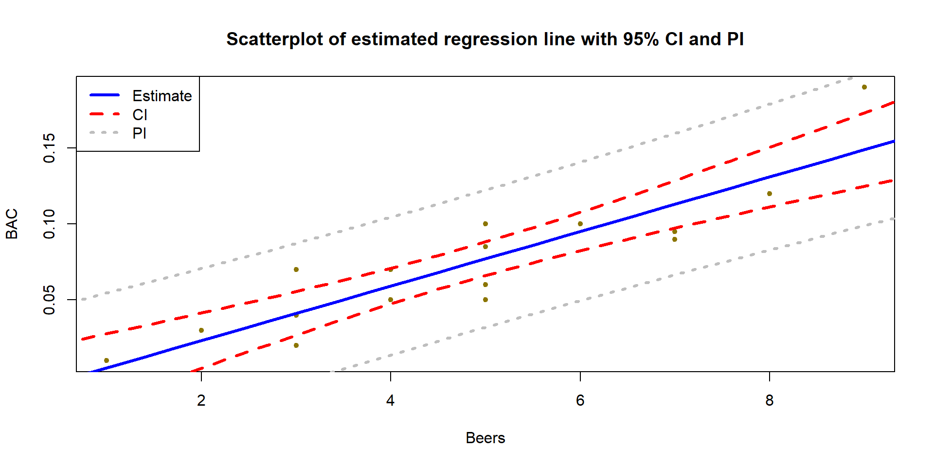
Figure 2.147: (ref:fig7-23)
par(mfrow=c(1,1))
plot(BAC~Beers, data=BB, xlab="Beers", ylab="BAC", pch=20, col="gold4",
     main="Scatterplot of estimated regression line with 95% CI and PI")
lines(fit~beerf, data=BBCI, col="blue", lwd=3) #Plot fitted values
lines(lwr~beerf, data=BBCI, col="red", lty=2, lwd=3) #Plot the CI lower bound
lines(upr~beerf, data=BBCI, col="red", lty=2, lwd=3) #Plot the CI upper bound
lines(lwr~beerf, data=BBPI, col="grey", lty=3, lwd=3) #Plot the PI lower bound
lines(upr~beerf, data=BBPI,col="grey", lty=3, lwd=3) #Plot the PI upper bound
legend("topleft", c("Estimate","CI","PI"), lwd=3, lty=c(1,2,3),
       col = c("blue","red","grey")) #Add a legend to explain lines
More importantly, note that the CI in Figure 2.147 clearly shows widening as we move further away from the mean of the \(x\text{'s}\) to the edges of the observed x-values. This reflects a decrease in knowledge of the true mean as we move away from the mean of the \(x\text{'s}\). The PI also is widening slightly but not as clearly in this situation. The difference in widths in the two types of intervals becomes extremely clear when they are displayed together, with the PI much wider than the CI for any \(x\)-value.
Similarly, the 95% CI and PIs for the Bozeman yearly average maximum temperatures in Figure 2.148 provide interesting information on the uncertainty in the estimated mean temperature over time. It is also interesting to explore how many of the observations fall within the 95% prediction intervals. The PIs are for new observations, but you can see how the PIs that were constructed to contain almost all the observations in the original data set but not all of them. In fact, only 2 of the 109 observations (1.8%) fall outside the 95% PIs. Since the PI needs to be concerned with unobserved new observations it makes sense that it might contain more than 95% of the observations used to make it.
(ref:fig7-24) Estimated SLR for Bozeman temperature data with 95% confidence (dashed lines) and 95% prediction (lighter, dotted lines) intervals.
temp1<-lm(meanmax~Year, data=bozemantemps)
 Yearf<-seq(from=1901,to=2014,length.out=75)

TCI<-as_tibble(predict(temp1,newdata= tibble(Year=Yearf),interval="confidence"))

TPI<-as_tibble(predict(temp1,newdata=tibble(Year=Yearf),interval="prediction"))

plot(meanmax~Year,data=bozemantemps,xlab="Year", ylab="degrees F",pch=20,col="darkgreen", main="Scatterplot of estimated regression line with 95% CI and PI")
 lines(fit~Yearf,data=TCI,col="blue",lwd=3)
 lines(lwr~Yearf,data=TCI,col="red",lty=2,lwd=3)
 lines(upr~Yearf,data=TCI,col="red",lty=2,lwd=3)
 lines(lwr~Yearf,data=TPI,col="grey",lty=3,lwd=3)
 lines(upr~Yearf,data=TPI,col="grey",lty=3,lwd=3)
legend("topleft", c("Estimate", "CI","PI"),lwd=3,lty=c(1,2,3),col = c("blue", "red","grey"))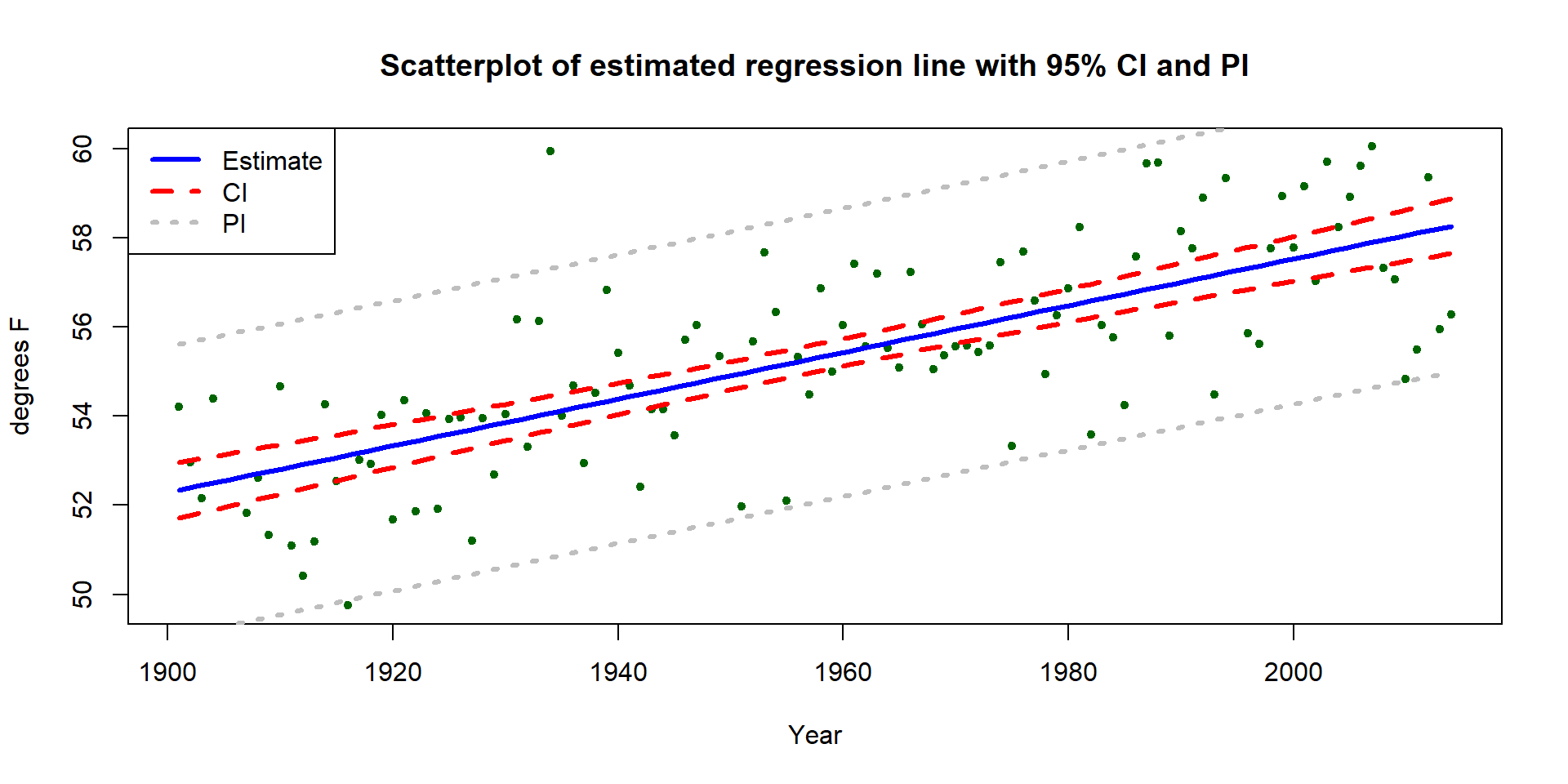
Figure 2.148: (ref:fig7-24)
We can also use these same methods to do a prediction for the year after the data set ended, 2015, and in 2050:
##        fit     lwr      upr
## 1 58.31967 57.7019 58.93744## fit lwr upr
## 1 58.31967 55.04146 61.59787## fit lwr upr
## 1 60.15514 59.23631 61.07397## fit lwr upr
## 1 60.15514 56.80712 63.50316These results tell us that we are 95% confident that the true mean yearly average maximum temperature in 2015 is (I guess “was”) between 55.04\(^\circ F\) and 61.6\(^\circ F\). And we are 95% sure that the observed yearly average maximum temperature in 2015 will be (I guess “would have been”) between 59.2\(^\circ F\) and 61.1\(^\circ F\). Obviously, 2015 has occurred, but since the data were not published when the data set was downloaded in July 2016, we can probably best treat 2015 as a potential “future” observation. The results for 2050 are clearly for the future mean and a new observation112 in 2050. Note that up to 2014, no values of this response had been observed above 60\(^\circ F\) and the predicted mean in 2050 is over 60\(^\circ F\) if the trend persists. It is easy to criticize the use of this model for 2050 because of its extreme amount of extrapolation.
This silly nomenclature was inspired by De Veaux, Velleman, and Bock (2011) Stats: Data and Models text. If you find this too cheesy, you can just call it x-vee.↩
I have suppressed some of the code for making plots in this and the next chapter to make “pretty” pictures - which you probably are happy to not see it until you want to make a pretty plot on your own. All the code used is available upon request.↩
I have really enjoyed writing this book but kind of hope to at least have updated this data set before 2050.↩