- Cover
- Acknowledgments
- 1 Preface
- 2 (R)e-Introduction to statistics
- 2.1 Histograms, boxplots, and density curves
- 2.2 Pirate-plots
- 2.3 Models, hypotheses, and permutations for the two sample mean situation
- 2.4 Permutation testing for the two sample mean situation
- 2.5 Hypothesis testing (general)
- 2.6 Connecting randomization (nonparametric) and parametric tests
- 2.7 Second example of permutation tests
- 2.8 Reproducibility Crisis: Moving beyond p < 0.05, publication bias, and multiple testing issues
- 2.9 Confidence intervals and bootstrapping
- 2.10 Bootstrap confidence intervals for difference in GPAs
- 2.11 Chapter summary
- 2.12 Summary of important R code
- 2.13 Practice problems
- 3 One-Way ANOVA
- 3.1 Situation
- 3.2 Linear model for One-Way ANOVA (cell-means and reference-coding)
- 3.3 One-Way ANOVA Sums of Squares, Mean Squares, and F-test
- 3.4 ANOVA model diagnostics including QQ-plots
- 3.5 Guinea pig tooth growth One-Way ANOVA example
- 3.6 Multiple (pair-wise) comparisons using Tukey’s HSD and the compact letter display
- 3.7 Pair-wise comparisons for the Overtake data
- 3.8 Chapter summary
- 3.9 Summary of important R code
- 3.10 Practice problems
- 4 Two-Way ANOVA
- 4.1 Situation
- 4.2 Designing a two-way experiment and visualizing results
- 4.3 Two-Way ANOVA models and hypothesis tests
- 4.4 Guinea pig tooth growth analysis with Two-Way ANOVA
- 4.5 Observational study example: The Psychology of Debt
- 4.6 Pushing Two-Way ANOVA to the limit: Un-replicated designs and Estimability
- 4.7 Chapter summary
- 4.8 Summary of important R code
- 4.9 Practice problems
- 5 Chi-square tests
- 5.1 Situation, contingency tables, and tableplots
- 5.2 Homogeneity test hypotheses
- 5.3 Independence test hypotheses
- 5.4 Models for R by C tables
- 5.5 Permutation tests for the \(X^2\) statistic
- 5.6 Chi-square distribution for the \(X^2\) statistic
- 5.7 Examining residuals for the source of differences
- 5.8 General protocol for \(X^2\) tests
- 5.9 Political party and voting results: Complete analysis
- 5.10 Is cheating and lying related in students?
- 5.11 Analyzing a stratified random sample of California schools
- 5.12 Chapter summary
- 5.13 Summary of important R commands
- 5.14 Practice problems
- 6 Correlation and Simple Linear Regression
- 6.1 Relationships between two quantitative variables
- 6.2 Estimating the correlation coefficient
- 6.3 Relationships between variables by groups
- 6.4 Inference for the correlation coefficient
- 6.5 Are tree diameters related to tree heights?
- 6.6 Describing relationships with a regression model
- 6.7 Least Squares Estimation
- 6.8 Measuring the strength of regressions: R2
- 6.9 Outliers: leverage and influence
- 6.10 Residual diagnostics – setting the stage for inference
- 6.11 Old Faithful discharge and waiting times
- 6.12 Chapter summary
- 6.13 Summary of important R code
- 6.14 Practice problems
- 7 Simple linear regression inference
- 7.1 Model
- 7.2 Confidence interval and hypothesis tests for the slope and intercept
- 7.3 Bozeman temperature trend
- 7.4 Randomization-based inferences for the slope coefficient
- 7.5 Transformations part I: Linearizing relationships
- 7.6 Transformations part II: Impacts on SLR interpretations: log(y), log(x), & both log(y) & log(x)
- 7.7 Confidence interval for the mean and prediction intervals for a new observation
- 7.8 Chapter summary
- 7.9 Summary of important R code
- 7.10 Practice problems
- 8 Multiple linear regression
- 8.1 Going from SLR to MLR
- 8.2 Validity conditions in MLR
- 8.3 Interpretation of MLR terms
- 8.4 Comparing multiple regression models
- 8.5 General recommendations for MLR interpretations and VIFs
- 8.6 MLR inference: Parameter inferences using the t-distribution
- 8.7 Overall F-test in multiple linear regression
- 8.8 Case study: First year college GPA and SATs
- 8.9 Different intercepts for different groups: MLR with indicator variables
- 8.10 Additive MLR with more than two groups: Headache example
- 8.11 Different slopes and different intercepts
- 8.12 F-tests for MLR models with quantitative and categorical variables and interactions
- 8.13 AICs for model selection
- 8.14 Case study: Forced expiratory volume model selection using AICs
- 8.15 Chapter summary
- 8.16 Summary of important R code
- 8.17 Practice problems
- 9 Case studies
- 9.1 Overview of material covered
- 9.2 The impact of simulated chronic nitrogen deposition on the biomass and N2-fixation activity of two boreal feather moss–cyanobacteria associations
- 9.3 Ants learn to rely on more informative attributes during decision-making
- 9.4 Multi-variate models are essential for understanding vertebrate diversification in deep time
- 9.5 What do didgeridoos really do about sleepiness?
- 9.6 General summary
- References
6.11 Old Faithful discharge and waiting times
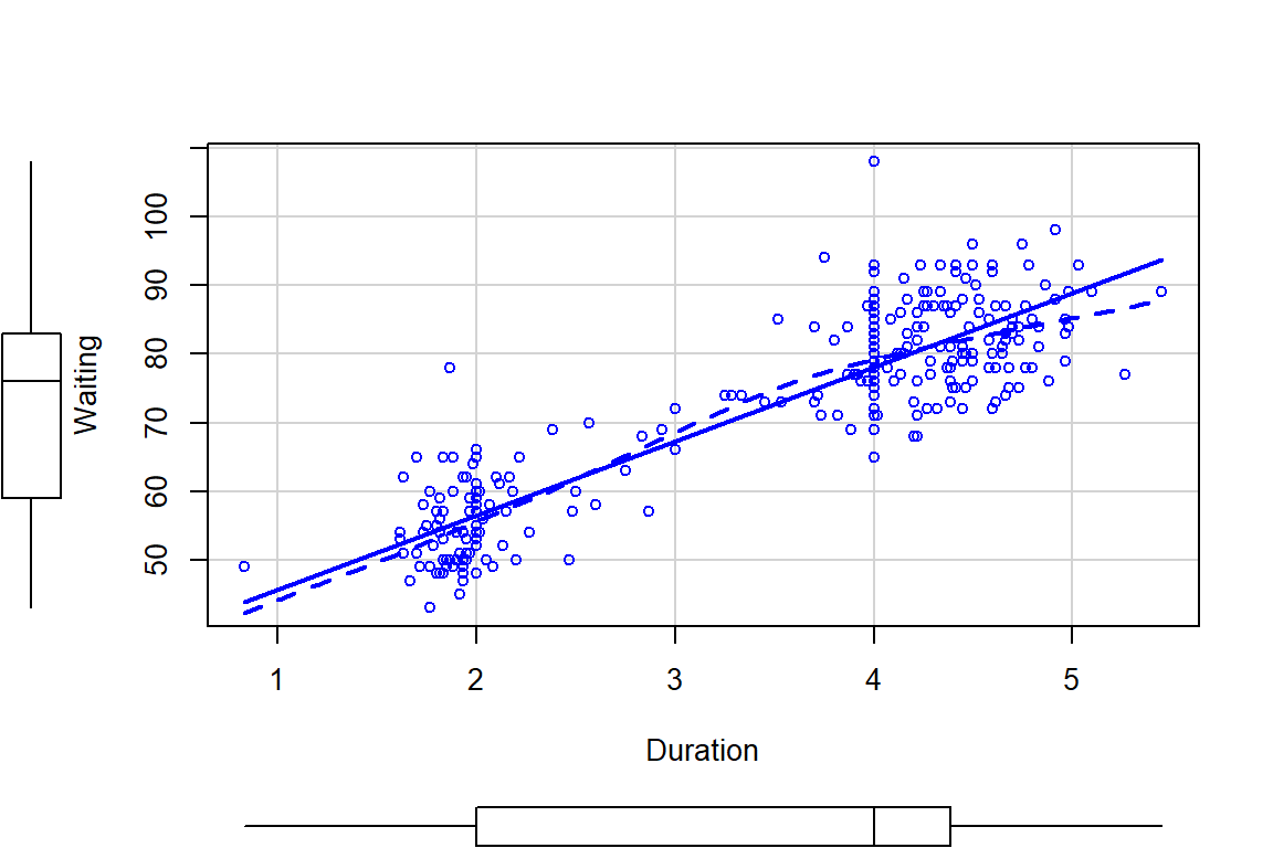
A study in August 1985 considered time for Old Faithful and how that might relate to waiting time for the next eruption (Ripley (2019), Azzalini and Bowman (1990)). This sort of research provides the Yellowstone National Park (YNP) staff a way to show tourists a predicted time to next eruption so they can quickly see it erupt and then get back in their cars, not wasting too much time in the outdoors. Or, less cynically, the opportunity to study the behavior of the eruption of a geyser. Both variables are measured in minutes and the scatterplot in Figure 2.123 shows a moderate to strong positive and relatively linear relationship. We added a smoothing line (dashed line) to this plot. Smoothing lines provide regression-like fits but are performed on local areas of the relationship between the two variables and so can highlight where the relationships change, especially highlighting curvilinear relationships. They can also return straight lines just like the regression line if that is reasonable. The technical details of regression smoothing are not covered here but they are a useful graphical addition to help visualize nonlinearity in relationships.
In these data, there appear to be two groups of eruptions (shorter length, shorter
wait and longer length, longer wait) – but we don’t know enough about these
data to assume that there are two groups. The smoothing line does help us to
see if the relationship appears to change or stay the same across different
values of the explanatory variable, Duration. The smoothing line suggests
that the upper group might have a less steep slope than the lower group as it
sort of levels off for observations with Duration of over 4 minutes. It
also indicates that there is one point for an eruption under 1 minute in
Duration that might be causing some problems. The story of these data
involve some measurements during the night
that were just noted as being short, medium, and long – and they were re-coded
as 2, 3, or 4 minute duration eruptions. You can see responses stacking up at 2 and 4 minute durations and this is obviously a problematic aspect of these data. We’ll see if our diagnostics detect
some of these issues when we fit a simple linear regression to try to explain
waiting time based on duration of prior eruption.
(ref:fig6-24) Scatterplot of Old Faithful waiting times to next eruption (minutes) and duration of prior eruption (minutes) with smoothing line (dashed) and regression line (solid).
library(MASS)
data(geyser)
geyser <- as_tibble(geyser)
#Aligns the duration with time to next eruption
G2 <- tibble(Waiting=geyser$waiting[-1], Duration=geyser$duration[-299])
scatterplot(Waiting~Duration, data=G2, smooth=list(spread=F)) #Adds smoothing line
Figure 2.123: (ref:fig6-24)
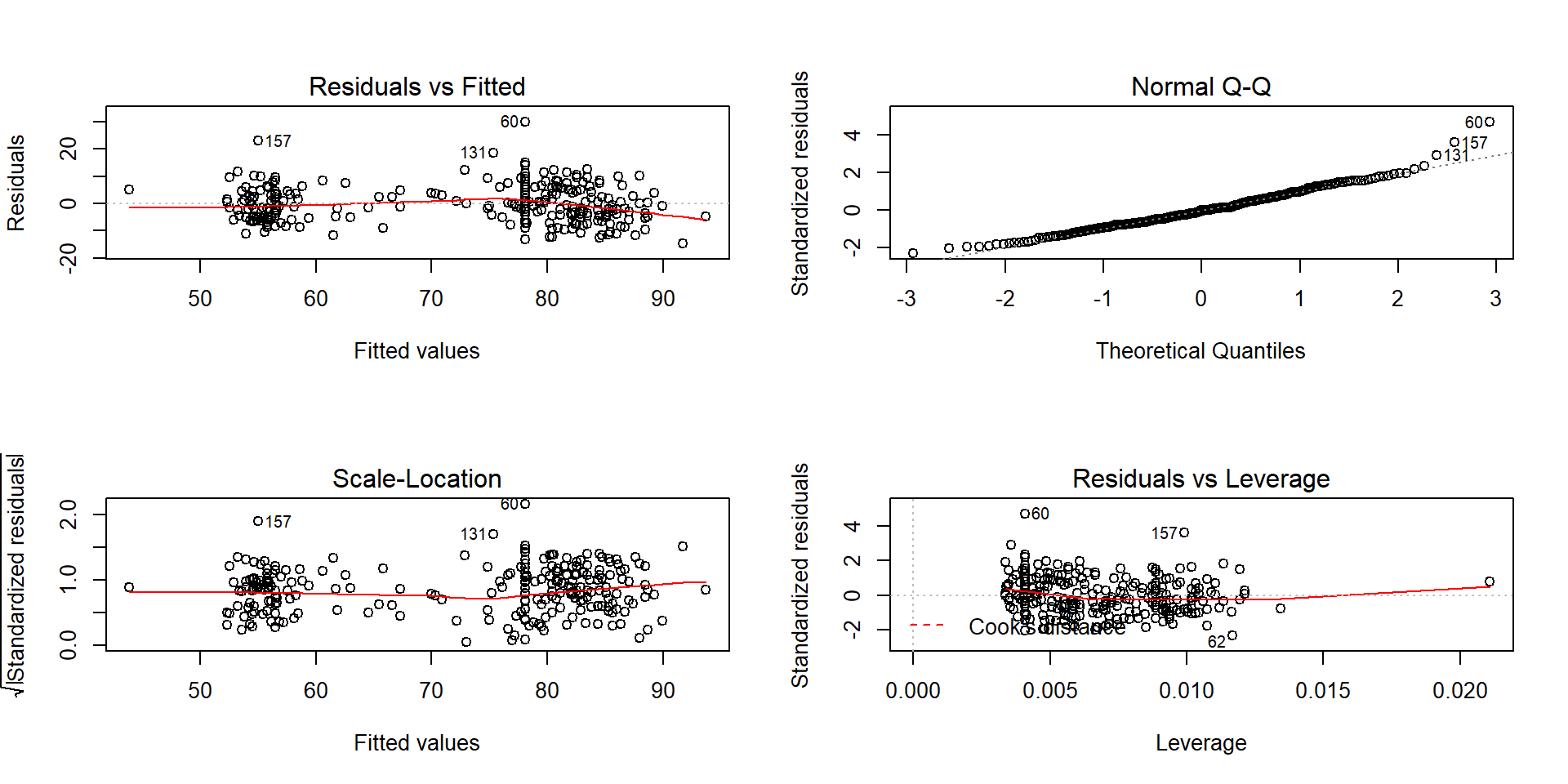
An initial concern with these data is that the observations are likely not independent. Since they were taken consecutively, one waiting time might be related to the next waiting time – violating the independence assumption. As noted above, there might be two groups (types) of eruptions – short ones and long ones. The Normal QQ-Plot in Figure 2.124 also suggests a few observations creating a slightly long right tail. Those observations might warrant further exploration as they also show up as unusual in the Residuals vs Fitted plot. There are no highly influential points in the data set with all points having Cook’s D smaller than 0.5 (contours are not displayed because no points are near or over them), so these outliers are not necessarily moving the regression line around. There are two distinct groups of observations but the variability is not clearly changing so we do not have to worry about non-constant variance here. So these results might be relatively trustworthy if we assume that the same relationship holds for all levels of duration of eruptions.
##
## Call:
## lm(formula = Waiting ~ Duration, data = G2)
##
## Residuals:
##      Min       1Q   Median       3Q      Max
## -14.6940  -4.4954  -0.0966   3.9544  29.9544
##
## Coefficients:
##             Estimate Std. Error t value Pr(>|t|)
## (Intercept)  34.9452     1.1807   29.60   <2e-16
## Duration     10.7751     0.3235   33.31   <2e-16
##
## Residual standard error: 6.392 on 296 degrees of freedom
## Multiple R-squared:  0.7894, Adjusted R-squared:  0.7887
## F-statistic:  1110 on 1 and 296 DF,  p-value: < 2.2e-16
Figure 2.124: Diagnostic plots for Old Faithful waiting time model.
The estimated regression equation is
\(\widehat{\text{WaitingTime}}_i = 34.95 + 10.78\cdot\text{Duration}_i\),
suggesting that for a 1 minute increase
in eruption Duration we would expect, on average, a 10.78 minute
change in the WaitingTime. This equation might provide a useful tool
for the YNP staff to predict waiting times. The R2 is
fairly large: 78.9% of the variation in waiting time is explained by the
duration of the previous eruption. But maybe this is more about two
types of eruptions/waiting
times? We could consider the relationship within the shorter and longer
eruptions but since there are observations residing between the two groups, it
is difficult to know where to split the explanatory variable into two groups.
Maybe we really need to measure additional information that might explain why
there are two groups in the responses…
References
Azzalini, Adelchi, and Adrian W. Bowman. 1990. “A Look at Some Data on the Old Faithful Geyser.” Applied Statistics 39: 357–65.
Ripley, Brian. 2019. MASS: Support Functions and Datasets for Venables and Ripley’s Mass. https://CRAN.R-project.org/package=MASS.