- Cover
- Acknowledgments
- 1 Preface
- 2 (R)e-Introduction to statistics
- 2.1 Histograms, boxplots, and density curves
- 2.2 Pirate-plots
- 2.3 Models, hypotheses, and permutations for the two sample mean situation
- 2.4 Permutation testing for the two sample mean situation
- 2.5 Hypothesis testing (general)
- 2.6 Connecting randomization (nonparametric) and parametric tests
- 2.7 Second example of permutation tests
- 2.8 Reproducibility Crisis: Moving beyond p < 0.05, publication bias, and multiple testing issues
- 2.9 Confidence intervals and bootstrapping
- 2.10 Bootstrap confidence intervals for difference in GPAs
- 2.11 Chapter summary
- 2.12 Summary of important R code
- 2.13 Practice problems
- 3 One-Way ANOVA
- 3.1 Situation
- 3.2 Linear model for One-Way ANOVA (cell-means and reference-coding)
- 3.3 One-Way ANOVA Sums of Squares, Mean Squares, and F-test
- 3.4 ANOVA model diagnostics including QQ-plots
- 3.5 Guinea pig tooth growth One-Way ANOVA example
- 3.6 Multiple (pair-wise) comparisons using Tukey’s HSD and the compact letter display
- 3.7 Pair-wise comparisons for the Overtake data
- 3.8 Chapter summary
- 3.9 Summary of important R code
- 3.10 Practice problems
- 4 Two-Way ANOVA
- 4.1 Situation
- 4.2 Designing a two-way experiment and visualizing results
- 4.3 Two-Way ANOVA models and hypothesis tests
- 4.4 Guinea pig tooth growth analysis with Two-Way ANOVA
- 4.5 Observational study example: The Psychology of Debt
- 4.6 Pushing Two-Way ANOVA to the limit: Un-replicated designs and Estimability
- 4.7 Chapter summary
- 4.8 Summary of important R code
- 4.9 Practice problems
- 5 Chi-square tests
- 5.1 Situation, contingency tables, and tableplots
- 5.2 Homogeneity test hypotheses
- 5.3 Independence test hypotheses
- 5.4 Models for R by C tables
- 5.5 Permutation tests for the \(X^2\) statistic
- 5.6 Chi-square distribution for the \(X^2\) statistic
- 5.7 Examining residuals for the source of differences
- 5.8 General protocol for \(X^2\) tests
- 5.9 Political party and voting results: Complete analysis
- 5.10 Is cheating and lying related in students?
- 5.11 Analyzing a stratified random sample of California schools
- 5.12 Chapter summary
- 5.13 Summary of important R commands
- 5.14 Practice problems
- 6 Correlation and Simple Linear Regression
- 6.1 Relationships between two quantitative variables
- 6.2 Estimating the correlation coefficient
- 6.3 Relationships between variables by groups
- 6.4 Inference for the correlation coefficient
- 6.5 Are tree diameters related to tree heights?
- 6.6 Describing relationships with a regression model
- 6.7 Least Squares Estimation
- 6.8 Measuring the strength of regressions: R2
- 6.9 Outliers: leverage and influence
- 6.10 Residual diagnostics – setting the stage for inference
- 6.11 Old Faithful discharge and waiting times
- 6.12 Chapter summary
- 6.13 Summary of important R code
- 6.14 Practice problems
- 7 Simple linear regression inference
- 7.1 Model
- 7.2 Confidence interval and hypothesis tests for the slope and intercept
- 7.3 Bozeman temperature trend
- 7.4 Randomization-based inferences for the slope coefficient
- 7.5 Transformations part I: Linearizing relationships
- 7.6 Transformations part II: Impacts on SLR interpretations: log(y), log(x), & both log(y) & log(x)
- 7.7 Confidence interval for the mean and prediction intervals for a new observation
- 7.8 Chapter summary
- 7.9 Summary of important R code
- 7.10 Practice problems
- 8 Multiple linear regression
- 8.1 Going from SLR to MLR
- 8.2 Validity conditions in MLR
- 8.3 Interpretation of MLR terms
- 8.4 Comparing multiple regression models
- 8.5 General recommendations for MLR interpretations and VIFs
- 8.6 MLR inference: Parameter inferences using the t-distribution
- 8.7 Overall F-test in multiple linear regression
- 8.8 Case study: First year college GPA and SATs
- 8.9 Different intercepts for different groups: MLR with indicator variables
- 8.10 Additive MLR with more than two groups: Headache example
- 8.11 Different slopes and different intercepts
- 8.12 F-tests for MLR models with quantitative and categorical variables and interactions
- 8.13 AICs for model selection
- 8.14 Case study: Forced expiratory volume model selection using AICs
- 8.15 Chapter summary
- 8.16 Summary of important R code
- 8.17 Practice problems
- 9 Case studies
- 9.1 Overview of material covered
- 9.2 The impact of simulated chronic nitrogen deposition on the biomass and N2-fixation activity of two boreal feather moss–cyanobacteria associations
- 9.3 Ants learn to rely on more informative attributes during decision-making
- 9.4 Multi-variate models are essential for understanding vertebrate diversification in deep time
- 9.5 What do didgeridoos really do about sleepiness?
- 9.6 General summary
- References
2.2 Pirate-plots
An alternative graphical display for comparing multiple groups that we will use is a display called a pirate-plot (Phillips 2017) from the yarrr package21. Figure 2.5
shows an example of a pirate-plot that provides a side-by-side display that
contains the density curves, the original observations that generated the
density curve as jittered points (jittered both vertically and horizontally a little), the sample mean of each group (wide bar), and a box that represents the confidence interval for the true mean of that group. For each group, the density curves
are mirrored to aid in visual assessment of the shape of the distribution. This mirroring also
creates a shape that resembles the outline of a violin with skewed distributions so versions of this
display have also been called a “violin plot” or a “bean plot”. All together this plot shows us information
on the original observations, center (mean) and its confidence interval, spread, and shape of the distributions of the responses. Our inferences typically focus on the means of the groups and this plot allows
us to compare those across the groups while gaining information on the shapes
of the distributions of responses in each group.
To use the pirateplot function we need to install and then load the yarrr
package (???).
The function works like the boxplot used previously
except that options
for the type of confidence interval needs to be specified with inf.method="ci - otherwise you will get a different kind of interval than you learned in introductory statistics and we don’t want to get caught up in trying to understand the kind of interval it makes by default. There are many other options in the function that might be useful in certain situations, but that is the only one that is really needed to get started with pirate-plots.
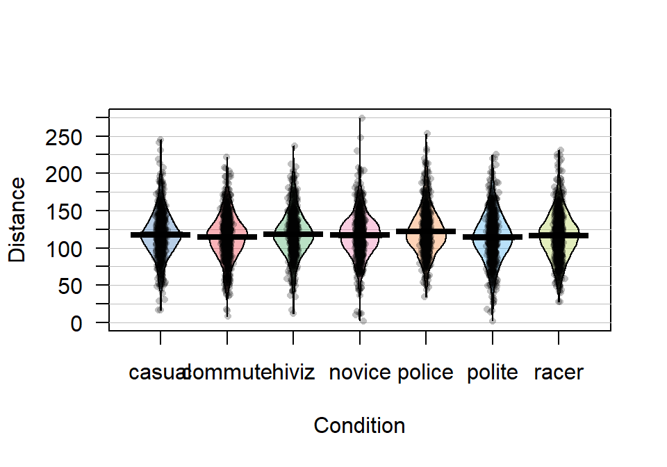
Figure 2.5: Pirate-plot of distances by outfit group. Bold horizontal lines correspond to sample mean of each group, boxes around lines (here they are very narrow here) are the 95% confidence intervals.
Because of the relatively symmetric nature of the distributions, the means and medians are similar, as shown in Figure 2.5. In this display, none of the observations are flagged as outliers (it is not a part of this display). It is up to the consumer of the graphic to decide if observations look to be outside of the overall pattern of the rest of the observations. By plotting the observations by groups, we can also explore the narrowest (and likely most scary) overtakes in the data set. The police and racer conditions seem to have all observations over 25 cm and the most close passes were in the novice and polite outfits, including the two 2 cm passes. By displaying the original observations, we are able to explore and identify features that aggregation and summarization in plots can sometimes obfuscate. But the pirate-plots also allow up to compare the shape of the distributions (relatively symmetric and somewhat bell-shaped), variability (they look to have relatively similar variability) and the means of the groups. Our inferences are going to focus on the means but those inferences are only valid if the distributions are either approximately normal or at least similar shapes and spreads (more on this soon).
It appears that the mean for police is higher than the other groups but that the others are not too different. But is this difference real? We will never
know the answer to that question, but we
can assess how likely we are to have seen a result as extreme or more
extreme than our result, assuming that there is no difference in the
means of the groups. And if the observed result is
(extremely) unlikely to occur, then we can reject the hypothesis that the
groups have the same mean and conclude that there is evidence of a real
difference. After that, we will want to carefully explore how big the estimated differences in the means are - is this enough of a difference to matter to you or the subject in the study? To accompany the pirate-plot, we
need to have numerical values to compare. We can get means and standard
deviations by groups easily using the same formula notation as for the plots with the mean
and sd functions, if the mosaic package is loaded.
##   casual  commute    hiviz   novice   police   polite    racer
## 117.6110 114.6079 118.4383 116.9405 122.1215 114.0518 116.7559## casual commute hiviz novice police polite racer
## 29.86954 29.63166 29.03384 29.03812 29.73662 31.23684 30.60059We can also use the favstats function to get those summaries and others by groups.
##   Condition min    Q1 median  Q3 max     mean       sd   n missing
## 1    casual  17 100.0    117 134 245 117.6110 29.86954 779       0
## 2   commute   8  98.0    116 132 222 114.6079 29.63166 857       0
## 3     hiviz  12 101.0    117 134 237 118.4383 29.03384 737       0
## 4    novice   2 100.5    118 133 274 116.9405 29.03812 807       0
## 5    police  34 104.0    119 138 253 122.1215 29.73662 790       0
## 6    polite   2  95.0    114 133 225 114.0518 31.23684 868       0
## 7     racer  28  98.0    117 135 231 116.7559 30.60059 852       0
Based on these results, we can see that there is an estimated difference of over 8 cm between the smallest mean (polite at 114.05 cm) and the largest mean (police at 122.12 cm). The differences among some of the other groups are much smaller, such as between casual and commute with sample means of 117.611 and 114.608 cm, respectively. Because there are seven groups being compared in this study, we will have to wait until Chapter 3 and the One-Way ANOVA test to fully assess evidence related to some difference among the seven groups. For now, we are going to focus on comparing the mean Distance between casual and commute groups – which is a two independent sample mean situation and something you should have seen before. Remember that the “independent” sample part of this refers to observations that are independently observed for the two groups as opposed to the paired sample situation that you may have explored where one observation from the first group is related to an observation in the second group (the same person with one measurement in each group (we generically call this “repeated measures”) or the famous “twin” studies with one twin assigned to each group). This study has some potential violations of the “independent” sample situation (for example, repeated measurements made during a single ride), but those do not clearly fit into the matched pairs situation, so we will note this potential issue and proceed with exploring the method that assumes that we have independent samples, even though this is not true here. In Chapter 9, methods for more complex study designs like this one will be discussed briefly, but mostly this is beyond the scope of this material.
Here we are going to use the “simple” two independent group scenario to review some basic statistical concepts and connect two different frameworks for conducting statistical inference: randomization and parametric inference techniques. Parametric statistical methods involve making assumptions about the distribution of the responses and obtaining confidence intervals and/or p-values using a named distribution (like the \(z\) or \(t\)-distributions). Typically these results are generated using formulas and looking up areas under curves or cutoffs using a table or a computer. Randomization-based statistical methods use a computer to shuffle, sample, or simulate observations in ways that allow you to obtain distributions of possible results to find areas and cutoffs without resorting to using tables and named distributions. Randomization methods are what are called nonparametric methods that often make fewer assumptions (they are not free of assumptions!) and so can handle a larger set of problems more easily than parametric methods. When the assumptions involved in the parametric procedures are met by a data set, the randomization methods often provide very similar results to those provided by the parametric techniques. To be a more sophisticated statistical consumer, it is useful to have some knowledge of both of these techniques for performing statistical inference and the fact that they can provide similar results might deepen your understanding of both approaches.
To be able to work just with the observations from two of the conditions (casual and commute) we could remove all the other observations in a spreadsheet program and read that new data set
back into R, but it is actually pretty easy to use R to do data
management once the data set is loaded. It is also a better scientific process to do as much of your data management within R as possible so that your steps in managing the data are fully documented and reproducible. Highlighting and clicking in spreadsheet programs is a dangerous way to work and can be impossible to recreate steps that were taken from initial data set to the version that was analyzed. In R, we could identify the rows that contain the observations we want to retain and just extract those rows, but this is hard with over five thousand observations. The subset function (also an option in some functions) is the best way to be able to focus on observations that meet a particular condition, we can “subset” the data set to retain those rows. The subset function takes the data set as its first argument and then in the “subset” option, we need to define the condition we want to meet to retain those rows. Specifically, we need to define the variable we want to work with, Condition and then request rows that meet a condition (are %in%) and the aspects that meet that condition (here by concatenating “casual” and “commute”), leading to code of:
subset(dd, Condition %in% c("casual", "commute"))We would actually want to save that new subsetted data set into a new tibble for future work, so we can use the following to save the reduced data set into ddsub:
There is also a “select” option that we could also use to just focus on certain columns in the data set and we can use that just to focus on the Condition and Distance variables using:
You will always want to check that the correct observations were dropped
either using View(ddsub) or by doing a quick summary of the
Condition variable in the new tibble.
##  casual commute   hiviz  novice  police  polite   racer
##     779     857       0       0       0       0       0
It ends up that R remembers the other categories even though there are
0 observations in them now and that can cause us some problems. When we remove a
group of observations, we sometimes need to clean up categorical variables to
just reflect the categories that are present. The factor
function
creates categorical variables based on the levels of the variables that are
observed and is useful to run here to clean up Condition to just reflect the categories that are now present.
##  casual commute
##     779     857
The two categories of interest now were selected because neither looks particularly “racey” or has high visibility but could present a common choice between getting fully “geared up” for the commute or just jumping on a bike to go to work. Now if we remake the boxplots and pirate-plots, they only contain results for the two groups of interest here as seen in Figure 2.6. Note that these are available in the previous version of the plots, but now we will just focus on these two groups.
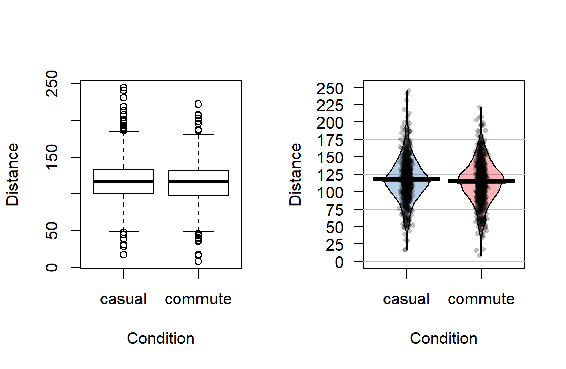
Figure 2.6: Boxplot and pirate-plot of the Distance responses on the reduced ddsub data set.
The two-sample mean techniques you learned in your previous course all
start with comparing the means the two groups. We can obtain the two
means using the mean function or directly obtain the difference
in the means using the diffmean function (both require the mosaic
package). The diffmean function provides
\(\bar{x}_\text{commute} - \bar{x}_\text{casual}\) where \(\bar{x}\)
(read as “x-bar”) is the sample mean of observations in the subscripted
group. Note that there are two directions that you could compare the
means and this function chooses to take the mean from the second group
name alphabetically and subtract the mean from the first alphabetical group
name. It is always good to check the direction of this calculation as
having a difference of \(-3.003\) cm versus \(3.003\) cm could be important.
##   casual  commute
## 117.6110 114.6079## diffmean
## -3.003105References
Phillips, Nathaniel. 2017. Yarrr: A Companion to the E-Book "Yarrr!: The Pirate’s Guide to R". https://CRAN.R-project.org/package=yarrr.