- Cover
- Acknowledgments
- 1 Preface
- 2 (R)e-Introduction to statistics
- 2.1 Histograms, boxplots, and density curves
- 2.2 Pirate-plots
- 2.3 Models, hypotheses, and permutations for the two sample mean situation
- 2.4 Permutation testing for the two sample mean situation
- 2.5 Hypothesis testing (general)
- 2.6 Connecting randomization (nonparametric) and parametric tests
- 2.7 Second example of permutation tests
- 2.8 Reproducibility Crisis: Moving beyond p < 0.05, publication bias, and multiple testing issues
- 2.9 Confidence intervals and bootstrapping
- 2.10 Bootstrap confidence intervals for difference in GPAs
- 2.11 Chapter summary
- 2.12 Summary of important R code
- 2.13 Practice problems
- 3 One-Way ANOVA
- 3.1 Situation
- 3.2 Linear model for One-Way ANOVA (cell-means and reference-coding)
- 3.3 One-Way ANOVA Sums of Squares, Mean Squares, and F-test
- 3.4 ANOVA model diagnostics including QQ-plots
- 3.5 Guinea pig tooth growth One-Way ANOVA example
- 3.6 Multiple (pair-wise) comparisons using Tukey’s HSD and the compact letter display
- 3.7 Pair-wise comparisons for the Overtake data
- 3.8 Chapter summary
- 3.9 Summary of important R code
- 3.10 Practice problems
- 4 Two-Way ANOVA
- 4.1 Situation
- 4.2 Designing a two-way experiment and visualizing results
- 4.3 Two-Way ANOVA models and hypothesis tests
- 4.4 Guinea pig tooth growth analysis with Two-Way ANOVA
- 4.5 Observational study example: The Psychology of Debt
- 4.6 Pushing Two-Way ANOVA to the limit: Un-replicated designs and Estimability
- 4.7 Chapter summary
- 4.8 Summary of important R code
- 4.9 Practice problems
- 5 Chi-square tests
- 5.1 Situation, contingency tables, and tableplots
- 5.2 Homogeneity test hypotheses
- 5.3 Independence test hypotheses
- 5.4 Models for R by C tables
- 5.5 Permutation tests for the \(X^2\) statistic
- 5.6 Chi-square distribution for the \(X^2\) statistic
- 5.7 Examining residuals for the source of differences
- 5.8 General protocol for \(X^2\) tests
- 5.9 Political party and voting results: Complete analysis
- 5.10 Is cheating and lying related in students?
- 5.11 Analyzing a stratified random sample of California schools
- 5.12 Chapter summary
- 5.13 Summary of important R commands
- 5.14 Practice problems
- 6 Correlation and Simple Linear Regression
- 6.1 Relationships between two quantitative variables
- 6.2 Estimating the correlation coefficient
- 6.3 Relationships between variables by groups
- 6.4 Inference for the correlation coefficient
- 6.5 Are tree diameters related to tree heights?
- 6.6 Describing relationships with a regression model
- 6.7 Least Squares Estimation
- 6.8 Measuring the strength of regressions: R2
- 6.9 Outliers: leverage and influence
- 6.10 Residual diagnostics – setting the stage for inference
- 6.11 Old Faithful discharge and waiting times
- 6.12 Chapter summary
- 6.13 Summary of important R code
- 6.14 Practice problems
- 7 Simple linear regression inference
- 7.1 Model
- 7.2 Confidence interval and hypothesis tests for the slope and intercept
- 7.3 Bozeman temperature trend
- 7.4 Randomization-based inferences for the slope coefficient
- 7.5 Transformations part I: Linearizing relationships
- 7.6 Transformations part II: Impacts on SLR interpretations: log(y), log(x), & both log(y) & log(x)
- 7.7 Confidence interval for the mean and prediction intervals for a new observation
- 7.8 Chapter summary
- 7.9 Summary of important R code
- 7.10 Practice problems
- 8 Multiple linear regression
- 8.1 Going from SLR to MLR
- 8.2 Validity conditions in MLR
- 8.3 Interpretation of MLR terms
- 8.4 Comparing multiple regression models
- 8.5 General recommendations for MLR interpretations and VIFs
- 8.6 MLR inference: Parameter inferences using the t-distribution
- 8.7 Overall F-test in multiple linear regression
- 8.8 Case study: First year college GPA and SATs
- 8.9 Different intercepts for different groups: MLR with indicator variables
- 8.10 Additive MLR with more than two groups: Headache example
- 8.11 Different slopes and different intercepts
- 8.12 F-tests for MLR models with quantitative and categorical variables and interactions
- 8.13 AICs for model selection
- 8.14 Case study: Forced expiratory volume model selection using AICs
- 8.15 Chapter summary
- 8.16 Summary of important R code
- 8.17 Practice problems
- 9 Case studies
- 9.1 Overview of material covered
- 9.2 The impact of simulated chronic nitrogen deposition on the biomass and N2-fixation activity of two boreal feather moss–cyanobacteria associations
- 9.3 Ants learn to rely on more informative attributes during decision-making
- 9.4 Multi-variate models are essential for understanding vertebrate diversification in deep time
- 9.5 What do didgeridoos really do about sleepiness?
- 9.6 General summary
- References
8.8 Case study: First year college GPA and SATs
Many universities require students to have certain test scores in order to be
admitted into their institutions. They
obviously must think that those scores are useful predictors of student success
to use them in this way. Quality assessments of recruiting classes are also
based on their test scores. The Educational Testing Service (the company behind
such fun exams as the SAT and GRE) collected a data set to validate their SAT
on \(n=1000\) students from an unnamed Midwestern university; the data set is
available in the openintro package (Diez, Barr, and Cetinkaya-Rundel 2017)
in the satGPA data set.
It is unclear from the documentation whether a
random sample was collected, in fact it looks like it certainly wasn’t a random
sample of all incoming students at a large university (more later). What
potential issues would arise if a company was providing a data set to show the
performance of their test and it was not based on a random sample?
We will proceed assuming they used good methods in developing their test
(there are sophisticated
statistical models underlying the development of the SAT and GRE) and also in
obtaining a data set for testing out the performance of their tests that is at
least representative of the students (or some types of students) at this
university. They provided information on the SAT Verbal (SATV)
and Math (SATM) percentiles (these are not the scores but the ranking
percentile that each score translated to in a particular year),
High School GPA (HSGPA), First Year of college GPA (FYGPA), Gender (Sex of the students coded 1 and 2 with possibly 1 for males and 2 for females – the documentation was also unclear this). Should Sex even be displayed in a plot with correlations since it is a categorical variable? Our interests here are in whether the two SAT percentiles are (together?)
related to the first year college GPA, describing the size of their impacts
and assessing the predictive potential of SAT-based measures for first year in
college GPA. There are certainly other possible research questions that can be
addressed with these data but this will keep us focused.
library(openintro)
data(satGPA)
satGPA <- as_tibble(satGPA)
pairs.panels(satGPA[,-4], ellipse=F, col="red", lwd=2)
Figure 2.163: Scatterplot matrix of SAT and GPA data set.
There are positive relationships in Figure 2.163 among all the pre-college measures and the college GPA but none are above the moderate strength level. The HSGPA has a highest correlation with first year of college results but its correlation is not that strong. Maybe together in a model the SAT percentiles can also be useful… Also note that plot shows an odd HSGPA of 4.5 that probably should be removed124 if that variable is going to be used (HSGPA was not used in the following models so the observation remains in the data).
In MLR, the modeling process is a bit more complex and often involves more than one model, so we will often avoid the 6+ steps in testing initially and try to generate a model we can use in that more specific process. In this case, the first model of interest using the two SAT percentiles,
\[\text{FYGPA}_i = \beta_0 + \beta_{\text{SATV}}\text{SATV}_i + \beta_{\text{SATM}}\text{SATM}_i +\varepsilon_i,\]
looks like it might be worth interrogating further so we can jump straight into considering the 6+ steps involved in hypothesis testing for the two slope coefficients to address our RQ about assessing the predictive ability and relationship of the SAT scores on first year college GPA. We will use \(t\)-based inferences, assuming that we can trust the assumptions and the initial plots get us some idea of the potential relationship.
Note that this is not a randomized experiment but we can assume that it is representative of the students at that single university. We would not want to extend these inferences to other universities (who might be more or less selective) or to students who did not get into this university and, especially, not to students that failed to complete the first year. The second and third constraints point to a severe limitation in this research – only students who were accepted, went to, and finished one year at this university could be studied. Lower SAT percentile students might not have been allowed in or may not have finished the first year and higher SAT students might have been attracted to other more prestigious institutions. So the scope of inference is just limited to students that were invited and chose to attend this institution and successfully completed one year of courses. It is hard to know if the SAT “works” when the inferences are so restricted in who they might apply to… But you could see why the company that administers the SAT might want to analyze these data. Admissions people also often focus on predicting first year retention rates, but that is a categorical response variable (retained/not) and so not compatible with the linear models considered here.
The following code fits the model of interest, provides a model summary, and the diagnostic plots, allowing us to consider the tests of interest:
(ref:fig8-14) Diagnostic plots for the \(\text{FYGPA}\sim\text{ SATV }+\text{ SATM}\) model.
##
## Call:
## lm(formula = FYGPA ~ SATV + SATM, data = satGPA)
##
## Residuals:
##      Min       1Q   Median       3Q      Max
## -2.19647 -0.44777  0.02895  0.45717  1.60940
##
## Coefficients:
##             Estimate Std. Error t value Pr(>|t|)
## (Intercept) 0.007372   0.152292   0.048    0.961
## SATV        0.025390   0.002859   8.879  < 2e-16
## SATM        0.022395   0.002786   8.037 2.58e-15
##
## Residual standard error: 0.6582 on 997 degrees of freedom
## Multiple R-squared:  0.2122, Adjusted R-squared:  0.2106
## F-statistic: 134.2 on 2 and 997 DF, p-value: < 2.2e-16par(mfrow=c(2,2), oma=c(0,0,2,0))
plot(gpa1, sub.caption="Diagnostics for GPA model with SATV and SATM")
Figure 2.164: (ref:fig8-14)
Hypotheses of interest:
\(H_0: \beta_\text{SATV}=0\) given SATM in the model vs \(H_A: \beta_\text{SATV}\ne 0\) given SATM in the model.
\(H_0: \beta_\text{SATM}=0\) given SATV in the model vs \(H_A: \beta_\text{SATM}\ne 0\) given SATV in the model.
Plot the data and assess validity conditions:
Quantitative variables condition:
- The variables used here in this model are quantitative. Note that Gender was plotted in the previous scatterplot matrix and is not quantitative – we will explore its use later.
Independence of observations:
- With a sample from a single university from (we are assuming) a single year of students, there is no particular reason to assume a violation of the independence assumption. If there was information about students from different years being included or maybe even from different colleges in the university in a single year, we might worry about systematic differences in the GPAs and violations of the independence assumption. We can’t account for either and there is possibly not a big difference in the GPAs across colleges to be concerned about, especially with a sample of students from a large university.
Linearity of relationships:
The initial scatterplots (Figure 2.163) do not show any clear nonlinearities with each predictor used in this model.
The Residuals vs Fitted and Scale-Location plots (Figure 2.164) do not show much more than a football shape, which is our desired result.
The partial residuals are displayed in Figure 2.165 and do not suggest any clear missed curvature.
- Together, there is no suggestion of a violation of the linearity assumption.
Multicollinearity checked for:
The original scatterplots suggest that there is some collinearity between the two SAT percentiles with a correlation of 0.47. That is actually a bit lower than one might expect and suggests that each score must be measuring some independent information about different characteristics of the students.
VIFs also do not suggest a major issue with multicollinearity in the model with the VIFs for both variables the same at 1.278125. This suggests that both SEs are about 13% larger than they otherwise would have been due to shared information between the two predictor variables.
## SATV SATM ## 1.278278 1.278278## SATV SATM ## 1.13061 1.13061Equal (constant) variance:
- There is no clear change in variability as a function of fitted values so no indication of a violation of the constant variance of residuals assumption.
Normality of residuals:
- There is a minor deviation in the upper tail of the residual distribution from normality. It is not pushing towards having larger values than a normal distribution would generate so should not cause us any real problems with inferences from this model. Note that this upper limit is likely due to using GPA as a response variable and it has an upper limit. This is an example of a potentially censored variable. For a continuous variable it is possible that the range of a measurement scale doesn’t distinguish among subjects who differ once they pass a certain point. For example, a 4.0 high school student is likely going to have a high first year college GPA, on average, but there is no room for variability in college GPA up, just down once you are at the top of the GPA scale. For students more in the middle of the range, they can vary up or down. So in some places you can get symmetric distributions around the mean and in others you cannot. There are specific statistical models for these types of responses that are beyond our scope. In this situation, failing to account for the censoring may push some slopes toward 0 a little because we can’t have responses over 4.0 in college GPA to work with.
No influential points:
- There are no influential points. In large data sets, the influence of any point is decreased and even high leverage and outlying points can struggle to have any impacts at all on the results.
So we are fairly comfortable with all the assumptions being at least not clearly violated and so the inferences from our model should be relatively trustworthy.
Calculate the test statistics and p-values:
For SATV: \(t=\dfrac{0.02539}{0.002859}=8.88\) with the \(t\) having \(df=997\) and p-value \(<0.0001\).
For SATM: \(t=\dfrac{0.02240}{0.002786}=8.04\) with the \(t\) having \(df=997\) and p-value \(<0.0001\).
Conclusions:
For SATV: There is strong evidence against the null hypothesis of no linear relationship between SATV and FYGPA (\(t_{997}=8.88\), p-value < 0.0001) and conclude that, in fact, there is a linear relationship between SATV percentile and the first year of college GPA, after controlling for the SATM percentile, in the population of students that completed their first year at this university.
For SATM: There is strong evidence against the null hypothesis of no linear relationship between SATM and FYGPA (\(t_{997}=8.04\), p-value < 0.0001)and conclude that, in fact, there is a linear relationship between SATM percentile and the first year of college GPA, after controlling for the SATV percentile, in the population of students that completed their first year at this university.
Size:
- The model seems to be valid and have predictors with small p-values, but note how much of the variation is not explained by the model. It only explains 21.22% of the variation in the responses. So we found evidence that these variables are useful in predicting the responses, but are they useful enough to use for decisions on admitting students? By quantifying the size of the estimated slope coefficients, we can add to the information about how potentially useful this model might be. The estimated MLR model is
\[\widehat{\text{FYGPA}}_i=0.00737+0.0254\cdot\text{SATV}_i+0.0224\cdot\text{SATM}_i\ .\]
So for a 1 percent increase in the SATV percentile, we estimate, on average, a 0.0254 point change in GPA, after controlling for SATM percentile. Similarly, for a 1 percent increase in the SATM percentile, we estimate, on average, a 0.0224 point change in GPA, after controlling for SATV percentile. While this is a correct interpretation of the slope coefficients, it is often easier to assess “practical” importance of the results by considering how much change this implies over the range of observed predictor values.
The term-plots (Figure 2.165) provide a visualization of the “size” of the differences in the response variable explained by each predictor. The SATV term-plot shows that for the range of percentiles from around the 30th percentile to the 70th percentile, the mean first year GPA is predicted to go from approximately 1.9 to 3.0. That is a pretty wide range of differences in GPAs across the range of observed percentiles. This looks like a pretty interesting and important change in the mean first year GPA across that range of different SAT percentiles. Similarly, the SATM term-plot shows that the SATM percentiles were observed to range between around the 30th percentile and 70th percentile and predict mean GPAs between 1.95 and 2.8. It seems that the SAT Verbal percentiles produce slightly more impacts in the model, holding the other variable constant, but that both are important variables. The 95% confidence intervals for the means in both plots suggest that the results are fairly precisely estimated – there is little variability around the predicted means in each plot. This is mostly a function of the sample size as opposed to the model itself explaining most of the variation in the responses.
(ref:fig8-15) Term-plots for the \(\text{FYGPA}\sim\text{SATV} + \text{SATM}\) model with partial residuals.
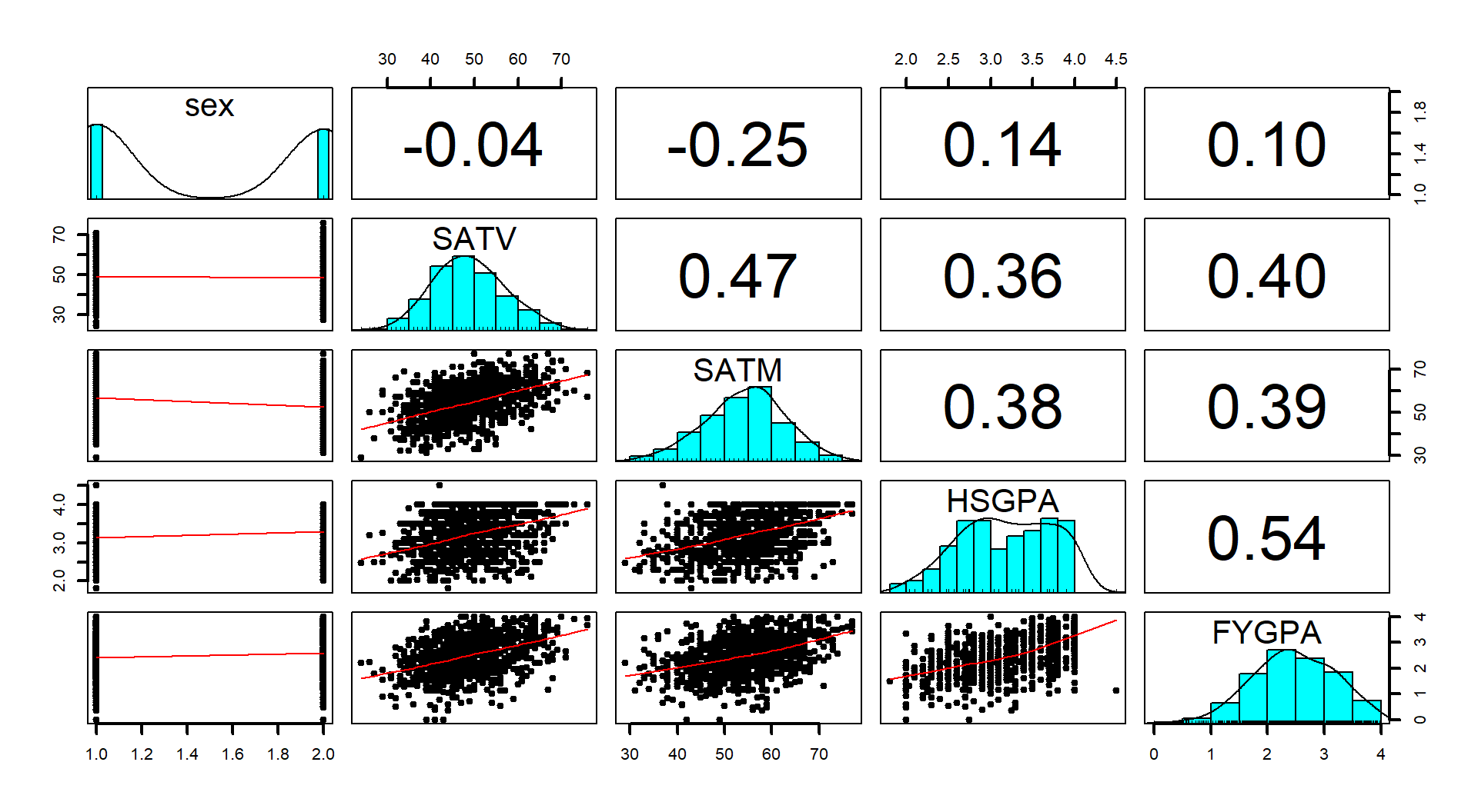
Figure 2.165: (ref:fig8-15)
* The confidence intervals also help us pin down the uncertainty in eachestimated slope coefficient. As always, the “easy” way to get 95% confidence
intervals is using the confint function:
##                   2.5 %     97.5 %
## (Intercept) -0.29147825 0.30622148
## SATV         0.01977864 0.03100106
## SATM         0.01692690 0.02786220
* So, for a 1 percent increase in the *SATV* percentile, we are 95% confidentthat the true mean FYGPA changes between 0.0198 and 0.031 points, in the population of students who completed this year at this institution, after controlling for SATM. The SATM result is similar with an interval from 0.0169 and 0.0279. Both of these intervals might benefit from re-scaling the interpretation to, say, a 10 percentile increase in the predictor variable, with the change in the FYGPA for that level of increase of SATV providing an interval from 0.198 to 0.31 points and for SATM providing an interval from 0.169 to 0.279. So a boost of 10% in either exam percentile likely results in a noticeable but not huge average FYGPA increase.
Scope of Inference:
The term-plots also inform the types of students attending this university and successfully completing the first year of school. This seems like a good, but maybe not great, institution with few students scoring over the 75th percentile on either SAT Verbal or Math (at least that ended up in this data set). This result makes questions about their sampling mechanism re-occur as to who this data set might actually be representative of…
Note that neither inference is causal because there was no random assignment of SAT percentiles to the subjects. The inferences are also limited to students who stayed in school long enough to get a GPA from their first year of college at this university.
One final use of these methods is to do prediction and generate prediction intervals, which could be quite informative for a student considering going to this university who has a particular set of SAT scores. For example, suppose that the student is interested in the average FYGPA to expect with SATV at the 30th percentile and SATM at the 60th percentile. The predicted mean value is
\[\begin{array}{rl} \hat{\mu}_{\text{GPA}_i} &= 0.00737 + 0.0254\cdot\text{SATV}_i + 0.0224\cdot\text{SATM}_i \\ &= 0.00737 + 0.0254*30 + 0.0224*60 = 2.113. \end{array}\]
This result and the 95% confidence interval for the mean student GPA at these
scores can be found using the predict function as:
##       1
## 2.11274## fit lwr upr
## 1 2.11274 1.982612 2.242868For students at the 30th percentile of SATV and 60th percentile of SATM, we are 95% confident that the true mean first year GPA is between 1.98 and 2.24 points. For an individual student, we would want the 95% prediction interval:
##       fit       lwr      upr
## 1 2.11274 0.8145859 3.410894
For a student with SATV=30 and SATM=60, we are 95% sure that their first year GPA will be between 0.81 and 3.4 points. You can see that while we are very certain about the mean in this situation, there is a lot of uncertainty in the predictions for individual students. The PI is so wide as to almost not be useful.
To support this difficulty in getting a precise prediction for a new student, review the original scatterplots and partial residuals: there is quite a bit of vertical variability in first year GPAs for each level of any of the predictors. The residual SE, \(\hat{\sigma}\), is also informative in this regard – remember that it is the standard deviation of the residuals around the regression line. It is 0.6582, so the SD of new observations around the line is 0.66 GPA points and that is pretty large on a GPA scale. Remember that if the residuals meet our assumptions and follow a normal distribution around the line, observations within 2 or 3 SDs of the mean would be expected which is a large range of GPA values. Figure 2.166 remakes both term-plots, holding the other predictor at its mean, and adds the 95% prediction intervals to show the difference in variability between estimating the mean and pinning down the value of a new observation. The R code is very messy and rarely needed, but hopefully this helps reinforce the differences in these two types of intervals – to make them in MLR, you have to fix all but one of the predictor variables and we usually do that by fixing the other variables at their means.
(ref:fig8-16) Term-plots for the \(\text{FYGPA}\sim\text{SATV} + \text{SATM}\) model with 95% confidence intervals (red, dashed lines) and 95% PIs (light grey, dotted lines).
#Remake effects plots with 95% PIs
dv1 <- tibble(SATV=seq(from=24,to=76,length.out=50), SATM=rep(54.4,50))
dm1 <- tibble(SATV=rep(48.93,50), SATM=seq(from=29,to=77,length.out=50))

mv1 <- as_tibble(predict(gpa1, newdata=dv1, interval="confidence"))
pv1 <- as_tibble(predict(gpa1, newdata=dv1, interval="prediction"))

mm1 <- as_tibble(predict(gpa1, newdata=dm1, interval="confidence"))
pm1 <- as_tibble(predict(gpa1, newdata=dm1, interval="prediction"))

par(mfrow=c(1,2))

plot(dv1$SATV, mv1$fit, lwd=2, ylim=c(pv1$lwr[1],pv1$upr[50]), type="l",
     xlab="SATV Percentile", ylab="GPA", main="SATV Effect, CI and PI")
lines(dv1$SATV, mv1$lwr, col="red", lty=2, lwd=2)
lines(dv1$SATV, mv1$upr, col="red", lty=2, lwd=2)
lines(dv1$SATV, pv1$lwr, col="grey", lty=3, lwd=3)
lines(dv1$SATV, pv1$upr, col="grey", lty=3, lwd=3)
legend("topleft", c("Estimate", "CI","PI"), lwd=3, lty=c(1,2,3),
       col = c("black", "red","grey"))

plot(dm1$SATM, mm1$fit, lwd=2, ylim=c(pm1$lwr[1],pm1$upr[50]), type="l",
     xlab="SATM Percentile", ylab="GPA", main="SATM Effect, CI and PI")
lines(dm1$SATM, mm1$lwr, col="red", lty=2, lwd=2)
lines(dm1$SATM, mm1$upr, col="red", lty=2, lwd=2)
lines(dm1$SATM, pm1$lwr, col="grey", lty=3, lwd=3)
lines(dm1$SATM, pm1$upr, col="grey", lty=3, lwd=3)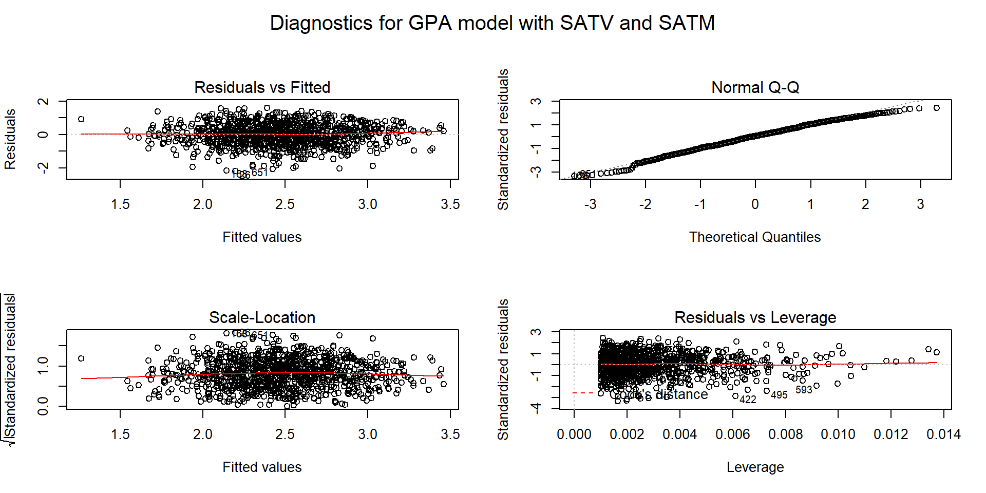
Figure 2.166: (ref:fig8-16)
References
Diez, David M, Christopher D Barr, and Mine Cetinkaya-Rundel. 2017. Openintro: Data Sets and Supplemental Functions from ’Openintro’ Textbooks. https://CRAN.R-project.org/package=openintro.
Either someone had a weighted GPA with bonus points, or more likely here, there was a coding error in the data set since only one observation was over 4.0 in the GPA data. Either way, we could remove it and note that our inferences for HSGPA do not extend above 4.0.↩
When there are just two predictors, the VIFs have to be the same since the proportion of information shared is the same in both directions. With more than two predictors, each variable can have a different VIF value.↩