- Cover
- Acknowledgments
- 1 Preface
- 2 (R)e-Introduction to statistics
- 2.1 Histograms, boxplots, and density curves
- 2.2 Pirate-plots
- 2.3 Models, hypotheses, and permutations for the two sample mean situation
- 2.4 Permutation testing for the two sample mean situation
- 2.5 Hypothesis testing (general)
- 2.6 Connecting randomization (nonparametric) and parametric tests
- 2.7 Second example of permutation tests
- 2.8 Reproducibility Crisis: Moving beyond p < 0.05, publication bias, and multiple testing issues
- 2.9 Confidence intervals and bootstrapping
- 2.10 Bootstrap confidence intervals for difference in GPAs
- 2.11 Chapter summary
- 2.12 Summary of important R code
- 2.13 Practice problems
- 3 One-Way ANOVA
- 3.1 Situation
- 3.2 Linear model for One-Way ANOVA (cell-means and reference-coding)
- 3.3 One-Way ANOVA Sums of Squares, Mean Squares, and F-test
- 3.4 ANOVA model diagnostics including QQ-plots
- 3.5 Guinea pig tooth growth One-Way ANOVA example
- 3.6 Multiple (pair-wise) comparisons using Tukey’s HSD and the compact letter display
- 3.7 Pair-wise comparisons for the Overtake data
- 3.8 Chapter summary
- 3.9 Summary of important R code
- 3.10 Practice problems
- 4 Two-Way ANOVA
- 4.1 Situation
- 4.2 Designing a two-way experiment and visualizing results
- 4.3 Two-Way ANOVA models and hypothesis tests
- 4.4 Guinea pig tooth growth analysis with Two-Way ANOVA
- 4.5 Observational study example: The Psychology of Debt
- 4.6 Pushing Two-Way ANOVA to the limit: Un-replicated designs and Estimability
- 4.7 Chapter summary
- 4.8 Summary of important R code
- 4.9 Practice problems
- 5 Chi-square tests
- 5.1 Situation, contingency tables, and tableplots
- 5.2 Homogeneity test hypotheses
- 5.3 Independence test hypotheses
- 5.4 Models for R by C tables
- 5.5 Permutation tests for the \(X^2\) statistic
- 5.6 Chi-square distribution for the \(X^2\) statistic
- 5.7 Examining residuals for the source of differences
- 5.8 General protocol for \(X^2\) tests
- 5.9 Political party and voting results: Complete analysis
- 5.10 Is cheating and lying related in students?
- 5.11 Analyzing a stratified random sample of California schools
- 5.12 Chapter summary
- 5.13 Summary of important R commands
- 5.14 Practice problems
- 6 Correlation and Simple Linear Regression
- 6.1 Relationships between two quantitative variables
- 6.2 Estimating the correlation coefficient
- 6.3 Relationships between variables by groups
- 6.4 Inference for the correlation coefficient
- 6.5 Are tree diameters related to tree heights?
- 6.6 Describing relationships with a regression model
- 6.7 Least Squares Estimation
- 6.8 Measuring the strength of regressions: R2
- 6.9 Outliers: leverage and influence
- 6.10 Residual diagnostics – setting the stage for inference
- 6.11 Old Faithful discharge and waiting times
- 6.12 Chapter summary
- 6.13 Summary of important R code
- 6.14 Practice problems
- 7 Simple linear regression inference
- 7.1 Model
- 7.2 Confidence interval and hypothesis tests for the slope and intercept
- 7.3 Bozeman temperature trend
- 7.4 Randomization-based inferences for the slope coefficient
- 7.5 Transformations part I: Linearizing relationships
- 7.6 Transformations part II: Impacts on SLR interpretations: log(y), log(x), & both log(y) & log(x)
- 7.7 Confidence interval for the mean and prediction intervals for a new observation
- 7.8 Chapter summary
- 7.9 Summary of important R code
- 7.10 Practice problems
- 8 Multiple linear regression
- 8.1 Going from SLR to MLR
- 8.2 Validity conditions in MLR
- 8.3 Interpretation of MLR terms
- 8.4 Comparing multiple regression models
- 8.5 General recommendations for MLR interpretations and VIFs
- 8.6 MLR inference: Parameter inferences using the t-distribution
- 8.7 Overall F-test in multiple linear regression
- 8.8 Case study: First year college GPA and SATs
- 8.9 Different intercepts for different groups: MLR with indicator variables
- 8.10 Additive MLR with more than two groups: Headache example
- 8.11 Different slopes and different intercepts
- 8.12 F-tests for MLR models with quantitative and categorical variables and interactions
- 8.13 AICs for model selection
- 8.14 Case study: Forced expiratory volume model selection using AICs
- 8.15 Chapter summary
- 8.16 Summary of important R code
- 8.17 Practice problems
- 9 Case studies
- 9.1 Overview of material covered
- 9.2 The impact of simulated chronic nitrogen deposition on the biomass and N2-fixation activity of two boreal feather moss–cyanobacteria associations
- 9.3 Ants learn to rely on more informative attributes during decision-making
- 9.4 Multi-variate models are essential for understanding vertebrate diversification in deep time
- 9.5 What do didgeridoos really do about sleepiness?
- 9.6 General summary
- References
9.5 What do didgeridoos really do about sleepiness?
In the practice problems at the end of Chapter 4, a study (Puhan et al. (2006)) related to a pre-post, two group comparison of the sleepiness ratings of subjects. They obtained \(n=25\) volunteers and they randomized the subjects to either get a lesson or be placed on a waiting list for lessons. They constrained the randomization based on the high/low apnoea and high/low on the Epworth scale of the subjects in their initial observations to make sure they balanced the types of subjects going into the treatment and control groups. They measured the subjects’ Epworth value (daytime sleepiness, higher is more sleepy) initially and after four months, where only the treated subjects (those who took lessons) had any intervention. We are interested in whether the mean Epworth scale values changed differently over the four months in the group that got didgeridoo lessons than it did in the control group (that got no lessons). Each subject was measured twice (so the total sample size in the data set is 50) in the data set provided that is available at http://www.math.montana.edu/courses/s217/documents/epworthdata.csv.
The data set was not initially provided by the researchers, but they
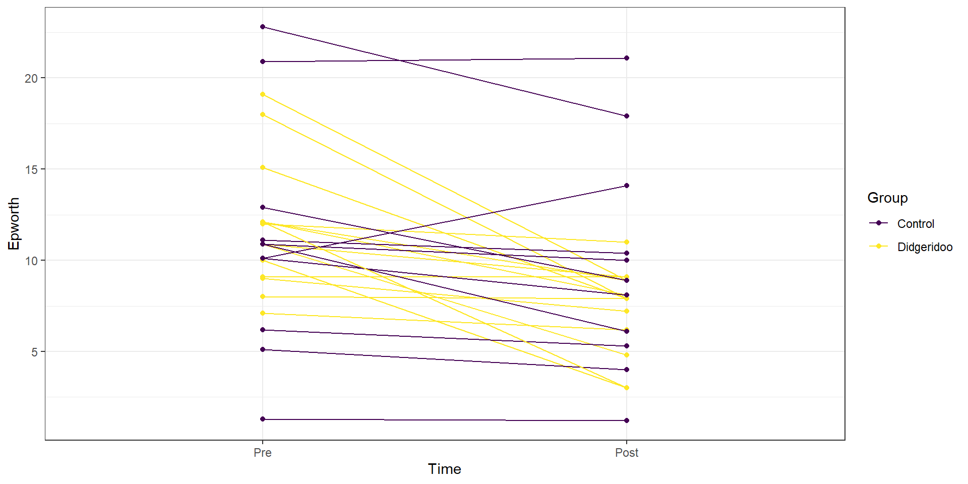
did provide a plot very similar to Figure 2.203. Since this
is the last section of the book, I am going to use a new package to make the plot,
qplot from the ggplot2 package (Wickham et al. 2019), that violates one of
the rules used for R functions to this point - it doesn’t have a formula interface.
If you continue much further in learning to use R, you will see the benefits
of some other functions and styles of functions. You will also likely run into
the ggplot2 package, which is part of the “tidyverse” and has been developed
to implement sophisticated graphics. For more on this, you can visit
https://ggplot2.tidyverse.org/ and the related book by Hadley Wickham, who works for RStudio. We could have used ggplot2 to make every graph in the
book, but elected to focus on functions that rely on formula interfaces. For now, I am going to use it to make Figure
2.203 with the qplot function that allows me to display a
line for each subject over the two time points (pre and post) of observation
and indicate which group the subjects were assigned to. This allows us to see
the variation at a given time across subjects and changes over time, which is
critical here as this shows clearly why we had a violation of the independence
assumption in these data. In the plot, you can see that there are not clear differences in the two groups at the “Pre” time but that treated group seems
to have most of the lines go down to lower sleepiness ratings and that this is
not happening much for the subjects in the control group. The violation of the independence assumption is diagnosable from the study design (two observations on each subject). The plot allows us to go further and see that many subjects had similar Epworth scores from pre to post (high in pre, generally high in post) once we account for systematic changes in the treated subjects that seemed to drop a bit on average.
epworthdata <- read_csv("http://www.math.montana.edu/courses/s217/documents/epworthdata.csv")
epworthdata$Time <- factor(epworthdata$Time)
levels(epworthdata$Time) <- c("Pre" , "Post")
epworthdata$Group <- factor(epworthdata$Group)
levels(epworthdata$Group) <- c("Control" , "Didgeridoo")

library(ggplot2); library(ggthemes)
qplot(x = Time, y = Epworth, data = epworthdata,
      group = Subject, colour = Group, geom = c("line",
"point"))+theme_bw()+scale_color_viridis(discrete=TRUE) 
Figure 2.203: Plot of Epworth responses for each subject, initially and after four months, based on treatment groups with one line for each subject connecting observations made over time.
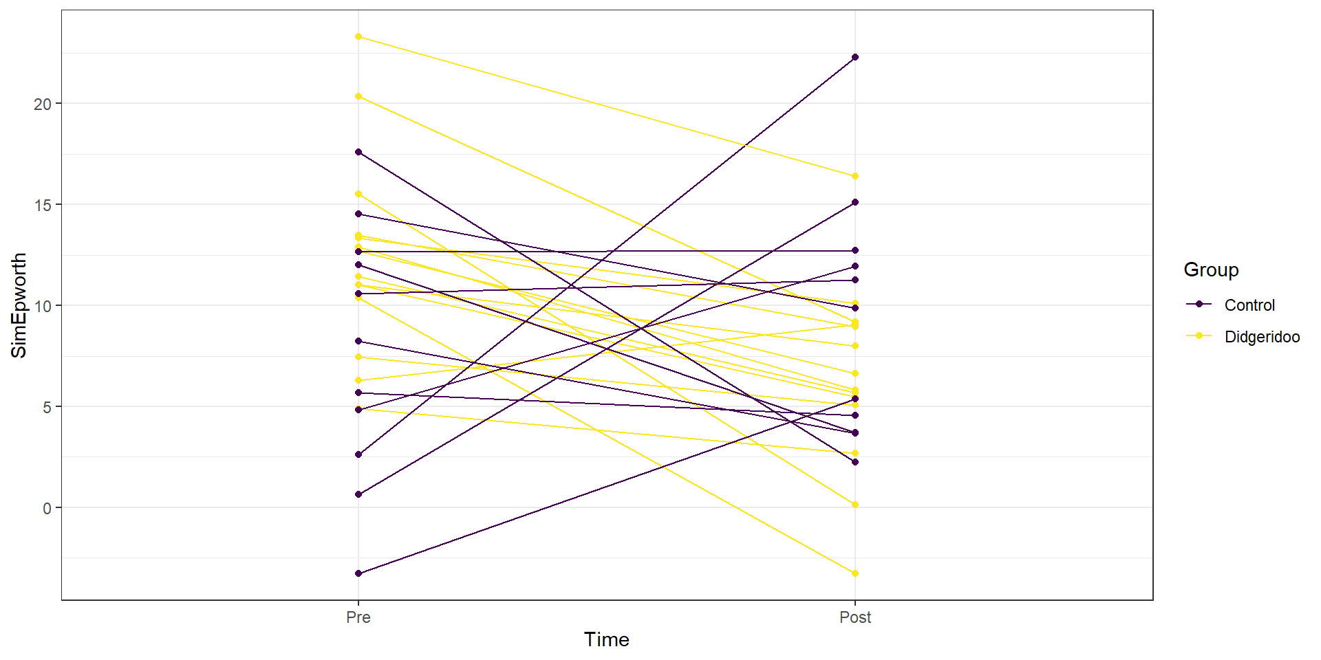
This plot seems to contradict the result from the following Two-Way ANOVA (that is a repeat of what you would have seen had you done the practice problem earlier in the book and the related interaction plot) – there is little to no evidence against the null hypothesis of no interaction between Time and Treatment group on Epworth scale ratings (\(F(1,46)=1.37\), p-value\(=0.2484\) as seen in Table 2.15). But this model assumes all the observations are independent and so does not account for the repeated measures on the same subjects. It ends up that if we account for systematic differences in subjects, we can (sometimes) find the differences we are interested in more clearly. We can see that this model does not really seem to capture the full structure of the real data by comparing simulated data to the original one, as in Figure 2.204. The real data set had fairly strong relationships between the pre and post scores but this connection seems to disappear in responses simulated from the estimated Two-Way ANOVA model (that assumes all observations are independent).
| Sum Sq | Df | F value | Pr(>F) | |
|---|---|---|---|---|
| Time | 120.746 | 1 | 5.653 | 0.022 |
| Group | 8.651 | 1 | 0.405 | 0.528 |
| Time:Group | 29.265 | 1 | 1.370 | 0.248 |
| Residuals | 982.540 | 46 |

Figure 2.204: Plot of simulated data from the Two-Way ANOVA model that does not assume observations are on repeated measures on subjects to compare to the real data set. Even though the treatment levels seem to decrease on average, there is a much less clear relationship between the starting and ending values in the individuals.
If the issue is failing to account for differences in subjects, then why not add “Subject” to the model? There are two things to consider. First, we would need to make sure that “Subject” is a factor variable as the “Subject” variable is initially numerical from 1 to 25. Second, we have to deal with having a factor variable with 25 levels (so 24 indicator variables!). This is a big number and would make writing out the model and interpreting the term-plot for Subject extremely challenging. Fortunately, we are not too concerned about how much higher or lower an individual is than a baseline subject, but we do need to account for it in the model. This sort of “repeated measures” modeling is more often handled by a more complex set of extended regression models that are called linear mixed models and are designed to handle this sort of grouping variable with many levels.
But if we put the Subject factor variable into the previous model, we
can use Type II ANOVA tests to test for an interaction between Time and Group
(our primary research question) after controlling for subject-to-subject
variation. There is a warning message about aliasing that occurs when you
do this which means that it is not possible to estimate all the \(\beta\)s in
this model (and why we more typically used mixed models to do this sort of
thing). Despite this, the test for Time:Group in Table 2.16
is correct and now accounts for the repeated measures on the subject. It
provides \(F(1,23)=5.43\) with a p-value of 0.029, suggesting that there is
moderate evidence against the null hypothesis of no interaction of time and group once we account for subject. This is a
notably different result from what we observed in the Two-Way ANOVA
interaction model that didn’t account for repeated measures on the subjects and matches the results in the original paper closely.
epworthdata$Subject <- factor(epworthdata$Subject)
lm_int_wsub <- lm(Epworth ~ Time * Group + Subject,data=epworthdata)
Anova(lm_int_wsub)| Sum Sq | Df | F value | Pr(>F) | |
|---|---|---|---|---|
| Time | 120.746 | 1 | 22.410 | 0.000 |
| Group | 0 | |||
| Subject | 858.615 | 23 | 6.929 | 0.000 |
| Time:Group | 29.265 | 1 | 5.431 | 0.029 |
| Residuals | 123.924 | 23 |
With this result, we would usually explore the term-plots from this
model to get a sense of the pattern of the changes over time in the treatment
and control groups. That aliasing issue means that the “effects” function also
has some issues. To see the effects plots, we need to use a linear mixed model
from the nlme package. This model is beyond the scope of this material, but
it provides the same \(F\)-statistic for the interaction (\(F(1,23)=5.43\)) and the
term-plots can now be produced (Figure 2.205). In that plot, we
again see that the didgeridoo group mean for “Post” is noticeably lower than in
the “Pre” and that the changes in the control group were minimal over the four
months. This difference in the changes over time was present in the initial
graphical exploration but we needed to account for variation in subjects to be
able to detect this difference. While these results rely on more complex models
than we have time to discuss here, hopefully the similarity of the results of
interest should resonate with the methods we have been exploring while hinting
at more possibilities if you learn more statistical methods.
library(nlme)
lme_int <- lme(Epworth ~ Time*Group, random=~1|Subject, data=epworthdata)
anova(lme_int)
## numDF denDF F-value p-value
## (Intercept) 1 23 132.81354 <.0001
## Time 1 23 22.41014 0.0001
## Group 1 23 0.23175 0.6348
## Time:Group 1 23 5.43151 0.0289
Figure 2.205: Term-plot of Time by Group interaction, results are from model that accounts for subject-to-subject variation in a mixed model.
References
Puhan, Milo A, Alex Suarez, Christian Lo Cascio, Alfred Zahn, Markus Heitz, and Otto Braendli. 2006. “Didgeridoo Playing as Alternative Treatment for Obstructive Sleep Apnoea Syndrome: Randomised Controlled Trial.” BMJ 332 (7536): 266–70. https://doi.org/10.1136/bmj.38705.470590.55.
Wickham, Hadley, Winston Chang, Lionel Henry, Thomas Lin Pedersen, Kohske Takahashi, Claus Wilke, Kara Woo, and Hiroaki Yutani. 2019. Ggplot2: Create Elegant Data Visualisations Using the Grammar of Graphics. https://CRAN.R-project.org/package=ggplot2.